Archive for August, 2013
August 31st, 2013 by dave dorsey
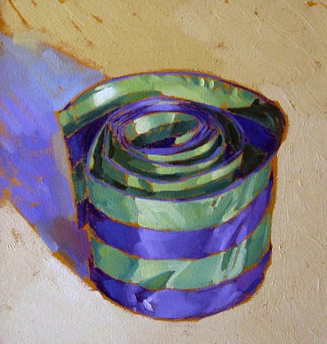
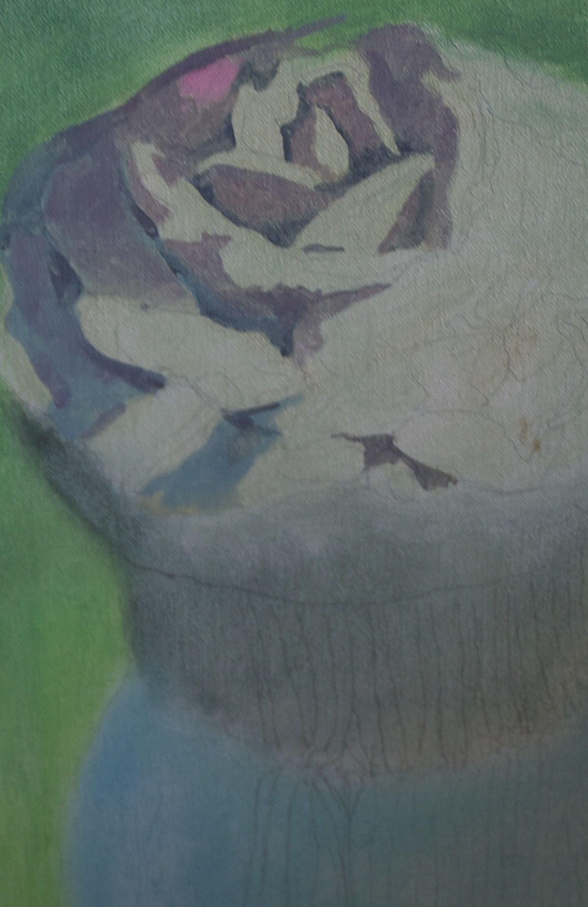
Striped Silk Ribbon, Kim Starr, Art Brokerage
Great work. All about color, abstract, but clearly a recognizable form and volume and distinctly representational. All-over undercoat on ochre, complementary to the colors in the image, letting it show around edges to heighten the color, a la Thiebaud, but it has a feel all its own. Painterly, has the feel of a first take, no “going back over” as Welliver claimed he never did.
August 29th, 2013 by dave dorsey

Beginnings . . .
So I got close to finishing a third cupcake yesterday and it brought back for me why both golf and painting can be extremely black emotional ordeals. I spoke in a previous post about the fear that precedes a golf shot or the first few brush strokes on a new canvas, which sounds laughable, but it isn’t fear of what’s going to happen at that particular moment. It’s anxiety over the irrational despair that can overwhelm you when you realize you’ve lost the feel of how to make a shot or paint a decent picture. (You never completely know how: that’s what you don’t want to face.) When it doesn’t go well, it strikes at the heart of your confidence in your ability to survive in the world, because it makes so clearly apparent that everything you thought you knew how to do, in order to get any sort of result, is just an image of an activity you carry around in your head. It isn’t the actual activity, which exists partly as instinct and muscle memory and subconscious intuition. You realize that this image in the head alone doesn’t enable you physically to get a reliable result. So when things go south, or threaten to, you’re faced with having utterly wasted four or five hours or days or weeks of your life—as a painter, of course. In the sporting version of this failure, the hours simply feel like years. When this happens, the frustration and suppressed anger quickly turn to a kind of peevish, childish despair—but it isn’t something you give in to. It comes over you like an opaque cloud. It leaves you feeling utterly helpless, until you go do something actually productive and forget yourself again. The self-loathing bubbles up. I just finished a nearly perfect painting. How can I be making such a mess of this one? I just birdied that par three. How can I step up the next tee and shank this drive? What is wrong with me? This can’t be my fault. I’m way better than this.
Painting, for me, is an essentially physical act, like golf. In both cases, this act is MORE
August 28th, 2013 by dave dorsey
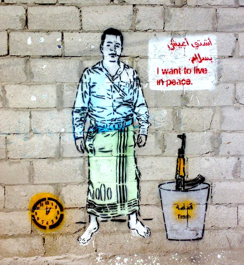
Graffiti as a political force for peace in Yemen.
August 27th, 2013 by dave dorsey
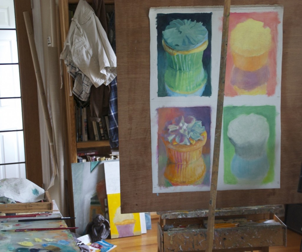
Lower left, pure suck. Upper left, success so far. Other two: fear and trembling.
“I was of three minds, like a tree in which there are three blackbirds.” –Wallace Stevens
1. In the circus of baked goods, cupcakes are the clowns. A cupcake has to be the least significant object anyone could paint. It is utterly devoid of both nutritional value and any possible claim to importance. It’s a subject worthy of Fragonard with his frothy, virtuoso sense of gratuitous gesture. And worthy of his period in history, for that matter. But that isn’t the point. For all I know, a cupcake may in fact be crying on the inside, but I see no evidence.
2. Painting a cupcake forces you to focus on purely formal qualities in the image. The shape and form, from painting to painting, can be as uniform as Rothko’s horizons or Motherwell’s odes to Spain, or Stella’s chevrons or any of Jim Dine’s uniform, repetitive templates for color: his hearts or robes, for example. (Dine’s paired hearts and skulls are another, interesting matter.) With a cupcake you eliminate a whole suite of choices and have no recourse but to focus on the fundamentals: color, line, value, the surface, and the quality of the paint itself. They all do that subconscious thing they do, which you can’t reduce to some interpretable “meaning.”
3. When it comes to cupcakes, I’m no virtuoso, which is unfortunate, because that ought to be the whole point of doing them. I still haven’t learned how to paint one properly except for maybe a couple instances and I’ve been trying, off and on, for several years. So far, toward the end of the job, I loathe painting them. Early on, with the first or second coat of paint, I love it. I love the flat, simple areas of pure color. Paying attention to that early stage and letting that be the whole point would mean I have to quit doing nearly everything that has gotten me exhibited as a painter, except for the candy jars and a couple other pieces. But in those I’ve still relied on exactitude in the way I render something. If I just did a cupcake, MORE
August 26th, 2013 by dave dorsey
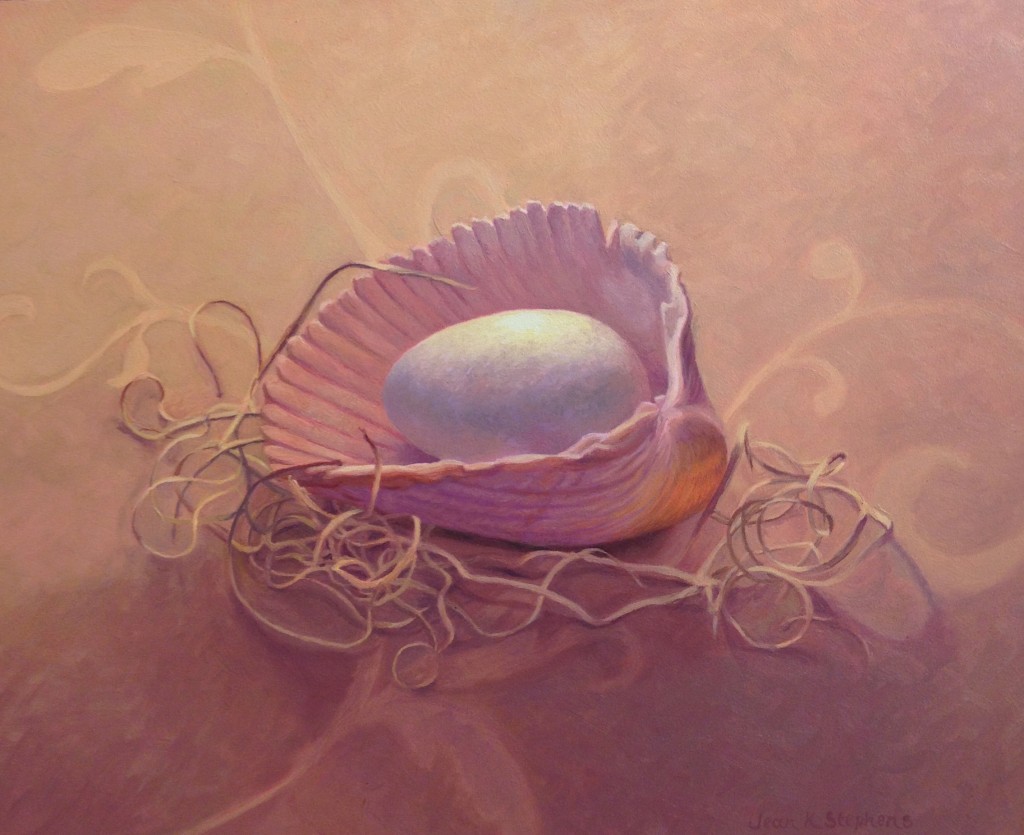
Nestled, Jean Stephens
There’s still time to check out the summer show at Oxford Gallery, which is full of great work, with a few pieces making an encore from previous shows, and a few offering a sneak preview of the exhibit of abstract work coming up next. The glimpses of what’s to come are intriguing and impressive, with work by half a dozen outstanding abstractionists. What’s on view, in advance, from that upcoming show is very strong, and James Hall thinks so highly of the exhibition that he’s publishing a catalog, with his own commentary on the show overall and each individual artist. He was just putting finishing touches on it when I showed up for a look. One thing I that struck me: the smaller work here was often what stayed with me the longest.
All the work in the current show is great, though I lingered longest over a few favorites. Tom Insalaco’s Adam and Eve on 57th St. returns from the Four Humours show and again dominates all the other work, somehow without diminishing anything around it by comparison. It just inhabits its own wall and world. Chris Baker’s 23rd St. makes a welcome return from a previous show, which appears to be a wonderful twilight glimpse of Manhattan’s Chelsea art district from the Hi-Line walkway. Alice Chen’s paintings, which often find their way into Oxford group shows, have always impressed me with their quiet mastery of Asian brush techniques. The small painting on view now looks, at first glance, like a purely abstract exploration of line and value, but as you study it you begin to discern what could be a pagoda jutting out from the side of a steep mountain slope. The scene takes shape. It’s a haunting, beautiful painting that hovers between pure abstraction and the evocative depiction of Chinese scroll painting. MORE
August 25th, 2013 by dave dorsey
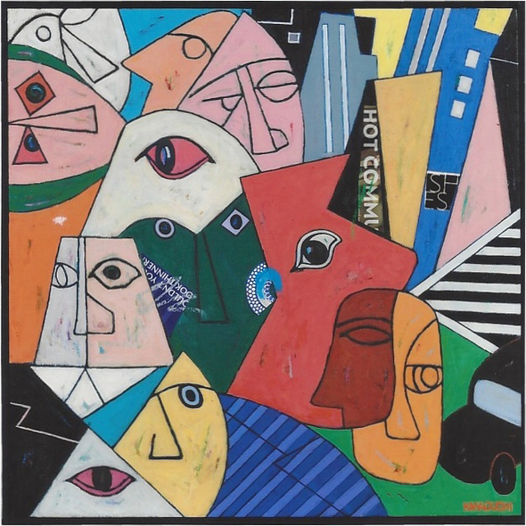
In a week or so, Kiyoshi Kawaguchi returns to Viridian Artists with a show of recent work about urban life that lives somewhere on a spectrum that includes both Ben Shahn and Stuart Davis. He’s exhibited at Viridian in 1978 and again in 2010. Like an elbow-to-shoulder subway ride, his images are busy and packed with life, but also quietly sad and solitary. The lonely crowd in Tokyo looks remarkably like the one in Manhattan. The artist’s contiguous faces seem isolated and mute, and yet they fit snugly, perfectly together like fragments of a child’s easy jigsaw puzzle. All those seemingly autonomous figures create a unified, interdependent whole. It’s how art, and life, work. (When they do. ) It’ll be going up next weekend and runs until Sept. 28, when it will head back for a show in Tokyo. I hope I can get time to talk with him while he’s here.
“Kawaguchi captures the exuberance and complex rhythms of city life with simple geometry and vibrant color. Kawaguchi paints bright pictures of a hyperlinked humankind full of possibilities, including being tangled by its own connections.”
–Deirdre S. Greben, former managing editor ARTnews
“Kiyoshi Kawaguchi …synthesizes classical American 30′s and 40′s traditionalism with Japanese modern day technology and craziness of city life… While other artists ignore the world situation and brand their works with Louie Vuitton, Kawaguchi foresees the future and tells it through his cryptic paintings.”
–Walter Wickiser, of Walter Wickiser Gallery, Inc
August 23rd, 2013 by dave dorsey
If only all of Fischl’s work were this good.
Eric Fischl: “Back then you could be shown in museums around the world and still be doing a teaching job or driving a taxi or something to do it . . . “ Things haven’t changed all that much except for the one percent, have they?
Some interesting talk with Alec Baldwin on how Fischl’s father learned to communicate with his son by taking up art himself:
Eric Fischl: My father . . . actually didn’t understand what success was in art anyway. He’d kinda given up by then, right? So in . . .
Alec Baldwin: On what? Understanding you?
Eric Fischl: On me. Yeah, exactly . . . he really didn’t know anything about art so he didn’t really know anything about what success in art was. And back then success and fortune were not connected to each other in the art world. You could be highly successful, you know, shown in museums around the world and still be doing a teaching job or driving a taxi or something to do it.
So he was perplexed that I would even be in a field in which there wasn’t a monetary reward, necessarily, right? But at some point, he started to see my name in print. And that was something that he understood as success.
All of a sudden a local newspaper or an art magazine or something, there’s his son, right? And then he really flipped from sort of disengagement to the proud parent who – we’d go into a grocery store and at the checkout counter, he’d go, ‘You know who this is? My son. This is the artist.’
Alec Baldwin: He’d take the clipping out of his wallet.
Eric Fischl: [Laughter] Yeah, exactly.
Alec Baldwin: ‘This is from The New York Times. My little E-R-I-C F-I-S-C-H-L’ – no E-L.
Eric Fischl: No E. No E. Well, you know he –
Eric Fischl: He became an artist at the end of his life as well. He discovered collage, and it took him a while after he retired to – he tried other things and then all of a sudden, he found himself, sitting in his office at home, cutting pictures out and gluing them together. You know, he was not a schooled artist but he had an eye and he had a kind of liveliness to these collages that he made that were very expressive.
And by the time he died, I’d realized that he and I could never talk to each other. We just kept missing, you know? But we understood each other visually, and so he would send me his collages and I knew exactly what he was thinking about, where he was at, how he was feeling. He was really communicating through these visual images.
And he showed me that he was – had been using my paintings to understand what had happened in our lives with my mother and the whole family dynamic. And so we, actually, were both visual people who understood what that meant to communicate visually to each other. So it was deeply rewarding to me ultimately, but it took me a while to understand it.
August 20th, 2013 by dave dorsey

Our director at Viridian Artists, Vernita Nemec, is offering a performance workshop in Germany. Details here.
August 19th, 2013 by dave dorsey
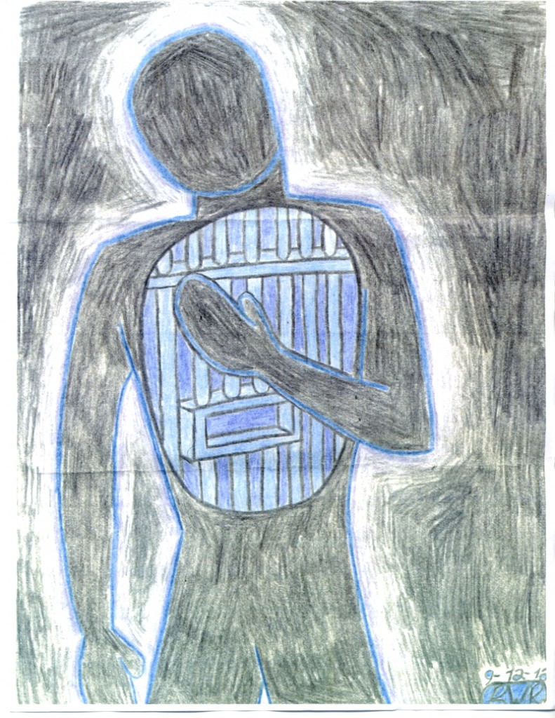 “Eventually I was moved to a cell with the same view, but with overgrown weeds outside. They became the epitome of beauty to me. They were “my weeds.” Had someone gone out and cut them, I’d have had a mental breakdown. Later on they moved us to cells (with the same nonexistent view) in another cell block, but I was confident because I knew “my weeds” were still there where we had left them.” —Brogan Rafferty
August 12th, 2013 by dave dorsey
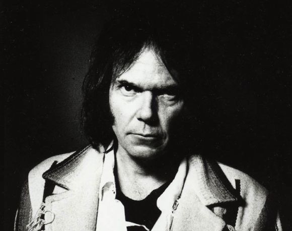
Neil Young gives cupcake haters the stink eye.
One of the hardest balancing acts for anyone who has found any sort of market for creative work is how much to keep pursuing work that has a chance of selling. In other words, how much should anyone purposely create work that is likely to sell, simply because it will sell. That last phrase is crucial. Part of what this activity involves is forgetting the wisdom of Yogi Berra, which was the content of my previous post. Doing great work means taking on a challenge where what you know how to do isn’t enough–at some point it doesn’t avail. When money beckons, the temptation is to settle into routines you do know, and though the results may be desirable to a buyer, the artist who’s honest knows that something lifeless has been passed along. (What’s so distinctive about painting for me is how it requires me to do things I don’t know how to do, and how the act of painting, like a golf swing, involves things that can’t be stored away as knowledge. The learning, if it’s there at all, happens in your body and your subconscious. Painting well is more about unknowing.) I’ve been finishing up a commissioned painting, a second version of a painting I sold several years ago–at the request of a family member who wants to buy it. I got this request early this year and have been procrastinating for months, partly in the interest of completing work I wanted to enter in the Rochester-Finger Lakes Exhibition this year, but also because I wasn’t sure I wanted to put in the weeks required to complete what will be nearly a duplicate of a previous painting. With my other work done, I had a choice between doing this repeat performance or creating a series of smaller paintings, which I have also been postponing for well over a year as well. (There’s a lot of procrastination up in here at Casa Dorsey. . .)
Walt Thomas, a friend who sends links to stories that occasionally inspire my posts, emailed me a link to this story about how David Geffen once sued Neil Young for not trying hard enough to be Neil Young. He’d started recording music MORE
August 10th, 2013 by dave dorsey
 In baseball, you don't know nothing.
--Yogi Berra
Go Jason Dufner . . .
In baseball, you don't know nothing.

                         --Yogi Berra

Go Jason Dufner . . .
August 7th, 2013 by dave dorsey
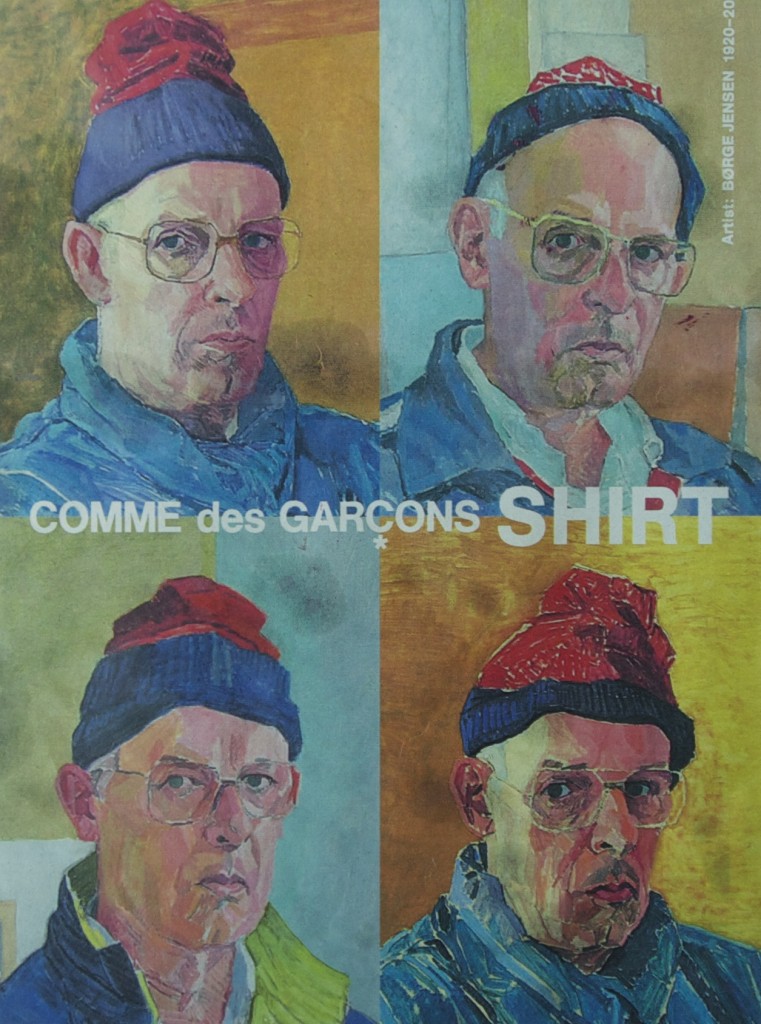
A few days ago, I came across a clipping I found, if I remember properly, in the Sunday Times magazine, about four years ago. It’s an ad for a fashion site that baffles me (click to it and figure it out at your leisure), but I was so impressed with the paintings in this ad, I cut it out and saved it. It shows a grid of oil self-portraits, in the manner of Warhol—same pose, same face, same hat, over and over, stacked and aligned like window panes. And yet that’s where the uniformity disappears. Where Warhol would have simply reprinted the same photograph, over and over, but used as a template for different colors, this artist had painstakingly repainted his own face, wearing the same colorful stocking cap, but using different colors, with different backgrounds, different jackets, differentiating each one to the point where it was almost entirely original in comparison with all the others. And you get the same sense of repetition, mass production, but he’s reversed the tension, emphasizing the originality, stressing how much manual labor went into this repetitive act of portraiture, with the hint of mass production an almost sardonic glance back at the intentional emptiness of Pop. I love these paintings, nearly Fauvist, but closer to actual effects of light, with an emphasis on color for its own sake, even though the faces convey exactly what portraits should: a complex inner life, and the evidence of a life lived in a unique way.
Here’s what pleases me most about this image, now that I’ve accidentally stumbled upon it in my studio. These paintings are by a virtually unknown Danish artist, who died in 2008, a year before this ad appeared. His name is Borge Jensen. If you try searching for anything about him on the Web, you eventually come across two websites that reproduce the ad I’ve got in paper form, but mostly your search engine tries to correct your spelling or takes you to links about other people entirely. If you are lucky, and try enough combinations of his name with the words “artist” or “painting” you may get to this link at lauritz.com. Twice when I clicked to it, a paragraph appeared which was, in Danish, a summary of the painter’s life, but whenever I click now, it redirects me to an error page. It’s as if even the Internet wants to keep this guy unknown. I’m not sure he would mind, frankly. One of the times my browser managed to get a purchase on that site and stay on it, I had Google translate it, and this is what I got:
Børge Jensen was a painter, draftsman and printmaker – has worked with landscapes, still lifes, portraits and self-portraits. Born and raised in Strib at the Little Belt. After being trained as a painter with his father he sought in the early 1940s to Copenhagen. To prepare for the Academy of Fine Arts, he began at the Academy of Free and Commercial Art at Jarmers place by the painter Askov Jensen and cartoonist Tom Petersen (6 winters).Next, he applied for admission to the Academy in 1946 and was assumed to begin painting school with Professor Aksel Jørgensen in January 1947. Was taught one semester of Vilhelm Lundstrom and followed the teaching of Painting School and the School of Graphic forward to 1955. While such Maria Lüders Hansen (b. 1925) and Knud Bjerre (1921-2005).Study tours and exhibitions have – due to an excessive modesty – only shown a few times, including Strib Idrætsefterskole 1994 and Strib Sognegård “Paintings tells the story” 1996. Attended School trips include to Florence in 1950. stations’ statements Børge Jensen landscapes, still lifes, portraits and especially self-portraits show the artist’s constant search around reflex candles importance and his immersion in the study of mass displacements in space and scale. More photos could call to mind Edvard Weie and Karl Isaksons color.
Wish I knew what “reflex candles” actually meant, in Danish. It’s almost like finding a message in a bottle, tossed into the Baltic, washing up years later on the shore of Lake Ontario. There’s actually almost no information even in this quick bio, but this one passage stood out: “Due to excessive modesty, has only shown a few times . . .” What could be more anti-Warhol? What could be more encouraging and inspiring. To do such great work and rarely seek any attention for it . . . what a tonic for this era.
August 6th, 2013 by dave dorsey

Andy Warhol’s grave, now streaming 24/7, in Pittsburg
From the The Verge late last night. It may be a while before I take a look. Can’t wait though. It’s next on my list after I get through seven more hours of watching the Empire State Building do nothing and then there’s this film of a guy sleeping for five hours . . .
August 5th, 2013 by dave dorsey
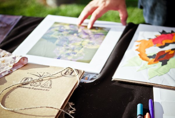
Local art in Minneapolis for members of a cooperative. Courtesy NYTimes.
Works with lettuce. Works with art, as well. C.S.A. also means Community Supported Art.
August 5th, 2013 by dave dorsey
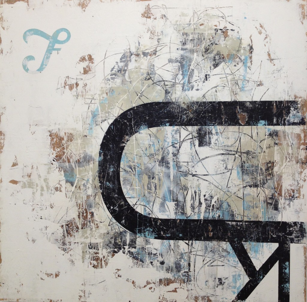 I found myself lingering quite a while last night at State of the Street-ish, an exhibit of street-inspired art at Rochester Contemporary Art Center, in partnership with the Memorial Art Gallery. It’s taken me far too long to get a look at Kurt Ketchum’s work, and I was even more impressed by it than I expected to be. Kurt’s paintings suggests graffiti in a tangential way, yet it’s street-ish because it conveys a sense that the objects he creates are almost ready-made segments of old city walls, covered with vestiges of posters, glue, weathered paint, and the scrawls of urban guerrillas armed with spray paint. The work requires time: you need to adjust to the visual language he’s developed, but the longer you look, the more the paintings draw you in and open up.
I’ve known Kurt for a long time. I was surprised that the show brought to mind what at first seemed an entirely random set of memories from a 90’s weekend I spent with him and a couple other friends, John Buck and Tom Curtin. The four of us golfed almost non-stop for two days in North Carolina on courses in and around Pinehurst. It was 36 holes a day. One of those marathons. The results were mixed from one round to another, but at one of the courses we played, you could rent a llama for a caddy. (I wish I had a llama story, but we declined them. Doh! Big hitter, the Lama. Long, into a ten-thousand foot crevasse . . . oh right, wrong Lama.) On the last day, we showed up in the morning mist, sleepy, dizzy, hungover and, frankly, intimidated by the first tee at a course called The Pit. It MORE