Archive for March, 2015
March 30th, 2015 by dave dorsey

William Shatner as Alyosha in The Brothers Karamazov. No joke, though what follows is.
My apologies to McSweeneys for quoting at such length, but I was too busy smiling, and ok, laughing, to rely on my better judgment:
THE RUSSIAN NOVELIST AT HIS DAUGHTER’S 2ND GRADE CLASSROOM’S CAREER DAY
Upon being called on to account for his life, Mr. Leskov, a thin man of about forty-five, rose from the classroom’s dinosaur-themed carpet and, in rising, acknowledged the absurdity of his condition—for all of us, in our own tragic ways, are trapped on a dinosaur carpet of despair, begging to achieve recognition. He silently stood, a pipe at his lips. The children who looked at him were waiting for an answer to a question they would never be able to articulate; the children who didn’t rested their gaze on their classmate, Lucy, who held the lizard her veterinarian father had just shown the class during his presentation.
“What if you told us about a typical day for you?” the teacher asked from a chair in the back. She was a young woman, perhaps thirty, with blonde hair so light it was alabaster and a smile that was plastered over her face, as if to hide the deep pain she felt every second of the day.
“On a typical morning, I wake up, wondering how and why,” he answered. “Light streams in through the gaps in the shades, and I dress in the preposterous costume our society deems appropriate, before entering the kitchen, where my daughter Savannah sits, eating an Eggo waffle from a yellow box . . . . She complains about the type of syrup her mother bought and the amount of butter she used, and in that instant I know that she is the kind of person Father Zossima warned me about on his deathbed, the kind of person who will suck the vitality out of you and cast a gray pallor over all the pleasures of life. Then I curse God for these wicked thoughts and pray to the Almighty Father for forgiveness. This child of mine I must protect, and I must help her understand that it is we who determine our happiness, and we who must decide whether the ridiculous show we designate life is under our control, or whether our attitudes will be controlled by others’ ludicrous values and insane commitments—all of which are ordained by political rulers whose primary technique for gaining approval is bloodlust, and economic rulers who, in the confusion brought on by the insularity that wealth affords, view greed as a spiritual vocation.”
“I… see. Isn’t that interesting, class?” the young woman said. “Everybody pay attention because after the presentations, we’re going to open our coloring notebooks and draw what we heard. Anyone have a question for Mr. Leskov? Yes, Pete?”
The teacher pointed toward Pete, a small, impish boy who would one day no doubt do terrible, unspeakable things to the people he loves.
“How many helicopters have you been in?” Pete asked. MORE
March 27th, 2015 by dave dorsey
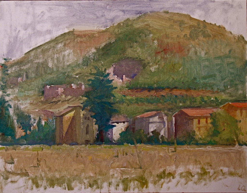
Mocaiana, oil on canvasboard, 13 3/4″ x 17 1/2″, 2009
Great thoughts from Fairfield Porter and Langdon Quin on how art offers a path toward particularity of experience, in many ways opposed to what technology is bringing about, from The Painting Center‘s website for an upcoming show that looks exceptional:
A long time resident of both Italy and upstate New York, Langdon Quin presents landscapes in Recent Paintings an exhibition at The Painting Center from March 31–April 25, 2015. The paintings were all created between 2010 and 2015. Each represents a synthesis of visual information derived from plein air oil studies, drawings, photographs, memory and invention. These various sources combine skillfully in the seven Italian landscapes on view here. They reveal Quin’s vision of an exhilarating pictorial world of taut and physically felt spatial tensions mediated by the luminous subtleties of color and light that are particular to each motif.
A decisive moment in Quin’s training as a graduate student at Yale in 1975 occurred on the occasion of a lengthy studio visit by the great painter and art writer Fairfield Porter. This studio visit followed Porter’s seminal public lecture at Yale based on his essay “Technology and Artistic Perception” published in the American Scholar in 1973. In that talk, Porter articulated what he believed to be the “province of painting” in the late 20th century. Quin recalls vividly that Porter likened painting to poetry in urging the consideration of “particularization of experience” as the essential expressive mission of both forms. Porter argued that this particularization stands in opposition to the generalization of experience that technology pushes upon modern culture. Quin’s internalization of Porter’s prescient directive has informed his feelings about picture making ever since. The palpable rapture he feels in front of observable phenomena in nature and the process of its transformation into painting are foremost among the forces that have always guided his artistic efforts.
In addition to Italian Quattrocento influences and French pre-Impressionist models such as Corot and Courbet, Quin has long admired a range of modernist masters as diverse as Bonnard and Balthus, Matisse and Morandi, or the Americans, Louis Eilshemius and Albert York.
March 24th, 2015 by dave dorsey

Frank Underwood’s favorite game in the new season of House of Cards, with the optical illusions and physically impossible geometry of an Escher. I played it on an LG Pad. Like Portal, the only flaw is that it doesn’t last long enough.
March 22nd, 2015 by dave dorsey
This review of Culture Crash, The Killing of the Creative Class, from the New York Times certainly nails the problem right now for most creative types. One continues to hope, though. The Internet, one way or another, ought to be the solution at some point, connecting creator with audience, as the last paragraph of this book review hints (you’ll have to click on the link to read it.):
From the Times review:
“The most depressing of all is a decimation of cultural institutions that’s been apparent roughly since the turn of the 21st century, but has accelerated in the half-dozen years since the start of the Great Recession. It’s an underreported crisis, he asserts, that has affected not only the higher realms of culture, like classical music and painting, but also indie music and indie film and graphic design. And it’s affected not only the artists and practitioners themselves “but also the many people who supported and spread their work” — music critics and publicists and ushers and record store employees. The injury is bad enough; the notion reflected in the typo-ridden reader comments, that the marketplace rules and that anyone who can’t make it there should quit whining and find a real job, piles on another layer of insult.
Timberg — himself a culture journalist who was a victim of one of The Los Angeles Times’s seemingly endless series of layoffs — makes a good case that, as Bob Dylan once put it, “something there’s been lost.” He starts off with a chapter describing cities and times when everything fell into place: the Boston poetry scene in the ’50s, the Los Angeles art scene of the ’60s, the Austin outlaw-country subculture and the New York punk movement of the ’70s. They all had, he says, a critical mass of creators, which attracted successive infusions of like-minded souls, along with institutions as varied as art galleries, specialized magazines, universities and nightclubs like CBGB or Threadgill’s that spread the vibe, hooked artists up with audiences and, in many cases, provided them with day jobs as they developed their gifts.
That was then, this is now. Numbers tell some of the story. After the financial crisis of 2008, jobs in graphic design fell by 19.8 percent over four years, in photography by 25.6 percent over seven years, and in architecture by 29.8 percent over three years. In 1999, recordings generated $14.6 billion in revenue to the music business; by 2012, the figure was down to $5.35 billion. Of course, owing to the change in the dominant distribution model from physical CDs to (first) downloading MP3 files and (now) streaming on services like Pandora and Spotify, performing artists get a thinner slice of the smaller pie. Timberg puts a human face on the statistics with portraits, scattered throughout the book, of poets, artists, moviemakers and reporters who had been doing good work and making not great but decent livings, when all of a sudden the rug was pulled out from under them.”
March 22nd, 2015 by dave dorsey
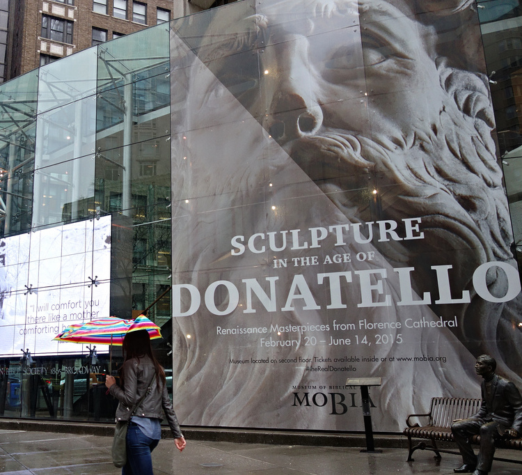
From Hyperallergic, (thank you, guys, for staying alert to the most remarkable thing going on in the city right now, in terms of art). Such an incredible opportunity, which I’m going to attend tomorrow. Apparently this museum is on its last legs, according to the Times. No surprise, there. Nice way to go out, by making history. I really want to see Donatello’s visualization of Abraham and Isaac, a father ready and willing to kill his son, which I expect will be a representation of all war, from pagan times to the present, a long history of human sacrifice and violence–as well as its specific meaning in the Old Testament. Hyperallergic:
It’s an improbable exhibition, with 23 early Renaissance pieces that have rarely (if ever) left Italy, let alone crossed the Atlantic to arrive at this small Upper West Side museum. After their return to Florence’s Museo dell’Opera del Duomo, it’s likely most of these pieces will never travel again because of their fragility and size. The exceptional nature of the exhibition is reason enough to visit, but the unexpected humanity of Donatello’s sculptures up close makes it essential.
And some other qualities, as well, make it once in a lifetime, for those of us who can’t fly to Italy. When they say pieces, I think what they actually are talking about are large, heavy, and apparently fragile sculptures craved from stone. But it sounds as if they are too fragile for even a second journey like this. (Is all the world as temporary as flesh? Yes. But does Donatello have to remind me with stone? Yes.) Which is to say, see it now. It won’t happen again.
March 20th, 2015 by dave dorsey
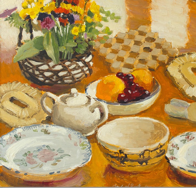
Field Flowers, Fruit, and Dishes, Fairfield Porter, 1974, oil on masonite, Alexandre Gallery
Painting is an art that favors the old, who’ve been at it for decades. From the last year of his life, give or take a few months, when it seemed he could do no wrong and everything looked both effortless and exactly right. I found this image at the Alexandre Gallery‘s website yesterday but cannot find it now . . ..
March 18th, 2015 by dave dorsey

Christmas in July, oil on panel, 6″ x 6″
A new Matthew Cornell show is opening at Arcadia just in time for me to visit this weekend, or early next week, while I’m in the city. His astonishing, small paintings look better and better. He somehow captures the light of less-illuminated things during a photographer’s beloved Golden Hour, just as or after the sun sets or rises. He somehow manages to evoke details and variations of color in the shadows, illuminated faintly by the sky itself, while creating a focal point with a small area of orange or yellow artificial light, usually from the window of a house. How he gets the amazing level of verisimilitude at the tiny scale of these paintings is a mystery, unless, as it seems Durer must have done, he uses brushes with a single hair. He can have as many as three light sources–the sky, the interior light glowing from windows and a streetlight or the sun itself shining somewhere beyond the frame of his picture, throwing another angle of illumination onto a house or strip of grass. What distinguishes his work, though, is the intense, complex feeling the images evoke–stillness, peace, satisfaction, beauty, yet also loneliness and isolation. In this show, as described in an excellent video he has produced, he returns to houses where he has lived and paints them, using photographs he takes at the site. He pushes the color just slightly so that a pair of yellow no-passing lines in a road look orange and his greens seem slightly more lush than they would in any photograph I’d be able to take. A neutral shadow becomes faintly purple next to the amber incandescence of a porch bulb. The ultimate effect is something both convincingly real and yet magical: Christmas in July. Actually, for me, it’s like Christmas morning every time I look at one of his paintings for the first time.
March 16th, 2015 by dave dorsey
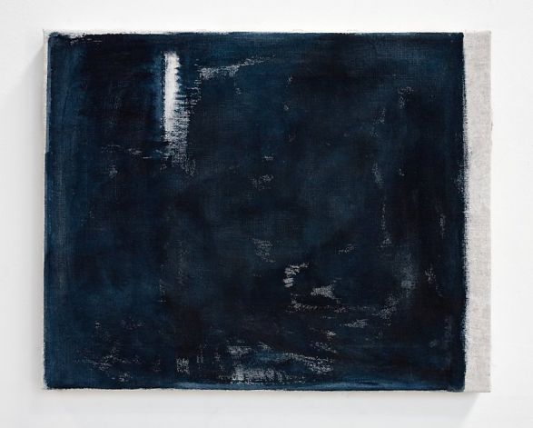
Klettur, John Zurier, oil on linen
John Zurier’s work looks strenuously minimal, and therefore offers little to grab onto. Still, there’s a feeling of monastic restraint and genuine feeling in his paintings, which often seem to be modest in scale, a feature commensurate with how self-effacing they are in other respects. All of those virtues are concentrated into one or two colors. Is that enough? I can’t tell from here. He appears to give me less to look at than I ordinarily like, but that could be a way to rewind all the current media noise. And maybe the lack is in myself, rather than in the paintings. It’s hard to say without seeing them, which I may try to remedy at Peter Blum on my venture into NYC next week. I think I would have passed on this, but for his artist statement, a requirement that I usually hate, but this one I love:
“I remember the first painting problem that really engaged me. I tried to paint the sky seen between two buildings so that the whole of my painting would be nothing but an empty blue space. I wanted the painting to be filled with a pale empty sky. I thought it would be very easy to do, but found it nearly impossible. The painting was a failure and I had to put it off for a long time.
In a way, my concerns now are not much different in that I want the maximum sense of color, light, and space with the most simple and direct means. I think the Japanese painter Ike No Taiga (1723–1776) was right: the most difficult thing to achieve in painting is creating a space where absolutely nothing has been painted.”
January 2008
March 13th, 2015 by dave dorsey
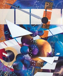
Bill Santelli, The Systemic Path, acrylic on canvas
This painting by my friend and fellow Oxford Gallery artist, Bill Santelli, is on view in”Cosmos–Imagining the Universe,” an exhibition sponsored by the Smithsonian Institution, in the Annmarie Sculpture Garden and Arts Center in Dowell, Maryland. Bill works in several different abstract modes, including prismacolor drawings I love. The Systemic Path is closer to the abstract work he does now in acrylic, but it’s from an earlier period. The exhibit runs from: February 13 – July 26, 2015. Bill and Tom Insalaco and I met for a couple hours last week to talk about what we’ve all been up to and, as a follow up, Bill suggested we have a small group show of work we’ve been doing, off and on, without ever submitting it for exhibition: in other words a show to offer a glimpse our semi-secret lives as painters. I like the idea, but it’s going to be up to Bill to take the initiative. He sounds eager to do it. We also think Tom deserves a big retrospective: he’s a great painter who has long deserved serious recognition, in addition to his extensive list of awards.
March 11th, 2015 by dave dorsey

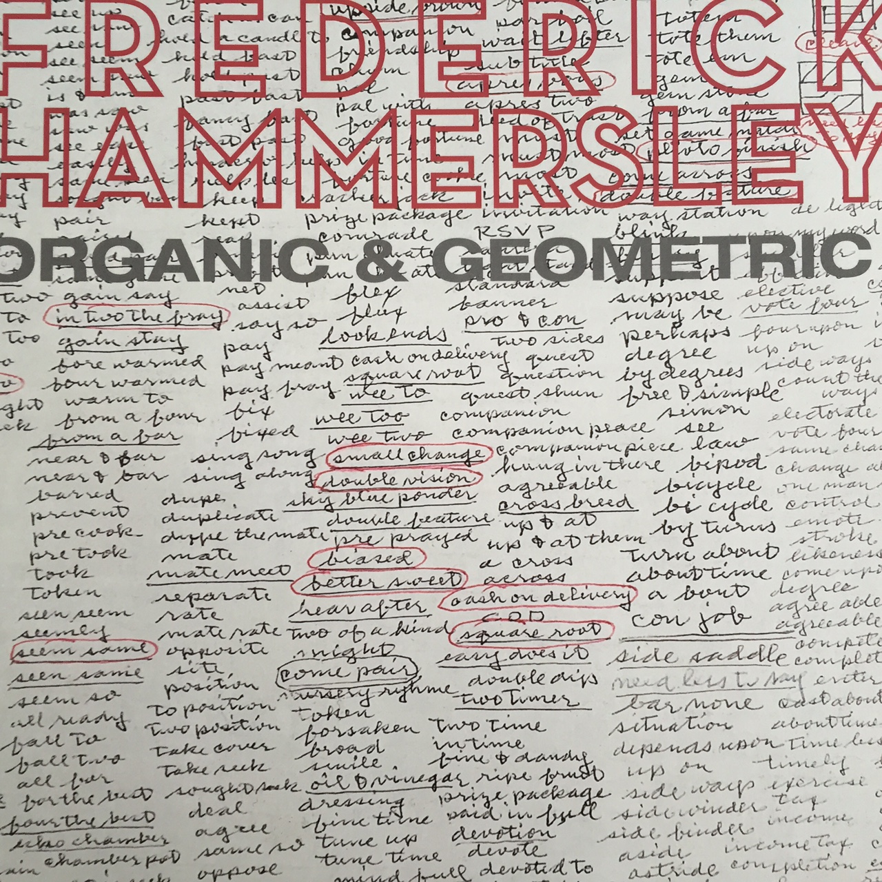
Dupe. Duplicate. Dupe the mate. Mate. Mate meet. Separate. Rate. Mate rate.
That’s a stream-of-consciousness improvisation, a free association of possible painting titles from Frederick Hammersley. When you string them out into a line that way, it sounds like a mordant poem about a bad marriage descending into sordid one-night stands with strangers. Yet those words, in that order, are from the lists of brainstormed titles (above) from Hammersley’s notebooks. His pages are reprinted on the covers, and inside the covers, of a slim, beautifully printed catalog published for a show I saw at Ameringer, McEnery, Yohe three years ago. I hate titles for paintings–shouldn’t paintings just be numbered or dated?–but in Hammersley’s case the titles can supposedly enhance your ability to see what’s happening in the work, as the catalog’s essay by David Reed examines in an interesting way. Yet the stacks of words all seem slightly parasitical to me, as if the unused side of the artist’s brain is getting even for all the fun his alternate number is having. Hammersley’s hues are the most unadulterated and intensely saturated colors of any oil painting I’ve ever seen. Noland and Stella invented sophisticated color harmonies you hadn’t seen before, but Hammersley seems to offer his unambiguously radiant colors in ultra-simple compositions, contained in mostly uniform squarish spaces, as if to say, look what I found today! Have you ever seen a yellow like that! Each of his colors seems an end in itself, pure play, regardless of whatever else is placed around it. Each color he puts down plays well with others and seems the king of infinite space, all at once. And then there are those lists of titles that either make you laugh or wonder what he meant, such as In Two the Fray, Altered Ego, Savoir Pair, but either way, once you see the title, the thinking takes over and the looking falls in line behind it. Doh.
March 9th, 2015 by dave dorsey
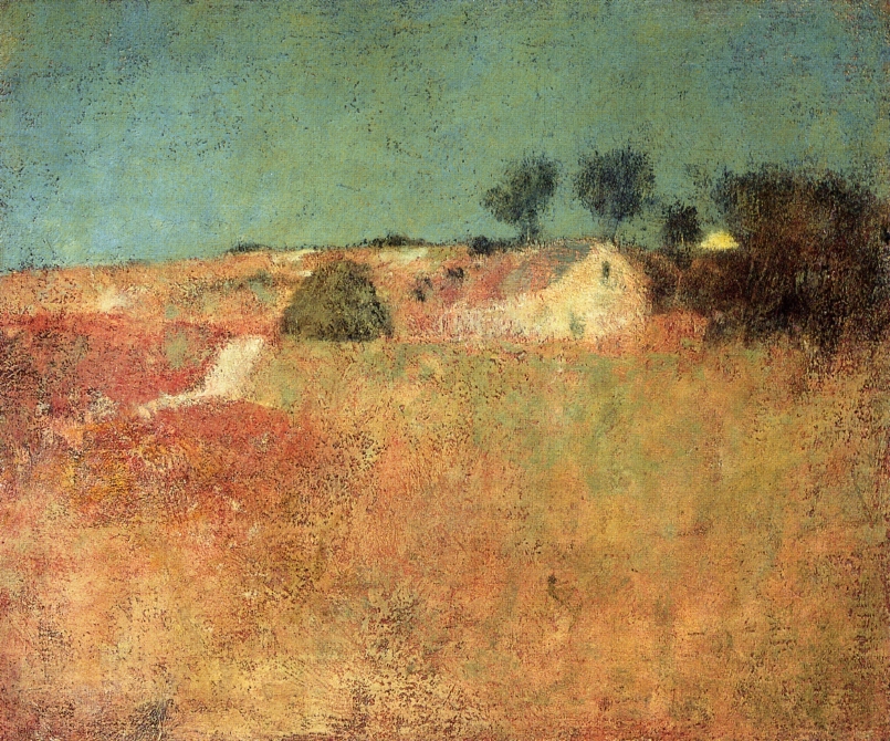
Green Sky Landscape, Charles Webster Hawthorne
As a follow-up to my previous post on my visit to the shows about perceptual painting in Maryland, I read a small book put together by the students of the man who inspired those two exhibits. When Hawthorne talks about how reasoning should not be part of painting, he means something specific: when you paint a person or a house, don’t paint as if you were a surgeon or an architect, simply see the spot of color it forms in your field of vision and paint that, not work form any prior knowledge about the “thing itself.” In other words, be a phenomenologist. But he also suggests that larger reasoning, theories or ideologies or conscious points of view about life are also alien to the sort of painting he advocated. Intentional narrative, message-imparting, intellectual content only turn painting into a package for some precious thought inside it. It becomes rarefied illustration of the thought comes first, the knowledge, and the painting serves it: the painting should give rise to thoughts, if there are any to be had, but mostly it should convey what it is through seeing, not thinking. That wasn’t how painting worked for him, and was probably at the heart of what drove the Impressionists, who were Hawthorne’s predecessors, to rebel against academic painting that served to illustrate classic myth, Biblical stories, and historical narratives. Painting had become a form of illustration. For Hawthorne, there should be no thought involved in the motive for a painting other than the logic of how it is shaped and how the colors are chosen, for no other purpose but to see the beauty in, essentially, everything, including the train station, as he like to put it. Not simply for the pleasure of visual experience. Seeing, for him, I think, was about far more than the visual sensations you get when you aim your eyes at the horizon or a bottle or a face. It’s about embracing an entire world by glancing at one small part of it, and if the painting is good enough, subconsciously, a certain wisdom about that world comes along with the perception of beauty. Abstract reasoning, beyond the logic of how to construct an image, only gets in the way of that.
From Hawthorne on Painting, Charles Webster Hawthorne’s advice to his students:
It is not the sentimental viewpoint but the earnest seeking to see beauty–in the relation of one tone against nother–which expresses truth–the right attitude. If you’re a thoughtful humble student of nature, you’ll have something to say–you don’t have to tell a story. You can’t add a thing by thinking–what you are will come out.
You cannot bring reason to bear on painting–the eye looks up and gets an impression and that is what you want to register. Painters don’t reason, they do. The moment they reason they are lost–subconscious thought counts. MORE
March 7th, 2015 by dave dorsey

Still Life, David P. Jewett, oil on linen on board
This stove is painted with a soul–there is as much beauty and religion in this painting of this black iron stove as in any of your so-called religious paintings. That is sacred–you have put your heart in it. One of the greatest things in the world is to train yourself to see the beauty in the commonplace . . . a freight car or a wash line of clothes . . . — Charles Webster Hawthorne
At two recent exhibits in Maryland, I saw paintings far quieter and more subtle, and therefore a lot more emotionally compelling, than the superficially clever, high-priced spectacle that routinely flows through the art market. It was a genuine relief how these shows created the sense of an uncovered tradition in the practice of visual art reaching back into the 19th century (and maybe further), a tradition where less is more, where the small trumps the huge, and silence is more inviting than showmanship. At first the paintings can look familiar and comfortable, as if they were witnesses to the past relocated into the present and given new names, but when you apply some sustained viewing to them—and listen to someone like Matt Klos, the curator for A Lineage of American Perceptual Painters, which just closed at The Mitchell Gallery—these painters can be surprising, unpredictable, and revelatory. Even the oldest, historical work Matt assembled for the show in Annapolis felt alive, fresh, and even offbeat, offering qualities I hadn’t noticed before even in a few of the paintings I’d seen in the past.
I met Matt a number of years ago when I began exhibiting at Oxford Gallery here in Rochester, where Matt grew up. I liked his work immediately and began to follow what he was doing over the past five or six years. I wanted to ask him more about how much effort was involved in putting the show at Mitchell together, but we didn’t have enough time to do that in the three hours we spent together, too busy talking about the work and exchanging thoughts about painting in general. The MORE
March 5th, 2015 by dave dorsey
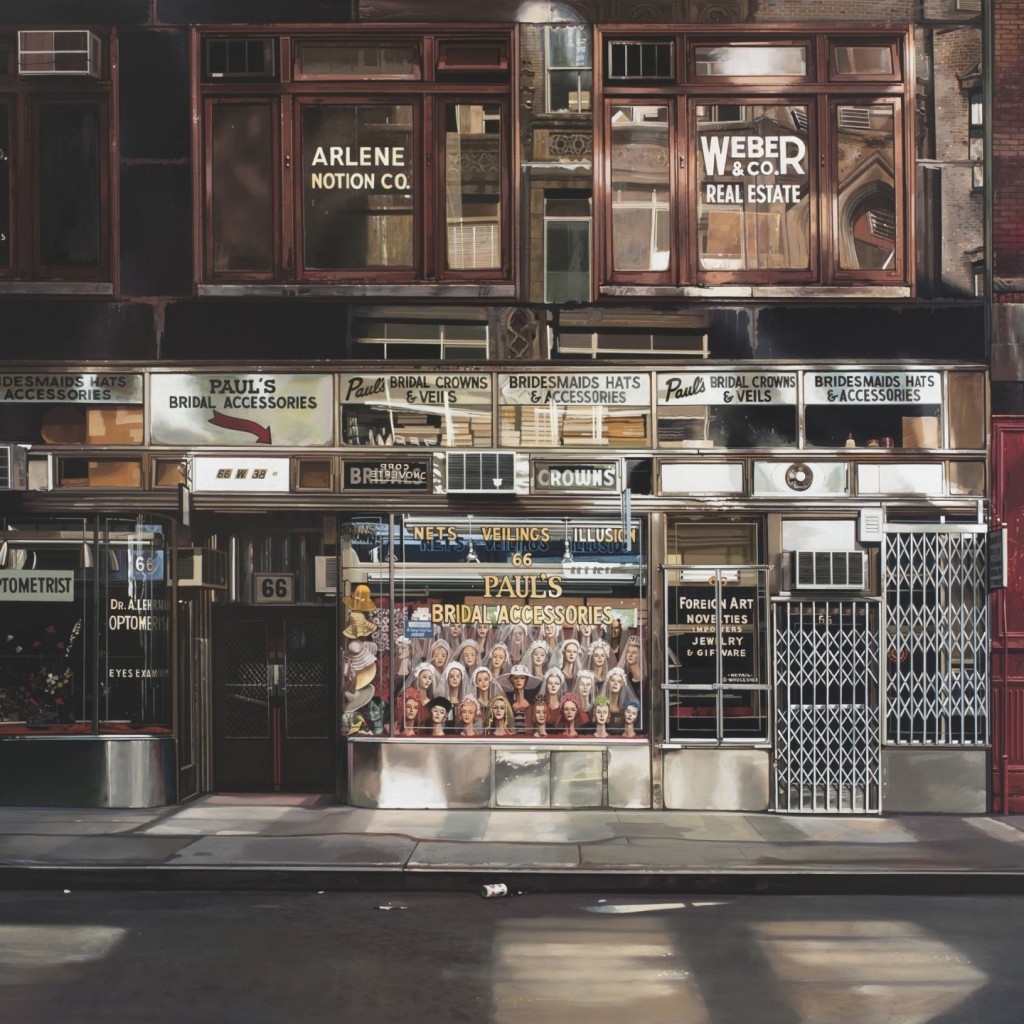
Bridal Accessories, detail, Richard Estes
I really want to see this one. From the article on a Richard Estes exhibition with, for the first time, his photographic sources: “What this exhibition makes clear is how unrealistic his Photorealism is from the standpoint of photography.”
March 3rd, 2015 by dave dorsey
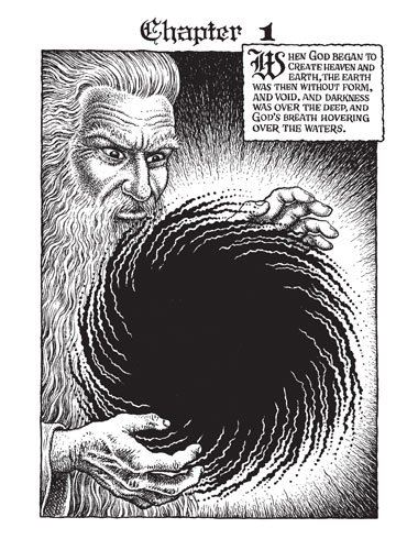 R. Crumb keeps on truckin’. He recently put in four years as a hired illustrator. And it was very good, apparently. I loved Classics Illustrated as a kid. He doesn’t exactly sound grateful, though. Blake would have loved the gig. From Paris Review:
INTERVIEWER
Let’s begin with Genesis. Where did this book come from?
R. CRUMB
Well, the truth is kind of dumb, actually. I did it for the money and I quickly began to regret it. It was an enormous amount of work—four years of work and barely worth it. I was too compulsive about the detail. With comics, you’ve got to develop some kind of shorthand. You can’t make every drawing look like a detailed etching. The average reader actually doesn’t want all that detail, it interferes with the flow of the reading process. But I just can’t help myself—obsessive-compulsive disorder.