Archive for September, 2015
September 30th, 2015 by dave dorsey
I’m emerging from a tunnel of work on a single painting I began in May and finished last week, so I’m only now catching up with what friends have been up to over the summer. Rick Harrington moved back to the Northwest, where he grew up, and is now living and working in Portland. I was sorry to hear he was going to be on the other side of the country, probably from now on, but I hope to keep in touch, and I also hope he keeps exhibiting at Oxford here.
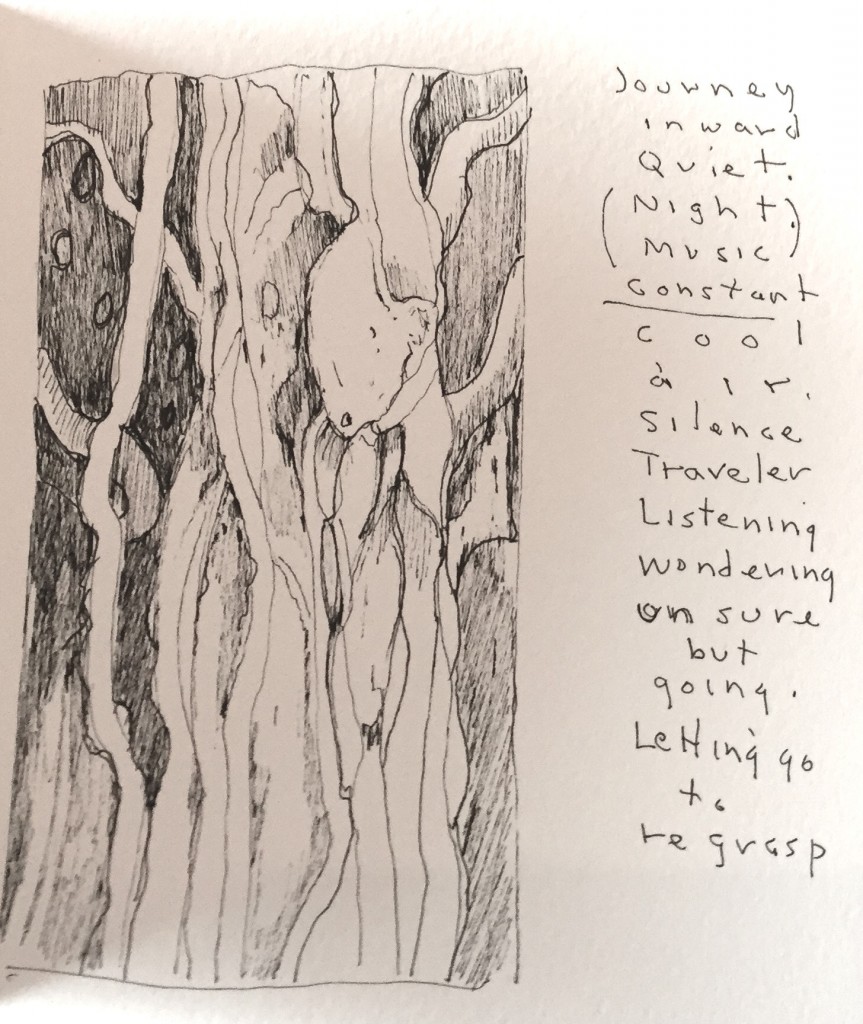
Bill Stephens has been on the road this summer, heading east to a retreat and then west to travel around the mountains and do sketches of what he was seeing. He’s creating notebooks that are a nice combination of text and image that he ought to try selling, a little touch of Basho on his journey. The line drawings in ink are assured and fresh and calming. With an economical use of line he puts me wherever he was from one day to the next. I’ve posted one of them above.
Bill Santelli is very busy, showing his work both here in the next Oxford Gallery show and right now at ArtPrize in Grand Rapids, Michigan. ArtPrize is an open international art competition decided by public vote and expert jury. It awards grants to 25 recipients, and has as well as offering a Fellowship for Emerging Curators program. The $500,000 competition runs from September 23–October 11.
My friend Rush Whitacre is teaching now at Washington State Community College, and he’s recruiting people for a fantastic tour of Italy next March: 10 days and six cities, Rome, Florence, Venice, Assissi, Sorento and Pompeii. You can learn more and sign up here. If I had the money to spare, I’d already be signed up.
Jim Mott is still on the road, as far as I can tell. He’s usually off the grid as he makes his way across the country and stays with his hosts on one of his itinerant painting trips. He ought to be somewhere in California by now. Send some images of what you’re doing, Jim, if you see this.
September 28th, 2015 by dave dorsey
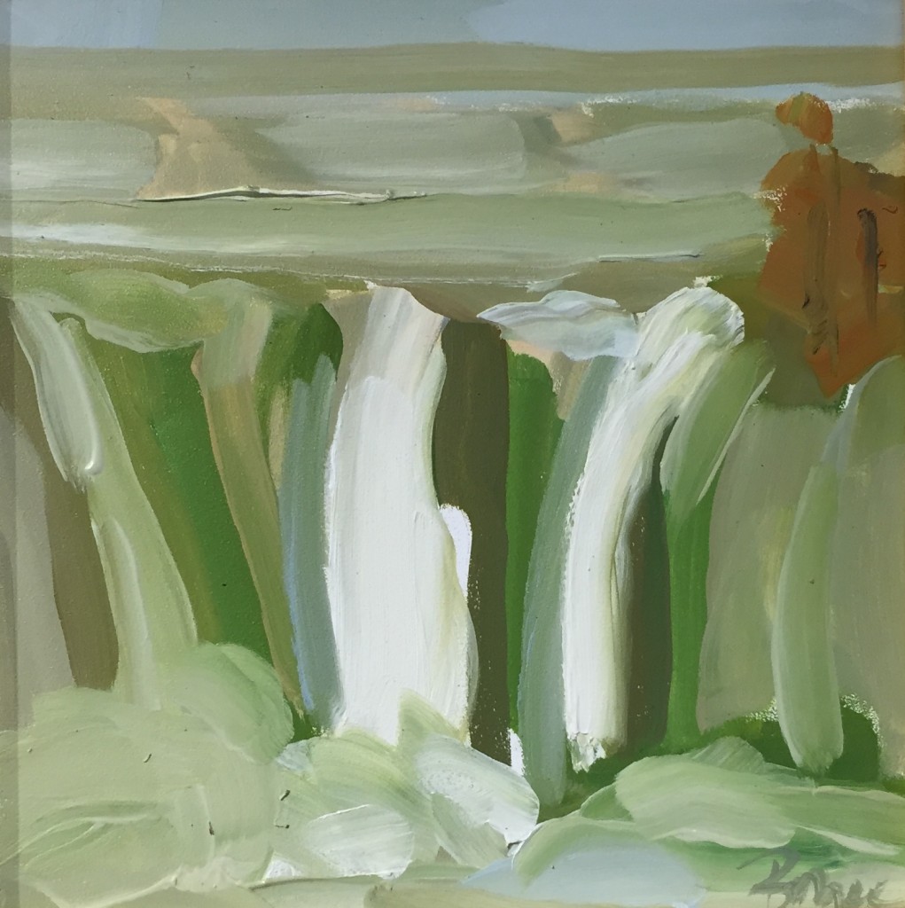
High Falls, Bryce Ely, oil on board
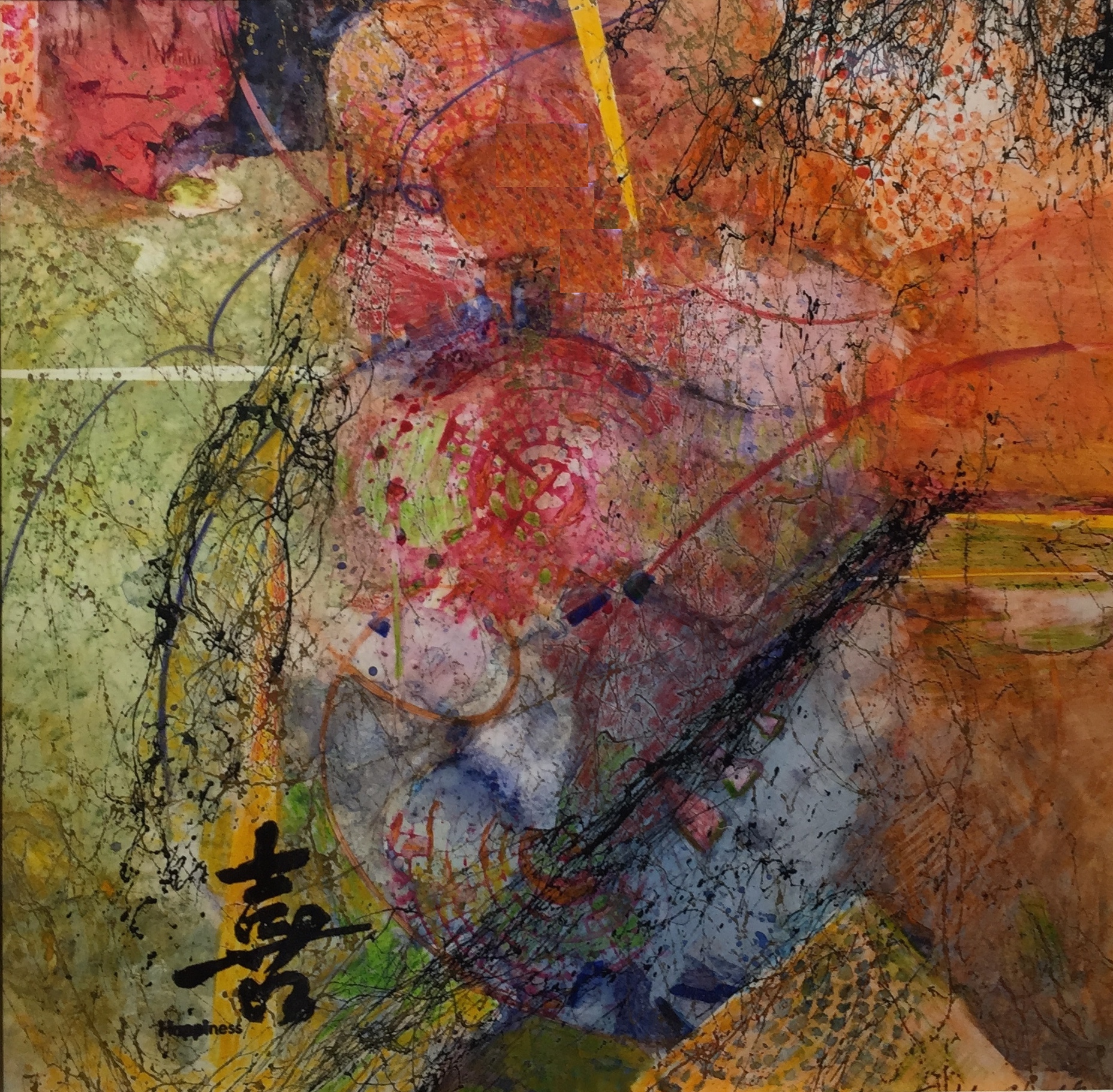
There’s a great show in its final days at Oxford Gallery, abstractions from two artists whose work took me by surprise. The invitation card didn’t convey how effective their best paintings are, and, as usual, the work was powerful insofar as I was mystified by what exactly enabled their imagery to succeed. I’d seen Phyllis Bryce Ely’s work before, when it won an award in the Memorial Art Gallery’s biennial Finger Lakes Exhibition in 2013. I admired her style without finding myself arrested by it as I walked around the exhibit back then. This time, I found myself coming back many times to particular paintings, seeing more as I stayed with it. Her work hovers right on the cusp between representation and abstraction. It’s always a distillation of a landscape, often involving swirling or falling water. This time, moving from one painting to another, I was reminded of both Charles Burchfield and Arthur Dove, yet her work departs from both influences. Where these two earlier artists were more concerned with careful depiction of a heightened vision of nature, Ely wants to create and convey a quiet energy by giving priority to the paint itself, making visible the way it flows from her brush, creating line and form with the edges of her strokes and slightly unpredictable modulations of tone that flow from the brush as it moves. (Many artists try to paint this loosely; it takes a gift to make it work as consistently as Ely does.) It gives her a special affinity with the subject of moving water–her paint seems a slow, loping doppleganger of the rushing flow it enables you to see. She’s very much in your face about how she pushes paint around. It’s the first thing that meets the eye, before your eye resolves the paint into a scene. Her most effective work looks as if, with Welliver, there’s not much “going back over” for her. So she’s also in a zone between what’s spontaneous and what’s calculated, and yet despite this irrevocable quality in how she applies the paint, the effects are often amazingly evocative–she’s still rendering a scene, with subtle effects of depth and distance, inspiring you to feel there’s more detail in the image than is actually there. With so much emphasis on the surface, and the quality of the paint, you still have a distinct and subtle assurance of a hazy, glowing light source. Or to put it in layman’s terms: you clearly see the, uh, sunlight. It’s remarkable. She makes you imagine more than she requires herself to show, which is the magic of painting at its best. Her technical mastery, from one painting to another, conveys a vision of nature in turbulent motion, but going nowhere in particular, an illuminated world giving a cold shoulder to the eye that eagerly takes it in.
 Todd Chalk, of Buffalo, has included some of her latest work–I counted three different personal modes. Some are more conventional abstracts. One especially powerful and effective small painting represents a glance upward through bare branches into an illuminated sky–it’s one of the best pieces in the whole show–and, finally, a series of square watercolors on yupo paper. I confess I’d never heard of that paper before, but it sounds like the perfect support for the green-minded crowd: synthetic, yet recyclable and “100% tree-free” as a promotional website puts it. I love it when artists explore unusual materials, and in this case, the qualities of what seems to be primarily an industrial paper made her intricate, small abstracts fresh, crisp and vibrantly colored. Watercolor on waterproof paper suggests an unconsummated tension as paint and paper fail to merge. She puts that romantic suspense to use: by keeping all the pigment right on the white surface it adds a special intensity to her beautiful explorations of color. Chalk has created a suite of improvisations with color and form, composing intricate Klee-like inner worlds as layered with overlapping tones as a looping song. For an artist thriving and innovating into her eighth decade–if her listed birthdate is true–these paintings offer hope for all of us embarking into the final third of our lives.
September 27th, 2015 by dave dorsey
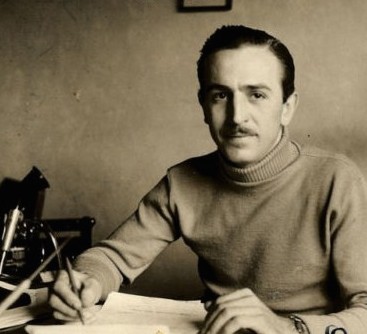
There was a fantastic two-part bio of Walt Disney on PBS recently. It’s worth the time if you have a chance to see it. Here is a near-quote from the broadcast about a time in his life I considered one of the most interesting moments in the story:
Underway was Cinderella. . . he seemed wary of fully investing himself in his film. Yet he left most of the hard work to his staff. Disney was . . . beginning to wear down and he kept a trained nurse in the studi0. Hazel George showed up every day to massage his back and his hips . . . she becomes one of those very few figures in his life . . . with whom he could talk. It wasn’t a sexual relationship but she was one of those figures with whom he could say anything and everything. It was difficult to say he had any close friends with whom he could share . . . he thought I’m never going to make anything as good as Snow White.
She suggested he attend a model train convention in his home state of Illinois . . . so he goes. The ride transforms him. When he arrives back home, Walt Disney was building these trains with his own hands. All in the zest for invention, for creating fantasies . . . Walt was happy to have the good reviews of Cinderella, but it was no Snow White as far as he was concerned. He builds a scale model of the old Marceline (his impoverished childhood home) barn for hours designing a (railroad) track and the engine. It was the toy he never had as a little kid, something that was pure fun and a pleasure to do. There was more in that train than just fun for Walt. When Salvadore Dali visited . . . Dali was taken aback. Such perfection did not belong to models. “It was comfort and salvation. I can’t control my workers. I can’t control the larger stage, I can’t control my company. . . but this is a world I can create down to the smallest details, down to the tunnels under my wife’s flower bed, that is mine and safe. I want you to work on Disneyland he told one slightly confused artist, and you are going to like it.”
September 25th, 2015 by dave dorsey
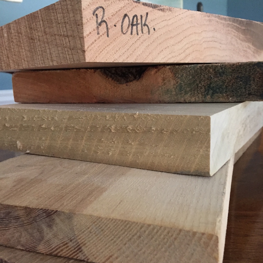
Two days ago, I hitched a ride south to Bristol to help my friend, Ed, buy some lumber for a pencil post bed he’s making. He bought more than $500 worth of wood simply to finish the frame for the bed—he’s already made the faceted posts. While he was selecting his long boards, I picked up about $25 worth of scraps, little flat blocks of ash and oak left over from the longer planks someone else had bought. (I’ll use them in small informal still lifes, with a couple objects resting on them, because I want to see what I can make of the raw wood’s texture and grain.) Ed needed a hand because he has a ruptured disk. Surgeons will fuse two of his vertebrae in October and, until then, he has to watch how much he lifts. We talked most of the way down to the little lumber place—it’s a specialty shop located in the Finger Lakes near the Bristol Mountain ski resort. I brought him up to date on the book I’m helping Peter Georgescu put together on income inequality and the need for the private sector to stimulate the economy by raising wages. Peter is a former CEO himself, not an academic. So far, it seems publishers feel more secure if an academic is solving economic issues, rather than someone who actually knew how to make a payroll once upon a time. So we’re involved in—how shall I put it—a gradual process of finding a home for his book.
“That’s what’s wrong with academics,” Ed said, though I hadn’t really offered any criticism of them, per se. I was intrigued by this logical leap, though. He brought it into focus as he talked: when it comes to actual market dynamics, how things get made and bought and sold, in his last job before retirement Ed watched an academic come in and mess with his company, a distributor of electronic components. “Before I retired, a guy took over the company who had never run anything, but he’d been a professor. I had a fantastic group of sales people. They started without much experience but were super smart and full of energy and ideas. This new guy decided that we should get rid of any client who was doing less than a certain level of sales with us. We had hundreds of clients. According to this new rule, we were to say goodbye to all of them but seven. I ended up having more sales people than we had customers. I had to let go of everybody. They were exceptional people. It was unbelievable. I became the only guy on the team because they didn’t need anyone else to handle the customers we had left. You couldn’t tell this CEO anything. He’d made the decision, and that was that. We lost hundreds of customers.”
“Organizational life is always a mess, but that sounds like a sure way to ruin a company,” I said, and then, MORE
September 18th, 2015 by dave dorsey
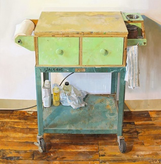
Paintiing Cart, detail, Brett Eberhardt, oil on panel, 69.5 x 41
September 14th, 2015 by dave dorsey
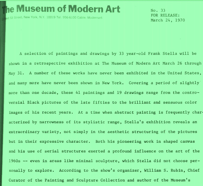
A week ago, as I was looking for a photograph of the Stella catalog I mentioned in the previous post, I came across this pdf of a typed press release from MoMA about a Stella retrospective in 1970. Everything about this bit of public relations made me intensely nostalgic for that period in American art and happy to have stumbled onto something so congenial to my sense of what a painter ought to be. The quotes from Stella at the end are what really made me smile, since there’s such humility and honesty in his words. I especially loved reading the phrase, “the Benjamin Moore” series, named after a brand of house paint. You won’t find a trace of the BS that infects so much talk about visual art in anything Stella says, plus he shares my admiration for Matisse, which makes me love Stella’s work even more:
In the past year, the interlaced, fan and rainbow patterned Protractor series have partly given way to paintings in which the protractor is used to create lyrical, almost floral patterns close in value and tender in their color — the most decorative stage of Stella’s painting. He sums up this recent development: “My main interest [in these pictures] has been to make what is popularly called decorative painting truly viable in unequivocal abstract terms. Decorative, that is, in a good sense, in the sense that it is applied to Matisse….Maybe this is beyond abstract painting. I don’t know, but that’s where I’d like my painting to go.”
September 13th, 2015 by dave dorsey
Frank Stella
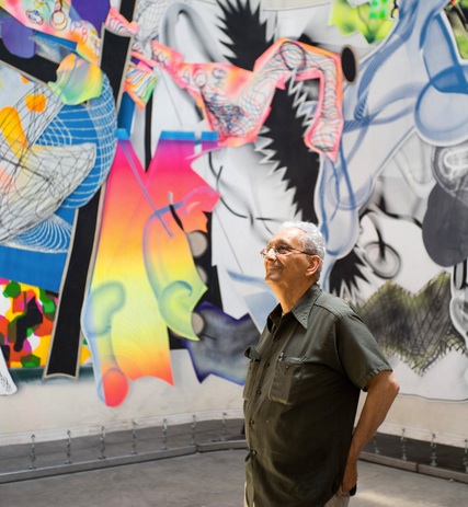
There’s a great, lucid profile of the great Frank Stella in this morning’s New York Times: the photograph of him standing with his work in the background says it all. I’ve been working since May on a large still life, another in the series of tabletops, and it depicts, as an earlier one did, a Frank Stella catalog from MoMA, published for a retrospective many years ago. The cover of the book has been difficult to paint, especially the sans serif typeface of Stella’s name, which I’ve done over three times in an attempt to get it right. I may have to settle for “right enough”. We had a few friends here for dinner last night, from our previous neighborhood, and one of them was looking at the nearly-done painting and asked, “Who’s Frank Stella?” I sent him this profile from today’s Arts & Leisure section, about the upcoming Stella show at the Whitney. Without ever saying it in so many words, it conveys, at least for me, that most of Stella’s work has been, if not actually a visualization of joy, at least a reliable source of it. Some of my favorite passages from the piece:
Mr. Stella has done more than any other living artist to carry abstract art, the house style of modernism, into the postmodern era. Yet his passion for form, for contemplating weight and balance, has made him an outlier in an age of nutty auction prices and art that adopts the global economy as its very subject. By his own admission, Mr. Stella does not keep up with the current scene. “In all honesty,” he said, “I never got beyond Julian Schnabel and that generation. He was the ’80s, right?”
What does he think of Jeff Koons, whose shiny balloon dogs and other pop trophies made up the most recent retrospective at the Whitney? “You know what I always thought he was like? The Franklin Mint. He’s from Pennsylvania, and he outdid them. He outshone them! It’s for very wealthy people with no taste.”
Mr. Stella does confess to admiring at least one mid-career artist, Kara Walker, whose monumental sculpture of a sphinx-like deity was displayed to great acclaim in a former sugar factory in Brooklyn last year. “I saw it on YouTube,” he said. “I thought it was interesting.”
And, at the end:
Mr. Stella could have been talking about himself when he told me, “De Kooning was once asked how he felt about celestial space” — the heavens, the stars, and all that. “He said he was only interested in the space he could reach with his hands.”
September 6th, 2015 by dave dorsey
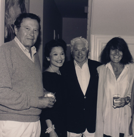
Joy Williams, right, with Bud Schulberg to her left, and Richard Wilbur, far left
Gratitude is the only mood for a painter who realizes the most significant word in this sentence, from an unpublished essay by Joy Williams is “undeserved”: Behold the mystery, the mysterious, undeserved beauty of the world. The second most important word is the one she underlined, of course: behold. Excellent profile of her in today’s New York Times Magazine. The other woman in the shot is Lynn Kaufelt, the author of an obscure book I actually bought long ago on one of our annual visits to Florida: Key West Writers and Their Houses.
September 3rd, 2015 by dave dorsey
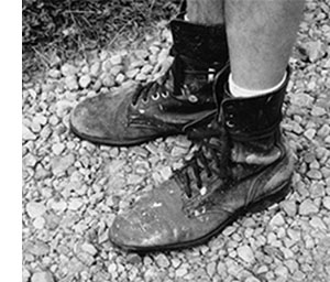
Jim’s boots
From Jim Mott:
There is gift-exchange in my life, to be sure, but even I have never had the nerve to try an experiment as full as the one you undertook. Bravo! – Lewis Hyde, author of The Gift, praising Jim Mott’s itinerant art project
Traveling Artist Seeking Hosts for Cross-Country Painting Project: Fall 2015 [2015 tour webpage]
Nationally-recognized landscape painter Jim Mott is celebrating the 15th year of his Itinerant Artist Project (IAP) with a coast-to-coast painting tour this fall, September -December 2015. Traveling New York to California, his route will be determined largely by where he finds volunteer hosts.
Each stop along the way is typically 2-4 days, during which Mott paints a set of small oil paintings in response to the surroundings. One of these paintings is given to the host.
The Itinerant Artist Project – “art for hospitality across America” – is about sharing non-virtual connections, a sense of place, and a sense of life’s journey through art.
You can share the adventure by being a host. Or by forwarding this message to friends and colleagues anywhere who might be interested in the project. This IAP announcement is not just about finding hosts but also about sharing the ideas behind the project. Spreading the word freely, without any need to feel responsible for specific outcomes, is best.
Links:
Email: