Archive for June, 2019
June 30th, 2019 by dave dorsey
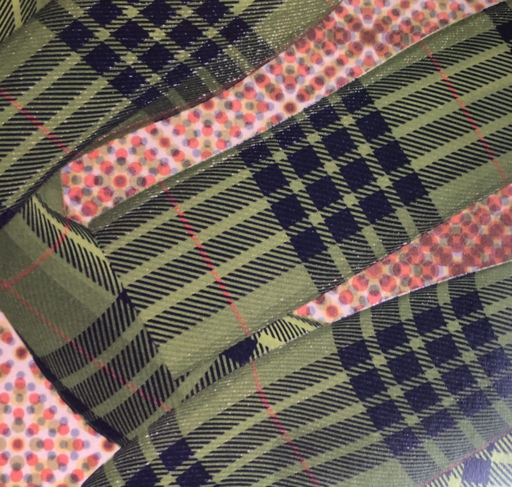
Audition #4, detail, Chris Hyndman, acrylic on canvas, 72″ x 48″
From INPA 8. I have to say, this doesn’t look humanly possible, if it is painted in the traditional way–you know, uh, with brushes. The regularity and exactitude of the lines in the fabric, draped across what looks like a sheet of old Ben Day dots, the way in which little specks and lines of white backing show through the surface of the curtain fabric–it all looks as if it would require months to complete. Hyndman’s intentions are highly conceptual and the feel of the work resists emotional engagement. He says on his website that he imagines them as backdrops–like ambient music, presumably–for people to pose or express themselves, such as a prop for a stand-up comic. I can’t help feel there’s more going on here, at the technical level, than “acrylic on canvas” is willing to divulge, but if not, then these paintings are an astonishing act of hyper-obsessive skill.
June 27th, 2019 by dave dorsey
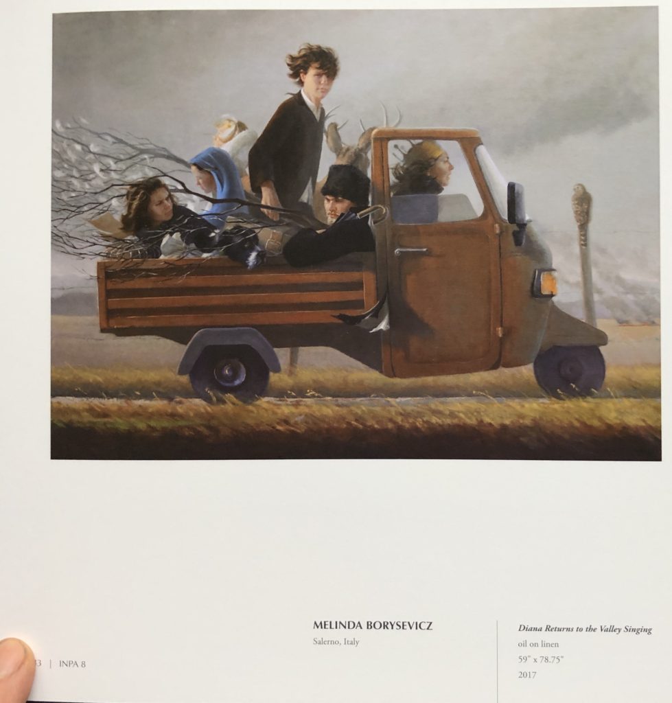
A page from INPA 8, work from Salerno, Italy. From Manifest Creative Research Gallery’s website:
For the INPA 8 Manifest received 1301 submissions from 389 artists in 42 states and 26 countries. Entries represented works made from 2014 through mid-2017. The publication will include101 works by 62 artists from 27 states and 6 countries including Canada, France, Italy, Ireland, Scotland, and the United States. A written work by Anne Keener (Columbus, Ohio) is also included.
Twelve professional and academic volunteer advisors qualified in the fields of art, design, criticism, and art history juried the eighth International Painting Annual. The process of selection was by anonymous blind jury, with each jury member assigning a quality rating for artistic merit to each work submitted. The entries receiving the highest average combined score are included in this publication.
June 24th, 2019 by dave dorsey
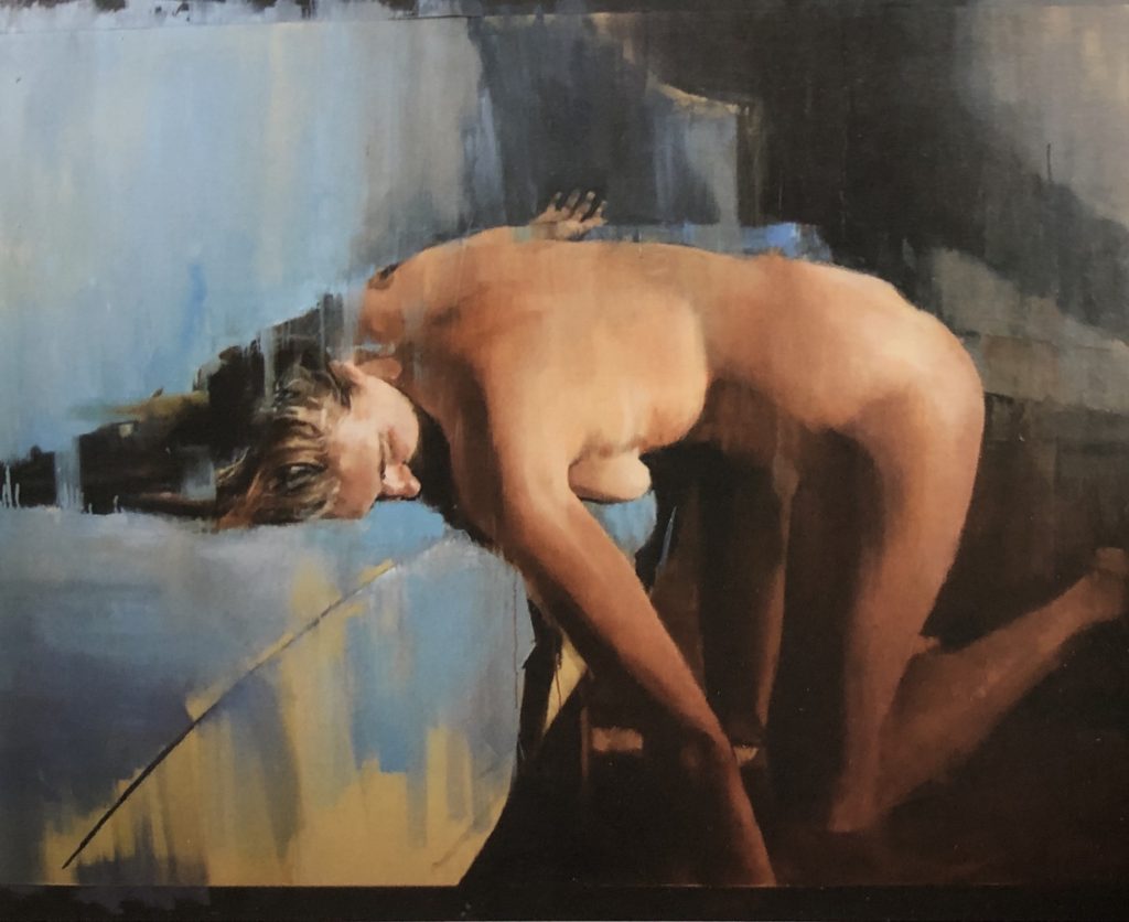
Hope, Yolanda Heijnen, oil on canvas, 48″ x 60″
This large oil on canvas is from the recently published INPA 8, from Manifest Creative Research in Cincinnati. (I’m going to post a series of paintings I love from the publication over the next couple weeks or more.) This is one of two offerings Manifest selected from Yolande Heijnen, of New York City. The remarkable handling of the paint gives the image the quality of something seen through a streaked, clouded window, yet it also flattens out what appears to be a couch or bed where the woman kneels in a surrendering pose. The way in which the artist abbreviates the blue sheen of the cloth in loose handling on a tan undercoat, with that one crisp line to designate a seam in upholstery or slipcover or bedspread, works beautifully to convey a tactile sense of the fabric without indicating any level of detail at all. The assertively, sensuously unfinished quality of the painting reminds me strongly of Diarmuid Kelley–and Mark Tennant to a lesser degree, though with Tennant there’s less love of the paint itself and an a more acerbic emotional distance from what’s depicted. This is an economical study in three or four colors, depending on how you parse it: dark gray, dull blue, yellow tan for the furniture and redder tan for the skin tones.
June 21st, 2019 by dave dorsey
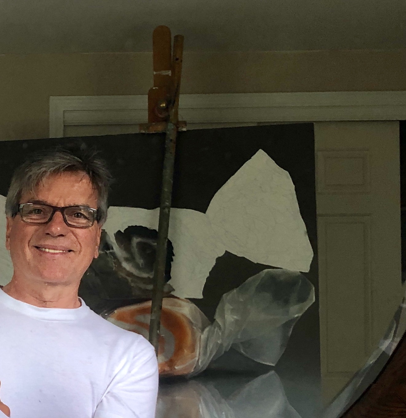
Here I am with a taffy painting I started in February, but have been deterred from finishing because of multiple family obligations. Nevertheless, slow but steady.
I embarked on a series of enlarged images of salt-water taffy last year, unable to reach cruising speed for the work because of a slow flood of continuous family obligations. Over the past year, I’ve had to keep halting my painting (and writing) every two or three weeks for multiple reasons, including several trips to Florida to prepare my parents’ condo for rental or sale, since they’re no longer able to get down there—as well as flights to L.A. to spend a welcome week with my kids and grandkids, after long absences. Having just gotten back from one of those weeks in L.A., my mother fell and broke her hip and then amazed the Highland Hospital staff with her rapid ability to get moving again after a partial hip replacement at the age of 94. So, with my time devoted to helping both parents adapt to all of this at home, my work has been on hold for yet another week as of today.
Caring for aged parents has provided an energizing counterpoint to work at the easel, especially because I’ve been focused on such what seems at first such a trivial subject, dollops of salt-water taffy veiled behind twists of waxed paper, in contrast to the somber, chastening experience of advanced age. Lauren Purje, after she saw my paintings of candy jars seven or eight years ago, remarked, “There’s sadness in them.” It was undoubtedly what charmed her about the paintings, though at the time I was nonplussed by the comment, unconscious of everything about those paintings other than my formal intentions. Sad candy seemed like an oxymoron. They offered me a way to bring more color to a still life—giving me a softened geometric image, a grid, and the format let me choose the colors I could put down. It also offered a balance between flatness and representational depth. The emotional pull of the image wasn’t even on my radar—I was too aware of my formal goals to be alert to what the act of painting had smuggled into the image on its own, while my attention was diverted to the paint itself. In other words, the candy jars were a reminder of how I think art actually operates, embodying a world of feeling and imagination despite an artist’s conscious intentions, conveying more than the artist is, or can ever be, aware of. Continue reading ‘The sorrows and joys of taffy’
June 18th, 2019 by dave dorsey
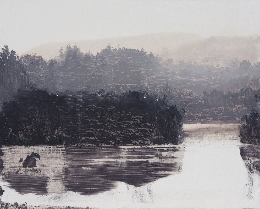
Lakeside-sunglare, oil on birch ply, 8×10 inches, 2019
I recently received my copies of INPA 8, from Manifest Creative Research Gallery, and I’ve been finding much to admire in its pages. I’m going to post some of the work over the next few weeks. It was especially pleasant to see David Smith represented yet again. He’s pitching almost a perfect game since Manifest started publishing INPA: getting his work into, I believe, all but one of the annual compilations of great contemporary painting. He used to have his studio in Hong Kong, which was appropriate, since in most of his work there’s a very Asian sense of unoccupied space, a philosophical void. As in the work of Clifford Still and Sam Francis, that sense of vacancy has as much to do with the effect of his images as whatever emerges from the emptiness. It links his work as well with sumiye painting and Chinese scrolls. It’s a Taoist esthetic that he doesn’t address candidly in his own statements about his work, though what he does say about his process echoes the principles of gutai, which finds new forms of creative expression by exploring the effects and properties of physical materials, again an Asian tradition, but out of Japan, rather than China.
From his website:
These paintings depict natural forms and spaces on solid, wood panels. They use the chemical qualities of oil washes to disrupt, dissolve or decay the image surface. Light, space, time and environmental decay play against natural elements. The images exist in a state of flux; location and time are not always apparent. The light, space and forms are shifting, living and dying, displaying a fragile and temporary nature. Influenced by ink painting, abstraction and photography, they aim for a sense of the mysterious and the elemental.
I recall the earliest work of his I saw in some of the initial INPA publications, work from nine or ten years ago. It showed a helicopter or jet suspended in fog, giving me the sense of being an entomologist discovering an unclassified caddis fly, with human technology seemingly as evanescent as a newly hatched insect. Having moved back to Ireland, he has evolved a process that, more than ever, prompts me to ask a question I emailed to Jason Franz years ago, knowing there would be no answer on the other end: “How in the world does he do that?”
I suspect there may be some originating step using the transfer of a photographic image onto his support, which is then worked by hand, the way R.H. Quaytman begins by silkscreening a Polaroid image onto a surface and then improvising on it with other materials. It’s possible, but the evidence of his brush is often so distinct that he doesn’t seem to be working from a transferred photographic template. Whatever he’s doing, I’ll bet he doesn’t want to talk about it in detail. I wouldn’t. He should consider his techniques proprietary. Like Quaytman, Smith reduces his image to the simplest possible interlocking layers of differing values—usually eliminating almost all color other than dark-to-light grays. The effect is wondrous: it’s as if he creates an astonishingly convincing landscape that recedes into a more and more atomized haze, each tier of earth or trees or water inhabiting its own particular distance from the eye. In some of the most recent work this year, he shows land masses rising from a remote lake, and these forms could be rock or trees or both, it’s hard to tell, and yet without being able to actually identify what you are seeing, the image looks perfectly real, even with the long parallel lines clawed into the paint, as if with a comb, on the shining surface of the lake. The effect is to make you feel a sense of convincing verisimilitude, true to dawn landscapes you’ve seen in the past, while at the same time introducing you to an entirely imaginary world, an almost abstract collage of shapes, where the scraped and squeegeed-looking ridges of paint somehow magically are both an inert substance disrupting a flat surface and yet exactly what the eye needs in order to seize on a perfectly-rendered, natural vista.
June 15th, 2019 by dave dorsey
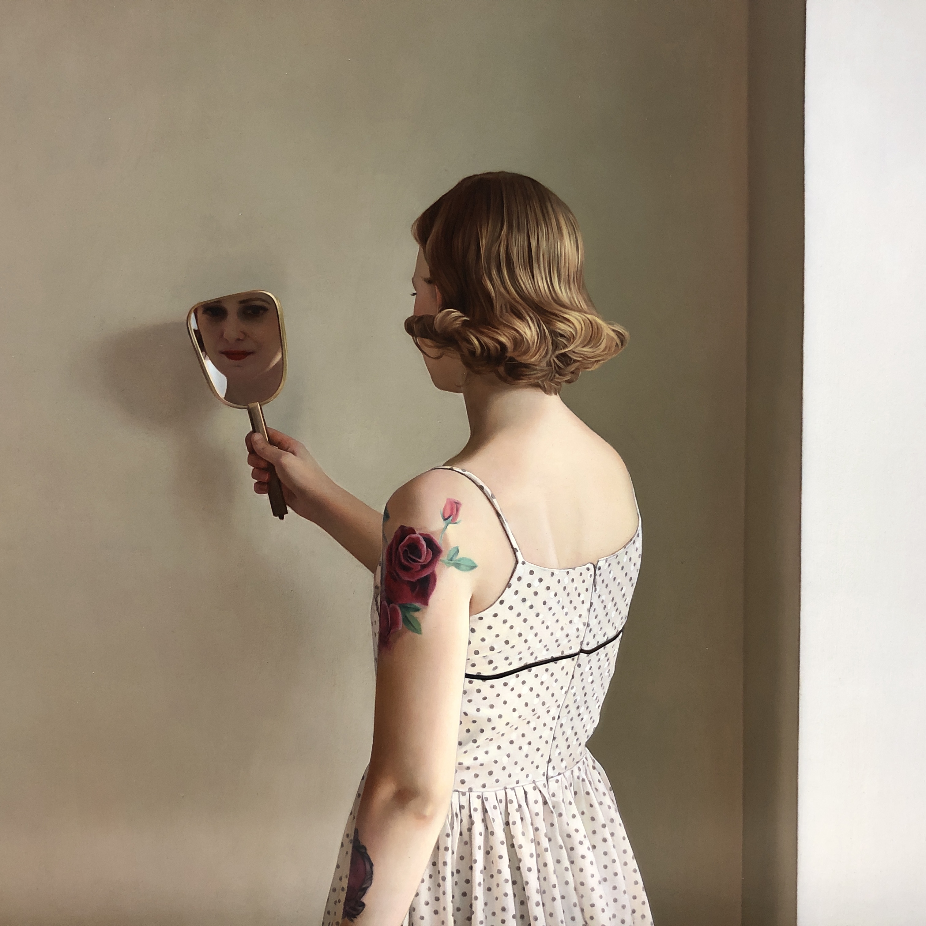
In Her Mirror II, detail, Shawn Downey, oil on panel, 2018
I visited Arcadia, in Pasadena, after Shawn Downey’s solo show closed nearly half a year ago now, yet some of his work was still hanging in the rear gallery and I was able to get a close look at half a dozen paintings, which was a great treat—including this one hanging above its shipping crate, ready for its trip home to Canada. Downey’s minimalist interiors, with a single contemplative woman, with the occasional tattoo, in stripped-down, geometric spaces, were a marvel. It felt like a contemporary fusion of Vermeer’s light and Hopper’s sympathetic eavesdropping on urban solitude, but with a brighter, more serene glow. I wish I’d been there to see all of the work.
June 12th, 2019 by dave dorsey
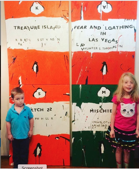
Ben Tankard’s kids posing with some of his book cover paintings.
It always cheers me when Ben Tankard posts something new on Instagram. The Australian painter works in several modes, one being his surreal landscapes where ordinary people confront things they can’t quite comprehend—if we’re honest with ourselves, we are those people, all the time, aren’t we?—and in another series he does Monopoly board images that have been slightly modified, as well as classic Penguin paperback covers. It’s all done with an ebullient wit. My favorites are his simple, uniformly produced fractures of Penguin covers, where everything has been slightly scrambled, as if the books are slowly becoming illegible as a result of macular degeneration. For me, the fragmentation of vision is cultural and his Pop version of those paperbacks speaks to our fragmented literacy in an age of inane social media telegraphy and knee-jerk rants. It’s refreshing to see a painter posing his two youngsters in front of images he’s completed of Robert Louis Stevenson’s and Hunter S. Thompson’s work. Just putting those books side by side feels tolerant, appreciative, and encouraging. Just painting the covers of great books, period, is a nice, humble way to class up the joint.
June 9th, 2019 by dave dorsey
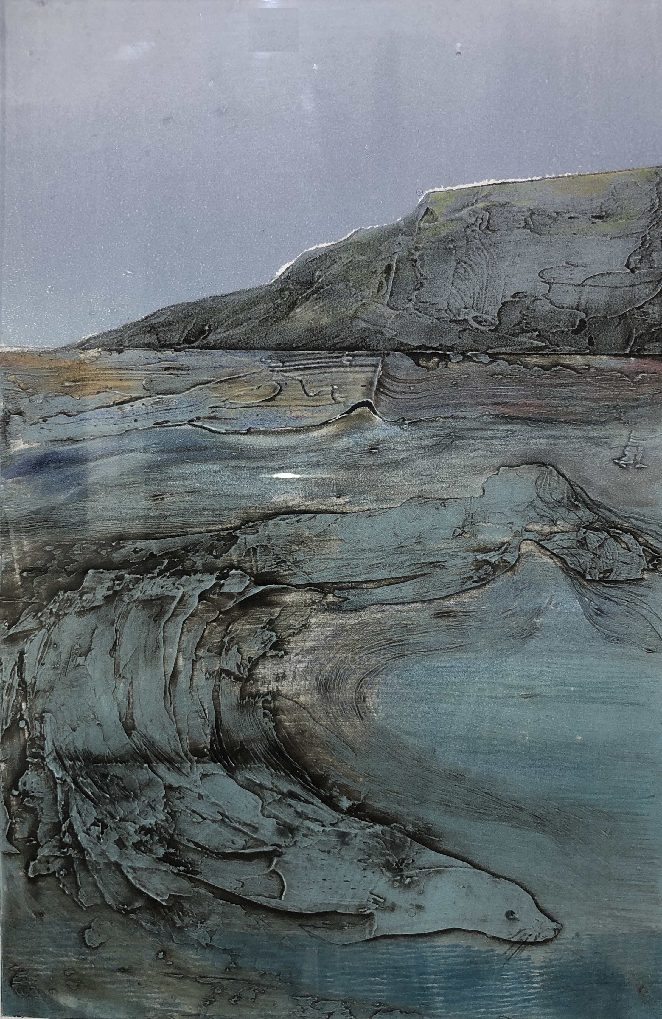
Selkie, collograph monoprint, Elizabeth King Durant
The current group show at Oxford Gallery, “Metamorphosis,” is one of the strongest James Hall has put together. Maybe because the theme signifies the essence of art itself. Art is alchemy, taking common human experience and transforming it into the idiosyncratic terms of an individual artist’s ornery insistence on his or her skewed way of seeing things. It’s a transformation of what could easily be a generic glimpse of something familiar into the odd, particular demands of one person’s heart. The greatest art goes a step further and somehow magically uses the unique weirdness of human individuality to open a window on the universal. A fleeting depiction of something partial and provisional offers a glimpse into what’s essential and enduring. Metaphor is metamorphosis. Yet, as Stephen Wright joked, “You can’t have everything. Where would you put it?” You can’t squeeze the whole world into a frame. But you can offer a door into it. In art, the part becomes the whole.
The best work in this show opens that door into the world as a whole. The pieces I keep going back to are the work from Debra Stewart, Elizabeth King Durant, Amy Mclaren, Barbara Fox, Phyllis Bryce Ely, Alexandra Latypova and, yes, even a few male artists, like Tom Insalaco and Daniel Mosner. (Has anyone else observed that the art women make right now often seems more vital and interesting than the work of their male cohort?)
Of all the work in Metamorphosis, my favorite has to be Durant’s Selkie, a perfectly executed and easily overlooked collograph monoprint visualizing the Celtic myth. Think Splash in more ancient terms, the shape-shifting of seal into woman and back again. There’s a perfect marriage of technique and subject in the print, with bravura, gestural lines seeming to articulate the shapes of seal and human in a sort of Taoist swirl of opposites. Her lines appear to be the edges of a three-dimensional surface, as if she had pulled the print from dried spackle applied with a knife—the wave that gives birth to both woman and seal also has the quality of a rock face, water transforming into stone. And yet another gentle polarity obtains in the tension between earth and heaven suggested in the extremely subtle shift between the emptiness of the grayish ultramarine sky above the slightly greener but almost metallic aqua of the sea under a mountain shoreline that quarantines those two regions. Her technique is spare and restrained and simple, yet the image looks timeless and primordial, an entire myth worthy of Joseph Campbell in a glance.
In a felicity that may be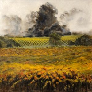 entirely unintentional, Alexandra Latypova’s misty landscape looks almost apocalyptic in the way she has suppressed the color of anything touched by the fog creeping toward the viewer from the horizon. The golden tones of what appears to be a foreground vineyard recede to a line where, at the edge of the fog and deeper into the haze, everything is sapped of hue. In Fog from The Bay, the ominous shapes of trees and shrubbery are faded to browns and grays, and somehow they seem to be in motion, becoming the fog that envelopes them, both collapsing and billowing up from the ground. The image reminds me of the live television feed from 911, the fall of the World Trade Center, where structures looming on the Manhattan skyline disappeared into dust. What may have started as a placid, idyllic morning on a lake’s shoreline has turned in a disquieting but eerily lovely reminder of the world’s end.
Amy Mclaren’s offering for this Oxford show, Retired, acrylic on canvas, upstages nearly all of her previous work in the gallery’s shows. Here she reminds me, surprisingly, of Norman Rockwell, his ease at suggesting deep emotional warmth through the depiction of facial expression and body language—in this case the stance and look in the eyes of an old dog. A 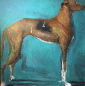 single greyhound, a retired racer, waits patiently at attention, wearing his worn racing color—it’s more of a visualized memory than an actual uniform here, dissolving into his flank. He poses against a nearly monotone but luminous blue background. The image has an iconic Pop simplicity, and the brushwork, as well as the way in which Mclaren positions the dog, boxing it in with the edges of the picture, flattening out the form, echoes Jim Dine’s robes. The very loosely applied globs of white to designate the greyhound’s paws are wonderfully accurate even though they almost look splattered onto the surface from the end of a brush fat with paint. The tension in the legs, the heartbreaking eagerness of the posture—please someone anyone give me another spin around the track—and the magnificently human look in that visible eye, the way it sadly studies whatever is happening in our faces as we loiter around this ex-champion indifferently, makes this image a wonderful, beautiful salute to all forms of guileless excellence and passion, especially when they have fewer and fewer chances to make their mark in the world. They also serve who only stand and wait . . . Continue reading ‘Windows onto the world’