August 29th, 2021 by dave dorsey
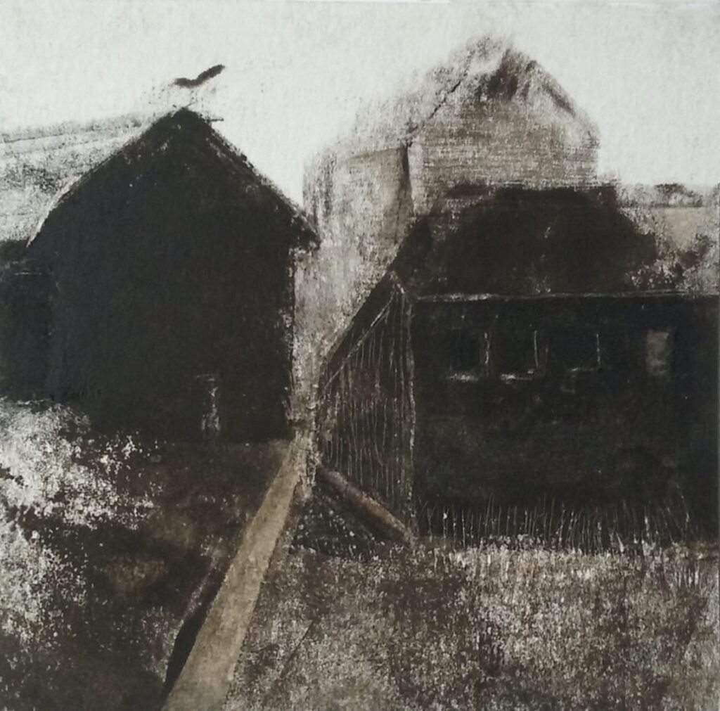
Alice Carpenter, monotype, relief inks on paper, 4″ x 4″
This monotype was selected for the 2021 Butler Midyear, another of the remarkable pieces included in one of the best Midyear exhibitions Butler has assembled in quite a while. I’m dumbfounded by the way Carpenter can convey a dreamlike, timeless, and utterly haunting world, a world that feels both slightly oppressive and yet spacious and expansive, all within the confines of a tiny square of paper.
August 25th, 2021 by dave dorsey
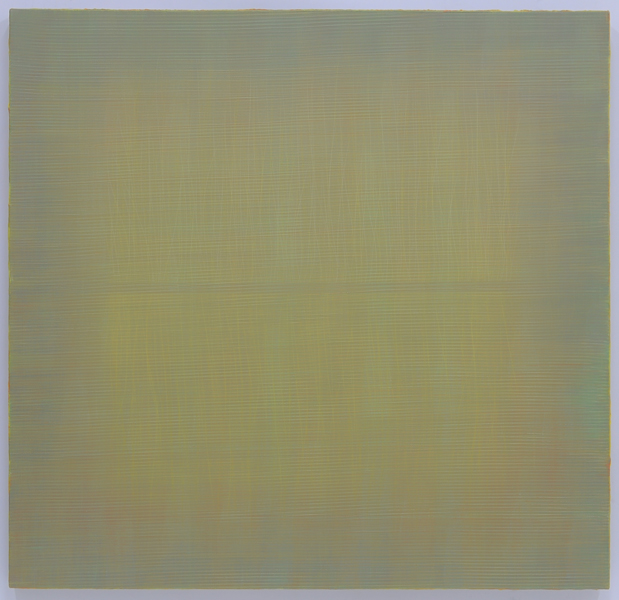
Marc Ross, Make Me That Happy 2, Acrylic, pastel and color pencil
53″x 55″
Another work from Marc Ross won Best in Show at the Butler Midyear exhibition. His exquisitely executed abstractions refer back to Rothko, minimalism and the ghostly, incremental discriminations of Agnes Martin’s bands of faint color, but his work is all his own.
August 21st, 2021 by dave dorsey
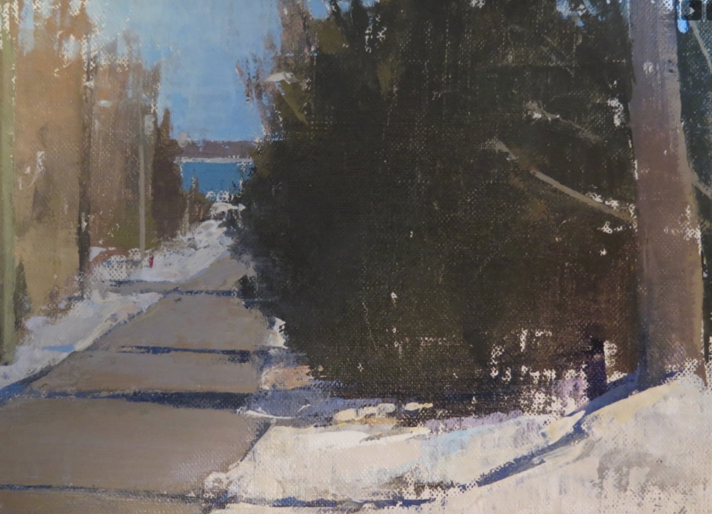
Frederick Fochtman landscape.
Fred Fochtman’s website is so minimal that I was unable to find a title, size or medium for any of the work there, but it’s fairly clear this is a small oil or acrylic. I discovered Fochtman’s work through the two paintings of his in the 2021 Butler Midyear. I went back through the past few years of his painting and quit clicking when I came to this one. It evokes for me what C.S. Lewis talked about in his autobiography: a feeling of joy fused with a sense of the unattainability of lasting happiness in a temporal world. He had this experience as a child when it seemed as if the eye of his soul was able to glimpse the “idea of autumn,” in a Platonic and eternal sense, the isness of autumn. This little painting opens a window on both winter, with the roadside snow, and somehow spring or even early summer in the color of the lake in the distance. Yet the color in the trees along the road look like autumn. My vision of these mixed seasons only heightens the effect this scene has: a deeply familiar mild winter day, the road with shadows reaching across it could be warm from the sun and the wind maybe fragrant with the thawing soil. It’s the perfection of a normally unregarded moment except that you suddenly feel as if everything is exactly as it should be, a gift, if something causes you to actually quit thinking and just notice everything. Easier said than done. The humility that undergirds everything in this painting is what makes it what it is: the simple act of putting paint on canvas in the hope that all of this will be conveyed, as it inexplicably is here. It’s an act performed for no other reason than that a warming winter day on an empty road with a lake too distant to make a difference, and with nothing ordinarily considered worthwhile going on, can be perfection itself. A moment like this of utter insignificance can somehow give you a glimpse of who and what you are, especially if you see it in a little painting like this.
August 17th, 2021 by dave dorsey
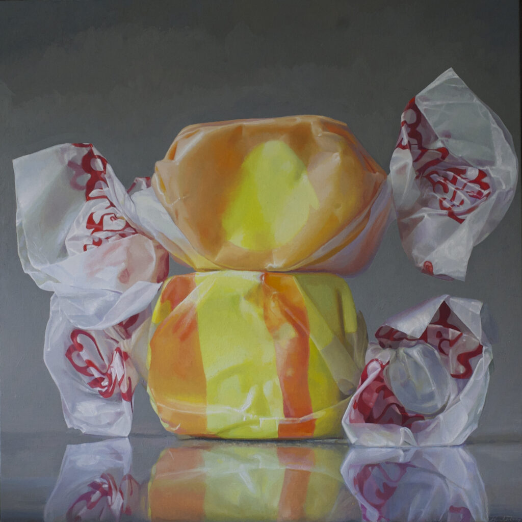
Taffy #3, oil on linen, 46″ x 46″
Taffy #3, which I refer to now as Happiness, is going to be included in Manifest Gallery’s INPA 10. If I were clever and a careerist, with a little sophistry, I might argue that my series of salt-water taffy paintings represent a nostalgic, ironic commentary on a lost period of art. They do remind me of the Sixties, full of hope, full of clarity about America’s primacy in everything, all those paintings filled with confidence in the advance of art history toward new discoveries. It’s true, I’ve been calling them “color field candy” informally for quite a while, because my deepest inspiration for these images comes from the work of painters like Stella, Rothko, Agnes Martin, and Frederick Hammersley. One might be more inclined to suspect my hope is to honor the influence of Wayne Thiebaud, that my real allegiance is to Pop, that I am engaged in a kind of re-interpretation (in a soft, wistful minor key) of what’s happening in Roberto Bernardi’s current hyper-realistic images of hard candy. But, as much as I revere Thiebaud as a serious artist engaged in discovering ways to do things with oil that others haven’t done, the work of other painters of candy is rarely on my mind when I’m making crucial decisions about these paintings. I see these paintings as realistic depictions of what amount to little abstract sculptures.
The choices I make with each painting sound amusingly absurd and trivial: what candy to use, whether and how to unwrap and re-wrap it to my liking, what to do about that squiggly Taffy Town logo printed on the waxed paper when I use that brand of candy (see what I mean?), what lighting to use to on these little chunks of colored sugar, and how to crop and then develop the photograph I take of them, using Lightroom. I began to paint this candy as an offshoot of the jars I started doing a decade ago, where my aim was more abstract: to create a kind of honeycomb grid defined by the shape of the bulk candy poured into a small pasta sauce jar. I would use the slightly irregular grid formed by jelly beans (if you viewed the jar directly from the side) to improvise with the colors in each cell of the grid—in other words, each Chiclet, or jelly bean, or M&M. My struggle was to create an image that was a three-dimensional representation but it also worked as a flat, minimalist pattern where I could completely choose and control the colors in the pattern, mostly by picking the candy. With some smaller candy jar paintings I worked from an image of all-white Tic Tacs and depicted them using whatever arbitrary colors I needed to make the image come alive in a certain way.
With taffy, I’m not thinking in the same way, or if I am, it’s at an ironic remove from any intent to honor the notion of flatness. When I bought a bag of salt water taffy many years ago, I was thinking of getting a larger jar, tumbling the taffy into it and then addressing the patchwork color composition it would create through the shine of the glass and the haze of waxed paper between glass and candy. It’s still an interesting challenge, but it put me off for many years, partly because it was hard to imagine a comparable jar, as wide as it is tall, with threads at the lip for tightening a lid, large enough to contain enough of those twists of taffy to be interesting. A few years ago, I thought again of the taffy and found websites where I could order specific color combinations and began to stock up, filling boxes with the bags that arrived. I finished one, a large, loosely executed image of three pieces of taffy stacked like a cairn. I promptly went back to my more traditional still lifes, concentrating on bowls decorated with Indonesian Ikat patterns. About eighteen months ago I finally returned to the taffy, and I have finished a dozen of various sizes. A dozen means I’m only about halfway through the series, which I intend to propose as a solo exhibit when this suite is mostly complete. It’s taking far longer than I anticipated when I began the project.
The taffy calls out to me primarily with its color, which is where I am haunted by the Sixties: the beautiful tones in the work of Stella, Hammersley, Noland, some of Blinky Palermo, Diebenkorn, Martin, even Bridget Riley, it’s a long list of painters who had an unabashed love of color for its own sake. With taffy, that love is slightly unrequited by the painting. It holds itself back. The evocative hues are partly hidden, bound inside the translucent waxed paper, in shapes and with colors that reflect my yearning for the minimalist simplicity of a Matisse cutout, the vibrance of a Stella protractor painting, and the sometimes quirky shape of a little Hammersley etude with its organic lobes of orange and yellow. Sometimes, the three globes, two on top of the surface, one the reflection of the bottom candy, remind me of Rothko’s landscape format: the sky, the horizon, and the earth. Again, I know this must sound funny, but I hope it’s funny in a self-effacing way: Rothko’s epic, sometimes tragic moods revisited as candy. Yet this love affair with flat minimalist color is ironically (yet with no snarky intellectual commentary intended) given weight and three-dimensional form, as if a color field painting had been melted down, compressed and molded into a nugget the size of a large walnut.
I was intent on numbering these paintings so that their status as variations on a partly rigid format, and their kinship with abstraction made a little more central, but in looking at the ones I’ve done, they evoke a plethora of moods, predicaments, epiphanies, times of day, spiritual states, and even myths. So I’ve gone back and taken away their number and given them a name (to turn a song lyric from the Sixties inside out). So, when I’m done, I’m looking at a little imaginary seed, which, when immersed in the mind of a viewer, I hope will unfold and expand into a vision of flat patterns of color as large as anything, the way memories are big without really having a size. Yet the waxed paper keeps it real, tethered, with forms that echo the heaviness of a clothed human body, fixed but not rooted to its place on my kitchen countertop, near the sink window, where I place the candy to photograph it. It’s earthbound, maybe yearning for flight with those waxed paper wings that would certainly droop in the summer heat as the taffy began to ooze in the sun. But while it’s poised, doing its balancing act, these little hunks of sugar seem full of hope, love, submission, longing, thwarted ambition, and even more defiant feelings, not always definable, the way a certain hour of the morning or a post-midnight walk on a deserted city street seems full of a particular mood, a sense of all human possibilities, without being about much of anything at all.
August 13th, 2021 by dave dorsey
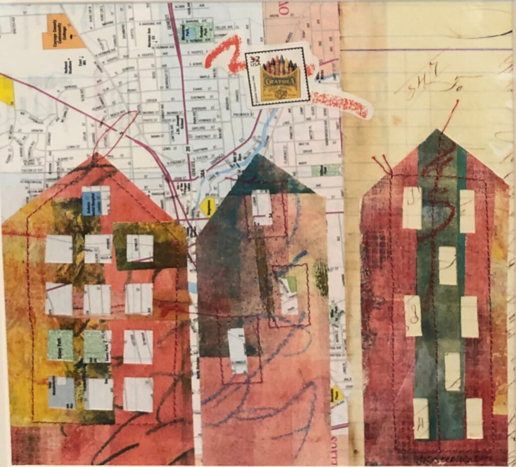
On The Map, Jean Stephens, mixed media collage
The pandemic had some upsides. My son and his family moved from California to live a mile away from us here in Pittsford, N.Y., after they discovered they could keep working in movies and television from thousands of miles away. It’s suddenly the Zoom era, and we couldn’t be happier about it. Jean Stephens, already living here in Western New York, took advantage of her self-imposed isolation to liberate her imagination through the act of simply paying attention to what she was enduring: both her physical confinement and how it launched her imagination into a series of soaring and lyrical new collages.
It’s a major shift in the way she makes art.
She does gelli monoprints and then uses the patterns created on the paper she applies to the acrylic-impregnated gel to carve out the shapes of houses and buildings. These are applied to a substrate of colored patterns Stephens pulls from her medium when applied to textured surfaces—the textures she has discovered in objects from a variety of sources, including a hardware store. Into the mix, she works the curving lines of script from old letters or other printed material. She collects objects wherever she finds them in her travels—stamps, letters, cards, as well as anything that has an interesting surface from which she can pull a pattern, including something as mundane as drywall tape. She uses all of them, picking just the ones that seem to work in juxtaposition with one another to create a little visual song of memory, imagination and yearning. Each image is like a visual poem, and in one, an Irish postage stamp floats in the sky above a house perfectly evoking the thwarted longing for freedom everyone felt last year. Her luminous color harmonies are marvelous.
Her work is on view at the Stephen Merritt Gallery, Merritt’s stand-alone studio situated behind his home on a densely wooded hillside north of Rochester. He converts his studio into a gallery for occasional shows. This one features, in addition to Stephens, fascinating new drawings from her husband Bill Stephens, Loraine Cooley’s beautiful jewelry and Dick Westfall’s amazing woodwork.
Stephen Merritt learned how to create his assiduously crafted terra cotta vessels in the late 1960s and early 1970s, studying in Japan under the guidance of Ishikawa Seiho and Inoue Manji. He has been deepening his understanding of the techniques he acquired over the past five decades. While the vessel is still moist, he brushes it with a variety of clay slips—watery solutions of different kinds of clay. His surfaces have a lustrous semi-gloss, or even matte, finish that suggests layers of subdued color, in the way living tissue reflects from various depths to create complex flesh tones. Each vessel seems to vibrate differently to the eye, but all of them emanate a balanced, meditative tone, a kind of spiritual energy that’s contained, withheld, but alive. His work is in the permanent collections of the Smithsonian American Art Museum, the Museum of Fine Arts, The Burchfield-Penny Museum, the Memorial Art Gallery and the Everson Museum.
August 10th, 2021 by dave dorsey
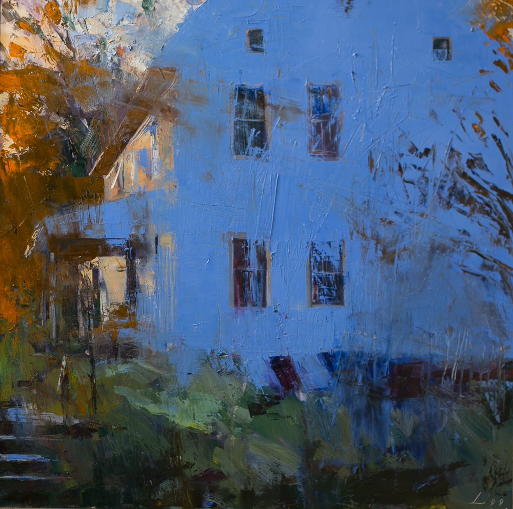
The Blue Side, Patrick Lee
One of Lee’s interiors is on view at the 2021 Butler Midyear exhibition.
August 6th, 2021 by dave dorsey
Sampler, Brian Ballenger, oil on canvas, 26″ x 34″
The question of how Ballenger creates these abstractions has puzzled me since I saw another of his paintings in the 2021 Butler Midyear. Here, the surface appears to be wet-on-wet bands of paint, created with uniform passes of a brush across the wet surface, guided by a straight edge tool. The way the bands seem woven together must be an effect of the order in which he applies them, and the complexity and number of the swipes across the canvas give the impression of wicker’s in-and-out network. He must work quickly, keeping the paint wet from start to finish. In this particular painting it looks as if he began with horizontal marks of black, orange and a kind of faint damask surrounded by white negative space, and then worked the completely coated surface with his rigid criss-crossing marks. The sense of three-dimensional depth is marvelous, a beautiful affront to Clement Greenberg, more than half a century since his celebration of flatness both supercharged and narrowed the way America thought about art. Obviously, we’ve recovered.
August 2nd, 2021 by dave dorsey
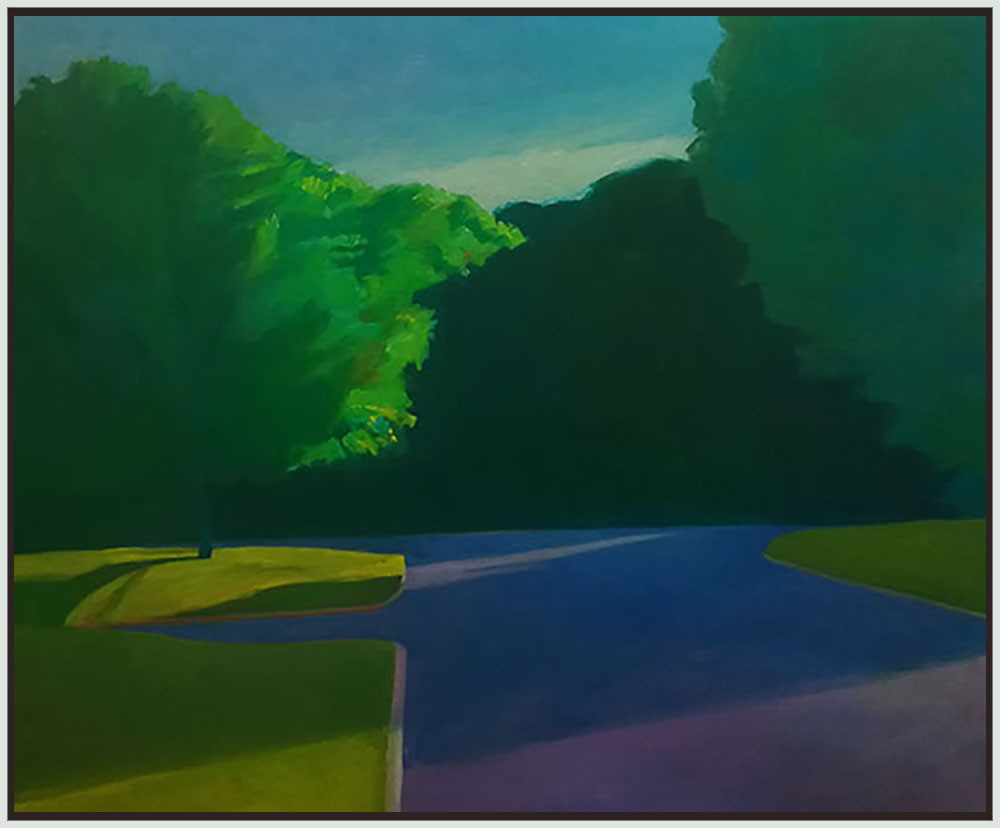
The Enigma of a Street, William Reed Simon, oil on canvas, 22″ x 27″
This is the first of several posts featuring the work of artists chosen for the 2021 Butler Midyear exhibition at the Butler Institute of American Art.