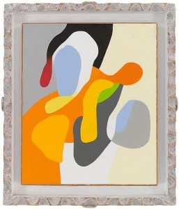
Organic & Geometric
In my recent tour of gallery openings in Chelsea on the 8th, with all the efficiency of a time management consultant, I managed to get a look at about ten new shows only hours after they opened—and, in one case, at Danese, several hours before it was supposed to be open, until I was quite courteously asked to return to the elevator and head back out onto the street. It took some spirited walking to see everything, and my polo shirt was nearly drenched in the humid, post-storm sun—walking around those large white rooms, others must have looked at me and wondered if I were just taking a break from unloading pallets from trucks. Since it was only a few days before the 9/11 anniversary ceremony further downtown, and the subways were telling everyone to be alert for suspicious activity, a guy sweating profusely for no discernible reason, carrying a North Face backpack, on his way uptown must have raised a few eyebrows.
This Mr. Magoo-ish treasure hunt of mine yielded a few memorable discoveries, a couple astonishing ones, and many satisfactions, but none quite as wonderful as Organic & Geometric, the show of Frederick Hammersley abstracts on view through Oct. 8 at Ameringer McEnery Yohe on W. 25th,. I’d never come across Hammersley’s work before, which says more about my ignorance than his stature, but the staff described him as “well-known on the West Coast, not so much here.” This show ought to change that. Hammersley (1919-2009) developed his images in a modestly-scaled format—that scale is one of several ways he can be compared and contrasted to Blinky Palermo, whose minimalist work is on view north of the city at Bard and Dia:Beacon. Hammersley essentially builds the visual equivalent of isometric tensions between opposing elements and forces. His entire output seems to be, in one sense, an ongoing extrapolation of Hoffman’s push-pull theory applied not simply to color, but also to form and value. Hammersley built each of his abstracts by creating a sense of almost-unstable, taut counterpoint between nearly every opposite element in the work itself—even between the canvas and its frame, in the suite of his organic images. As a result, his surfaces seem to be holding their breath, poised at the serene edge of some yoga pose—even when you’re looking at a spare grid of only a few austere rectangles: blue, red, black and white. For all those hard pointy edges, they are luminous, sensuous, intimate and friendly, and the organic canvases are quite often sexual—with a cartoonishly expressive line suggestive of lava lamps and jigsaw puzzles—though somehow the anatomical imagery seems elevated to the level of a loopy extrapolation of Taoist yin/yang symmetries. His imagery, hinting at genitalia, evokes the union of fundamental, cosmic energies. We’re not talking John Currin here, or even Louise Bourgouis. Think Georgia O’Keefe doing tightly interlocking Matisse cut-outs. With the geometric paintings, he framed them uniformly in extremely thin metal floaters. For the organics, he built wooden frames from scratch, apparently carving, distressing and painting them, creating extensions of the work itself, as Hodgkins does, and he left wide trenches of space between the canvas and the frame, painting these little moats in earth tones that recede behind the saturated color of the panels. These are remarkably tactile, physical objects, not simply flat theoretical arrangements of colors. The rough, toothy texture of the canvas, the opacity of the paint, sumptuous as icing on pastry, and even the telltale feel of the pencil pressing into the wet paint when he signed the work—it all contributes to the sense that he was assembling unique objects in three dimensions that refer to nothing but their own shape and color and surface–their reality right here, on this wall, at this hour and day and year. Coming across these tiny works, you feel you’ve discovered a whole new panoply of exotic tropical plants or birds or insects. The physicality of the work is at the heart of the joy it imparts. And yet, juxtaposed against all of this, Hammersley’s intellect stands apart and playfully invents a pun for a title to provoke thought: Savoir Pair, Knew to Me, Altered Ego. I hate titles. If someone proposed a Constitutional amendment prohibiting titles, when it comes to visual art, I’d start a signature campaign in support of it. Most are fatuous, or pretentious, or wishful thinking, and they’re of more value in the aftermarket, as it were, for the taxonomist and historian and dealer, than as a way of conveying what’s actually going in a painting. A painting ought to be named with nothing but the date of its completion. Keep the words away from it (says the guy typing words to describe it.) Yet with Hammersley, the titles give you yet another vantage from which to assess the work at a level of meaning that wouldn’t likely be apparent without those few, clever words. You don’t need that meta-level of ambiguous meaning. You can discard it without losing a thing. It’s just there to show you Hammersley is as poised and self-aware as you can get and still paint effectively. The work gives you everything it has to offer in utter silence, as great painting is meant to do.

Comments are currently closed.