Archive Page 4
December 25th, 2022 by dave dorsey
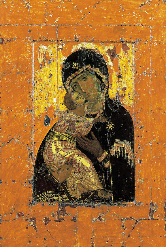
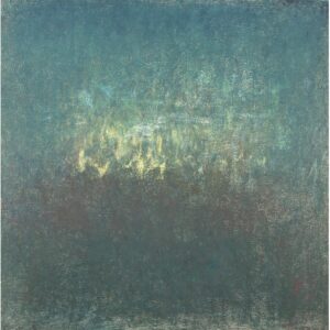
Theotokos of Vladimir, 11-12th century Constantinople, egg tempera, 27 x 41
From the Old Jordanville Prayer Book:
Rejoice, height inaccessible to human thought.
Rejoice, dawn of the mystic day.
Rejoice, rock that refreshes those thirsting for life.
Rejoice, door of solemn mystery.
Rejoice, thou who shows philosophers to be fools.
Rejoice, thou who exposes the learned as irrational.
Rejoice, ray of the noetic Sun.
Rejoice, thou through whom creation is renewed.
–Excerpts from the Akathist to the Theotokos
These lines, in an oblique way, express–in a more ecstatic mode–how I’ve responded to much visual art since my teens. It’s hard to imagine how something in this spirit could be sung as an accompaniment to paintings being made now. Where are the mysterious painters who might evoke this sort of mystical affirmation? Some modernists would have recognized something like this as the mission for painting, Klee and Chagall, even Kandinsky, and many others. Some of the modernist writers as well, Proust and Flaubert (if you look at the arc of his subject matter over his career) and Eliot and Auden.
The Old Jordanville Prayer Book is named after a Russian Orthodox monastery south of Utica, New York, a place I visited in the 80s, a period when I was studying print-making at Munson-Williams-Proctor and writing for the Utica newspapers. When we lived in Utica, I saw a retrospective of Charles Burchfield paintings at the museum that had a deep effect on me, as well as a survey of contemporary representational art that opened up my sense of the possibilities available to me as a painter. When I was assigned a feature story on the Jordanville monastery, the spiritual energy I discovered there astonished me. What most impressed me was how the monks were busy publishing literature to be smuggled into the Soviet Union, before it fell apart, when that country was most repressive, harassing and persecuting its own Orthodox practitioners. Russia maintained tight censorship over religious publications, so the role of producing and distributing books, as samizdat, that Christians wanted within Russia’s borders, fell to a little organization in upstate New York, Holy Trinity Monastery. My visit there bolstered my interest in and respect for Russian Orthodoxy which began in college when I read J.D. Salinger’s Franny and Zooey and then The Way of the Pilgrim, probably the best-known book associated with this church. Now, years later, after having read Everyday Saints–stories about monks in the Soviet Union when the regime was actively hostile to their faith–I found Russian Orthodox services only miles from where I live, in Brighton, NY, at the Protection of the Mother of God. It’s a beautiful place to try and quietly contemplate the ultimate reality of life with people more meek and humble than I am, while being surrounded by paintings on nearly every square inch of wall and ceiling, which seems a particularly appropriate haven for a visual artist to keep an eye on his own spiritual health. One of my good friends at the church, Father Theophan, a Danish monk from Holy Trinity, lives in Brighton–more or less on assignment from Jordanville to assist the church–paints icons, and is also translating the Psalms into Danish from Greek and original versions in other languages. His path began when he read The Way of the Pilgrim around the same age as when I read it–and he likewise became both a painter and writer. At some point, I hope to do a post about him. I’m fascinated by how icon painting is an ongoing and mostly overlooked niche of the art world, continuing without any expectation of economic reward or critical recognition.
I write this post in memory of Peter Shehldahl, The New Yorker’s art critic who confessed to being a non-church-going Christian when he knew he was terminally ill, not long before he died in October. His intelligence and humanity lives on in his writing.
December 21st, 2022 by dave dorsey
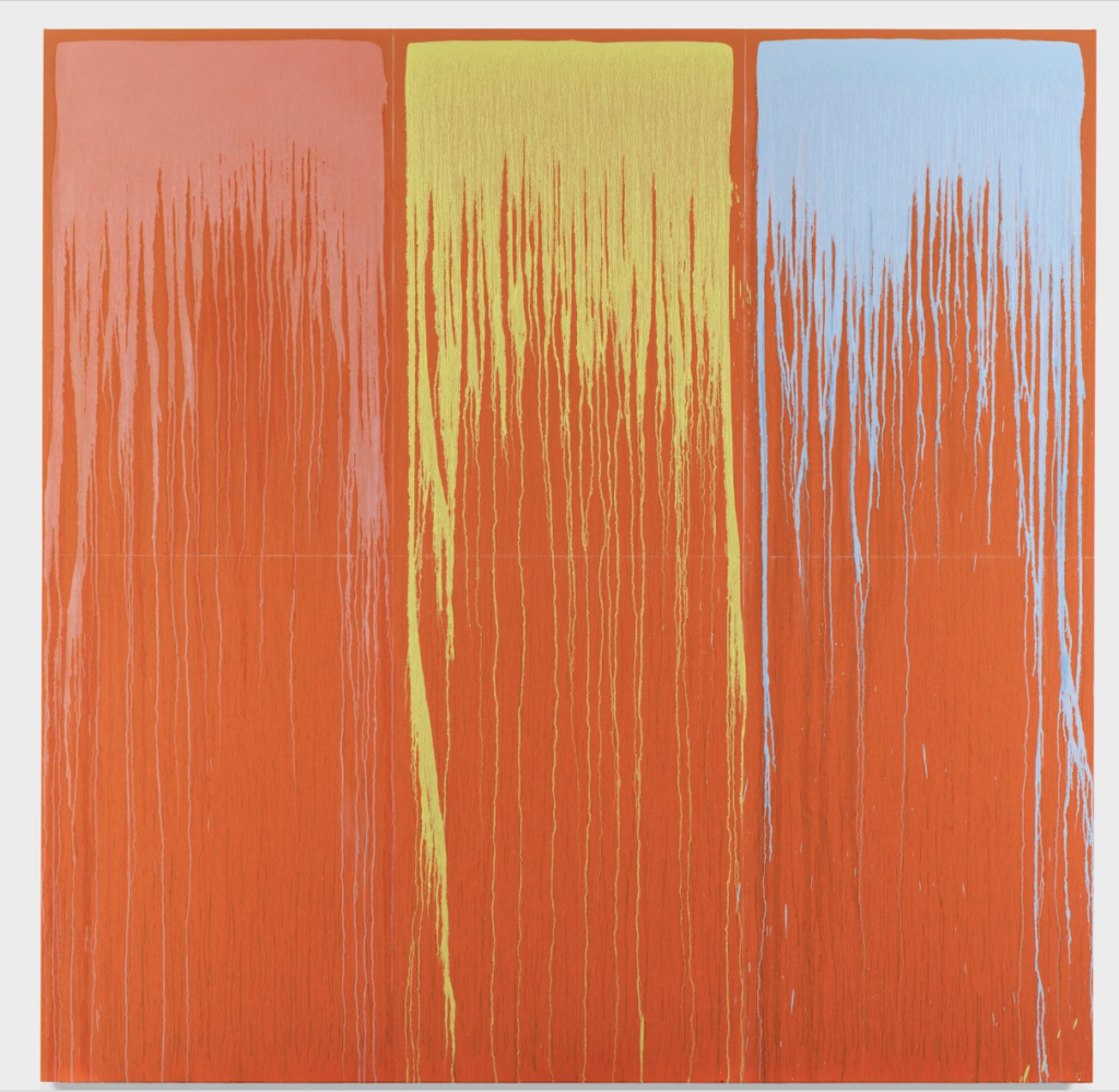
Pat Steir. Rainbow Waterfall #5.oil on canvas, 108 x 108
 Get to Hauser and Wirth in the next day or two, your last chance to get a glimpse of Pat Steir’s powerfully simplified and radiantly colorful drip paintings, including the largest canvas she’s ever done. She reduces her methods to the most uniform imagery, from painting to painting–working slight variations in color and scale, with an almost Warholesque sense of choosing color schemes within the repetitive armature of an almost identical shape. Chalk lines form a faint grid against which the random journey of the drips sink downward. More to the point, these paintings do what the great color field mimimalists did, severely simplifying the means of making an image and then finding limitless prospects for wildly different states of consciousness as you move from one immersive field of color to the next. The resplendent paintings hum with life. There’s a great review of the show at Hyperallergic.
December 18th, 2022 by dave dorsey
Summer Fruit, Yuval Yosifov, oil on canvas
Only a few days left around the holidays to see this painting (properly stretched and framed in the show) along with work by other painters who studied in Israel in Shapes of Light at the Figure/Ground Gallery in Seattle, a spiritual sister to Sugarlift in Chelsea, where Zoey Frank’s recent work is on view until Jan. 7. Yosifov is young and gifted, someone to watch.
December 15th, 2022 by dave dorsey
Canopy, Rebecca Purdum, oil on panel, 24″ x 24″
The beauty of her abstractions are Rebecca Purdum’s greatest appeal, bringing to mind both late Monet and Color Field. Yet what delights me the most about her website is the plain-spoken, no-nonsense artist’s statement which is admirably titled: “A few words”:
To start a painting, I look at a surface of infinite possibility. How to find the one image that will be this painting? How to paint something I’ve never seen before? Even after making hundreds of paintings, it is still possible. That anticipation, and its affirmation when a painting is finished, is why I paint abstractly.
Whether a painting is nine feet or sixteen inches, they begin the same way. During the process of painting, however, many factors influence what happens next. Early on, it’s one-sided with my decisions propelling the action. As the surface grows, a shift occurs so that what I want is no longer important. The painting dictates what it needs. I know the painting is finished when what I see has a physical and emotional resonance, unique in time and place. That’s why all the paintings are different.
By contrast, I offer a sample from www.artybollocks.com, the random AI artist statement generator. First results upon clicking the words “generate some bollocks”:
My work explores the relationship between the universality of myth and recycling culture. With influences as diverse as Rousseau and Francis Bacon, new insights are distilled from both mundane and transcendant meanings.
Ever since I was a pre-adolescent I have been fascinated by the essential unreality of the zeitgeist. What starts out as hope soon becomes manipulated into a carnival of defeat, leaving only a sense of nihilism and the unlikelihood of a new synthesis.
As temporal forms become frozen through studious and critical practice, the viewer is left with a clue to the possibilities of our era.
Love that last sentence. At the bottom was a link asking “still not good enough?” Who could resist? I clicked up this:
My work explores the relationship between the Military-Industrial Complex and copycat violence. With influences as diverse as Caravaggio and Joan Mitchell, new insights are created from both orderly and random layers.
Ever since I was a child I have been fascinated by the theoretical limits of relationships. What starts out as yearning soon becomes corroded into a carnival of futility, leaving only a sense of what could have been and the chance of a new order.
As shifting forms become transformed through emergent and critical practice, the viewer is left with a clue to the limits of our world.
With influences as diverse as Monty Python and Woody Allen, the bollocks generator does a nice job of impersonating the average statement, but this carnival of pretention can’t compete with the way Purdum just sticks to the craft and doesn’t try to say what can only be shown. As someone once put it: “What can be said at all can be said clearly, and what we cannot talk about we must pass over in silence.”
December 12th, 2022 by dave dorsey
He goes by a single name, like Madonna or Bono or Sting, the contemporary Spanish master, Golucho, completely self-taught and mostly under-the-radar if you try to learn more about him on-line. One finds little written about him, but he’s considered part of the New Realism, with Antonia Lopez Garcia in the forefront of the movement. His work is less astringent that Garcia’s, more willing to use unnatural tones of color to evoke a response that moves the viewer beyond one’s initial amazement over his boldly persuasive technique. It’s easier to think of Garcia as a photo-realist, though Golucho likely is working at least partly from photographs of his subjects. His use of color varies from restrained to lush, from beautiful to assertive, and his drawings of aged bodies seem to descend from the Northern Renaissance yet don’t look coldly clinical. Occasionally he emerges from his information embargo to teach briefly and then withdraw: once at the New York Academy of Art in 2009 and then with a group of Chinese students who came to Spain in 2017 for a week of instruction hosted by the International Arts and Culture Group based in Florence, Italy.
 His figures and still lifes are frequently lit from overhead, and both are startlingly vivid with brushwork that seems to be almost Tonalist, layer upon layer over surfaces he scores and scratches. His mastery reminds me of Jerome Witkin but his brushwork is less bravura, and his compositions are simplified and often almost vacant except for a human figure and a few indications of a room with random furniture: figures that look as if they are on a stage in the middle of a Beckett play. His few translated comments are more profound than most artist statements. In one he sounds like Hemingway on the art of writing: “The best part of painting is what hasn’t been painted.” One could take that enigmatic pronouncement a number of ways, syntactically: what’s left out as a result of the artist’s skill, what’s yet to be done by future painters, what remains to be done to a given painting but is yet to appear. A longer comment aims at the heart of painting, the quality no amount of art criticism can pin down or reliably identify:
The problem with realism is that everyone believes that they understand it, they think before a realistic picture that its aim is the mere representation of everyday life. On the other hand, abstraction makes the viewer become humble and say ‘I don’t understand it’ and in that way, by not discovering that picture, they’re closer to the testimony of that work, but when it comes to quickly ‘understanding’ the painting, there is realism. The conclusion is that the viewer stays on the surface of what is represented and this work can be left in mere appearance and in technical ability.
What he appears to mean is that critical attention can focus on nothing but appearance and technical skill. What many might understand from these words would be: it’s easier to understand what greets you visually with a realist painting, it’s recognizable and that’s a great part of the pleasure, but simply transcribing the look of things isn’t the point. Abstraction can be puzzling and therefore brings the viewer closer to the actual mystery of painting, the way appearances point toward something less visible (something that isn’t intellectual content). But privileging abstraction pushes aside what feels like easily understood realism as a lesser form of painting, mere copying. What he’s likely saying is that “understanding” isn’t the point. The point is to see what’s being shown through what’s depicted, and that remains mysterious but the actual aim of the painter. You behold something you can’t carry away as knowledge. It isn’t available to intellectual analysis or description. To engage with it, you have to keep looking.
December 9th, 2022 by dave dorsey
This month in the New York Review of Books, Jed Perl wrote what’s almost a seminal essay on the way contemporary artists are finding their place in the spectrum that runs from pure abstraction to pure representation. For his argument, he reduces the spectrum to a polarity. He wants artists to pick a side and stick to it: be abstract or representational and work within the lines dictated by that choice. Instead, dogs and cats are living together, and he doesn’t like it. By lamenting the loss of the trench warfare between abstraction and realism, he aims at the central challenge for an individual painter now, but doesn’t quite articulate it. It’s a wonderfully thoughtful and well-written assessment that nearly nails the universal quandary painters face now—but he doesn’t quite enable the reader to see his target. He zeroes in on it and then veers away like a pilot who notices his runway is occupied at the last minute.
Anarchy is axiomatic now: anything goes, and everything is contemporary. A small part of what’s produced deserves celebration, as is true of most human endeavors. But anything is possible because everything is permitted. This is pretty much the open field painters face. They choose their own rules, with or without the attendant philosophical justification for one’s métier that Arthur Danto requires each artist to keep handy, like a holstered sidearm hanging from the easel. Perl yearns for the old faiths, the face-off between abstraction and realism that carried forward from early modernism through the 60s and into the 70s when the cheerful ironies of Pop Art and color field minimalism and then photorealism seemed to overshadow the intellectual angst that gave AbEx such gravitas and made New York City the center of the global art world. But then, poof, the antinomies withdrew, and we have the slow-motion free-for-all of individual invention, our current scene. Oh, the humanity.
It puts us in a place where snobbery still prevails, everyone is welcome to look down on anyone outside a particular zone of taste, and justify the sneer with commentary on what matters in painting. As if what matters can be put into words. Everything has splintered and the splinters keep splintering until we have Donald Kuspit’s advocacy of neo-Old Masters pursuing idiosyncratic visions, which screens out the enormous and wonderful fecundity of what’s going on everywhere. Anyone who tries to say what ought to be privileged in art criticism is missing what’s most vital and unpredictable in both art and life. The good stuff is always surprising. Critics make plans; God and artists laugh.
What runs counter to Perl’s vision is the much broader sense among many painters that they ought to do work that answers to the demands of both abstraction and representation. There’s a loose spiritual confederation of perceptual painters who want to fuse representation and abstraction in a way that makes much of their work appear to belong to a consistent, new school of painting. From where I sit, perceptual painting is a much broader category. It’s any painting that achieves what it sets out to do without intellectual baggage, without the homework, without any conceptual foundation or fixed rules whatsoever: what you see is where it’s at, not what you or even the painter thinks the painting is up to. The thinking lags behind, like a high school girl trying to make the word “fetch” happen in Mean Girls. MORE
December 6th, 2022 by dave dorsey
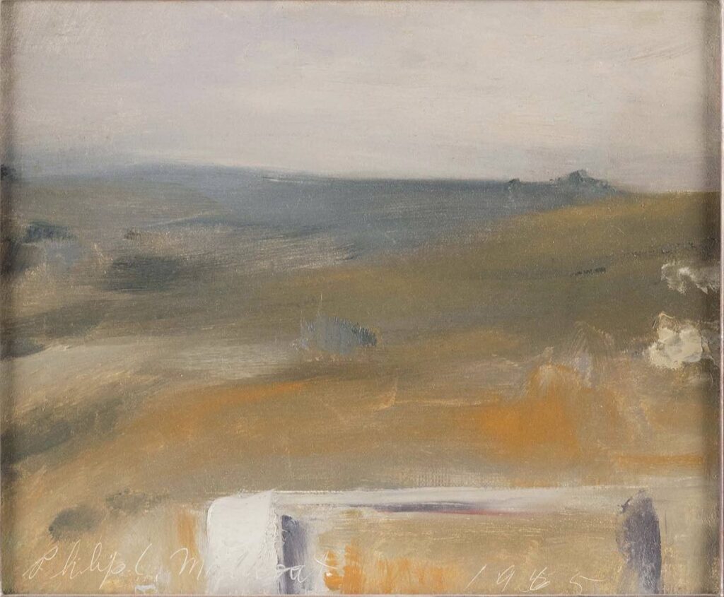
Back Shore, Philip Malicoat, 16″ x 22″, oil on canvas.
Tom Insalaco told me earlier this year to check out Philip Malicoat. His close association with Edwin Dickinson emerges immediately in one glance at his work, in both modes that Dickinson employed: the large, dark and mysterious figures and interiors and the quickly executed, nearly abstract scenes Dickinson described as “first stroke”: premier coup. Back Shore is clearly an example of the latter. From the Provincetown Art Association and Museum:
Philip Cecil Malicoat was a child of farmers with little exposure to the arts, first in Oklahoma, then in Indiana, before coming to Provincetown in 1929 to study with Charles Hawthorne. Malicoat went on to build a life in Provincetown, meeting his wife, the artist Barbara Haven Brown, and together raising two children, Martha and Conrad, both of whom became accomplished artists. Malicoat was active in Provincetown arts community as a member of the Provincetown Art Association and Beachcomber’s Club, a teacher, a painter, and, in 1968, a co-founder of the Fine Arts Work Center.
December 3rd, 2022 by dave dorsey

Jessica Brilli, Morning of the Camping Trip, acrylic and oil on canvas, 30″ x 30″
This new painting, from earlier this year, has the amazing quality Jessica Brilli often achieves with her vintage cars. The forms are utterly flat and abstracted, a geometric puzzle, and yet her handling of values makes the trunk of the car jut into view. That effect is supported by the one area of analog gradation from dark to light on the wall of the garage behind the car. The colors viewed individually are flat and muted, almost dull–that blue sky looks lusterless in a disciplined way, but arrange them in relation to one another the way she has and what comes to life is the heat and light and expectant silence of a summer morning, just before a longed-for getaway. The canoe is a wonderful touch, also given a sense of three-dimensional depth with the smooth shift in values along its curve. The whole painting comes alive around those two red tail lights, like a pair of opossum’s eyes, their little U-shaped highlights underneath the crimson irises echoing the slim arch of shine over the rear window. The car looks sentient but fast asleep, eyes wide shut, waiting. The restraint of the subtle hues, and the combination of uncommon tones, the rigor of her reduction of everything to the simplest possible terms, everything works inexplicably to create the aura of an eerie moment both commonplace and alluringly mysterious, everything charged with somnolent but vigilant awareness.
November 30th, 2022 by dave dorsey
A painter’s impossible challenge, as well as the essence of painting, from The Little Prince.
And now here is my secret, a very simple secret: it is only with the heart that one can see rightly, what is essential is invisible to the eye.
–Antoine de Saint-Exupery
“The narrator becomes an aircraft pilot, and one day, his plane crashes in the Sahara desert, far from civilization. The narrator has an eight-day supply of water and must fix his aeroplane. Here, he is greeted unexpectedly by a young boy nicknamed “the little prince.” The prince has golden hair, a loveable laugh, and will repeat questions until they are answered.
The prince asks the narrator to draw a sheep. The narrator first shows him the picture of the elephant inside the snake, which, to the narrator’s surprise, the prince interprets correctly. After three failed attempts at drawing a sheep, the frustrated narrator draws a simple crate, claiming the sheep is inside. The prince exclaims that this was exactly the drawing he wanted.”
November 27th, 2022 by dave dorsey
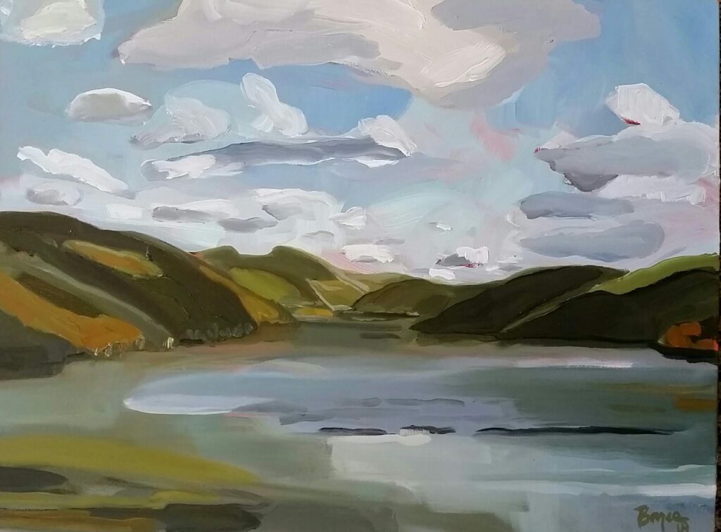
Phyllis Bryce Ely, Seneca Lake, Looking South, oil on linen, 12 x 16, 2019.
Phyllis Bryce Ely has been doing en plein air paintings of the nearby Finger Lakes, one of which is on view in Spellbound: The Art of Mystery at Oxford Gallery. I keep coming back to this image she sent me, at my request, a while ago. It’s less abstracted than much of her work, and more reliant on the shape of the brush and the flow of the paint for the cool tension between the accuracy of the paint and what I’m seeing through it. What I love is how loose and yet carefully precise it is. This isn’t really bravura brushwork, it’s more personal than that: it has her touch, the ghostly, translucent gradations between tones. Much of what Ely does is less like what one would actually see standing at a scenic pull-off, more like the Group of Seven or at least Lauren Harris, but Ely’s work is even more about the paint. This one creates a very real and precise sense of a three-dimensional view and yet looks utterly free and spontaneous in the way she applies the paint.
November 24th, 2022 by dave dorsey
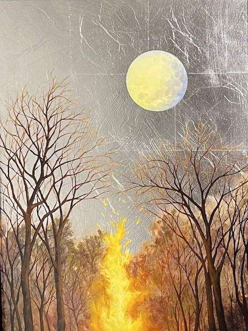
Bonfire Moon, Bridget Bossart van Otterloo, oil and silver leaf on board.
At Oxford Gallery many of the participating artists responded to the theme of the new group show—Spellbound, the Art of Mystery—with compelling work.
When I first walked through the gallery, I passed a welded steel raven from Wayne Williams with a cursory glance at the bird, but then on a second tour of the show, I paused and looked at it from various sides and began to absorb the dignity of the crusty, ruffled creature. It began to remind me just a bit of Donatello’s Lo Zuccone, a prophetic 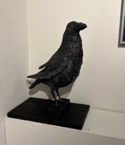 interloper, in from the cold, out of place in polite society, but also just where he ought to be. Titled Nevermore Evermore, it’s ostensibly an homage to Edgar Allen Poe but it’s even more an admiration of the huge bird itself, with its sentient eye, poised and observant, sizing up the entire gallery from his corner. What struck me most deeply was how little Williams consciously imposes himself on the steel he brings alive—his ideas, his opportunity to call attention to his stylistic prowess. He gives you the raven as it is, an intelligent, even playful genetic sibling to the crow, its aggressive shifty cousin. Anyone who knows birds has mixed feelings about the larger corvids. Yet I once worked at a desk beside a woman who kept a pet raven and called herself a “raven maniac” largely because her bird was always playing games with her, enjoying control of air space in her home, pilfering small objects from various rooms and hiding them in the cushions of her couch. Wayne Williams’s raven could easily be a portrait of her bird, a haughty touch of mischief in the eye, with a lack of urgency in the pose suggesting wisdom or at least wise-guy confidence. When I asked why the feathers seem to rise up in relief at the tips, like old roofing shingles, Williams told me this is how a raven’s feathers behave, unlike a crow’s. Williams takes the world as he finds it and gives it back to you in a way that makes you see it afresh and just as it is. This isn’t a Leonard Baskin bird, nor a bird used to campaign against the world as Ted Hughes employed his crow, but an actual bird as mysterious and complete as the world itself, with a title that offers a choice between utter despair and the possibility of hope. It’s a work of deep appreciation and representation, the artist disappearing into what he has created: everywhere present but nowhere visible.
Anthony Dungan’s large abstract acrylic on canvas, Saucerful of Secrets, almost side-by side with the raven, represents a new benchmark in his painting. His best work in the past has been built around abstracted but evocative human figures where the sensuous curves are incorporated in such a way that they take you by surprise when you recognize the silhouette: working as both abstraction and representation. Here representation has been almost abandoned, though the three spheres suggest celestial or planetary visions. Mostly they work to create tension between their exact circumferences and the ruptured, richly colored grid. The riot of brushwork seen through black louvers looks like a distillation and concentration of an upstate autumn but also suggests a psychological or emotional cauldron. You see all that energy trying to burst through, but safely locked behind black bars, both hidden and disclosed.
At first glance, William Keyser’s Inexplicable Lacuna appears to be a joyous pastel homage to a Matissse cut-out or one of Milton Avery’s women assembled with flat, simplified color. Yet it has a mysterious dark black line stamped MORE
November 21st, 2022 by dave dorsey
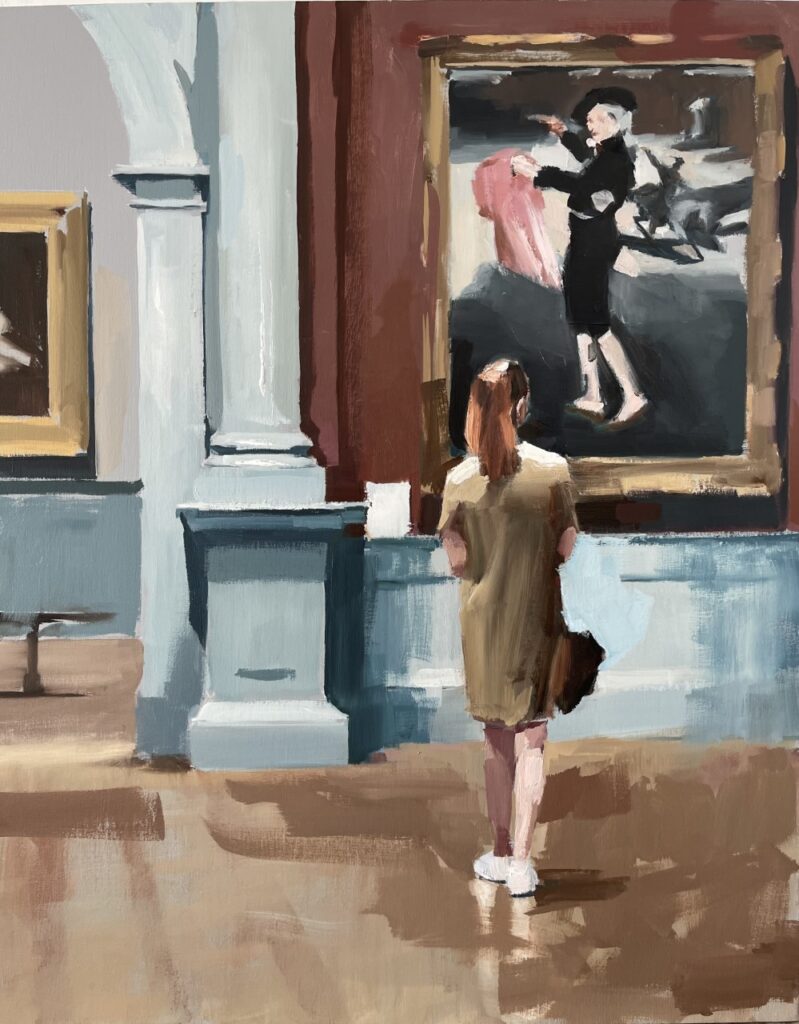
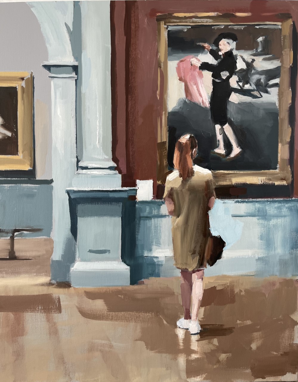
Mark Tennant
It’s a lovely candid moment, a young woman pausing to study a Manet at the Metropolitan. It’s one among a series of paintings Mark Tennant has done from what could be a field trip of female students milling through the museum. It seems to eschew his typically prurient or declasse subjects, a departure for Tennant whose metier is mostly a dour and slightly Calvinist glare that exposes the seamier precincts of human desire and behavior in depressingly raw terms. His subjects range from streetwalkers, cocktail parties that look like clueless celebrations in the eye of the social hurricane in the 1960s (or in Portland and Seattle, circa 2020), Zsa Zsa Gabor’s driver’s license pic, moments of drunkenness, public making out, many many exposed teenage legs going up and down stairs or posing in a variety of places that make them seem Spring Breakishly available for mischief, and a killer under arrest viewed in Gerhard Richter black-and-white. Most of these are photographically sourced from flash-lit freeze frames, offering him black outlines that push his figures forward. Much of it seems a dark celebration of the despised male gaze skulking at the edge of legality. What a relief to see a well-behaved girl tamed by the greatest of the Impressionists. But wait. Even here, if you try enough search engine queries, it turns out the Manet has a little transgender touch that pulls the knowledgeable viewer out of the comfort zone and into the present: Mademoiselle V in the Costume of an Espada. A young woman as matador, drag king in mid-19th century Paris. In his sly au courant way Tennant has stuck to his program: the notion of normality is a relic. It was on the wane already back then at the birth of modernity, when Manet’s nude enjoyed lunch on the grass with a couple fully dressed men. By contrast, the subject matter is what’s least interesting with Tennant, but it appears to bring him a huge following, a Pamplona stampede of fans if you check his Instagram. I suspect the seedier side of his imaginative home is a decoy. Like that pink cape, it draws you close enough for his brushwork to slay you. Those killer marks recommend him to anyone who paints.
November 18th, 2022 by dave dorsey
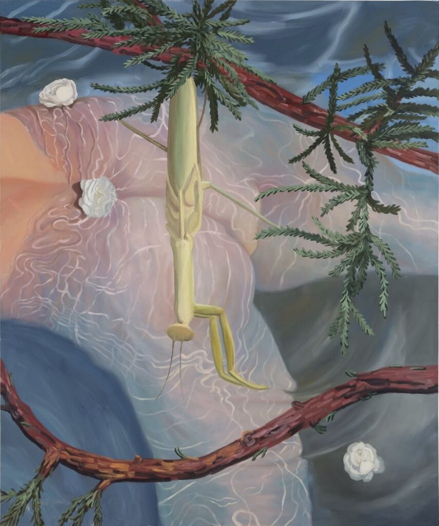
Drea Cofield, Mantis, oil on canvas, 60 x 50 inches, 2021
Drea Cofield’s more recent work has an idiosyncratic way of engaging visually with the natural world that brings to mind Burchfield and
Nick Blosser, though her work seems closer to the spirit of animation. Burchfield is one of the few non-Asian painters who have depicted cicadas, and not just the legs, wings, and thoraxes, but also their rattlesnake, high-frequency whine. Cofield does insects in an equally interesting way. There’s a charmingly Disneyesque but disquieting air to her praying mantises. Some of her natural scenes are simplified but exacting in the way they capture the light on the deformities of old trees in a drab unpicturesque acre of woods most painters wouldn’t give a second look. All of her current work departs dramatically from her earlier Day Glo caricatures of naked figures cavorting in strange ways in erotic fever dreams. In the image above, the vestigial naked figure is submerged, shimmering under sunlight filtered through the water’s rippled surface. You hardly realize you’re being mooned. Mostly, the new work looks outward at nature, from within the house of her style, to produce carefully observed images of what’s there in the world, not just in her mind, though her vision is a strong and simplifying filter. I’m sorry I missed her work in my visit to The Armory Show. Here’s her bio from Exeter Gallery, a Matt Klos joint in Baltimore celebrating its fifth year of operation (congratulations Matt) exhibiting mostly perceptual painters:
Drea Cofield has created a sensuous and saturated world in her new series of paintings for Soft Limbs. The series depicts the cycle of a day: sunrise, sunset, and night illuminated by cool lavender light. The show is on from Nov. 14th-December 31st. Come celebrate with the artist at a reception on Friday, November 18th from 5-7pm.
Drea Cofield is an artist currently working between Indianapolis, IN and Brooklyn, NY. In 2013, she received her M.F.A from Yale School of Art (New Haven, CT), and in 2008, her B.A from DePauw University (Greencastle, IN). She has exhibited in the U.S. and internationally including New York, Los Angeles, and Perugia, Italy. Most recently she exhibited in the Armory Show with 1969 Gallery in New York; solo exhibitions at the Tube Artspace in Indianapolis and DePauw University. Upcoming exhibitions include a solo exhibition at Exeter Gallery in Baltimore, MD. Her work has been featured in the Brooklyn Rail, Artnet News, Juxtapoz, Blouin Art Info, and in Suzanne Hudson’s latest issue of Contemporary Painting (World of Art). She is the recipient of an Elizabeth Greenshields Grant and the Yale University Gloucester Painting Prize. Residencies include the Guild of Adventure Painters SWAB Mobile Residency in 2019. She is the Founder and Director of Bomb Pop-Up, a pop-up Art & Music initiative that focuses on providing visibility in exciting contexts to emerging and established artists and musicians, working with over 200 artists from all over the world and collaborating with institutions such as the National Academy of Design. Cofield has been a visiting artist at Cooper Union, Pratt Institute, and a returning critic at the School of Visual Arts. She is currently an Assistant Professor of Art at DePauw University in Greencastle, Indiana.
November 15th, 2022 by dave dorsey
Above are multiple opportunities to see new work from Jean Stephens, including the current excellent group show at Oxford, Spellbound: The Art of Mystery. It’s well worth the effort to take a look.
November 13th, 2022 by dave dorsey
Here’s a pretty well-known quote in context. A part of the context is that it is from Selden Rodman’s book. The telling of it printed here is the most accurate that we’ve got, and perhaps this is relevant as I’m seeing it condensed or misquoted in memes often.
“You might as well get one thing straight,” he said, relaxing, “I’m not an abstractionist.”
“You’re an abstractionist to me,” I said. “You’re a master of color harmonies and relationships on a monumental scale. Do you deny that?”
“I do. I’m not interested in relationships of color or form or anything else. I’m interested only in expressing basic human emotions — tragedy, ecstasy, doom, and so on — and the fact that lots of people break down and cry when confronted with my pictures shows that I communicate those basic human emotions… The people who weep before my pictures are having the same religious experience I had when I painted them. And if you, as you say, are moved only by their color relationships, then you miss the point!” – Selden Rodman, Conversations with Artists.
November 8th, 2022 by dave dorsey
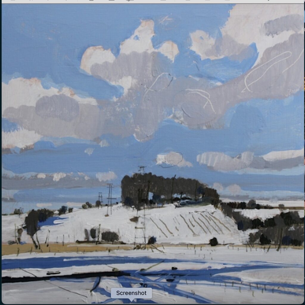
Harry Stooshinoff, 10 Saved Acres, February 20, Acrylic on birch panel
I hope Harry doesn’t mind if I repost most of his latest newsletter. Note his use of the word rubbish. So much of good art depends on chucking that particular quality out, especially prohibitions based on consideration of anything that diminishes the intensity of energy one applies to a painting. His letter is so full of wisdom and expresses so well what it’s like to try and maintain this creative energy in painting. My mom died in April and I’ve spent the past six months, in which I’ve had to pull away from painting quite a bit, thinking about what I want to do as a painter from here on, and I’ve been drawn toward several different paths, without actually getting back to daily work yet. Soon. But I’ve been wanting to work in several modes concurrently and this newsletter offers a lot of encouragement.
Harry talks about this kind of juncture directly. He advises that you do what energizes you, what you most want to see when you are done, not what you think you should be doing based on any other consideration–market, past work, reputation, what other people think, “branding”, whatever. What I admire in Stooshinoff’s painting is how it reflects two kinds of work I’ve deeply loved in the past: Asian art, especially Japanese sumiye painting and Fairfield Porter’s paintings in the 50s and 60s. I’m not sure he considers either of these major influences for his work, but it’s what I recognize through his work. In the background lurks Matisse of course, casting his enormous light-filled shadow, but you don’t get to him from Stooshinoff’s work except through Porter. Mitchell Johnson is another artist doing something very connected to this kind of painting, with Porter and Matisse as a backstory, but without the Asian element for me.
Harry works quickly, very quickly, premier coup, as Dickinson expressed it, and yet his use of value and color convey how light and form in landscape actually looks. That’s the marvel. He’s a loose painter, and you can often see pretty clearly how he makes his marks. There’s no attempt to refine the evidence of his hand. The application of acrylic flows off his brush in what appear to be spontaneous gestures, but if you drill down into the details you see some very straight lines, hatch marks almost as regular as Durer’s, and exacting precision everywhere, even if some of his hills are stylized, more like karst mounds in China. I don’t think you see this terrain in Canada, but maybe the humpy kames and eskers we have down here south of Lake Ontario are common directly to the north of us on the other side of the lake. That paradox, the marriage of generalized forms and gestural marks with visual exactitude where one area of value ends and another begins reminds me of the paintings Fairfield Porter did when he was clearly using photographs as sources. Stooshinoff works from sketches done immediately in response to a scene that strikes him as arresting. His work looks abstracted from the actual vision of a landscape, but it’s more a kind of involuntary shorthand without any pretensions: just a man working under the pressure of his passion to convey what he sees, with an urgency to move on to the next moment of looking. It isn’t some sort of transformation of what’s seen into something more interesting or valuable than an original glimpse of an actual hill with a clouded sky overhead. He just wants to be a conduit of what’s already out there, in his own quiet, quick way. Here’s his newsletter:
There really are 1000s of ways to make paintings. And I’m not just talking about the history of art and other people. There are 1000s of ways for YOU and ME to make paintings. Perhaps we think we paint the way we do because we evolved naturally onto this path, this style, and so this is our signature ‘style’ that is somehow essential to our artistic quality and integrity. That may or may not be true, and mostly I think it’s untrue. Artists have been fed lots of rubbish through the decades that, for the most part, they have internalized. Whatever artistic path we stay on is a choice, and it’s a choice we make every day. You can wake up tomorrow and make a different kind of picture. Keep in mind that for years artists feared that their dealers might say something to this effect, “….you look like you’re all over the place and jumping around too much…keep within this style that you’ve made popular and that you’re now known for”. Hmmm…branding, and all that. Again, there is some good sense in this sentiment. Sometimes it’s obvious when an artist is not committed enough and is simply flailing in multiple directions. But, the inverse is so evident as well. Artists should not harness themselves in too tightly, for market reasons, or any other reasons.….if the need is felt, there is always room to explore more, in style, method, direction, or subject.
MORE
November 1st, 2022 by dave dorsey
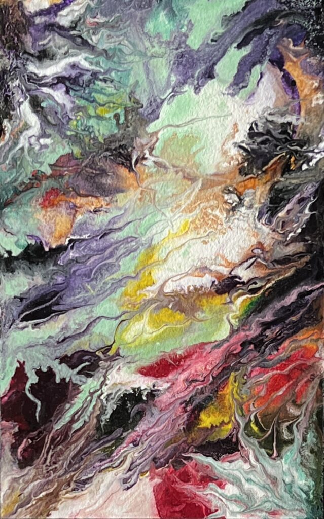
Reverie #5, Bill Santelli, arcylic on paper.
One of Bill Santelli’s recent pieces on paper: he’s doing what I’ve been hoping for years he would do, building a composition without his typical geometric partitioning. Small work, on paper no less, but it offers the sense of a cosmic view, though it also gives me the impression of looking skyward at night or gazing up through water toward the surface in a colorful reef. And, on top of that, the image seems to map inner states in a 60s way. Marvelous.
September 14th, 2022 by dave dorsey
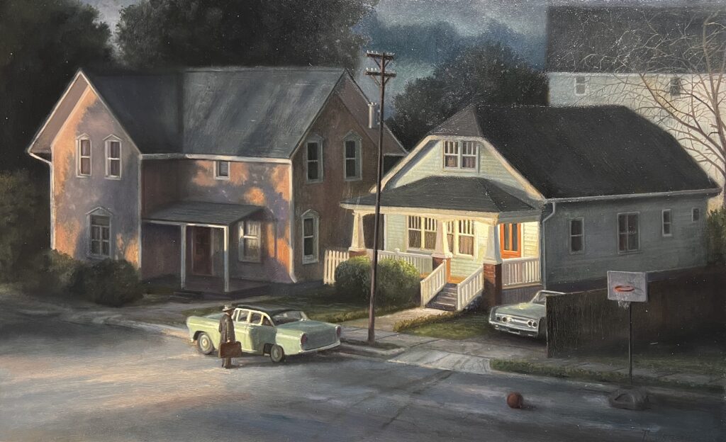
Landlord, oil on panel, 16″ x 26″
It’s hard to believe it’s been more than a decade since James Casebere’s photography was included in the Whitney Bienniel. I remember, back in 2010, being wowed by his reproductions of the suburban dioramas he painstakingly constructed and then lit and shot. His work seems to have gotten more austere and cerebral and political since then, but his landscapes of newly-built suburban dream homes still convey the ambivalent beauty of an increasingly unaffordable American Dream. Casebere centered the simplicity of his scenes at the median point between verisimilitude and minimalist geometry of newly constructed McMansions. His houses stand on an otherwise almost naked slope with newly-planted saplings a quarter century away from offering privacy and shade. Anyone who has lived in a new suburban tract knows the mix of feelings: the exhilaration of moving in, the weird sense of emptiness and exposure in a place without foliage, the smell of new construction and the sounds of new doors clicking into place, as well as the paradoxical solitude of tract housing jammed side by side into narrow lots. Casabere’s dioramas were about American life, as it is experienced by those lucky enough to buy a home—how much more poignant now in the current real estate market these scenes must be for young people hoping to put down roots. Yet his houses jutted up in various colors, evoking geometric abstraction, like the structures in an Icelandic landscape by Louisa Mattiasdottir. It was stunning work and it stirred many conflicted feelings—yearning, hope, and the inevitable disappointments of routine.
He was one of those art stars of the moment, using dioramas to make two-dimensional images, like Gregory Crewdson, on an even larger scale, whose constructed scenes—far more realistic and detailed—have a cinematic power and a darker, but even more alluring mood. Crewdson lives on the edge of popular culture. There’s a sense of epic effort in his illusions that seem imbued with an invisible presence. Built by hand and then captured with photographs, his work would be familiar to anyone who listens to Yo La Tengo (where I discovered it on one of their album covers) or watched Six Feet Under. His art was mentioned on the show, and he was recruited to do a promotional campaign for it.
It’s been years since I’ve looked into diorama art, so it took me a while to even come up with Casebere’s name, MORE
September 12th, 2022 by dave dorsey
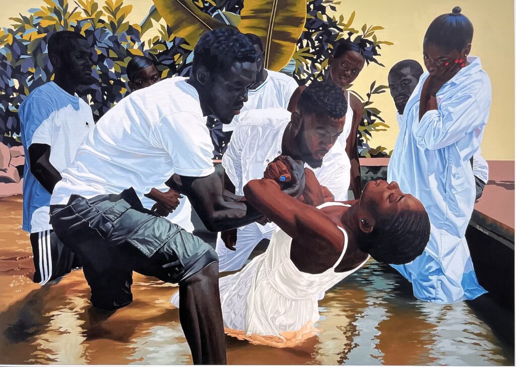
Le bapteme, Marc Padeu, 78″ x 110″
On Saturday, I wandered lonely like a cloud through The Armory Show, at the edge of Hudson Yards. That domineering real estate venture is the child of our precarious finance-driven economy. It’s a forbidding, crystalline, Antarctic Fortress of Solitude rising up along the river, with Dubai-like heights so reflective its towers almost disappear against the sky. Across the street, a honeycomb of gallery booths spread out in uniform ranks inside the equally glassy, tourmaline facets of the Javits Center. (By contrast with the glass towers, the Center looks more like an enormous multi-story greenhouse.) Inside, at this annual pop-up art mall, rows of booths gave birth to another seemingly endless grid of tight little alcoves as I slowly made my way through the maze, swiveling my head in all directions, trying not to miss anything, as if riding through Pirates of the Caribbean.
The beautiful people were there in abundance, trying to look as chill as the champagne in ice buckets beside their plush chairs. So much money, but how much of it was being spent? I don’t know the break-even point for a gallery—how much needed to be sold to make a profit after the fee for a booth—but few of the people staffing these booths looked light-hearted. Most had a selection of work from their roster, while quite a few staked their investment on a solo show of only one artist. The solo shows were invariably the most interesting.
The free market is a necessarily brutal place, even at this lofty level. A corner bodega probably has an easier time turning a profit than many of the souls who must spend months preparing to ship this costly work overseas and put it up for sale at a fair. Represented were 250 galleries from around the world, but after an hour of walking, it felt like far more. It was often depressing, so much of it a cavalcade of disposable and over-hyped art. But that isn’t far from the experience of walking through Chelsea and ducking into one gallery after another. New York City is changing and has been for many years now. I miss being able to wander into Danese-Corey and never being disappointed. I miss OK Harris downtown. I also miss the Half King. And Hi Fi in the East Village. And the lines outside the Upright Citizens Brigade on 26th. All gone. Fine, so one is a restaurant, and another is a little bar/music studio, and another a school of improv, but they are similar disappearances of the past decade and were small bastions of quality or history or what will probably be considered Old New York in only a few years. Manhatttan needs another Maeve Brennan or Joseph Mitchell to document this metamorphosis, this infiltration. You feel as if you’re watching from the shore as art rides the froth of a giant wave of international money sweeping aside graceful little figures who managed to stay vertical on economic swells of smaller, more human dimensions. (There are notable survivors, like Arcadia Contemporary, whose scale is in all things extremely human. It didn’t need a booth at this show, because it is killing at its SoHo location, having sold out its entire new show at the opening on Thursday.) So it can still be done, old school, if the goal is to make enduring art rather than spectacular profits.
MORE
August 11th, 2022 by dave dorsey
Dave Hickey, 1940-2021
In The Invisible Dragon, Dave Hickey argues for the unruly vitality of the human imagination against forces of control—economic, political, and academic. It’s a book that wants art to be made in a state of absolute individual freedom, where forms and ideas contend for survival in an imaginative free market governed by nothing but desire: the desire to make art and the desire to see or own it. It’s an energizing book. Though it’s a bit of an invitation to anarchy—creative anarchy—ironically, it’s an argument for deference and courtesy. He elevates beauty into a core principle, which hardly sounds scandalous, though it was greeted that way. For him the struggle to make something beautiful forces an artist to cede power to the viewer—the artist has to beguile, not lecture. That’s a shift in power that few people around him wanted to see. He asserts a painter needs to make the viewer want to look, rather than rely on institutions that compel people to look and think a certain way, based on certain forms of approved expression. Better to make a beautiful object without significance than to create an admirable bit of agitprop that repels or bores everyone who sees it, as it offers a dose of permissible opinions about life.
Yet rereading this book again, one can see how Hickey never thought to follow his impulsive invocation of beauty (in response to a question at a professional conference) with a journey to its Platonic extreme and see beauty as the mysterious goal itself. He doesn’t pause to attempt the impossible that every real philosopher has: what is beauty, in and of itself? The question is unanswerable, but craving an answer to it is an essential way to be awake to life. It’s a question a bit like Heidegger’s question of Being: “why is there something rather than nothing.” The first time I read his book, this avoidance on Hickey’s part didn’t really occur to me, this shunning of questions about the nature of beauty. It’s easy to miss how he degrades beauty, in a sense, as something almost equivalent to advertising. His point here was to fight back against external controls over creativity, and he succeeds, with supple, showboating eloquence.
He’s a relativist, a pragmatist, a postmodern theorist himself pushing back against how postmodern theory has been debased with political agendas. He argues that beauty is the most effective Trojan horse for smuggling ideas into the heads of others. If you’re a progressive who wants to see social change, then you need a David to paint something as visually thrilling as the Oath of the Horatii and secondarily deliver some politics, on the side, while he has you transfixed. Beauty is the gift wrap for provisional, historically useful ideas—yet the real gift for Hickey turns out to be the wrapping—and this is where he has to cede that beauty matters more than any significance you can consciously invest in it—because most ideas have an expiration date, while great beauty endures. MORE