Jenison’s good, but he’s no Sphinx
Tim Jenison’s marvelous attempt at Vermeer
Reader advisory: I’ve been slacking on this blog, because I haven’t had time to write. So I’m going to make up for it here and go on and on at lengths nobody but me will want to finish reading. If I actually finish, uh, writing it. So, herewith, another post on Vermeer. Ironically, seeing Girl with a Pearl Earring at the Frick, along with three other works from the greatest Dutch master, isn’t what made me want to write about Vermeer again. Nor did I get the urge to write about probably the greatest Western painter in history (who was ignored for a couple centuries) after hearing, by contrast, how so much lesser art is selling like gourmet hotcakes in Miami right now. The itch to write this actually began while I was finishing up a month of work on a recent painting for my solo show next May at Viridian Artists.
Two things occurred to me as I kept returning to the canvas every morning: I spend much of my time thinking my purpose is to match my paint to what I see on a computer screen off to the side of my canvas. I copy as dutifully as a monk with a quill and some parchment and a tome on comedy from Aristotle. Usually, a digital photograph I’ve taken serves as the guide. I look at the photograph. Then I look at the canvas. I try to make them match. Repeat, repeat, repeat. I do this for days, weeks, or months. With this last painting, I realized, as I always do when I pay attention, how much more I’m doing than simply copying what I see. I’m continuously altering all sorts of things: the exact hue of an object or area, the level of detail, and even the shape of certain patches of color or value. Occasionally I improve elements that aren’t there in the photograph, and, more often, remove things that are there. Often I make significant changes to color: intensifying a yellow or orange, compared to what’s in the photograph, or actually making a hue warmer or cooler. As with many of the ways I alter what I see in the photograph, the point is to make the painted image more alive or immediate than it feels as a photograph. I do it by feel. The eye plays a minor role when it comes to this kind of editing: it’s all instinct, in the heat of work. I err in ways that satisfy me, and that usually means what I show in the painting is less “accurate” than what I shot. Behind all of it is another and more significant kind of continuous pressure on what I paint: the unconscious way I alter the look of something based simply on the way I want the paint itself to look and feel on the surface, in an effort to make the entire image hang together as an act of craft. Part of that craft is learning to do more with less. For me, the law of diminishing returns governs the act of painting. An image peaks at a certain point, after which I begin to weaken it by working down into more and more granular levels of detail. What I learned from Chardin long ago was that it’s not a bad thing for the paint to dissolve into what looks like a mess an inch away from it, as long as when you step away from the canvas, you recognize the image. Chuck Close offers the same lesson, more dramatically. Get next to his work and you have little squares of abstract expressionism. The point is to allow the viewer’s eye to believe in a level of detail that isn’t actually indicated—and in many ways the more you leave to the imagination, the more the image will remain fresh and new with each viewing. It changes because you’ve changed since you last looked at it. To paint is to create an image that becomes convincing, on its own terms, without necessarily yielding up more and more recognizable detail the closer you get to it. It finds some optimum balance between what it renders and what it induces the viewer to imagine, without the viewer needing to be aware of where one stops and the other begins. (A couple of the Rembrandts at the current Frick show were incredible, in this regard: so little precise detail and yet such a dramatic sense of vivid immediacy.)
This is the heart of Chardin’s still lifes: what you see in his paintings leaps back and forth in that contrast between the texture of the paint and what it lets you see. I think something similar happens with a Vermeer, though I’m probably in the minority on that. Most people, astonished at how alive and present his images look, often don’t notice how little he actually needed to render in paintings that are, for the most part, pretty small. He figured out how to make you imagine what isn’t there.
What makes a painting great happens subconsciously, even though almost everything that makes a painting good can be learned and is a matter of disciplined craft. Except for maybe the most rigorous hyper-realist, what’s distinctive about a particular artist’s touch, his or her “style” in Susan Sontag’s sense, is what the artist can’t help but do, and doesn’t consciously choose. It’s like an accent. You aren’t aware you have one, even though it may be what other people hear first, when you speak. The expertise, the repeatable craft, is what catches the eye of a new viewer, but the subconscious way in which an artist warps what he sees gives the painting its unique personality. What a painter can’t keep from doing—where he or she finds it necessary or unavoidable to alter what’s seen, simply in the way that person paints—that’s where a painter’s quality comes alive. And if these modifications are consistent from painting to painting, as they are with Vermeer (though they are extremely subtle and hard to describe in his work), then you have a “style” that itself conveys as much as, or more than, the sum of what the artist consciously wants you to see.
This brings me to Tim’s Vermeer, the new documentary about Tim Jenison, a rich electronics entrepreneur who became obsessed with Vermeer and eventually painted what is probably the most convincing Vermeer forgery ever produced. It’s a marvelous painting, and he earned his success with it the hard way. There is no other way, if you want to do what Vermeer did, even though the message of the film may be just the opposite: that anyone can paint a Vermeer. His effort was wildly involved and time-consuming. In other words, his quest seems to have taken over his life. (At least in that regard, he became a painter, in character as well as action.) Vanity Fair has published a nice, and relatively brief account, of what he went through. Jenison didn’t simply paint what he hoped would be the equivalent of a Vermeer, he did it exactly the way he believed Vermeer had done it, in terms of technique. He ground his own pigments. Say no more, right? Oh, there’s more. He staged an entire interior to match the one in Vermeer’s Music Lesson, pretty much the way a movie director would have a set constructed, and then used a new kind of camera he suspected Vermeer had used: employing a lens and mirrors. The technology enables Jenison to arduously copy on canvas what he sees projected by a camera obscura he built involving a lens and two mirrors that allow him to match color for color, detail for detail, in image of his staged scene projected into a mirror beside his canvas. Here’s a description of what he built from London’s Daily Mail:
Unlike traditional models, Vermeer’s camera obscura would have used two mirrors and a four-inch lens. The image would have been projected through the lens onto a 7-inch concave mirror fixed to the wall opposite. This mirror bounced the image onto a smaller 2 x 4-inch mirror situated next to the canvas. If Vermeer used this system, he would have been able to paint with little movement of his head and capture the light and detail more accurately.
Did I point out that Jenison was obsessed? To get things right, he actually built a duplicate of the harpsichord in Vermeer’s Music Lesson. The project took years. As a result, his finished painting is an astonishingly beautiful piece of work, as lovely as anything painted in the Dutch Golden Age, and as finely crafted as, and far more subtle than, what many photo-realists paint these days. It draws you in and invites you to discover one beautifully rendered detail after another and it carries a lot of that peaceful, balmy sense of upper middle-class contentedness that distinguishes Vermeer from so much of the antagonism associated with art since the birth of modernism.
Now, since the movie is backed by Penn Jillette, of Penn & Teller, it would appear there’s a spirit of debunking going on: See? Vermeer was no otherworldly genius, no magician of paint. He was a trickster! A complete amateur with no training can paint a Vermeer! Most advance reviews, though, don’t dwell on the question of whether Jenison’s painting is equal to a Vermeer, but rather on how his quest simply offers the viewer a greater appreciation of the slow, painstaking craft that produced fewer than 50 paintings in an entire career. Based on the amount of time Jenison devoted to his single painting, by comparison, Vermeer was the Roadrunner to Jenison’s Wile E. Coyote.
Vanity Fair’s account makes me want to see this documentary if and when it opens here:
Tim Jenison . . . is a nonstop tinkerer, building giant model airplanes and battle robots, and learning to fly helicopters. Curious, careful, soft-spoken, and comfortably schlumpy, he comes across more as a neighborhood professor you might see at Home Depot than as a guy who owns his own jet.
But in 2002, one of his daughters, then a student at the Rhode Island School of Design, recommended he read Secret Knowledge. “And Steadman,” Jenison says, “really got me thinking hard.”
He decided to construct a version of a device that Vermeer himself could have built and used. And since he had no training or experience as an artist whatsoever, he figured he was the ideal beta user of whatever he rigged up.
First of all, I’d love to hear how Jenison’s painting holds up under the scrutiny of Vermeer scholars and authenticators. My own impression, based on the excellent reproduction at Vanity Fair’s website, is that it’s a phenomenal painting, but it isn’t a Vermeer in significant ways that have to do with two things: how Vermeer composed his set, to begin with; and how he altered the image projected by his camera. In this latter regard, the camera for Vermeer simply became another tool, along with brushes, easel, and paints, enabling the Sphinx of Delft to achieve a vision as only he could. The camera serves the process. It doesn’t control it. In other words, Vermeer was creating something unique both consciously and subconsciously, not simply capturing what he saw, like a street photographer. These extremely subtle influences on what the viewer sees compared to what was actually there, are fairly consistent from one work to another, and it’s the quality of this continuous modification embedded in the act of painting that makes his work so rare. He was fooling the eye as well as anyone who has ever painted, but he was also, on the surface of his canvas, assembling a stunning composition of color, form, textures, light and dark, all of which worked in unison in an entirely abstract, physical way, as paint. At this level, his paintings are unsurpassed. You can find artists whose images offer a much higher-def vision of the world, and would therefore seem to be more “accurate,” but they don’t come close to Vermeer’s sense of intoxication in the disembodied character of light and color itself and in the sensuous pleasure offered by the quality of his paint. What makes Vermeer so great is not simply how he mastered a process but in these extremely subtle instincts about what to put on a canvas. This passage from The Essential Vermeer expresses the truth of this perfectly, and it even refers to Aldous Huxley to clarify the point:
Vermeer was a supremely intelligent painter, perhaps one should say an intellectual painter; but at the same time he had I believe an extraordinary capacity for switching between this intellectualized, rational eye, and what one might call a perfectly ‘idiotic’ eye, with which he was able to see luminous patches of hue and tone, quite independent of the real-world objects from which they emanated. As Gowing puts it, in this mode of seeing, “Vermeer seems almost not to care, or not even to know, what it is that he is painting. What do men call this wedge of light? A nose? A finger? What do we know of its shape? To Vermeer none of this matters, the conceptual world of names and knowledge is forgotten, nothing concerns him but what is visible, the tone, the wedge of light.” Aldous Huxley in his book The Doors of Perception describes the world seen under the influence of mescaline as being like a painting by Vermeer: “Things without pretensions, satisfied to be merely themselves, sufficient in their suchness, not acting a part, not trying, insanely, to go it alone…” The drug, as one might say, switches off the higher-level powers of conceptualisation, leaving the eye to see just light and colour – as the painter was able to do without the benefit of artificial stimulants.
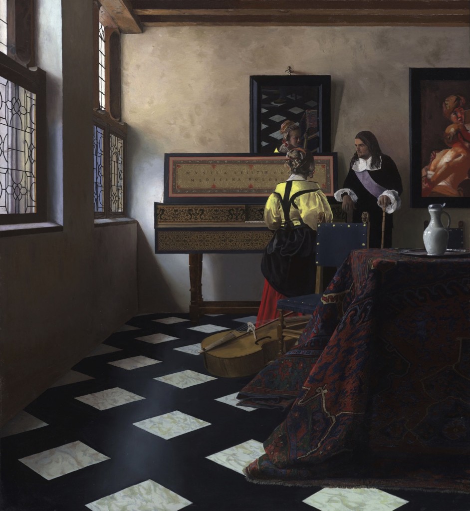
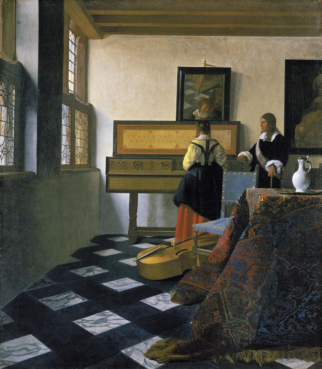
So. I haven’t even seen the movie yet, but based on what’s been published on the Web, it appears that Jenison’s painting differs from Vermeer in a number of ways. First of all, in the photograph at NPR’s site, if I’m right in assuming the painting is resting, face-up, on a flat surface next to Jenison, it’s larger than the original. He has given himself more canvas, which makes it easier for him to indicate more precise detail. Vermeer kept his images small, making it harder to do that and therefore required him to find ways to suggest detail without showing all of it. Jenison’s painting captures the pixelated weave of a typical Persian carpet’s mandala pattern. It reminds me of a still life from James Valerio decades  ago in which a flocked-looking bedspread is depicted with astonishing, uncanny precision. Jenison renders every last digit in that fabric’s pattern. Vermeer never did. He let go of that detail and invited you to imagine it on your own, which you do. In Jenison’s treatment of the harpsichord’s legs, the same kind of literal rendering holds true: you’re clearly looking at lathed hardwood, the color of the wood perfectly conveyed. Yet Vermeer doesn’t bother with that. In the original, you see the light in the room when you look at those furniture legs and the legs themselves all but fade into ghosts in the glow of the sunlight shining onto the floor in front of the instruments. Vermeer is more interested in the invisible light in the foreground air than the legs seeming to fade away behind it. The color of Jenison’s bass violin is a wonderful brown, but Vermeer’s violin has a honey-colored hue missing in Jenison’s—and that hue calls out to yellows elsewhere in the harpsichord. The painting Jenison chooses to hang on the wall behind the instructor seems miscalculated and draws attention to itself in a pleasant way, while Vermeer’s remains almost colorless, serving as just another rectangle in a row, from window, to harpsichord and mirror, to chair, and then the painting on the right—it echoes and completes the other shapes but otherwise almost isn’t there. It doesn’t draw your eye away from the lesson itself. Most of all, Jenison loses the marriage of the yellow blouse to the blue chair in Vermeer’s painting. Vermeer’s cornflower-blue was one of his most personal and consistent choices, usually paired with a pale yellow. Girl With a Pearl Earring offers probably the most famous example of those colors. If you’re going to do Vermeer, you pretty much have to tackle those colors. Jenison darkens the chair in an elegant way, showing off the shine of the brass tacks to greater advantage, but he loses the music of yellow and blue in the process. It doesn’t take anything away from his achievement: he wants to show how Vermeer’s technical mastery can be equaled. He succeeds. The question is: what does one do with the technology at one’s disposal? Vermeer does one thing; Jenison does another. Those two colors are an element of what gave soul to Vermeer’s work. He relied on a particular blue and a particular yellow, and I think it was partly because they enabled him to bring the sun and sky into a room, in harmony with the light they were bestowing on Delft from outside his windows. In the original Music Lesson, the blue and yellow are very faintly echoed, as well, in the color of Vermeer’s wall where the shadow has the faintest violet tint and the sunnier parts of the wall lean toward yellow. Jenison’s wall seems mostly brown.
These are all choices it would be possible to avoid, if you were really trying to forge a Vermeer. Yet there are other, more elusive and significant ways in which Jenison’s painting departs from the master’s work that underscore why Vermeer is so revered. Granted, it may be the photograph and the reproduction altering Jenison’s color, but he changes the way the reds work in the original Vermeer. In Jenison’s painting, the girl’s skirt has become a distinct red that stands out on its own, linked to the reddish tones in the carpet, a bow in the girl’s hair, reflected in the mirror, the details in the harpsichord’s lid, and the bloody-looking colors in the painting hanging on the wall. (That painting seems like a quirky, intentionally defiant touch from Jenison, a discordant announcement that he has no intention of being Vermeer, just proving that he can equal or surpass the master on a technical basis.) Yet Vermeer’s warm tones lean toward orange rather than red, and they are placed to serve as a kind of pivot for the rest of the painting: the skirt, the carpet, the details in the lid, and—here is where the difference is significant—in the face of the instructor. The way Vermeer indicated the shadowed areas of the man’s face share the same orange as the other three locations in the painting. Not only does that orange facial tint pull the man into the woman’s field of gravity, it helps unify the entire image, and, most of all, works the way the harpsichord legs work: the face seems to dissolve into the warmth of the light and simply glow as a condensation of the light rather than an object with its own distinct reality. This is where Vermeer’s brilliance became unique: he could enable you to see an entire scene where everything has an utterly convincing sense of weight and presence, and yet he also, at the same time, lets you to see nothing but a field of light and color so that all the objects in the painting seem to be made of that light, the way particular notes exist only as part of a song that surrounds them.
Proust celebrated Vermeer’s work, I think because his aims were so similar to what Vermeer accomplished. Both Proust and Vermeer portray everyday routines with amazingly particular detail–yet in a context that makes all of it serve as a window into a sense of the eternal. You are looking at a fleeting moment that, paradoxically, feels timeless. This is where Vermeer couldn’t help himself: where his involuntary choices (only an oxymoron will serve, here) in simply trying to get things exactly as he wanted them to look, always seemed to open a little door of perception into what’s completely immune to historical, economic, social, and even personal influences. The quality of light in a Vermeer painting seems to expand to convey intuitions about time itself: and that’s where words about what Vermeer attained especially fall short. Looking at a Vermeer you have a sense that immortality isn’t an illusion, and yet all you’re actually seeing is a woman pouring milk from a jug. Looking at Jenison’s work, you see a life you wish you had, full of things you wish you could own, with people it would be fascinating to know. Yet there’s nothing transcendent in that light, that color. It’s a superlative painting, but it isn’t Vermeer, and the ways in which it falls short show why Vermeer’s achievement was more than the sum of his methods. Jenison’s invention turned him into a fine painter, but Vermeer remains out of reach.
highlight of the afternoon. thanks for the post