No ideas but in things
Frederick Hammersley’s notes for possible titles
To live and work by inspiration you have to stop thinking. –Agnes Martin
Frederick Hammersley was a sort of visual Taoist. Everything in his work seems to emerge out of a creative tension between polar opposites. Even his titles often depend on the polarities of a pun. If something in his work is pregnantly curved, it will be answered by razor-sharp angles elsewhere. In his organic images, the paint seems as irresistibly pure and fresh and new as tinted icing on a cake, yet it will be surrounded by a frame that looks salvaged and restored, as distressed as driftwood. These one-off, hand-crafted wooden frames—the urge to run a fingertip across them was mighty strong when I saw his work in 2011—are countered by the thin, low-profile lines of the floater frames that contain his geometric images. He worked on comparatively miniature canvases for the organic paintings and built the shadow box frames seemingly to bulk them up, and the frames work as yet another essential, polarizing element. They are almost prosthetic, a completion of the work, different from the way Howard Hodgkins integrated his frames with the work by making them a wider surface for his paint. With Hammersley, the frames are idiosyncratic, original, married to the painting rather than subordinate to it, making the painting a distinctly three-dimensional object, physical and situated in a particular place in front of the viewer’s body, a fellow traveler through time, smiling with an unspoken individual history. The painting sits inside the shallow box, without seeming to touch it, at rest, at home.
In these organic paintings, black and white wrestle as opposites often in their own tiny zip codes, yet they are segregated in such a way that their polarity is enveloped by the larger polarity between this opposing duo and the various peninsulas of luminous color around them. It’s wheel within wheel of opposing elements, smaller polarities within larger ones.
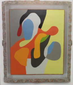
Group Insurance, Frederick Hammersley
Hammersley’s organic shapes look anatomical and informal, hand-written, as if they could be cartoon X-rays of whatever is going on inside a Dr. Seuss figure. His lines feel as recognizable as a signature. The coloring book shapes allow him to juxtapose one pure color against another. The tones glow with delight, a calmly heightened response to the experience of seeing one spot of pure color next to another. They offer understated, captive ecstasies. Their color harmonies emerge gradually as you view them. The assertive, overconfident world of so much large-scale abstraction depends on its ambitious scale. Hammersley’s luminously colored lobes huddle and fold into one another like vulnerable newborns on small canvases; they almost need their frames to get noticed.
His geometric paintings are much larger, but not all that big. The work I saw at Ameringer McEnery Yohe (now Miles McEnergy) were square, ranging between three and four feet wide, small enough to fit on the wall of nearly any American house. As David Reed pointed out in the show’s catalog, Hammersley’s work was meant to be part of one’s daily life, a domestic companion, not something to visit on “high art occasions.” The structure of his geometries seem like an entirely dispassionate pursuit, like a multiplication table, a methodical working through of every possible recombination of variables, every last way to assemble a rectangle, triangle and parallelogram within a square. Yet even these angular images don’t feel impersonal or cold. Their amiable simplicity is what’s most striking. Often he worked in black and white, and rarely relied on more than three or four tones, keeping his paintings as minimal as they could get. And yet when he did venture into color in the geometric compositions, it was usually a lyrical departure into lilac, taupe, peach, or a muted green.
The work these paintings do is entirely perceptual. There’s nothing to decipher. Yet, against my better judgment, I’ve been lured back to my catalog of Hammersley’s work recently because of their coy, elusive titles. This troubles me. Normally, I hate titles and the way they offer a foothold for intellectualizing a painting. Conventions notwithstanding, a date would suffice. With plenty of notable exceptions, titles usually strike me mostly as an artifact handy for taking inventory. Even Guernica would have been just as well served by its title if any other town had been attacked—a different place-name wouldn’t have diminished the painting’s shrieking protest, and Untitled might have conveyed an appropriate speechlessness. With a host of exceptions, the names of paintings are like the names of people—you need them mostly to talk about them or add them to somebody’s list. Yet Hammersley’s titles are both playfully irrelevant to the silent work his paintings are actually doing, and—like those weathered frames—a way of situating the work for the idle pleasure of musing about it. The question, as always for me, is whether or not thinking about a painting matters at all—since, for me, painting (like music) does it’s most essential work immediately, before any thought about it can get in the way.
I’ve been leading myself down this garden path this summer, though—against my better judgment—and I’m two thirds of the way through for a triad of paintings where naming the work will offer more ideas than my typically pedestrian titles do—and so I’m going back to Hammersley to reassure myself about this. When I did my first painting of paired jelly beans and bullet casings, I was looking for a way to combine soft and colorful objects with something hard and shining. It occurred to me that a Jelly Belly might fit into a bullet casing as a whimsical substitute for a lead slug. The idea made me uncomfortable because it felt like a facile metaphor, like a distant nod to the famous photograph of the protestor who inserted a carnation into the barrel of an MP’s rifle during the Vietnam era. I have no passion about guns nor about controlling their ownership. Gun owners should be allowed to own whatever they want, under the law, knowing that they’ll likely never need to fire them. Gun control is virtually pointless. With millions of weapons already out there, you can’t, as they say, put the genie back in the bottle. All the guns anyone will ever need are privately owned already and will never be seized unless we end up living in a completely different country. If the nation wants to ban particular semi-automatic rifles, we should do it, but it won’t change the culture nor really stem much violence. If bullets made of sugar are social commentary, it’s my wry, impertinent version of it. The problem is not in our Ninja stars, but in ourselves.
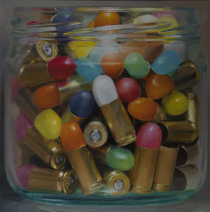
Jelly beans/bullet casings
None of this has anything to do with why I painted the image. Jelly beans and bullet casings seem to belong together as polarized formal elements, visually, regardless of whether or not they form a coherent or unambiguous assertion about anything at all. Yet it’s hard not to think about what they can be construed to mean, though—and that makes it doubly hard to resist the urge to make the painting. The title arrives after the image, and in this case it has involved weeks of musing, weighing alternatives, finding the lightest touch possible and then discovering a way to tie things together. It took me more than two months to come up with a title for my second painting of bullet casings with jelly beans, mostly because I had nothing in particular that I wanted the painting to convey, intellectually. The temptation is to draw from my own long-standing or current preoccupations, though, and this is what I’ve ended up doing.
For the small series it belongs to, a subset of the jars I’ve done over the past decade, I’ve wanted to do three of them containing something other than jelly beans or M&Ms or Chiclets, and so I’ve been on the alert for objects that are roughly the same size as something small and edible, with some kind of distinctive sheen—if not as colorful as candy, then something metallic. The motivation to do the first candy jar arose as a response to my love for color field painting and abstraction in general. I wanted to find a way to stick to still life painting—technically the jar paintings are a single object placed on a flat surface containing multiple repetitive parts—but at the same time I wanted to build the image out of nearly uniform areas of color, pieced together to form a pattern that extends across nearly all of the canvas. Color was the primary motivation. Thiebaud, Mattiasdottir, Matisse, Porter, Morandi, and especially Janet Fish used a personalized palette to make color nearly an end in itself in their versions of a still life. Without taking overly painterly liberties with what I saw, I wanted to find a way to do something similar, to use color to create a persuasively real image that also has qualities of an abstract pattern. I enlarged the jar and presented it so that it nearly fills the entire canvas, pushing everything it contains forward toward the viewer so that it seems to be hovering at the flat surface of the canvas. The image toggles back and forth between representation and abstraction, and the fact that the same but slightly different set of objects is clustered so tightly together in a repetitive pattern hints at all-over abstraction.
With one jar of candy after another, using color and shape to explore variations on the same basic structure, I had little interest in doing more than numbering the individual paintings according to the order in which I’d painted them. But with my first departure into something other than sweets—the first painting I did using diaper pins a few years ago—I recognized the opportunity to venture elsewhere with the titles. A friend, Sheri Colao, had suggested the subject when I was visiting her and her husband Brian, in Pompton Lakes. Until then, I’d had no idea these colorful pins even existed. But I liked the idea, found them on the Internet, and ordered enough for the project. At the time I had planned to paint two different images containing the diaper pins—one jar full of open pins and one full of them safely closed. After finishing the first of the pair, I began to free associate in order to come up with a title and the fact that the pins were all open and jabbing toward one another in a seemingly disordered jumble suggested the perils of an unrestrained, impulsive, or rebellious life. (Or, maybe, social media?) Hence, Cutting Loose and Breaking Free. So I ended up with a conceptual label for an image that grew out of nothing more than a craving for certain formal qualities in the image. As counterpoint to that first painting, the smaller companion in this current series of jars will be named Reticence.
For the second coupling of jelly beans and bullet casings, I’ve drawn from my recent reading of Tolstoy’s Anna Karenina and his later non-fiction inspired by his code for civil disobedience and, at least for now, I settled on Resist Not, shortened from Resist Not Evil, though the first canvas ended up with the slightly ironic title that seems too obvious: Gun Control. The new title suggests that maybe both gun owners and gun opponents might find a better approach by refusing to fire back at their opposition, intensifying an anger that simply spurs further polarization. Yet I find nothing in this issue very compelling. I grew up borrowing a friend’s .22 rifle and shooting targets at a range—it was a fun, coming-of-age ritual. Guns are a part of life. But Tolstoy was right: the more you fight your opponent, the more he fights back. Imagining a gun that merely stuns, or dispenses candy, might suggest a form of non-violent resistance—or no resistance at all, which was the original advice. “Resist not evil” is an admonition adopted first by Tolstoy and then by Gandhi and Martin Luther King Jr., who both scaled the Russian’s advice into social change
And on it goes, as my thinking mind improvises on an image that wasn’t inspired by any of these considerations.
I’ve played all sorts of interpretive games this way, as Hammersley did when he playfully improvised on his tones to puzzle out his titles. In fact, the past couple days, I was thinking of mottos or guidelines that come in threes, trying them out, but none of them really fit. Silence, exile, and cunning. No. Hope, faith, and charity. Not really. Waking, dreaming, deep sleep. Life, liberty and the pursuit of happiness. Paper, rock, scissors. Moe, Larry and Curly. Still thinking of Tolstoy, I even looked up lists of monastic vows, of all things, and found one that actually almost applies: chastity (restraint), poverty and obedience. What three admonitions could be a larger repudiation of current Western culture? I could almost twist those notions to fit, but it would be a stretch. But the point is that none of this ex post facto significance motivated me to make the paintings, the third of which should be finished by the end of August. My interest is working with formal characteristics, smuggling certain kinds of color into a painting, and letting the integrity of the image generate it’s own ideas, or none at all. Bypassing the discursive brain is how most or all of a great painting’s work gets done.
Comments are currently closed.