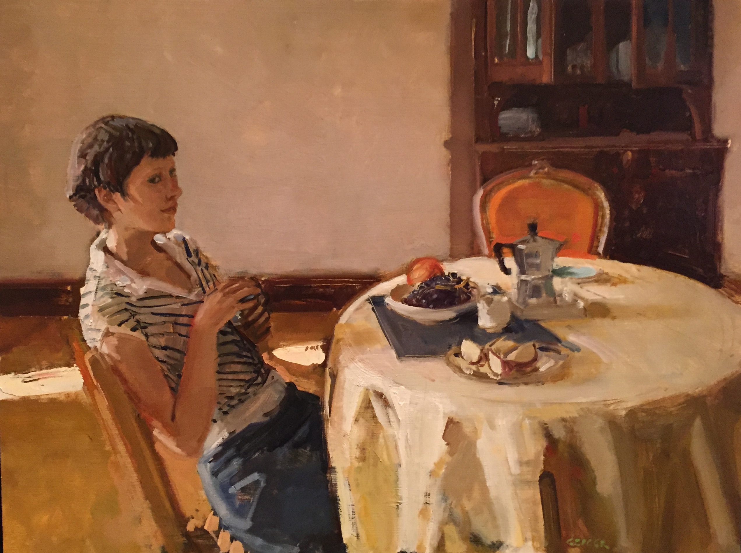
PP

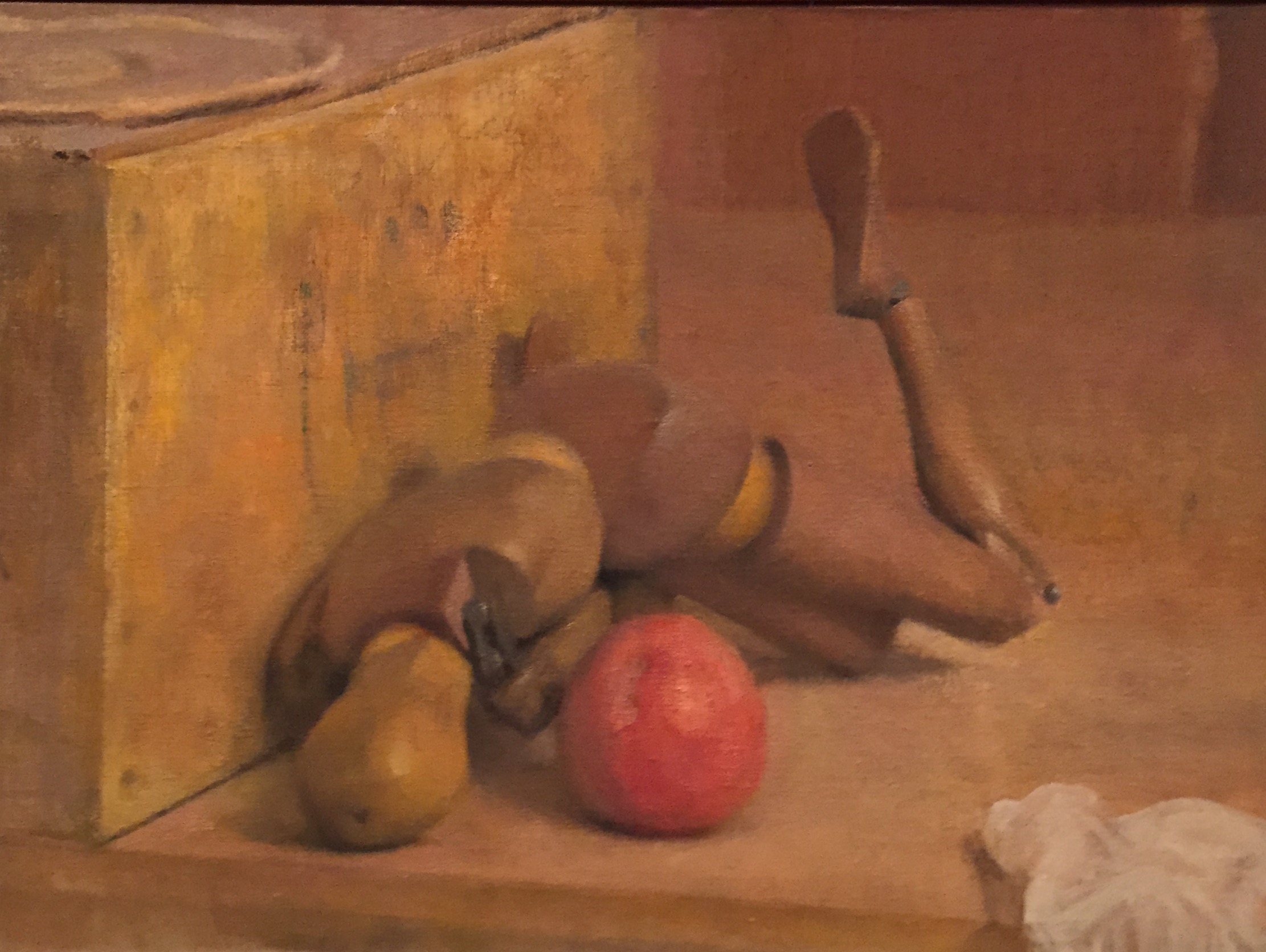
Still Life, David P. Jewett, oil on linen on board
This stove is painted with a soul–there is as much beauty and religion in this painting of this black iron stove as in any of your so-called religious paintings. That is sacred–you have put your heart in it. One of the greatest things in the world is to train yourself to see the beauty in the commonplace . . . a freight car or a wash line of clothes . . . — Charles Webster Hawthorne
At two recent exhibits in Maryland, I saw paintings far quieter and more subtle, and therefore a lot more emotionally compelling, than the superficially clever, high-priced spectacle that routinely flows through the art market. It was a genuine relief how these shows created the sense of an uncovered tradition in the practice of visual art reaching back into the 19th century (and maybe further), a tradition where less is more, where the small trumps the huge, and silence is more inviting than showmanship. At first the paintings can look familiar and comfortable, as if they were witnesses to the past relocated into the present and given new names, but when you apply some sustained viewing to them—and listen to someone like Matt Klos, the curator for A Lineage of American Perceptual Painters, which just closed at The Mitchell Gallery—these painters can be surprising, unpredictable, and revelatory. Even the oldest, historical work Matt assembled for the show in Annapolis felt alive, fresh, and even offbeat, offering qualities I hadn’t noticed before even in a few of the paintings I’d seen in the past.
I met Matt a number of years ago when I began exhibiting at Oxford Gallery here in Rochester, where Matt grew up. I liked his work immediately and began to follow what he was doing over the past five or six years. I wanted to ask him more about how much effort was involved in putting the show at Mitchell together, but we didn’t have enough time to do that in the three hours we spent together, too busy talking about the work and exchanging thoughts about painting in general. Theshow is built around the premise that Charles Webster Hawthorne and Edwin Dickinson are the patriarchs of perceptual painting. Dickinson was born in Seneca Falls, about an hour’s drive from my home here in Pittsford. In his short essay for the exhibit, Matt suggests how hard it can be to define what perceptual painting is, using Dickinson’s own work as an example: “Sometimes (Dickinson) painted quickly and sometimes slowly over the course of years. Some of the work was significantly abstract and some highly realistic. Some paintings were dreamlike and poetic while others were mathematical and geometric. When taken as a whole, Dickinson was a painter who seemed more interested in the connections of things (objects, people, landscapes, history, and stories) than in the divisions between them. His art was that of wholeness.”
Anderson
The “school” of perceptual painting can be as hard to delimit as Dickinson’s own work. Matt showed how it began, with Hawthorne, from whom Dickinson learned painting. I’ve always felt that Lennart Anderson and Fairfield Porter are the two other key influences in this group, both of whom were well-represented. Putting Dickinson, Anderson and Porter side-by-side is enough, alone, to show how broad a category perceptual painting can be. After our visit, Matt sent me a pithy overview of the “lineage”: “Perceptual Painting hearkens back to Hawthorne and his influences, American impressionism and William Merritt Chase, and the painting going on at the time, Duveneck with the Ash Can school and Albert York and American visionary painting, the Tonalists, and even Inness as a more painterly parting of the ways with the Hudson River School, which was the prevailing American style of the early 19th century. Although it may be hard to imagine now that these painters were anti-academic . . . anti-establishment at the time. Dickinson’s influence can be traced through Lennart Anderson and George Nick, his most influential students. Porter and Downes, although having no real ties with Dickinson, have both ‘moved the meter’ for many contemporary representational painters as is evidenced by those in this exhibition.” This summary is a good riposte to those, including me, who wonder if “perceptual painting” is mostly an umbrella under which to assemble what are simply examples of good painting, period. The heterogeneous collection Matt drew
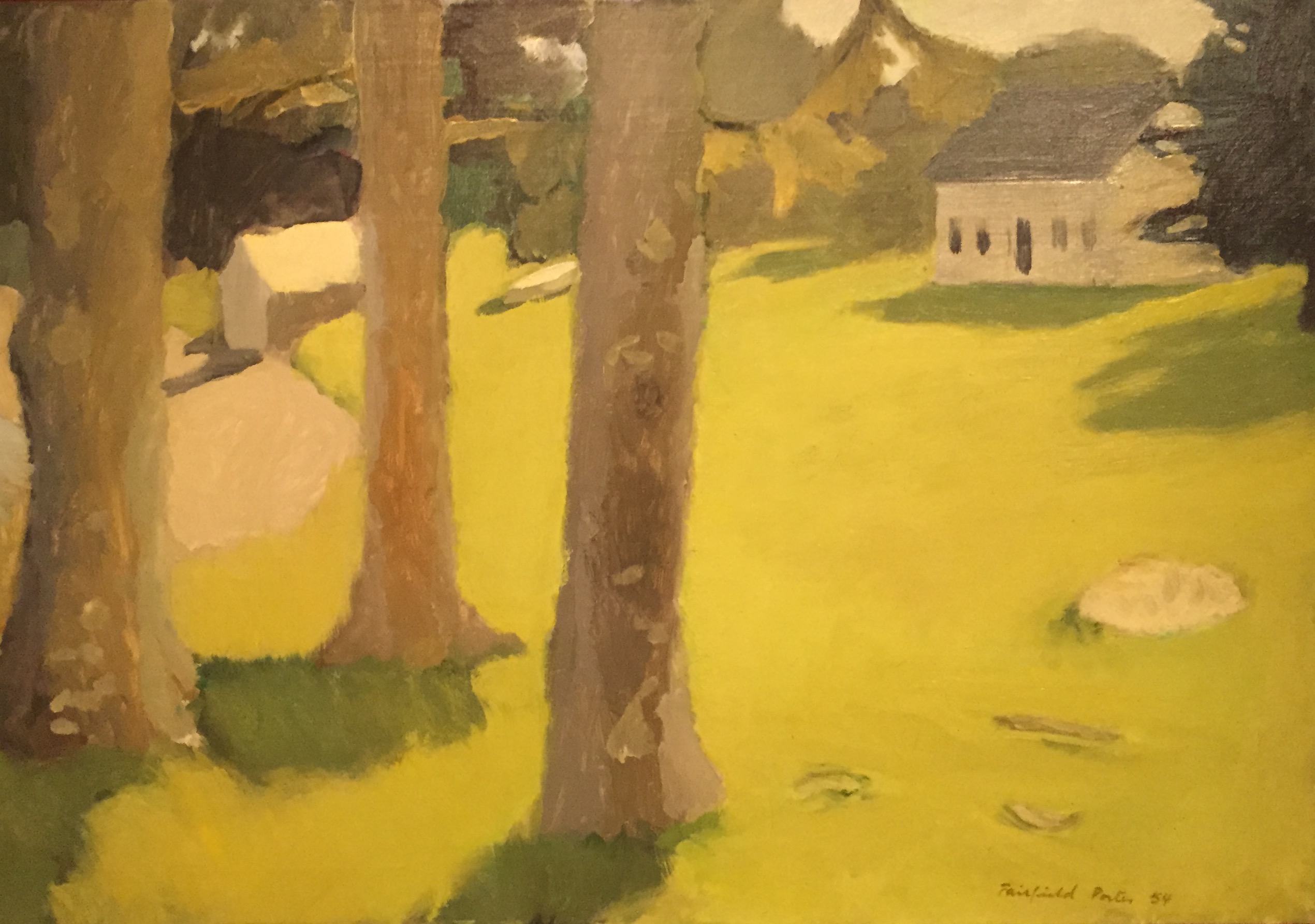
Porter
together did suggest that this category leaves room to do some very different things and still be in the fold, or at least huddle for warmth around its edges. Some of the work I saw fell outside the core of what I’ve come to think of as perceptual painting, since I first spotted examples of it from contemporary practitioners. Which means, I think, that it’s easier to say what it isn’t than to describe exactly what qualifies as PP.
Without question, it’s representational and it’s painted. Which gets me nowhere. So maybe before I describe what I think is the core ethos of perceptual painting—and I think that’s easier than trying to define it with a set of invariable rules—I’ll offer a checklist of what it isn’t, like a good Hindu sannyasi subtracting everything extraneous from his list of concerns on the path toward wisdom.
It isn’t (with occasional exceptions):
- Conceptual: Ideas and concepts can’t be distilled from these images and the images aren’t devised to illustrate ideas. Matt pushed back a bit when I suggested this, saying there’s plenty of careful, calculated thinking going on around and through the process of perceptual painting. But that isn’t what I meant. Hawthorne himself said, “You cannot bring reason to bear on painting–the eye looks up and gets an impression and that is what you want to register. Painters don’t reason, they do. The moment they reason they are lost–subconscious thought counts.” (Hawthorne on Painting, p. 22) And again, he said it’s ” . . . the earnest seeking to see beauty–in the relation of one tone against another which expresses truth, the right attitude. If you’re a thoughtful, humble student of nature, you’ll have something to say–you don’t have to tell a story. You can’t add a thing by thinking–what you are will come out.” (p. 66)
That last sentence is, for me, what painting represents. It conveys who you are, not what you think.
- Hyper-realistic: This rule seems hard and fast. No exacting duplication from photographic sources, but again, photographic sources weren’t disallowed. On the other hand, Rackstraw Downes was included, and his work certainly looks photorealistic to me, though Downes maintains his curving horizons don’t result from the use of a big lens or any lens at all. As a still-aspiring gentleman, I take him at his word, but still. Lennart Anderson has talked of relying on photography, in some paintings. Being loosely reliant on photography seems to have its place, though working directly from life is a preference this group tries to honor.
- Ironic: Pop Art’s cheerful, chilly postmodern ironies are anathema here, though there were small grace notes of humor in these shows. Mostly they were surrounded by a Tonalist yearning for something larger than the fleeting present moment—which is both there and not there in what’s seen—a haunted quality I feel almost everywhere in these paintings. Matt quoted Francis Bacon: “Painting deepens the mystery.” In a group email Matt sent out about the show after my visit to Maryland, he included a quote that’s a good indication of how earnest this group is about the virtues of painting: The painter Jake Berthot in a letter to Ryan Smith once wrote, “The mind lies and is capable of making a justification for anything. The eye and the hand are incapable of lying. Look with your heart and it will tell you through your eye what your hand needs to do.”
- Pretty: The paintings are almost always beautiful but they aren’t exactly pretty. The subject matter is almost purposely unconventional when you put it into the traditional buckets of still life, the figure, interior, landscape, though again there was work that was more conventional in those modes. Hawthorne told his students to find the ugliest location in their vicinity and paint it: he specified the train station. Hawthorne told a student: “You have gone pretty again this week. Your apples would break into a thousand pieces, they are so precious and lacking in vitality. Try to do ugly things so that you make them beautiful . . . color in nature is never pretty. It’s beautiful. Next time select an old coal scuttle on the beach.” (p. 51-52, Hawthorne on Painting)
- Heroic: PP is about as anti-heroic as painting can get. No one wants to change the world here: they simply want to see the world just as it is. Light is beautiful no matter what it falls on. There’s no upper-case communication here: if these painters were poets, they would work on a typewriter inherited from e.e. cummings. The “meaning” of their work isn’t detachable from the experience of looking at the painting, just as the meaning of an autumn afternoon is more or less the experience of an autumn afternoon, in its wholeness.
- Spectacular: These painters often seem to be trying not to be noticed, except by other painters. Edwin Dickinson can be magnificent, but he’s definitely not showy. As Matt Klos nicely put it in the two-hour tour he generously gave me, it’s as if you have to let your eyes adjust to the darkness of An Anniversary in order to spot what’s there and in some regions of the painting your guess is as good as mine.
How to describe what did belong is more delicate. The work chosen by Matt at The Mitchell Gallery and by Matthew Ballou for Subject and Subjectivity at Anne Arundel Community College (dominated by Matt’s collective of East Coast perceptual painters, a group founded in Philadelphia) was mostly painted from direct observation. The paintings derived much of their power from being blatant about how much the paint itself wanted to be seen for its own sake as paint (Clement Greenberg, off in the wings, sighs with relief)—scraped, pushed, smeared, scumbled, layered, all to make the image more immediate, not to distract from it. Again, though, sometimes the abundance of paint nearly obscured the image entirely, as in Stanley Lewis’s piece, where the topographic complexity of his mounds of oil made it seem the paint could have been an inch deep in places. In general, this work is more ambiguous than precise, creating an instability that leaves the viewer wanting just a bit more from the image, circling around it with imagination to figure it out, fill gaps or find a coherence that seems just beyond reach.
Campbell
I love the way the images in these paintings follow Fairfield Porter’s advice and seem to have been “found” rather than set up. As Porter put it: “The truest order is what you already find there, or that will be given if you don’t try for it. When you arrange, you fail.” Some must have been at least partly arranged, but even those looked casual, almost accidental, as if things had been picked and grouped at random, when not left standing as they were. David Campbell likes to cluster a few favorite objects into eerie minimal scenes. One painting in the Cade show involved a life mask and frosted glass and foil, creating a weird and slightly funny angle on the world Campbell managed to tinge with menace. David P. Jewett stole the show at Cade by putting together a still life of small origami-like geometric objects (shown at the top of this post) to create a dreamy, riveting visual puzzle where things seemed to vibrate and merge into one another, almost levitating in a soft bath of light. More typical of the group, Peter Van Dyke’s comparatively
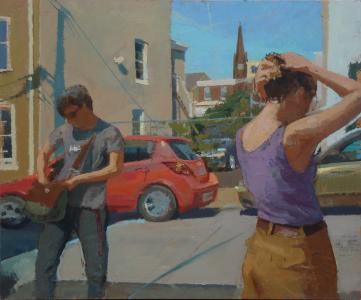
Van Dyke
large canvas seemed utterly un-set-up, offering a freeze-frame of two figures caught in mid-motion in a parking lot of a town not far from Philadelphia. It looked as if he started with a uniform undercoat of blue and covered most of it with other colors to model the objects in the scene, letting the blue peek through in the shadows and windows. This one reminded me of a Garry Winogrand-style snapshot, offered as a study in areas of interlocking muted color. Just one spot of color next to another, as Hawthorne advised his students, reminiscent of Porter’s most precise paintings, though a little more intricate and varied than Porter’s scenes. Matt Klos’s own work, chosen by Ballou, were humble glimpses of objects in an interior twilight, coming forward out of darker surroundings, what appeared to be a discarded dollhouse in Bluffs, and a few things on shelves in a basement in Sediment (the title referred to the dust that had settled on the vase, I think). This latter painting was understated and painterly, yet somehow suggested a shallow physical depth you could reach in and measure with your fingers behind the vase.
One notable feature of these two shows: women were about as well-represented as men. The list of female painters was long: Anne Harris, Catherine Kehoe, Gwen John, Gillian Pederson-Krag, Susan Jane Walp, Eve Mansdorf, Erin Raedeke, Carolyn Pyfrom, Megan Schaffer, Elizabeth Geiger, and Shannon Soldner. Matt found great examples from all of them. In fact, it’s impossible to go into enough detail about how fine some of the work was from so many masterful painters: Philip Geiger, Charles Ritchie, Brian Rego, Stanley Lewis, Neil Riley, and many others.
Philip Geiger
In general, the images were mostly of everyday moments, things that might have been all but forgotten if someone hadn’t unpacked some brushes and gotten to work. Chardin’s or Bailey’s formal arrangement of recognizable and familiar objects on a shelf or table—there was nothing like that in either show. And even the human figures looked only provisionally perched wherever they happened to be. (Again, there were a few exceptions.) The ordinary and everyday reigned, a well-appointed living room or family room from Mark Karnes glimpsed through a pre-Depression-era curved inner doorway, (which was probably my favorite painting from both shows); a couple acquaintances, one sitting and the other standing, in a living room by Tim Kennedy, one of his best canvases, and a line of trees in the snow by Neil Riley, painted with gestural aplomb, as assured and precise as calligraphy in its spontaneity. Fairfield Porter’s sense of the world’s informality ruled here, the marvel and interest and potential of the most ordinary things. Rackstraw Downes was undoubtedly included because his subject was both the antithesis of pretty and something thousands of people probably tried to ignore on a daily basis in
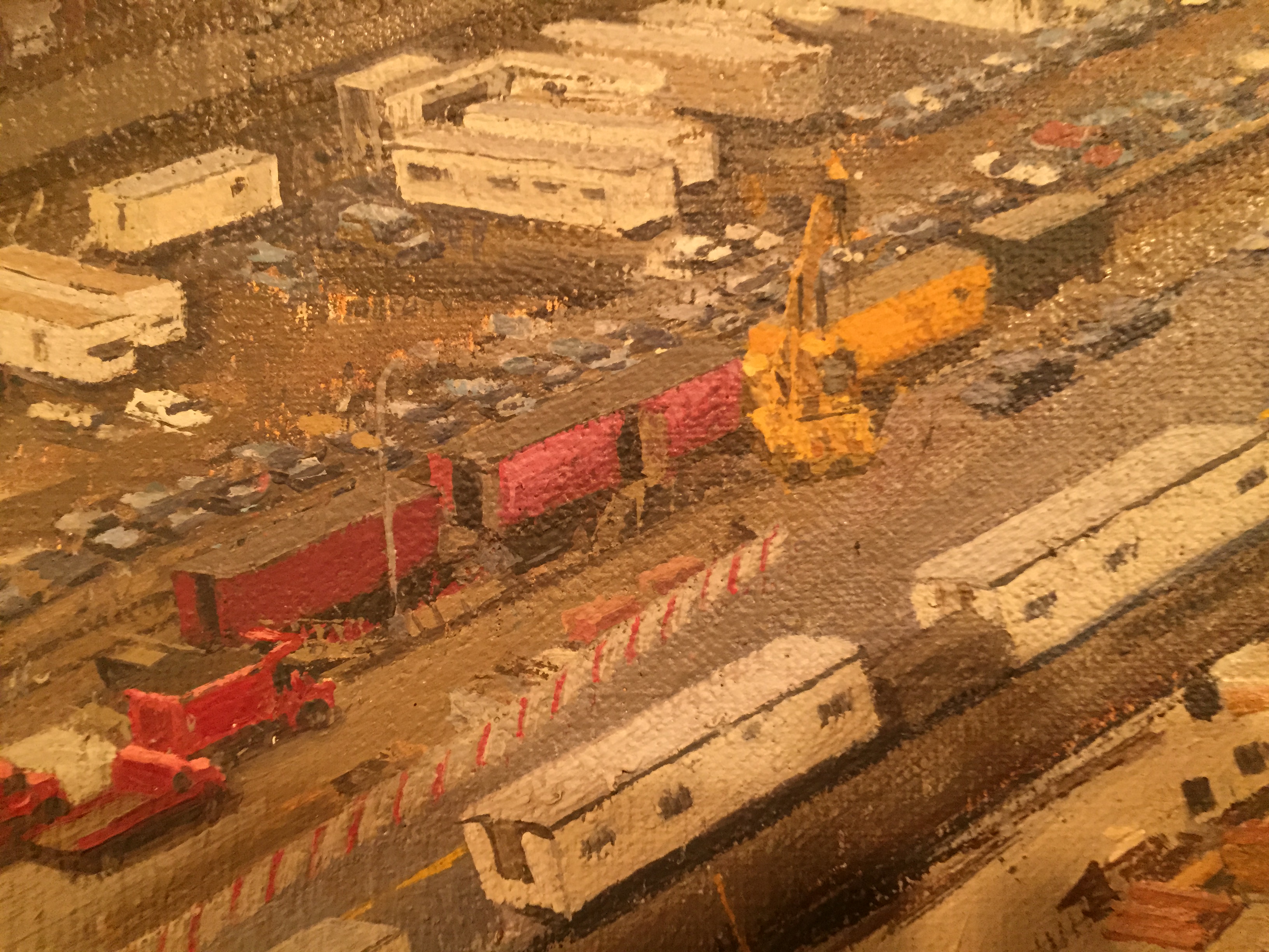
Downes, detail
New York City as it happened–the equivalent of Hawthorne’s train station–with nothing picturesque built into the subject from the start: an image of the construction of New York City’s convention center. The painting is fascinating because of its sustained intensity of observation and craft. It communicated the long-term attention required by an image this complex and inclusive, the marvel of having simply ordered so much relentless detail into coherence. (The fictional drummer’s agonizing, ceaseless pursuit of excellence in Whiplash comes to mind. Endurance is a virtue in painters too.)
These painters are not only trying to represent what they see in a way that triggers intimations of an entire world of experience around a commonplace moment. They’re also bearing in mind how painting evolved beyond representation in the last century. Many of them are balancing their realism with concerns about how the images work as a flat puzzle of shape, color and value—as Porter did, always seeing the abstract in the representational and vice versa. The flat pattern of their images on the surface work in concert, or play a tug-of-war, with the illusions they convey. The visible counterpoint between what you think you see and what you know you’re actually looking at—just a pattern of paint—gives this work a sense of earnestness about the physical act of painting, and the virtues of paint’s physicality, as an end in itself, which Abstract Expressionism brought to the fore.
One of the delights of walking with Matt through the show at The Mitchell Gallery was the way he pointed to one Dickinson painting after another (there were five pieces, I think) and said nothing but: “Gorky. El Greco. Braque.” I think maybe I’m the one who said “Braque” but I probably only beat him to it by a couple seconds. El Greco makes his presence felt in the greatest painting in either show, An Anniversary, where the central figure, Dickinson’s father, seems to be sitting under a spotlight on a stage, surrounded by the materializing memories of his entire life, his beautiful and much younger new wife (in heels no less), his brother dead by suicide, assorted other people from the past, a little crowd of objects at his feet including what appears to be a whole, recently-caught catfish, complete with half a lemon—one small wry detail that made me laugh. (We’re served the whole fish, plus the garnish.) El Greco, and by implication, expressionism, haunts this painting in the way in which this central, very old man seems almost to be melting, pulled forward and down by the process of aging, elongated and almost struggling against the paint itself for attention, while the crowd of memories around him look vital, alive and solid. Dickinson did exactly whatever needed doing with his paint in this canvas, depending on what he wanted to show in whatever area he was developing, without requiring an all-over consistency in the way he handled the medium. With Sargent, for example, you get bravura brushwork everywhere. Dickinson does what’s required wherever it’s needed on the surface. He renders a beautiful ceramic tureen
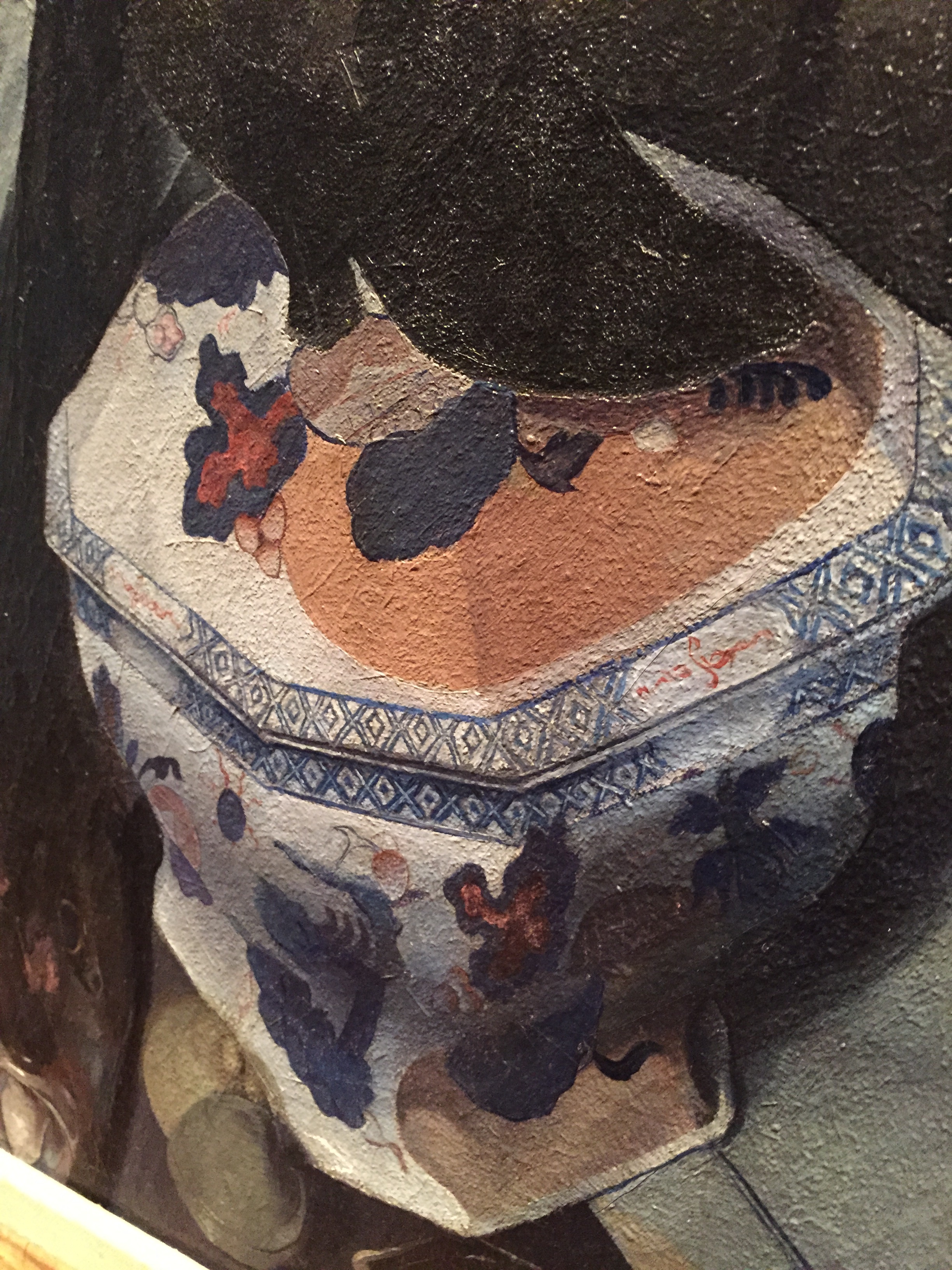
Dickinson’s tureen
in the bottom right corner with obsessive detail and accuracy and no indication of gesture. This region of paint has the matte surface that Braque loved, as if sand had been mixed into the oil here as well. Yet move your eye slightly toward the center and find the highlight on a large, glowing blue vase indicated with a single De Kooning slash of white paint smeared from the edge of a knife. Like the Tonalists, these artists paint both thin and thick in a single painting, asserting or effacing their own handiwork, using whatever technique is needed, varying what’s done in different parts of the same picture—gently calling your attention away from the image toward the paint itself only to send you back to what they depict. I think this emphasis on improvisation with paint, on the spot, adapting to whatever has been happening with the paint as it’s applied, responding to the needs of the image as the painting develops by solving problems with any technique that works, is central to what this group does—and shows their ability to assimilate and put to use methods and styles from other periods and schools of painting.
From Hawthorne on Painting, the first page goes to the heart of what perceptual painting does:
“We go to art school and classes to learn to paint pictures, to learn our job. Our job is to be an artist, which is to be a poet, a preacher if you will, to be of some use in the world by adding to the sum total of beauty in it. We must teach ourselves to see beauty in the ugly, to see the beauty of the commonplace. It is so much greater to make much out of little . . . .In every town the one ugliest spot is the railroad station, and yet there is beauty there for anyone who can see it. Don’t strain for a grand subject–anything is a painter’s fodder.”
Hawthorne advised his students to do this by simply putting one spot of color next to other spots of color and leave drawing to emerge through the process of shaping object from a few large areas of tone–to let the shaping of paint create the drawing, not do a drawing and fill it in. Which leads me to say (conveniently), that this is about as close to perceptual painting gets to a cardinal rule: the elevation of shaping values and colors rather than working from lines.
Yet behind the technical instruction Hawthorne offered, it isn’t really about rules, but about a relationship to life, through looking. For me, PP is all about conveying the momentary nature of things directly, instantly, at a glance, visually and only visually, without the need for interpretation or reasoning about what you are trying to express or capture. Yet, by making An Anniversary itself the pivotal painting in the show, Klos seemed to be showing how the intuitions triggered by looking weren’t always enough for Dickinson. An Anniversary is an ambiguous story, but it’s a story. It’s pretty baffling without some commentary on Dickinson’s life, and is still mysterious even when you know some of his biography—as Matt provided. You need to reason about it in order to get the most from it. It’s a narrative painting, offering much to talk about, so in a way it seemed to have crashed this party. (There were only abbreviated narratives suggested in other paintings I saw by Campbell, Van Dyke, and Hawthorne, himself.) An Anniversary seems to offer you an entire life at a glance, a long complex tale compressed into a single image. It reminded me of past paintings with overt things to say about particular events, things readily extracted and clarified with logical analysis: The Surrender of Breda, Las Meninas, or Simeon’s Song of Praise. (Or take your pick from dozens of other examples, including most of Bruegel.) This painting, though, remains more ambiguous than any of those earlier works, though there’s just as much calculation behind what it’s meant to show you as a painting with a more transparent intent. You can read about the Surrender of Breda, and Velasquez illustrates it for you, while adding commentary on how victors should treat the vanquished, in the way he depicts it. This was all planned into the image before he even constructed it. Much of what his painting conveys can be conveyed with words, without seeing the painting. An Anniversary does what it does using the techniques of perceptual painters, though strictly considered it’s more than a perceptual painting, for me, a narrative, though it remains nearly as hard to pin down as any other painting in the shows. The image suggests a slightly Oedipal drama about an old man who fathered the fellow who painted this portrait, a painter who seems to be as haunted as the picture’s subject by the family he’s depicting. The clarity of the central figures melt into the phantoms that surface toward the edges. It has the grandeur of Shakespeare. Perhaps Matt’s most interesting choice in his curatorial role was to make such a seemingly literary painting seem a bit like an interloper while actually being the guest of honor.
Note: A special thanks to Lucinda Edinberg, assistant curator, and Hydee Schaller, gallery director, for opening The Mitchell Gallery on their day off, so that Matt and I could get a look at the show. It was very gracious.
Comments are currently closed.