Archive for the 'Uncategorized' Category
April 25th, 2026 by dave dorsey
Spells Being Cast
Daniel Sprick’s solo show at Arcadia Contemporary was an amplification and possibly the completion of his solo show there nearly two decades ago. As before, it presented a series of perfectly realized views of his studio, offering a sort of spiritual and psychological X-ray of his identity as a painter. Aong with the magnificent Raphael exhibition at the Metropolitan, What Remains provided a glimpse of mastery rarely seen in contemporary painting. Sprick’s work serves as an apt antipode to Raphael’s immense and passionate Italian warmth: these studio interiors seem to have been transported from cooler, darker Renaissance Germany, as if Hans Holbein and Albrecht Durer found a way to teleport Daniel Sprick into this century to show us how painting ought to be done. His sobriety and gravitas give birth to great beauty. Sprick’s handling of paint equals Gerard Richter’s. Sprick has that same perfection of surface, the rich texture of perfectly applied oil paint, feathered from one tone to the next, so characteristic of Richter’s work. Yet he also can make the paint disappear in the service to his visualization of objects exquisitely tangible in the manner of a Golden Age Dutch still life painter.
His vision is both mundane and hauntingly mysterious. Eldritch is the recondite adjective one might fish up for Sprick’s work, but it isn’t quite right: the lurking menace implied by that word isn’t part of Sprick’s world. In his earlier show he was a hungry ghost. His haunted, twilight vision craved a fully alive, productive interior space where he could recreate the incredibly subtle ways light falls on a fairly small collection of objects. There were a lot of bones. Yet these studio scenes weren’t catacombs but work spaces full of potential energy. It’s always a contest with Sprick, in a way, between the fascination of the objects themselves and the spell cast by that light. In his 2007 show, Sprick returned to a small set of objects again and again, like Chardin, arranged differently in slightly different areas of his studio, exploring variations of his theme, a mixture of classic vanitas painting with an intimate vision of familiar, useful objects, left in a state of handy disorder, waiting to be used. His pictures could both attract and push you away at the same time, like Holbein’s The Ambassadors, offering all the vitality and immediacy of lived experience, but with a strange fissure in the floor that turns out to be a ghostly human skull, elongated, leaking into the scene, a reminder of this world’s vanity.
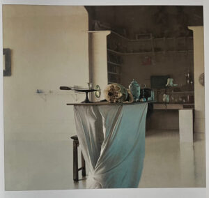 What was so remarkable about Sprick’s 2007 exhibition was how he illuminated his scenes with a diffuse natural light, often from two different directions. A warmer light flooded in gently from large windows to the left, in The Memory Jar, while a blue light, reflected off the opposite sky glowed in folds on the other side of the pedestal he wrapped in white fabric. This duality of light defined most of the paintings from that show. The cool, blue reflected light enabled him to bring his still life objects into greater relief against the ambient, pale Naples yellow of the more direct sunlight illuminating the rear walls and alcoves and shelves. Against that polarity of light sources, he juxtaposed the Dutch clarity of the foreground objects against the soft, diffuse, slightly unfocused rendering of the backgrounds. For those, he used a Richter handling of paint that creates the photographic immediacy Richter loved, mimicking the different focal planes offered by a camera set for shallow depth of field. It’s a subtle way to create a third level of balance between opposites: the overall feel of Northern Renaissance clarity and melancholy austerity in tension with the hazier contemporary warmth of the walls that seem to melt into the floor as they would in a certain kind of cinematography. The walls sometimes looked as if they were translucent frosted glass lit from behind. They have the warmth of sunlight but the emotional neutrality of a florescent glow.
The recent show breathes new life into his studio interiors. These images feel alive, crisp, fully present: the disjunction between the evocation of the past and our contemporary life has receded. His backgrounds are much more clearly defined, the floors distinct from the walls, and it’s an almost physical pleasure to see how he captures the sharp turns in the baseboards of a white wall now. He brings the viewer into a much more intimate relationship with what he’s depicting in various ways. His previous, almost monochrome palette, has advanced to a tremendous—though still restrained—sense of intense color. He has embraced a new range of color with quiet passion. He uses these highly saturated areas sparingly, bringing the eye toward the sweetness of a brilliant red or shimmering blue, while creating a more neutral field of light around those focal points.
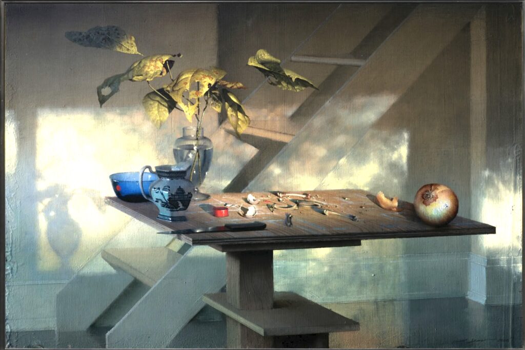
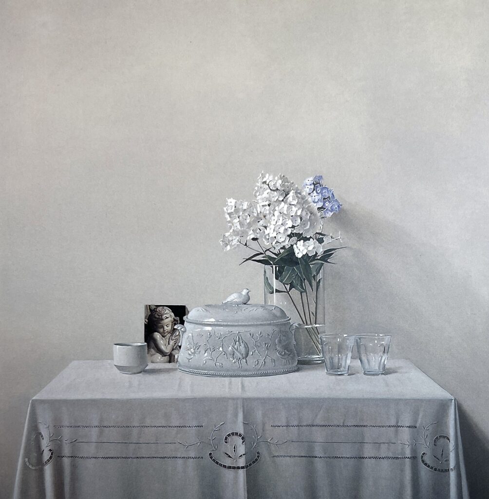
Spells Being Cast offers a standard around which much of the rest of the work revolves. As he did twenty years ago, Sprick uses his tables, pedestals, walls, and now a set of stairs at the back of his studio, to create a geometric, compositional grid as a foundation for the objects close to the viewer. He can create an almost abstract grid in the arrangement, the setting, in the lines and forms of what he’s showing. He composes his scenes so that a structural grid is there, inherent in what’s seen. In this painting, the lyrical color is concentrated in the objects, huddling near the rear corner of a pedestal holding up a square of high-density plywood. In the one corner, a blue glass bowl, a brilliant red pill box, a glass vase in which he has arranged some decaying catalpa leaves, all of it balanced, at the opposite corner of the plywood slab, by an onion. Between these opposing corners he has strewn his familiar small chicken bones, a couple cracked egg shells, and a knife. What’s most marvelous, though, is the direct light flooding across the scene from a large window behind the viewer. If I had to guess, I would say it’s an autumn light from the first hour after sunrise. This is what he has evoked with his background: the direct light shines through a tree outside, then through the window, which is fully in view via the shadows cast on the back wall. The shadow of the vase establishes the direction of the light and, then across the white staircase, the wall and the floor, you begin to see how the sunlight is casting muted bronze and sienna tones, filtered through the turning leaves outside. Vanitas remains, in a way that doesn’t require a skull. It’s incredibly subtle, in the decay of the catalpa leaves, the discarded bird bones, the broken shell and the autumn leaves. To capture the brilliance of sunlight falling directly onto objects in a room and yet not lose detail in the darkest shadows (the way Caravaggio might have evoked a shaft of light falling into a dark space) is an extremely difficult feat. To be able to paint this way is in itself a major achievement. But after two decades of painting, Sprick has refined even more skills and his worldview has opened up accordingly. He shows us now how the present moment counts most of all. The reminders of mortality are still an anchor, but he shows the actual life that’s passing, the loveliness of it in the humble objects of everyday life. There is still a heavy Dutch influence in these interiors, but it’s Vermeer’s light now, Vermeer’s blue and pale gold, Vermeer’s love of home as a subject able to convey deep wisdom and beauty.
July 15th, 2025 by dave dorsey

Piggyback, 2009
“Bring me my arrows of desire. Bring me my Chariot of fire!” — William Blake
Feeling is first.” — e.e. cummings
I drove into New York City on the Fourth of July. Chelsea was a ghost town. This left the roads and highways as fast as I’ve ever enjoyed heading into the tunnels. I stay in Morristown, because I can get a suite for half the cost of a walk-in closet of a room in Midtown, plus I’m treated to the piccolo calls of wood thrushes outside my window. Usually, from deep in New Jersey’s wooded hills, it can take as long as ninety minutes and rarely less than half that to get under the Hudson and into SoHo. This weekend it was half an hour. Downtown, the pedestrian traffic was so sparse I imagined tumbleweed rolling down 21st Street (growing up in Idaho imprints itself on the brain), but Times Square at night was nearly as packed as usual and the Metropolitan Museum was a zoo of casual tourists and reliably well-dressed sophisticates. There was a line at the second-floor ladies restroom. New York City was as alive as ever.
I was grateful for the holiday’s radically reduced my art-viewing options. A gallery tour was off the list. The Chelsea galleries look for an excuse to close. (And they’ve been doing it permanently for many years.) As the hardest working art dealer in the business, who remained open on the holiday, told me, “The other gallerists look for any excuse to beat it out of town. National Popcorn Day will do.” The vacancy of Chelsea forced me to spend my afternoon in the best possible way, at the Morgan and the Met. I’d planned on only three inflexible attractions. I wanted to see the Lisa Yuskavage drawings at the Morgan and to visit Arcadia Contemporary for Crosswalk by Sun Eun Kim. Plus, I got a seat at the bar for the Christian Sands Quartet at Birdland where the early set was a killer mix of melodic interpretations bookended by bebop.
Lisa Yuskavage: Drawings is a must-see show of artistic struggle and mastery. It’s also yet another lesson in how so much art since the advent of modernism requires double vision: you recognize the elite skill of whatever is being done and yet also see how something is missing. This something can be interpreted as the actual subject of the work, but to asssert that is often a way for the critical consensus to ignore the long-standing predicament of visual art. Random idiosyncrasy has replaced the imperative of historical progress or any kind of higher calling for art. There’s still the dreary, dutiful observance of post-modern social justice which some want to see as a stand-in for religion.
Before I drove down, I was not excited about this trip, because my preview online of what is being shown right now in the galleries left me dispirited. The element of pleasant surprise is mostly missing. Yuskavage was at the top of my list because it’s erotically powerful in a light way—you’re actually meant to feel something when looking at the actual work, while feeling distant from it and a little embarrassed by the enjoyment. I didn’t anticipate how complicated my reaction would be, nor how technically superb her work is. As Yuskavage once suggested to her critics: “Have you seen the work in person?”
Eros has been her central preoccupation from the beginning. Years ago, Donna Rose, at Art Brokerage, told me that she helped give the young Yuskavage her start by selling photographs the artist had been taking in strip clubs. If there’s any surviving evidence of that photography it’s impossible to find on the Internet, but hanging around a topless bar would be the perfect place to study the state of semi-make-believe eroticism she offers and the ambiguous balance of power between those looking and those being seen. You can see the pose of pole dancers in many of her nudes even now.
It was interesting to see her work nd then ride uptown to the Met for a glimpse of Madame X in the John Singer Sargent exhibition. What a difference a century makes: the formal portrait of his model depicted her in a low-cut gown with one shoulder strap hanging loose (the Met offered a study that preserved this detail, while the actual painting had been retouched long ago to show both straps securely where they belong to prevent further criticism.) That one detail, along with the model’s plentiful use of make-up, attracted scorn and outrage over such subliminal indications of her seductive charms. At the time, these now innocent-seeming details shocked the public. It’s hard to believe the model’s reputation was forever stained, and Sargent moved away from Paris to avoid scorn after the painting inspired a storm of controversy. One loosened shoulder strap in the 19th century caused an uproar while Yuskavage’s depictions of spread-eagled, naked young women are celebrated now as boldly transgressive. Sargent’s painting was a reminder of what’s missing in Yuskavage, and contemporary art in general: a moral and esthetic anchor that gives the viewer a reliable way to feel about what’s on view. One always wonders, is this genuine or ironic? As a result, it’s hard to answer the simple question: “Is this actually a good thing I’m looking at or not?” This absence of clear standards can be touted as a post-modern opening for critical theory about a woman’s power over men or lack of it (the standard social justice stand-in for religion), but it remains as evidence that the spiritual center of our culture hasn’t held. All standards in art and elsewhere have become subjective. This offers an opening for genuine originality. But it also means reputations are now heavily touted and guarded mostly to establish and preserve their dollar value.
This painter’s own ambivalence about what she’s doing gives it a unique energy and, in a way, has required Yuskavage to achieve the technical mastery so evident in her mature work. While I was looking at a group of drawings, I heard a young woman let out a little yelp of bafflement behind me, walking past. It was involuntary, a hiccup of skeptical amusement: as if to say seriously? I glanced back and exchanged a smile of agreement. Was this a good thing we were seeing?
Technically, it was more than good. Her skills are a marvel. Her sense of color and the brevity of what she shows in order to let the viewer imagine so much more: it’s a level of skill few artists share. The nubile and perilously young figures hold your gaze long enough to see that they are themselves often transparent outlines of all-over undercoatings of neutral color that constitute much of the surrounding landscapes. In Neon Sunset, her prone nymph is established in the same way that Yuskavage creates the tree line and bank of the stream in the foreground: by using lighter tones to carve what’s shown from the monotone value underneath. The ground becomes the figure while the distance distinguishes itself by emerging in tone from the rest of the surface. Her voluptuous sprite emerges as an absence of the distant surrounding light. You can gaze at the picture for a few seconds before you even realize the woman is there. (Mother Earth indeed, though clearly this is no mother.) She emerges like a protrusion of the riverbank closer to the viewer. So she becomes the embodiment of the natural scene, a kind of pagan representation of nature itself. Ironically, her pose is cartoonishly pornographic, with buttocks shaped unnaturally like balloons and nearly as shiny. Yuskavage undercuts her marvelous, quiet twilight with the anime-like curve and sheen of her figure. As with all the later work, the technique is masterful, almost always employing the simplest possible kind of marks to establish convincing form and shape and volume.
In the realm of transgressive imagery, Yuskavage has a friendly, light touch. Her drawings are far more restrained, and certainly more fun, than Picasso’s Vollard suite—she’s far more modest in her R-rated visions. Yet, like Picasso’s, her sexual fantasies aren’t anchored in social codes that establish what’s permissible in a way that created boundaries for her cheerfully erotic Rococo antecedents, Boucher and Fragonard. Fragonard’s Progress of Love at the Frick is a monument to civilized courtship and gives testimony to the power of a woman’s ability to catch and control men and to the standard of social codes about how marriage happens. Women hold the power in Fragonard. Men hardly exist in Yuskavage and that absence creates the sense that you’re entering a world of sexual fantasy where the coquette and her best friend are equal partners. Power isn’t what’s being depicted. The male gaze is hovering around the painting, of course, but it isn’t really essential or even an element of the subject. Her paintings are all about the women.
We’re flying blind when it comes to sexuality now as we are when it comes to painting in general. (When political figures don’t know how to define the term woman, we’re in the uncharted wild.) Every painter now has to find some kind of inner necessity, as Kandinsky put it, and develop an idiosyncratic way of seeing. There’s no historical justification for a particular kind of work: it’s all been done, the frontiers have all been opened. A painter has to find a personal way to do what’s most visually compelling. Yuskavage has found her inner necessity. She paints what pushes her to push paint. “Bring me my arrows of desire,” Blake sang. She’s embraced her lavish, flamboyant eroticism as a personal drive to make pictures, but at the same time she’s watching the whole process of making her work with a dispassionate and ironic attention that restrains what she’s doing in many stylistic ways. She’s never explicit. She suggests rather than shows, the way Turner did in his erotic work, withholding detail and using her scenes as an armature for formal challenges, exploring intense color harmonies and evocations of atmospheric light. She finds ways to make her dazzling and expressive use of color itself the primary appeal. A pink or acid green haze induces a psychological state in the viewer and becomes a kind of cosmic equivalent of her desire’s tranquil excitement. But eros is just the hook she’s used to do things that aren’t limited at all to sexuality. In the best work at the Morgan, she finds a way to do what artists have been doing for centuries: show the viewer a world where figure and ground give you an emotional sense of a space lit by a recognizable light that has emotional power. You step into her world.
At this point in her career, she might consider using these techniques to move beyond what’s been driving her to make art for decades in the way Jenny Saville has been trying to do, as she draws from Renaissance art to explore the human figure in far more restrained ways than in her past work. With Yuskavage, her current studio paintings use a monochrome color scheme and often feature a nude model in a less dramatic way. But it isn’t nearly as powerful as the earlier work. Her most evocative work is Piggyback Ride, from 2009, a nearly grisaille image of a nubile young woman giving a ride across a river to what has to be another young woman on her back. What’s powerful about these nearly life-sized figures is how they emerge so distinctly into the foreground while the distant horizon is so gauzily indicated, even while being deeply spacial. All the details in the figures are so minimal that eyes and hands are almost erased, but are distinctly there in a way you can imagine and feel. You can see what isn’t even visible in the marks. They reside there without being shown. But what is shown is amazing: one tiny eye that expresses a world of sorrow and care and love. How is the shape of that eye possible at that scale? It’s like the tiny El Greco I saw many years ago, where the lose, rough brushwork conjured faces far smaller yet with even more expressive power. In her painting, this minimally indicated contrast between foreground and distance, where she has used a nearly uniform gray to unify the image and serve as both warm intimacy and the shadow from which the distance shines so brightly—it’s total mastery. Her next level is to do that with the color she so deeply loves in scenes that don’t revolve around exposed breasts. Not that there’s anything, ahem, wrong with them . . . for the record.
Yuskavage’s ability to draw in almost any medium is astonishing as is the bravura quality of her mark-making. The great pleasure of this exhibition is seeing how she can get almost any medium to do things few artists are ever able to pull off, which is actually the more important quality she has in common with Sargent. One wonders if Yuskavage might try moving beyond her female nudes—break away from her erotic brand identity—and simply depict what she sees in the everyday world around her, sexy or not, putting her lavish, rare talents to use in ways that celebrate a commonplace but utterly human way of seeing that doesn’t trigger that little ambivalent laugh I heard behind me in my visit to the Morgan. Get out of the studio and show a world with the same twilight economy she has used so powerfully and just be literal and let the beauty emerge from that engagement with the depiction of emotional closeness and physical distance as she did so consummately in 2009’s Piggyback Ride. I suspect Yuskavage would need to find a new, personal inner necessity for that to happen. The only axiom left in the art world now is that anything’s possible. That happens to be my spiritual faith for human life in general as well. One can only hope.
July 10th, 2025 by dave dorsey

Deconstruction and Blue Lights
Romantic photorealism
There are a few days left to see Crosswalk at Arcadia Contemporary. Sung Eun Kim’s photorealistic New York street scenes have a distinct and consistent aura of city life’s tranquil energy. He tinges it with yearning. The paintings offer a window onto mundane and overlooked urban views so commonplace as to be unnoticed by the habitual pedestrian. I delivered six of my newest paintings to Arcadia on Saturday and lingered long enough to be captivated by Kim’s approach to New York City. His subject and execution is similar to how Richard Estes offered indelible views of busy, everyday streets. But in many ways, Kim is a yin response to the yang of Estes. Estes favored bright daylight on commonplace, quotidian haunts: diners, florists, cigar shops and nearly anything mundane enough to be invisible to anyone walking past it every day. His painted surface, up close, shows discreet, similarly defined marks, rigorously and masterfully applied in such a way that the crisp, hard edges of a city street pop from the canvas. Kim’s vision is less illuminated, moodier, drawn to twilight, overcast days and night. Even his mid-day scenes put the viewer into the haven of a shaded length of street, with the full light kept at a distance. His Old Police Headquarters, showing how two seemingly parallel streets converge, hints at Waverly Place by Estes. His handling of paint gives evidence of marks, but the paint moves more fluently from light to dark than it does in Estes. The feel of each painting is at opposite ends of the emotional spectrum. The pleasure of Estes is how his deadpan rendering of the most unpicturesque subjects becomes beautiful in a Zen way, where the suchness of anything he turns his attention to offers a viewer the unique joy of being distinctly what it is, interesting and wonderful in itself when given sustained attention. With Kim, the rain-drenched surfaces of his street reflect light from various directions, and the overhead haze diffuses the sun, so that headlights and streetlights glow beyond a lone figure in a crosswalk, all of it conveying a world both old and new, freshened by the weather, hinting at mysteries where details get lost in distance. The stand-out painting in the show, which sold quickly, is Deconstruction and Blue Lights, a constrained view, from below, of what looks like the Queensboro Bridge but not quite. You stand in the night below, on the street, looking up toward the sky, with the bridge visible only between an apartment building and another building with a large arched opening, lit from inside, like the door for trucks in an old firehouse. Gazing up, your eye follows a thin necklace of lights hanging from the towers of the bridge, and then you see open windows in the apartment building along the right side of the painting, each of them lit up, though no one is visible inside. It’s like a little, sidelong homage to Rear Window. The light cloud cover in the night sky is perfectly rendered, lit up from below by the city’s incandescence. The cinematic quality of these paintings give them a contemporary sense of this crowded city’s abundant opportunities for solitude. Not many photorealists offer a vision as romantic as Kim’s.
February 27th, 2025 by dave dorsey

Natura Morta, Giorgio Morandi, 1943, detail
Giorgio Morandi is a painter who, maybe more than any other, requires you to pass F. Scott Fitzgerald’s test for having a first-rate intelligence: the ability to hold two opposing points of view in mind at the same time without having to reconcile them. Someone not versed in art history might dismiss the charm of Morandi’s elementary style as an affectation. He is both very good and his late work also looks easily achieved. He embraces the paradox that being a 20th century artist often means having a beginner’s mind and, well, making what looks like a beginner’s marks. On the other hand, he understood how to make paintings that stood out because of what they didn’t do: he was a perceptual minimalist. He flirted with Cubism and Futurism and the Metaphysical School of De Chirico, but eventually he chose a way to paint where what he shows you almost isn’t visible. (Remember that band in the Pynchon story that thought all the notes rather than playing them?) He was a sort of monkish recluse, a J.D. Salinger of visual art, painting in his home, never marrying, living in a household he shared with three unmarried sisters. His isolation has the aura of a folk tale. Yet in his photographs he looks astute, stylish in his Bauhaus eyeglasses, with his handsome Italian visage. He was no naif. The two opposing points of view in Morandi’s case would be: a) this painting really is a pleasure to look at; b) this painting doesn’t appear to be showing me much at all. It’s sort of the definition of minimalism. Yet some minimalism looks even more minimal than the rest.
More than a decade ago, when she was working the desk at Viridian Artists, Lauren Purje introduced me to Simon Cerigo, an art consultant and collector who visited regularly. He told me he attended every gallery opening in Manhattan. I didn’t doubt it. He looked the part: intense, serious, a little disheveled from staying so assiduously informed. I enjoyed his company. He was unpretentious, laconic, and smart. In one conversation, he mentioned knowing Kim Gordon and Thurston Moore. A lot of doors were open to Simon. He died young, at the age of 60, not long after we met, but during one of our random encounters he confided his recipe for art stardom, condensed to its simplest form. He wasn’t endorsing it, just passing it along as an observer of the scene. It went like this. First, you get your MFA. Learn everything a school can teach you. And then forget all of it and paint as if there were no rules. This, as he understood it, was the path that led to a career like Elizabeth Peyton’s. Back then, she was selling awkward, quickly-executed portraits of rock celebrities and others. It’s also a way to describe the impulses that gave birth to Modernism itself: learn how to do it the academic way and discard it and paint like a beast!
I’ve never forgotten Simon’s recipe. Amid all the self-conscious spectacle of much contemporary art and the calculated look-at-me Instagram gambits artists cook up, Simon’s intrigue was: learn everything you can and then forget it. What was implied in this ostensible path to glory MORE
February 21st, 2025 by dave dorsey

Daniel Sprick
Visitors to the L.A. Art Show will be in luck: they’ll get a rare glimpse of Daniel Sprick’s work, who has been included this year in the lineup of painters at Arcadia Contemporary’s central booth. Arcadia usually serves more or less as the LA Art Show’s tent pole. It’s nearly unavoidable as you walk in. You can spend time in the booth and then really can’t escape it until you head back to the parking lot. You move out in various directions only to walk past Arcadia’s sprawling space on your way to see work on the other side of the building. Sprick’s paintings are a rare treat. He had an astonishing, definitive solo show at Arcadia a couple decades ago where he painted various scenes from his studio. Objects for him are arranged carefully to create a formal composition but his skeletons and tools and tightly bound fabrics find their place in your field of view so haphazardly that the scene looks as if he’d discovered it rather than set it up. The light in one of his paintings is liquid, offering just enough illumination to offer precision, but rarely bright. His handling of paint in that show was flawless and tactile, bringing to mind the gifts of Gerhard Richter and even Velasquez. His skills haven’t faded. He’s able to make random arrangements of tools and objects in a studio look as if they are perfectly situated to convey exactly the quality of light falling on them through his studio windows.

John Brosio
There are dozens of other opportunities for awe at the Arcadia booth this year. Once again, guy-in-charge Steven Diamant is exhibiting an amazing quantity of masterful painting, all of it idiosyncratic, some of it quite strange and dark (stopping just this side of morbid here and there), some just the opposite, bright and affirmative and flush with vitality. Much of the work offers hyperrealistic depictions of time-shifted dreams from an indeterminate past, a transposition of slightly antiquarian styles or objects into the present, a visionary esthetic that has found a welcoming dwelling at Arcadia. John Brosio continues to depict low-rent locals or storefronts unwittingly providing a foreground for apocalyptic landscapes behind them. Occasionally he cashes in on the potential for amusing ironies in these hermetic dramas.

Adam McGalliard
You feel you are gazing into a snow globe where a couple shakes might stir up a few tornados rather than snow. Adam McGalliard, in painting after painting, juxtaposes splendidly lush bucolic scenes with a figure clothed in an antique-looking spacesuit. Like a pre-Raphaelite Ophelia, his drowned subject, young and beautiful, floats, nearly submerged, in a blooming marsh, face up, eyes closed behind her helmet’s bubble of glass. Michael Chapman gives us strangely aimless, remote-feeling urban scenes, lonely even when populated with human figures, the way Hopper’s always felt. Now and then, an Albers square appears or a lost circus bear makes a cameo appearance, as if each of these paintings were a John Irving novel.

Michael Chapman
ch
Stephen Mackey offers more of his unsettlingly Gothic visions of fey children and skull-or-animal headed chimeras, not threatening enough to be visualizations of night terrors but weirdly almost soothing, the way I would imagine a vampire’s request to come inside for a bit.
Other painters take postmodern liberties with similar time-shifting but without the surreal fevered reveries. Patrick Kramer’s images offer a postmodern reprise for historic artwork: Gericault’s The Raft of the Medusa, brilliantly copied, but on further study it’s incomplete and falling apart:

Mary Jane Ansell
in the tromp l’oeil reproduction it becomes clear that Gericault’s painting is peeling away like wallpaper from a surface behind it. In paintings with an exquisitely finished surface where mark-making has been completely effaced, Mary Jane Ansell presents, in different settings, a young woman in a suggested narrative, sometimes as a sort of Joan of Arc with hints of a vast army behind her. The contrast between the contemporary girl-next-door beauty and the antiquarian narrative and costume intensifies the impact of both the portrait and the setting. Jong-Jae Kim offers a second nod to Edward Hopper in the show:

YongJae Kim
a reprise of Early Sunday Morning, a small town’s depopulated street with its long row of windows and doors, a sort of Hopper 2.0. Stephen Foxsubmits his astonishing drive-in movies: still images from easily recognizable films like giant nightlights glowing under dark skies in surviving drive-ins, a few cars assembled, sometimes a little lightning in the distance beyond the screen, a venue in many places still stubbornly drawing viewers willing to burn the gas needed to attend the showings. Alberto Ortega is well represented with multiple versions of his twilight and night scenes painted from dioramas he constructs himself, often with accessories—figures, buildings—from supplies for model railroad hobbyists. As with Chapman, Ortega’s scenes include

Alberto Ortega
the egg-shaped cars with rounded fenders from seven or eight decades ago. His appear along haunted residential streets with people who seem to be dazed by the dream he’s created, fixed with indecision or intent on half-hearted errands. Shaun Downey’s assiduously hyper-real portraits of women seem to float outside time; the styles of hair and clothing, the glamourous ook of the faces almost suggest mid-20th century starlets, surrounded by flora blooming in such profusion they seem to inhabit that botanical

Shaun Downey
medium like air or water. Downey, like many of these painters, seems to be saying yes to what he most wants to see emerge as he paints, regardless of whether or not it fits with anything anyone else is doing in the art world. This ideosyncratic choice applies to many of the painters at Arcadia. It’s a choice that Thiebaud made before he emerged, when he finally decided after much anxious deliberation to paint subjects others would have thought trivial or frivolous; the same choice Inka Essenhigh made before she became as one of the most original painters working today.
The show is also replete with portraiture, figures, and still lifes each suggesting a world firmly recognizable but no less oneiric, as Bachelard would have put it. Floral paintings are a difficult feat, and many representational painters don’t have the patience for it. All of the floral work is impressive in this booth, but two examples are exceptional: Daniel Bilodeau’s peonies manage to convey exactly the texture and color of new peonies as they are just starting to bloom. The tissue-thin petals in his work are immense achievements of sustained observation and handling of his materials. His enlarged images of flowers are really cornucopias, celebrations of nature’s abundance, but they are constructed with a remarkable acts of sustained, assiduous attention. Jonquils and narcissus are extremely hard to paint effectively as well; the required variations in white and yellow don’t yield readily to a quick easy shortcuts. Jane Beharrell captures them in a simple still life that will remind everyone of the season about to return in a couple months.

Anne-Christine Roda
Mary Sauer, Miriam Hoffman, and Kesja Tabazcuk offer quasi-traditional portraiture but in each case the painter’s consummate skill and originality of vision make the sitter’s identity nearly inconsequential: the painting itself holds your attention because of the life it conveys. Each of the three artists handle paint quite differently but with skills so advanced the work looks as if it revels not just in the painter’s abilities but in the quality of the paint on the surface. Anne-Christine Roda’s image of a young woman wrapped in a white blanket could pass for a lost, newly discovered Zurburan, the work is so refined and so old-school Spanish–without looking at all dated. Dana Saltzman’s image of a bowl filled with water and a cloth, sitting on uneven ceramic tile bearing a faint blue pattern, is equal to anything Richard Maury has done in still life. Sung Eun Kim’s twilight city streets evoke the gritty romance and beauty of an American city’s ceaseless, impersonal energy, and Caren Wynne-Burke’s architectural facades with sky compete respectably with Christopher Burke’s rooflines.
The fair runs through Feb. 23, plenty of time to check it out this weekend. You can view all the Arcadia work in this online catalog: Arcadia, LA Art Show.
February 15th, 2025 by dave dorsey

Jimmie, archival digital print
I showed up late for Michele Ashlee-Meade’s solo show, too late to hear her talk at SUNY/Finger Lakes Community College—only a couple stragglers were still there studying her photography. Yet the room was a beehive of silent conversation. A dozen voices spoke from the walls around us, both in the photographs, and in the brief oral histories transcribed beside them. Letters to Myself, Portraits of Adversity is a marvelous assembly of the photographer’s friends: homeless, ill, struggling with addiction, celebrating modest personal victories, remembering things that made them cry, and yet everywhere looking as if they were reveling in life.

Ana, detail
Her photographs exude emotional strength, self-awareness, wit and in a few cases startling glamour. She asked each of her subjects to write or talk briefly about themselves, mounting their statements—sometimes in their own hand—alongside each portrait at Williams-Insalaco Gallery 34.
She’s an engaging talker herself, articulate about what she’s doing with her photography, but what comes through most clearly is her deep appreciation for and delight in nearly anyone she meets. It’s what charges her work with life: this ability to see someone else from the inside out. She documents the lives of men and women she meets in all phases of her day, including her work at St. Joseph’s House of Hospitality, where she helps care for the homeless. As with Avedon’s portraiture, much of her work captures a spontaneous moment, while other portraits are posed with

Truth
care against backdrops that amplify or contrast with the subject’s character. A beautiful woman in an elegant dress bares one shoulder in front of an abandoned lot strewn with detritus. A bisexual, married woman who wanted to remain unidentifiable is covered from head to foot in black drapery, wearing eyeglasses outside her costume like Cousin Itt hiding behind a body-suit of hair. She’s posed in a narrow alley between brick walls with a fire escape behind her offering a retreat that looks more like a trap. Homeless since 2007 and sixty days sober, a smiling man lofts a half-finished pop bottle like a trophy beneath bright, white clouds.
What comes through in the faces and the personal, biographical accounts she excerpts from each subject is how much they not only have suffered adversity, but have overcome it and drawn energy from the strength it trained in them. Her images are rich with shadow—she luxuriates in value and focal contrasts that highlight the detail that give immediacy and history to her faces, yet the photographs are anything but dark. After having read the terse personal accounts of these people and recognized even more in their faces, you want to keep looking, and, most of all, to hear them keep talking.
January 29th, 2025 by dave dorsey

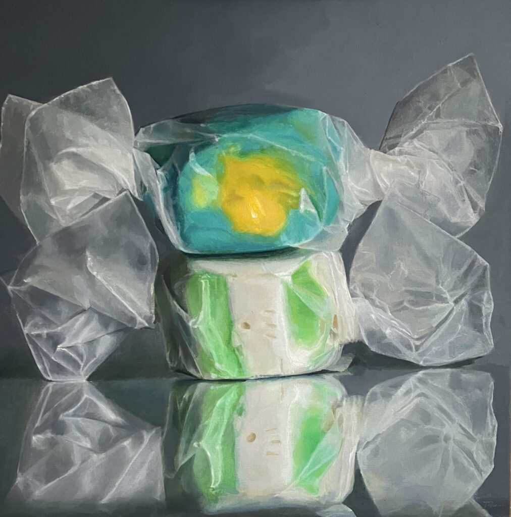
1
It has to be nearly impossible to sound pretentious when writing about candy, but I can probably find a way. My intent in painting images of gumballs and taffy and Chiclets leaves little room for grandiosity: I love these sugar delivery systems for their utter insignificance. But talking about any sort of painting since the advent of modernism is difficult to do without sounding like a self-important smarty pants. So, if I do, I ask in advance for your pardon (pardons are getting handed out left and right these days). Sounding obscure and difficult is just a part of the predicament of visual art since the late 19th century, as Tom Wolfe suggested in The Painted Word: we feel the need to philosophize about it. I like painting taffy for a number of simple reasons, mostly because I can lord it over a piece of taffy like a sculptor working with a tiny chunk of modeling clay in a translucent wrap, both of which—taffy and waxed paper—can be arbitrarily shaped and positioned. It’s raw material for an exploration of color, value, form, light, space, volume and line. Its interest is purely formal and visual and sensory for me. (More on this later, because it’s not as hedonistic as it sounds.) By sensory I don’t mean the memory of sugar and flavor. I rarely eat candy. My relationship with candy is that I buy it and abuse it by neglecting it for a time until I reshape and/or rewrap it and then keep adjusting until it looks fit to be photographed. (Often though it’s what I can’t change that determines the character of the image.) I have let hundreds of pieces of taffy sit in bags in my studio for years, each piece deliquescing though its waxed paper wrap. Sometimes I dig into these sticky grab bags for a few pieces I’ll need for a new painting before it completely decomposes. As salt-water taffy ages, it actually extrudes itself into little lobes and globes of hardening sugar water, apparently oozing through invisible pores in the paper. It ends up looking afflicted with deformities. And, after a few years, even when stored in the freezer, some flavors become soft as burnt marshmallow. If you unwrap a piece, it just sticks to the paper and stretches into tendrils like newly chewed gum or Neo’s mouth in The Matrix.
This mutability actually points to the other reason I like taffy. When it’s new, it’s like hardened Play-Dough or modeling clay, with sharp little interesting crags or dents and creases you can adjust just slightly. When it’s new, you can unwrap it cleanly to rewrap it with a square of fresh waxed paper from the supermarket for an entirely new element of drapery that can be modified to look like a Futurist sculpture. You can control much of what will present itself to the viewer: the candy offers itself as raw material to be molded, twisted, pressed, plumped, balanced, squashed and generally manhandled into an image that somehow looks unified when depicted in paint. But I can modify things only up to a certain point. Too much reworking and some element of simplicity gets lost and it becomes shapeless.
All of this came to mind after I’d written recently about William Keyser’s sculpture where he combines found objects he pairs with other components he fabricates. Someone categorized my paintings as planned. Actually, the only planning is in buying the taffy: after that I take what I find and reshape parts of it until I realize I have something that works. It isn’t working from a plan, but working in the dark toward something that becomes recognizable as an image I want to paint while I struggle to come up with the source image. It later occurred to me that Keyser is a creative cousin to another favorite artist of mine, Susie MacMurray, whom I interviewed at Danese Corey in Chelsea before it closed: in their work, they both transform overlooked or common things to find a form that has resonance for them. Bill innovates by pairing what he finds with what he invents. His three-dimensional bricolage triggers various associations. It MORE
December 11th, 2024 by dave dorsey
Jean and Bill Stephens, courtesy RIT
There are a few days left to see Continuum, the current exhibit of new work by Bill and Jean Stephens. They are both long-time art educators who met and fell in love at Rochester Institute of Technology fifty years ago in the printmaking studio on a floor above the one where their work now hangs.
The work is arranged almost symmetrically, in an alcove open to the main exhibition space filled with politically motivated fiber art. (Some of the adjacent fiber work is quite good, extremely well crafted and almost childishly subversive given the soft, amiable quality of the medium.) It’s an apt curation, each exhibition contributing to the spirit of the other. Jean’s subtle and spiritually suggestive collages alternate on the walls with Bill’s abstract paintings in acrylic ink and gel pen. Husband and wife, this creative team has been improvising new work for decades, responding to first marks and finding a way forward toward a sense of completion in whatever medium they choose. In his dark paintings, the imagery comes forward from a black ground of permanent ink he lays down over the entire support. He removes the ink with an alcohol solution and then makes marks with fine-point white gel pens. Bill’s soul resides in the drawing, the almost microscopic-looking marks—thousands of them—that move in waves across the surface of each painting. In others he erodes the blackness into egg-shaped modules, like jostling cells, that form designs he doesn’t anticipate but discovers as he works.
Jean creates gelli prints building new textures of color with a brayer, and then she assembles portions these prints as a collage, along with found objects such as postage stamps or newsprint or columns of text or shreds of maps. In many of the pieces on view, she improvises her own imagined ancient script, which looks Middle Eastern. It’s quite persuasive, and on these faux Arabian lines she creates a sense of flow and assurance, like a master calligrapher’s brushwork. Jean told me she isn’t saying anything in particular in this automatic writing, simply channeling script in a tongue not yet defined. The work is playful and associative and brightly affirmative, dreamlike—the words sweet and spot serve as bookends for one images. It’s all essentially as improvised as her husband’s paintings. Her collages often look like disassembled and rearranged modernist mandalas, with north south east and west wings.
As a whole the entire show is introverted—in the sense, say, that Paul Klee’s paintings were introverted—and very understated. It’s quiet the way someone who would like to be heard speaks so softly you pay closer attention.
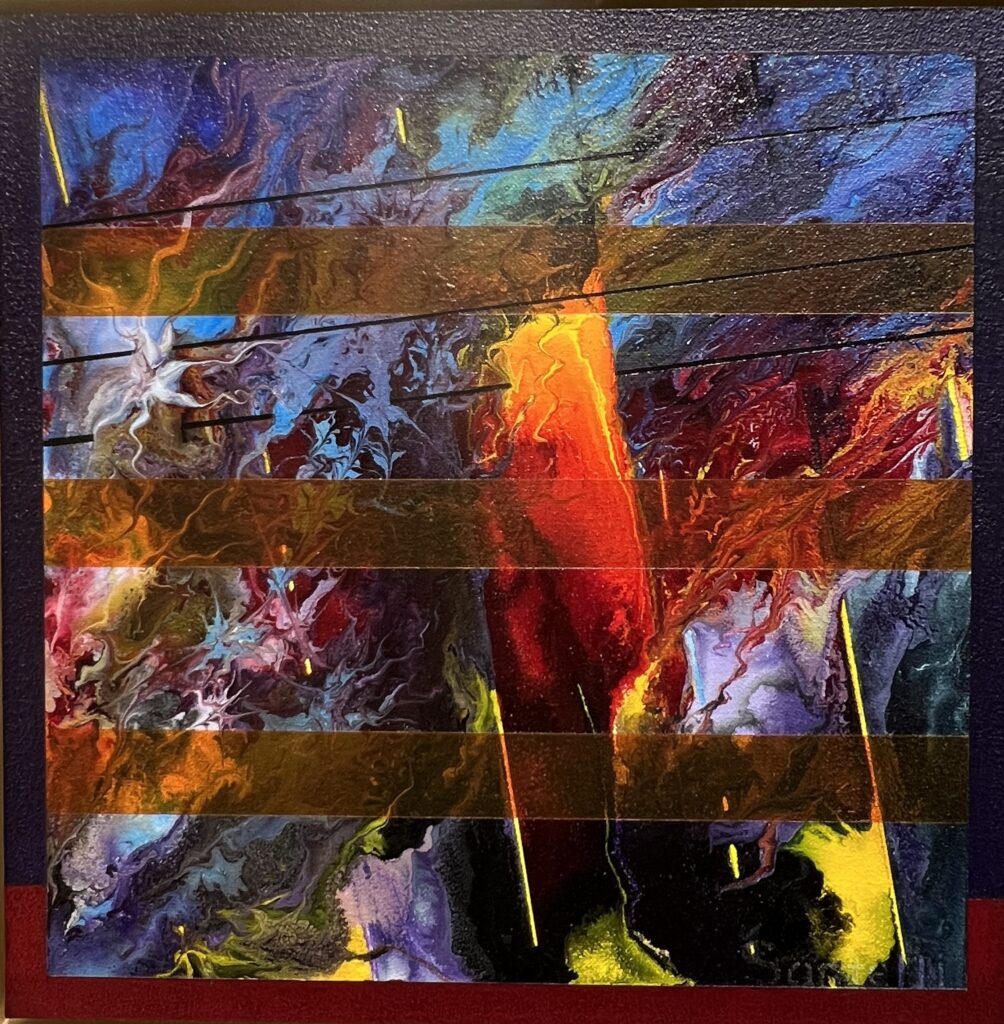
Flash Instant, acrylic Bill Santelli
I gathered with some other artist friends to talk about the show and our life as artists: Bill Stephens, Bill Santelli, Barron Naegel, and William Keyser. Stephens talked about how he works, but his process is instinctive and meditative; he doesn’t indulge in the kind of art-statement doubletalk that so many artists use to inject a bit of fuel into a career. We sat in a circle at one of the tables in the School of Art and Design in Booth Hall.
Stephens: I work with permanent acrylic ink, Caran D’ache crayon and white gel pen. I put down the black background and then remove it with alcohol wipes.The whole painting is done in black acrylic ink and I go in with 70 percent alcohol wipes and remove the ink to create shapes. The ovals are made using my finger. I pick up the texture of the canvas underneath. Then go back in with a fine point pen. White marker on top of the black. I had a young woman recently ask me, Mr. Stephens, when do you know when a painting is done? When I die, I’ll let you know that it’s done.
Santelli: How do you feel about where you are in your work?
Stephens: Good. I’m always experimenting. That’s all I’ve ever done. It’s coming together.
He keeps laughing after he says this, suggesting that his work MORE
November 22nd, 2024 by dave dorsey
Flash Instant, acrylic on canvas on aluminum panel
When Bill Santelli was seven years old, in 1960, he discovered Jackson Pollock in Life magazine, and it changed his life. He walked up to his mother and said, “I’m going to France to become an artist.” On his way to France, he didn’t make it past his mother, nor did he get there to study art when he was older, though he flew to Paris during his honeymoon with his wife partly on a mission to see Pollock’s The Deep at the Pompidou Center. When he came of age, he went to live and work in L.A.
During his talk for his new solo exhibition’s opening at SUNY/Finger Lakes Community College, he said, “Along the way, it was necessary to earn money to keep painting, and so began shadow-careers in education and arts-related businesses. I forged an independent lifestyle that way. I’ve held positions as a high school art teacher; archival picture framer; manager of the largest antique print gallery on the west coast in LA; sales person and book buyer for an art supply company.” Eventually, in 1991, he was able to make a living as a painter without any side hustles partly by learning to market his work himself in an era when it was easier to work with agents to promote work. “In art, survival is success.”
He’s done far more than survive. As Barron Naegel, the gallery’s director, pointed out in his introduction to Santelli’s talk, he has combined his MORE
November 17th, 2024 by dave dorsey
Alberto Ortega, Community Watch, oil on panel
Some Arcadia Contemporary painters produce work so rapidly, I wonder how many hours of sleep they’re able to get during an average year. It feels like Alberto Ortega’s last solo show at Arcadia Contemporary was a few months ago. You can see a tranche of his new paintings at Arcadia until Dec. 1. His visions feel paradoxically like precognitions of a past (circa 40s, 50s, maybe early 60s) we are destined to relive alone together. They are achingly haunting. They have the quality Bachelard called “oneiric” in The Poetics of Space, halfway between waking and sleep. He builds original dioramas and then stages twilight or night scenes that feel like intimate, antique precursors of Gregory Crewdon’s cinematic scenarios and then paints from views of these constructions. I’m eager to see the work on a visit to the city in a couple weeks.
November 11th, 2024 by dave dorsey
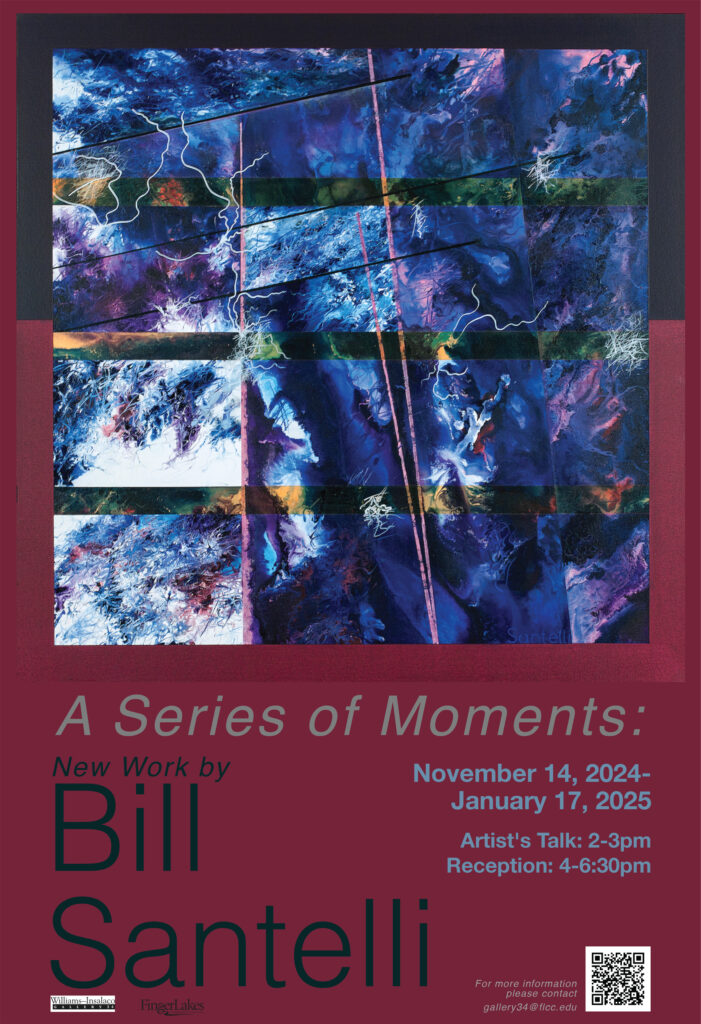
A show of new work from Bill Santelli opens next week at Gallery 34, Finger Lakes Community College. I’m eager to see the actual work after seeing his posts on Instagram the past few years. Santelli has struggled with health issues and chronic pain that haven’t seemed to hinder his output except to reduce the amount of time he spends each day in the studio. The reception and artist’s talk will be on Nov. 14.
November 11th, 2024 by dave dorsey


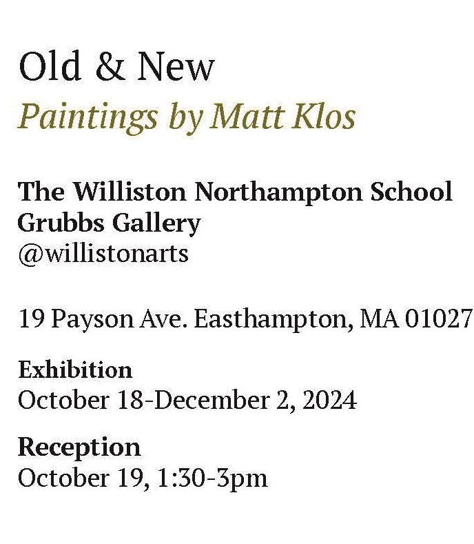
Going to schedule a side trip to talk with Matt about his new show in a couple week, after a visit to NYC. I’m interested in how Klos evolved from the Lopez Garcia style of realism he mastered in college to his approach now as a perceptual painter and also how he defines this school of painters. I had a quick conversation with him recently about how Pennsylvania Academy of Fine Arts is shutting down its degree program and he agreed that there may be a sea change coming in higher education, which isn’t necessarily a bad thing. I hope to pass along his thoughts here after I see him in person.
November 8th, 2024 by dave dorsey

Eager to see new work from these two innovators who are continuously experimenting with materials and methods.
September 13th, 2024 by dave dorsey
Wellesley Island Beach Triptych, detail.
1
It’s hard to imagine a less picturesque subject than the Inner Loop, a channel of traffic that circles and threads its way through downtown Rochester. It might be an interesting route for an F1 race at some point, but it wouldn’t strike most painters as a promising place to search for beauty. In Common Ground, an astutely curated show of Jim Mott’s paintings and Andy Smith’s photographs at Lumiere Photo, Mott’s views of the Loop (originally exhibited at RoCo in 2011) serve as an anchor for understanding what he’s up to. Paired with his paintings of the High Falls and the Rochester skyline, these larger paintings, often with wide, panoramic dimensions, offer a wonderful path into Mott’s work in general. The exhibition is more comprehensive than it looks at first glance, with fifty paintings by Mott on view. It essentially serves as a retrospective of his work from the past 20 years.
In Downtown River View, Mott uses office buildings, along with a bridge over the Genesee River, as a way of structuring the image geometrically. At the same time, he relieves the rigor of that grid with the organic shapes of trees along the river banks and the Genesee tumbling across the bottom of the painting. Throughout the image, Mott simplifies what’s being depicted and minimizes his detail, in a sense making as few marks as possible to capture the reflected light that gently illuminates most of the shadowed scene while striking the higher buildings, bringing them into bright relief against a pale blue sky. Mott’s strategy is to leave most of what he sees ill-defined.
Avoiding definition is his way of life in an even broader sense: he doesn’t try to define what he’s doing as a painter. His approach is apophatic: eliminate thinking to make discovery possible. I’ve heard him say, only part joking, many times, “I don’t know what I’m doing.” Each time he begins a painting, he relearns how to capture the scene and his approach is never a repeatable series of technical moves; it’s always an improvisation. Mott believes that pushing toward tighter definition MORE
August 17th, 2024 by dave dorsey
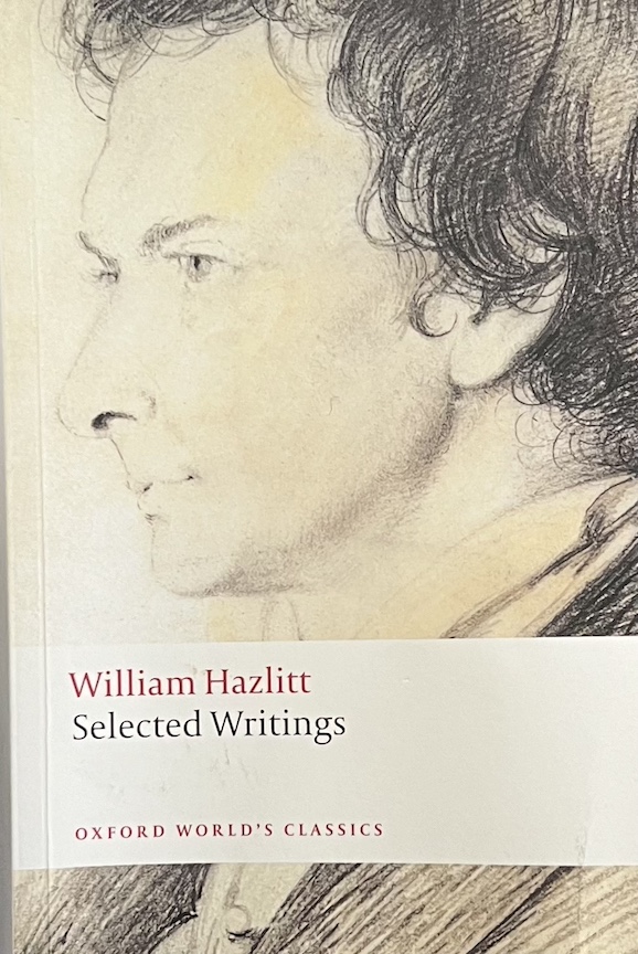
“Hmmmm.” At the door he turns and fixes you with a serious look. “Read Hazlitt,” he says. “That’s my advice. Read Hazlitt and write before breakfast every day.” –Bright Lights, Big City
Sounding much like a precursor to Dave Hickey, a portrait of William Hazlitt, from the Introduction by Jon Cook to William Hazlitt, Selected Writings:
Hazlitt’s argument about the arts can be understood . . . as a metaphor for freedom. As polemic, the argument fueled his assault on the British art establishment of the day. Hazlitt was deeply suspicious of Joshua Reynolds’s attempts to improve the education of artists and their public through the institution of the Royal Academy. Where Reynolds thought to dignify the artist by turning art into a profession, Hazlitt regarded professionalism and genius as antithetical. The Royal Academy provided a dignified cover story for turning art into a species of commodity production. It was ‘a mercantile body … consisting chiefly of manufacturers of portraits who pander to the personal vanity and ignorance of their sitters’.
Far from improving art and educating its public, the Royal Academy hastened a process of decline which Hazlitt thought was already inevitable. Hazlitt’s polemic against Reynolds and the Academy is suffused by a melancholy resistance to the idea that art can be improved by becoming subject to an educational regime. Hazlitt makes the history of art speak against this meliorism. One radical implication of this view of history, and one which Hazlitt occasionally voices, is that there can be no such thing as a beneficial tradition in the arts. The arts are strongest at an early stage of their history because their expressiveness is not constrained by the accumulation of precedent. Artists were not obliged to be always looking over their shoulders to see what others had done. They could be ‘original’ in one of Hazlitt’s primary senses, by representing in their art some particular aspect of nature which had been uniquely disclosed to them. By contrast, the opportunities for originality in modern conditions are limited not only by the accumulation of preceding work which stands between the artist and an original representation of nature, but also by the need to assert the distinction of any work against the claims of contemporary rivals; hence, the restrictive egotism which Hazlitt discerned in a number of his contemporaries, an egotism necessary for their survival in a crowded market.
He attempts to return our experience of art to a moment which Susan Sontag has described as ‘before all theory, when art knew no need to justify itself, when one did not ask of a work of art what it said because one knew (or thought one knew) what it did.” The attempt is essentially ironic, and self-defeating because in writing about art the critic returns it to the very realm of discourse from which he wants to defend it. Running alongside this is another kind of fantasy: art, in Hazlitt’s writing, both in its creation and its reception, stands for the possibility of an unprecedented and unpredictable event. The career of Napoleon is the political correlative for Hazlitt’s sense of this kind of freedom and power in art, and stands as a reminder of how much artistic genius meant to him as a form of ambition realized without the privilege of noble birth or professional status.
Hazlitt’s beliefs about art illustrate his ambivalence towards the legacy of the eighteenth-century enlightenment, which, in his Life of Napoleon, had figured as the cause of the French Revolution. If reason, and the circulation of ideas through the printing press, promoted new kinds of freedom, they also were in the service of new forms of centralization and standardization which seemed to diminish the possibilities of dramatic expression and debate.
Hazlitt’s value as a writer may well be in the thoroughness with which he registers such ambivalences and his corresponding refusal of the protection of intellectual systems or political establishments. As a dramatic thinker he can be volatile and unpredictable, a writer who resists critical framing. But this is at one with Hazlitt’s sustained commitment to the values of freedom and dissent, something which sets him apart from a subsequent English tradition of critical thought devoted to dreams of social stability and obedience. His writing is open to the reader’s agreement or dissent; it is not in pursuit of disciples. His tone is democratic and secular; even now, this can make him seem a moving, and even exemplary, figure.
August 15th, 2024 by dave dorsey
Snowmelt, oil on linen, 24″ x 24″
All art constantly aspires to the condition of music. –Walter Pater
This year I received an invitation to show my work at either of two exhibitions in Venice, Italy, and another invitation to exhibit in Spain. There’s no prestige associated with these shows, just an opportunity to get a little visibility, but I’m not going to bite. It’s quite an undertaking to ship work to Europe; I know because of the struggles occasioned by sending a small still life to Prague last year. The theme of the Italian exhibition, though, Consciousness and Visions, prompted this post. I’m mostly a still life artist, so it required some insight for the curator of the show to recognize how I might fit into those shows, but I suspect their invitations cut a wide swath and one could argue that any painting is an example of a vision but no one would need to argue that a great painting aims to arrest and alter the viewer’s immediate awareness of the world.
More than a decade ago, when I was showing work in Chelsea, I met Jane Talcott, a painter in Brooklyn. She immediately understood what I was doing, generally working in two different modes: “The still life work is about the outside world; the candy paintings are about the inner world.” The distinction isn’t hard and fast or exhaustive nor all that intentional, but she was mostly right: all of the paintings attempt to evoke states of mind, meditative experiences of a world otherwise incommunicable. Yet my more traditional still lifes do this, if they do it at all, by offering a glimpse of what one normally sees in the external world, while the candy paintings offer isolated, enlarged, straightforwardly realistic renderings of what’s there, but by isolating the subject and eliminating any surrounding context, and radically changing the scale of what’s seen, the effect becomes far more abstract. The impetus for the candy paintings has more in common with abstraction than traditional representation. I don’t improvise on what I see. I create the image in large part, before I ever pick up a paintbrush, in the physical act of arranging candy in a jar or when I wrap two pieces of taffy and try to find a way to get the visual elements to work together, given the shapes of the waxed paper, in some kind of unity of line, form, shape, color and light. When I look at two chunks of salt water taffy, sitting on the reflection of the lower piece, I think of Rothko. Three areas of color, stacked, uniformly and repetitively configured, but in my case with variations in line and hue and tone, in the sculpting of the wax paper, to express very different moods, or different experiences of a particular place and time, or simply inner states of awareness. Candy is what’s visible, but candy isn’t the subject matter, or rather it isn’t what the painting is “about” any more than a long jam built around a song about Casey Jones is about rail transportation or being cautious after an application of cocaine to one’s work day.
Instrumental music is the best metaphor for what I’m trying to do with candy paintings. It isn’t so much a metaphor as an equation. It’s hard for many people to see painting this way, but with the emergence of abstraction more than a century ago, it’s impossible to miss how painting at least partially makes visible what music makes audible. The fact that each painting is structurally identical in most ways, with variations in color and line and form—inside the structure—offers a way to do what abstractionists have done for decades, to keep reworking a motif and see how a set of severe restrictions on one’s choices can yield a series of images that evoke different kinds of responses and ways of seeing. Numerous artists have explored the expressive possibilities of tightly restricting their choices in formal terms and working variations within these restrictions: Rothko, Noland, Stella, Barnett Newman, Agnes Martin, and many others. Abstraction, for these painters, evokes a musical structure where the major formal elements remain uniform but each painting creates a different response by subtle varations within those formal restrictions. This is how I want the candy paintings to work. So what’s seen, for me, isn’t the literal subject, candy, but an elusive sense of a world summoned by a composition by Erik Satie. I’ve sold ten taffy paintings since last summer, thanks to Arcadia Gallery, Oxford Gallery, Artsy, the LA Art Show, and the Greenwich Art Society. At least one collector bought a taffy painting because the literal subject matter reminded him of taffy from his childhood. I like that, but that isn’t why I paint candy. I suspect others see through and beyond the objects to what the abstract qualities of each image can convey, in its visually musical way.
The annual Five and Under group show begins this week at Arcadia Contemporary. I will have several taffy paintings on view in the exhibition.
July 19th, 2024 by dave dorsey
May 14th, 2024 by dave dorsey

Fall, oil on panel, 9″ x 12″
There is still plenty of time to see Second Sight, a final solo show of work by Ron Milewicz at Elizabeth Harris before the gallery space permanently closes. It’s another Manhattan gallery to mourn, along with OK Harris and Danese Corey and many others. One wonders how long rent can keep rising in Manhattan before a growing number of commercial spaces become permanently empty. This particular show is a treat, showing how Milewicz continues to refine his idiosyncratic, radiant vision of nature. His paintings seem almost a visualization of what the English Romantic poets and the American transcendentalists extolled: the spiritual energy inherent in nature. I’ve compared his work before to Burchfield and to a Tennessee painter, Nick Blosser, whom I discovered a couple decades ago at the Adam Baumgold Gallery. What’s distinct in Second Sight is the central importance of light: the world of nature Milewicz depicts seems not just to be intensely illuminated, but to be made of light or lit from within. This isn’t an easy feat to pull off but he does it beautifully.
In Maple Swirl he offers the viewer a single green maple against a background of the surrounding woods. Light shines through all the gaps in the leaves, and it works as a representation of a shaded woodland view. The greenery is perforated by the bright, midday sky softly piercing the tree. Yet there’s an intentional confusion of figure and ground, emphasizing the abstract alternation between white and green (the painting is almost entirely those colors), and giving the glimpses of bright light a congealed but ghostly physicality, as if they are dancing in the foreground, between the viewer and the tree. He’s as interested in the quality of that light as he is in the tree he’s ostensibly painting. Here the tree reveals the light rather than the other way around.
In Not So Pink Pond, the light glows around the edges of branches and leaves, the way sunlight glows outward from around the borders of clouds. The row of slim trees reaching up to the canopy remain dark, lit from behind, but Milewicz applies great effort to rendering the varied color of the shaded trunks and the soft ovoid condensation of faint color that give volume to the leaves—the color in both foreground and in the brightly lit clearing beyond that MORE
April 6th, 2024 by dave dorsey
White and Lavendar Phlox with Michelangelo’s Infant, 1998, oil on canvas, 52″ x 52″
April 3rd, 2024 by dave dorsey
La Coiffe Bleue, oil on wood, 20 x 20
Anne-Christine Roda’s portraits, mostly of her daughter, are a must-see for anyone in New York City during these last seven days of her solo show at Arcadia Contemporary in SoHo. I was impressed with her work in the digital catalog emailed out before the show opened, but there’s little comparison between the albeit excellent photography and the presence of the work itself. In a quick visit to the gallery yesterday, I was astonished and moved by the immense discipline brought to these paintings.
They are good on every level: technical skill, the quality of the paint surface, the intensely personal and unpretentious relationship with her sitter, and the almost monastic simplicity and austerity of the information each painting conveys. The title of the show, Les Silencieuses, conveys the aura of Roda’s work: it’s all signal, no noise, and it’s a precise, narrow bandwidth of signal at that. The peak and trough of her wavelength are shaped at one extreme by the spiritual, protective quality of her care for her daughter embodied in these paintings, and the contrary sense that this young woman is on the threshold of what is inevitably a wildly unpredictable adulthood. This young woman is an icon of purity and vulnerability, her image indelible and protected by its frame, though the actual sitter, the living human being, will find nothing equivalent to that safety in the world.
To say the work is hyper-realistic is almost an understatement, but also misleading. Her inspiration comes from the Old Masters with their dark baroque backgrounds and almost somber moods: intentionally or not, Zurburan looms large here, but the finish she brings to each painting compares as well with Rembrandt and Van Dyke. Her surface has a smoother finish than much work by the Old Masters, closer to the uniform absence of brushwork one sees throughout hyper-realism, but while her edges can be distinct and precise, there’s an unaccountable softness in the light and the texture, even the skin of a leg or arm. The feel she brings to her paint handling mysteriously remains sensuous and incredibly supple, even with such little evidence of her brush: her tones are impossible to describe in some places, the shadow on the back of a hand, the color of the creases in a knuckle, seeming to effectively blend every possible hue while representing the absence of color. I would think her achievement with these paintings MORE