June 30th, 2016 by dave dorsey
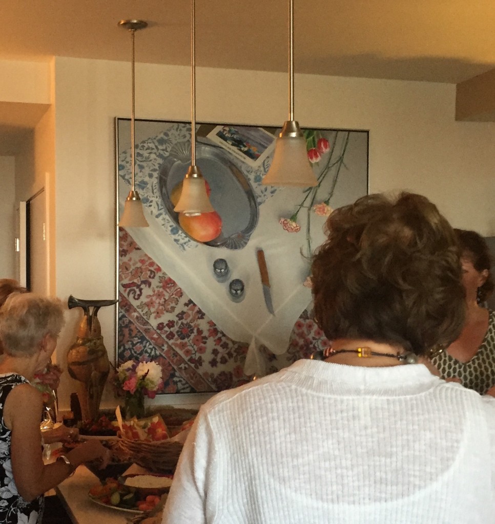 It’s always gratifying to see a painting find its way to a warm and loving environment. I was invited to the birthday party of one of my most devoted collectors here in Rochester a couple weeks ago. She owns two of my paintings, including this large one, Mangoes and Matthiasdottir, which won an award in an exhibition at the Memorial Art Gallery. She purchased it from that show in 2009 and recently moved to this new apartment and wanted me to see the work in its new spot. Lest anyone get the impression I’m completely self-absorbed, and not just mostly self-absorbed, I should point out how great it was to see her again and meet her friends and children.
June 28th, 2016 by dave dorsey

June 25th, 2016 by dave dorsey

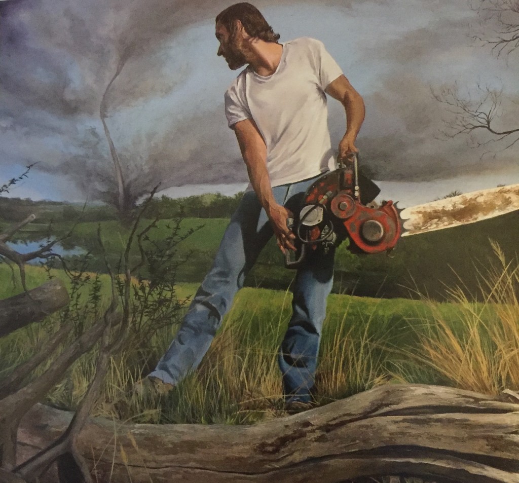
Taking On Twisters, Here Comes the Vortex, Kevin Muente, oil on canvas, 36×48
This is a detail from Muente’s perfectly composed painting, from INPA 5, Manifest International Painting Annual, Manifest Gallery. Manifest’s current selection process involves a complex two-part system, juried by a 9-12 member panel of professional and academic volunteer advisors with a broad range of expertise. The jury then passes along their scores to the project curator who will assemble the final selections from the jury-approved pool. The gallery is accepting entries for the next annual, with a deadline of July 18.
June 24th, 2016 by dave dorsey

Path 29, Prismacolor drawing, Bill Santelli
One of Bill Santelli’s tremendous drawings has been selected for “DRAWING NEVER DIES” a national juried exhibition at Redline Contemporary Arts Center, Denver, CO. This drawing comes from a series I’ve loved since I first saw it here at Oxford Gallery.
The exhibition will run from July 9 – August 5, 2016. Opening Reception is July 9, 2016 at 6PM.
Bill’s contribution to the show is THE PATH 29, above, a prismacolor pencil drawing.
About the Exhibition, from Redline:
Perhaps the oldest and most basic art act, drawing remains relevant despite significant changes in technology and the nature of art. The definition of drawing is blurry and often serves as a basis for study in most every other medium. Drawing is rarely is given the same attention as other disciplines within visual art, but is regularly a root for other artistic practices, as well as being a valid realm on its own.
Drawing Never Dies will survey the range of drawing taking place today. Approaches may span from minimal to maximal, meticulous to messy, monumental to miniature. From commonplace and traditional materials such as graphite and pens on paper, to drawing on the surface of the earth, to artists working with technology such as 3d pen drawings in space or forms intended for experience on the screen; we are interested in a broad/expansive survey of drawing now.
RedLine is pleased to announce Donald Fodness (artist & curator) and Daisy McGowan (Director & Chief Curator of Gallery of Contemporary Art, Colorado Springs) as guest jurors.
June 12th, 2016 by dave dorsey

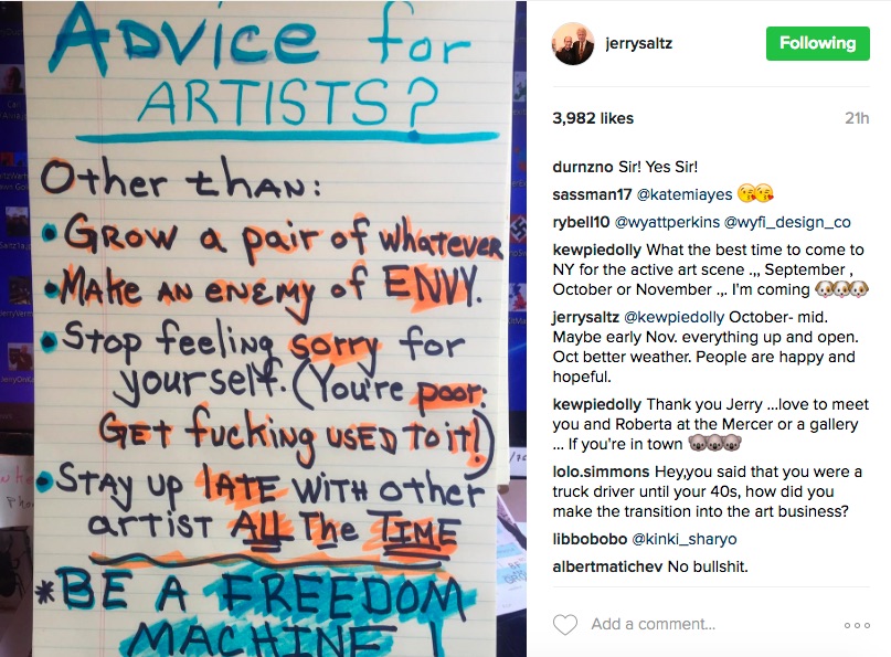
That’s Rule #6 from William Friedkin in this interesting interview:
Inside every one of us who has ever created anything there is almost a constant record of failure, that’s what we think of, that’s what involves our thought process. I know some of the most successful filmmakers and songwriters and inside these giant talents is a little mouse. And that is, I guess, the problem of the creative artist.
June 6th, 2016 by dave dorsey

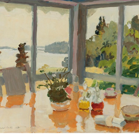
The Table on the Porch, detail, Fairfield Porter, oil on masonite, 1971, 18 x 24
I’m hardly posting here of late, because I’m finally hitting my stride again in the studio, after a desultory year, crammed with more social activity and other work than any year in recent memory–all of it good, but also a hindrance to daily painting. I have been almost completely abstaining from exhibiting work this year in an effort to get to the point I think I’m reaching now in my work, with strong momentum, along with a queue of ideas for enough future paintings to fill a show and a currently-successful diagonal move toward something a little different in my still lifes–while continuing to do what I’ve done before, alternating between the two modes. The perfectly executed painting by Porter, above, serves as something of an inspiration–most of the work he did at the end of his life (he had four years left when he painted this one) humbles me, actually, though what I’m doing isn’t nearly as loose. I may get there. What I’m trying to uphold from his example is the sense of a light-drenched scene, where color and only the upper register of values are used to define form, where the shape of the paint is as important as whatever the paint depicts, and where everything seems to have been laid down with a single brush, giving a unity to the marks. It’s as spontaneous as a watercolor, the liquid quality of the oil conveying the shine and reflections of the sunlight. It looks exactly right as you see it for the first time, until you wonder why the shadows of the porch’s window frames could be that yellowish-ochre-orange: in fact it’s the color of the table revealing itself in the shadows of those wooden struts, apparently beneath a sheet of glass laid down over it, or simply a glossy finish on the wooden tabletop. It appears Porter applied that color to the entire tabletop and then went back over it, alla prima, or else on the next day, with an off-white to convey the reflected light from outside. Maybe it’s just an arbitrary color choice that works because it evokes all of this even if he didn’t see it on the actual table. This one has an effortless quality, sprezzatura, the masterful way all the colors harmonize as an abstract pattern, and yet also, amazingly, evoke the unified world of that hazy day on the Maine coast, instantly recognizable as a moment of ordinary happiness, perfection. But it’s the quality of this light, coming from behind but also glowing in this porch, seemingly from all directions, that pushes me to take a different approach in the painting I’m doing now, not just in the quality of the scene, but in the way I’m applying the paint–a greater simplicity of application, thicker layers, some wet-on-wet, and a bolder more simplified way of building the picture through areas of color with less attention to minute details. I’m liking it.
 It’s always gratifying to see a painting find its way to a warm and loving environment. I was invited to the birthday party of one of my most devoted collectors here in Rochester a couple weeks ago. She owns two of my paintings, including this large one, Mangoes and Matthiasdottir, which won an award in an exhibition at the Memorial Art Gallery. She purchased it from that show in 2009 and recently moved to this new apartment and wanted me to see the work in its new spot. Lest anyone get the impression I’m completely self-absorbed, and not just mostly self-absorbed, I should point out how great it was to see her again and meet her friends and children.