September 20th, 2021 by dave dorsey

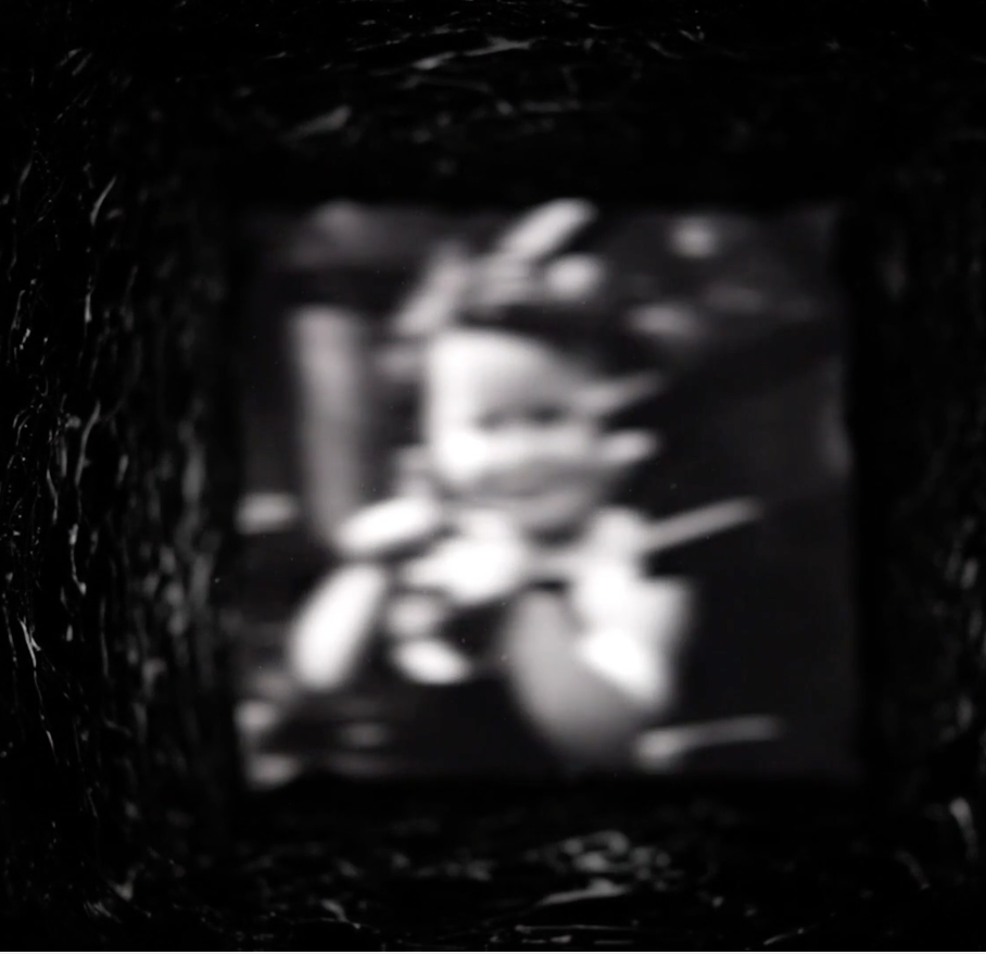
Screen shot from Bridge
I met a young artist at the Chautauqua Institution in August, Ali Georgescu, through her grandparents, who visit during the lecture season every summer. Having recently earned her degrees at Kenyon and Columbia College Chicago, and still looking for a path out into the world, Ali was working the front desk at one of the galleries. She’s a “lens-based” artist herself, but her work wasn’t on view in the student show at the Fowler-Kellogg Art Center. Having toured that show and then later in the day viewing one of Georgescu’s videos, I was more taken with her work than with anything I saw in the exhibit, except maybe an archival inkjet print, Truth or Consequences, by Furen Dai.
Georgescu is an observant young woman, laconic, skeptical, but personable and quietly intelligent. Her video, Bridge, is a montage of short excerpts from archival video and film. With software she’s constructed a dream sequence that reminded me a little of the deadly video in The Ring except that with the VCR footage in The Ring it’s actually easier to deconstruct what you’re looking at by the end of the movie. (I didn’t get a dreaded phone call, with Bridge, and haven’t yet died after watching it several times.) I’ve been charmed enough to keep going back and trying to make out what I’m seeing and though I haven’t made much headway, I’ve enjoyed it more each time. It seems there are maybe a couple dozen excerpts fused into one surreal narrative: a road rolling under the camera, a knife-thrower using a child as a target, houseflies flickering into view, ocean waves, large fish swaying against one another, a close-up of a woman’s eye—all of it slightly out of focus and most of it washed out, as if the lens were pointed toward a setting sun. Behind the entire video is a tubular white noise, eerie and hollow, affectless. You look at this sequence of imagery as if through a strange, throbbing, square tunnel. In the end, everything is swallowed by that oncoming light. I wanted to see and recognize more of what she was showing me, have something come into focus at last, but nothing ever did, and yet as a result the seven-minute video—for all it’s remote and chilly imagery—felt almost nostalgic and wistful, like the fragmented memories from a child of itinerant parents. It’s haunting and assured and maybe an indication of even more interesting things to come.
September 7th, 2021 by dave dorsey

In 2004, for his MFA thesis at the University of Maryland, Matt Klos painted a series of underground studio spaces. In these White Paintings, he paid homage, in his own idioms, to the work of Antonia Lopez Garcia. He represented various aspects of a drab and artificially lit basement studio. All of these interiors were spare and utilitarian and slightly abandoned-looking. The subtle complexity of their white walls fascinated him, as well as their blank, apophatic humility, the quality of erasing themselves, reflecting maybe just enough light to direct your attention to the muted color of other charmless things in the room: a utility sink or a chalkboard or a skeleton. As Klos put it in his thesis, in this small series of studio scenes, he wanted to evoke “the ethereal beauty inherent in the visible.” That doesn’t seem quite right. Most painters I know have signed up for that mission. It’s more as if, in his work, he wants to create a way of tapping the potential for a pictorial beauty inherent in a place, a beauty that wouldn’t be quite visible anywhere except in the quality of a painting of it. The beauty of a Matt Klos painting lives in the intensity of his gaze, and the insistence of his struggle to make paint retain its character as paint on a particular surface while conveying the life of what he sees. (This seems like a core axiom of the perceptual painters with whom Klos has aligned himself.) Mostly, like Antonia Lopez Garcia, he likes the challenge of representing what wouldn’t instantly be recognized as lovely or appealing. The beauty of his painting rests in the uncompromising passion that drives this assiduous and painstaking attention to what most people might not bother to let their eyes rest on for more than a few seconds.
It would appear Klos hates to come up out of the basement. For a decade and a half, he keeps returning to these underlit spaces, some of them cluttered and crammed with antiquated objects or the tools he relies on. (He does come out of Plato’s cave now and then, though. When he ventures above ground, as he does regularly, his work is quite different, often bright and stunningly expansive even in the confines of very small canvases. His little painting, Belfast Bay, is a marvel in which he creates qualities of scintillant light and a sense of a vast brilliant stretch of water simply through the way he magically scumbles the paint.) His new solo show, Contents of a Cabinet, at Gay Street Gallery is virtually a catalog of the many antiquated things left behind by a previous resident in a basement he adopted as his studio in Maryland more than a decade ago. He paints in a working-class neighborhood near the “recently closed Bethlehem Steel plant in Sparrows Point.” (The most startling word in that artist’s statement is “recently.” How did an American steel plant survive so long?) As he wrote for the first installment of this series of studio paintings at Gay Street in 2017, when he moved into the space more than a decade ago, “Dust and disorganization obscure the objects. Even when the objects are clearly defined their meanings may be lost to our current generation. In an age when so many answers are at our fingertips, I marvel at what seems to be a disconnection with our recent past.”
At the gallery’s website, the paintings aren’t titled, nor are their sizes indicated, though it’s clear from the texture of the surfaces that some are quite small. The larger paintings are the most intriguing. Klos paints the sort of things that look as if they stayed put on their shelves after an estate liquidation and weren’t snatched up by survivors of the owner’s death. He shows an old Sanka can, probably full of nails or bolts, and then something that looks like an improvised vise for squaring a frame, and shelves full of Depression glass and old dishware, a teapot, dolls, candles, a box full of wrench sockets, and an old landline wall telephone. These objects mostly give the impression of physical weight and mass, and they cast harsh shadows. They look stubbornly resistant to current culture, popular style, feng shui, ergonomics, and the virtualization of human experience: in other words, they are immune to everything contemporary, with one eccentrically lovely exception. Somehow, Klos gives us the guts of what appears to be a desktop computer being scavenged, its little green circuit boards (a video card maybe, or a wafer of RAM) glowing like grass in a university quad, lodged into a composition arranged as a wheel of muted, subtle colors: coral, ochre, olive green, blue-grey, and dark apricot. Against this parade of lumpy physicality, there is one painting in the series that looks as if it crashed this party from another dimension. In what almost qualifies as a Diebenkorn vision of a Santa Monica ocean view, Klos shows the viewer two blank turquoise panels, side by side, bisected by a small crease through which you can see vague gray details of what’s hidden behind the panels, a small and vibrant wound around which everything pivots, with a little bleeding sliver of brilliant red near the bottom. A rectangular streak of blue sweeps across the base of the canvas, and along the left border (bringing the viewer back to earth) what appears to be a sheer robe or apron hangs to the left of the panels. It’s a brilliant, luminous study, minimalist, almost non-representational, full of joy, as if all the expansive green and blue of sea and sky and mountains beyond the walls of this work space had flooded into his basement through this one canvas.
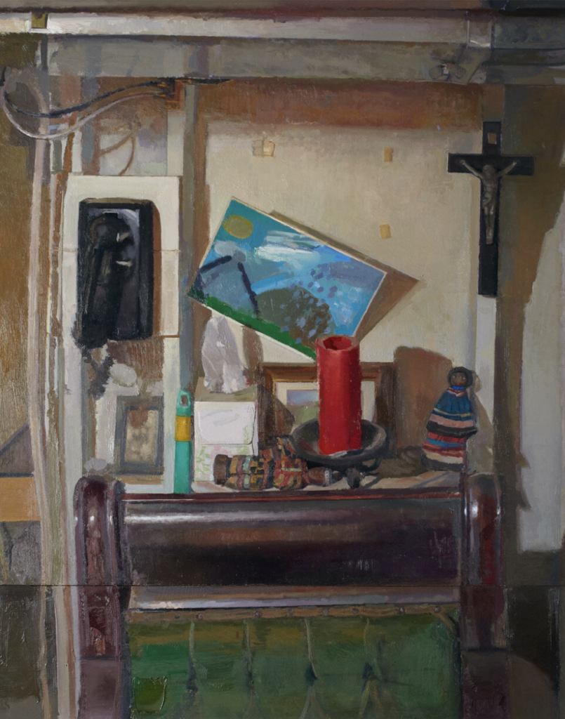
What keeps me coming back to look at the paintings in this show is a jumbled interior scene with what appears to be a child’s brilliant painting on paper that has come loose from its anchoring tape and rests askew behind and above a fat red candle resting on a flat surface shared with a couple dolls and a Kleenex tissue cube. In front of these objects is what appears to be the upholstered backrest of an antique, carved hardwood chair. The surface of the wood is conveyed with precision, the cataract glaze of its old glossy finish gone dull and gray, all of the cordovan-colored wood in bad need of being stripped and refinished. The whole composition, like the neo-Diebenkorn canvas, is structured in concentric rectangles shaped by wires and lumber, these elements criss-crossing themselves into a firm grid around the red, unlit candle that looks votive given the fact that it’s sitting just below a crucifix hanging on one of the exposed studs in the upper right corner. The whole image inhabits a sort of tattersall of crosses. Klos includes two paintings of this scene in the show, the other one a quick study of these central objects, including the crucifix. As you absorb these circumstantial indications of spirituality, you look again at the Kleenex tissue and it seems to be floating up like smoke or a ghost or rising like a shrouded figure from its cube. It all offers just enough of a signal of Matt’s faith: it doesn’t overwhelm the painting, but makes itself felt and appreciated and respected as a quiet affirmation of something that seems to be at home among things discarded and overlooked by contemporary culture. It would be interesting for someone to do a study of how current painters tackle the struggles and disciplines of faith, from any tradition, and the parallels to the work of painting itself: the requisite mindfulness, humility, and patience. In my own work, faith is entirely subliminal, a motive for painting without being the overt subject of anything I depict. This may be Matt’s situation as well: painting as a corollary of prayer.
During the Renaissance the question of faith was quite simple: it was the reason for painting anything, the system in which painting made sense. After the advent of modernism, with a few exceptions like Rouault, faith seems to have little place in most painting, especially now, given the West’s intellectual antipathy to Christianity. Even though more than two-thirds of Americans identify as Christian, do painters need to work little samizdat signs, like this basement crucifix, into their images as a code to other spiritually devoted types? Being a Christian can’t be an effective calling card in Chelsea—more a quick way to get ostracized and banished from sophisticated society. Which makes these indications of it just as much a signal of artistic integrity as a predilection for painting things underground.

