February 27th, 2023 by dave dorsey
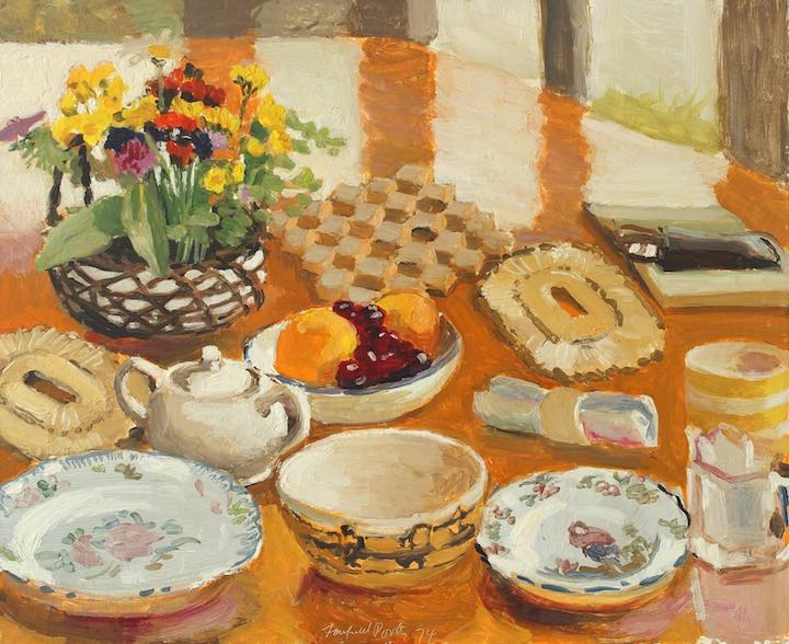
Fairfield Porter Field Flowers, Fruit and Dishes, 1974 Oil on masonite 18 × 22
Fairfield Porter’s work reached its apogee in the last decade of his life. By today’s standards, he died young, in his late 60s, but his work achieved a new level in those last years, a more photographic clarity, simplicity and balance that seemed to serve as a counterweight to the intentionally awkward-looking, sometimes primitive, way he handled paint. Yet at the same time, in his coastal scenes, he pushed the looseness as far as he could take it to a dazzlingly luminous near-abstraction. In both modes he surpassed much of what he’d done before, though his work all through the 60s was at a new level, as was Burchfield’s, though in a much different way and even more remarkably. Porter always wanted the paint to be what you saw, as much as de Kooning and Vuillard did, both of whom he admired, but in the more precise draftsmanship of that last period, he let you see what he was representing more clearly than ever before. He got out of the way: one hardly noticed how radically he simplified what he saw, eliminating all but the most necessary detail, and it went less noticed because his line was more photographic. In Portrait of Nancy Porter Strauss, The Tennis Game, House with Three Chimneys, Lizzie and Bruno, The Harbor–Great Spruce Head, Still Life 1975, and many others he distilled and refined what he had begun to do in the early 1960s, being bolder and brighter with his simplified areas of color, far more accurate in his line and embracing a realism less French, less Impressionist, harder-edged but, maybe ironically, more and more radiant. There were amazing harbingers of his late mastery, especially The Mirror, his homage to Las Meninas, but also in probably his most complex painting, the utterly controlled The Cove, a depiction of what is probably the Maine coast, one of his favorite subjects, but this time looking in toward the land, at low tide. A lone figure in khaki shorts picks his way across countless rocks toward shallow water. The way in which he simplifies without ever violating the actual look of that uneven littoral path, the muted color of the low mountains and pines, exactly the shift in value they require to indicate their distance, everything precise and not a single extraneous bit of paint applied anywhere–it pointed toward what he would be doing even more powerfully in the 70s. Meanwhile, the almost purely abstract, and paint-besotted, Calm Morning, in 1961, points toward The Ocean, a large square canvas that looks almost minimalist in the abstraction of its layered horizontal tiers of low whitecaps and the thin sheet of lilac tidewater washing back toward the ocean. It’s both uncannily accurate and yet seemingly loose, spontaneous and improvised.
There was a brief, insufficient piece in The Economist about five years ago about the notion of “the late, great work” of famous creative artists: Van Gogh, Beethoven, Ibsen, Goya. Proust died so young that his late work is really almost his only work, which is certainly true of Keats as well, so there’s a confusion at the heart of the thesis: are we talking old age or just the last act in a life of any duration? It’s funny the way the author sticks to its guns by citing work from the minds of those who were falling apart under stress and thus creating work that reflected the inner disintegration and/or withdrawal:
For each of these composers, late style meant something different. Gesualdo had murdered his wife and her lover, and spent his last days in a torment which one can sense in his crazily discordant late works. The emotional devastation of Schumann’s final days becomes starkly evident in his ruthlessly pared-down Gesänge der Frühe (“Songs of Dawn”). The Britten string quartet which Mr Biss has chosen shows the composer delighting in an extreme—and to him quite new—economy of expression. The chaotic middle movement of Mr Biss’s chosen Schubert sonata reflects the composer, who was dying of syphilis, going to pieces in rage and terror. Brahms’s late works suggest a man whose emotional energy has been sapped dry; Beethoven’s suggest the opposite. What links these composers, as Mr Biss points out, is that “with each of them, something has happened to completely change their style”.
Beethoven’s late quartets are indisputably awe-inspiring and maybe the best argument for the thesis that creative flourishing can take a lifetime to nourish. The list to support his thesis is fairly persuasive: the aforementioned Burchfield, Van Gogh, Porter, Matisse with his cut-outs, maybe whatever Stella will be doing before he dies, maybe Rembrandt, Degas, and certainly Monet. My takeaway: there’s hope for all of us who see the traces of youth shrink daily in the rear-view mirror.
February 24th, 2023 by dave dorsey
Another from Bill Santelli’s Reverie series, which for me brings his work to a new level, along with the In the Humming Air series. These very small pieces are entirely organic, though when he introduces geometric elements into this series, they create a grid that also feels new, compared to the tension between geometric and natural shapes in his previous work. The work feels natural and the imagery offers more little pings of recognition: hinting at light through trees or underwater, spaces that feel more outdoors than psychological. Love where it’s all going.
February 21st, 2023 by dave dorsey
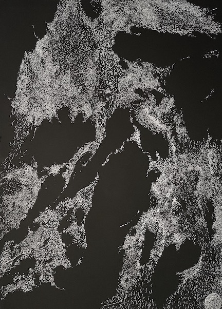
Bill Stephens has been doing something that strikes me as new, though he may not see it that way. He’s using fine-tipped pens to apply inks in varied colors to mixed-media paintings and, though extremely fine lines are his wheelhouse, the effect is different in the new work. There’s a jittery but shimmering quality to the almost pointillist throng of hatch marks in the new work. In his black and white drawings, the tiny white marks look like scratches applied to a black coat of paint on a white surface, but they are actually white ink, each mark one among what appear to be thousands that sweep across the surface like a murmuration of starlings or particulates 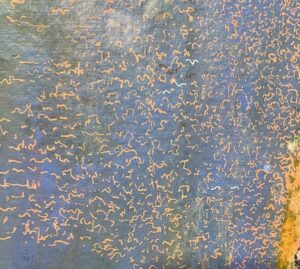 of smoke or very fine cloth swaying in a breeze. It gives the effect of seeing a massive migration through space, souls swept helplessly along in Dante, say, or just ants marching across sand. The shapes as a whole also look geographic or meteorological, seen from space. At the same time, Stephens is using different tiny marks, more like runes, in other brilliantly colored work, again colored inks against complementarily colored grounds in highly saturated tones. The effect is entirely different, more like the quality of light off a cathedral in Monet. In both modes, he’s capturing the febrile quality of awareness itself: constantly in flux, quiet and still and barely moving in the dark work, yet intensely alive and shimmering with a kind of static bliss in full color.
You can see this work at the current member show at Mill Art Center.
February 18th, 2023 by dave dorsey
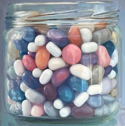
Candy Jar #13, oil on linen, 44 x 44
Candy Jar #13 has won Second Place in the Camelback Gallery’s online 2023 International Juried Painting Awards. A second candy jar painting was also included in the exhibition as a finalist.
February 15th, 2023 by dave dorsey
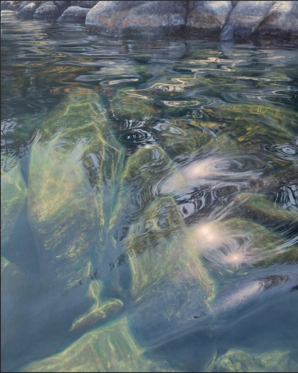
Irina Cumberland, Stone Warm, oil on copper
From today through the 19th, Arcadia Contemporary is offering what is essentially an international survey of representational art from 13 different countries at the L.A. Art Show. The catalog for work available from this one gallery is astonishing. The Arcadia booth is nearly an entire exhibition in itself. The range of work is purposefully narrow in one sense, driven by Arcadia’s adherence to the dictates of its own largely dark, figurative esthetic, but I was dumbfounded by the sheer number of artists and variety of work, the way Arcadia has located, in so many different places around the world, exactly the sort of painter it chooses to represent. The Arcadia catalog rivals the international painting annuals produced by Manifest Gallery, with over 500 pages of artwork offering around 200 paintings and drawings. It’s an impressive act of curation and offers what must be the fruit of endless research to locate exactly the sort of painter the gallery seeks from Korea, Nigeria, United Kingdom, United States, Spain, Israel, France, Cuba, Japan, Australia, Russia, Ukraine, Spain, and Poland.
When I last visited the gallery in SoHo, Steve Diamant showed me his most recent discovery, one of the paintings in this show from a female Russian painter he’d recently discovered. He said he almost always seeks out the artists he shows, not the other way around, without divulging exactly how he tracks painters who fit into the gallery’s esthetic. It’s a category of work hard to pin down precisely because it depends on his own individual sensibility. There’s just a touch of Weimar Republic in some of this work, the mordant air of the cabaret. But he also shows bright, ecstatically affirmative almost wholesome paintings of simple, familiar things and situations from painters whose vision is anything but sceptical. He said the work he wants is frequently beautiful but never pretty, though some work in his catalog could be considered quite pretty—except that the adjective seems to have joined sweet and nice in a ghetto of paradoxical pejoratives. (Wait long enough and someone will start a Make Pretty Great Again movement.) All of which is to say the work he selects is often visually and morally or emotionally dark, limited in its range of color, often nearly monochromatic. What a few of his artists depict verges on the decadent, even depraved, and there’s a theatrical and implicitly narrative quality to what he likes, something he prefers to call cinematic. Staged drama would be my description, and clearly some of the work is painted from scenes with models costumed and posed for the painting, with all the drawbacks and all the undeniable impact of that kind of artifice. Frequently, the images imply a backstory through these posed, stylized subjects, and some work verges on illustration or fashion shots, yet most of the paintings remain challenging because they almost always have a quality Gaston Bachelard called oneiric—being both real and unreal at the same time, sometimes hyper-real, but in a way that tips the portrait or scene beyond the range of mundane daily experience into a slightly disquieting state of surreal or haunted dream. That pretty little girl in bright colors has a lizard on her shoulder. There are bees gyrating around the flower in another girl’s hand. The rugged and handsome older man with the gray mane has a stiletto pump aimed at his nose like a gun. That quaint little town has a massive tornado approaching from the distance. The roller coaster is, hm, well it’s on fire! Much of this work feels equal to the eschatological mood that seems to be the dominant tone of the media about nearly everything now: the world just keeps either dying or ending, if you watch the news often enough. Yet the tone of the work Arcadia shows is quietly poised just this side of its own existential dread, balancing there, the way Hopper did with the subject of loneliness in his single figures in urban, dense populations.
In this vein, the work that least appeals to me, in terms of my personal taste, but most impressed me in the way its conscious limitations give it power is from another Russian: Alexander Timofeev. Like so much of what Diamant selects, his color is so muted as to be almost absent, but in his cropped images of faces, the moribund skin tones are perfect for the warped, moral universe on display. At a different level, his paintings read like a gallery of the vices, but without Giotto’s clear delineation of one vice from the next in his own Early Renaissance sequence. The most stunning one, Secret, shows two women, one gazing up with addicted desire at a glittering clutch purse, dangling by its strap from the hand of the other witch-like figure. The temptress is dressed in a red robe (a robe that reappears in another painting, Slave ,of someone smothering the head of a man, visible in relief through the red fabric that wraps around his head like molten plastic pressed onto a mold of a face). It’s a world as weird as Macbeth, as morally ill as the Marquis de Sade, and yet the remarkably detailed realism in the faces and hair transcend allegory, reminding one of Christian Seybold’s 18th century portraits, even though these are far darker in spirit and tones. Yet, the context for all of them is established in the title of the catalog’s penultimate painting, The Tenth Commandment, a simple image of an older man’s hand grasping the limp wrist and hand of a very young woman, who in her submission appears to be either dazed or drugged.
Dark in imagery, but completely different in spirit and worldview, are Stephen Fox’s marvelous night scenes of drive-in movie screens beneath a sky during an electric storm. The convergence of what is essentially a screen capture of Darth Vader in The Empire Strikes Back with illuminated storm clouds over the pines that flank the screen and the audience of people sitting in front of their cars at night: the scene is irresistible and breath-taking, partly because the expansive Romanticism of the image gets undercut by the irony of juxtaposing a big rectangle of luminous pop culture that looks trivial against nature’s infinite sublimity. The effect is to make what’s depicted feel like an image of the perfect family night out: summer warmth, lightning and thunder without any rain, a fantastic movie, civilization having reached a sort of apogee of balance between old-school film projection, CGI, a population with leisure time on its hands and the loveliness of nature itself, all of it painted with astonishing skill. You look at Fox’s paintings and think we aren’t such a terrible species after all and the world has never been a better place to be.
Matthew Cornell’s two contributions to the catalog are just as beautifully done as always, but these two scenes are more enigmatic than his previous ones, which were often painted during the “golden hour” after sunset, before dark. These are at night, little structures with a single light shining down, painted in a way that looks a bit looser than in the past, until you realize they are only eight inches wide. The tiny scale demands more generalized brushwork. One has a more consciously imaginative touch: a second glance at that one-way sign behind the windowless building and you realize it says Hope. These tiny paintings are one of Arcadia’s signatures: the smaller the work, more he’s interested. Diamant has assembled here some of the miniature work he regularly exhibits and sells. For example, Stephen Mackey’s fey oil-on-panel portraits of rodents dressed as infants in frilled collars are only three inches square. It’s hard to imagine smaller artwork, other than of course sculptures inside the eyes of needles.
Cuban artist Darian Mederos contributes portraits of sensuous female faces, eyes closed and alluring, but he lets you view them through bubble wrap. The distortion it affords would seem gimmicky and coy, as if to suggest you’re spying on these sultry women though a wall of warped glass blocks, imaginatively completing the picture on the other side, until it’s clear the regularity of the grid created by the bubbles points back to Chuck Close with his later grid paintings and Alyssa Monks, when she was doing portraits of faces seen through droplets of water on glass. It’s a balancing act between soft porn and a simple exploration of a different way to examine how visual perception works. Plus, of course, a smart way to recycle all that surplus bubble wrap left over from shipping artwork to collectors and fairs.
In a completely different mode, with the most emotionally upbeat work in the catalog, Tim Rees depicts women, some solitary, others with a child in their arms, as well as a Norman Rockwell-esque boy in pants and loose suspenders, standing at low tide along the ocean or the Gulf. The scenes are lovely, one might be so bold as to say even extremely pretty, with low sunlight, sometimes at sunset, but without any of the kitsch sentimentality, or at least Pre-Raphaelite drama usually inevitable with paintings of beautiful women standing near water. These are simple, realistic transcriptions of what’s already beautiful and casually, accidentally wonderful in and of itself in daily life, full of light and color, a sharp departure from what would seem the Arcadia creed but perfectly at home with the rest of the work in the quality of its vision and execution.
The most abstract of the paintings are also at least as hyper-realistic as the most detailed work in the show, the swirling, undulating essentially color-field compositions of Irina Cumberland, one of the gallery’s Ukrainian painters in the show. Her large oil-on- copper paintings capture the dance of light on what would appear to be rippling tropical water. Paintings of light on water are plentiful, if you search for them, but these are carefully composed in such a way that they may be the best and most lyrical I’ve ever seen. Stone Warm is a fantastic abstraction: blues, violets, greens, and yellowish olives swirl in unpredictable ways, reverberating toward the top of the canvas, erupting from beneath, all of it balanced and yet in constant motion. It’s an amazing painting, the sky reflected in such a way that you can’t quite recognize anything in the water until you notice and realize that the row of huge river stones along the top of the canvas anchor the image in reality, snap it back from abstraction. What a joy it must be to paint these canvases: what must be weeks of arduous, painstaking accuracy leading up to the way in which the finished painting seems a perfect image of spiritual liberation.
February 12th, 2023 by dave dorsey
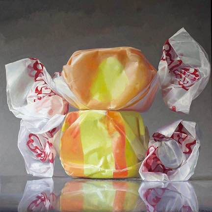
Happiness, oil on linen, 46 x 46
I was pleased that Happiness, from my series of salt water taffy paintings, was invited to be a part of the biennial 68th Rochester-Finger Lakes Exhibition at the Memorial Art Gallery. It will also be included in the new International Painting Annual published by Manifest Creative Research Gallery. I’ve been included twice before but it has been a few years. It will be a pleasure to see it keeping company with the work of the other artists selected this year.
February 9th, 2023 by dave dorsey
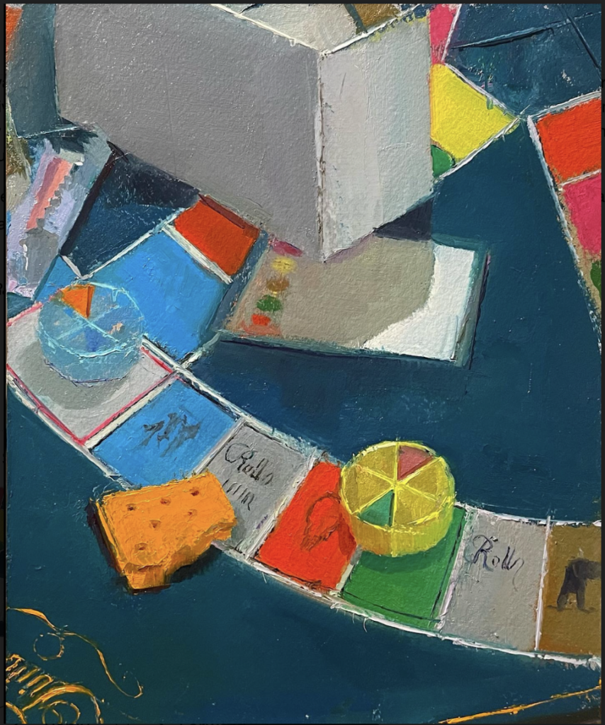
Erin Raedeke, Trivial Pursuit, 10” x 8”, oil on panel.
I’ve been returning to Erin Raedeke’s paintings with pleasure over the past decades. What first intrigued me were her perfectly composed images of what appeared to be detritus from a child’s birthday party. Getting what looked like perfect compositions from a post-party mess was an achievement in itself. Yet her color carried most of the charm. She hasn’t posted any of that uniquely lovely work from a decade ago at her website. I wonder if she thinks they’re too pretty. That’s how Matt Klos referred to them when we were discussing her paintings, after he’d included her work in his curation of a show of perceptual painters in Baltimore. (On my last trip to New York City, Steve Daimant at Arcadia Gallery talked about how he looked for work that was beautiful but not pretty, so pretty is pejorative. Got it. I’ve always thought Matisse cut-outs are pretty great, as well as just pretty, but maybe I’m wrong.)
Some of her more recent still life images come close to those after-party paintings: looking down at a flat surface, objects randomly strewn into view, everything forming an abstract pattern from top to bottom and side to side, with little or no negative space, just a solid patchwork of one thing astride another or sharing adjacent space, everything falling into place randomly as the playmates leave their mess behind. The birthday paintings were haunting, charming, beautiful, with colors perfectly chosen—her sense of color in the best work is extremely good, purely musical—and a little sad, given that we are loitering around after the party has ended, glimpsing the beauty the celebrants left by accident. Go even further back and some of her landscapes from 2006 and 2007 are marvelous village scenes that could be from nearly any little burg or ‘burb in the hilly Northeast. As I’ve written here in a post years ago, Backyard Gardens is a perfect painting, reminding me of the simplified precision of the late Fairfield Porter at his best. My favorite Porters are the ones that I’m certain he did from photographs, keeping his simplified approach to representation, one patch of color next to another, accurate in terms of shape and form but more concerned with light and color than detail, and this painting has that same quality. Her color sense in these outdoor scenes—intensely evocative of a certain kind of light at a given time of day—are quite different from the still life work, but just as carefully felt in the way the colors work together. They aren’t there just to trick the eye or drafted into service as a way of creating a sense of depth or volume or whatever–each color is there for its own sake, along with what it’s doing for the others around it. It’s hard to describe how her color distinguishes itself from so many of her fellow perceptual painters. Her tones, in absolute terms, can be just as muted, but they harmonize and accentuate one another and come together in a way that sometimes sings–not always but often–and has a quality of nostalgic yearning: she feels her images into being with these tones. Her recurrent affinity for humble and common subject matter most painters would think unworthy of attention, often related to childhood—board games, party hats, jelly beans, snacks, Froot Loops turning to junket in a bowl, as Robert Lowell would have put it—it reminds me of Pop’s friendly, unpretentious and anti-heroic attention to everyday things, simple food, household products, things so familiar you don’t even see them when they’re there, inanimate companions everyone takes for granted, domestic objects Chardin might have painted if he’d had a dozen things from the past fifty years shipped back to his era.
You can see Raedeke’s latest work at Exeter Gallery’s current show “Generations.” You can get a preview of the Gen X Series at her site. It’s being shown along with work from Neil Callander and Nicole McCormick Santiago. As Matt Klos writes about the work of all three: “The art in Generations explores youthful memories, present hardships and enjoyments, parenthood, and a look toward the future with soberness and sincerity.” I would say in Raedeke’s work, it’s a mood of poignant joy, a wistful quiet glimpse of innocence, past and yet fully present.