A tour of Chelsea
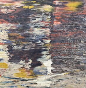
Raven V, Natalie Frank, detail, gouache and pastel on paper
After attending the reception for the 106th Annual Open Exhibition at the Greenwich Art Society last week, I spent Friday again touring Chelsea galleries, as I did a month ago, this time with fewer moments of joy, but without regrets for the time spent. There was powerful and original work, but early on in my tour it was less rewarding. Mostly, it was a good occasion to step away, as I did when I attended the Armory Show last fall, and wonder how many people actually pay attention to visual art now and whether anyone in the high art world cares about reaching people outside what seems even more of a cult than ever in the past. The audience must get smaller, as a portion of the population, every year. Someone should commission a poll of what used to be called Middle America–let’s say working- and middle-class families with children, the demo of people who labor to make life productive and endurable for most people–and simply ask them if they are familiar with any visual art produced in the past decade. Ask them to name a contemporary working artist. Ask when they last set foot in a gallery or art museum. Most of the galleries I visited were empty except for the young woman or man offering to answer questions at the front desk.
There’s nothing terribly new in this. Since the advent of modernism (and photography), visual art has become increasingly intellectualized in order to maintain its critical standing as a field of activity deserving as much respect as science (which itself has become less and less comprehensible to the average human being). Much of this effort has gone into distinguishing itself from humble representation, a job all but handed off to someone with a lens since the mid-19th century—though representational art still thrives as a vital and often the most interesting branch of visual art. All of the new art movements that marked the first half of the 20th century found their apotheosis in AbEx and Pop, when it became inescapable that Western art history had terminated itself in total freedom: anything could be art, all the frontiers were now open for cultivation, the whole idea of progress was nullified. There has been an attempt to replace that old sense of theoretical progress with progressive politics: art now can legitimize itself as something new by finding a unique way to deconstruct the patriarchy, white supremacy, racism, gender bigotry, religion, American exceptionalism, and so on. It’s an opportune way to retain the sense of moving forward. It feels as if the art seen in the larger cities often (certainly not always) illustrates or embodies these academically orthodox political ideas much the way painting illustrated Biblical narratives during the Renaissance.
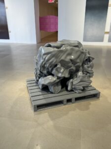 Visiting more than a dozen galleries last week, it was hard not to feel that the work on view was meant to disconcert viewers, not puzzle them in an intriguing way, as they went from door to door hoping for some tiny morsel of recognizable human warmth and delight. Probably the most laconic expression of this disdain for ordinary perceptions and accepted historical perspectives was Figuer Sucia at Green Naftali. It was a deconstruction of the heroic myth of the American West—something one could understand only by reading the press release—and the best one can say of it is that it was so subtle and understated as to be almost entirely incommunicative. You entered the space through swinging pink saloon doors. One object occupied the center of the space, looking like a gray, plastic excretion, probably a 3D print from the digitized image of a horse deformed with software and then materialized into a cube of intestinal complexity. The press release indicated it was an enlarged image of a toy horse, squeezed and twisted into what looked like several human or animal figures trash-compacted into this gray object sitting on a warehouse pallet in the center of the gallery. (So much for Dodge City’s equine transportation.) On the walls around it were sets of three-to-four dye sublimation prints on tall, rectangular sheets of aluminum. They look weirdly monolithic at first, like the dream of someone who dozed off while watching 2001: A Space Odyssey. As I examined them, I could see little artifacts of photography: dots of lint on the camera’s sensor enlarged and furry against the nearly monotone surface. Also visible were the vastly enlarged squiggles left by image compression. All of these flaws made it clear these probably were enlarged details of video images. The show’s title could be translated as “Dirty Figure”, but Dirty Ground would have been more appropriate since in none of these images could a figure be spotted, so to speak, except for what could have been a fuzzy assembly of clouds or a hazy suggestion of a reclining woman floating in space. The hand-out at the desk explained: “The scenes originated as hand-painted backdrops for episodes of Looney Tunes.” Somehow this didn’t help.
It was hard not to wonder whether the whole exhibit was a wry send-up of contemporary art itself. Aria Dean showed how little physical effort it takes to deconstruct the notion of manifest destiny and human dominion over a landscape that offers up mostly a literal and figurative emptiness, an infinite sky and endless, unpopulated spaces impossible to master. The horses can’t move. This frontier is mostly empty of people. Look on your works, ye mighty, and despair. . . But the aftertaste here of facile technological engagement with ideas, a sardonically knowing minimalism–it’s all (probably intentionally) off-putting and more than a little funny, if you take it as a wry commentary on how art gets thought-up and made now. If the joke was on us, the show was actually good satire, but as with so much art, this all depends on an amused, rational interpretation rather than a felt response to the immediacy of something visually conveyed and visually understood.
 At Hollis Taggart I stopped in for a few minutes, glanced around and again wondered if the exhibit was a stunt. In the hand-out, the gallery said, “John Knuth Pays Homage to the Horseshoe Crab.” The show, on view until June 24, is indeed a faint tribute to this creature’s shell, which the artist has painted metallic gold and affixed to painted canvases, over and over and over. Turn a full circle in the gallery and in every direction you would see the same thing, a pastiche of poured color-field canvases, like tame salutes to Paul Jenkins, festooned with the gilded shells. The show’s title, High Noon, echoed the political deconstruction going on back at the Greene Naftali show, but in this case it’s an environmental crisis that commands attention: how declining populations of the crabs imperil our supply of their blood: “their blue blood … has been essential to the development of safe vaccines and call for the development of an artificial alternative.” Art here, again, puts itself in the service of social needs, with an implicit critique of capitalist depredation, here of the environment, even though the entire show looked as if it required about a month to produce and about sixty seconds to assess. It also required written commentary to begin to understand the point of the work.
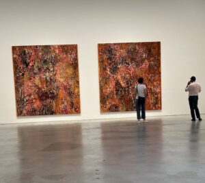 Hauser & Wirth has organized a monumental solo exhibition of Mark Bradford’s work. As with much of the other work I saw in Chelsea, the critical theory embedded in what’s being shown requires commentary. It would be a bit optimistic to imagine the average viewer glancing at his dense, layered surfaces and seeing a denunciation of manifest destiny, colonial exploitation, racism and socio-economic injustice. Some of his work is closer to Anselm Kiefer’s mysterious built-up surfaces than anything with a recognizably political agenda. It’s hard not to admire these multi-media constructions simply for the immense effort of creating such topographically complex objects, where color is applied in layers—dense and deep layers of paper attached to the surface and “oxidized,” after which he creates variation in this hidden field of color by sanding or otherwise abrading this layer cake to the hue he wants in a particular area. These constructions offer a completely different visual experience when you stand up close, jazzy and wildly colorful compared to what you see from a distance, muted encrusted colors, like cooling lava, almost muddy and richly earth-toned with hints of rust and blood. It’s fascinating to get a foot away from his surfaces and look at them from different angles and ponder how long he labored to create the hills and valleys that achieve the wildly intense close-ups he makes coalesce into a muted blur. Chuck Close does something similar in ways that achieve just the
 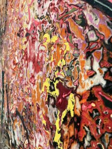 opposite: a seemingly reckless expressionistic use of color in unrecognizable grids up close that resolve into an individual portrait from a distance. Here, stylized figures become visible, upon study: a jaguar, a bird, but they are subsumed into the mosaic, where the distinction between figure and ground disappears.
Beyond that, you have to take the gallery at its word when it says you’re looking at his show as a deconstruction of Western culture’s exploitation of indigenous and minority communities in a body of work that represents a “deeply personal exploration of the multifaceted nature of displacement and the predatory forces that feed on populations driven into motion by crisis.” You read those words afterward and think, Guess I need to go back and look again. Maybe that’s the irony in the exhibition’s title: “You Don’t Have to Tell Me Twice.” No, but it helps if you ask me to look twice. Two canvases in particular, Where Lee Goodwin Was Jailed and Lynched and Go Down Moses are powerful and arresting abstractions. They are original in their use of materials and extremely restrained color, the first looking almost like a wall of papier mache draped across the surface in colors as supple as fur and the second a complex visual image that evokes a number of different impressions: Asian scroll painting, oddly enough, and what’s left after multiple bills have been ripped from a wall. This description isn’t meant to sound droll, though it might. Again, with written instructions one understands that these interesting and rewarding experiments with materials and surfaces have everything to do with social injustice—but it requires a catalog to even see a glimmer of the political cargo here. Once again, you need a user’s manual to understand why the work has been given the deluxe and reverent presentation.
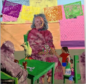 At Art Basel last week, Garth Greenan offered a selection of interesting, sometimes amusing works from the early 1960s by Pop Artist Rosalyn Drexler. In its blurb for the selection, the gallery writes: “They expose not only the underside of the American Dream but also a vision of America as the violent and self-violated world of white men.” That pretty much sums up quite a lot of our politics now. And it describes much of the work I’ve been assessing here, and I imagine it could easily be the marching song for entire classes of painters flowing out of art schools. It’s definitely in keeping with the neo-Marxist critique of patriarchal-capitalist culture going on throughout many of these exhibitions and in our culture in general. In Chelsea, on 20th St, for another month, Garth Greenan will be offering a selection of work that isn’t so stridently accusatory, but is consistent with that vision of America, from Esteban Cabeza de Baca, the child of parents involved in the radical left during the 1970s. From the press release: “Cabeza de Baca’s parents met in the 1970s while working as union organizers with César Chávez and Dolores Huerta. Chávez and Huerta, co-founders of what became the United Farm Workers, were dedicated to improving the lives of farm workers using non-violent practices such as boycotts and strikes.” The paintings are part fantasy, part biography, gently distorted memories from the painter’s childhood. The political is integrated into the personal by making it all surreal or magically real, as the AFL-CIO shares space with the Mexican cloth dolls and Kachina dolls given to the artist by his mother. As the gallery observes: “By working with the repeated imagery of these dolls, Cabeza de Baca reimagines these figures in the landscape of his father’s ancestral home in New Mexico. These dolls, and the resulting paintings, reflect memories from the artist’s childhood— stories of growth, migration, resistance, liberation, and solidarity.” Again, a show adhering to the current political orthodoxy, yet it was a refreshing exhibition for two reasons. The politics were delivered through visions from half a century ago, when economic struggle and unions acted as the point of the spear for the Left. But it’s a relief to walk through it because the artist’s style is child-like, colorful and affirmative. I didn’t love it, but I liked the parameters, a critical vision earned in the process of growing up and shown from within a world of remembered innocence. To fully understand what you’re seeing still required footnotes, but it’s a non-confrontational, almost nostalgic vision of people working together for family and community in good faith.
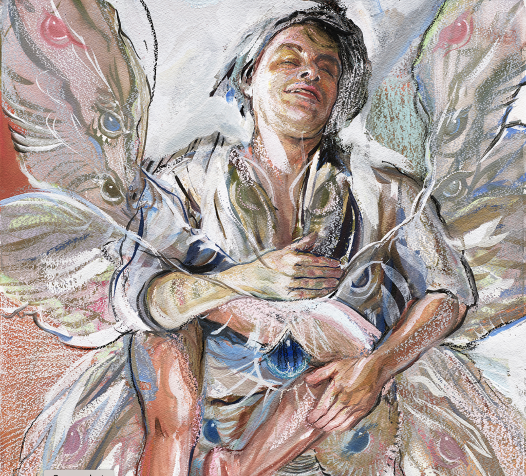
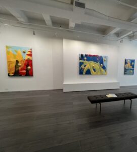
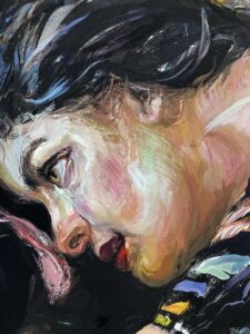 In Chelsea, there was also plenty not just to examine and study, but to love as well. As usual, Miles McEnery didn’t disappoint. (I am doing penance with a long post here for the sin of still not having written, after my last visit a month ago, about Inka Essenhigh’s marvelous, magical sold-out show at this gallery. I will get to that soon.) I discovered this gallery in 2011, when it was Ameringer McEnery Yohe, with a little show it assembled of Frederick Hammersley’s unique and winning minimalist abstraction, and I’ve been passionate about his work ever since. Under the transformed management, the gallery has expanded into new spaces and, in one of them on W. 21st St., is offering a powerful exhibition through July of Natalie Frank’s Jungian visions of inner loss and struggle. In the best of these paintings, she reaches for an almost visionary, Blakean extravagance and occasionally achieves it. The assembled work explored two themes: a woman’s struggle with her inner jungle cat, facing it, trying to tame it, a psychological exploration of the amoral, uncontrollable, dangerous, but psychologically innate drives in a person’s character and subconscious experience. Presumably Frank is drawing from her own inner life as Lion Queen. One of the most powerful of these paintings—much of the show is erotically charged, but this one achieves a sort of balance, a détente between lion and its tamer. She is touching foreheads with the lion, a gesture of affection less celebrated than the kiss but in some ways more selflessly loving, and our sultry tamer looks fully in control. The handling of the mixed media, what looks like oil as well as pastel and gouache used in much of the work, is bold and masterful, rich with a full spectrum of color. In fact, much of the show brings to mind almost a female Chagall from an alternate world, full of dark emotions, shorn of his Kabbala and the fascination with Christ. In the other series, Edgar Allen Poe’s Lenore is fused with his Raven, figures of death, fate, passion and loss. Raven V, the work with the least saturated or varied color, is the most transcendent, an image of a blissfully sleeping or dreaming figure clutching the legs of his lost love surrounded by wings filled with eyes, like an albino cecropia moth or a vision from Ezekiel. Without any commentary and completely out of the context of the show, it serves as a convincing vision of bliss. (Something hard to come by in Chelsea last week.) Frank’s work is imbued with passion, vision, daring, and immense reserves of felt experience full of unresolved ambiguity and verging on chaotic confusion. In other words, the show is brimming with life.
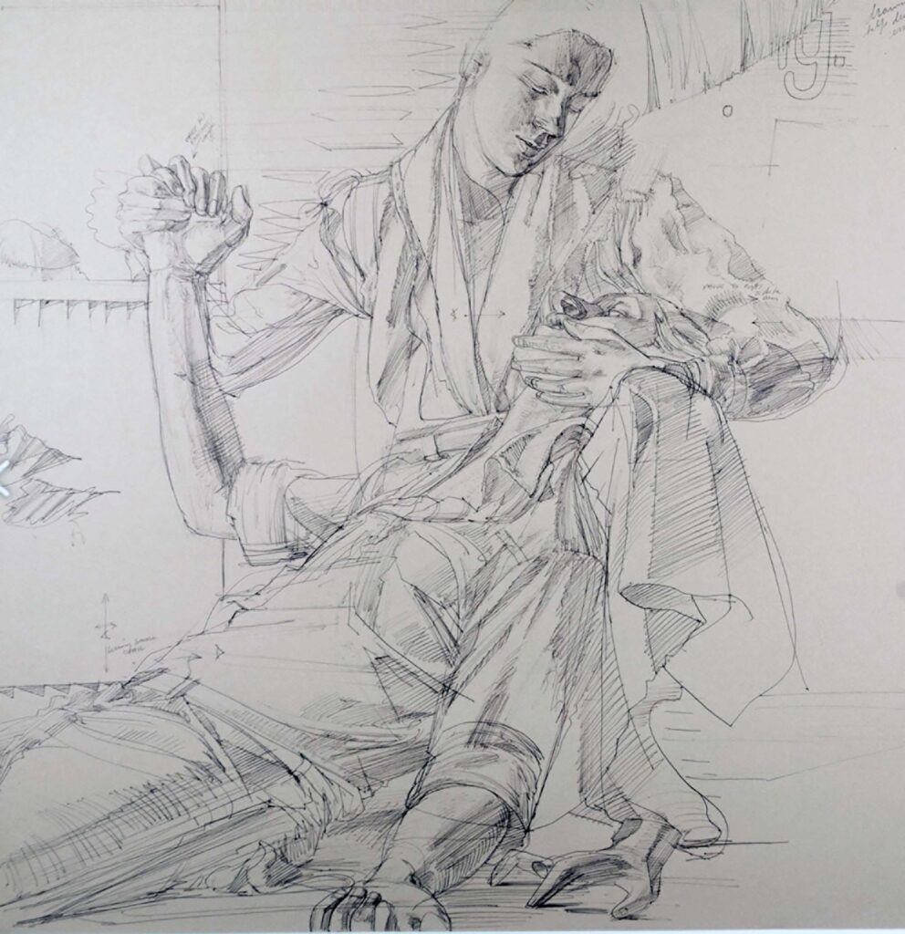
 A Minotaur makes a small cameo appearance in one of Frank’s paintings, recalling Picasso’s Vollard Suite and the sexual abandon it represented so mysteriously in masterful line drawings. Another show picked up this theme, at Gladstone on W. 24th, and made it urgently contemporary in a show by Carroll Dunham that ended a few days ago entitled merely Drawing. (Gladstone represents Matthew Barney as he does his unique thing out on Long Island.) This little show was a vehemently, explicitly sexual exhibition that would have been considered pornographic a hundred years ago, but now looks as distanced and almost clinical as an engineer’s sketchbook. Its sexual content is startling and at first disconcerting, but then—as what’s being shown falls into place—the show reveals itself as a much needed view of our sexually saturated culture, especially in its lonely, obsessed, voyeuristic modes. That said, the gallery’s press release is comically euphemistic, as if we don’t live in a world where you couldn’t actually say what’s being shown here. Quasi-prurient content gets announced with a slightly Puritanical reticence. Maybe anything goes on Tinder but Chelsea galleries can’t say a penis will be shown in a line drawing. (The Sixties and Seventies are definitely over.) Walking into Gladstone, you would have no idea whatsoever of what you’re about to view by reading up on it ahead of time. The press release talks of the green project and purple people, explorations of identity, science fiction, Celtic mythology and fundamental formal concerns, yadda yadda. No, this is a show about sexual obsession. “Male and female forms vibrate with intense purple hues, amongst other tones of red, yellows and blues,” the press release mutters. Vibrate is the least of what they do. This show is an eruption of taut, feverishly executed and masterful line drawings that bring to mind Picasso and perfectly do the artist’s bidding, which is to show you people trapped in a world reduced to nothing but sexual gratification. It’s claustrophobic. Whether this was what Dunham set out to do when he began this series, it works. It’s a concentrated and terse, and largely restrained (compared with Picasso’s erotic ouvre) creative response to a world where sexual stimulation is as easy and available as tapwater, vicarious and otherwise. On one wall, six drawings work variations of a female figure, half sunk into the floor, anchored in a tiny room, staring at an image of a vagina projected onto the wall in front of her. She and many of the figures in other drawings occupy this minimally indicated room, delineated with only a few lines that define a rectangular box, a cage, around the figures. In a companion drawing across the gallery, you look through the bars of the cage behind a bearded man gazing at the far wall again, and over his shoulder you see that he’s staring at a pair of breasts as large as the wall where they appear. The colors are indeed purposeful, distancing the viewer from what’s being shown, but also faintly hinting at the green skin of the Hulk, as he emerges in the series of drawings that greet the visitor on entering the studio. While there’s nothing political going on in this exhibition, Dunham’s vision of what’s consciously and subconsciously driving our social interactions and our economic life struck me as more powerful than anything I saw in the overtly political deconstructions going on elsewhere.
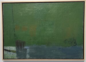 Finally, a retrospective group show at Berry Campbell on W. 26th St. introduced me to the Women of West Coast Abstract Expressionism. As the show was designed to point out, the work of these women was different in character from the more assertive and less emotionally calibrated painting of their East Coast male counterparts. Their work is far less indebted to Clement Greenberg’s axioms about paint needing to simply be on a flat surface. Much of this painting are examples of abstracted representation. It’s closer to contemporary perceptual painting, structured as a scene with the suggestion of three-dimensional depth, but mostly a simplified composition of different values and tones. Bernice Bing employs a sense of shape and line and volume reminiscent of Arshille Gorky for a modified pastiche of Las Meninas. Adelie Landis Bischoff, wife of the esteemed Elmer Bischoff, titles her oil on canvas Still Life No. 2, but it suggests an interior as well, three disconnected human figures positioned around a table rather than on it. The most powerful and perfectly composed oil in the show, Emiko Nakano’s Night Landscape would be most at home in a show with the East Coast abstract expressionists, akin to Franz Kline, but again the eye can’t help but discern an inscrutable scene, an unfinished expressway, a table, some thick construction topped by white globes like newel post caps, all of it projecting out from a green backdrop. It refuses to flatten out, the surfaces consistently reflecting a light source but the whole assembly working as rugged abstraction with the brush marks creating the illusion of relief. Irene Pattinson’s Spring Rain is a simplified landscape, as sparing with detail as Rothko, a wet surface, pavement or water indicated with a long streak of dull blue under a green expanse above, with one small rectangle in the lower left where the blue has been coated with a thin layer of white, suggesting moonlight reflected on the fallen rain from an orb outside the frame of the scene.
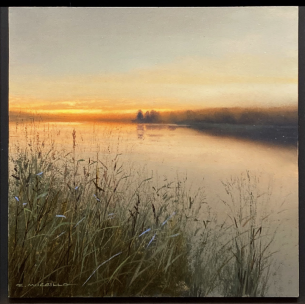
 The most impressive painting in the show is Dorr Bothwell’s City Dusk, an oil on canvas that revels in the physical properties of oil paint and yet simultaneously evokes both abstraction and a distinct sense of an immediately recognizable scene. It appears to be an impasto image of a city sunset reflected in the surface of a river, all of the color streaking from side to side. It brings to mind Richter’s squeegee abstractions, but the handling here is more delicate and, amazingly, accurate, and thus representational. Some of the paint is clearly applied and dragged from side to side with a brush, but in the middle, where she seems to be conveying a sunset shining over the reflected structures hovering over the middle of the scene, the paint has a different quality. It’s as if she applied cling wrap or something flexible, laid it on top of the paint and then pulled it sideways just slightly, then carefully peeled it away, leaving the little puckered webs that form when two glued surfaces are pulled apart before the glue sets. The effect is efficient and effective: the whole work suggests ripples and streaks in a reflective body of water. It’s also an elegantly uniform field of oil paint, each area with the same sense of effortlessly perfect application.