Baird’s bowl of grapes
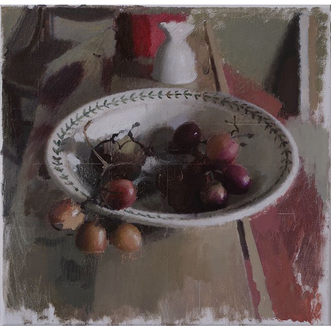
David Baird, Still Life with Grapes, 12 x 12, oil on canvas
I’ve been observing this painting for weeks now, off and on, trying to deconstruct what I’m seeing and why I love it. It does many things quite orthodox within the methods of the perceptual painters, some of them I “feel,” as one might say, and others I find irksome when they seem to become affectations and tics. He avoids everything irksome here even while engaging in a couple of the tics.
He’s another extremely talented alum of the Jerusalem Studio School, and he isn’t alone among painters who have studied there in that the quality of the paint he applies, for me, gives the sense of being mixed right from the tubes, without additional medium, so that it affords what seems like a dry, ragged texture, almost like pastel. The unfinished edges, which can seem like an affectation (one that I usually like until it looks studied), feel natural and serve his composition by echoing the tone of the bowl and the inverted soft-boiled egg cup—an object he has used repeatedly, going back to it the way Chardin kept using the same household tools from one painting to the next. That ragged border of raw canvas shows, in the gauzy and yet abrupt shift from paint to untouched canvas, what appears to be a low ratio of linseed oil to pigment. All of this sounds like shop talk, and I may be completely wrong about his mixing, but he is using this quality of paint to convey light and color in a way that’s deeply felt and sensuous. His tones are rich and beautiful and in perfect harmony. His very limited range of color is there to offer itself up for its own quiet virtues, not just to serve the purpose of representation.
Baird’s umber in the upper right corner, just leaning toward olive recedes obediently almost as negative space, a little glimpse of taupe wall that offers a ground for the objects closer to the viewer, but it’s also a hue that comes alive in juxtaposition with the reddish surface just below it that draws its harmonies from the grapes. Together, they are luscious colors that don’t call attention to themselves at first, but offer subtle pleasures to an insistent gaze. The geometry of this still life—the sphere, the rectangle of the plank, the ovoid cup, and the puzzle of triangles that lock together into a sort of gutter along the right side of the image—also bring to mind Braque’s spiritual father Cezanne and his insistence on the geometry of representation. Here, geometric flatness works—subliminally, without calling attention to itself—in a state of tension with the dramatic foreshortening produced by that center plank and the central oval and the general sense of real depth that, to say the least, would have annoyed Clement Greenberg. The slight confusion of what we’re looking at along the right side of the painting doesn’t matter because the lack of definition redirects you toward the grapes.
That plank: Baird seems to have used masking tape to create the left edge and its groove that looks like something one finds inside panels of Ikea furniture. (You drop that flimsy rear panel down into the grooves on each side so that you won’t be able to see the wall through your nice new bookcase.) He creates this groove by indicating it with the same color as that reddish column, so that the tan color of the plank seems painted on top of it. The groove is a groove, and then it looks as if you’re seeing through it to the colored surface underneath it and you see just flat stripes of color, one painted on top of the other. It works three-dimensionally but also offers that tension, the flatness of its minimal geometry. This is one of those elements of perceptual painting that becomes studied and can seem overly programmatic to me, the way abstraction seems to become all too visible in some of the work—but here it emerges as shorthand in service to straightforward impressionistic representation, a natural and shrewd way to abbreviate the execution of a painting that shows us real objects in a real world in a very real light, all of it done with feeling. The quality of that light and the narrow simplicity of the color unify the image despite the ambiguities around the edges of the central subject.
The necklace of ornamentation around the lip of the bowl, those little regular brush marks forming a chain of arrows seem to have been spontaneously added as a final touch, without any penciled drawing to guide his hand, not filling in, but just making marks. Given that, the uniformity of each little link in the chain is impressive: the steadiness and intensity of concentration required and the trust that the brush will leave the same mark time after time. The way the grapes melt into the shadow inside the bowl and then seem to change tone when exposed to direct light hanging over the bowl’s edge: again it looks both quick, effortless and accurate. Except that the color shifts in a way I like, making me think I’m seeing cherries inside the bowl and pale grapes of a color that I can’t find at Wegmans or Publix—those hanging over the edge in the brightest light. I don’t buy that color as terribly accurate, but I think it works pictorially. Also, there is that patch of utterly flat flesh tone that almost looks pasted onto the low grape furthest to the left, or as if a layer of paint has peeled away to reveal a monotone undercoat that looks arbitrary when you actually recognize that it’s just a patch of flat, uniform color. Somehow you were seeing the round grape with the brightest surface of all exposed to light from an unseen window– but then keep looking, and you see only that flat patch. This is one of those tics, the flat-looking marks that sort of work but also call attention to themselves as just paint. It either works or looks like virtuosity-signaling among this school of painters: here it really works because you see the grape first and not the patch of paint just being paint.
There’s another tic many of the perceptual painters adopt, the notion that a painting is done over a long period of time, and changes are made to earlier marks to accommodate mortality, essentially. Time passes, things degrade, light shifts, flowers in the vase wither, the world or the day ages before your eyes, dinner arrives, whatever, so that a painting needs to show all of this, with iterations laid on top of previous ones, pentimento serving like rings in a tree to convey time. Again, when this happens naturally and unconsciously, it can work for me. Otherwise, again, it feels like cleverness and adherence to a sort of new dogma, rather than a simplicity of vision and purpose rooted in feeling. One of the artifacts of this process is being able to see grid lines (penciled onto the canvas as an aid to drawing) through layers of paint. (Giving you a little glimpse of the painting’s history itself.) In theory I like that: it’s part of the unfinished ethos (and line drawings are often more alive than paintings), so any evidence of drawn guidelines can add energy and some of that lively tension between opposites generated by the flatness/depth opposition. Some painters seem to have moved beyond this, scratching these ostensible “guidelines” into the paint after the fact. For some reason this does add something, but it goes beyond the original justification for them. It’s an odd echo of horizontal lines in digital images and video, artifacts from technology, and this triggers a wild little sense of recognition subconsciously that sets up yet another tension between the handmade, painted object and the virtual illusions of digital displays. Here, Baird pays homage to this little new tradition—almost as if it’s a private joke between painters—by dragging into the wet paint the faintest indication of these lines across the bowl and then just slightly at the bottom of the lowest grape, so that the line does duty in another way, almost seeming to indicate light shining up on to the grape, reflected from the plank. It’s so faint you probably wouldn’t notice these suggestions of grid lines if you weren’t aware that others are doing it with much less subtlety. Here it works. The whole painting, as is true of his work in general, looks as assured and understated as a Manet.
This little still life has a simplicity of intent and execution, almost a paucity of brushwork, that gives it a marvelous sense of restrained passion: you feel every surface, every shift in color, and all the while, you see a bowl of grapes clearly painted, with much evidence of the artist’s hand, in a way that doesn’t call immediate attention to itself, because at first glance this modest subject looks exactly how it would look in natural light from a nearby window, as if you were seeing it while sitting there beside him.
Comments are currently closed.