Disconnected realities at Viridian
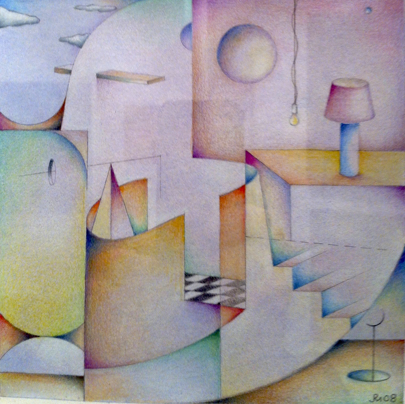
One of Jeffrey Melzack’s watercolors
I stopped into Viridian Artists last week to pick up a painting I’d shown in Endings and Beginnings, because I needed to ship it to Manifest for their current exhibit. With the parking maneuvers of an unlicensed limo driver, risking big parking tickets at rush hour, I got the job done, I’m proud to report. I’m getting as bold and improvisational as a seasoned New York driver, though I’m only an interloper in this town. I parked illegally at Second Avenue and 51st St., in the bus lane, and on a crosswalk. (You would think I was kind of a big deal.) I sprinted into UPS, plopped my big, pre-labeled pre-paid shipment onto the counter, and rushed back out to the car before anyone would have time to ticket or tow me. Gotta love those emergency blinkers. Before all of these urban scofflaw antics, I had time to catch up with Vernita N’Cognita and Lauren Purje, who were both on duty at the gallery desk. I lingered quite a while taking some iPhone shots of the current Viridian affiliate show, Disconnected Realities, getting in everybody’s way and in general feeling like an uninvited guest. It gave me time to warm up to the way the whole show looked. It seemed to hang together more coherently than most of the group shows we’ve had at the gallery over the past year, including ones I’ve been in. There was a lot of work on the walls, but it was hung in tight clusters of individual style that gave me a pretty clear sense of each artist’s strengths. It helped that most of the work was fairly small. A few quick impressions:
What I noticed about the photographs by William Atkins was how they captured contemporary sitters with techniques that give the look of 19th century figures in sepia prints, daguerreotypes, and tintypes. He induces a mild sense of perceptual friction in the contrast between the antiquated style and little clues that you’re actually looking at contemporary figures: anachronistic details such as body piercing or boxing gloves at rest on a woman’s lap. (A recent slideshow in the Times online called my attention to another photographer working in the same vein, pulling screen shots from video games like Call of Duty to create images that induce flashbacks to Matthew Brady’s Civil War.) Atkins’ photographs are wonderfully shot and printed and fun to search for those telltale signs that they were shot now, rather than a century ago.
Renee Kahn’s best painting in the show, The Card Players, despite its title, owes far more to Milton Avery than to Cezanne. It’s a quietly musical study in extremely muted, subtle greens and violets, with her three players clustered like confederates on a picnic, their bodies reduced to the simplest abstract shapes. As with Avery, by softening the edges of her geometric simplifications, and layering her paint until it vibrates with life, Kahn conveys a lot of emotion with an image reduced to its most fundamental elements. As she puts it: “maximum intensity with the least . . . means.”
Like Atkins’ photography, Lauren Purje’s paintings ride in the gap between her anxieties about contemporary disasters—things fall apart, the center cannot hold, mere anarchy is loosed upon the world, yo—and her love of the traditional masterwork of Durer, Turner, and Constable. She’s also smitten by a few contemporaries like Walton Ford, but mostly she’s got a crush, big-time, on the Romantic sublime. A couple fine examples of how she melds present and past are on view, but I wanted to see a couple of her witty and self-deprecating drawings, unveiled weekly at Hyperallergic. They offer wry commentary on contemporary art as well as the joys and sorrows of Purje’s nocturnal, Brooklyn-centric habitat, as well as the fauna populating the small region of her zip code located inside her skull. Her default setting about the world, and herself, is essentially, “I’m just not sure I feel good about all this.” I hear that.
Two colorful works on paper from Vernita Nemec, the gallery’s director, are quite different from the performances she’s contributed to the shows I’ve seen in the past year. The one I liked the most appeared to be an image created by immersing the plume of an ostrich fern in red paint and then using it to lay a flat, patterned shadow of itself on paper—a monoprint off a natural, botanical design. It has subtle variations in the predominant red with faint cooler tones showing through in patches, like sky through clouds. The effect is moody but cheerful and almost Chagall-like, She’s been pulling monoprints from nature’s ready-mades for many years, including her own body in a nod toward Ives Klein. It’s part of what she calls an “archeology of the self.” Her work—performances, installations, photographs, prints, and collages are assembled from found materials to convey a kind of inner autobiography. She tells me she has yet to do a monoprint of her cat, though. If that happens, I’m going to have to go ahead and ask her to do a YouTube video of the process. Now that’s a cat video even I would watch.
Meredeth Turshen offers only the briefest reflections on her gestural abstractions in her artist’s statement, which refrains from explaining much of anything. Wish that would become a new standard. Her colors are rich and subtle, and she can load the rifts with ore by saving the most saturated passages of intense hues for the tiniest slivers of line and form. Sounds geometric, I know, but her work is anything but. Formal properties suggest a kind of mammal warmth more than abstract precision. Shards of color melt at the edges and lope in friendly, lazy swaths across the paper. Irregular figures huddle like badly-fitted puzzle pieces. There’s a slight sense of unfinished business about all of it: the energy of what she chose at the last second not to quite finish, leaving the viewer room to imagine the rest in a way that makes what’s there even better.
I suggest you take the photographs of Sheila Smith as an invitation to view more of her work on her website. The work on view at Viridian seems to marry the feel of a Matisse cut-out with Pollock drips. She assembles large crinkly collages from what appear to be colored tissue paper—the sort you might wrap around a new blouse in a gift box. Then she dribbles and splatters paint across the surface, and finally takes detail photographs of the work, which she modifies with Photoshop and then prints onto cradled painting panels. It’s all good, but it’s only a small taste of her diverse photographic work. She seems to constantly try to reconcile her schooling in both photography and painting: her detail shots of New York City graffiti sing with a surprising sense of push-pull visual depth and a deep affinity with the abstract expressionists, both from the 50s and 60s. One thinks of Mark Tobey at one point, while another image on her site is a dead ringer for de Kooning. Good de Kooning. I’d love to see her try one further step: to do actual paintings based on photographic images she thought she’d Photoshopped to completion.
Joshua Greenberg’s sophisticated photo-based images combine photography with digital processing to create surprisingly textured images that look as if they’ve been painted on a rough surface. My fingertips had to resist temptation. His artist statement spins around on itself, generalizing in abstract terms about the balance between photograph and computer manipulation. In other words, he gives nothing away about what he’s actually doing—what image he shoots, and what specifically he does to it once he uploads it. The results look unapologetically modernist. The way Jeffrey Melzack’s images hearken back to Klee, Greenberg’s stir memories of Braque’s analytical Cubist phase at one point and Mondrian at another, if Piet had been way more into blue. What’s most enjoyable is how painted his images look.
A balance between photography and painting seems to be a major thread running through this show. Katherine Smith’s paintings carry this dialectic to a more complex extreme: she shoots digital photographs of paused movie scenes on her flat-screen, then uses these images as sources for large, nearly monochromatic water-based oil paintings, done on polymer film. Process-wise, it’s a bit of a sandwich of paint between layers of film—one at the start of the process and one at the end. The paintings she’s included in the show, painterly and nearly expressionist in their brushwork, are only two of a series based on shots that took her nearly three years to compile by sifting through vintage films for just the right image. The effect is to lift an image completely out of its original narrative by isolating it and stressing its formal properties as a painting—yet in the process the figures in her scenes evoke complex, subtle emotional responses, a hint of passing time just as powerful as the flicker of frames shuttling through a projector.
Elvira Lantenhammer’s statement about her Site Maps offer a pretty concise reflection on what she’s up to in her work, which has grown from her practice as an art restorer. I pass it along with only slight editing: “I reprocess details of maps and street plans into painted tableaus – sometimes in large format. Through an intensive study of topographical map works, historic and contemporary, I arrive at the formal basic structure . . . of the place. In my abstract acrylic paintings on canvas or egg tempera paintings on wood, the main points of orientation for the viewer are the dominant colors. I am inspired by the wonderful brightness of the colors of the early Italian paintings. With the background of my education as restorer, I use this traditional materials pigment/ egg tempera on wood to express what I feel about a certain place.” In an email, she emphasized that color is her primary focus. To increase the brightness and intensity of her color, she uses wood panels, three layers of chalk, and then paints with egg tempera. She says she strives for “a remarkable, deep shining surface, like velvet.”
When I stood before Michael Rippl’s photography I had no idea it was based on Polaroid prints. I was admiring the sense of disconnected reality he achieves, as if he’d taken the show’s title to heart a long time ago as a philosophical principle. The patina of faded color evokes lost time—again a convergence of past and present that runs through a lot of this show. Yet he underscores that feel of lost time by giving the images a look of rough usage: slightly faded, slightly worn. What amazes me in retrospect is that I started talking with Lauren, at the desk, apropos of nothing, about how Polaroids might be the last really trustworthy photographic technology available (not for long, since the technology isn’t as readily available anymore), given the ubiquity of digital manipulation. At that moment, I didn’t realize I was looking at digitally manipulated images based on Polaroids. (Subconsciously I must have picked up on it.) For these images, Rippl shot his Polaroids, which he altered as they developed—not in the manner of Andre 3000’s sage advice (shake it Suga, shake it like a Polaroid picture)—but by massaging them with his fingers, among other things. He then uploads digital images of these Polaroids for further manipulation. So what I saw here destroyed my fatuous nostalgia for a mythically untampered-with photographic image. I was seeing yet more evidence that photographs aren’t any more “objective” or literal or trustworthy than any other form of representation. Not that I cared. The beauty of the images justified whatever it took to achieve it.
I kept coming back most often to the smallest work by Jeffrey Melzack. His finely wrought images hover, like Paul Klee’s or Escher’s, in a world where geometry seems to represent a visually inviting but mostly unfamiliar world. His work is seemingly abstract but full of feeling. With the slight caveat that it’s impossible to pin down exactly what’s being represented, his world here is dreamlike, full of trap doors and stairs that lead nowhere and colors that seem to airbrush themselves into the void. There’s a quietly upside-down, inside-out enchantment going on that feels exactly right, as if this is what you came to art for in the first place, back when you had no need to know what the point of it all was. No excuses, no explanations, just my world and welcome to it. Back when you loved art because it was so irresistibly where you wanted to lose your head for a while and all the significance would dart away if you tried to take dead aim at it.
[…] Disconnected realities at Viridian […]
missing your writing! thank you for these words! & hope to see you again soon! gotta see Jasper Johns monoprints!
v
I missed this when you commented, Vernita. Hope all is well at VA.