Abstract impressionism
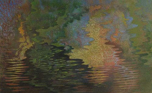
River Mosaic I, John Cullen, mixed media
There’s a fine show of John Cullen’s latest work at Viridian Artists. He paints modestly-scaled abstracts that begin with a kind of AbEx experimentation, where he allows thinned acrylic paint to drip down a sheet of paper. In other words, he lets water have its way, at the start, and then he begins to build on the trail it leaves behind with pencil and more acrylic. That may sound like a pretty dry way of describing an artistic practice, yet Cullen is all about the wet. His paintings evoke the flow of water in all its forms: streams, raindrops on glass, mist and clouds. While so much abstraction builds from geometric exploration, Cullen’s provenance is really physics: the irregular, organic waves evoked by light reflected on fluid. He ends up with mosaics that appear to have the intricate order of fractals. His colors glow and hint at different states of consciousness, not simply different angles on the outer world.
His current work builds from a wavy, warped grid, a skeleton, of vertical and horizontal axes, which provides an anchor for his improvisations with color. If you look long enough at some of them you realize he’s created an abstraction from an actual image of a scene reflected on rippled water. You see bits of blue become sky, and tiers of green resolve into trees that surround it. There’s a mosaic quality to his technique inspired by pointillism. Yet he found that Impressionism didn’t allow him to create the color harmonies he wanted because its emphasis on atmospheric light didn’t provide opportunities to create discreet enough areas of color—he needed edges and borders. The lines aren’t that continuous or steady—shapes become recognizable but begin to dissolve as the eye moves across them.
The stylistic tension in his images grows out of the way his lines and shapes move in and out of definition—providing him ways to quarantine one area of color without allowing any particular shape a sense of completion. There’s no negative space, no foreground/background in his images. All areas are equally significant. It’s his own version of an “all over” technique.
I talked with him a bit about how he arrived at this work, and how he creates an image.
Tell me about how you started painting.
I knew I wanted to do art, I was fascinated by art, at age 11. I was reading the Saturday Evening Posts my parents used to get. I was fascinated by the illustrations. I was totally turned on by it. Stephen Dohanos in particular. He did wonderful stuff. I started doing pastels based on that, though his was based in oil.
That was Norman Rockwell’s turf. He did a lot of covers for them.
Yeah, I wasn’t interested in him. Too tight, too realistic. I like Donanos. It was very simple. Then I went on for a few years, doing that and pen-and-ink drawings, doing art in high school of course. My first experience with professional artists was in my teens. My parents knew someone who ran an art school in Elizabethtown, in the Adirondacks. I spent two summers up there. They were mostly part-time, some dilettantes, some were professional. I didn’t go to art school for another ten years, when I was 27. I’d lived in San Francisco until then. I came to New Jersey and went to the Newark School of Fine and Industrial Arts and then went to New York City, doing portraits, and got my Bachelor’s at NYU and then Pratt for my Master’s. Then kept on painting and taught school in north New Jersey for four or five years and Syracuse for about seven years, in the public schools.
What sort of work were you doing then?
Landscapes and wildlife, but I was always interested in water. I used to do quite literal things with water. Lakes. I became fascinated by reflections. That’s what got me started with abstract stuff in the 90s. Before I knew it, I was so far ahead of myself I couldn’t even define what I was doing.
Has it felt that way since then?
I don’t take the time to analyze. I don’t use photographs anymore as a point of reference. The procedure is like this. I work on 30” x 40” sheets of illustration board. It’s good watercolor paper adhered to a backing. I start with acrylic paint, very thin, and I drip it on this board and it sort of goes all over the place. I use a large eye dropper and put it across the top and tip the board up and let it drip. I get these loose images and let them dry. I start the drawing based on what I see. I use colored pencils. So it’s a combination of acrylic and colored pencils. Later I go over it with acrylic again.
Do you thin it out again?
Yes.
More like watercolor.
Definitely. I never use it thick.
Why acrylic then?
When you put it down it doesn’t change. If you put watercolor, one over another, it doesn’t hold fast. Acrylic stays there. I like to work on illustration board because if you have something that doesn’t work, I can scrape it right off. I also take it off with rubbing alcohol.
It doesn’t warp the board?
I use it in little doses. If the board wants to warp, it’ll warp from the get go.
It isn’t like wood where you can’t take the warp out of the wood. When I frame them I’ll put them behind Plexiglas and that flattens them anyway.
You have a medium that will do what it wants to do at the start, but watercolor has too much life of its own.
With acrylic what you see is what you get. I like that. I used to work in oils. I gave that up because the drying time is too slow. I use a lot of glazing. I put one color over another. I love to glaze with acrylic. Hard to do that with watercolor. Then the colored pencil intensifies stuff tremendously.
Your images have that luminosity you get with watercolor.
The reason for that is the very white illustration board. It’s underneath that’s important. Sometimes I use watercolor paper, Cold Press, Arches. But the board I can be brutal with.
I want to go back to that first stage where you’re dripping, where you’re not controlling it. It’s obviously an AbEx technique but you’re applying more control as you keep working.
Exactly. Basically I’m a draftsman. I’ve found a happy medium between the loose flow of the paint and the drawing with the sharp edges and delineated forms.
There’s a lot of that in Paul Klee.
Well, he’s one of my favorites. I have three: Klimt and then Klee and then Vermeer. I love Klimt not for his figures but for his design, the mosaic, Byzantine quality.
There is that mosaic quality in your work because of the pencil.
Exactly.
What is it about Vermeer?
He isn’t really an influence. I’ve always just loved looking at his work. I could not get away from his paintings. They’re like magic. I love his work also for its simplicity.
Comments are currently closed.