Gifts
Gifts, oil on linen, 53 x 53
1
Starting this spring, and all through the summer, I’ve worked on only one painting. I’ve never invested this many calories into a single painting, this much obedience to the act of looking at a particular set of objects. I suppose this can’t be an entirely good thing for a person, but I’m pleased with the results. For me, painting is rhythmic, like factory work—you do a certain amount each day, on a regular basis, and at the end of X number of days you have a painting. This one has been different. Most days, since early May, I’ve put in several hours of writing every morning, first thing, usually from 6 a.m. to 9 a.m., which enables me to pay the bills, then another four to six hours of painting, seven days per week. I took much of July off, in the middle of all this, when I went sort of rogue, insofar as that’s possible at my age, and I rode 1,700 miles around New England and into Canada on my eleven-year-old BMW R11050R motorcycle, mostly staying with friends. Then I came home and got back to painting, wielding my brush with the wrist I’d made sore during a couple weeks of using it to twist a throttle. Around four each day I would settle into a chair for a while or go for a run. Writing this blog took a backseat, as did most other things. My absorption with this painting drew me away from a number of other activities, and last week I more or less finished it. I say that provisionally, since no painting is ever finished until you store it somewhere you won’t see it again, preferably in the home of a new owner–or send it off for exhibition. I’ve already entered in in a show at Manifest, so that means it’s done.
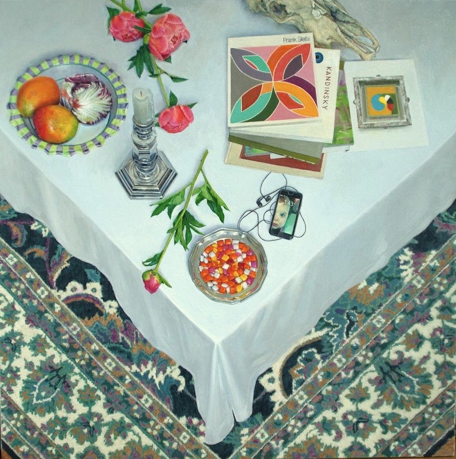
This newest painting is an overhead views of a tabletop’s corner, with wedges of Persian carpet beneath, and various household objects strewn at random over the white tablecloth, some like tropical birds perched on snow. I’ve been doing these tabletops for twenty years, probably finishing a dozen of them in all, and I think I secretly hope this one will be the last. I undertook it partly as an effort to complete a definitive version of this personal genre.
I started doing these tables in the 80s after a long obsession with Braque. Inventing this format was my truce with the force of his heavy influence over me back then. I’ve returned to this format again and again, trying to do it better each time, each painting like a new cover of the same song, or an attempt to recall a dream that won’t quite come together and make sense. I think mostly of modernist abstraction when I’m painting one of these, because of the way so many of those painters (Pollack, De Kooning, Motherwell, but especially Rothko and Stella), would paint almost the same image over and over—a fixed template within which the artist would vary certain other elements, especially combinations of color. Stella tried one different set of color harmonies after another in a repetitive grid of his chevrons or quatrefoil puzzles of arching crescents and almond-shaped patches of paint. For these tabletops, my composition is nearly indistinguishable from one version to the next. I gather together a diverse, circus troupe of household objects on the white bedspread (not a tablecloth) flowers and art books, a dish or candlestick, a CD case or a phone, and the objects usually gravitate to the same place from one canvas to the next. Books toward the upper right. Flowers descending from the center top. Something shiny and round down near the apex of the cloth, maybe containing a little shining pool of candy. All of this appears on top of an architecture of downward-pointing, overlapping chevrons, in the lines of the table and then in the V-shaped sections of the carpet.
In the beginning, though slightly less so now, my motives were simple and entirely formal. There was little more to it than the desire to juxtapose concentrated doses of intense color, linked by nothing but the imaginary geometry of their relationship to one another across a field of white. Painting these tabletops, I feel like Richard Dreyfus in Close Encounters of the Third Kind, building a mountain out of anything within reach without knowing what he’s trying to visualize, making it over and over and never quite being able to figure out why, with mud and little shrubs from outside the kitchen, mashed potatoes on a plate, molding it all into something he keeps trying to recognize. He looks at it, never quite satisfied but he’s absolutely certain: this means something.
2
From when I first saw Neil Welliver’s paintings in the 80s, I was captivated by his personal credo of “no going back over.” He would start at one corner of the painting and finish on the opposite corner, with no reconsideration of the first paint he put down. I saw his professed ability to get everything right on the initial strike as something to emulate. Anyone who has practiced photorealism understands what he was trying to do because you are transcribing a photograph. Welliver claimed to do that from his drawing and from memory. And he said his work had roots in abstraction rather than representation.
For me, the reality is, if you work slowly enough there’s no need to glaze or correct or add any depth or complexity to the color you put down. There’s no need to push new paint into old. Most of my painting has strived for that ideal. Van Gogh, in his ability to finish a painting in a day, set the standard for it. Welliver simply flattened the depth of the paint, and also gave himself a lot more time and fewer colors, but his work still had that early-morning quality of a first look at something the light has only now unveiled. I’ve always wanted that and still achieve it now and then, in quickly executed work, alongside the more painstaking images I make.
With these paintings, I did just the opposite, requiring myself to do things I haven’t done in any of the dozen or so previous ones like it. I think I’ve surrendered to the exhausting requirements of this format more completely than in the past. It’s a marathon of effort. When something isn’t quite right it may take me three or four weeks, even more, to admit this, but more than in any previous example of these overhead views of tables, I’ve capitulated to the way it irks me. In this one I’ve been willing to go back over trouble spots until they’re right, sometimes more than twice. Several times, I knew what I’d painted wasn’t good enough, and I kept backtracking, covering up my work with a layer of white and starting over, or simply painting the thing anew on top of the imperfect, dried paint that’s already there, using the failed attempt as a map for the new version, something that peeks through just a little and subliminally strengthens what the eye sees or eases its hue up through the latest color, pentimento-style. The tablecloth represents four or five layers of slightly different white. The carpet shows, in some places, three or four layers of a particular color, or one color on top of another, while in other places you see only the first layer. The catalog of Frank Stella paintings in the upper right quadrant of the painting was more demanding than the candlestick, probably the one object that most resisted my efforts to get it right: days were devoted to getting nothing but the san serif letters of his name to the point where I could leave them alone, with perfection receding gently and incessantly, like the destination of Zeno’s arrow. Like that arrow, I felt completely stalled, but in the end I was happy with the outcome. It felt almost acrobatic, the contortions and care I took with my fingers and arm to steady a few hairs of a brush.
The candlestick in this one was the most rewarding example of my willingness to do something completely over again. I’d spent a week or so on it. I was at the point where no one who took a peek at the painting had a problem with it, but I knew it wasn’t right. The highlights on the silver facets looked disorganized and confusing—it was hard to feel a coherent light source by looking at the complex shining contours. So I got the candlestick out again, set it down in the foyer where I’d originally had it, and positioned it so the highlights converged, like a string of pearls, right down the center front. It was exactly what I wanted. I studied it, took a photograph and studied that, but the other problem with the original version was that it looked golden, almost like brass, because it was reflecting the taupe color of the foyer’s walls, and this new shot had that same yellowish quality. So as I went back over the original layer of paint, in the act of putting down a second layer with a new arrangement of lights, darks and grays, and I modified the color, as I worked, even more toward blue-gray. Some of the old brownish tint remains, showing through here and there, but it’s a minor complexity and gives the dominant silver a slightly warmer quality—making the final version look far more convincing and alive. I changed the candle itself completely, finally seeing what was there: that the white candle was actually darker than the white tablecloth behind it. I can look at something for hours and not see it accurately, and part of the value of doing a painting at all is in learning how to simply be aware of what’s there in front of you, which more or less is the first and last step of intelligence.
The peonies themselves, a particular kind we ordered from Whiteflower Farm some years ago, start as intensely pink buds and fade to a rich peach color as they open, turning an off-white by the time the petals are ready to fall off. They bloom and fade and fall as fast as the magnolias Robert Lowell wrote about in his poem, with their five days of life. These were all early in that arc of color, hardly open, and the flowers themselves flowed from the brush, premier coup. The leaves and stems . . . not so much.
They’re shiny and the veins dent the surface a bit like creeks in a hillside flowing down into the central vein. I couldn’t get it, because the photographs were not crisp and the color wasn’t right. At one point, I thought the leaves were going to ruin the weeks of work that preceded them in other parts of the painting, or else would require me to remove the flowers entirely—they were just wrong, no matter what I did, working from photographs I’d taken in the spring. So I went outside, the plants still dark green all summer, full of foliage, without flowers, and picked a few small stems and brought them in. I stuck one of them to the central strut of my easel above the painting, with a push pin, and began redoing all the leaves based on what I saw. That first day of repairs didn’t help, because the lighting was insufficient in my studio—a room without skylights, plus a northern exposure.
So I went out the next day, picked more leaves and took some photographs of them in the foyer–in other words, with lighting identical to what I’d used for everything else in the painting, a large window slightly behind and above the viewer’s head. Again I pinned leaves right above the canvas for further reference. It took me five minutes to finish one leaf working from these two sources. I had to be able to see the leaf in three dimensions, how the veins actually sink down under the surface of the leaf and then how the light shines on it as a result: the surface shines, looks polished and the color is almost a blue-green. I woke up uneasy that morning, feeling slightly desperate about whether or not I could really master all this foliage, whether it would ruin the painting as a whole, and after a few minutes I knew I’d found a path, if not to mastery, at least to something that worked. I quit grinding my teeth every time I looked at my work.
In all, this backtracking represents a significant change in the way I’ve approached these paintings, which have never inspired me to be this painstaking. All of this backtracking solved the problems I faced. The candlestick’s transformation surprised me the most. It makes me happier to look at that candlestick now than probably any other spot in the painting. It feels like a little personal coup, a discovery and a reward for dogged determination all at once.
3
As I worked through most of the summer on this one—minus the three weeks in July dedicated to anything but art—it struck me that these tabletops look like cornucopias, but also like formal altars, for offerings, a sacrifice, some kind of ceremony. I haven’t set foot in a church in decades, but the formality of the white cloth gives these paintings a slightly ritualistic feel. I was ready to name this one Altar of the Everyday, and it made sense: life and death, the sum of all experience, is a gift. We didn’t create it. We didn’t deserve any of it, good or bad, when we were born. It was, and is, a gratuity, all of it. Every day is a gift and, if you recognize that, you have a chance to give something back. You give it your best, as they say, if you’re doing something right. Painting itself is a sacrifice and an offering of time, effort, feeling, hope, with no clear notion of what there is to be gained by giving up everything else you might be doing with your time. You generally gain nothing more than the finished work itself, the outcome of the gift of being able to do it. So I kept going through titles until I settled on Gifts, realizing that most of the objects on the tabletop actually happened to be just that, in an everyday way: things someone else had given to me or our family, or else things I’ve given freely to others, such as the flowers. Even the cow skull. There’s a personal story behind most of these objects, though I had no intention of assembling them for that reason.
As always, I picked them simply because they offered a shape or color I needed to see at that particular place on the canvas. Again, the imperative was formal, perceptual, not something dictated by an idea or concept. In the end, this whole Corner of Plenty, as it were, inspires me with ideas about what the image could mean, yet none of these ideas inspired me to paint it. As I’ve said before, the meaning follows the purely visual invention of an image, not the other way around, as in so much art now, where the work merely signifies an original idea. You find your way to meaning by touch, in the dark, not entirely knowing where you’re going, and when you get there, the meaning may not be anything that surrenders to words, any more than an instrumental song can be translated into a proposition.
4
As I’ve been doing this painting, I’ve thought about all the influences that converged for me in this series, back when I attempted the first one. As I mentioned, at the time, I’d just emerged from a year of being enthralled by Braque’s mid-career work, the monumental pedestal tables I saw during a couple visits to New York and Washington, D.C.—especially a powerful retrospective at the Guggenheim in 1988. I loved those paintings not only because they were so mysteriously riveting, but also because the French painter had found a way to assimilate his influences into an individual aesthetic that was entirely, recognizably his. He was transforming what he saw into a physical object that had its own mystery and presence, in no small part because of the way he mixed sand into his paint, calling attention to the tactile surface. Objects were still recognizable but they melted and intersected with their surroundings into a new, original whole that, in most of his work, conveys something you can see but are unable to express in words. This something, in Braque, is there from painting to painting and, for me, is unlike anything else in Western art. He found a small niche of utter uniqueness, somewhat Burchfield did in an entirely different way. Yet every great artist has that quality in some degree: that unique quality you can see but can’t translate into other terms.
I had gotten to the point where I knew I couldn’t simply imitate Braque—it didn’t stop me from doing that in a dozen or so paintings. As much as I loved his work, I’d exhausted what I had to learn from his hybrid personalization of cubism. At around the same time, I saw a solo exhibit of large still life paintings by a contemporary painter, Raymond Han, at the Munson-Williams-Proctor Arts Institute in Utica (where I also discovered Charles Burchfield’s work, in a retrospective of his large watercolors.) At the time, Han had done a substantial series of large paintings, most of them of tables covered with a white cloth on top of which were clusters of dishware, flowers, and other household objects. So, at that time, I was pulled toward both straightforward representation and also abstraction, and in this series of my own, I was attempting to reconcile the two in the way I composed these tabletops, as well as the scale I was using.
I pulled everything up toward the viewer, as Braque does, tilting my image so that the tabletop was almost parallel with the surface of the canvas, so that the objects, on a 1-to-1 scale—almost appeared to be attached to the surface of the painting, though I had no interest in trompe l’oeil. I wanted the objects to be almost touchable, seen from above, and yet I also wanted their outlines to create an abstract pattern—the painting would have a certain character as simply an arrangement of flat patterns even as it worked as a realistic, large still life.
Meanwhile, I was instinctively picking objects for their physical qualities and grouping them: squares floating in one half of the image, circles on the other side, with a few things at the border representing both squares and circles. I’d picked the Kandinsky book because of its white cover and simplicity of the images on that cover, as well as for the shape of the typeface in his name. Yet looking at the image as I painted it, I realized I was arranging simple geometric forms the way he did, against a negative space. The polarity between angles and curves, circles and squares plays against another polarity between natural forms, flowers and fruit or vegetables, as well as the cow skull, versus the manmade objects: books, the tray, the candlestick and the candy. The candlestick and candy are both angular and round, a synthesis of the different shapes. None of this has any overt meaning; there’s nothing consciously Pythagorean here, but it was a way of establishing regularity and order in what appears to be a random scatter of discarded things on a table, a life in flux caught as the owner has stepped away from the scene to do other things.
There’s an intimation of a narrative, the story of a life—which would be mine, obviously—and it could be glimpsed there, especially in the face of our grand-daughter in the phone and in the candle from my daughter’s wedding at the Memorial Art Gallery, with the gracious permission of Grant Holcomb, who generously allowed us to hold it there. No one had suggested a wedding there before. But the painting isn’t intentionally a narrative: that aspect is just a byproduct of my groping toward a sense of order and beauty through my formal preoccupations. The hint of narrative adds another sense of depth to the image, and I’m happy it’s there.
5
Most of all, I want Gifts, and the other vertiginous tabletops I’ve done, to convey a state of mind somewhere between lucid everyday observation and a dreamlike disorientation. Looking almost straight down at the corner of the table gives it the look of a boat’s prow, slowly descending into view from above, the opposite of what you would see if you were standing on the boat and looking down at the water, Titanic-style. It’s more as if you were on a bridge above it and gazing at a canal as a barge floated into your field of vision. The white rippling cloth seems to cleave upward as objects float into view, each one self-contained, like a separate memory, against the empty cloth. In a traditional still life the background recedes from view at the top of the painting. Here it offers a backstop only a few feet away, beneath the things in the foreground, higher up. The background is more intricate and colorful than anything else in the painting, and the white middle ground offers the only real respite from the detail and color of the things sitting on top of it and the carpet behind. In a typical still life, the distance between viewer and object shrinks as the eye moves from top to bottom, while here it’s just the reverse. The way this inverts everything and creates a dizzying new orientation for things is probably what brings me back to this format again and again. It dislocates what you see from where you expect to see it. Of all the painters whose work I’ve loved, my fascination with a few paintings by Chagall, in my teens, probably has the most influence here. They were four he did to show the state of being in love: The Promenade, with Bella floating in the air like a helium balloon attached to his hand, The Anniversary, where he’s the one who floats over her head and curls his gaze around to look her in the eye (with its Persian carpet on the wall), Over the Town, where they float together in the air, and Double Portrait with Wine Glass, where he rides on her shoulders. All of them are under the sway of Cubism and yet create their own alternate world, without gravity, with compositions that allow him to do what he wanted with color, but without losing the crisp lines and flattened forms that make them surge with energy and delight. It’s the defiance of gravity, the sense that what you’re seeing is untethered and hovering that reminds me of the almost upside-down feeling of the tabletops and the sense of freedom it gives me.
Hello Dave,
I came across your post about the Oxford show last night and want to thank you for your visit and sincere look at our paintings. I am truly honored to receive your thoughts and words about my work. You saw me. I likewise have been drawn into your paintings and appreciate your work with paint every time. On behalf of Todd and myself, thank you for spending time with our work.
My pleasure, Phyllis. I really enjoyed the show.