All art is contemporary now
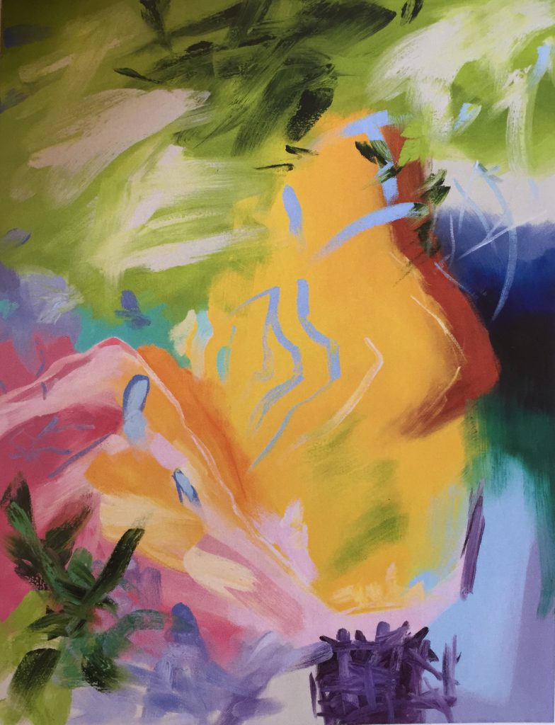
Libica, Elise Ansel, oil on linen
During my tour of the L.A. Art Show in January, a glimpse of Elise Ansel’s work from a distance reeled me into the Ellsworth booth about as quickly and effectively as anything I spotted in my tour of the entire fair. It was a small study based on a Poussin painting, reducing the original image to an abstract expressionist composition full of perfectly harmonized, intensely saturated tones with areas that looked as if the paint went straight from tube to canvas. If I had seen Ansel’s work before, and I may have, in a more absent frame of mind, it didn’t draw me in. This time, as I stood before that little study, I felt about as pleased as if I’d just stumbled upon the largest chocolate egg in a hunt on Easter morning. (Most of the work in the fair was a lot less stunning, therefore exceptional work tended to stand out even more powerfully than it would have done in a curated show. I had the same reaction to Kim Cogan’s small paintings a few booths away.) Barry Ellsworth, the gallerist, was staffing his own booth and told me a little about Ansel when I asked who’d done the painting, and he mentioned that she was also represented by Danese/Corey where, about a week ago, I discovered that Ansel has a new solo show. For anyone interested in seeing her work first-hand, the work will be on view in Chelsea for another ten days and includes some paintings even more remarkable than what I saw in California.
Ansel’s images are compelling for two reasons. First is the luxuriance of her rich, intense color, creating harmonies that feel both inevitable, yet freshly unpredictable, and sensuously felt. Her color is both inviting and beautiful. Matisse would have enjoyed these paintings, though it was Picasso who was more inclined to rework the occasional Old Master in his own idiom. She reprises images from Rubens or Veronese or Michelangelo, taking the original painting as an occasion to build a spontaneous, rapid translation of the historical painting’s colors into a contemporary calligraphic abstraction, freeing the colors of the original to overwhelm the original artist’s intent and completely define the new image. What she retains, though, is the original painting’s spiritual energy submerged into the libidinous pleasure of her color—the lyrics of the source are gone, as it were, and only the melody remains.
Second, she works essentially as an abstract expressionist, building flat patterns of various tones, and yet she’s able to convey a sense of great volume and space, a depth of field that has nothing to do with the flat plane of the canvas. You see into the painting as powerfully as you would a conventional landscape. She tends to favor scenes that include at least a glimpse of sky, which often helps to anchor and orient everything else in her paintings. This isn’t remotely like De Kooning, say, whose figures seem to depict a claustrophobic act of violence remembered in tranquility. Clement Greenberg, with his insistence on flatness, would have been puzzled about how to justify Ansel’s reliance on this convention of representational painting—the illusion of looking through the surface of the work rather than simply at it. She gets that three-dimensionality simply by juxtaposing indistinct forms and huge gestural swipes of paint. One might say the same of Turner, or Matisse, but here the color has been unleashed almost entirely from its representational parent and is asserting itself for its own sake, in relation to other colors, not primarily for the purpose of building a vaguely recognizable scene. In that regard, she’s closer to Howard Hodgkins, but the hints of representation in his abstractions feel completely different, enclosed, confined, and concentrated into boxes of paint, and there’s something a little suffocating about the intensity of his color in comparison with the balance and even restfulness Ansel achieves. If you could inhabit one of Ansel’s paintings, it feels as if you might grow a pair of wings and simply float around—which incidentally would enable you to blend in, socially, since you would be sharing some mythic space with winged figures from the original paintings.
What struck me immediately in that little Poussin study was the way in which her seemingly arbitrary and lyrical arrangement of pigment on a flat surface seemed necessary, without my being able to analyze what gave rise to this impression of necessity. Even as I was walking by and had simply caught a glimpse of the little painting, I could see she had solved the one central problem every painter faces: how to arrange colors and tones in a certain compelling and individual way on a flat surface, first of all as a celebration of nothing more than the pleasure of the paint’s formal properties. This spot of color next to that spot of color—it’s easy to put them down in a way that gives pleasure for a while, but how to make them seem absolutely right, correct, and ordered, no matter how many times a viewer returns to the image? This is enormously difficult, and Ansel makes it look easy. This imperative—to make the paint itself your primary concern, not simply what it will induce the viewer to see—is just as important in representational painting as it is in abstraction.
When I visited the Richard Estes retrospective at the College of Arts and Design two years ago, I got as close to the paintings as I was allowed and  that proximity revealed how much one of his paintings relies on small, uniform areas of color, with minimal blending across edges, similar to the way Neil Welliver would construct an image using a far more narrow range of colors. This isn’t apparent at all in reproductions nor when you look at an Estes painting even a few feet away, which is where you would normally stand in order to take it all in. In a way, he creates something analogous to a digital version of an analog image—sometimes breaking it down into simple constituent and almost modular parts at a level that isn’t noticeable. This works as a way of making the arrangement of paint in a certain pattern, without any reference to what the paint represents, seem to be at the center of his actual concern as a painter. The fact that this myopic attention to these carefully crafted marks accumulates into a stunningly complex and realistic visual image seems even more magical when you note how much he simplified what he was doing inside, say, a square inch of canvas. He had solved the core problem: how to give himself a pretext for arranging areas of color in a certain way on a surface. The realistic image offers the pretext for putting one mark here and another mark there, with a consistent quality in the application of paint; the challenge for Estes and other realists is how to find a personally compelling way to use an image for that purpose, as an excuse for applying certain qualities of color, with certain kinds of marks.
This is exactly what Ansel has done, but with an entirely different vocabulary of marks. By improvising on an Old Master, she gives herself a pretext for making what appear to be incredibly loose strokes of paint, any way she likes, and yet she’s constantly, strenuously referring to the source image, just as any representational photo-realist would study his shot—but with her own rulebook. She is straining to echo the armature of color in the original, not the actual appearance of the source painting; the way Bill Evans or Miles Davis, say, had their way with a song. The personal guidelines she’s devised for these re-interpretations are entirely hers, and probably impossible to articulate in an exhaustive way, but the original image and the rules together create the core of necessity—the sense when you look at the finished work it’s exactly right. This isn’t always the case, of course. A few of the paintings don’t hang together as coherently, or as powerfully, as her best work, but these are exceptions. The most stunning work: Venus and Adonis, with its little white dog in the foreground reminiscent of Louisa Matthiasdottir’s grazing sheep; Revelations XI; Cornbury III; Medium Study for Tiger, Lion and Leopard Hunt; and most of all, Libica, based on Michelangelo’s Libyan Sybil—an alchemical transformation of its source into something that, for me, comes as close to capturing the spirit of early spring as effectively as the opening of The Canterbury Tales or a poem by e.e cummings.
A brief Q/A conducted this past January, admirably devoid of pretention, serves as the introduction to the show’s catalog. In it, Ansel offers some instructive observations about the way she works, with hints about why she paints:
I have been surprised by the extent to which the spiritual or mythological content of the historical paintings I work with has revealed itself during the process of painting.
My initial attraction to Old Master painting often has to do with color harmony, composition, and structure. Beyond the formal characteristics, I search for . . . a certain quality of sincerity, resonance and sensitivity.
I would say one important thing is how to communicate spiritual truth visually.
I look for formal brilliance, emotional depth, spiritual energy . . . and a certain kind of erotic energy. I think we see this in the work of Matisse, Titian, Rembrandt, Picasso, Joan Mitchell, de Kooning—many great artists.
Spontaneity, improvisation, instinct, and intuition eclipse rational, linear thinking during the process of making the studies. My paintings are most successful when the entire surface is worked ‘wet into wet’ in one long session.
Like Matisse, who said he was aiming merely to give a restorative pleasure to his viewer, but later maintained that his aims were spiritual—as he made explicit in the work toward the end of his life—Ansel is consciously driven by spiritual preoccupations and yet her pursuit offers mostly a subtle, intense and calming pleasure. The sly ironies of Kehinde Wylie’s appropriation of Old Masters is absent here: this work isn’t driven by a postmodern agenda, but absorbs its influence and internalizes it the way Blake internalized Milton. She’s refreshingly and unabashedly modernist in her aims—there’s no trace of sardonic postmodern commentary on the earlier work, even though she claims that her study of historical art gave her some feminist pause in reaction to how women were depicted, consistent with John Berger’s thesis about Western art’s objectification of women in Ways of Seeing. But one doesn’t feel the weight of this nod to postmodern deconstruction of the male gaze in historical art here at all, other than to note, perhaps wistfully, an absence of bare breasts. This is earnest modernist painting, with no regard for the silly notion that modernism is over, or ever could be. Her work, in more ways than one, serves as a quiet assertion that no school of art can ever be over. Art history doesn’t work that way anymore.
Comments are currently closed.