Continuum: Chris Baker
In conjunction with Oxford Gallery’s show of new work by Chris Baker and Jean Stephens, Continuum, I drove to Weedsport and met with Chris at his home studio for a conversation about his work. Here are some of his comments when he could get a word in edgewise, despite my motor mouth. Chris is super-fit and in September he finished eighth in the world for his classification in Rotterdam’s ITU World Triathlon Grand Final):
Tell me how you got started.
When I was in high school it was for fun. Always enjoyed it. But then when I went to Rochester Institute of Technology for undergraduate work and things started to meld. I wanted to do it, become a professional artist, but realistically . . . you have to have a plan B, or maybe painting is the Plan B. I was lucky enough that I just went for a BFA and when I got out in ‘68 the war was on, and someone said, “If you go into teaching you’re draft-free.” I went into teaching, but it didn’t work. I taught in Auburn for two years. After two years in the service, I got back out, went right to Auburn and got an MFA and again thought I want to paint not teach, but I had to go back into it. In Auburn, they said no openings but there’s an opening in Cato. They hired me when I walked in the door. The superintendent said you’ve got to get your certification. He said “Let me just check, you’ve had two years experience in Auburn” So I got my certification a month later in the mail. Thirty-six years there. That was a great job. Summers off, painted all summer. Over the years I taught kindergarten all the way up to a little bit of college in Auburn.
That’s the great thing about teaching. It really does afford almost enough time to make art.
When we lived in the village we had a carriage house I converted into a studio. I was able to work evenings, weekends, year round.
What sort of work were you doing then?
I started playing around with tempera paints in the classroom.
On the way to gouache.
I went to Commercial Art and said this Crayola tempera, as much as I enjoy it, not sure . . . they said try gouache and that was that.
You were doing representational art even back then?
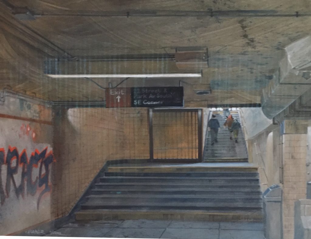
Yes. In our recent visit to Rotterdam we went to the Franz Hals museum but didn’t do Rembrandt. Didn’t do Van Gogh. People said if you go you’ll have to stand in line. I wanted to be with the people on the streets taking photographs and eating the food. I’m not looking for an influence. (He was there to compete athletically and to capture images to paint.) When I look at my work now, I see things have developed in a direction, things are changing. <We were looking at a larger gouaches he’d done of an exit from a subway line in New York City, underground, looking up from near the turnstiles, a bit of graffiti on the left, with a few people climbing up the steps toward the light of the street on the right.>
How so? So much of your work has the strength of abstraction, the geometry of the compositions. This one has those big brush strokes in the ceiling of the subway, you have this ground that shows through, with the gesture of the brushwork.
C: There’s so much more energy and life that way.
It shows the physicality of the process.
The paintings can get too tight. When I work them so much sometimes it loses life. It turns into something else.
You’re presenting areas of color with just enough detail.
I have students who say “You make it look so easy.” Every time I pick up a brush I feel as if I’m doing it for the first time. Most of my work starts with an underpainting and I have a four-inch brush for housepainting, and that’s how I start. I try to leave as much of that as I can and use that as a way of keeping it alive.
You mean leave as much evidence of that early loose brushwork as possible.
Yes. <He brings out an aerial view of marathon runners he painted as a contribution to a themed show next spring on the subject of Joy at Oxford Gallery.> This happened so quickly. The fast ones are the ones that are usually the better ones. This is underpainting down here: that big brush and spraying it and thinning it and putting it on heavier in one place and not another.
You can see your hand in that. You have these areas of color that define the forms. It’s like building a puzzle. Instead of modeling you’re building the image with areas of color.
To get the value right is the hardest part. When I’m working with light, the value is the answer (to problems). If things aren’t going well, it’s because the value is wrong. Things are either flat or jumping all over the place. Where do you want it bright and where do you want it dull.
You’ve got Beethoven in there on the surface of the road. It’s as if Banksy stenciled his face onto the road where they’re running.
Yes. A lot of people probably won’t see that.
Ode to Joy. One thing that has struck me is that in the Scotland paintings you found opportunities to simplify a bit in the execution. The one in Skye.
I was conscious of it before we went. In that particular scene, it was as if somebody had painted it for me. All those buildings, all the same color, and then that one patch near the harbor, with all those colors. And that shaft of light. It was one of those days when it was sunny and rainy and sunny. Scotland is like that all the time. I took advantage of that and flattened out that foreground so the background would leap right off. Most of my paintings have some focus of light somewhere, even in the darkest paintings. Instead of light everywhere.
You started talking about how things are changing in your approach.
This (marathon painting) got me going just because it was a little looser. That’s what I always struggle with. Things get tight and when a painting happens fast it has to be loose. I used to think that the more it looked photographic the better it was; now if I can combine the intensity of the light and the image with areas that are loose, with more energy, that’s my ideal right now. There’s that fine line and it’s hard to know how far to push it in one direction or the other.
It’s similar to an attempt to balance the abstract properties with the representational ones.
For me, on my level, realism is still important.
That’s the game for me. That’s the rule of the game. I’ve done abstract, but I need something to push against.
Me too. When I start, I use a tan, paper bag type of material with black and white pencils. If I want detail I have the photography. But at first I’m laying it out on paper. I tell students, the creative part is in the drawing. The painting is just values. After I do the drawing and establish lights and darks, I’ll mark it off on illustration board and go after it with my large brush. Sometimes I think why not just stop there.
Stop there, save that and start over and do it again.
Small ones. Sometimes using a big brush with a small painting. I do a number of eight by tens after some larger pieces that tend to become too predictable. So I’ll do something small to freshen things up.
So you start on the brown paper . . .
<He brings over drawings on brown notebook paper of bee keepers that are tremendous, just outlines of the figures in their protective suits with parallel hatch marks in the shadows and highlights as flat, uniform areas of pure white. He shows me what he’s doing based on a photograph of a canal in Netherlands.>
On this one my plan is to strengthen the light across the central part and this back part will really drop away. That’ll be very dark maybe picking up some reflections of light but I want the light to be coming between buildings right across here. So this foreground will be a medium value, the brightest in the middle and this will be darker back here. In terms of detail I can get whatever I need off the photograph, but in terms of light and dark this will be the guide. Many times I like the drawings better than the paintings.
If you go back to Van Gogh and Brueghel, their drawings often look more alive and contemporary than the paintings. The evidence of the hand in drawing is what gets lost in so much painting.
I feel I should do a lot more drawing, but I can’t wait to get to the painting. You can paint and paint and paint and every time that brush hits the surface you can lose a little bit of the life. The less I can touch it the better.
Yes. So much of painting is trying to juxtapose those two things. The image you are inducing the viewer to see in contrast to what’s actually there on the surface. Creating a disparity between what’s there and what’s seen, that’s where you get the life. You can make it look like a photograph and it can still have that life. That’s what I saw in Estes. Up close, it’s an abstract pattern of little uniform shapes. At the show I saw they even had his notes to himself about “not so much blending” or modeling from one color to another. Up close the paint often looked like Welliver’s, those distreet areas of nearly uniform color.
Yes. One thing I often end up doing since gouache is water soluble, when a painting is overdone, just spray the surface and go over it all with the big brush and then work on top of that.
Yes, I’ve done that too, since oil stays wet long enough to let you wipe much of it off leaving that afterimage.
It’s only paper and paint. It’s nothing precious. Why not take the big brush and attack this thing, and the parts you don’t like just redo them.
Easier said than done, Chris.
Comments are currently closed.