The perfect flow of paint

Mark Tennant’s recent work
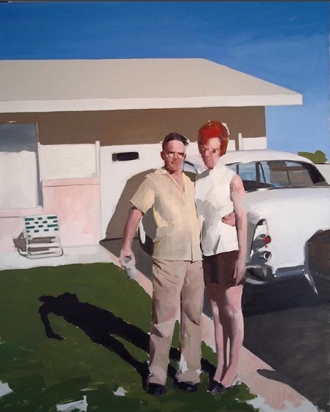
Mark Tennant posted this painting on Instagram a little while back, and I’ve since gone back to it many times with pleasure. At first, it suggests an almost clinical distance from his subject, a hauteur about a fragment of past American culture, which he’s isolated for observation. In this case, he seems to be looking back at a middle-class couple, standing proudly in front of their tract home and new car, circa 1960—he with beer in hand, she in pumps that aren’t even indicated except by the tiptoe slope of her feet. It’s all imbued with a cool, dubious squint of someone who doesn’t share the enthusiasms he depicts, a clinical detachment present in some of Tennant’s more erotically suggestive work, much of which has a muted, colorless sheen reminiscent of Gerard Richter’s early portraits based on media photographs of Baader-Meinhof terrorists. In this clinical mode, Tennant picks subjects that seem selected to provoke a raised eyebrow or a half-smile of condescension—as if he’s looking down, rather than head-on, at whatever he’s showing. It reminds me of what Martin Mull has been doing in his work—purchasing collections of family photographs from garage sales and flea markets to use as source material for his own surreal, emotionally detached and dreamlike visions occasionally on view at Hirschl & Adler.
Still, though I doubt this is the response Tennant wants, I react to this painting with nostalgia for those brief post-war decades when America was genuinely thriving, leading the world in building a middle class that was actually earning more than what it needed to get by. What drove productive lives wasn’t false hope back then. This proud couple could easily have been living on one salary at Eastman Kodak here in my hometown, with its generous wages and annual bonuses for workers, when a household could thrive on a single income, earning enough to get a mortgage on a new house and even buy a new car every few years. Over the past few decades, that level of material comfort could be sustained only on higher and higher lines of credit and more than one wage. The middle class has waned though it remains to be seen if it’s down for the count. Simple bourgeois comforts, along with an occasional luxury, are certainly as illusory as anything else on this spinning planet—so Tennant is perfectly justified in suggestions of sic transit gloria mundi, especially when the glories are so humble. He casts a cold eye on this moment of celebratory happiness yet it feels like something most people wouldn’t mind working toward now as much as they did in the 60s, and rightly so. It’s precisely what people who flee into our country are hoping to find. But what’s going on in this image has gotten harder and harder to make happen.
That said, this painting is different from what I consider Tennant’s usual mode and that keeps me coming back for another look. It’s far more colorful than most of what he posts. His technical facility conveys, by contrast with his seeming emotional detachment from the scene, an avid pleasure in being able to render things in such a way that his formal skill emerges as what’s most compelling in the work. The stylistic sang-froid recedes, for me, overcome by my vicarious delight in Tennant’s representational powers. Jenny Saville works toward the same kind of stand-off between subject and execution, picking subjects almost designed to be an affront to taste as a way of tempering the appeal of her bold, lush facility with paint, the sensual pleasure of seeing her push heavy loads of oil paint around so . . . well, so athletically, given the scale of the paintings. I’ve always thought of it as a strategy akin to Sinead O’Conner’s buzz cut, a way of hedging rare beauty in the interest of being taken more seriously. As if beauty has to earn its right to exist. Tennant doesn’t disagree: at the same time, alongside this work that seems to invite social or psychological commentary, he posts straightforward, masterful charcoal portraits executed with economical and bold technique, classic in their simplicity and remarkable in the way they convey particular qualities of light and individual personality.
When Tennant posted this painting of a suburban couple, it inspired some comments from some followers who assumed it was a skewering of the shallow tedium of a middle-class cul-de-sac life, but for me the handling of the paint and the rigorous elimination of all needless detail builds an image that’s both strikingly three-dimensional and a powerful flat pattern of paint. It’s somehow echoes both Hockney and Fairfield Porter, and vaguely akin to the perceptual painters, but it’s both more precise and photographic and less worked-over than what many of Porter’s heirs are doing. Lennart Anderson’s influence is nowhere to be found here. It’s a large canvas and seen in its actual scale, it’s probably even more powerful, and even more about the paint, but the values and color both create a dramatic sense of depth and immediacy. It succeeds at the universal attempt to create a field of marks that stand for something else, but also work almost as well as nothing but marks, but in this case Tennant is setting up even more polarities: judicious blurring vs. geometric hard-edged structures, neutral and almost colorless stretches in contrast to saturated shards of blue and green and that intense patch of red hair echoed by the rose dot of a tail light in the sedan’s rear fin. One follower commented, right after Tennant posted the image, that she was pleased with where Tennant seemed to be going with the painting. How presumptuous. I thought it was done. I hope so. It’s hard to imagine any way to improve it.
Comments are currently closed.