In a Different Light
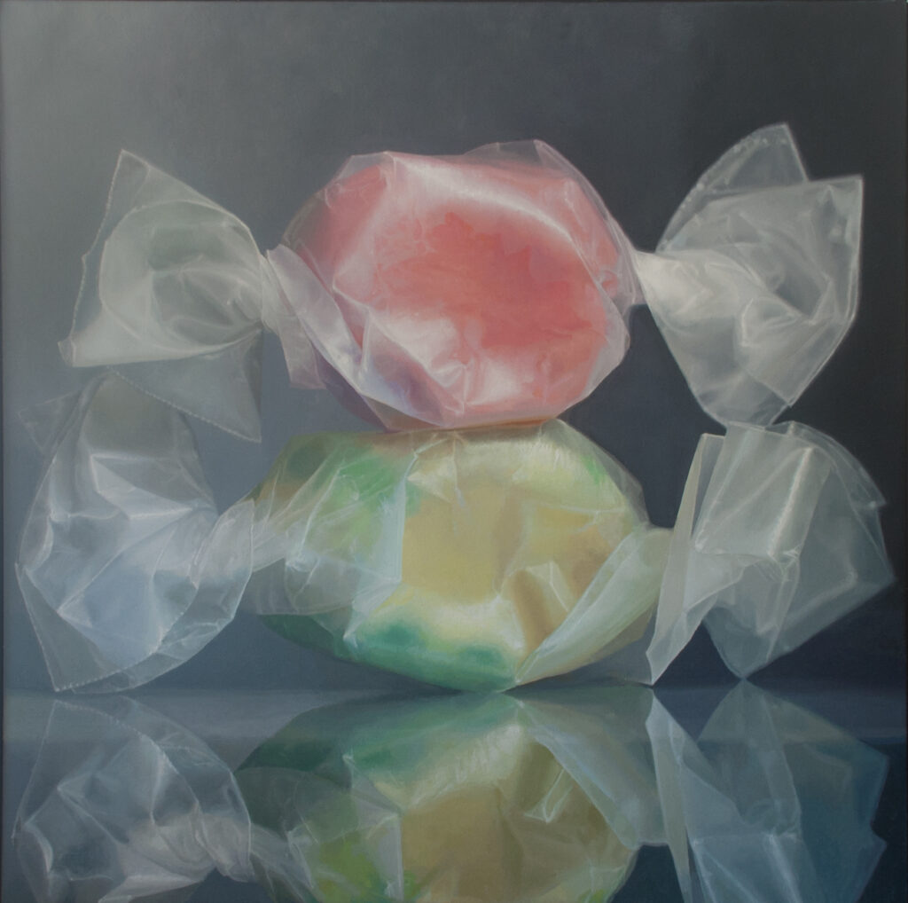
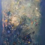
My submission for the Oxford show, April Dawn, oil on linen, 52″ x 52″. Sold.
At the opening reception for “In a Different Light” at Oxford Gallery Saturday, from 5:30 p.m. to 7:30 p.m., you’ll be able to get a glimpse of one of the best themed group shows Jim Hall has organized. Nearly all the work is rewarding and some of it is remarkable and surprising. Tom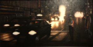 Insalaco has been working for years on a series of paintings showing city traffic at night, almost an extreme reduction of his usually dark motifs into two-tone compositions that either look like a procession of ghostly headlights or sinuous lines of stars against the black ground of the urban night. In Night and Light, the title emphasizes the stark juxtaposition of blindingly bright light against almost featureless darkness. Yet this potentially bleak darkness comes across as familiar and alive: two figures, perfectly rendered in the half-light, watch the passing cars and make the viewer feel like another pedestrian enjoying the night’s energy. It’s as ordinary as a remembrance of a late walk to your room in New York City, but also suggestive of the anonymity of city life in a spiritually-isolated age.
Elizabeth Durand’s Shoreline Light, at etching monoprint, shows how much she has continued to push her work toward a sort of abstraction that somehow looks wonderfully accurate in the way it 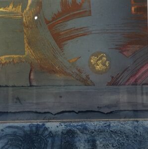 conveys the rich warm color of a setting sun over a strip of land and sea, all of it minimally indicated, yet rich with carefully applied color and brushwork that somehow passes for cloud formations but also looks expressionist and gestural. She has been making art for many decades, and now late in her life is still innovating as a quietly original and masterful print-maker whose feel for color has always been superlative.
In an utterly unique contribution to the show, Barbara Page has interpreted a small library of books in visual terms. It’s the outcome of an epic endeavor to create a personal card catalog of 800 different books. Using blank library lending cards, she covered 800 of them with the title and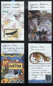 author of each book then a unique work of art to visualize the book’s content in the spaces where borrowers would normally sign their names. The drawings are funny, clever, touching, and sometimes mysterious. All of them are either lively, lovely, or both. One of her contributions to the show is a copy of the book she published offering readers a catalog of the art work itself, and it was accompanied by a digital print of some of her favorite cards, as well as the two drawers containing all of the 800 original works. One could spend days poring intermittently through her efforts, giving each title the attention it deserves.
One of my favorite paintings in the show is Amy McLaren’s “Democracy.” I didn’t look at the title when I saw the painting at Oxford, and today when I spotted my photograph of it on my iPhone, I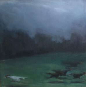 thought, “This is either about marriage or politics.” Then I saw the title in Jim’s price list and laughed. It is a funny painting—it shows what appears to be a white rooster running toward the left with a small group of black roosters running toward the right, the group clearly running away from the lone rooster and vice versa—as a metaphor of cluelessness of our contemporary political luminaries. But it’s a haunting image, and the faint light that falls on the agitated fowl bathes them in a sad kind of wisdom, as if this flight makes visible the universal human desire to flee the truth in a fading light that makes this possible and only fades faster because of it. The image transcends its intentions and the sense of mystery exceeds the title. It feels intimately familiar and mysteriously strange, these birds that seem to be levitating by virtue of their moonlit shadows.
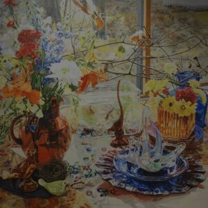 In “Birds and Fish,” Kate Timm offers another of her still life/landscapes, with objects arranged before a window that offers a view of low hills browning with autumn color. The arrangement of objects enables her to work from pale greens and whitish yellows at the center of the composition outward toward more intense areas of warm reds orange and yellow, beside blues and purples. Colored glass, delphiniums, a drooping day lily, two birds pausing on thin branches reaching out of a red pitcher, and a small rectangular glass aquarium with goldfish, offer her a way to create a wonderful field of color on a bright autumn day.
Bill Santelli’s “Novalunosis” uses geometric abstraction to segregate and contain a small square of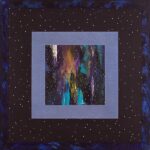 organically swirling color in a way that intensifies the effect of the color and the sense of freedom it suggests. Across the surface of the painting, regularly spaced small white dots form a rhythm of starry light, a motif from his work decades ago, introduced in a way that makes the painting work perfectly with the show’s theme. The feel of the image is the tension between mathematic, geometric order and control and the unpredictable core of swirling color as well as the immensity of that starry expanse against which it all takes place.
In his first contribution to an Oxford Gallery show, “Open Your Window”, Buffalo artist Michael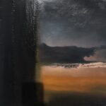 Herbold creates an eerie and beautifully unsettling painting that draws attention to the surface in the thickness of the paint and the regular marks that descend like a column down the left third of the canvas. Yet in the remaining space, he creates what appears to be a cloud formation at sunset, the invisible sun reaching up from behind the curve of the horizon to blanch the underside of the cloud formation. The cloud seems to extend fingers or tentacles toward the right edge of the canvas and though it doesn’t seem to be advancing, the feel of the image reminded me of the end of Take Shelter, where a sort of apocalyptic storm is approaching the family on the beach from far out over the Atlantic.
 With “Glimmer”, acrylic on canvas, Bill Stephens explores another corner of his inner imaginative world, plumbing his subconscious and finding an almost impressionistic scene, with hints of the Nabis, vague shapes flickering with light here and there, seen through a violet haze. His work has, for so long, centered on ink drawing, with great success, that it’s a surprise to see such an emphasis on color, another chapter in his prolific path.
With oil and cold wax on panel, Sharon Gordon continues to produce masterfully indefinite,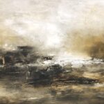 abstract landscapes, this one more indebted to Turner than to recent abstractionists. In “Moving Toward Home V,” she uses blacks, bronze, gray and white to hint at a dark house on a shore, seen from out on a lake, with a low sun glinting and breaking through hazy clouds near the shoreline. Yet the image works as well as pure abstraction, where every mark seems both spontaneous and energetic and yet perfectly considered.
Probably the most innovative works on view are Margery Pearl Gurnett’s three Agamaglass constructions, geometric digital prints assembled behind vertical rows of curved glass that operate as lenses through which the image warps, changes color, and slowly insinuates itself away as you move from left to right or vice versa, gazing at the print. It’s Op Art that works almost the way one of those printed holograms worked, like the cover of The Rolling Stone’s Their Satanic Majesty’s Request.
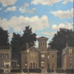 And Jim Mott’s “Corn Hill a La Magritte” depicts a restored Victorian house in the Corn Hill district with a sky with clouds overhead that’s clearly a nod to Magritte’s “Empire of Light.” It’s an interesting way of merging Mott’s long-standing devotion to the particulars of specific, often random, places around the United States, brought home to Rochester, but with a sky from more than half a century ago.
This is an inadequate sample of the rewards the show offers. It will run until Nov. 27.
Comments are currently closed.