Archive for September, 2013
September 30th, 2013 by dave dorsey

Faces in the Crowd, a show of drawings by my fellow Viridian artist, Susan Sills, opened recently in the lobby gallery at the Standard Motor Products Building in Long Island City. It’s a range of work she’s done over several decades, mostly ink drawings, but including one large painting as well. It’s a departure from the work she shows at Viridian, her three-dimensional wooden cut-out pastiches of works from art history. This is a show that reflects how she reacts to what she sees every day, and what she notices most are faces. In earlier years, while riding the subway, she would always have a small sketchbook and capture faces sitting across from her.
“A pen was a part of my hand back then,” she told me. “Today I just look.”
She prefers working from life, though she has included portraits of family members from the past hundred years, using scrapbook photos. “I do the eyes first. I know that isn’t the way you’re supposed to do a portrait, but I have to do it that way. When you start, your sitter is really looking at you intensely. Then they start to drift. You have to get the eyes when they’re paying attention.”
If forced to choose between painting and drawing, she would prefer to draw. In his campaign against photography-based painting, David Hockney said much the same thing: that painting should essentially be more like drawing, an immediate transfer of energy from the eye, through the heart, to the hand. At the time, he switched to watercolors, which are often considered drawings, rather than paintings. Hockney built his campaign, in part, on his celebration of a single brilliant drawing by Rembrandt, A Child Being Taught to Walk, where with only a few spontaneous and irrevocable strokes of a reed pen he evoked an entire family scene helping a toddler take her first steps. It’s closer to calligraphy or Japanese sumi e than most Western art. When I mentioned how drawing often feels more alive than painting, and mentioned how Van Gogh and Brueghel’s drawings seem to breathe more than their finished paintings, she immediately said, Rembrandt. “He was a genius as a painter, but his drawings are genius-plus.”
The show runs through Nov. 25.
September 29th, 2013 by dave dorsey

“While at bootcamp in Farragut, Idaho, Rauschenberg got hold of a set of oil paints and began a portrait of one of his fellow recruits. Working on the piece proved a bit of a challenge “…because the john was the only place with lights on after taps,” he says, “I sat in there to finish it. When I ran out of red, I pricked my finger and rubbed it into the skin tone.” After bootcamp, Rauschenberg was assigned to the hospital corps at Camp Pendleton, near San Diego. Before he reported for duty, he visited the Huntington Gardens, where three paintings changed his life: Pinkie by Thomas Lawrence, The Blue Boy by Gainsborough and Joshua Reynolds’sSarah Siddons as the Tragic Muse. Up until this point, Rauschenberg had never seen original oil paintings and had no idea there was such a thing as being an artist. What struck him, he told Time magazine’s Robert Hughes was “…behind each of them was a man whose profession it was to make them. That just never occurred to me before.”
“. . . Rauschenberg thought of (Albers) as his most important teacher. “He was a beautiful teacher and an impossible person,” he said in an interview, nearly 20 years after Black Mountain. “I’m still learning what he taught me. What he taught had to do with the whole visual world, and it applies to whatever you’re doing, gardening or painting or whatever.”
September 28th, 2013 by dave dorsey

Red Rain, detail, Darryl Moody
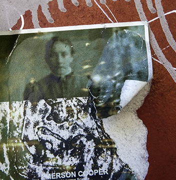
The title of this show of objets trouvés could be the standard subtitle for any exhibit in a gallery setting, but it’s especially pertinent here, where the artist has captured photographic images from walls in cities around the world. Generally these walls are covered with an interesting and disintegrating surface of paper, paint, rust, dirt, and other layers of artificial skin, so to speak. While doing a critical assessment of work by artists in a residency at Cooper Union, Peter Schjeldahl once told Darryl Moody that his photographic prints reminded the critic of Aaron Siskin‘s work. This was after a long sequence of brutal dismissals aimed at other participating artists. Darryl asked The New Yorker critic if he could repeat that remark, and he got a nod. Few and far between are the artists who can carry around a blessing of any sort from Peter Schjeldahl. I had a brief chance to get a look at the photography on my hectic visit to the city on Thursday, and seeing it in person is the only way to absorb the subtle color of the prints. Not to dismiss the other strengths of his work, but his handling of color gives many of these images an especially poignant quality, a sense that weather and time are investing a rough beauty into something torn and punished that pushes back against what are otherwise lonely glimpses of loss and entropy. I’ve been looking at a smaller reproduction of the peeling image of Castro for the past two years at the gallery, but in the larger exhibited print, the steak of color he captured that runs through a rupture in Castro’s face is remarkably complex and almost melodic. Moody wanders around the world looking for images on walls to shoot, and half the success is simply finding a haunting image by spotting and cropping a particular area of what he sees. What you see is pretty much what he got when he clicked the shutter: I didn’t have the impression that there’s a lot of post-production going on as the image travels from camera to print, through a computer, but I may be wrong about that. There’s a reception tonight at the gallery: 458 W. 28th St. 6th floor. It’s Moody’s first solo with VA. Should be fun.
September 28th, 2013 by dave dorsey

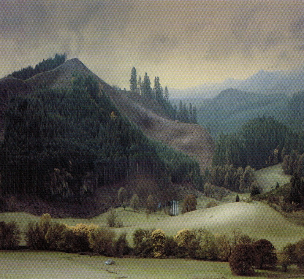
Untitled 2, Alexander Solomon
What looks like a tremendous show opened Friday at Manifest, including this great landscape from Alexander Solomon. I’m pretty sure we’re looking at a meticulously constructed diorama which the artist has then carefully lit and photographed. Hard to tell much more about it, and there’s very little information about the artist on the Web, but it looks superb on the invitational postcard I got from Manifest. Dioramas have become a fascinating branch of art, especially from people like James Casebere, Matthew Albanese, Amy Bennett and now, apparently, Alexander Solomon. (We had a photograph by Claudia Fainguersch, similar to some of Solomon’s, in a juried show at Viridian Artists not long ago.)
I must have done something wrong in a previous life, which brings with it a recurrent payback in this one every time I want to be in Cincinnati. It’s a city just barely too far away for me to get there more than once a year, if that. For me, it’s essentially as inaccessible as L.A., given the hours/cost required either on the road or in the air. Otherwise, I’d show up for every opening at Manifest, a little oasis of sanity and quality for artists around the world. Fallback position: I’m going to do some browser hunting of the artists in this landscape show to get a better look at their contributions to Vista.
On Mr. Solomon I could find only terse and/or cryptic comments he’s made about his own work. He appears to be a recent art school grad. What little I did find was interesting, especially his second observation below:
For any landscape, my goal is to make something sublime and unsentimental. To my mind, that combination tends to consist of pairing opposites.
I’m curious why I feel a compunction to coldly approach this kind of work and the fear of sentimentality that I’ve experienced throughout the contemporary art world.
For the viewer, I hope my work is like the cave in The Empire Strikes Back, “What’s in there?” “Only what you take with you.”
May the force be with you Alexander. Keep making scenes like Untitled 2.
There are impressive shots here, if you want a detail of this work (the scene is so amazingly rendered that I keep questioning whether or not I’m looking at something he constructed rather than an actual scene, but I’m sticking to my story. The silvery car helps.) Plus another similar scene, just as impressive, of a hill shorn of trees but ready for more depradation.
September 27th, 2013 by dave dorsey

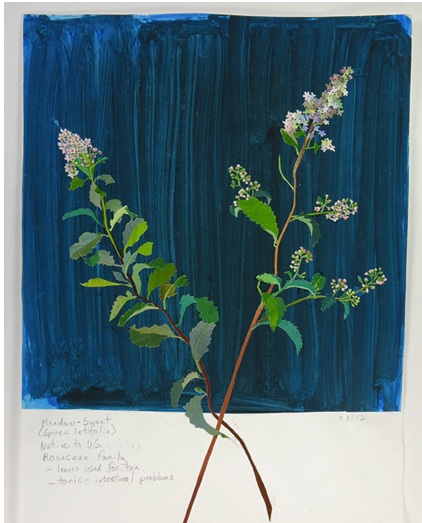
Meadow Sweet, Elizabeth Bisbing, gouache, paper, graphite.
Any artist who learns to work in a garden quickly recognizes parallels in the way a plant and a painting grow. It takes time and repetition: fluids (oh, don’t I know), light, and an interaction with random elements all play a role in both forms of creation. As I work with plants I’m constantly reminded of how I work with images: I get something started, I add more of this or less of that, and I prune away at whatever isn’t helping. And what I’m working on tends to grow more slowly than I’d like, requiring a lot of waiting otherwise known as patience. What you’re really doing is guiding, not creating. Looking at a nasturtium bloom or a ripe tomato, after sometimes months of husbanding the plant, can feel exactly as if I’m standing back and gazing happily at a completed painting. (I start dahlia tubers in January, inside the house, and step-by-step transfer them to potting soil and then sometimes larger pots before putting them outside in May or early June. Some even start blooming in the house in May. There are really only a few months I’m not tending dahlias one way or another–from October through January I keep them dormant in the garage.) So, more and more, painting an image of a head of lettuce or a dahlia strikes me as almost the final step in gardening itself. I’m actually just looking, studying, consuming with my eyes, the outcome of continuous labor and care over the course of more than half a year, in the case of the dahlias. And the act of painting one of these plants recapitulates the process of growing it. What I see is beauty, but it’s more than that. There’s always a hint of strangeness in natural forms, which is part of the fascination. Often I see something like what Michelangelo conveyed in his unfinished Captives, a wrestling with the constraints and obstacles of physical life–every flower and vegetable is, in some respect, at act of overcoming. The flowers that emerge twisted and deformed–qualities echoed in the complex form of a healthy dahlia, which has as many curving planes as a skull–can become just as fascinating as what seems initially more symmetrical and “perfect” in the healthiest flower. What comes through, in nature, again and again, is unity within complexity, how something with so many diverse parts can look utterly simple and coherent. It’s amazing to me that a dahlia can emerge from a shrunken tuber locked into the ground, as even enormous plants emerge from the tiniest seeds. I look past the beauty of a flower, amazed at how something like this, something this infinitely detailed, can emerge from the skin of that little brown lump underground, swell itself into fat stalks that sometimes rise seven feet into the air, get as large as a cluster of corn stalks, produce dozens of ten-inch flowers and then turn black in the frost and disappear. Paintings are like that flower at the peak of its cycle. You stand there, looking at it, thinking where did that come from? Seriously? How did that get made?
Many of these reflections and experiences influenced the way I appreciated Elizabeth Bisbing‘s exhibition of flower mosaics at Soho 20, late in the show’s run last week. (It closes in a day or two–I was late to a number of shows on this MORE
September 26th, 2013 by dave dorsey

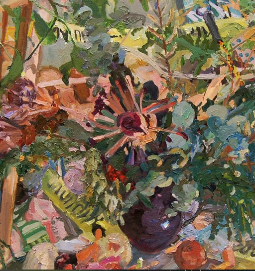
The Secret Messages, detail. Gulgun Aliriza, oil on board
At Blue Mountain, Gulgun Alizira, a young painter from Turkey, has her first show with a delightful range of work, from quite large to extremely small. As in 4″ x 4″. Clusters of these tiny oils greet you as you walk into the gallery, and they held my attention the longest. At first they look like details from or studies for larger paintings, but they push Aliriza’s all-over technique into full abstract expressionism. In the larger paintings, there’s a tug-of-war between representation and paint itself, which reminds me most of Cecily Brown‘s more recent, less porn-y images where it’s even more of a “Where’s Waldo” hunt for the nude figure in the nest of brushstrokes. Here, the thicket of paint gets just as dense. In a studio scene, stretchers and props mix it up with furniture, and the room looks like what’s left after a tropical storm has blown out all the windows. It’s an interesting creative mess, both as a place to work and as an image of actual space. It’s all about making the paint a little more important than the rendering of a scene, and this comes through most dramatically in the tiny squares that seem to abandon representation altogether and where her areas of color become more coherent and powerful. I liked all of it, but the smallest work had the most charm. The paint gets really thick too in these tiny ones: folds and ripples of it rise up like peanut butter on a cracker. I told the sitter at the desk, “I’d love to see her duplicate one of those tiny ones, but on the same scale as her big paintings.”
September 25th, 2013 by dave dorsey

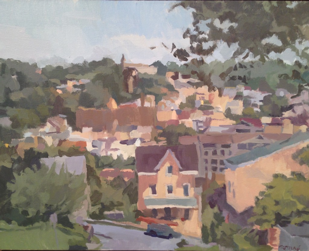
Belmont Hills, Ian Tornay
When I walked into the Bowery Gallery last week, I could have sworn the ghost of Fairfield Porter had been summoned to choose the current show. Ian Torney’s oils have internalized and absorbed a great part of what Porter achieved, and he has taken Porter’s intuitions and refined them into his own perfectly executed landscapes, still lifes, and the one self-portrait on view here. He works in the same mid-range of values, avoiding the brightest and darkest ranges of light and dark, muting his colors into effortless harmonies, evoking detail rather than rendering it—painting the light between objects rather than the objects themselves, as Porter phrased it. He does it all with seemingly unconscious ease: what others struggle for years to achieve and never attain. If art buyers were looking for genuine greatness, rather than simply a good investment, this show would have sold out. I think I saw only one or two red dots, even though these paintings were vastly underpriced. Buying art now must be a lot like choosing a college for your high school grad: just go to an art fair and look for the one that’ll pick the most money from your pocket. Anything that high-priced has to be the best, right? If you want to know what’s great about painting and what’s depressingly bad about the art market, take a look at Tornay’s work while it’s still up for the final days of the show.
September 24th, 2013 by dave dorsey

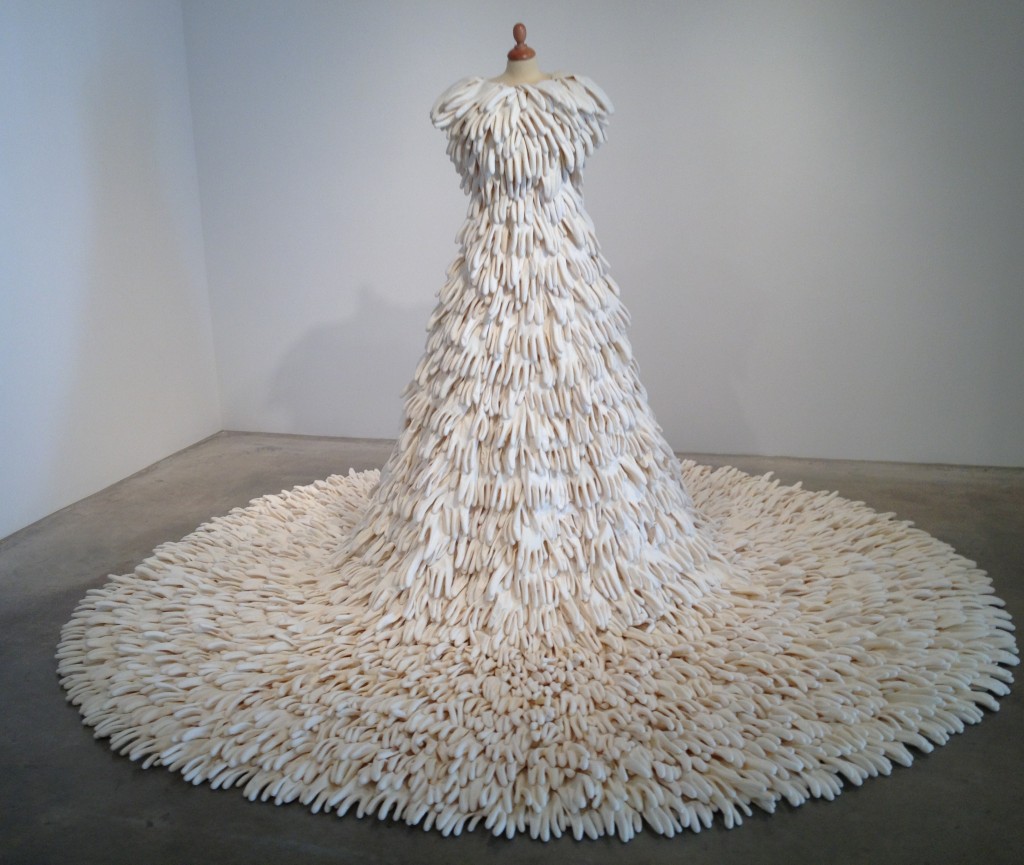
A Mixture of Frailties, Susie MacMurray
If you want to marvel at how rubber gloves and fishhooks can be turned into fascinating works of art, check out Susie MacMurray’s current show at Danese Corey. The gallery opened in a new location only a few weeks ago. I stumbled onto it last Thursday while walking past its large street-level windows on West 22nd. I was on my guard against the cool, impersonal feel of the show, which at first had the familiar white-cube redolence of chilly and cerebral, high-end formalities, but it won me over. It’s a beautiful show in a wonderful and much larger space than Danese used to occupy, and the place is perfectly suited to MacMurray’s spare, less-is-more constructions. The artist’s ability to create a sense of poised expectancy out of the most ordinary and humble materials is remarkable. She works in a repetitive range of shapes, using craft shop and household supplies: dollops and teardrops of wax, thin-gauge wire, hooks, hairnets, rubber kitchen gloves, air compressor hoses, and—my favorite—knitting pins. She returns again and again to a tight range of materials: fishhooks, wax teardrops and the knitting pins. In a few cases, her work reflects her previous career as a musician, such as the assembly of those pins  bearing what look like conical spinning tops made of wax. Arranged in dozens across one wall, they suggest, collectively, the lines and clefs of musical notation. These slight, long pins have small eyes, like skewer handles, which she pierces with her fishhooks bearing much larger dollops of wax. Rows of those identical dollops dangle in mid-air like topsy-turvy raindrops—or pendant earrings. Those pins, though, are alive. They bristle from a wall like acupuncture needles, arching as they seem to pull back against gravity.
As in so much of her work, there’s an energy in the paucity of means. MORE
September 22nd, 2013 by dave dorsey

Finding and Recognition of the True Cross, Piero della Francesca
At Hyperallergic, a great essay on Piero della Francesca, who has become my favorite Renaissance painter. Much of Thomas Micchelli’s precision and eloquence in reflecting on this painting would have applied as well to Virgin and Child Enthroned with Four Angels, where angels and architecture seemed to be echoes of one another and arrayed on a single plane, as well as figures standing within the illusion of a three-dimensional scene. Seeing it at The Frick was the opportunity of a lifetime, and I was so grateful to be there for the time I spent with it. Oh to be able to see The Dream of Constantine some day. Not likely. (You can get as good a view of it as possible here, without seeing the actual painting itself. That angel’s arm. Those stars above his wing . . .)
Also, I love the notion that “all art is contemporary” now, because, well, it is.
September 21st, 2013 by dave dorsey

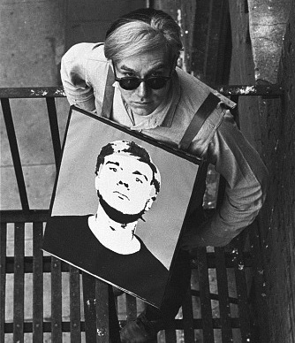
A Warhol sandwich
What could be more Warhol than a photograph of Warhol wearing a photograph of Warhol? Photographs by William Love Kennedy at Steven Kasher.
September 20th, 2013 by dave dorsey

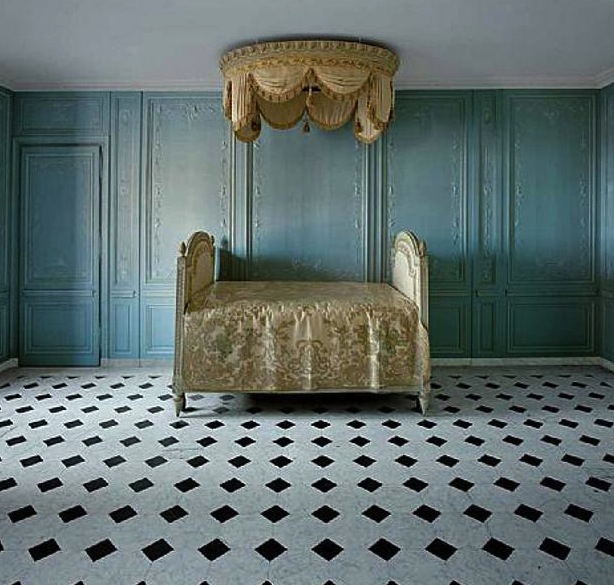
Marie Antoinette’s bathroom
Don’t say cupcakes. Cheap shot. All I want to know is, where’s the granite-topped St. James Vanity from Restoration Hardware? At Mary Boone, Robert Polidori’s photographs of Versailles. . . could there be a timelier show, all things historically considered?
September 19th, 2013 by dave dorsey

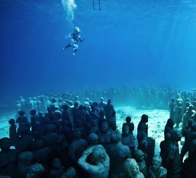
Cancun’s underwater sculpture museum
In Cancun, you have to go underwater to tour the Museo Subacuatico de Arte, or MUSA. It’s a museum that doubles as a new kind of coral reef: a haven for fish and people both. Nature and art become one.
“It’s the story of the three dedicated – nay, heroic – people who made the place happen. There was Jaime Gonzalez, a biologist and hard-nosed bureaucrat sickened by the damaged reefs in his country; Roberto Diaz, the entrepreneurial tour operator and closet artist who knows everybody in town; and Jason Taylor, the outsider with a new idea and the talent to pull it off. In all, it was a herculean effort. But eventually permissions and a little money came through and so Taylor started working in 2006. He makes the molds using plaster on the naked body and then adds the clothing later. Walking through a new dry-land exhibit of his work, he says he can name each of his models – from the young girl to the pregnant woman to the worker he flagged down in the street who was initially confused about what exactly this odd foreigner wanted to do. Even Diaz, who’s also an amateur sculptor, got into the game and created a statue designed from a lost picture of his grandmother. Today, with 470 statues, the museum is a huge success and one of the major tourist draws to Cancun.”
The goal: 10,000 sculptures over the next ten years.
September 17th, 2013 by dave dorsey

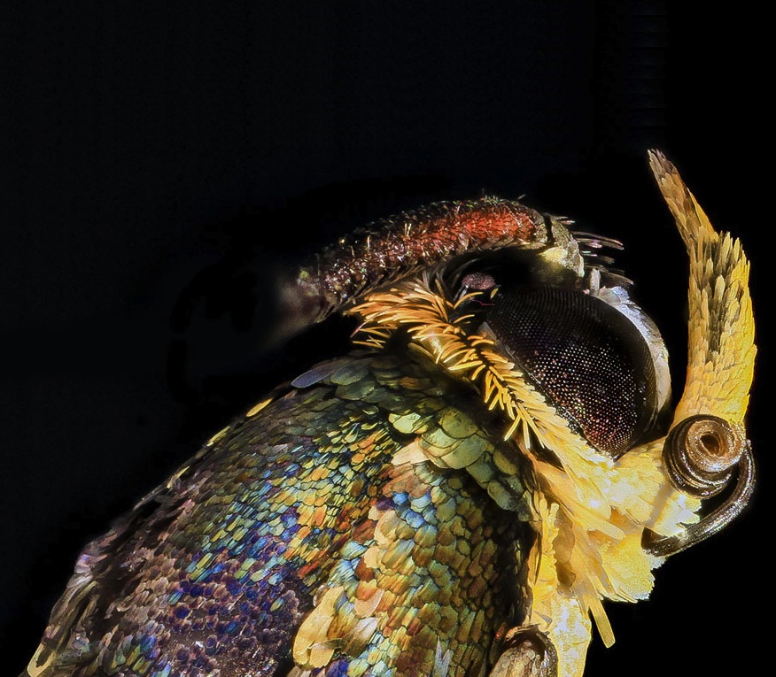
Apple Bark Borer Moth, up close
If Prospero had had broadband on his little island, he would have spent hours with this cache of macro photography–more than a thousand shots you can scroll through. The collection offers you a glimpse into the way insects actually look–like visitors from another dimension. I don’t know how much the color here as been enhanced, but the tiny iridescent scales on this moth’s body look to me like shingles from a home in Middle Earth. There is nothing any artist has ever made that can compete with the intricate and strange beauty of nature itself. Imagine if this were a photograph of something someone had fabricated and assembled, and you saw it sitting on the floor inside the white cube of a gallery in Chelsea. I’m not sure anything else would be able to compete. And all you need to do is go to Maryland and pluck one from the bark of an apple tree. Just bring a magnifying glass.
September 16th, 2013 by dave dorsey

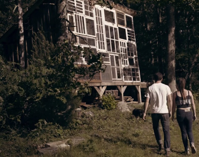
DIY glass house
“We thought wouldn’t it be cool if we had a house that was all made of windows so then you wouldn’t have to try to fit the sunset into one little space. Then, less than a year later, we built it.” Interesting thoughts in the video on why the physical process of making something by hand is a large part of what makes it worthwhile: whether it’s a little sunset-viewing home or a photograph. As a painter, I know how much manual labor matters.
September 15th, 2013 by dave dorsey

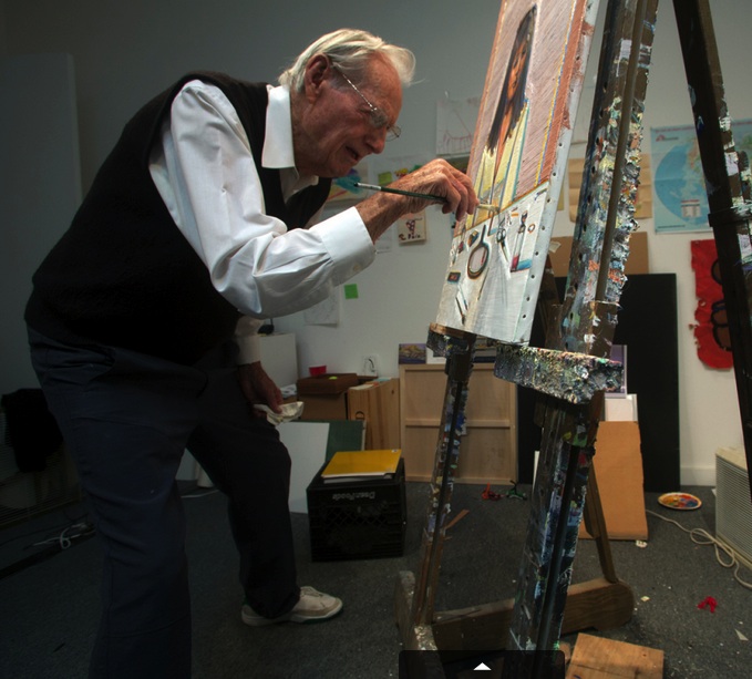
Wayne Thiebaud, 92, at work
For those of us whose daily life is becoming a training camp for geezerhood, this Time magazine photograph of Wayne Thiebaud, still tirelessly turning out beautiful work, is a gift. Every day, I hone my skills for entry into the ranks of over-the-hill curmudgeons: random crankiness, disgust with the news, a constant refrain of “what’s that actor’s name?” whenever the flat-screen is on, occasional distrust of all cultural developments more recent than the ancien regime, aches in my feet that don’t go away, a new-found fascination with watching plants grow, since it often happens faster than my mind can process information, and a variety of other hard-won skills that will become faithful companions in the years ahead. One thing that does actually get better, as everything else about me begins to fade, is the ability to paint and the delight that comes from doing it. James Hall, at Oxford Gallery, once told me, “Painting is an old person’s art.” What better proof than Thiebaud, unpretentiously applying paint to his human-sized canvas, using a classic tripod easel, self-taught, still learning. The cutline for the photograph: “He still paints every day, holidays too.” Check. “All along, he says, you just keep hacking away at it.” Check. “I didn’t go to art school.” Check. “When I decided to try and be a painter, I thought I’d better go to work whether I feel it or not, and that’s what I’ve pretty much done.” That’s the big one. There is at least one country for old men, and it’s called painting. Geezerhood, here I come, if this is what awaits.
September 14th, 2013 by dave dorsey
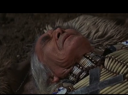
 Chief Dan George in Little Big Man. A great scene from a great movie. Funny and beautiful both. The chief is right–sometimes it works and sometimes it doesn’t–and it applies to painting as well. I love the sound of disgust he makes when he realizes he’s still in this world. It’s pretty much the sound I make when I fail to disappear into the act of painting. Loved him in Harry and Tonto, too. (Tonto was a cat.)
September 13th, 2013 by dave dorsey

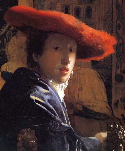
Girl with a Red Hat, Vermeer
Professional debunkers, Penn and Teller, have produced a documentary that appears to be an attempt to cash in on “revelations” about Vermeer which have been common assumptions about the painter for at least half a century. NPR reported that there were gasps from the audience when the film was premiered at the Toronto International Film Festival. Apparently, no one in the audience had read much about Vermeer. Vermeer used mechanical tools to aid him in his drawing and painting! That’s a bit like saying, in the voice of Claude Rains, “I”m shocked, shocked, that camera obscura was being employed in Delft!” In all fairness, the film sounds interesting. It apparently follows the inventor Tim Jenison as he uses a small simple device he invented, a lens and mirror that allows him to accurately match what he’s drawing with what he’s seeing. In other words, the conclusion our esteemed comedy team wants us to arrive at is that Vermeer may have been robotically reproducing only what a system of lenses enabled him to see. Busted! It may be a fun film to watch, but what’s being uncovered here isn’t news. For at least half a century, scholars have assumed Vermeer used the equivalent of a photographic projector, a camera obscura, to achieve his remarkable accuracy, and they’ve even noted that the way he handled reflected highlights owes everything to the way a lens creates “discs of confusion,” small discreet orbs that appear when the object is slightly out of focus. Jenison’s mirror/lens device is more or less a new generation of the camera obscura. When Hockney went on his crusade, in the same spirit, about how lens-based Western art has been–the horror!–I yawned as well. Either you use photographic technology or you don’t, and in either case, an artist selectively includes, changes, simplifies, and adjusts what he or she sees, with or without a technological shortcut, in order to create a painting. Photo-realists have been using photographs and projectors for decades. Gerard Richter was happy to demonstrate to visitors how he traced his projected images–before he settled down to the real challenge. Tim Jenison apparently spent seven months reproducing a Vermeer painting for this film. Vermeer may have spent as long, or longer, on each of his rare paintings. And in the process, for each painting, he made a thousand tiny choices on how to simplify or modify what he saw, obsessed with creating a certain kind of scene in a certain quality of light with certain quite specific colors, colors which run throughout his work. His technology didn’t make any of those choices. It served his vision, not the other way around. This brief commentary on the issue from the 60s offers a fine debunking of Penn and Teller’s attempt to debunk Vermeer:
The hypothesis that Vermeer used the camera obscura was recently put to the test by Professor Charles Seymour of the Department of Art History at Yale. He drew parallels between Vermeer’s painting and photography, by demonstrating, for example, how many of the artist’s effects could be reproduced with a camera. In addition, Seymour took a 19th Century viewing camera obscura (no earlier model was available) and set it up about two-and-a-half feet away from a few carefully chosen props–a chair with lion’s head finials, a piece of draped velvet and tapestry backdrop. When these were viewed on the screen of the camera obscura, they exhibited qualities much like those displayed by similar materials in Vermeer’s Girl with a Red Hat. The lion’s head glimmered with discs of confusion, and the fuzzy texture of the velvet was rendered even fuzzier, in all but the middle distance, by the soft focus of uncorrected lenses. Even the quality of light and the color tones mirrored Vermeer’s own. But it was evident, when a photograph was made duplicating these effects in a polished metal mirror, that an all-important ingredient was missing–the artist’s selective eye. The secret of Vermeer’s art is not that he used the camera obscura, but that he used it so well–as a point of departure for art, never as an end in itself. –Hans Koningsberger
The photograph these researchers took of the staged duplication of Vermeer’s setting looks flat and lifeless. The painting itself is quite the opposite.
September 12th, 2013 by dave dorsey

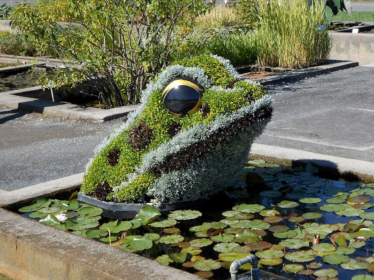
Edward Scissorhands, move over. Some cool examples of horticultural mosaics here.
September 11th, 2013 by dave dorsey

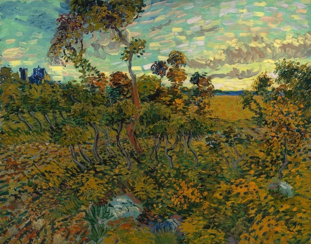
Sunset at Montmajour.Vincent Van Gogh.1888
From The Verge. Amsterdam’s Van Gogh Museum has announced the discovery of a new painting, Sunset at Montmajour, by Vincent van Gogh — the first full-size example since 1928. “A discovery of this magnitude has never before occurred in the history of the Van Gogh Museum.” The clincher: a letter from Van Gogh to his brother Theo expressing his disappointment with it. I’m not seeing any grounds for disappointment.
September 10th, 2013 by dave dorsey

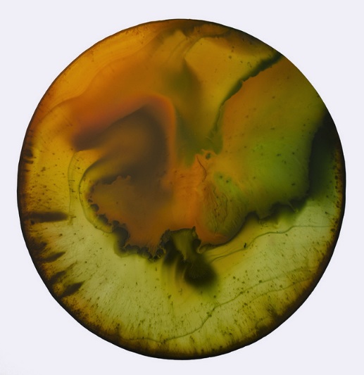
A Chroma painting by John Sabraw
I first saw John Sabraw’s work while visiting with Lauren Purje and Rush Whitacre when they were rooming together in Brooklyn. Lauren treasures a drawing John gave her, a startlingly exact rendering in graphite of a revolver and a syringe. It was hanging on her wall, up near the ceiling—as if she wanted it to be just out of reach. I seem to recall her telling me it was his interpretation of a line from a Modest Mouse song, but what struck me was how uncharacteristically grim it was, an exception to a line of work that otherwise glows with a radiant affirmation of the natural world’s complex unity. I saw one of his Chroma disk paintings, done on a metal support, when Lauren was collaborating with him, which involved destroying John’s painting and doing something of her own on top of it. (Remind me of the dangers of a Purje collaboration if that ever seems like a good idea, not that I expect she’ll ever have any interest in destroying my work.) I recall that John gleefully coached her through the whole thing, even when she complained about how hard it was to paint on metal. Thus I became acquainted with John Sabraw. We’ve never met, in person, but he once told me he loves and admires Illmatic as much as I do, which may not mean much to anyone else, but gave me the illusion that I understand who he is. So I sent him some questions about his work a few days ago, and he promised to answer them. I will post the exchange if he finds the time to attend to it, but he warned that he’s been involved with a segment the Discovery channel is doing on his new show. So, having had my place in the world thus properly adjusted, I’m not holding my breath.
Meanwhile, I got up early this morning to write and, on a Google search for his MORE


