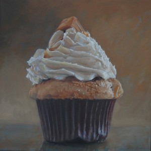
Sweetness and light
I’m taking a break from painting a cupcake this morning, partly because I keep second-guessing what I’m doing. I ought to be completely engrossed in the task at hand, because, I have to be honest, I find a cupcake visually intriguing. It offers nice contrasts—light and dark, straight and curved, soft and hard—a perfect subject for the study of all the basics of representational painting. Light, color, value, form, line. It’s a strange fusion of different kinds of texture and pattern, the prickly and rigid cup, a soft spongy pedestal of cake straining to hold up the coiled icing. It’s all decadent and excessive and tempting, crowned with its little sugary redunancy of candy or cookie. The whole thing is just plain bad for you. It has no redeeming value. It’s a little example of superfluous luxury—like art itself, in that respect. In fact, as you paint an image of one, you feel as if you’re looking at a tiny sculpture, with all those voluptuous curves. You fight the urge to quit painting and just stuff it into your mouth. (Occasionally, the relationship between artist and sitter can get complicated.)
So, in a way, it’s a perfect test of what I believe about painting—that the subject, the content, should have little or no metaphoric significance. You communicate in the way you paint more than through the subject you pick. The more an artist intentionally invests “meaning” into what he’s doing, the more skeptical I am about the final result. Painting, for me, is primarily about light and color and paint—which are the properties that convey an awareness, a feeling, in silence. When Ed Ruscha paints a shred of rubber tire alongside other trash he’s found on a highway, and doesn’t superimpose any words on top of it, I perk up: I’m drawn to the way he presents it, without needing to even know what he’s depicting. But then he titles his work Psycho Spaghetti Western, and I think, oh here we go again. It seems the title is meant to surround the image with dark, sophisticated hints about the decline of the West, the disintegration of our culture, the economic calamity we’re just barely holding off. Why can’t it just be a picture of trash, which is accurately rendered and yet looks gorgeous in a way you feel you’ve never seen before? Why isn’t that enough? The fact that he can create a simple, powerful and elegant image out of such meaningless material: now that’s painting. All of which is to say a cupcake should be the perfect test: you can’t get pretentious about something that has virtually no nutritional value, can you? Well, on second thought, you can get pretentious about anything, if you try. About five cupcakes into this series, as I was painting, I had what I thought was a little epiphany: what if I were to put together a solo exhibit of nothing but cupcakes (I suppose I could throw in a few other sweets) and call it Let Them Eat Cupcakes. This struck me, at the time, as a clever way to intellectually justify the act of painting a cupcake—which, let’s be honest, could be the perfect symbol for so much of what’s wrong with our world right now. (After I finished a large painting of a peanut butter cupcake last year, I wrote to a friend and said something to the effect that it reminded me of a delicacy that might have been served to guests at Versailles a couple centuries ago. Say, oh, around 1780. Something Marie Antoinette might have ordered up by the dozen. The parallels between that decade in France and the one we’ve living through right now can’t be lost on anyone. Did you know there’s a reality show on cable called Cupcake Wars? Meanwhile check the current state of unemployment.)
Well, if I ever do put together a show of cupcakes, I’m more likely to call it La Dolce Vita, but maybe you could take that in a sardonic way as well. I still believe a great painting should follow the same rule that used to apply to kids at the dinner table: it should be seen, not heard.

Comments are currently closed.