Zoey Frank
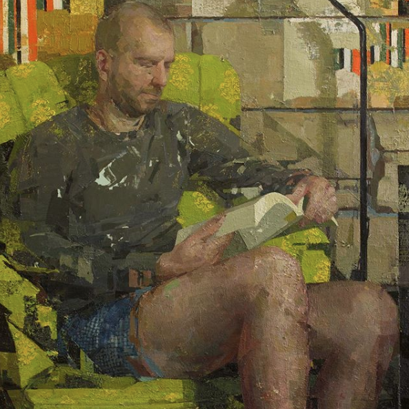
Peter Reading, oil on panel, 36″ x 36″
Zoey Frank has a show at Gallery Mokum in Amsterdam opening on March 16. She has to be the perceptual painter who has risen to prominence more rapidly than anyone else in that club. I’ve been following her with bemused fascination since she was the star of Manifest’s INPA not long ago. She’s everywhere, it seems. When I checked out Arcadia’s booth at the L.A. Art Show two years ago, I noticed they had one of her paintings on view. She’s included in a group show now at Danese Corey, with plenty of work to spare for a solo show in Europe. For someone with her prolific confidence, the challenge has to be picking what not to paint.
The polarities in her work are what keep me trying to reverse engineer what she’s doing, but it’s as hopeless as twisting a Rubik’s Cube back to perfect alignment. At her best, the surface works on its own semi-abstract terms. Conversely, the image works just as well, as a representation, despite all the flat decorative patterns she so often seems to improvise behind and almost in front of her subject, if you can actually pin down a single subject in some of them. Note the checkered pattern of the boxer shorts, the irregular cinder-block lines in the wall, the random-looking orange stripes at the top, as if someone has ripped a pasted advertisement away. Hers are “all over” paintings that resolve themselves, at least partly into the old familiar genres of interior, figure and still life. When this polarity between surface and image is strongest, but without marks that don’t seem unified into a recognizable image, her paintings are the most satisfying. (It looks as if lately she’s moving more toward heavy impasto, in the vein of Stanley Lewis, and the image flattens into two-dimensional patterns completely, losing some of her charm in the process.) Her work is about the texture of the paint and yet they often look as accurate in the way they convey light as a photograph. (It’s hard to imagine she doesn’t refer to photographs at all in some paintings.) As with most of the perceptual painters, she’s willing to paint anything she sees, seemingly just as she finds it, so that anything for her is a fitting subject. Each individual painting looks more like an inconclusive portion of a long scroll of work that never ends–just an arbitrary clip from a continuous experimental translation of seeing into paint, never quite arriving at completion, which adds to the transitory quality of her images. They feel more dreamed than seen.
In her most interesting work, she’s constantly juxtaposing scumbled or scraped spots of paint against crisply defined edges–the way Eve Mansdorf once talked about the importance of edges as a counterpoint for her more improvisational areas of paint. The governing greenish light here–is it a yellow incandescence or a muted natural glow on her friend’s nose from a leafy summer scene outside? She conceals a line that looks as if she’s trying to slice her friend’s anatomy off at the knees, angling up from the lower right, the way a Cubist would, arbitrarily (hints of Braque often are absorbed into her compositions and texture) and yet that little edge seems to work as an accidental but accurate alignment of shadow. In most of her work, she uses these structural straight lines, as if she’s clicking everything into a purely imaginary grid that keeps surfacing in the shapes she puts down. She breaks up this particular image with little shards, wedges and shims of color, without detracting from the depth of her forms and the realistic light, so that a lot of these details don’t coalesce the way you would expect them to, yet don’t keep you from seeing the scene. In this case, it’s almost the way a digital photograph looks when it’s pulled off a slightly damaged SATA hard drive, fractured with visual noise, but still recognizable.
Comments are currently closed.