Making marks

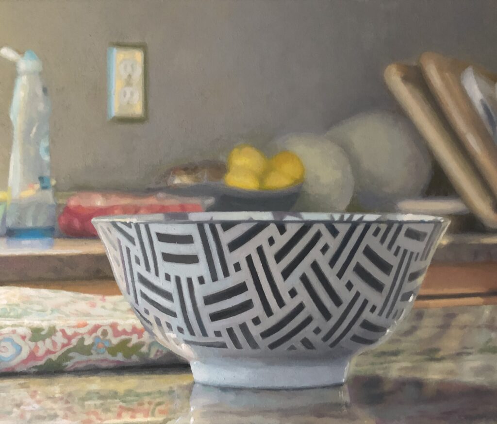
The Light in The Room, detail, oil on linen.
My most recently finished still life makes me uneasy. If I look at it in a dim light, before going to bed, I’m gratified that I did almost exactly what I set out to do—capture a glowingly illuminated kitchen in the middle of a bright, summer day. But during the daylight hours, if the surface of this painting is well-lit, I want to crawl into a corner and close my eyes.
I had this same feeling a year ago last month when I went to see my prominently displayed paintings—I could see them through the front windows of the museum while parking my car on the street—at the Wausau Museum of Contemporary Art exhibition in Wisconsin, jurored by Frank Bernarducci. Once I got up close, by virtue of the unsparing gallery lighting, the brushwork made my skin crawl. I felt exposed. The execution didn’t appear to have bothered anyone else, considering the placement of the two paintings. But ever since that opening, I’ve been concentrating on the thickness of the paint—endeavoring to get a Goldilocks feel, not too thick, not too thin—and the way I need to handle it, wet on wet. I’ve been conscious of the desire to user thicker paint for years, but this determination to paint wet into wet began when I returned from Wisconsin last year. (I make exceptions when this isn’t possible, when I see something in the already dried coat that makes my stomach tighten with disappointment, as it did yesterday with the taffy painting I’m doing now. But I make my amendments by putting down uniform areas of wet color and then going back to push detail into them immediately.)
I don’t want what I’m rendering to look hyper-realistic. The paint should look like paint, not the surface of a photograph. But it needs to flow gradually from one spot to the next. No rough edges where edges don’t form clear lines and borders in the source. So now, today, the formerly irksome part of the painting doesn’t make me want to hide when I look at it. It’s all about the nature of the brushwork, the energy and visibility of the mark (or just the way the paint flows from one tone into another) as catalyst for how the eye flows across the image and reads it. I don’t expect my brushwork to be what it is in Van Gogh, or Sargent, or Manet, or Hals, or Thiebaud, or Jenny Saville. But the brushwork now doesn’t get in the way of what pleasure I get from looking at what I’ve done. It isn’t at odds with the image. But when I see areas where the paint is applied skillfully in terms of value and hue, but it just looks awkwardly scumbled, dragged across already-dry paint, and the edges of each spot of color make it look scuffed and chaotic, then I want to slip the painting away into storage. I don’t, because it’s a decent enough painting. Yet his knowledge doesn’t help, which I take as a good thing. Excellence requires striving.
It’s all about whether or not the eye bumps into a spot of paint or glides over it, riding the energy of the paint itself, the life it imparts to the act of looking. I am probably right in reacting this way to the work I’ve done. But maybe not. When it comes to painting, it’s best not to be certain of anything except in those rare cases when I know the painting is really finished and as good as I can make it. (I’m certain about the prefection of most of Vermeer, and quite a bit of Piero, but that’s a pretty safe certainty and though I know I’m looking at a painting when they’re the ones making it, the marks they make aren’t all that visible.) The less refined execution might end up being what people value most in some of these paintings I want to avoid seeing—the way in which the surface is at odds with the image it induces you to see. In fact, I’m constantly trying to do smaller, more improvisational paintings that are all about the visibility of the paint and where the areas of paint look abstract and unrecognizable up close—in other words, simplified and much more painterly work. But this isn’t what I’m after in the sort of paintings I’ve been exhibiting over the past decade—with the exception of one small interior with figures, quickly executed with easy brushwork, I showed at a pop-up in London years ago.
The humorous element here is that with either kind of brushwork, my current painting looks roughly the same from a few feet away—and the magic of Chardin resides in how, up close, it is just a chaotic mess, while a little farther away, it’s amazing. But it’s a good chaotic mess up close. His paint was thicker, more sensuously applied, more like Thiebaud than Vermeer, so that the paint itself was a pleasure to see. As opposed to what I’m dealing with. But I’m working on it.
Comments are currently closed.