Archive for February, 2012
February 24th, 2012 by dave dorsey

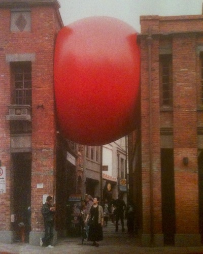
Red Ball Project, Taipei, from Time magazine
Love this, don’t know why. Not sure I would call it art, but still. Like life I guess: it’s caught between a hard place and a hard place. And yet it looks so snug and supported by all that pressure. Ah, if only I could feel the way this ball looks. I think I want one in my area code.
February 24th, 2012 by dave dorsey

Simon Cerigo photo courtesy Martin Bromirski
I ran into Simon Cerigo as he did his rounds Thursday at Viridian Artists in north Chelsea, attending 15 or more gallery openings, who knows how many, that evening—he cruises through more than 60 a month, maybe more, constantly looking for the pleasant surprise. He does it all for his clients, who come to him simply to know what to buy before anyone else knows it. Sometimes they listen. Often, they don’t. The last time I saw him I told him I was knocked out by the Michael Borreman’s show at Zwirner, which I’d seen that afternoon, and he dismissed it with two words: “Too finished.” I found it funny and intriguing, that response. I was hooked. I wanted to hear more. (My impression of Borreman’s technique is that it’s never too much, but always just enough—in terms of amount of paint, brushwork, subject matter, you name it.) So I wanted to run into him again and was delighted when he walked into the gallery. He was wearing a bright orange stocking cap, which a friend of mine calls “a hat even gravity doesn’t understand” because of the way it floats around on Simon’s head, and he smelled just faintly of marijuana—a scent that always makes me feel eighteen again, ready to stay up all night, which actually I did, though without smoke, or anything else, to prop me up. He held forth on the current art scene with precision and insight and had a lot of fascinating things to say.
Simon: The new Koons show, the dot paintings. Ultimately it’s Internet art. The whole show revolves around the Internet. This interactive, multi-locational situation and besides that if you follow Hirst’s work and his market, the dots were considered very glib, throwaway at first. Nobody liked it. It was a half-baked idea. Jay Joplin, this dealer at White Cube, he said enough with the sharks, make some paintings, I’ve gottta sell some stuff. So he rolled out the dots. I met Hirst at the opening, his wife was wearing a hat with a little dot painting on it. He was so stoned. I asked him, what were you on when you did these? He knew I was kidding him. Brilliant showmanship. If you’re going to one-up Koons or anybody else, do it big!
DD: Which opening did you say you crashed back in the 90s?
Simon: The Hirst opening I attended at the Michel Cohen Gallery was the medicine cabinets, very valuable, always considered very important, glass, with pills, the More
February 22nd, 2012 by dave dorsey

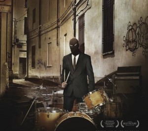
The Sound of Noise
“Some things will be illegal, but it will be one hell of a work of art.” –from The Sound of Noise
The Sound of Noise gets it’s U.S. release in March. Can’t wait.
The sound-and-image anarchists behind Music for One Apartment and Six Drummers, the 2001 cult short film, successfully transfer to a larger arena in Sound of Noise, a delightful comic cocktail mixing a modern urban symphony, a police procedural and a love story. The up-tempo feature debut of Swedish directors Ola Simonsson and Johannes Stjärne Nilsson boasts the most complex and wacky musical numbers since Marc Caro and Jean-Pierre Jeunet’s Delicatessen, hitting notes alternately silly, raucous and rhapsodic. The narrative revolves around police officer Amadeus Warnebring (an engaging Bengt Nilsson), tone-deaf scion of a distinguished musical family, and his attempts to track down a group of six guerrilla percussionists whose public performances are terrorizing the city. The drumming set pieces correspond to an avant-garde score in four movements. Where the short film had the six drummers imaginatively using standard apartment furnishings as their instruments, the feature unleashes them on an unspecified city’s civic and cultural institutions. “Doctor, Doctor” plays out in a hospital operating room, literally removing the sound from a windbag patient; staged like a robbery, “Money” makes beautiful music from a bank’s paraphernalia; the classical music establishment comes under attack from heavy machinery in “Music;” and daredevil “Love” unfurls in midair on the city’s electric lines. There is even an amusing backstory for each of the soberly dressed drummers and investigator Warnebring, their music-hating nemesis.
—San Francisco International Film Festival, Alissa Simon
February 20th, 2012 by dave dorsey

Vernita N'Cognita, Invisible Woman
I drove to NYC Thursday to attend Vernita N’Cognita’s performance of Invisible Woman, at Viridian Artists. I’d spoken with her previously about her work, which focuses on the experience of women in contemporary life. I was especially interested in this performance because of its resonance not simply for women but also as a metaphor for Vernita’s life as a visual artist—and, by implication, the lives of most visual artists. I also felt compelled to see the actual performance, as a gesture of support, rather than watch a video of it on YouTube, because she had been hospitalized for ten days last month, with a rare blood disorder. Her treatment at New York Presbyterian involved five plasmapheresis treatments, where her blood was routed outside her body to remove and replace all of her plasma. In a conversation with a friend of mine, I heard about Vernita’s weakness—having lost ten pounds from an already waif-like frame—and her fierce determination to go ahead with her performance, regardless.
“I have a new hero,” my friend said.
N’Cognita’s work is rooted in butoh, a Japanese art form that began in the 50s when two dancers created it as a rebellion against existing traditions. It relies on exaggerated and slow physical movements, superficially similar to tai chi. More
February 18th, 2012 by dave dorsey

Day 2, Seattle to Rochester
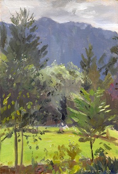
My friend, Jim Mott, the itinerant artist who does paintings in exchange for room and board, has begun a blog where he’s posting a day-by-day account of his 2007 drive from Seattle to Rochester. http://mottart2007.blogspot.com/ What’s wonderful about the way he’s presenting his story as a plot is that you get to see the paintings he did, on the spot, as he wandered across the country, absorbing his surroundings and turning them into the currency of his journey. Here’s a sample from one of the earliest posts, describing an experience most honest painters will corroborate, no matter how masterful they’ve become:
What I won’t tell the class is how uncomfortable painting makes me. Maybe I’m just lazy, but I find painting to be almost prohibitively strenuous, especially emotionally. There’s the strain of trying so hard to capture or convey something I see that interests me, without really knowing how to do it. It always feels that way: like I don’t know how to paint. And I rarely like what I end up with, at least not at first. Yet it seems important to do, and after the painting’s been finished for an hour, a day, a week, a year, I can usually see that something important came through, enough to have made it worthwhile. Enough, in fact, to make me not want to let go of the painting. At any rate, in the end it feels worthwhile, and that’s what keeps me going. But I almost always have to overcome a lot of resistance to get started, especially since stopping to paint something usually means two or three hours locked in struggle instead of two or three hours spent doing something more practical or pleasurable – such as wandering around looking at other things.
It’s so encouraging to hear such familiar doubts and resistance from someone who clearly knows how to paint.
February 12th, 2012 by dave dorsey

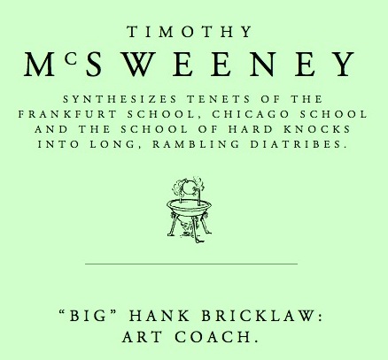
Cheers to McSweeney’s. In what is essentially an homage to Jim Belushi’s skit as a chess coach on Saturday Night Live in the mid-80s, Oyl Miller modifies the premise for a witty satire of the current art scene. My favorite line from Big Hank Bricklaw to one of his students: “People have to think there is something wrong with you.” There’s plenty more where that came from. Here’s a sample that hit home for me, someone for whom the still life never ceases to lose its appeal:
What the hell are these still lives? You’re just going through the motions with your painting, kid! These are high school level art class toss offs. You wanna make it to the kind of cutting edge galleries whose walls are bare and only open to B-list celebrities on Tuesdays at three in the morning? You think a smudgy pastel rendering of an inoffensive, submissive, realistically colored little peach is your ticket there? What if it were rotten? What it if had a deformed arm sticking out of it? What if it had dinosaur fangs that represented capitalist desire? These are exactly the kinds of thoughts real artists think. Do you even think? You need point of view in your work rookie. The artwork needs to drip with your disturbing vision.
February 10th, 2012 by dave dorsey

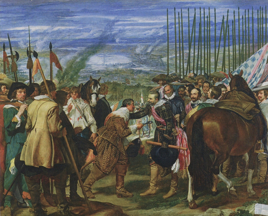
Velasquez, The Surrender of Breda
When anyone speculates on who might be tagged as the greatest painter in Western history, Velasquez always finds himself at or near the top of the list. And Las Meninas is always ranked as the Spanish master’s greatest work. But The Surrender of Breda is in many ways a more awe-inspiring technical achievement, an incredible fusion of artistic influences, an enormous canvas, twelve feet wide, in which a numbingly complex and protracted conflict has been simplified, unified and turned into an ironic image of tenderness. Velasquez takes what James Joyce called “the nightmare of history” and transforms it into a vision of warmth and humanity. At the same time, he’s also representing a small act of courtesy as the best we flawed creatures can hope for: kindness, compassion and humbling gestures of respect in the midst of the world’s ceaseless carnage and cruelty. And there’s a second universal truth here, maybe not entirely intended, given the reality of historical events that ensued: with the passage of enough time, all our victories are Pyrrhic.
Spain lost Breda only a few years after the surrender and went on to lose the entire war in 1648. This moment in 1625 was only a brief setback for The Netherlands. From here onward, the declining Spanish Hapsburg empire gradually ceded its primacy on the world stage to another rising imperial star: the Dutch. This brief, temporary victory for Spain followed a rogue siege of the town, unauthorized by the crown, organized and executed by a remarkable general: Ambrolio Spinola. The Surrender of Breda celebrates how Spinola forced surrender from an equally esteemed Dutch commander, Justin Nassau. Spain had been steadily losing the Eighty Years’ War against the Netherlands, which had begun two generations earlier, at the end of Pieter Bruegel’s life, who depicted the early days of the conflict in his own historical paintings in the Low Countries.
No other painter in history was better situated than Velasquez to paint the life of empire and the tenuous nature of political power. It’s always amazed me how securely Velasquez was installed inside the court of Philip IV. He was never at a More
February 9th, 2012 by dave dorsey

Chris and John Pulleyn's human skull
I’m now in possession of a human skull. I don’t own it. Like the skull on my own shoulders, it’s been loaned to me for only a little while. As I expected, it’s a completely unique experience, lifting an actual skull from the cardboard box where it’s been stored for years: to hold what once housed a human being’s eyes and mouth and ears. It didn’t feel as questionable as I thought it might to hold what’s left of someone’s head in my hands—it didn’t seem I was violating some taboo by lifting it up into the light of a pendant lamp in our kitchen. I was delighted to find that it even has a jaw, and most amazing of all, a few teeth. As weathered and aged as it looks, it sort of kept me company. It’s grinning like a Halloween pumpkin, but its look of laughter is friendly, not ghoulish. Actually, it looks kind of happy to be in my house. It sounds odd, but I felt a little less alone with this death’s head sitting on our granite countertop a few feet from the refrigerator.
I wrote earlier about how much an actual human skull costs now—not a model, but the real thing—if you order one on-line, now that the supply from India and China has been choked off by laws in those countries. When I wrote it, I put a link to my post on Facebook and a few hours later got a message from an old friend, Chris Pulleyn: “I know where you can get a skull. And it isn’t buried in my back yard. Call me.” I used to work for Chris and her husband, John, at an ad agency here in Rochester. A few weeks later we met for lunch at Jines, on Park Avenue, spent an hour catching up on the diaspora of ex-employees from their disbanded company. I told them I began my search for a skull after another artist, one of my Brooklyn friends, suggested we collaborate on a series of paintings using skull imagery. The collaboration may not work out, but I’ve gotten interested in doing several paintings, variations on the vanitas tradition, of my own using the skull. So we abandoned our corner booth, left a tip, and then walked out to the parking lot where John fetched the box from the back seat of his car and handed it to me, like contraband. “We didn’t think we should bring it into the restaurant since it says actual human skull on the side,” he said, laughing.
“Does it have the jaw?”
“Oh yes. It’s a good one. You’ll love it,” Chris said. “My father found it on his desk as a joke years ago. When John went into nursing school he sent it to us. You’ll see the note inside the box.”
My initial response to the skull is a sense of pleasure about the color: it’s a rich leathery brown, not white, as if the bone had been steeped in tea. It’s incredibly detailed, and looks like something shaped by hand with loving attention to proportion and line, the size of the apertures for eyes and nose, the curve of the chin, the slope of the brow. The mouth has eroded, so that the sockets where teeth had rooted themselves are a sawtooth row of holes. The eight surviving More
February 6th, 2012 by dave dorsey

Art for the People: Animal Instinct
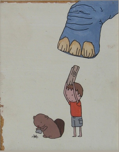
Lauren Purje, a fellow artist at Viridian Artists, just sent me a brief manifesto she’d glued together with scraps of paper a few years ago, announcing her project called Art for the People. It’s from back when she thought she could inspire a small movement where artists saw themselves as servants of their fans, painting things upon request, for almost nothing. To the sound of that, you may ask Lauren, what world do you live in? You will find Lauren roaming somewhere in the vicinity of the land where Lewis Hyde’s gift culture rules. That’s where. Her scanned document looks a bit like a ransom note, as if she were being held hostage by her own ideals—I, Lauren Purje’s superego, will release her into the wild only if you give her an idea for a painting and pay her $50 for whatever she creates, based on it. That’s how I imagine her conscience sounds–resorting to crime to save the world, calling itself her superego, but with its heart in the right place.
What I love about this is project of hers is how it attempts to cut through so much of what has isolated the art world from the vast majority of the population. It’s an attempt to connect with common people who simply want something meaningful to hang on a wall. Jim Ott has taken this even a step further in his itinerant artist project, which I wrote about recently, yet Lauren’s scheme feels to me like something many artists could try in some form or another. (It would be tougher for most of us, though. Not all of us can translate ideas into images the way she does, nor execute work as quickly.) Her one-woman movement goes back to the root of why people do art: to cherish what matters in their lives, as well as offering a way to step back and think about life’s quandaries with a sidelong perspective. That’s Lauren’s speciality, the quizzical irony, the sense of affectionate puzzlement about the most ordinary situations. I can’t go on; I must go on. That sort of thing. It’s what she keeps trying to visualize.
If you want her to paint something for you, keep your idea simple: a phrase, a situation, a moral dilemma, but don’t bother telling her how you want it to look. “In the beginning I said if you even say ‘I want it to be this color’ I will More
February 5th, 2012 by dave dorsey

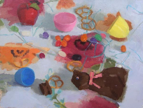
Still Life with Chocolate Bunny
“You know people talk about films bypassing the intellect and bypassing the thinking part of your brain and behaving in the way that memory does. And the very very best films have that way of . . . they impinge themselves upon your consciousness in a way where you are not entirely sure how (they do it.)”
–Mark Kermode, from his review of The Descendants
When I’m in New York next week, I’m hoping to stop at First Street Gallery to get a look at Erin Raedeke’s paintings. She hasn’t been with the gallery long, and hasn’t been out of school long either, yet her style seems fully realized. She merges a primary interest in color harmonies with the demands of representation and she has a touch that offers just enough detail, and no more, to create a distinct sense of light and form. A representative assortment of her work can be seen at www.erinraedeke.com (it’s lucky to have an uncommon moniker when shopping for uncluttered domain names now). Her village scenes are wonderful, glimpses of quiet small-town streets in a hilly landscape somewhere in the northeast, maybe Pennsylvania, upstate New York, or the Berkshires. Yet this current solo show appears to focus on her still lifes, which offer views of horizontal surfaces covered with either wallpaper or wrapping paper, offering loosely repetitive patterns as a ground for unassuming objects from a child’s playroom or the detritus of a party. These paintings seem steeped in memory, without exactly evoking nostalgia–the soft light that bathes all her pastel colors seems to be aged and faded, shining into view from a previous decade, yet the objects themselves feel fresh and immediate: in one painting, she focuses on one last discarded bite from an Egg McMuffin, or one of its competitive clones. Her objects are quietly festive, or playful, and evocations of childhood seem to be the rule: ribbons, animal crackers, toys, crayon drawings, balloons, ornaments, tinsel, spiral notebooks, Easter candy, plastic Easter eggs, and jelly beans. (I think, given my obsession with them, I’m professionally required to admire anyone who paints jelly beans.)
What’s impressive though, is that she has borrowed and then advanced a technique from Janet Fish in her oversized still lifes, gazing down at objects on a surface, after arranging them in such a way that the pattern of color becomes the driving preoccupation of the work, rather than whatever “meaning” is associated with the objects being used as props. (A vague sense of narrative does keep working to draw together what’s there in the image, but it runs vaguely in the background and isn’t required to “make sense” of anything; her color has a formal coherence all its own.) By using this format from Fish, but cropping the image more severely than Fish did, she moves closer to abstraction. It’s representation which also has the feel of an “all-over” technique, where negative space has been eliminated and there’s really no relief from the field of color and shape she builds, no passages of white that offer a little room to breathe: it’s a brave way of betting on her ability to unify her typically diverse choice of colors. (The image at the top of the post offers more white than usual, which may be why I like it so much.) At times her images get a little busy, and some of her color veers toward tones that feel as if they were sampled from a Sherwin-Williams swatch, but then so did Stella’s, in his early work. Each painting remains an interesting and deeply felt exploration of how to arrange color in such a way that it seems to be applied for its own sake, yet in the end the image offers, as a bonus, a glimpse of the everyday world, as well.
February 1st, 2012 by dave dorsey

I finally got around to watching Objectified on Netflix. It’s a documentary about industrial design, by the makers of Helvetica. Both films are excellent. As I was watching it, I realized that many of us actually live inside an almost entirely pre-imagined world. This is true even if you dwell in the suburbs. A house and lawn are both products of human design. They involve completely natural components, like mice and chickadees and grass and rain, but the grass is cut, and chickadees nest near the bird feeder and mice are sniffing peanut butter in traps and rain gets sluiced off into downspouts. The overall feel of living in a suburban home, or really almost any home, is an experience produced by shaping, tending, adjusting, and adapting to an imagined vision of what daily life should feel like. But for city dwellers, or anyone who lives in some kind of urban environment, you can go through a day and encounter almost nothing that isn’t the product of the human imagination. Spend a day walking through Manhattan and you are living inside a completely imagined world: it was all thought-up by somebody at some point. The roads, the lights, the buildings, the billboards, the vehicles, the hot dog stands, the subway, the signs in the subway, the t-shirts on the people in the subway, the guitar somebody was playing which gets smashed over the musician’s head by somebody who doesn’t like the guy’s acoustic version of Free Bird—everything but the few scarce bits of vegetation poking up through the concrete and the little rectangle of sky overhead. Even the faces and poses of other pedestrians or subway riders are consciously shaped, designed to express indifference and aloofness, usually, if we’re talking about New York. The point is, the world you inhabit was, at some point, an act of imagination. The filmmakers don’t make this point explicitly but I think it was really behind the motivation to make the film: an insight into the fact that we invent a design for our world and then, subliminally and ubiquitously, that design begins to invent us, or at least our experience and behavior. Human design literally structures the world we inhabit. Painting also creates the sense of a world, though it’s one only your imagination can inhabit. Design is an imaginative act, but its ultimate goal is behavioral: it governs how our bodies and minds interact with the physical world all day long. One Japanese designer in the documentary, Naoto Fukasawa, says that he More
