All work and no play
March 31st, 2013 by dave dorsey
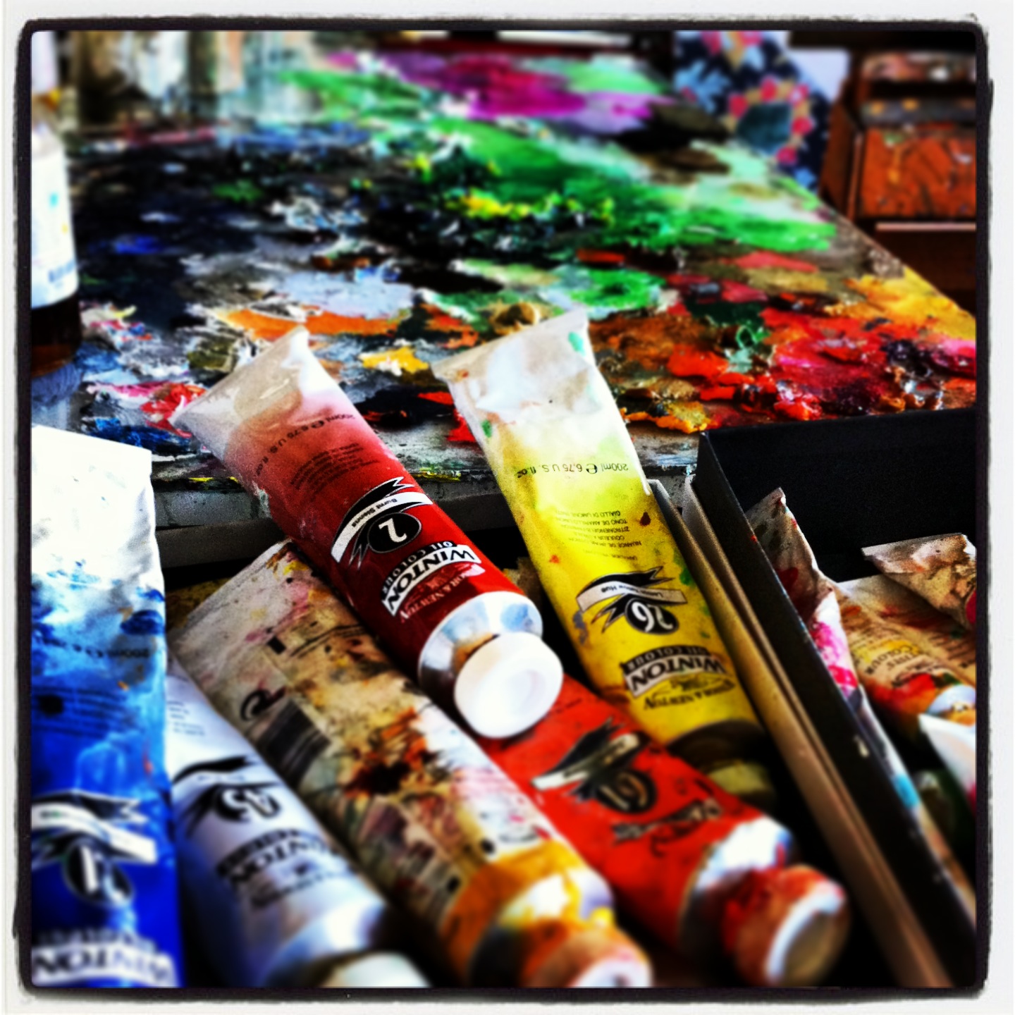
Big tubes of cheap paint. Time to get to work.
the painting life
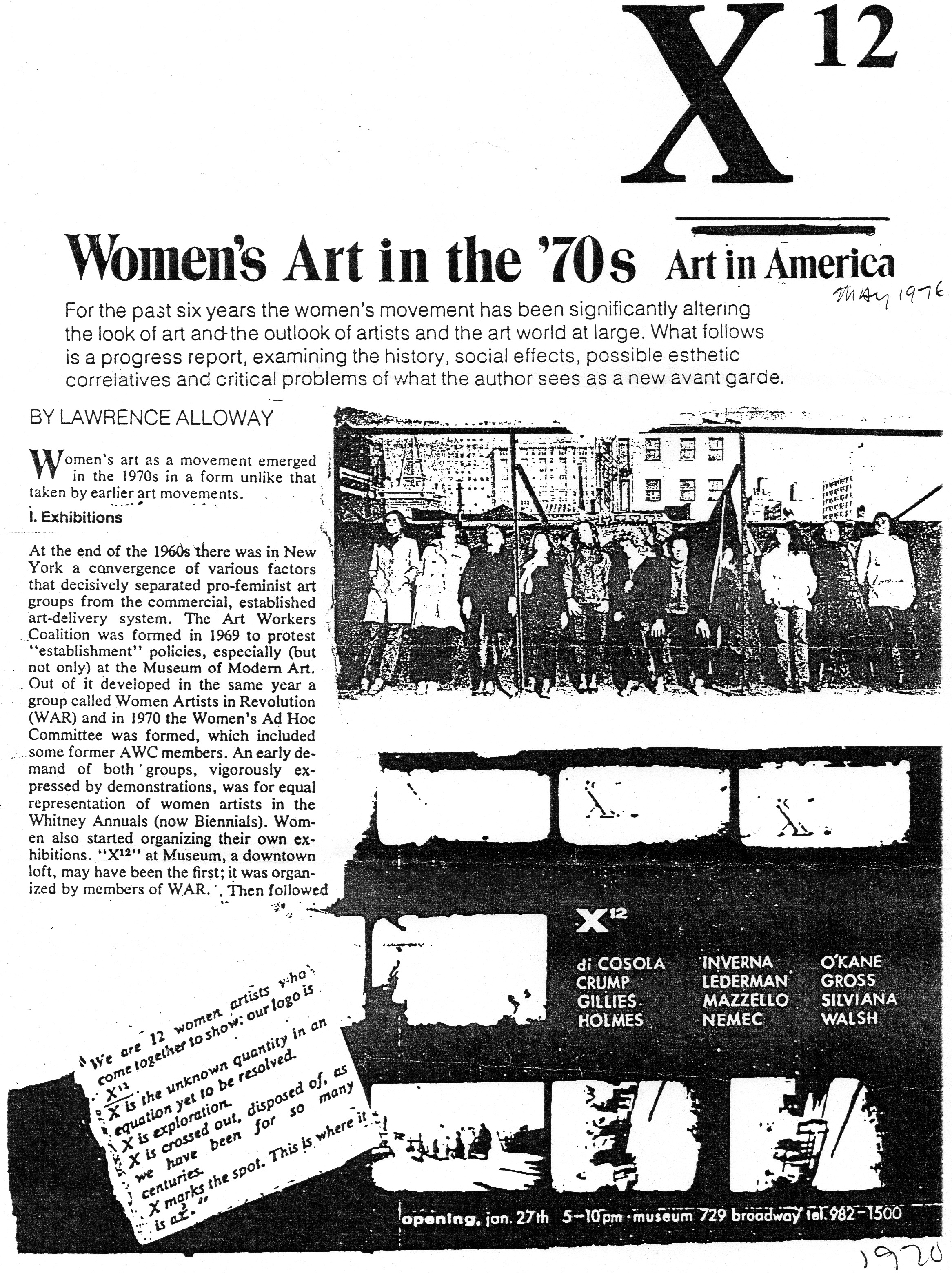
When I was in Manhattan a couple weeks ago, I spent a couple hours at Viridian asking Vernita Nemec about her experiences as an artist in the 70s. She talked about how it felt and still feels to be a woman in the art world, and also what life was like for an artist back then. In other words, how has the scene in lower Manhattan changed over the past 40 years. (Long story short, it was friendlier, more informal and ridiculously more affordable. To wit, the young Robert Mapplethorpe and Patti Smith.)
It’s pretty clear, from what she recalled, that walls have arisen between the successful and the struggling that simply didn’t exist back then. Art careers have become more professionalized, compared to a far more bohemian life in the early 70s. A New York artist’s life was less like something involving a career plan than an ongoing exclusive party, but with extremely lax security.
One thing wasn’t better back then: it was far more difficult to be a female artist. Vernita told me she and a friend conceived and organized what has never been recognized as the first all-woman art show in 1969. It was called X to the Twelfth Power: an exhibit of work by a dozen women, with X standing for their obscurity. None of them were known at the time—being a female artist meant, first and foremost, being unknown. By choice. most women artists, at that point, hesitated to identify themselves as women.
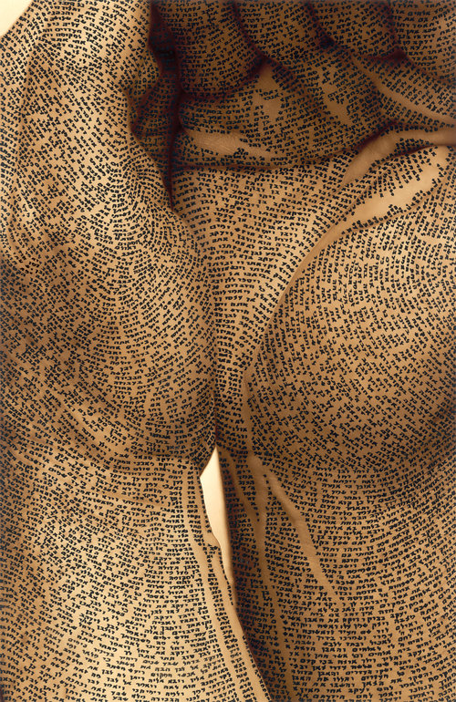
“Body Scripture II” is Ronit Bigal’s new exhibition featuring from the 27th of may 2010 at the Artists House in Tel Aviv. Photography, Calligraphy and floral ornamentation are the elements comprising this exhibition. Digital photography topped with drawings in black Indian ink produces an effect of bas-relief. Bigal photographs the body completely exposed. The camera explores the body, capturing different parts, discovering a world of hidden landscapes, textures, and unspoken eroticism. For the artist this was a journey of unforeseen surprise. Therefore she wraps parts of her photos with floral ornamentation and others with cited calligraphy taken from Biblical texts. They are almost abstract and enigmatic, arousing the viewer’s curiosity to discover what are the photographed objects, what meanings lies behind the texts; and whether there is a thematic affinity between them or, perhaps are the associations purely aesthetical? —Saatchi Online via Kottke,org
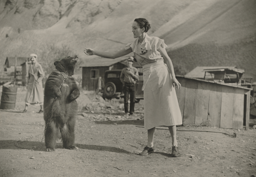
A woman feeds her pet bear in Riggins, Idaho. From National Geographic archives.

Li Hongbo with his collapsible paper sculpture
You have to see his work in motion to get the full effect, at YouTube. I like him as much as I like his work. Childlike intensity and delight.
Paul D’Agostino, “Ahnung keiner Ahnung 9: Les fugues des oiseaux” (2012). Acrylic, charcoal, and painting ground with collaged elements on panel, 14 x 20 inches.
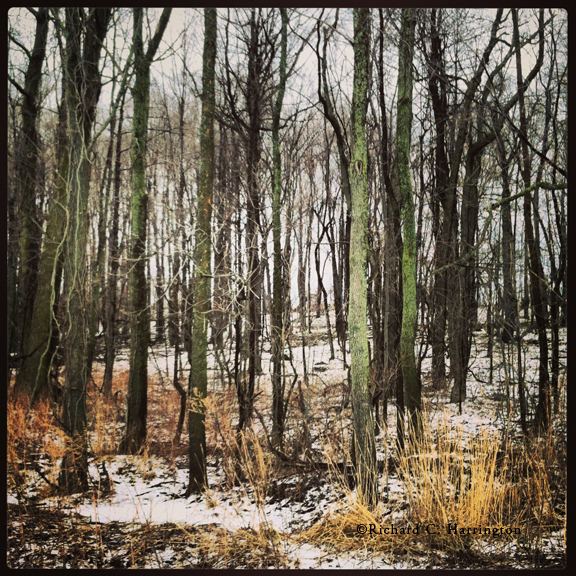
Beautiful little post from my friend Rick–including some of his great photographs, like the one above–about his encounters with coyotes not all that far south of our Rochester suburb. I remember telling him about the coyote pups we heard beside the house in Palm Springs we rented for a week last summer, and he dismissed it: “We hear them all the time here.” The way he conveys nature in this brief account reminds me of the way he does it in his paintings.
Just as I turned east over a culvert, I sensed something ahead of me. He must have done the same thing, because as my head came up, so did his, and we locked on each other about 15 feet apart. I’m sure if the visibility had been much more the 25 feet we had that afternoon he would never have let it happen. We stared for a moment, frozen. I heard the dogs’ collars tinkling behind me, turned to cut them off before a chase. But when I glanced back ahead, there was no need, the coyote had vanished. –Rick Harrington
I got to the Metropolitan Museum of Art just in time to see Matisse: In Search of True Painting, the tremendous show which just ended, built around the French painter’s tendency to exhaustively try different variations on a theme. When he did this, and he did it a lot, I’ve never been sure whether he was trying to get something exactly right or simply exploring every possible way to render an image, the way many artists have repeatedly returned to the same image again and again: Monet’s haystacks and cathedrals, Warhol’s various riffs on a particular iconic image and Motherwell’s repeated reworkings of Ode to a Spanish Republic. In the case of Matisse, I’m never quite sure I like the later versions of particular paintings more than earlier ones. In some cases, I get less and less interested, the further he simplifies and refines a motif. But almost everything in this show seemed to be offering itself to me from a fresh, new angle. This was especially true of the first painting, Still Life With Compote and Fruit, one of the 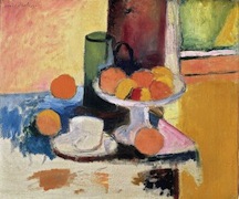 artist’s earliest paintings, whose incredibly subtle color—impossible to fully appreciate in the catalog—made me want to stay there at the entry into the show and skip whatever else was coming. It’s unfinished, and yet it’s as fine a painting as any he ever did, with incredibly delicate feeling in the balance between the two sections of muted green against the peach and salmon colors of the fruit. The tug-of-war between illusions of depth and the flat and uniform areas of color—an energizing opposition at the heart of what gives life to Matisse’s work—imbues the image with a dreamlike quality that seems to breathe as you keep your eye on its cluster of simple objects that reminded me of Morandi. And that was only the start. This show was a thrill, from start to finish, and taught me at least as much about the way Matisse painted as any other exhibition of his work I’ve seen, including MOMA’s Matisse: Radical Invention 1913-1917 which gave me an awed respect for the monumental paintings he did after his return from Morocco.
Yet I’m not sure I absorbed what this show was curated to emphasize. MORE
 From The Nation, I loved the interpolation of the subscription pitch just where it counted, for maximum amusement:
“The problem is, like many theories, this one has a hard time explaining how, in the midst of a revolution in the modes of cultural production, people are going to keep themselves in cat food, if you catch my drift . . . in a media environment that is still largely bound up with gatekeepers. Your WordPress blog is just never going to have the cachet of even a guest-blogging stint at The Atlantic. And one still, generally, needs the anointment of a record company in order to get the kind of press and, hell, capital investment, that it takes to make one’s first albums a success. And it sure helps to have three seasons of your TV show already produced and available for years on DVD to build the kind of audience who will gladly donate millions to keep you going.
Please support our journalism. Get a digital subscription for just $9.50!
Therein lies the rub: In this sort of hybrid environment, where we still have gatekeepers, creators still need to leverage themselves with existing brands in order to break into the conversation. And even businesspeople who dedicate themselves to the arts are obviously capitalists. Sure, on one side, certain aspects of the Internet—piracy, yes, but also sheer volume of stuff to look at and listen to—are putting pressure on profits. But on the other side, in an atmosphere of growing noise, artists still need these businesspeople to give them legitimacy in the early stages of their careers, to float them reputational capital. That is why you see places like The Atlantic, a profitable institution, kick up only a minor fuss when it fails to pay people. Journalists still need the legitimacy The Atlantic can confer to stand out. And that is no doubt how the people who own profitable arts-related businesses justify their free-labor practices to themselves.”
This was in response to a TED talk by Amanda Palmer, a video of which is accompanied by this commentary:
Don’t make people pay for music, says Amanda Palmer: Let them. In a passionate talk that begins in her days as a street performer (drop a dollar in the hat for the Eight-Foot Bride!), she examines the new relationship between artist and fan. Alt-rock icon Amanda Palmer believes we shouldn’t fight the fact that digital content is freely shareable — and suggests that artists can and should be directly supported by fans.
Four by Four at Canaltown Coffee Roasters
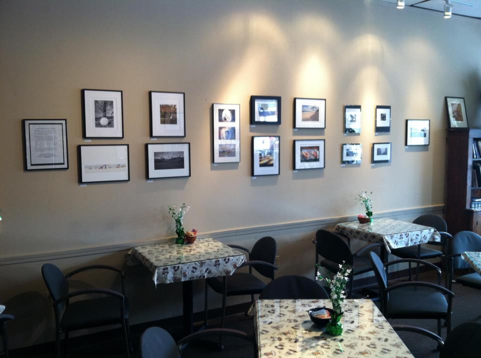
Four photographs each by four people–Bob Shea, Hank Shaw, Walt Thomas and somebody named Dave Dorsey–are on view at Canaltown Coffee Roasters across from the new Wegmans going up on East Ave. Some excellent photography with few pretensions. It’s nice to think someone might get some pleasure by looking up from a smart phone in order to take them in for a few minutes. Bob organized the show and did a lot of the framing. At home in Tennessee, Walt participated in the afternoon reception via Google hangout using Hank’s laptop to get a look at what was happening, though he wasn’t picking up much conversation over the background noise, via the laptop’s microphone. Hank had me laughing through most of the reception. The people who showed up to look at the work had some great questions and stuck around. Bob, Hank and Walt are all more serious about photography than I am, and they know a lot more about cameras and software. I depend on my Nikon mostly as a source of images for paintings. Walt has had one of his photographs included in a Manifest Gallery INPHA annual and is the administrator of a Posterous site for photography, though that’s coming down soon, thanks to the demise of Posterous. And, oh yeah, he also sold one of his shots. The work was all uniformly interesting and really well done and though it was a struggle pulling the whole thing together at one point or another, it was gratifying to see that people actually showed up to take a look. Facebook strikes again. Four by Four ought to become a regular thing.
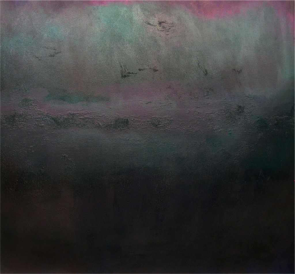
State of Mind, Amalia Piccinini
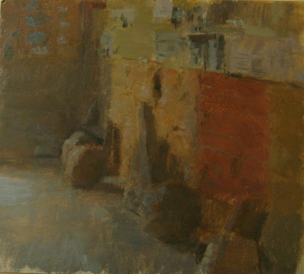
The Painting Center has a show of paintings that explore darkness in varying degrees, still up until later this month. This one stood out for reasons that aren’t suggested in the press release from the gallery. When I saw it I thought of the twilight and night scenes of Tonalism. This reproduction is pretty good, though the painting is actually darker than this and you have to study it a while to see the subtle variations in color.
“I could do whatever the fuck I wanted to do and make a livin’.” Trailer for Sign Painters. From the blurb on Vimeo:
It’s the first anecdotal history of the craft, features the stories of more than two dozen sign painters working in cities throughout the United States. The documentary and book profiles sign painters young and old, from the new vanguard working solo to collaborative shops such as San Francisco’s New Bohemia Signs and New York’s Colossal Media’s Sky High Murals.
The book published by Princeton Architectural Press in November 2012 features a foreword by legendary artist (and former sign painter) Ed Ruscha. We encourage you to pick up a copy at your local book shop, or directly from Princeton Architectural Press –goo.gl/aTZLq
“Just to feel that, that brush. Just a little bit of drag in the paint. You could make the brush do anything you wanted to. That’s power. It’s real power.”
That’s exactly it: “Just a little bit of drag in the paint.”
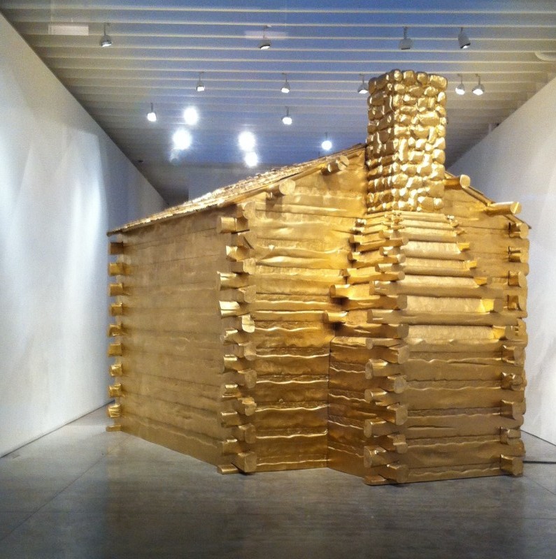
America, Will Ryman
As conceptual art, this works without any need for commentary. One glance and you get the point it’s making, and it does it powerfully and with genuine beauty. It also makes you wonder what it would be like to live inside of it. I’m pretty sure it would feel . . . what’s the word I’m looking for . . . unaffordable. America, by Will Ryman, at Kasmin, could pretty much pass for an actual log cabin, such as the one Lincoln grew up in, except that it’s seriously shiny. This little starter home would have offered Thoreau more than enough space to crash for a couple years. Daniel Boone and Davy Crockett also come to mind. But then, inevitably, one thinks, hey, nice penny jar for Donald Trump. Get up close and you can see all the consumer product parts used as building materials: car parts, railroad components, keyboard keys, corn, coal, cotton, chains, shackles, (cotton, chains, shackles . . . oh, I get it), wood, exterior paint and bullets. Bullets? Just another consumer item at Wal-Mart. (Point taken.) Any serious shopper whipping out the checkbook at Kasmin, though, must wonder, do I have to wait two years to resell it at auction or should I just, you know, melt it down now? Reminder: it’s only gold resin. Also, it’s real estate, so you take your chances. Just wondering, America wants to be an act of dissent about the decline of American culture, as seems to be the case, shouldn’t all the money from the sale go directly to Occupy?
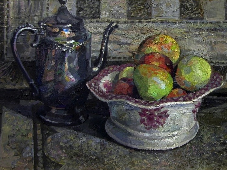
Apples, detail, Charles Kaiman, Oil on Canvas
Yet another painter influenced by Edwin Dickinson. (Will it never end? Hope not.) Some excellent work by Charles Kaiman at Blue Mountain Gallery until later this month.
Guemene sur Scorff, Neil Riley
It seems to be the case, in some quarters, that you aren’t an artist until you quit making art and get to curating, which is fine with me, if it gets Matt Klos into the game. He sent me an invite to a show he’s curated that opened today at 39th Street Gallery in Brentwood, Maryland, which looks like a must-see for anyone who can get to it.
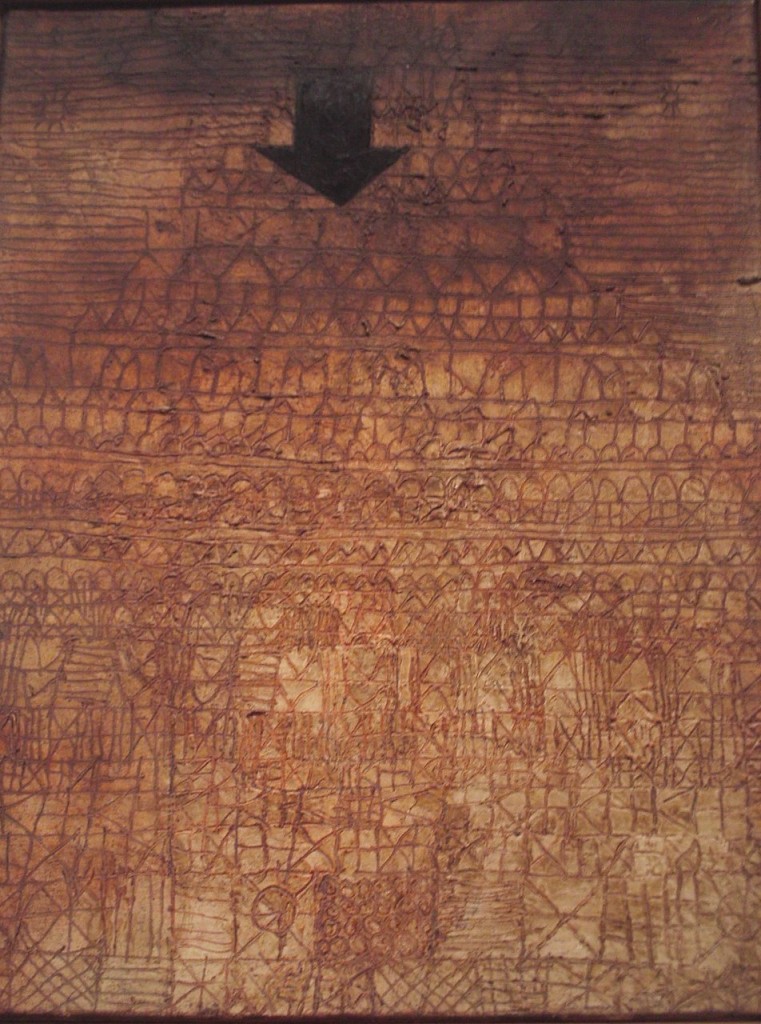
Stricken City, Paul Klee, gypsum and oil on canvas
That was the word that came to mind when I saw this in the current small exhibit of late Paul Klee at the Metropolitan on Saturday. Knowing Klee, without glancing at the title, it might have been his poetic heiroglyph for smoggy rain. But instead it srikes me as Guernica writ small. Let this be a warning to you if you’re an American suspected of terrorism, eh? You never know what arrow might strike from the skies. Klee did this one in the last years of his life, along with all the rest in the show. If you click to the Metropolitan page for this work, amazingly, you can enlarge the image until you actually are able to peer down clearly into the grooves of the surface. His lines are all incised into the gypsum. He never stopped experimenting. You can walk up and see this one right after you come out of the Matisse show, which is phenomenal and offered me new ways to see at least a dozen of that master’s works. More on that later.
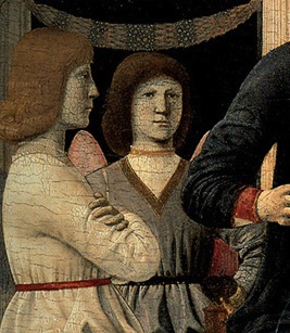
Angel faces (detail) from Virgin and Child Enthroned with Four Angels
I managed to get to The Frick on Saturday to see the Piero della Francesca exhibit, and this one show, alone, made the long drive down to NYC and back worthwhile. I’d done a quick tour of a few galleries in Chelsea on Friday and was feeling a little dispirited. There was plenty of fine work, but nothing that I would have regretted missing, if I’d decided to blow it off and see Lebron at Madison Square Garden, or just stayed home. Ironically, I had to get to the museums for the sense that I was seeing something with fresh eyes. So, here’s a tip. If you’re going to The Frick for Piero, my advice is simple: save the best for last. Look at the lesser paintings first, and then be prepared to stand silently in amazement by the contrast between the other work and the greatness of Virgin and Child Enthroned with Four Angels. This show is all about that one painting, and it works in this room the way Vermeer’s Milkmaid worked at the Metropolitan in 2009. It’s flanked with collateral paintings, but with both shows, you’re attending essentially a one-painting exhibit. I may be the only person who sees it this way, but the contrast between the six other paintings and this masterpiece couldn’t have been more dramatic for me. As I looked at the fragments of the altarpiece, the individual figures, I had to suppress the urge to ask for my admission fee back: after a minute or so I wanted to move on. My response was to wonder why American collectors took such pains to secure work by this founder of Renaissance painting. (Historical note: they bought them for only hundreds of thousands of dollars.) When I got to Virgin and Child, though, it was as if I were meeting a completely different painter. I had the rare sensation of looking at a quality of work I’d never seen before, which is nearly impossible to experience after decades of viewing thousands of paintings. I don’t know if this painting could change your life, as Peter Schjeldahl suggests, but I can attest that it ought to change what you think it’s possible to do in paint. Or maybe I should say it will MORE
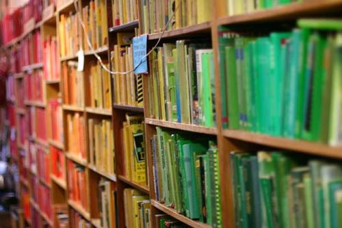
Chris Cobb’s installation
Now this is almost subversive. Chris Cobb organized all the content of this book shop, Adobe Books, by color. So long, alphabet. I think Cobb’s left brain just put his right brain on the watch list. I love the title of this installation: There’s Nothing Wrong in This Whole Wide World. If I owned a book shop, this is exactly how I would choose to go out of business. Or else I’d have the only bookstore in the world with a sign in the door: for browsers only. Why do my own bookshelves not look like this? All of mine are some earth tone or one of various shades of gray. (No, that book is not among them.)