Archive for the 'Uncategorized' Category
July 8th, 2022 by dave dorsey
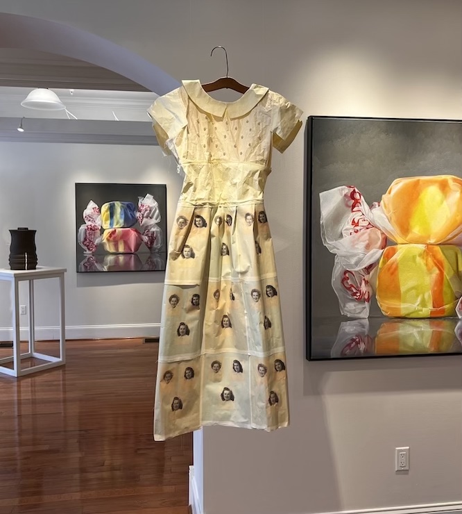
Tangible Things, invitational group show at Main Street Arts, Clifton Springs
Main Street Arts invited me to show some of my taffy paintings in its current exhibit, Tangible Objects, along with the work of six other artists who are experimenting with form and materials, and whose work in many cases evokes commonplace, overlooked objects. In other words, Bradley and Sarah Butler recognized that someone who tries to bring forth the sense of a world in a couple pieces of salt-water taffy would be right at home with these others: all of us are exploring the formal opportunities afforded by the most humble, vulnerable objects most would consider insignificant. In other words, the spirit of still life painting hovers throughout the show: the beauty and resonance of the everyday, domestic, and mundane. I was also delighted to see my sense of being haunted by color field painting (in my candy paintings) is echoed a bit in the work of one of the other artists, Myung Urso, whose materials are fabric and paper. It’s a great show, and the work is original, surprising and often quietly poetic and stirring.
Becca Barolli, weaves stiff, annealed steel wire into shapes that suggest fabric—an old, falling-apart afghan, a long muffler—bending the wire and braiding it into these nearly immovable effigies of something far more warm and cuddly. She works long hours, rubbing CBD oil into her fingers at the end of a work day, trying to weave with steel—it’s almost a vocation the Greeks would have imagined as karmic justice for some offense against tunics. The objects suggest petrified remains of what once nurtured 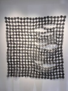 comfort and life, but they aren’t morbid, nor depressing. Instead, the immense, repetitive effort, the meditative devotion required to transform the body of supple, humble things into art gives them a mysterious totemic after-life. The contrast between the delicate, original object, and the work based on it, impervious as chain mail, accentuates the gap between the medium and what it represents as well as the delight triggered by that gap in all representational art, fusing both sameness and difference into one perception. Barolli is a recent MFA from the San Francisco Art Institute and has had a residency at Mass MoCA and has shown at galleries in L.A., New York City and San Francisco. Her practice favorably brings to mind Susie MacMurray’s, and it would be interesting to see them paired in a show some day.
At first, Sue Blumendale’s dresses look as if they could be worn to a party, but they’re made of archival copy paper that serves as a support for digital images of people from her ancestry: mother, father, aunts and a grandmother she never met. The dress becomes a sort of sculpted image of an absent human form, missing from inside the dress but commemorated with two dimensional images printed on the paper. The pictures of her family come from a family album. It’s intensely personal and felt, and the humble quality of the dresses has an almost Japanese quality of self-effacement, the everyday object surviving, transcending its wearer, coming into its own, and likewise, the artist herself withdrawing to let the dress shine, just as the subject, the missing person is absent inside the dress but present in the memorial pattern. It’s the transformation at the basis of all art: the individual human being sublimated into the creation. These are wonderfully realized three-dimensional images, where stylistic choices come together perfectly in a unique way. It’s lovely, intensely personal work. One wonders if someone could make a living doing cloth versions of these dresses to be worn, on commission, for people who wanted to clothe themselves with a memory. A new form of portraiture and a new line of clothing that exhibits the work anywhere, at any time.
MORE
June 10th, 2022 by dave dorsey

I have never finished reading Frank Stella’s Working Space, a long and impressively written essay on the evolution of “pictorial space” in Western painting. It’s done as a coffee table art book, with lavish illustrations, so reading is optional. For a while, I loved listening to him talk about art, but early on I decided to get off the train at the nearest stop because I gathered what appeared to be its destination: positioning his work in the ongoing history of art. It’s a fascinating argument, because Stella can be a spell-binding rhetorician. His prose draws you in with its magisterial command of art history and his unique position as a pioneer in painting back when it was still possible to be such a thing. I suspect he has never gotten over that—who could? —and this book struck me as his attempt to characterize his entire body of work as pioneering. The book is bold, brilliant, and sometimes baffling, but I didn’t mind that last part, because his slippery prose has rewards of its own. That’s how rhetoric works: it draws you in with its momentum. He seems to be arguing for his later three-dimensional work, on shaped canvases, as a new way of painting “pictorial space” comparable in its paradigm shift, historically, to the intimate, cinematic depth of field Caravaggio brought to painting in his own time.
I don’t know. Aren’t Stella’s constructions more of an idiosyncratic fusion of painting with sculpture? I love his ebullient, affirmative energy, no matter what he’s doing. So does he need to cling to his pioneer status, especially when “progress” in visual art exhausted itself in the 60s?
Along the way in Working Space, though, Stella says things, in quasi-poetic idioms, where he finds brief, profound ways to veer out of his swim lane. It’s hard to tell if he knows he’s no longer talking about space or the depiction of space, but about epistemological quandaries fundamental to human life, not simply in the art of painting. Without warning, he slides into a passage about the limits of human knowing, the limits of knowledge itself, not just whatever is the case with things shown or signified. It’s evocative language that seems better delivered in stanzas than paragraphs. The italics are mine:
This ephemeral quality of painting reminds us that what is not there, what we cannot quite find, is what great paintings always promise. It does not surprise us, then, that at every moment when an artist has his eyes open, he worries that there is something present that he cannot quite see, something that is eluding him, something within his always limited field of vision, something in the dark spot that makes up his view of the back of his head. He keeps looking for this elusive something, out of habit as much as out of frustration. He searches even though he is quite certain that what he is looking for shadows him every moment he looks around. He hopes it is what he cannot know, what he will never see, but the conviction remains that the shadow that follows but cannot be seen is simply the dull presence of his own mortality, the impending erasure of memory. Painters instinctively look to the mirror for reassurance, hoping to shake death, hoping to avoid the stare of persistent time, but the results are always disappointing. Still they keep checking. We can see Caravaggio looking at himself from The Martyrdom of Saint Matthew, Velásquez surveying his surroundings in Las Meninas, and Manet testing the girl at the bar to see if there is anything different about those who have to work rather than see for a living.
Stella bears down on something fundamental to human experience at the start of this passage: the way in which knowledge MORE
May 30th, 2022 by dave dorsey
 I’ve been delinquent for quite a while now on this blog and Instagram, painting and not posting, much of the time, though for the past four months, I was also caring for my mother who died in April. I’ve also been awaiting the completion of a new studio, I was away from painting since early February. In the past four years I’ve chosen to spent nearly a near away from painting to be more with family members who were ill or at the end of life, so my work on the salt water taffy series has been slower than I’d hoped. That personal era seems to be over, and the new studio is almost entirely set up, so work resumes this week. I hope to return to this blog on a regular basis as well. It isn’t that I haven’t had things to say. As I like to remember Jack Benny’s punch line: “I’m thinking! I’m thinking.” It isn’t quite the way he phrases it in the bit, but you get the idea.
May 30th, 2022 by dave dorsey
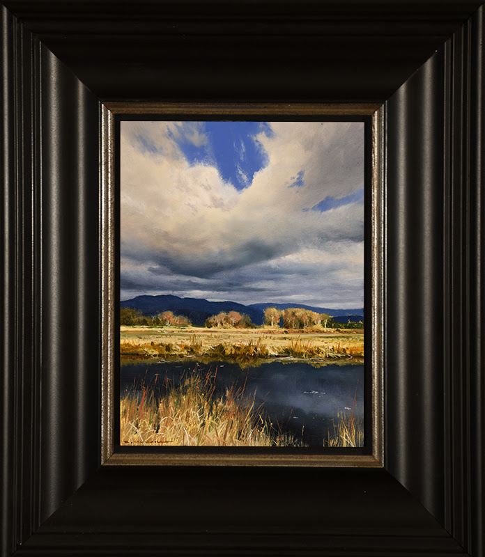
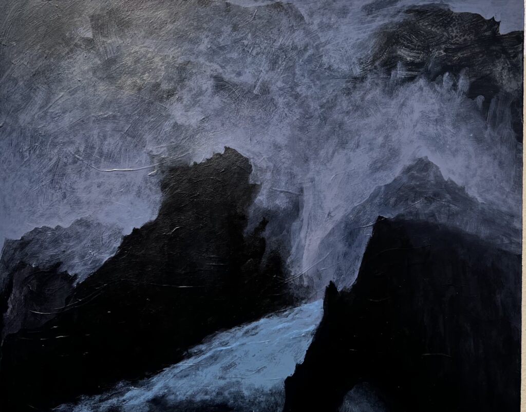
Dark Waters, Renato Muccillo, 6″ x 8″
Remarkable new paintings by Renato Muccillo at Arcadia Gallery. Very small, intensely realistic, yet painterly.
May 6th, 2022 by dave dorsey
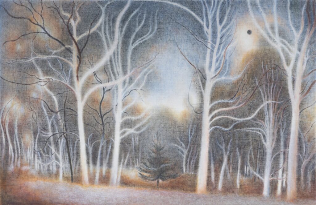
eclipse, oil on linen, 12″ x 18″
One of the first shows I visited when I was in New York City last week was a meaning made of trees, a collection of new work form Ron Milewicz. It’s outstanding. Milewicz continues to explore the pictorial possibilities of his new location in the Hudson Valley. I had an illuminating conversation with him about the work.
1. The little catalog available at the show, first of all, how was it done? I’ve tried that for solo shows in the past and have not been happy with the results, but your images were accurate and well printed. Who did these for you? Second, the catalog was from your previous show? If so, there’s a real consistency in quality and approach between those paintings and the ones on view now. You have found a groove and are working it, and you have clearly defined personal “rules” you follow in these Arcadian views. Did this style come to you all at once, full blown, or in stages?
The catalogue is from my Axis Mundi show in 2020. It was printed by an online company called Uprinting. I had the paintings photographed professionally. I designed the catalog myself on my Mac using Pages, and then a graphic designer familiar with Uprinting design programs made the layout that was sent to the printer.
That was two shows ago—I had another show since at Pamela Salisbury Gallery in Hudson, New York, in 2021.
I do not have “rules” but I do have a consistent approach to the landscapes that has developed over the past several years. For a period of about two years, I was only making on site graphite drawings. These tonal works are very much a direct response to the experience of the landscape I am working from—its atmosphere, light, spaces, and forms as well as its stillness and calm. The drawings were a very intuitive reaction to the environment, and they came relatively quickly. I then started to make oil paintings in the studio from the drawings. It took a longer time to understand how the drawings might be reinterpreted as paintings, in terms of materials, touch, color and scale.
2. Your career is interesting: you’ve gone from excellent urban landscapes to these visionary woodland scenes, both periods just as well done, but with a completely different sense of purpose, at least for the viewer. The urban landscapes fit within a much broader practice for contemporary artists; many more people are working in that vein these days. What you are doing with the trees reminds me of Burchfield and Nick Blosser, a Tennessee artist who has almost disappeared from view on the Web. Do you see these as two distinct phases or is there a continuity between the city and the country work for you?
They are two phases as they are derived from distinct locales and from the very different circumstances of my life outside of the studio, which inevitably changed my priorities in the studio. There is continuity in the sense that I am painting the world around me in both instances, although the conditions of those worlds are very different from each other. There’s also consistency in my concern for light, stillness and formal rigor.
3. I think of Burchfield in particular: the disjunction between his dark, almost monochrome American Scene pictures and the nearly psychedelic visions of his last period where he seemed to be attempting to convey the totality of nature in each painting. The divide between those two periods was radical, more radical than the shift in your work, but there’s no way for me to see how you get from the urban landscapes to the woodland visions, step by step. The move to Hudson Valley obviously triggered something, but the question is: what internally changed in how you see and paint as a result of this move? Did you grow up immersed in nature and then left it behind for years working in New York? MORE
March 31st, 2022 by dave dorsey
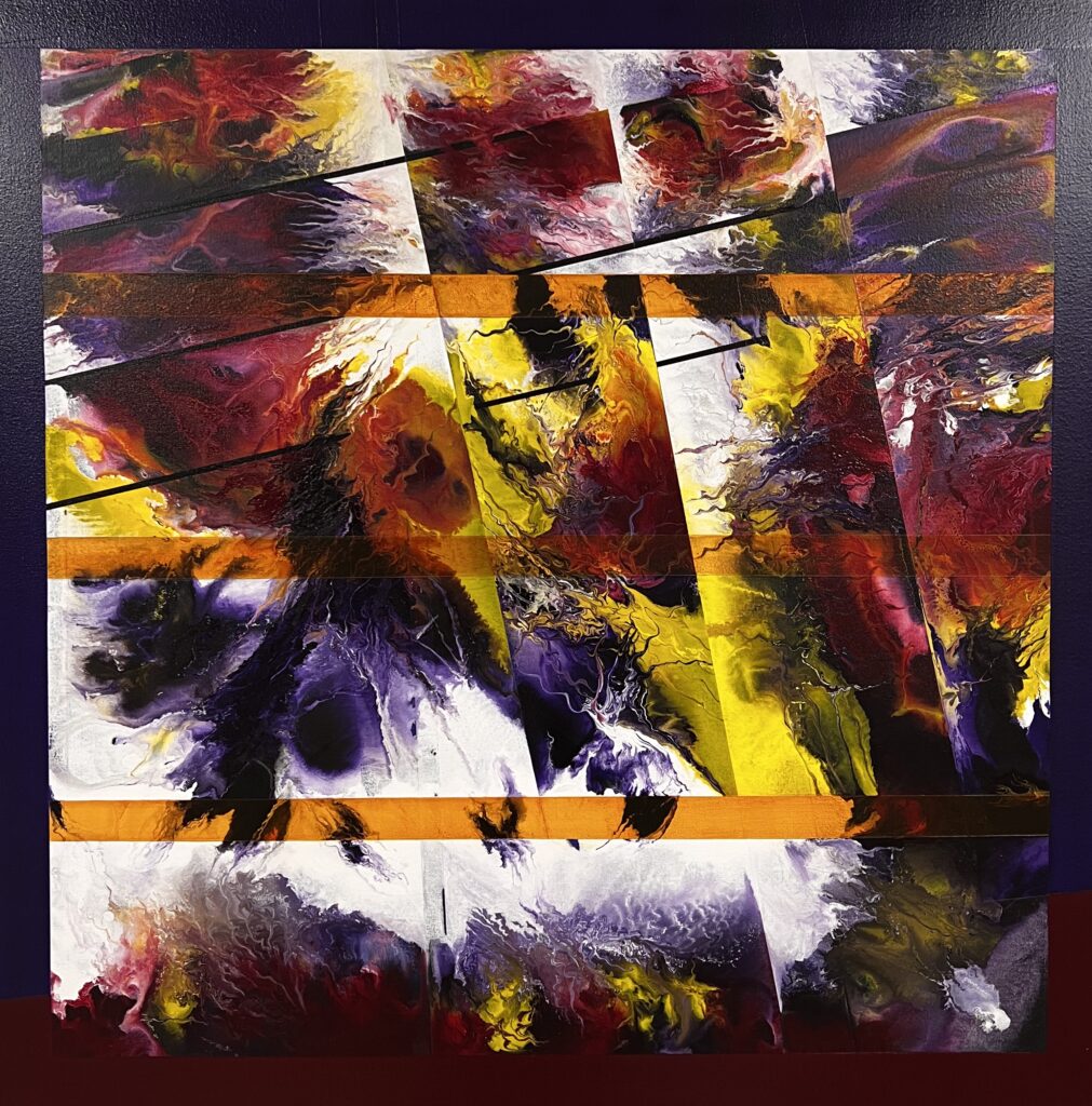
It’s There in The Humming Air, Bill Santelli, acrylic on canvas
On a quick visit to Bill Santelli’s studio last week, I saw a recent painting that knocked me out. In my Instagram post about it, I touched on some of the things that really work and give it a sense of natural depth, as if I’m seeing an actual scene in nature, with a slightly altered mind, as it were. There’s a shape that reminds me of a sunflower and the tendrils of paint reminding me of sprouts—I called them fractal rivulets in the post. The presence of white space, and the shape it assumes throughout the image, has a very kinetic unity and tension. I love the relief of white space in any abstract—and the shape the total white space assumes, sort of rearing up in the center of the painting—the way it sets off highly saturated color and offers a respite, a bit of emptiness that plays off the intensity of what’s going on around it. It really works here. The diagonal lines, in sets of three, on a bias, rather than a balanced grid, also contribute to the sense of energy and movement and surprise.
Bill: It’s called It’s There In the Humming Air. I think I did talk to you about this. I was going to do this other painting, and it’s the first time I’ve painted over something. Underneath it was a painting of the bones of a church I took a picture of in Washington DC. It was like a Jehovah’s Witness or something, not a cathedral, a glow coming out of the windows as we drove by. It was a blurred shot I took as we drove by. The painting never got going. Then you and Bill and I were at Bill’s house and we were talking about painting over stuff and I said I had this painting and I was going to paint over it. There was an outline of the church, so that’s why there’s the slant.
That has a lot to do with it: the asymmetry of the three lines and three here, so that it brings your eye up to the upper right corner. And it has a lot of white in it. This has a lot of white compared to what you usually do.
B: That’s a good remark, that’s what I was feeling. I got over here and there wasn’t much of the underpainting of that church and there’s still an outline here of a window and I was thinking this needs something different and didn’t want to keep going with the red and the yellow, so I went with white.
It looks so much like enamel, not acrylic. Like the Alkyd paintings of the color field painters.
B: Some of these acrylics are glossier when they dry. We’ve had this conversation ongoing, the whole idea of hard-edged painting, getting rid of the personal connotation in the title. I was saying last time we talked I’ve been thinking of this other series of hard-edged painting with no subject, just color.
Just improvisation. And that’s what I do with the taffy. I’m not trying to say anything. I’m just getting it to work formally and by the time I’m done, this is a field with the sun over it or it has some other resonance. I don’t start out trying to express anything definite.
B: It’s so interesting, I’ve been watching videos of Bryce Marden, one is an interview at the Tate Gallery and another is a lecture he gave in conjunction with the show. He’s articulate. He was talking about numbers and the importance of the numbers, and rules, and how he approaches painting. I’ve been marveling at the surface of his work. He said it’s a process of mixing turpineol, the oil paint and beeswax. The paintings never really dry. He goes back over the surfaces to level them off with palette knives or whatever.
February 18th, 2022 by dave dorsey
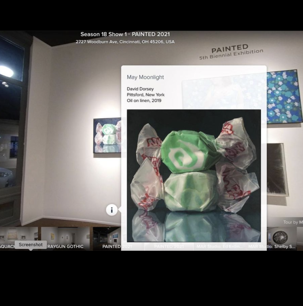
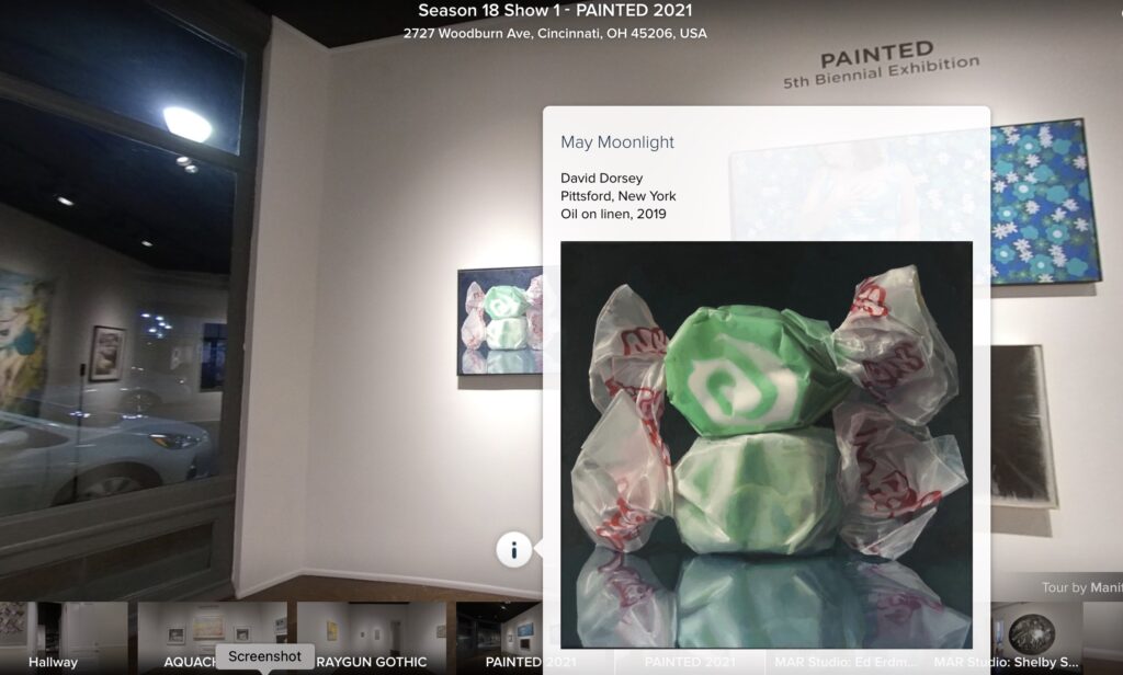
A screenshot from the online tour of Manifest’s Painted exhibition.
While the Painted exhibition was still running at Manifest Gallery, in Cincinnati, late last year, I participated in a Zoom conference with around a dozen artists whose work was chosen for Painted and the gallery’s other concurrent exhibitions. It was fun and humbling, because some of the other artists were conversationally eloquent about their work and art in general, while I felt bashful and halting by comparison. After more than a decade of writing about visual art, you would think I’d have been an open spigot of confident opinions, but that isn’t how it felt. Adam Mysock, Education and Studio Program Manager at Manifest, moderated the conversation. Of course, some of it was inevitably about what the artists were trying to achieve in their work. What they intended for their work to do for a viewer. How the work was the outcome of purposeful intent and had designs on a viewer’s perceptions, ideas, emotions, and so on. Later in the online conference, Mysock asked a question that got crickets from the participants: “So is it possible to imagine an entirely passive way of painting?” I thought at the time it was a question worthy of the sort of strenuous meditation a Zen adept brings to a koan and was especially pertinent to anyone who works with photo-realistic methods as I usually do. I couldn’t think quickly enough on my feet, partly because it’s subtle and complicated and a little paradoxical. The question has continued to haunt me and only recently have I realized I should have at least said that whole issue is central to what I’ve always sought to do in representational work.
Most people, including painters, think of style—the signature of the painter’s heart in every detail of the finished work—as the essence of the work’s originality and value. So the way in which an artist distorts, shapes, censors, simplifies, or translates what he or she sees into a unified image establishes the value of that particular painter’s work. This would appear to be an entirely active process: the outcome of complex, continuous choices as the picture is being painted. At some point, Fairfield Porter said something that probably wouldn’t be repeated by most painters now, but it’s a simple way to imagine what even photographically accurate painting actually does: to depict the world, just as it is, while making it a little more beautiful. It sounds like a recipe for the equivalent of sentimentality: trying to make the world more beautiful than nature did. But that isn’t what he meant. I think he was talking about how the process of transforming natural vision into a painted image mysteriously reveals the beauty that’s there but unrecognized in what a person looks at but doesn’t really see every day. How that transformation occurs is the essential mystery of the whole pursuit. Porter simplified what he saw, reducing a wealth of detail to one or two strokes of paint in some cases, made countless choices to eliminate aspects of what he saw and alter a color here or there, or everywhere, for that matter, to harmonize it with others on the canvas. He made active choices that had some conscious or subconscious end in mind, his goal or purpose, even if that purpose was merely to complete the work in a way that enabled every little part to be indispensable to the work’s visual unity. It would seem to be an intensely active, not passive, process.
But he was hoping that his work would do nothing more than capture “the light in the room” just as it was, the moment in time and place, even if much of what the light revealed to his observant eye gets lost in its resolution into paint. His painting of tennis players has that quality of being exactly how the court looked just as one of the players served the ball, the bright mid-day light intensifying the whites and flesh tones, deepening the darks of the shadows behind them, even though most detail was erased in the way he applied his paint. There’s no purpose here other than to convey the entire experience of that moment, and he succeeds in such a way that you can smell the air and feel the warmth of the sun on the backs of the players. In that sense, what he’s doing is utterly passive, honoring a simple, trivial moment in all its vitality and beauty and order. His paintings are an homage to this sort of mindfulness and humble appreciation of the mostly unregarded glory of ordinary life, from hour to hour—as were the paintings of Vermeer and Chardin and most of the Impressionists and the perceptual painters now. And most landscape painting in general. In other words, he worked as part of a long tradition very much still alive now.
For the record, over the past year, I’ve become interested in art that does just the opposite. MORE
January 30th, 2022 by dave dorsey
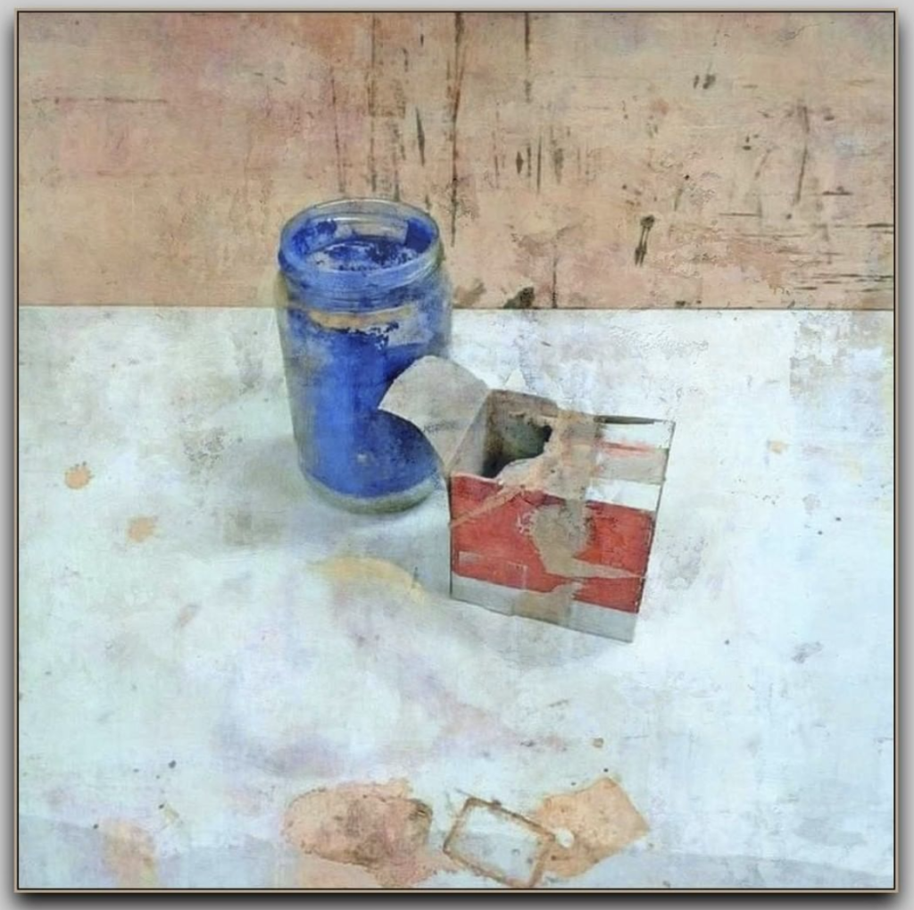
Giuseppe Celi, Still Life and Things, 2005
oil on plywood, 32×32 cm
January 27th, 2022 by dave dorsey
Head with Fabric, David Baird, Birmingham, Alabama Oil on canvas, 2020
David Baird had three paintings in Manifest’s Painted exhibit to kick off their 18th season in Cincinatti. This one, Head with Fabric, has many of the fine qualities of his painting, Red Nude, that just took First Prize at the Salmagundi Club’s New York Figurative Show. His handling of paint in the way he renders a figure reminds me a bit of Degas, which is high praise: the soft glow and gradual transitions among tones without being obsessive about detail while conveying the living quality of flesh–his figures breath. You feel you can take their temperature. But what makes his paintings so astonishing is the variation in level of verisimilitude, moving from persuasive illusions to flat patterns and roughly unfinished portions of canvas without destroying the overall feel of space and depth. Diarmuid Kelley has been doing this, to a lesser degree, for a while now, but without creating as much interesting tension between the finished/unfinished, illusionistic/flat areas of his canvases. It’s something Baird has in common with other painters who have connections with the Jerusalem Studio School. Some of Baird’s still life objects work both as fuzzy abstract areas of tone and as soft but utterly convincing visions of objects in three-dimensional space. The color is usually a range of rich, gorgeous earth tones worthy of Braque. It’s hard to figure out precisely how he does it. That usually wins my highest respect, when the technique seems utterly impossible to reverse-engineer.
January 24th, 2022 by dave dorsey
An online view of Manifest’s Painted exhibition last fall.
I’m way late posting this screen shot from last fall’s Painted show at Manifest in Cincinnati. The online portal allowed a viewer to click and scroll through every gallery at Manifest, all of the shows mounted there, with the ability to swivel 360-degrees, Google-maps style. You could use your touch screen or track pad or mouse to look in any direction from any station in the sequence of click-to spots that walked you through the show. Every gallery and museum should do this, at least the ones not dependent on admission fees for survival. I clicked on the info icon and up popped the image of the painting with all the identifying data. Very cool and it helped make up for the inability to attend.
December 21st, 2021 by dave dorsey
Where Did It Go?, Bradley Butler, 8″ x 10″, acrylic on panel
Bradley Butler’s recent solo exhibition at Williams-Insalaco Gallery 34 at Finger Lakes Community College was a quiet thrill. The work is quietly evocative, simple, deeply felt and as ontologically disorienting as a Beckett play. He took his title from Pet Sounds, Brian Wilson’s groundbreaking album: I just wasn’t made for these times. Many of his titles were equally candid in their unknowing vulnerability: I Don’t Know What I’m Doing Here and I Want to Believe in Something. His dark, mysterious landscapes—Turner meets Giorgione meets David Smith’s Hong Kong paintings—evoke a multitude of perceptions that hover just below the reach of the intellect. They are extremely simple in their execution. He uses black, white, thalo ted and thalo treen, and his brushwork remains mostly uniform across the canvas. He reduces his methods to the fewest possible choices and still comes up with a broad array of images that seem to straddle the border between one’s inner life and a twilight world of mountainous space, all of them looking consistently primordial. He seems not to want to assume to know more about existence than what prevailed before the first few words of the Book of Genesis. The way he gets so much variation out of such a paucity of tools reminds me of a guitar lesson I had in my teens when my instructor told me to riff for five minutes, without repeating myself, against a minor seventh blues chord progression by using only three notes. There were, to say the least, a lot of long, expressive pauses. Butler, in his relatively small canvases, creates a sense of vast reaches of an undiscovered world. It beckons and invites you to venture past a corner that juts into view, but also makes you hesitate, unsure what you are going to find. I posted one of his paintings on Instagram and simply quoted a passage from Lao Tzu as commentary:
Something mysteriously formed,
Born before heaven and earth.
In the silence and the void,
Standing alone and unchanging,
Ever present and in motion.
Perhaps it is the mother of ten thousand things.
I do not know its name.”
I disagree with Butler’s show title though. His work seems perfectly attuned to his times, being an example of an honest uncertainty and humility that would go a long way to being an antidote to the cloud of knowingness that cloaks how people communicate now. Anyone interested in seeing Butler’s work can find him most days doing a remarkable job of showing excellent art at his gallery, Main Street Arts in Clifton Springs, where a fascinating national juried show of small workswill be up until the Dec. 23rd.
December 19th, 2021 by dave dorsey
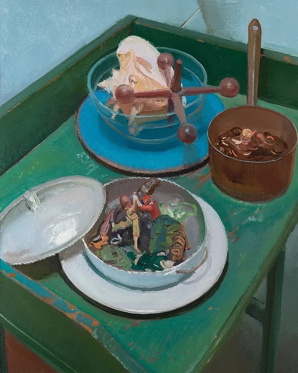
Scott Noel, Still Life with Pennies and Shell, 30″ x 24″ 2021
From Matt Klos at Exeter Gallery (241 S. Exeter St., Baltimore MD) a solo exhibition, “Still Life”, of Scott Noel’s recent paintings running through the end of the month. His remarks about color are on point. Noel’s paintings have a colorist’s skill with tone and hue. Once you recognize that little red action figure in the center of Still Life with Pennies and Shell, above, all the other colors in the painting are anchored and vivified by it:
Scott Noel has lived, painted, and taught in Philadelphia for most of his professional life. He has inspired generations of painters through his teaching at Pennsylvania Academy of Fine Arts (PAFA) since 1996. His subjects range broadly from figure, cityscape, domestic scenes and gardens near his home in Manayunk, studio interiors, and still life. His painting methods harken to traditional methods of American painting related to artists such as Thomas Eakins, Edwin Dickinson, and Charles Hawthorne although he creates color spaces that register as something contemporary, and perhaps, even indicative of an upbringing in the 60’s in Charlotte, NC.
This exhibition features ten oil on linen paintings, eight painted within the last year. Noel’s painting practice is unrelenting, and his output is abundant. His method of working “allover” in long, sometimes eight-hour sessions, is necessary since he’ll often scrape away his initial marks to serve as a platform for subsequent moves. In this way he keeps the image fresh and walks the line between delicate descriptions and unresolve. His mastery of painting is apparent yet there is nothing insincere or aloof about his work. He is seeking to understand what lays before him and seems to approach his latest works with a touch of naivety and all the joy he finds in his craft.
Scott Noel’s exhibition at Exeter is his first exhibition in Baltimore and coincides with his solo exhibition at Gross McCleaf Gallery in Philadelphia, Current Events, Provisional Painting. He was born in Charlotte, NC in 1955, educated at Washington University, St. Louis. Noel has written catalogue essays about forbears and peers that include Lennart Anderson, Larry Day and Ben Kamihira. His work is in numerous collections including The Woodmere Museum, Lasalle College Art Museum, The Pennsylvania Convention Center, and Drs. Don and Allison Innes.
December 1st, 2021 by dave dorsey
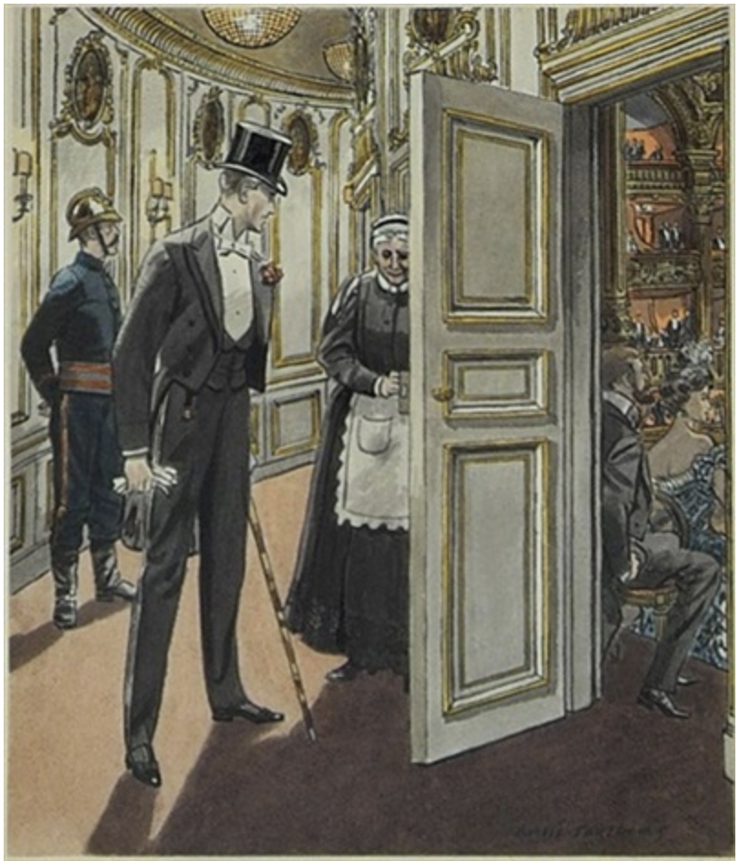
Chad, making his debut in the novel, coming into the balcony at the theater occupied by Strether. Illustration by Leslie Saalburg.
It might be fun and profitable for someone—if college students still read Henry James—to translate his late novels into English. I read The Ambassadors in graduate school, as required, and absorbed little of it. It was a compulsory title. The problem was that I wasn’t prepared to pay enough attention to actually locate subjects and verbs. It’s often a challenge in The Ambassadors. Over the past several years, as I’ve attempted to read or reread all of James’s novels, I’ve struggled to find the right adjectives to describe this late prose style: elliptical, disembodied, ethereal, circuitous, evasive, a sort of private murmur of abstracted assertions that seem to exhale the aura of his protagonist’s awareness rather than simply tell the reader what in the world is going on. Henry was offended when his brother, William, reacted to The Golden Bowl, the novel James published directly after The Ambassadors, by saying he admired its brilliancy but would have preferred an “absolute straightness of style” rather than “the method of interminable elaboration of suggestive reference.” William was being tactful: his observation more or less sums up how annoying these novels can be. And yet they are addictive once you succumb to the challenge of deciphering the prose. They tease you into submission. It can be amusingly, ridiculously frustrating to fish in the dark lake of this prose for what a given sentence signifies, especially when—fish in creel —you realize you could have netted one just as nourishing from inside an easily plumbed aquarium of the sort built by the earlier Henry James himself.
Lambert Strether is the central “ambassador” in the book. He has been sent to Europe by Mrs. Newsome to retrieve her son, Chad. She owns and runs a lucrative industry in Woollett, Massachusetts, and she wants him to lead it into the future. Ostensibly, Chad has been seduced by an immoral woman, maybe even a woman “of the streets.” Fears about this mysterious woman’s antecedents are groundless. She’s an aristocrat. Chad has been transformed into a genteel, poised, Parisian courtier by his association with Madame de Vionnet and her daughter, Jeanne. He has become a bit like Swann, from Remembrance of Things Past, twenty years ahead of Swann’s emergence in Proust’s novel. Strether must convince Chad to come home because his mother wants him, effectively, to run the company with a focus on the new world of advertising—a force that, it’s surprising to learn from this novel published at the turn of the 20th century, was already fueling commerce.
From the moment he arrives in Europe, Strether falls in love with his surroundings, and finds himself—in his own version of a mid-life crisis, in his fifties—falling, not for the first woman he meets (who falls in love with him, as it happens) but for Europe and, especially Paris itself. When he meets his quarry, Chad Newsome, he recognizes that Chad has matured and come into focus as an accomplished social creature in ways Strether never would have guessed were possible from his acquaintance with the boy while he was growing up. Strether’s imagination opens to Paris, the magnificence and subtle elegance of the shops and houses, the left and right banks of the Seine, the Faubourg St. Germaine, the parks and the museums, the restaurants, the hotels, and the everyday sounds that rise from the streets. The world has been renewed before his eyes. His impulse is to wander and absorb everything he sees, smells, hears and touches. He’s reborn. Through this febrile, almost manic hunger for the city and the region, he’s only half-aware of how the seemingly innocent seductions of a beautiful place color his perception of the relationship between Chad and this lovely, charismatic and slightly older woman. Marie de Vionnet is a countess, highly intelligent, sensitive, humble, the model of noblesse oblige. All of Strether’s actions arise from his desperate faith that her relationship with Chad is virtuous, chaste, a model of Platonic devotion and friendship. She is married but estranged from her husband and Chad’s family suspects adultery, hence the need for Strether to bring the son home. Yet, from the beginning, Strether is charmed by both Chad and the countess and immediately begins to resist his mission, the call of Woollett. His motives for temporizing are a complex mix of selfishness and generosity—he wants to dwell in Paris as long as possible to absorb its glory. This requires Chad to be morally pure. If Chad’s love for this woman and her daughter were base, it would break the spell of Paris itself, destroy the aura of nobility. It would be the serpent and apple in this garden. The garden itself would cease to charm. This would obligate him to bring Chad home by any means possible, ending the entire European idyll. His actions throughout most of the book are based on Strether’s desire for this new, improved Chad to MORE
November 19th, 2021 by dave dorsey
Night Walker, Jim Mott
It’s the last week to see Jim Mott’s excellent work from a unique project, Life Studies, a modification of his usual itinerant mode, where he travels to a city like Ferguson, Missouri and paints scenes from the life of his participating host, as a gift in exchange for lodging. In this case, he has painted multiple scenes that mattered to a woman who lives here in Rochester. About “Night Walker”, he says:
One of the paintings in my current show at the Yards – done after exploring Ridgeway Avenue at night a couple of weeks ago. This is in the area of Sacred Heart Cathedral – where my project collaborator, Sonja Rosario, was baptized and where one of Rochester’s 50+ fatal shootings of 2021 occurred earlier this year.
At THE YARDS – Jim Mott’s 2021 NYSCA project exhibit runs through Nov 28, Saturdays 10-1 and by appointment. Jim will give a talk about his practice on Nov. 20 from 5-7 pm. “Featuring the results of my 2021 NYSCA Grant project, Life Studies is a collection of paintings and stories based on collaborative sketch outings with Sonja Rosario Belliard, a creative individual and young mother from northwest Rochester. The images and words represent places of significance to her life.”
November 6th, 2021 by dave dorsey
My submission for the Oxford show, April Dawn, oil on linen, 52″ x 52″. Sold.
At the opening reception for “In a Different Light” at Oxford Gallery Saturday, from 5:30 p.m. to 7:30 p.m., you’ll be able to get a glimpse of one of the best themed group shows Jim Hall has organized. Nearly all the work is rewarding and some of it is remarkable and surprising. Tom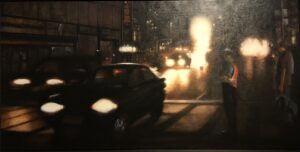 Insalaco has been working for years on a series of paintings showing city traffic at night, almost an extreme reduction of his usually dark motifs into two-tone compositions that either look like a procession of ghostly headlights or sinuous lines of stars against the black ground of the urban night. In Night and Light, the title emphasizes the stark juxtaposition of blindingly bright light against almost featureless darkness. Yet this potentially bleak darkness comes across as familiar and alive: two figures, perfectly rendered in the half-light, watch the passing cars and make the viewer feel like another pedestrian enjoying the night’s energy. It’s as ordinary as a remembrance of a late walk to your room in New York City, but also suggestive of the anonymity of city life in a spiritually-isolated age.
Elizabeth Durand’s Shoreline Light, at etching monoprint, shows how much she has continued to push her work toward a sort of abstraction that somehow looks wonderfully accurate in the way it  conveys the rich warm color of a setting sun over a strip of land and sea, all of it minimally indicated, yet rich with carefully applied color and brushwork that somehow passes for cloud formations but also looks expressionist and gestural. She has been making art for many decades, and now late in her life is still innovating as a quietly original and masterful print-maker whose feel for color has always been superlative.
In an utterly unique contribution to the show, Barbara Page has interpreted a small library of books in visual terms. It’s the outcome of an epic endeavor to create a personal card catalog of 800 different books. Using blank library lending cards, she covered 800 of them with the title and author of each book then a unique work of art to visualize the book’s content in the spaces where borrowers would normally sign their names. The drawings are funny, clever, touching, and sometimes mysterious. All of them are either lively, lovely, or both. One of her contributions to the show is a copy of the book she published offering readers a catalog of the art work itself, and it was accompanied by a digital print of some of her favorite cards, as well as the two drawers containing all of the 800 original works. One could spend days poring intermittently through her efforts, giving each title the attention it deserves.
One of my favorite paintings in the show is Amy McLaren’s “Democracy.” I didn’t look at the title when I saw the painting at Oxford, and today when I spotted my photograph of it on my iPhone, I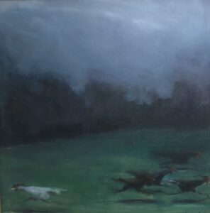 thought, “This is either about marriage or politics.” Then I saw the title in Jim’s price list and laughed. It is a funny painting—it shows what appears to be a white rooster running toward the left with a small group of black roosters running toward the right, the group clearly running away from the lone rooster and vice versa—as a metaphor of cluelessness of our contemporary political luminaries. But it’s a haunting image, and the faint light that falls on the agitated fowl bathes them in a sad kind of wisdom, as if this flight makes visible the universal human desire to flee the truth in a fading light that makes this possible and only fades faster because of it. The image transcends its MORE#
November 4th, 2021 by dave dorsey
Season of Plenty II, Caitlin Winner, oil on canvas, 65″ x 67″
Note: I was honored to be included in Manifest Gallery’s Painted biennial, an international survey of new painting, yet the show came and went before I had a chance to write about it. A week ago, though, near the end of the exhibit, I participated in a Zoom call with 15 or so of the artists showing at Manifest, including a few from the collateral exhibitions: Jason Bly to talk about his solo show and some painters from the galleries concurrent overview of exceptional recent watercolor painting. It was a stimulating discussion that ran into the evening for those of us on the Eastern side of the country, exciting partly because the work from these artists is among the best Manifest has gathered for Painted, and also because some of the artists were exceptionally articulate. I felt tongue-tied much of the time as I tried to speak briefly about what I’ve been able to write about more fluently in these posts. There’s almost no work in the show that didn’t impress me at one level or another, sometimes to the point of envy and sometimes despite my own aesthetic preferences. I’m going to try to post work from these painters every few days, alternating with paintings from the current group show at Oxford Gallery here in Rochester. I was so impressed by one painter in particular, I reached out to her and got some interesting answers to the questions I posed. This post is based on my response to her painting and what she wrote back.
Caitlin Winner works very slowly and deliberately, putting in more time on her paintings than nearly anyone I know. It shows in the strength of the results. Two of her large canvases were included in Manifest’s Painted exhibit in October, and they take perceptual painting to a place I love. I admire the work of most of the perceptual painters, though I think of it as a larger aesthetic space than do its primary practitioners, and I would include in its ranks painters whose work doesn’t exhibit many of its most familiar stylistic hallmarks—and aren’t usually considered part of the club. Above all else, Winner is an exceptional colorist, which I think sets her apart from much of the “perceptualists,” whose color is often remarkable but more subservient to other ends. Erin Raedeke’s paintings of birthday party detritus from a decade ago have been an exception, achieving a rare and delicate touch in the selection and use of color almost for its own sake. Yet color is boldly front and center for Winner in a way that isn’t the case with people like Zoey Frank and many others in that growing collective. I think of color as one of many equivalent formal tools most of the perceptual painters use to create a way of seeing that hovers between abstraction and representation, creating a sense of temporal disorientation, so that the past seems to move into view, blurring the contours of the present moment, creating what feels like the inexactitude of remembrance. David Baird, whose paintings were hanging beside Winner’s in the Manifest exhibit, offers an astonishing example of this: the gorgeous, autumnal tones of his images work to reinforce a dreamlike sense of temporal dislocation. Yet even with Baird, color—masterfully chosen—is on an equal footing with shape, value, line, and so on.
With Winner, as with someone like Louisa Mattiasdottir and Fairfield Porter, in October Interior, color becomes almost the overarching visual mission itself, with all the other formal qualities in a subservient role, even though so much else is going on in her devotion to the figures she shows the viewer: family and close friends who enriched her life during the pandemic’s most isolating months. The precision and clarity of her line also distinguishes her from many of her peers. Eve Mansdorf talks about the importance of edges, but clearly defined edges aren’t a mainstay for most perceptual painters who tend to elide and obscure the transitions between figure and ground. Winner’s outlines could have been drawn with a pair of scissors inherited from Matisse. The edges in her work bring to mind the clarity and definition of geometric abstraction from the 1960s. Her canvases have the translucent luminosity of watercolor, even though the oil is undoubtedly layered and opaque. Her color is intense and radiant, heighted by juxtapositions of complementary tones, but it nonetheless offers a visually accurate sense of immediacy in the way direct sunlight falls onto an outdoor scene. It’s almost impossible to capture the radiance of a bright summer day with photography, which favors the magic hour, early or late, when sunlight is diffused into the air, for bringing out the most vivid color without losing definition in the shadows. Yet here the relentless, high sun casts no colorless, murky shade. Foliage on the far side of a lake becomes a uniform curtain of beautiful green, a block of distinct color, as saturated in tone as anything in the foreground. Everything is crisply defined and drenched with color, like an old Kodachrome slide on a light table—it’s the light of the Impressionists—yet her figures are solid physical presences cut cleanly from their surroundings, not simply extensions of it, except in the way their color harmonizes with and enriches the color of what’s around them. Her kitchen interior works the same way: everything glows with color and light, nothing lost to shadow, no highlights overexposed, as inevitably the lights and darks would end up in a snap shot of the same room. MORE
October 29th, 2021 by dave dorsey
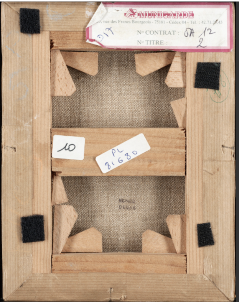
This is the verso view of the Degas self-portrait at the Getty. I was surprised at how many stretcher bar “keys” were wedged into every available joint in the wood to tighten it up. I generally use them as a last resort, keeping the surface flat by using different kinds of linen canvas for larger paintings than for small, unfastening the canvas and restretching, and so on. The problem I’ve had with this method is that the wedges loosen up in transport so that a tightly stretched canvas comes out of the crate a little slack by the time it arrives at a show. Also surprised that such a relatively small painting would need this much attention: smaller linen canvases tend not to loosen up in a visible way in my experience. It’s a pleasant surprise to see how a 160-year old painting looks almost brand new from the back: maybe because some comparatively recent attention was given to restretching it on new wood. It would be interesting to see how someone would do this job in such tight spaces behind the canvas.
October 23rd, 2021 by dave dorsey
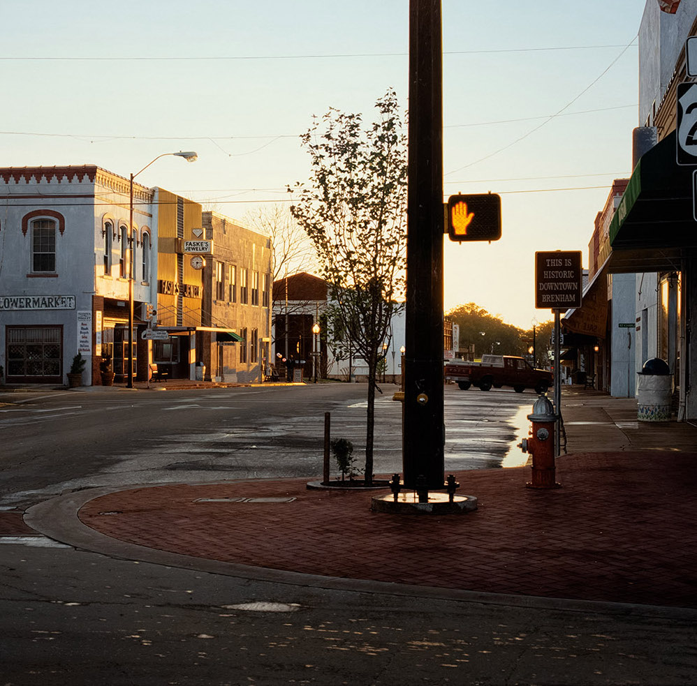
Rod Penner, 290 East Brenham TX, acrylic on canvas, 32″ x 48″, detail
1
There’s a sense in which Vermeer’s interiors have an aura similar to that of a religious icon. There is little that’s explicitly religious in Vermeer’s subject: civilized, upper-middle class life in a culture where capitalist wealth was generating a new quality of life and an economic environment where painting could thrive. You can look at other work during the same period and be astonished at the quality, but in Vermeer, something unique emerged, this ability to convey the most ordinary moments in a tranquil, prosperous household as if they were eternal, blessed, somehow transfigured by ordinary sunlight through a leaded glass window. In a certain sense, Vermeer used purely esthetic means to awaken an ethical sense in the viewer—ethical in Ludwig Wittgenstein’s broad and slightly unconventional sense of the word. He opens his lecture on ethics with a startling assertion: “Now I am going to use the term Ethics in a slightly wider sense, in a sense in fact which includes what I believe to be the most essential part of what is generally called Aesthetics.”
He goes on to explicate what he’s attempting to say:
Now instead of saying “Ethics is the enquiry into what is good” I could have said Ethics is the enquiry into what is valuable, or, into what is really important, or I could have said Ethics is the enquiry into the meaning of life, or into what makes life worth living, or into the right way of living. I believe if you look at all these phrases you will get a rough idea as to what it is that Ethics is concerned with.
If you have read enough Wittgenstein, you would recognize that he is saying things that he, in other contexts, would call nonsense. This is not a pejorative term for him. It’s fundamental nonsense. To enquire into the “meaning of life” is to do something of almost grave importance, something he highly respected—as a threshold for living properly. (He would undoubtedly go on at length about the various implications of saying “properly” here.) This was, more or less, the mission of Socrates, to use reason as a ladder at the top of which you step off to live a good life, in the ethical (and also esthetic) sense of the word. It’s not a coincidence that Wittgenstein was the most Socratic of all Western philosophers since Socrates. He taught and philosophized by thinking along with his students, and he published only one book—which actually ought to draw comparisons to the pre-Socratics in its epigrammatic form—in his lifetime. What good means in this context is essentially indeterminate, inexpressible, but that doesn’t mean that it’s relative or subjective. Wittgenstein understood that to assert “I need to know the meaning of life” is to say something accurate and meaningful about a pursuit of nonsense—in his usage of that term. You are saying something about yourself that can be verified in a sense, so that the sentence itself has reasonable content about you, but the phrase “meaning of life” isn’t a signifier for which there are corresponding facts in the world. If the world is “everything that is the case” or the sum total of all facts, and logical thought consists only of propositions about the world that can be either true or false, then a phrase for which there are no corresponding facts is not logical; it is nonsense. And yet the fact that the phrase exists, that people use it, shows something that the words themselves cannot say: it “shows forth” the universal human urge to say what isn’t sayable, to think what can’t be thought—to discover, as it were, what life is. To put it another way, it demonstrates the human desire to step outside the world and see the whole of it clearly, objectively, in a way that makes sense of the totality of being. This is rationally impossible for a thinking individual, living within the world. You can’t step outside yourself and get a good look, let alone step outside the entire world for a more comprehensive view. In a similar way, in Tractatus Logico-Philosophicus, Wittgenstein pointed out, in reference to logical thought as a picture of the world, “2.174 A picture cannot place itself outside its form of representation.” And “3 The logical picture of the facts is thought.” Therefore, thought cannot get outside itself to see and express clearly its own relation to the world. Nevertheless, thought reaches its limit and keeps pushing, speaking nonsense—in Wittgenstein’s sense—in order to express what’s unthinkable and inexpressible. There is something both absurd and yet utterly essential in this endeavor, this craving, and this restless compulsion resides at the core of Wittgenstein’s life work. He spent his life attempting to clarify the limits of reasoning and to show how reasoning—and especially science—isn’t enough, it can only take you so far, and not very far at that, when it comes to understanding how to live a good life, in both the ethical and aesthetic sense.
In his essay on ethics, he says:
I contemplate what Ethics really would have to be if there were . . . a science, this result seems to me quite obvious. It seems to me obvious that nothing we could ever think or say should be the thing. That we cannot write a scientific book, the subject matter of which could be intrinsically sublime and above all other subject matters. I can only describe my feeling by the metaphor, that, if a man could write a book on Ethics which really was a book on Ethics, this book would, with an explosion, destroy all the other books in the world. Our words used as we use them in science, are vessels capable only of containing and conveying meaning and sense, natural meaning and sense. Ethics, if it is anything, is supernatural and our words will only express facts; as a teacup will only hold a teacup full of water . . . <even> if I were to pour out a gallon over it.
One’s first reaction to this is to say that there are, on the contrary, many quite obvious ways to describe ethical behavior, good behavior, a good life. Why is a book on ethics so unthinkable? Karen Armstrong, who studies the commonalities of the world’s religions, reduces the essence of religion to one imperative, The Golden Rule. This would seem to be a way in which one could answer the question about the most important thing in life, or the meaning of life: to not do to others what you wouldn’t want them to do to you. This is for her the heart of all ethical codes. But this advice isn’t a proposition that can be verified; it isn’t a statement of fact that is either accurate or inaccurate. It isn’t an argument that turns a command—love your neighbor as you love yourself—into a propositional truth. It’s still an imperative, or command, and is in a sense supra-natural, not a proposition about facts, not something derived from the world or the sum total of facts about the world. It isn’t something one can derive rationally from what is the case in the world. The goodness of treating others with kindness and love may seem self-evident, but only if you begin with a presupposition of a self-evident absolute good—and reason has no way to express or comprehend this absolute other than to believe that it obtains. It doesn’t exist in the world and reason can only contend with facts in the world. This presupposition of an absolute good may be utterly central to your life, but as a rational postulate it’s a chimera. Absolute goodness can’t be located or described or, really, imagined, let alone verified. For Wittgenstein, the only way to clarify this idea of The Good is to observe how language about it is used in a particular way of life.
All of this carries over into how Karen Armstrong, in A Case for God, explains why religion has become intellectually discredited over the past two centuries and yet is alive and well, in various forms across the globe: because it has been misunderstood as a set of propositions about the world rather than a complex language that “shows forth” a way of life that can embody a distinctly different awareness of human existence, with all the concomitant behavior that embodies it. The key for her, and Wittgenstein—and Tolstoy before him—was the realization that religion (and art for that matter) are ways of life, founded on the desire to align oneself with absolutes that transcend the facts of the world. Only with an assumption of these absolutes do facts have any value whatsoever. Otherwise, the world is a collection of neutral facts, none of which have more value than the others. Wittgenstein says:
I see now that these nonsensical expressions were not nonsensical because I had not yet found the correct expressions, but that their nonsensicality was their very essence. For all I wanted to do with them was just to go beyond the world and that is to say beyond significant language. My whole tendency and, I believe, the tendency of all men who ever tried to write or talk Ethics or Religion was to run against the boundaries of language.
This running against the walls of our cage is perfectly, absolutely hopeless. Ethics so far as it springs from the desire to say something about the ultimate meaning of life, the absolute good, the absolutely valuable, can be no science. What it says does not add to our knowledge in any sense. But it is a document of a tendency in the human mind which I personally cannot help respecting deeply and I would not for my life ridicule it.
2
In this essay on ethics, as should be obvious from the clarity of these quotes, Wittgenstein says fundamental things about both ethics and aesthetics, religion and art, directly and plainly (in a way that’s more conversational than his better-known work which often leads the reader around the insight he wants to evoke, circling it and aiming at it obliquely.) For example, about his intimations of absolute goodness:
I believe the best way of describing it is to say that when I have it, I wonder at the existence of the world. And I am then inclined to use such phrases as ‘how extraordinary that anything should exist’ or ‘how extraordinary that the world should exist.’
And shortly, he adds:
The first thing I have to say is, that the verbal expression which we give to these experiences is nonsense! But it is nonsense to say that I wonder at the existence of the world, because I cannot imagine it not existing.
MORE
September 20th, 2021 by dave dorsey
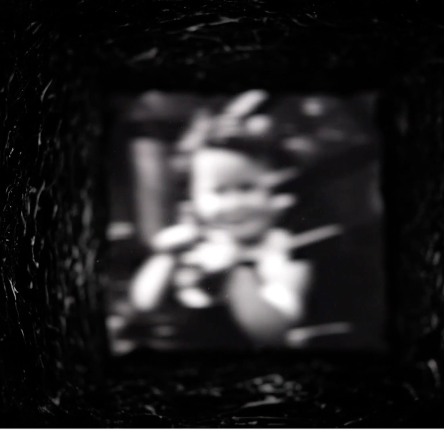
Screen shot from Bridge
I met a young artist at the Chautauqua Institution in August, Ali Georgescu, through her grandparents, who visit during the lecture season every summer. Having recently earned her degrees at Kenyon and Columbia College Chicago, and still looking for a path out into the world, Ali was working the front desk at one of the galleries. She’s a “lens-based” artist herself, but her work wasn’t on view in the student show at the Fowler-Kellogg Art Center. Having toured that show and then later in the day viewing one of Georgescu’s videos, I was more taken with her work than with anything I saw in the exhibit, except maybe an archival inkjet print, Truth or Consequences, by Furen Dai.
Georgescu is an observant young woman, laconic, skeptical, but personable and quietly intelligent. Her video, Bridge, is a montage of short excerpts from archival video and film. With software she’s constructed a dream sequence that reminded me a little of the deadly video in The Ring except that with the VCR footage in The Ring it’s actually easier to deconstruct what you’re looking at by the end of the movie. (I didn’t get a dreaded phone call, with Bridge, and haven’t yet died after watching it several times.) I’ve been charmed enough to keep going back and trying to make out what I’m seeing and though I haven’t made much headway, I’ve enjoyed it more each time. It seems there are maybe a couple dozen excerpts fused into one surreal narrative: a road rolling under the camera, a knife-thrower using a child as a target, houseflies flickering into view, ocean waves, large fish swaying against one another, a close-up of a woman’s eye—all of it slightly out of focus and most of it washed out, as if the lens were pointed toward a setting sun. Behind the entire video is a tubular white noise, eerie and hollow, affectless. You look at this sequence of imagery as if through a strange, throbbing, square tunnel. In the end, everything is swallowed by that oncoming light. I wanted to see and recognize more of what she was showing me, have something come into focus at last, but nothing ever did, and yet as a result the seven-minute video—for all it’s remote and chilly imagery—felt almost nostalgic and wistful, like the fragmented memories from a child of itinerant parents. It’s haunting and assured and maybe an indication of even more interesting things to come.
September 7th, 2021 by dave dorsey
In 2004, for his MFA thesis at the University of Maryland, Matt Klos painted a series of underground studio spaces. In these White Paintings, he paid homage, in his own idioms, to the work of Antonia Lopez Garcia. He represented various aspects of a drab and artificially lit basement studio. All of these interiors were spare and utilitarian and slightly abandoned-looking. The subtle complexity of their white walls fascinated him, as well as their blank, apophatic humility, the quality of erasing themselves, reflecting maybe just enough light to direct your attention to the muted color of other charmless things in the room: a utility sink or a chalkboard or a skeleton. As Klos put it in his thesis, in this small series of studio scenes, he wanted to evoke “the ethereal beauty inherent in the visible.” That doesn’t seem quite right. Most painters I know have signed up for that mission. It’s more as if, in his work, he wants to create a way of tapping the potential for a pictorial beauty inherent in a place, a beauty that wouldn’t be quite visible anywhere except in the quality of a painting of it. The beauty of a Matt Klos painting lives in the intensity of his gaze, and the insistence of his struggle to make paint retain its character as paint on a particular surface while conveying the life of what he sees. (This seems like a core axiom of the perceptual painters with whom Klos has aligned himself.) Mostly, like Antonia Lopez Garcia, he likes the challenge of representing what wouldn’t instantly be recognized as lovely or appealing. The beauty of his painting rests in the uncompromising passion that drives this assiduous and painstaking attention to what most people might not bother to let their eyes rest on for more than a few seconds.
It would appear Klos hates to come up out of the basement. For a decade and a half, he keeps returning to these underlit spaces, some of them cluttered and crammed with antiquated objects or the tools he relies on. (He does come out of Plato’s cave now and then, though. When he ventures above ground, as he does regularly, his work is quite different, often bright and stunningly expansive even in the confines of very small canvases. His little painting, Belfast Bay, is a marvel in which he creates qualities of scintillant light and a sense of a vast brilliant stretch of water simply through the way he magically scumbles the paint.) His new solo show, Contents of a Cabinet, at Gay Street Gallery is virtually a catalog of the many antiquated things left behind by a previous resident in a basement he adopted as his studio in Maryland more than a decade ago. He paints in a working-class neighborhood near the “recently closed Bethlehem Steel plant in Sparrows Point.” (The most startling word in that artist’s statement is “recently.” How did an American steel plant survive so long?) As he wrote for the first installment of this series of studio paintings at Gay Street in 2017, when he moved into the space more than a decade ago, “Dust and disorganization obscure the objects. Even when the objects are clearly defined their meanings may be lost to our current generation. In an age when so many answers are at our fingertips, I marvel at what seems to be a disconnection with our recent past.”
At the gallery’s website, the paintings aren’t titled, nor are their sizes indicated, though it’s clear from the texture of the surfaces that some are quite small. The larger paintings are the most intriguing. Klos paints the sort of things that look as if they stayed put on their shelves after an estate liquidation and weren’t snatched up by survivors of the owner’s death. He shows an old Sanka can, probably full of nails or bolts, and then something that looks like an improvised vise for squaring a frame, and shelves full of Depression glass and old dishware, a teapot, dolls, candles, a box full of wrench sockets, and an old landline wall telephone. These objects mostly give the impression of physical weight and mass, and they cast harsh shadows. They look stubbornly resistant to current culture, popular style, feng shui, ergonomics, and the virtualization of human experience: in other words, they are immune to everything contemporary, with one eccentrically lovely exception. Somehow, Klos gives us the guts of what appears to be a desktop computer being scavenged, its little green circuit boards (a video card maybe, or a wafer of RAM) glowing like grass in a university quad, lodged into a composition arranged as a wheel of muted, subtle colors: coral, ochre, olive green, blue-grey, and dark apricot. Against this parade of lumpy physicality, there is one painting in the series that looks as if it crashed this party from another dimension. In what almost qualifies as a Diebenkorn vision of a Santa Monica ocean view, Klos shows the viewer two blank turquoise panels, side by side, bisected by a small crease through which you can see vague gray details of what’s hidden behind the panels, a small and vibrant wound around which everything pivots, with a little bleeding sliver of brilliant red near the bottom. A rectangular streak of blue sweeps across the base of the canvas, and along the left border (bringing the viewer back to earth) what appears to be a sheer robe or apron hangs to the left of the panels. It’s a brilliant, luminous study, minimalist, almost non-representational, full of joy, as if all the expansive green and blue of sea and sky and mountains beyond the walls of this work space had flooded into his basement through this one canvas.
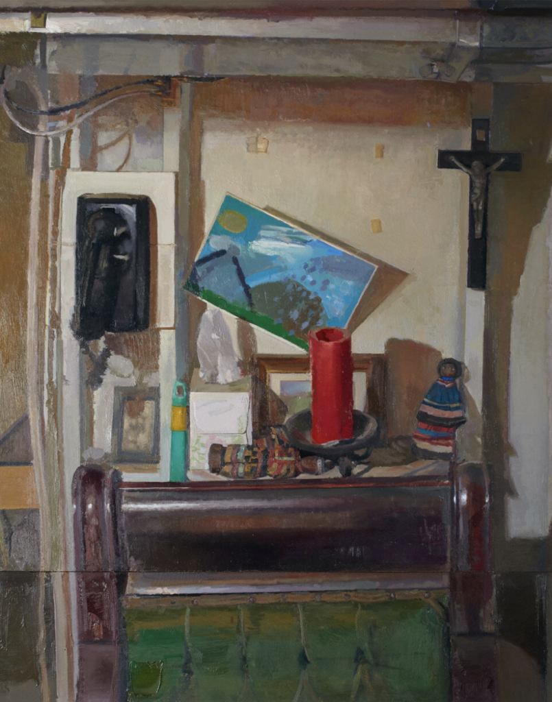
What keeps me coming back to look at the paintings in this show is a jumbled interior scene with what appears to be a child’s brilliant painting on paper that has come loose from its anchoring tape and rests askew behind and above a fat red candle resting on a flat surface shared with a couple dolls and a Kleenex tissue cube. In front of these objects is what appears to be the upholstered backrest of an antique, carved hardwood chair. The surface of the wood is conveyed with precision, the cataract glaze of its old glossy finish gone dull and gray, all of the cordovan-colored wood in bad need of being stripped and refinished. The whole composition, like the neo-Diebenkorn canvas, is structured in concentric rectangles shaped by wires and lumber, these elements criss-crossing themselves into a firm grid around the red, unlit candle that looks votive given the fact that it’s sitting just below a crucifix hanging on one of the exposed studs in the upper right corner. The whole image inhabits a sort of tattersall of crosses. Klos includes two paintings of this scene in the show, the other one a quick study of these central objects, including the crucifix. As you absorb these circumstantial indications of spirituality, you look again at the Kleenex tissue and it seems to be floating up like smoke or a ghost or rising like a shrouded figure from its cube. It all offers just enough of a signal of Matt’s faith: it doesn’t overwhelm the painting, but makes itself felt and appreciated and respected as a quiet affirmation of something that seems to be at home among things discarded and overlooked by contemporary culture. It would be interesting for someone to do a study of how current painters tackle the struggles and disciplines of faith, from any tradition, and the parallels to the work of painting itself: the requisite mindfulness, humility, and patience. In my own work, faith is entirely subliminal, a motive for painting without being the overt subject of anything I depict. This may be Matt’s situation as well: painting as a corollary of prayer.
During the Renaissance the question of faith was quite simple: it was the reason for painting anything, the system in which painting made sense. After the advent of modernism, with a few exceptions like Rouault, faith seems to have little place in most painting, especially now, given the West’s intellectual antipathy to Christianity. Even though more than two-thirds of Americans identify as Christian, do painters need to work little samizdat signs, like this basement crucifix, into their images as a code to other spiritually devoted types? Being a Christian can’t be an effective calling card in Chelsea—more a quick way to get ostracized and banished from sophisticated society. Which makes these indications of it just as much a signal of artistic integrity as a predilection for painting things underground.