Archive for October, 2011
October 26th, 2011 by dave dorsey

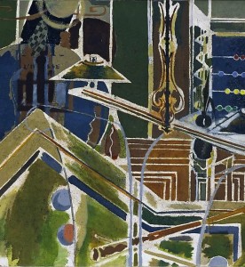
Braque's Billiard Table
I spent years looking at reproductions of Bonnard’s paintings and shrugging. I couldn’t understand what made them work. All the praise was lost on me. Then, only a few years ago, I finally stopped in front of one at MoMA, startled by the immense complexity of its color. Now I get it. Part of what woke me up was the depth of the paint: the intensity of his effort to apply color after color until he achieved something that just wouldn’t sit still as you watched it—and no reproduction even hinted at this shimmering complexity. A couple of days ago, I had an email debate with my cousin about how looking at a painting can be a tactile experience—even if all you’re doing is imagining how it would feel to touch it. Not only is that sense of a painting’s surface an integral part of what it delivers to the viewer, it makes looking at the actual work imperative, because no affordable reproduction can convey surface texture and what it does to color. Photography doesn’t even pretend to offer this sense of physical presence. Films and video are ghostly, a flickering sequence of disembodied shadows at the back of Plato’s cave. Paintings are objects in the world, something that has a physical relationship to your body. He scoffed at all of this, implying that texture and dimension have no significance in a visual medium and that current technology can produce life-sized reproductions that would convey a sense of the painting’s surface—or at least deliver everything that “mattered.” I shot back that maybe he should get out of his house and visit a museum or two, and he sent a long list of major museums around the world he had frequented in his younger days. I gave up. As long as I’ve known him, he’s never been wrong about anything. Like my wife.
Anyone who agrees with this kind of certainty about how painting works should check out the show of Braque canvases at Acquavella. It’s a fairly significant assembly of this master’s work, and it has a number of works from the middle of Braque’s career, when his genius reached its peak. If nothing else it will prove that standing a foot away from an actual Braque is a revelatory experience—he created objects, not just images, and they impart a sense of ancient provenance, with stratas of color like layers of sediment in rock. This is partly the result of the way Braque liked to mix sand into his paint, as if he were doing masonry. Like Burchfield, in America, Braque attempted to take painting into a region beyond the scope of painting, a territory populated, so far, by only one settler—both artists pushed the art form toward something beyond depiction, submerging themselves in their work to the point where their paintings seem to be offspring of the natural world rather than symbols of it. Braque’s genius was to make his images seem perfectly executed, down to the shape of every line, every color, every texture, when there’s no rational explanation for this sense of perfection. The complexity of his images shouldn’t work: they should seem ridiculously busy and cluttered, and yet they have a sense of invulnerable unity and repose. His work doesn’t mimic the world, but extracts shapes and forms from it to create something that seems both incorporeal and musical and yet as invulnerable and fixed and heavy as the striations in sandstone or granite. Picasso wouldn’t have had a clue how to reach the depths Braque excavated even on one of his off days. There’s no way to recognize this dimension of Braque’s work without seeing the paintings themselves.
October 25th, 2011 by dave dorsey

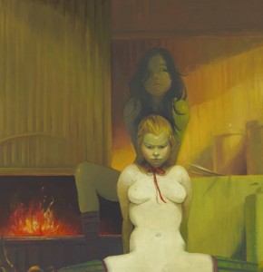
Detail from Fireplace by Lisa Yuskavage
A recent notice in The New Yorker with a title that made me laugh—Dangerous Beauty—compares a new painting by Lisa Yuskavage, Fireplace, on view now at David Swirner, to a couple paintings by Manet. It’s clearly a pastiche drawing from Olympia, and it shows what appears to be a seated sex worker naked except for her ribbon choker, backed by an attendant, or partner, with a fireplace behind her roaring with warmth. The tableau is a comfy little domesticated demimonde—exactly what Manet presented, with a smirk, in Olympia and Dejeuner sur l’herbe, a professional sort of nudity displaced into the bourgeois parlor and picnic. What was an outrage, at the time, now looks like wicked wit. In Fireplace, with the professional sangfroid of her spread legs, this temptress is more realistic than Yuskavage’s typical virtuoso performance, yet her pout is about as menacing as the work gets. Most of her paintings strike me as an adolescent fantasy which Alberto Vargas might have taught a Japanese anime artist to do on deadline for Playboy, with Russ Meyer attached for quality control. It’s caricature to mock the antiquated tropes of softcore pin-ups as a springboard to give herself license to achieve the innocently cheerful effects of light and color that actually interest her. The irony is that she needs to pretend that she’s offending you with her content in order to do, with color, something that actually just cheers you up, in a way that really does move beyond the settled boundaries of taste. The way she throws inhibition to the wind here is in her handling of color, not in the choice of subject, which is pretty tame. The danger is all in the palette. If you want something genuinely nasty, turn off SafeSearch and let Google take you by the hand and show you the way.
Critical comparisons to Vermeer are just jaw-droppingly knuckleheaded, but she isn’t too far from Fragonard’s coy eroticism. They both evoke sexual readiness as a career move, without investing much genuine emotion into anything but the execution of the work, which is impressive in her case (and was astonishing in Fragonard’s). But she seems to be satirizing—or should it be satyrizing—a harmless target. Her work feels like an amiable send-up of that old bugbear, the offending “male gaze”—but it’s the fevered stare of a 16-year-old boy circa 1967, a pimply kid who really buys into the perceptual distortions of chronic high school horniness. Everything seems unreal and weightless in Yuskavage’s world. Her girly-girls are over-ripe, vacuous fantasies. Yet they’re done in sickly-sweet colors that actually win you over, the more you see them—partly because Yuskavage has so completely surrendered to the excesses of her tongue-in-cheek kitsch. Her light and color, not her subject, have the feel of genuinely guilty pleasures. You sense that she’s giving in to the ease of her painting skills like a girl on a diet, with her bedroom door open–just try to stop me!–spooning her way through a gallon of French vanilla in a single sitting. Talk about transgressive. It’s an offense to the sophistication of coolness. The way she handles color and light is assured and energizing, and yet the outcome invariably looks more animated than alive, like the fantasies she depicts. Is this anything for her to bother herself with? I think not. The market niche she’s cornered probably overlaps a bit with John Currin’s sales region and customer base, and it’s a lucrative one. Her paintings bring six and seven figures now. The only downside to all this is that a masterfully rendered cartoon is still just a cartoon. Not that there’s anything wrong with that. But it doesn’t seem entirely out of line to wish for work where Yuskavage is as secretly invested in the subject as she is in the way she paints it.
October 21st, 2011 by dave dorsey

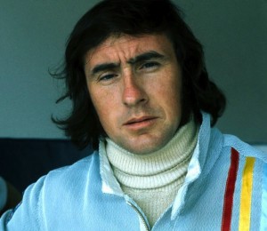
Jackie Stewart
Once again, a non-painter has expressed perfectly, for me, why painting matters. This time it’s the famous Formula 1 driver, Jackie Stewart. I finished watching Martin Scorsese’s excellent documentary, George Harrison: Living in the Material World yesterday. Late in the film, he brings in Stewart because Harrison became close friends with the driver—open-wheel racing was one of Harrison’s diverse passions, and in the movie, Stewart speculates on why this was the case. Harrison had other passions as well, none of which seem to have much relationship to the world of racing: God, cocaine, Pattie Boyd, landscape design, and Monty Python. Yet the ex-Beatle’s obsession with racing seems the one interest most closely related to Harrison’s brilliance as a musician. In the film, Stewart puts it this way:
You’re going very fast. You’re going at the absolute limit of the car’s tires, suspension, and you yourself are right there on the very edge of your own limits, taking it to the finest point. When that happens, your senses are so strong. In my case, I relate it to a real experience where I came to a corner and before I got to the corner I smelled grass. My senses were so sharp, so exaggerated, that a car had gone off the road in front of me, out of my sight. My senses told me there was something wrong. That was grass. The cars should be on the tar macadam road. So I backed off. The millisecond you’re talking about is so small. That’s what, I think, George saw (in me). That is this heightening of the senses, your feeling, your touch, your feel, your gas pedal, your brake pedal, the sensitivity to the function of those. When I talked about that, George loved that. A guitarist, how he can make that guitar talk, that is another heightening of senses beyond the ken, beyond knowledge . . .
The hint of mysticism in Stewart’s description of driving at the limit of one’s ability will ring true of anyone who has gone deeply into any physical activity to the point where the conscious mind steps aside and something else takes over, a larger and more intense state of awareness. Shooting a three pointer. Hitting a perfect chip shot. That heightened state of awareness is what, fundamentally, painting is about. It’s often a function of the amount of time required—hours, days, weeks, even months—the time devoted to just looking at something in order to capture the way light falls on it. Until you can convey what you see, without thinking. Someone looking at a painting can feel the time invested in it. You can almost see time itself, when you look at a Vermeer. What you’re really seeing is a form of meditation, a rich kind of disciplined mindfulness. And that’s primarily what’s conveyed to someone looking at a painting executed in that state of awareness. This same heightened awareness can be conveyed just as effectively in an ink-brush sketch that takes no more than an hour to do, if it’s done with that kind of total mindfulness—after years of learning how to do something with that intuitive and instinctive touch. Iris Murdoch sees this mindefulness as the basis of ethics and moral choice—as well as the foundation of great art. Aldous Huxley simply talks about heightened awareness as an end in itself. Waking up to the isness of things, the nature of what’s real, seemed to be, for him, the whole point of being alive.
October 20th, 2011 by dave dorsey

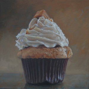
Caramel Cupcake
I’m taking a break from painting a cupcake this morning, partly because I keep second-guessing what I’m doing. I ought to be completely engrossed in the task at hand, because, I have to be honest, I find a cupcake visually intriguing. It offers nice contrasts—light and dark, straight and curved, soft and hard—a perfect subject for the study of all the basics of representational painting. Light, color, value, form, line. It’s a strange fusion of different kinds of texture and pattern, the prickly and rigid cup, a soft spongy pedestal of cake straining to hold up the coiled icing. It’s all decadent and excessive and tempting, crowned with its little sugary redunancy of candy or cookie. The whole thing is just plain bad for you. It has no redeeming value. It’s a little example of superfluous luxury—like art itself, in that respect. In fact, as you paint an image of one, you feel as if you’re looking at a tiny sculpture, with all those voluptuous curves. You fight the urge to quit painting and just stuff it into your mouth. (Occasionally, the relationship between artist and sitter can get complicated.)
So, in a way, it’s a perfect test of what I believe about painting—that the subject, the content, should have little or no metaphoric significance. You communicate in the way you paint more than through the subject you pick. The more an artist intentionally invests “meaning” into what he’s doing, the more skeptical I am about the final result. Painting, for me, is primarily about light and color and paint—which are the properties that convey an awareness, a feeling, in silence. When Ed Ruscha paints a shred of rubber tire alongside other trash he’s found on a highway, and doesn’t superimpose any words on top of it, I perk up: I’m drawn to the way he presents it, without needing to even know what he’s depicting. But then he titles his work Psycho Spaghetti Western, and I think, oh here we go again. It seems the title is meant to surround the image with dark, sophisticated hints about the decline of the West, the disintegration of our culture, the economic calamity we’re just barely holding off. Why can’t it just be a picture of trash, which is accurately rendered and yet looks gorgeous in a way you feel you’ve never seen before? Why isn’t that enough? The fact that he can create a simple, powerful and elegant image out of such meaningless material: now that’s painting. All of which is to say a cupcake should be the perfect test: you can’t get pretentious about something that has virtually no nutritional value, can you? Well, on second thought, you can get pretentious about anything, if you try. About five cupcakes into this series, as I was painting, I had what I thought was a little epiphany: what if I were to put together a solo exhibit of nothing but cupcakes (I suppose I could throw in a few other sweets) and call it Let Them Eat Cupcakes. This struck me, at the time, as a clever way to intellectually justify the act of painting a cupcake—which, let’s be honest, could be the perfect symbol for so much of what’s wrong with our world right now. (After I finished a large painting of a peanut butter cupcake last year, I wrote to a friend and said something to the effect that it reminded me of a delicacy that might have been served to guests at Versailles a couple centuries ago. Say, oh, around 1780. Something Marie Antoinette might have ordered up by the dozen. The parallels between that decade in France and the one we’ve living through right now can’t be lost on anyone. Did you know there’s a reality show on cable called Cupcake Wars? Meanwhile check the current state of unemployment.)
Well, if I ever do put together a show of cupcakes, I’m more likely to call it La Dolce Vita, but maybe you could take that in a sardonic way as well. I still believe a great painting should follow the same rule that used to apply to kids at the dinner table: it should be seen, not heard.
October 19th, 2011 by dave dorsey

Magic from T.E.D.
A little three-card monte from Marco Tempest at T.E.D.:
“Debussy said art is the greatest deception of all. Art is deception that creates real emotion. Art creates a lie that creates the truth. When you give yourself over to that deception it becomes magic.”
October 17th, 2011 by dave dorsey

Matisse cutout wounded in cover shooting
You never know where Matisse is going to turn up, this time with a gunshot through the heart. Why oh why couldn’t something by Jeff Koons have been wandering around that part of Philly? The new Roots album apparently drops on Dec. 6, according to an email alert from Okayplayer. The link took me to an image of what looks like an album cover but maybe it’s only there to promote the leaked single, Make My. I expect my favorites will probably remain Illadelph Halflife and Things Fall Apart. I just sighed, thinking about how long it’s been since I discovered those albums. I’m going to have to ask time’s winged chariot to go ahead and stop accelerating now. Meanwhile, I’ll just listen to the new Wilco again, which is at least one reason to cheer about the fact that it’s 2011 already.
October 16th, 2011 by dave dorsey

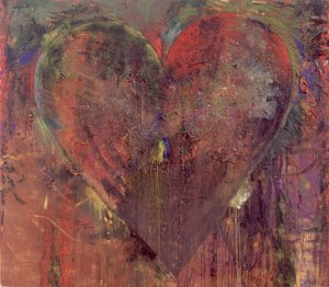
Blue Clamp Jim Dine
In the most recent Art in America, the editors called out a quote from Ed Ruscha about painting which has been nagging at me: “I’m still puzzled about my own work when it comes to painting—whether it’s really that necessary to believe in this great ideal of the painter’s painter and the idea of spreading paint on a canvas. I question all of that.” Ruscha’s work as a pure painter can be tremendously impressive, the simplicity and scale of his imagery, so stripped of emotion and seemingly devoid of context—his imagery is monumental, impersonal, and mysterious in a cerebral but fascinating way. One might almost say Cartesian in the way each painting seems absolutely sure of one thing: its own existence. When he superimposes text—his little Zen koans that aren’t meant to enlighten—the mysteries thin out toward a supercool ambiguity, like lines out of John Ashbery, so resonant when you read them until they self-destruct when you try to investigate a little further. Nothing wrong with that, but puzzlement gets old when awe doesn’t make you forget about trying to understand what you’re seeing. And Ruscha’s word paintings are too intentionally sardonic to evoke awe. They have Pop’s detached, self-cancelling reserve, suggesting a skeptical perspective on popular culture without ever letting you in on the joke. Ruscha’s precision, the way he makes you forget you’re looking at paint is part of what gives his huge paintings, the wordless ones, so much power, so it’s understandable he might decide to dispense with paint altogether.
The fascination of painting, first and foremost, is the sheer physicality of paint. Many of the greatest paintings revel in their ability to rub your nose in the nature of the medium on a given surface, the way it slides, clumps, and flows, thick as icing on a cake or thin as wax on a car—all of this while the paint makes you imagine something else, even if it’s as indistinct as a Rothko horizon line. This double-vision—the way a painting can make you see paint qua paint, while, at the same time, evoking an illusion of something that isn’t really there—that’s the magic. When Ruscha makes the paint irrelevant, when he makes you see only what he means for you to see and forget what you’re actually looking at, then he might as well dispense with paint. And that’s a perfectly acceptable choice. Spreading paint is simply a choice, but a choice that points toward a sort of surrender you don’t find in Ruscha’s work—a surrender to the medium where it’s allowed to contribute in ways that can’t be entirely controlled or anticipated. De Kooning made this surrender the central impetus of his work, yet go back centuries and you’ll see this duplicity, this fascination with the luxuriance of paint itself, as well as for the way it can let you see beyond it. It’s there, again and again, at the center of an artist’s mission, this duplicity. Bacon says somewhere, to comment on his indebtedness to Velasquez, that the texture of paint on a canvas—simply the way it’s handled—can have a direct, subconscious effect on the nervous system of someone who looks at the painting. That comment was his way of saluting the glories of brushwork in a typical Velasquez, and you can see how Bacon’s own handling of paint derives from it. Think of the artists whose discipline was to “push paint around” in his or her own unique way—a phrase Peter Schjeldahl used to describe Soutine’s technique. Braque, Van Gogh, Bacon, Freud, Sargent, Manet, Hals, Chardin, Vermeer, Matisse, Porter, Bonnard, de Kooning, Thiebaud, Sickert, Dine, El Greco, Saville, Kiefer, Innes—I’ll stop, but the list keeps going. Select a painting from each of those artists and turn it upside down—to nullify the image you’re meant to see through the paint—and just observe the surface, and it’s obvious how each artist imparted a unique feel for anyone viewing the canvas, simply in the way each applied paint to the surface. The texture produces a certain kind of purely physical experience. They all learned how to get paint to do things on its own and to make the almost tactile sensation of looking at paint a part of the mission. The list of artists who don’t do this—those whose genius emerged primarily in watercolor like Blake and Klee and Burchfield—might be just as long. But I think, to say the least, we’ve moved beyond the point where we think rendering an image in paint is the ultimate ideal for art, since we just emerged from a long dark period where painting was left for dead. Even so, it’s nice to hear somebody still talk about “the ideal of the painter’s painter.” If you want to be in total control of the process, of the final image, by all means, toss out the acrylic, the enamel, the oil, the brushes and knives and the rags. Yet the act of painting is as much about the body as it is about the mind. If you want a medium that has a life of its own, conveying the purely physical qualities of the object and the unexpected quirks imparted by the movements of fingers, hands, arms—and maybe even the legs, in the case of Pollock—then you can’t do any better than work in oil.
October 13th, 2011 by dave dorsey

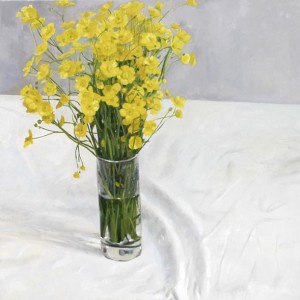
Buttercups . Blaise Smith
One of the advantages of figuration is that it is, by its nature, a language we all understand. This is not to say that figurative painting does not inspire a rich and illuminating accompanying literature. It clearly does. But at the same time, as the graffiti artist Banksy has observed, you generally do not need an explanatory essay to see what a figurative artist is trying to do. This doesn’t make the work any less valid, but it does have the effect of prising it from the controlling grasp of the art world theocracy. And it often seems that, while paying lip service to the idea of accessibility, many within the art world would prefer a situation whereby contemporary art depends on the exegesis of a specialist elite of critical theorists.
Alden Dunne, Molesworth Gallery, Dublin
October 11th, 2011 by dave dorsey

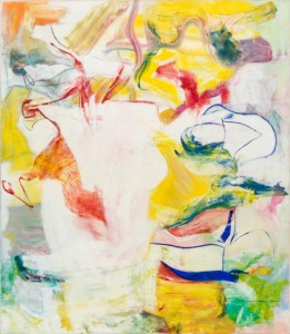
Pirate (Untitled II)
De Kooning is the most demanding of all the abstract expressionists. In a way that isn’t the case with Pollock or Rothko or Still or Motherwell—insert name here—de Kooning’s work always seems a bit confrontational. It’s as if someone who doesn’t have your best interests in mind (or maybe just doesn’t care that you’re there) has entered the room, and it might be best to keep an eye on him. This is a natural human reaction to an unpredictable presence, and de Kooning was never predictable. His work never settles down and behaves. You could forge a Rothko or Pollock or Motherwell without too much guesswork, really: their brilliance was in their invention of their own recognizable style, with a set of personal rules one can extrapolate pretty reliably from any of their great paintings. From then on, they worked out the consequences of their particular niche, with great consistency. It’s hard to imagine de Kooning had any sense of his own style, as such, nor did he seem to care much about how one of his paintings would look in the end. Once he began a painting, his only concern seemed to be to leave behind something that doesn’t just sit there—to reach the point where he could finally quit working on a canvas, stand back, and say, OK. It’s doing things on its own now. Let’s move on. It was all visceral, muscular, hand-eye, with the intellect in sleep mode: as Susan Sontag quotes him in an epigraph: Content is a glimpse of something, an encounter like a flash. It’s very tiny–very tiny, content. It would have been more honest to say, Content? There isn’t any. It’s all about the paint.
The big retrospective of de Kooning’s work at MoMA offers an opportunity to see how his work represents the essence of abstract expressionism, the heart of the movement, and you can see echoes of his continuous risk-taking and discovery more in the next generation, in Frankenthaler and Sam Francis, for example, than in the work of anybody in de Kooning’s crew. (It also happens to demonstrate, once again, that abstract expressionism originated with Gorky. You can see how clearly De Kooning pretty much impersonated Gorky for a while, as Pollock also did, before he became himself.) I began to warm up to de Kooning when I could see his paintings not as the conclusion of a plan, but as an artifact left behind by his endless attempts to discover a way forward after making an initial mark. His genius was that he never quite figured this out, once and for all, never really developed a technique or method for building the tensions that seem to hold his images together: every canvas was a fresh start, a new plunge into the unknown. Everything he did still seems risky. As a result, his work has a tactless quality—as if each painting is too self-absorbed to at least glance at itself in a mirror once or twice before heading to the gallery. The point wasn’t to please, but to instigate something that had a life of its own, regardless of how it all looked in the end. Many of his paintings happen to be dazzling, but in de Kooning’s case, it wasn’t by design. That just wasn’t the point.
