Archive for the 'Uncategorized' Category
October 13th, 2011 by dave dorsey

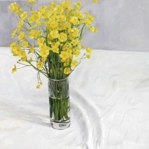
Buttercups . Blaise Smith
One of the advantages of figuration is that it is, by its nature, a language we all understand. This is not to say that figurative painting does not inspire a rich and illuminating accompanying literature. It clearly does. But at the same time, as the graffiti artist Banksy has observed, you generally do not need an explanatory essay to see what a figurative artist is trying to do. This doesn’t make the work any less valid, but it does have the effect of prising it from the controlling grasp of the art world theocracy. And it often seems that, while paying lip service to the idea of accessibility, many within the art world would prefer a situation whereby contemporary art depends on the exegesis of a specialist elite of critical theorists.
Alden Dunne, Molesworth Gallery, Dublin
October 11th, 2011 by dave dorsey

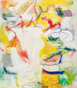
Pirate (Untitled II)
De Kooning is the most demanding of all the abstract expressionists. In a way that isn’t the case with Pollock or Rothko or Still or Motherwell—insert name here—de Kooning’s work always seems a bit confrontational. It’s as if someone who doesn’t have your best interests in mind (or maybe just doesn’t care that you’re there) has entered the room, and it might be best to keep an eye on him. This is a natural human reaction to an unpredictable presence, and de Kooning was never predictable. His work never settles down and behaves. You could forge a Rothko or Pollock or Motherwell without too much guesswork, really: their brilliance was in their invention of their own recognizable style, with a set of personal rules one can extrapolate pretty reliably from any of their great paintings. From then on, they worked out the consequences of their particular niche, with great consistency. It’s hard to imagine de Kooning had any sense of his own style, as such, nor did he seem to care much about how one of his paintings would look in the end. Once he began a painting, his only concern seemed to be to leave behind something that doesn’t just sit there—to reach the point where he could finally quit working on a canvas, stand back, and say, OK. It’s doing things on its own now. Let’s move on. It was all visceral, muscular, hand-eye, with the intellect in sleep mode: as Susan Sontag quotes him in an epigraph: Content is a glimpse of something, an encounter like a flash. It’s very tiny–very tiny, content. It would have been more honest to say, Content? There isn’t any. It’s all about the paint.
The big retrospective of de Kooning’s work at MoMA offers an opportunity to see how his work represents the essence of abstract expressionism, the heart of the movement, and you can see echoes of his continuous risk-taking and discovery more in the next generation, in Frankenthaler and Sam Francis, for example, than in the work of anybody in de Kooning’s crew. (It also happens to demonstrate, once again, that abstract expressionism originated with Gorky. You can see how clearly De Kooning pretty much impersonated Gorky for a while, as Pollock also did, before he became himself.) I began to warm up to de Kooning when I could see his paintings not as the conclusion of a plan, but as an artifact left behind by his endless attempts to discover a way forward after making an initial mark. His genius was that he never quite figured this out, once and for all, never really developed a technique or method for building the tensions that seem to hold his images together: every canvas was a fresh start, a new plunge into the unknown. Everything he did still seems risky. As a result, his work has a tactless quality—as if each painting is too self-absorbed to at least glance at itself in a mirror once or twice before heading to the gallery. The point wasn’t to please, but to instigate something that had a life of its own, regardless of how it all looked in the end. Many of his paintings happen to be dazzling, but in de Kooning’s case, it wasn’t by design. That just wasn’t the point.
September 30th, 2011 by dave dorsey

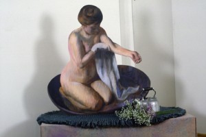
Susan Sills, Bather with Towel
A new group show is up at Viridian Artists, where I’ve recently become a fellow member. We’ve moved to 548 W. 28th St., in the upper region of Chelsea, from a couple blocks away. I joined the gallery this past summer, and I’ve been visiting to help out, attend meetings and generally get to know the other members—Vernita Nemec, Susan Sills, Bob Mielenhausen, and many others, including a couple promising young non-member artists who work at the gallery, Lauren Purje and Rush Wittacre. It’s a great gallery, founded when most of the prominent artist-owned galleries sprang up, in the early 70s, back when the global art world was still anchoring itself in Manhattan. In fact, feminist work by Nemec and Sills from that era was recently acquired by Rowan University, in Glassboro, New Jersey, from the collection of Sylvia Sleigh—and artists represented by the collection were honored in a ceremony to celebrate the acquisition in September.
The Viridian group show, Moving, to inaugurate the new exhibition space is a great overview of the diverse work being done by members—and, to be honest, I was surprised at how strongly I responded to the Susan Sills cutouts when they were already on display at the last group meeting. Sills does life-sized wood cutouts based on works by the Old Masters, and they not only have a wry sense of humor, their craftsmanship is remarkable—you know you aren’t standing before Las Meninas or Degas, yet her ability to evoke the look and spirit of the original is remarkable. I recently had an email discussion with some photographers about ongoing controversies over appropriation of previous work—sparked by ridiculous imputations of plagiarism surrounding Bob Dylan’s artwork, where he bases his imagery on work by earlier artists. I agreed that the mania surrounding intellectual property and plagiarism seems to ignore the centuries-old practice of reworking imagery from earlier masters: “after Delacroix” or “after Rembrandt” was commonly appended to the title of an homage, usually meaning a copy, of some previous tableau. The timing of the discussion was serendipitous since I’d been delighted by Sills’ work during a visit to the gallery a couple weeks ago. In general her cut-outs serve not just as an homage to an earlier painting, but they bring the previous image into three-dimensional space, extended it into a provisional diorama, replete with three-dimensional objects. It’s as if the little infanta in Las Meninas has popped upright from the pages of a book and assumed the dimensions of an actual child. Degas’ bather sits beside a real tea kettle. And Picasso’s mother, teaching a child to walk, leans over her child’s shoulder near a set of square cubes—a baby’s playroom building blocks, which Sills adds to the scene as an amusing way of transforming Cubism into child’s play. What struck me most, though, was the way Sills used the cutout to gently chide Picasso himself—focusing on his repressed gentleness, his fondness for his children, and making that the whole point, ignoring his default persona as the great alpha male of 20th century painting. At the same time, as she pays homage to Picasso’s work, she has picked a painting where Picasso himself was honoring an earlier artist, paying homage to a series of drawings Rembrandt did of women teaching children to stand and walk, many of them in the permanent collection at the Tate. She shows how modern art is as much about tradition as it is about radical invention. By giving these previous masterpieces a three-dimensional power, Sills makes them more inviting, more intimate, a companionable presence in a room—showing how much the work of painters long dead can continue to have a vital presence in the life and work of contemporary artists.
September 24th, 2011 by dave dorsey

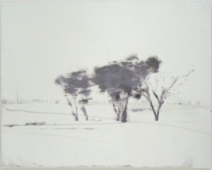
Trees-Abandoned Lot by David Smith
On view soon, at Manifest in Cincinnati, will be the work of David Smith, an Irish artist who now lives in Hong Kong. He works on a small scale, yet his images offer a feeling vast and empty, hinting at the notion of the void at the heart of Taoist and Buddhist philosophical traditions, which would seem to be his actual subject, rather than the aircraft, ships, buildings or mountains you can hardly make out through the haze. As a result his images bear a certain kinship to classic Asian art. Recently, an image of one of his paintings on the Manifest website impressed me so much I wrote to Jason Franz, the director at Manifest, and asked, “How does he do that?” I didn’t expect him to explain. It was a rhetorical question I often ask when I stand before work that impresses me so much I wish I’d painted it myself, as Smith’s does. Yet if you go to his website, you can get something that resembles an answer, up to a point.
When I first saw his paintings, they seemed so slight, so lacking in what one would normally consider a compositional armature, that I hardly paused to register the subtle complex polarities that seem tensely fused within each one of them—object vs. atmosphere, purpose vs. serendipity, presence vs. absence. Sometimes all of these oppositions seem to hold each other in check within a single image, where they all add up to one encompassing polarity: his ability to suggest an enormous and unbounded sense of space within the solitary confines of a tiny, rectangular MDF board.
If you check out his equally spare, modest website, you’ll read an artist’s statement that’s a welcome relief from all the nonsense these self-absorbed meditations can inspire. It’s a quiet, simple description of his work process itself and how it results in the mysterious images he ends up with. At the basis of his technique is a respect for and reliance on the unpredictable properties of diluted oil paint, how it diffuses and dissolves, coagulates and solidifies, has a life of its own, producing unexpected effects as Smith works toward the image he hopes will emerge. He makes his move and watches as the paint counters with an opposing move, as it were. And so it proceeds. As he puts it, it’s an alliance, a cooperative partnership, a dance, between artist and medium, hearkening back to Japanese gutai, where the medium virtually becomes the subject by being allowed to assert its true nature. Here it’s coaxed into doing something much more than simply assert what it is. Alchemy ensues.
September 23rd, 2011 by dave dorsey

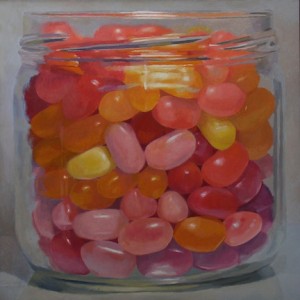
Candy, candy, candy, I can't let you go . . . Iggy Pop
Two days ago, after putting in a long morning of work on a large candy jar painting, I spent nearly three hours visiting with James Hall at the Oxford Gallery, and it struck me that I’ve started a blog ostensibly about the painting life—what it means to be a painter—but all I write about so far is what it means to paint. The life keeps getting left out, except for that trip I described to the Home Depot in Brooklyn and back. There’s a good reason: what does one say about standing before an easel for six or seven hours a day? It’s a pretty uniform predicament, being a painter. Unless you surrender to the academy and become a teacher, or go into graphic design and help your clients sell whatever—digital printers, Diet Cokes, domain registries—it’s a life lived on the fringes of solvency. You work in the hope that a few lone collectors (usually people as singular and unusual in their focus as you are, if you’re lucky enough to be singularly unusual) will discover your work and pay you for it. You will notice I refrained from using the term eccentric here. I recently got an email from Vernita Nemec, the artist who directs the activities at Viridian, where I show my work in New York, and the gist of the email was that we all need to think of ourselves as sales people, greeting potential customers, introducing ourselves, establishing a human relationship with the buyer. It’s true, of course. I do it myself with people who have bought my work. But my first emotional response, on reading that email about how we’re all in sales no matter what we do in life, was to think of a story that Sam Kinison used to tell, which was as hilarious as it was scatological in the worst way—if you know him you know the story—the one that ends with his screaming, “It never ends!”
It’s true. Buyers are the real heroes of a painter’s life, the people who keep it going. My visit with James the other day was amazing in a number of ways, but the most delightful moment was when the conversation turned to the subject of his customers. More
September 22nd, 2011 by dave dorsey

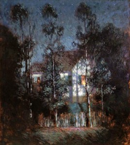
Cornoyer, The Lights in the Window
For the next three weeks, you can see a rare and brilliantly assembled collection of American Tonalist paintings at Oxford Gallery—representing what has to be one of the most significant private collections of Tonalist art in the U.S. It’s the first period show the gallery’s director, James Hall, has mounted in eight years, and it’s a revelation of this massive underground river of Romantic painting—a coherent and totally American aesthetic, which was more of a philosophical stance toward life and death than a set of techniques or subject matters. Tonalism is beginning to emerge and command the attention of critics with a big show that included Tonalist work earlier this year at The Spanierman Gallery and a huge scholarly tome, The History of American Tonalism, by David Cleveland. The movement flourished from the late 19th century to around the time of the Armory Show and it represents a diverse span of work, encompassing Inness as well as Whistler, and eventually, as Cleveland argues, it emerged to find its final embodiment, transformed, in the work of Abstract Expressionists like Rothko, Newman and Still. Tonalism explored ideas at the heart of literary Romanticism—Wordsworth, Blake, Keats, even Thomas Gray, and then half a century later in America, Thoreau, Emerson, Whitman—a vision of spiritual transcendence through a silent union with the natural world. These same principles align it with Asian traditions as well, especially classic Chinese landscape painting, which became a central inspiration for Burchfield, whose unique body of work represents a stepchild of Tonalism and is one of the most original achievements of 20th century art, as the Whitney’s retrospective proved last year.
The Oxford has been collecting examples of this work for nearly as long as the Halls have presided over the gallery—and, again, it’s one of those collections, like the Phillips, that reveals as much about the movement as it says about the taste of the collector. Some day, the 45 paintings in this collection could easily be worth a small fortune, if Tonalism emerges from obscurity—as it may have begun to do this year—as the Jungian shadow of European Modernism. As of today—though far more expensive than the typical fare at the Oxford—the work is listed at a fraction of the prices at Spanierman earlier this year, though the quality of Hall’s collection is of the first order. In other words, I wondered why I didn’t see the Memorial Art Gallery’s entire acquisitions committee in conference in heated conversation, trying to narrow down which six of these paintings it needed to claim before anyone else discovered them. This is an assembly of work worth it’s own small museum.
James first showed me a few of these paintings a couple years ago—quietly stepping into the little dehumidified room that serves as his vault—and I nodded with appreciation but just didn’t get it: they seemed unfocused, diffuse, foggy, and, well, so 19th century. More
September 20th, 2011 by dave dorsey

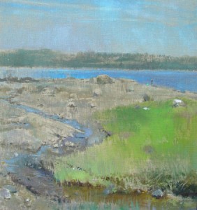
Clam Digger, Matt Klos
A brief shout-out for a pair of excellent young emerging artists who have solo shows just opening: Matt Woodward and Matt Klos. Both have exhibited here in Rochester—Woodward grew up in a Rochester suburb, and Klos is represented by the Oxford Gallery where I show my own work. I’ve written about Woodward already, and his drawings continue to strike me as mysteriously captivating in a way that echoes the greatness of early Jim Dine, yet he’s taken that influence as a springboard to launch you into a world all his own. Though he’s just getting started in his career, Klos has been collecting honors and awards at a regular pace. If you want to see work that’s classic, in the best possible way, you can get some idea of what he does at his website, but there’s no substitute for seeing the actual paintings. He’s an artist who not only lets you see what he saw, but also makes you marvel at how much inner life paint can embody, in and of itself, applied in what often seems risk-taking ways—though apparently not when he’s handling it.
Matt Woodward: The Tremendous Alone Elmhurst Art Museum, Sept. 16-Dec. 31.
Matt Klos: Rochefort-en-Terre, Plein Air Paintings Still Life Gallery, Ellicott City, MD, Sept. 17-Oct. 31.
September 17th, 2011 by dave dorsey

Fairfield Porter's homage to Las Meninas
Louis Menand has a tremendous essay on T.S. Eliot in the current issue of The New Yorker, in which he offers a concise definition of modernism (and gives it a pulse in his portrait of Eliot). He points to the way this movement was desperately seeking to convey old verities in new forms, borrowing (stealing, Eliot would have put it) from the past, and then smuggling ancient insights in a new voice, for a fresher vision. Old wine into new skins. (It would be funny to see if Thomas Sterns would have turned a whiter shade of pale as you told him that he was the world’s first old-school hip-hop DJ, sampling tracks from the past to build something with a new sound, albeit one that’s deeply rooted in respect for tradition. Hip-hop is one of the ways in which modernism became, for a while, a forceful benevolent presence in the lives of countless millions, though most of its listeners would give you a blank stare if you told them so.) The resulting vision of modernists often seemed fractured—as in The Wasteland or Les Demoiselles d’avignon or The Rights of Spring—but the wonderful irony of modernism is that behind the apparently savage and dissonant exterior lurked an unrequited love for, and a faith in, fundamental and ancient truths and harmonies, even if they had become mysteriously resistant to interrogation, aloof and impregnable, like Kafka’s castle. That old fortress is looming overhead, up there on the mountain all right, it still presides, but you can never quite get inside and see the world from its parapets. (While the people who think they can get inside it generally become a menace.) You’re not sure it even knows who you are, living down here in the village. As Menand points out, for Eliot, only Dante was able to get into that castle and gaze to the horizon, comprehending the world in a way that would illuminate the landscape for his readers, and after that, for Western literature, it was all a slow disintegration into increasingly fragmented vernacular. That always makes me laugh, Eliot’s worship of Dante, it’s such a concise summary of his fanatical conservatism: to hear him say that everything after The Divine Comedy is a bit of a letdown. Yikes. So my love for Bottle Rocket, where does that fit in, exactly, Tom? Needless to say, Shakespeare wept.
One of the wonderful things about Menand’s essay is how he traces the virtual invention of the university English department back to Eliot. Eliot’s presumption, which is at the root of modernism, is that you need to understand as much as you can of English literature, back to Sir Gawain and Beowulf and Chaucer, in order to comprehend anything worthy being written at the moment. More
September 14th, 2011 by dave dorsey

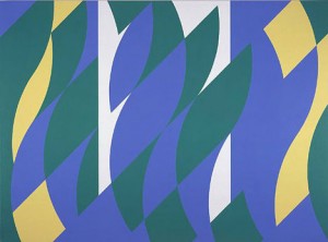
Bridget Riley: Painting with Two Verticals
I dimly recall New York’s rude welcome of Riley in 1965, when her work appeared in a show at MOMA called “The Responsive Eye.” What was so unacceptable about them? I think it was the utter clarity of their dealings with viewers, their way of forestalling interpretation. Their bluntness stymied intellectuals, and their impersonality bummed out romantics. The sixties had begun in a spirit of clarity, with youthful embraces of democratic taste and pragmatic joy. Then the shock of so much change, so fast, set in. As the art world expanded, it also fragmented, and artists retreated into subcultural parishes. Today, it seems plausible to look back on the past three decades in art as one long case of post-traumatic stress.
—Peter Schjeldahl, The New Yorker, Nov. 6, 2000.
September 12th, 2011 by dave dorsey

Coney Island II, details
On what has become a frequent five-hour commute for me into New York City (ten hours, round trip), I decided to take the Thruway and detour over the Hudson River to Bard College to check out Blinky Palermo. He’s a German who painted in the 60s and 70s, in both Europe and New York City, and who died, apparently of a drug overdose, at the age of 33. The show has gotten so much attention I had to see it. Two days later, on my way home, I visited Dia:Beacon, a little further south along the river, to see his final work in the other half of the joint retrospective. If you’re going to see one or the other, check out the Dia show. When I say it’s his later work, I mean only a few years later, yet it’s far superior to what he’d done before, with only a few exceptions. (And Dia:Beacon is a trip in itself, pretty much a Grand Monastery of Modernism, an awe-inspiring, silent, light-filled structure, formerly a Nabisco factory, and it reminded me of a chilling set out of Kubrick. The other work, surrounding the Palermo show, makes you think long and hard about how many ways the art of the 20th century could terminate in so many different stylistic dead ends.)
The Bard show was extremely uneven, and it included a room of shaped canvases and constructions that might be referred to as the Laurel and Hardy Period, pairings of tall, skinny stick-like objects beside squat, bulky ones. They’re not well-crafted, maybe intentionally, but the impression you get is that he tossed them off as notations more than finished work, though they can make you smile. One turned out to be a chalkboard complete with chalk tray still attached, completely disguised with fabric cocooned over the front, and it’s puzzling until you see the title and figure it out and smile, which is not to say you aren’t still puzzled about why we need a shrouded chalkboard mounted and framed under glass. So much of Palermo has the duplicity of an inside joke: is he really committed to what he’s doing, you wonder, or just dead serious, like a professional comic, about wanting to amuse. Palermo often seems a bit of the prankster whispering wisecracks from the back pew. The real rewards of the Bard show are the few large “paintings” he did, stretching unpainted fabric—it looks like silk dyed with beautiful subtle tones—to create what might be hard-edge minimalist homages to Rothko. It’s lovely, simple, elegant work and it was probably just his way of saying, hey, check it out, who needs paint?
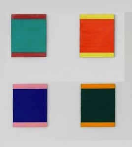
Yet his most focused innovations with color can be found at Dia:Beacon. It feels as cavernous as a hangar, and as you move from Sol LeWitt to Dan Flavin to Agnes Martin and then Robert Ryman, you realize you’re seeing almost nothing but different shades of white. Martin’s canvases seem to be fields of frost with stripes of various pastels bleeding decorously up from underneath, and Sol LeWitt’s line-covered walls make you their puppet for a while, pulling you from room to room, yet the impression you get is that all these artists were trying hard to disappear into the Void. After all this surrounding erasure, Palmermo’s jazzy colors, painted on metal squares and rectangles, feel like impulsive affirmations. The largest segment of the show seems repetitive, a sort of penance done every which way, all stripes and rectangles painting in different combinations of the same three colors: red, black and a deep, rich yellow. It’s like a long blues riff performed with only three notes. The real prize of the show comes near the end of exhibit—Coney Island II—four small metal panels in a row, Palermo’s own private semaphore, in colors that sing and seem to intensify as you watch them.
September 12th, 2011 by dave dorsey

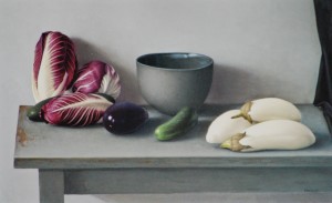
Still Life with White Eggplants and Radicchio
Representational painting tends to defeat the colorist. The challenge is always to take the hue that’s actually there in what you see and somehow build musical harmonies with it. You’re torn between the pleasure of rendering objects exactly as they look or working away from them toward an image that has its own inner logic, as Cezanne, Braque, Matisse, Morandi, Porter and many other modernists have done. How to build a picture that’s as much about color as it is about the isness of ordinary things, their light and shadow and heft—it’s a delicate balance that has to be renegotiated with every new picture. Amy Weiskopf’s still lifes zero in on the unique opportunity that still life affords for total control of the image, and she uses that freedom to evoke difficult color harmonies by carefully picking and arranging objects and backdrops as she stages her paintings. When I brought the little brochure of reproductions from her current show back to my home-away-from-home in Chelsea, the Viridian Gallery, and I showed the images to Lauren, a friend who works there, she said, “But they’re so set up.” That’s the thing, exactly: Weiskopf’s still lifes hint at a heightened mindfulness through an artificial presentation of natural objects, and either you see the poetry inherent in this centuries-old tradition, or you don’t. Weiskopf’s talent for this demonstrates why still life is the representational genre that most closely resembles abstraction in the privilege it offers a painter to select and arrange the elements of a picture at will. Simply by choosing and placing objects in a given setting, you can dictate everything about the image, its color, lighting, composition, form, and line . Ironically, though, a still life unified by its color relationships can be easier to do if, like Porter or Matisse, you present a table of objects in its accidental environment, giving the impression that what you see is what the artist simply happened upon. Expanding a still life by surrounding it with an interior can make it easier to build an image with color and light, taking more liberties with how individual objects actually look as you stand back from everything to take it all in. And, if you’re Matisse or Porter or Morandi, you flatten the image up to the picture plane, you make paint and color nearly the whole point of the image, altering each hue until it plays well with others, enjoying all the prerogatives of a Greek god with what you’re showing. I’m not knocking it. It’s marvelous.
Yet to paint a lemon or a radish as assiduously as Zurburan and yet still eek out a particular range of coordinated purples, blues, yellows, grays, or reds in the brightly illuminated picture as a whole—and locate these colors against a wall that bathes the entire scene with a certain delicate enveloping tone—it’s a masterful achievement, where all the feeling condenses itself into small areas of understated, well-behaved hues. If you want to see this done beautifully, check out the show of Weiskopf’s commanding still lifes at Hirschl & Adler, in the ICM building on Fifth Ave. It opened Thursday with a couple pieces already sold out of what had to be nearly 20 canvases—representing two years of labor. They are so modestly scaled that the entire show fits comfortably into their small central gallery. It was the first show I saw on my tour of openings last Thursday. I rode the subway up from Chelsea to see this work before I headed back downtown for the rest of the day, and all day long, I kept wishing, instead, that I’d saved the best for last.
September 11th, 2011 by dave dorsey

9/11 Memorial
At first almost against my will, I turned on the coverage of the 9/11 anniversary memorial ceremony. It has been so hyped by the media for days that I felt I’d had enough. Yet it’s on and I can’t turn it off: understated, beautiful and moving. I’d seen one of the bag-pipers on the street in Chelsea only a few days ago without understanding who he was: thick red tartan kilt, knee-high woolen socks, tugging a little wheeled carry-on suitcase behind him, probably trying to locate his hotel room. But that was as close as I got to the site, because the city had asked everyone to stay away from the scene. It’s a sustained, disciplined exercise in sorrow. The songs by James Taylor and Paul Simon, the moments of silence, the tolling of the little bell, a son getting up to the microphone to tell his father how much he still misses him after ten years . . . it couldn’t have been more effectively orchestrated.
Yet what struck me more than anything this morning was the power of the two memorial pools. If someone is searching for evidence to show the value of conceptual art—and I’ve always had a hard time finding it—these two pools stand as proof that work created from the blueprint of an idea can be brilliant, effective, and mysteriously powerful. These two pools work for many of the reasons Maya Lin’s Vietnam Memorial works, because the artist’s humble self-effacement answers perfectly to the work’s historical and artistic needs. The two pools preserve the footprint of the twin towers, and by transforming these pits into waterfalls, they create images which seem to be the exact physical opposite of a public fountain. They are whirlpools that don’t whirl but simply surrender to gravity. Fountains, with their collection of tossed pennies, represent beginnings and the future: they spring upward in ways symbolic of life’s origins and all the hope that your wishes will come true. The 9/11 memorial pools speak of the past, not the future, and remind you of your own mortality in a way that’s both tranquil and deeply disturbing. Against the image of a round pool gathering its water into a central spout, defying gravity, these square pools show a quadrangle of water falling, flowing and then draining into an ominous, disquieting tunnel—all the water falls into the earth at the basin’s center where, in a fountain, it would be shooting up to heaven. And the water flows into central pits that look as if they could very well be bottomless—the falling never seems to end here. What’s amazing is that gazing down into what is effectively the antithesis of a tall building, you have a twinge of vertigo, as if you’re standing on top of one—and thus it brings you back, imaginatively, to the top of the towers that have disappeared. If you needed to invent a Chinese ideogram, a new word rendered as a picture, which stands for the notion of free-fall, emptiness, loss, and death—all major food groups for existential anxiety combined into one unified image—these two pools would be that visual word. Like Maya Lin’s classic work, the greatness of this memorial resides in what’s missing, in how the memorial itself almost isn’t even there.
September 11th, 2011 by dave dorsey

Group Insurance
In my recent tour of gallery openings in Chelsea on the 8th, with all the efficiency of a time management consultant, I managed to get a look at about ten new shows only hours after they opened—and, in one case, at Danese, several hours before it was supposed to be open, until I was quite courteously asked to return to the elevator and head back out onto the street. It took some spirited walking to see everything, and my polo shirt was nearly drenched in the humid, post-storm sun—walking around those large white rooms, others must have looked at me and wondered if I were just taking a break from unloading pallets from trucks. Since it was only a few days before the 9/11 anniversary ceremony further downtown, and the subways were telling everyone to be alert for suspicious activity, a guy sweating profusely for no discernible reason, carrying a North Face backpack, on his way uptown must have raised a few eyebrows.
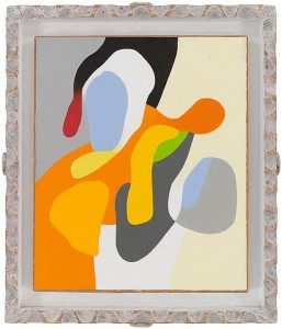
This Mr. Magoo-ish treasure hunt of mine yielded a few memorable discoveries, a couple astonishing ones, and many satisfactions, but none quite as wonderful as Organic & Geometric, the show of Frederick Hammersley abstracts on view through Oct. 8 at Ameringer McEnery Yohe on W. 25th,. I’d never come across Hammersley’s work before, which says more about my ignorance than his stature, but the staff described him as “well-known on the West Coast, not so much here.” This show ought to change that. Hammersley (1919-2009) developed his images in a modestly-scaled format—that scale is one of several ways he can be compared and contrasted to Blinky Palermo, whose minimalist work is on view north of the city at Bard and Dia:Beacon. Hammersley essentially builds the visual equivalent of isometric tensions between opposing elements and forces. His entire output seems to be, in one sense, an ongoing extrapolation of Hoffman’s push-pull theory applied not simply to color, but also to form and value. Hammersley built each of his abstracts by creating a sense of almost-unstable, taut counterpoint between nearly every opposite element in the work itself—even between the canvas and its frame, in the suite of his organic images. As a result, his surfaces seem to be holding their breath, poised at the serene edge of some yoga pose—even when you’re looking at a spare grid of only a few austere rectangles: blue, red, black and white. For all those hard pointy edges, they are luminous, sensuous, intimate and friendly, and the organic canvases are quite often sexual—with a cartoonishly expressive line suggestive of lava lamps and jigsaw puzzles—though somehow the anatomical imagery seems elevated to the level of a loopy extrapolation of Taoist yin/yang symmetries. His imagery, hinting at genitalia, evokes the union of fundamental, cosmic energies. We’re not talking John Currin here, or even Louise Bourgouis. Think Georgia O’Keefe doing tightly interlocking Matisse cut-outs. With the geometric paintings, he framed them uniformly in extremely thin metal floaters. For the organics, he built wooden frames from scratch, apparently carving, distressing and painting them, creating extensions of the work itself, as Hodgkins does, and he left wide trenches of space between the canvas and the frame, painting these little moats in earth tones that recede behind the saturated color of the panels. These are remarkably tactile, physical objects, not simply flat theoretical arrangements of colors. The rough, toothy texture of the canvas, the opacity of the paint, sumptuous as icing on pastry, and even the telltale feel of the pencil pressing into the wet paint when he signed the work—it all contributes to the sense that he was assembling unique objects in three dimensions that refer to nothing but their own shape and color and surface–their reality right here, on this wall, at this hour and day and year. Coming across these tiny works, you feel you’ve discovered a whole new panoply of exotic tropical plants or birds or insects. The physicality of the work is at the heart of the joy it imparts. And yet, juxtaposed against all of this, Hammersley’s intellect stands apart and playfully invents a pun for a title to provoke thought: Savoir Pair, Knew to Me, Altered Ego. I hate titles. If someone proposed a Constitutional amendment prohibiting titles, when it comes to visual art, I’d start a signature campaign in support of it. Most are fatuous, or pretentious, or wishful thinking, and they’re of more value in the aftermarket, as it were, for the taxonomist and historian and dealer, than as a way of conveying what’s actually going in a painting. A painting ought to be named with nothing but the date of its completion. Keep the words away from it (says the guy typing words to describe it.) Yet with Hammersley, the titles give you yet another vantage from which to assess the work at a level of meaning that wouldn’t likely be apparent without those few, clever words. You don’t need that meta-level of ambiguous meaning. You can discard it without losing a thing. It’s just there to show you Hammersley is as poised and self-aware as you can get and still paint effectively. The work gives you everything it has to offer in utter silence, as great painting is meant to do.
September 10th, 2011 by dave dorsey

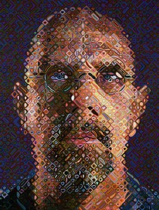
Chuck Close, Self-Portrait
If you’ve got more money than you know what to do with, and you’re open to worthwhile suggestions, the show at David Zwirner, until the 14th, is the one for you. From there, all the work will go to auction at Christie’s later this month to raise money for Haiti. Apparently, a few people haven’t forgotten how that little nation remains in dire need of help—and they’re hoping for support from those who may not be feeling the pain of our own economic peril here in the U.S. It’s always cause to celebrate when those who have so much more than the rest of us pass along some of it to those who have little or nothing, and there are some wonderful ways to do it hanging at this spacious gallery at the lower end of Chelsea. Who knows, in the process you might get a nice return on the value of your donation, since some of these prices may just go up through the years. It’s been known to happen. Also, there’s requisite overpriced junk on view, for those who snatch it up. But anyone with an adequate checkbook won’t need to care one way or the other when you’re helping to rebuild a small, impoverished nation. If I had an investment banker’s line of credit, I’d be bidding on Raymond Pettibone, Neo Rauch, Dan Flavin (anybody who has spent so much energy on years of work created from long cylindrical light bulbs as a tribute to a Russian Constructivist, I don’t know, it’s just nutty in such an intensively passionate way that I love it, plus all that light it would emit would really help my seasonal affective disorder in January if I hung it down in the basement where I work out), Cecily Brown, Marlene Dumas, and the incomparable Chuck Close, whose self-portrait has a kind of squiggly life force, an amazing feat given the strictures of the grids, and the scale, he relies on to build an image now. His self-portraits have always been his best work and this is no exception. But the little gem of the show is by Ed Ruscha, an artist I’ve never understood and never will, but somehow I keep watching him expectantly, scratching my head, smiling uncertainly, waiting for an insight when it all becomes clear, wondering if the undeniable coolness of what he does will carry him into the next century. This one, though. This one, I grasp with enthusiasm. It’s a little modest line drawing in pencil from 1979, and it seems to speak to our entire national predicament: a prospector’s pick-axe and shovel crossed over a pan containing a few nuggets of gold, alongside a knife and fork crossed over a dinner plate, beside a tiny pair of wooden matches, also crossed. Over the entire sheet of paper, Ruscha walked around in his dirty boots, leaving a workman’s tread everywhere on the drawing. It’s funny and gritty and the evidence of his hand, his body—OK, his feet at least, sorry ladies, not the whole body—makes it lively, personal and unpolished in a very un-Ruscha-ian way. So many crucial contemporary realities juxtaposed in simple graphite outlines: labor vs. wealth, the need for one square meal vs. the cruel dream of luxury and ease, and that illusory gold rush that has powered our economy for so many years now, to the brink of collapse. Brilliant and simple. And the perfect donation for this auction and this cause.
September 3rd, 2011 by dave dorsey

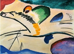
"Lyrical"
Two years ago, I attended the big Kandinsky show at the Guggenheim and found a long line stretching out of the coiled building, all the way to the corner of Fifth Avenue and E. 88th St. The cheerful, amused couple behind me laughed and the husband, or boyfriend, said, “A good rain would shorten this line considerably.” I said, “Yeah, what happened to that forecast anyway?” I got a text from my son, Matt, about Michigan’s win and Ohio State’s loss—we’ll be chanting Go Blue again this afternoon during the first game of Michigan’s new season—and we texted until I walked into the building for another fifteen minute crawl through a serpentine line. It reminded me of Disney World’s switchback queues, and it was at least encouraging that a painting exhibition could still draw long lines of people willing to pay for a glimpse of it. Inside, I went up the elevator to the top of the spiral and wandered slowly down, against the flow of the crowd. For me, the work at the end of Kandinsky’s life was so lifeless as to be almost comical, and I wondered, knowing what was to come from the artist during the heat of his younger explorations, how such a visionary, inspired innovator could have shrunken into the safety of those geometric puzzles. He began his career talking about painting images at the bidding of an indeterminate inner necessity, a spiritual imperative, back when he referred to color as an instrument for creating visual music. Yet, as the years passed, he eventually became involved in Theosophy, as a way of systematizing the mystery of his intuitions, and it isn’t hard to imagine that Blavatsky’s odd theories about geometry took hold of his imagination. It isn’t that the later paintings fail, they just aren’t nearly as alive as his early work: you can see the way thought has taken charge, as the paintings become more and more visually predictable.
Strolling downward, I enjoyed the pull of gravity in the grade of that spiral mezzanine—Matthew Barney’s Cremaster show being the last time I’d been in the museum—as it drew me into work that went backward in time but upward in quality, until the line and color began to come apart and the storms of light and dark and the riot of brushwork dissolved the visual order of his paintings in a way that flooded me with sensations and flashes of buried seasonal memories, complex mixtures of emotion and visual perception. I remembered the two oils of his you can see briefly at the Chicago Art Institute in Ferris Bueller’s Day Off, when Ferris and his fellow truants wander about that great museum. A pair of early Kandinsky oils appear for a second, at most, backed by minor-key, oceanic music, More
September 1st, 2011 by dave dorsey

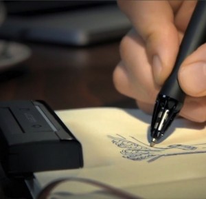
The Inkling
Sancho sent me a link to a new pen, which will go on sale this month, to translate an ink drawing, in real time as you do it on paper, directly into a digital image of the drawing. Sensors in the pen record the motion and pressure of the nib, recreating the exact lines being committed to paper, creating a replica of the drawing for reworking or sending/posting, via computer. I can’t ever see wanting to buy one of these, but for those who use Adobe or other software to digitally create prints, it might come in handy. It’s also an alternative to scanning or photographing a finished drawing for display on the Web. The technology can record and store hundreds of drawings before you ever have to upload to a computer, via USB port.
For me, though, limitations are what stood out.
Sancho: It says “pressure sensitive pen” so it must read pressure + position + time?
Me: Sure. It could easily register and transmit any kind of motion. The pressure could be picked up with a nib that “gives” a little under pressure.
Sancho: Right, I was just trying to think if there’s anything else it would need to know to reconstruct a drawing. Does it need to know when and how long the pen was in each position? Maybe not. Pressure and position are enough.
Me: Yeah, that’s all there is, pretty much. A lot of other things happen in a drawing, though: erasing, smudging, swearing, tearing up paper, dancing with fury on the shreds, cutting off ear lobe in a fit of despair.
Sancho: You’ll need the upgrade to capture all that, I guess.
August 30th, 2011 by dave dorsey

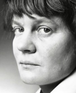
Iris Murdoch
I read a tremendous book a few months ago called Shop Class is Soul Craft, by Matthew Crawford, about the philosophical satisfactions of skilled physical labor. I heard about the book from my friend Walt—aka, Sancho—down in Tennessee, and I promptly ordered it and read it in a couple of sittings. It celebrates the dignity, beauty and intelligence of craftsmanship, and it makes me want to tear down my R1150R and put it back together again, just to get physical with my motorcycle in some way other than riding it. It’s a book people in Washington and on Wall Street ought to read, though they never will. They might realize that a country strong in the trades—a country good at building and repairing physical objects, a place where the average voter knows a socket wrench from an Allen wrench—is one that produces value the rest of the world actually needs. (How to revive manufacturing here in the U.S. is part of the economic enigma that needs to be deciphered for our economy to revive—and to wean ourselves from the financial sleight of hand that has been passing for economic growth the past couple decades.) It’s a sophisticated book by a man who left his position at a Washington think tank to repair motorcycles for a living. You can see some of his own craftsmanship at www.shockoemoto.com. Yet the real joy of the book for me was that it introduced me to yet another book, The Sovereignty of the Good, by Iris Murdoch, the British philosopher and novelist. When I finished Crawford’s book and started to read Murdoch’s, I realized I’d found yet another foundational piece of writing—like The Doors of Perception—that helped explain why painting matters, especially representational painting. (The writing about painting that means the most to me, for some reason, often gets done by people outside the field of art—in this case by a motorcycle mechanic.)
You can open Murdoch’s book almost anywhere and come away with a sentence that makes you say, “Of course! I knew that.” And then you ask yourself, “Didn’t I?” Nicholson Baker used to do that for me on every page, some little observation about the engineering of a plastic straw, vs. paper, that would make you pay attention to your own subliminal awareness of how daily objects work, how they’re designed, perceptions that underlie your experience of life without your being quite conscious of them, until you’d read The Mezzanine. Murdoch does this on a more abstract plane. For example, everyone knows how discomfiting it can be to watch a John Cassavetes film or one by the young Mike Leigh, or to glance at certain great paintings for the first time, one of Lucien Freud’s nudes, for example. Murdoch has a simple perspective on this:
(good art) resists the easy patterns of fantasy . . . the recognizable and familiar rat-runs of selfish day-dream. Good art shows us how difficult it is to be objective by showing us how differently the world looks to an objective vision.
Crawford elaborates wonderfully on this in his own book: More
August 30th, 2011 by dave dorsey

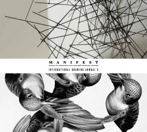
The award-winning book
Slightly belated kudos to Manifest, a unique gallery and publisher in Cincinnati, for winning the Silver Medal in the fine arts category—the highest ranked category among all the awards they bestow—at the Independent Publisher Book Awards in New York City recently. This maverick, non-profit organization—supported by individual donors, ArtsWave, and The Ohio Arts Council—has been doing an amazing job of helping serious emerging artists from around the world show their work by holding juried shows and publishing a full-color catalog of every work it exhibits. Every event at Manifest gets its own catalog, and these books are perpetually kept in stock for purchase by anyone who wishes to see excellent new work being done, around the world. Manifest won this award for one of the most recent in a series of annual books it publishes—the 5th International Drawing Annual, showcasing 114 works by 72 artists from Australia, Canada, Croatia, England, France, Germany, Japan, Portugal, Scotland and the United States. The work included in the book was selected from nearly 4,000 entries.
Manifest represents a small but influential island of sanity and balance—not hewing to any particular academic creed and not swayed by whatever happens to be selling at any given time. Work is chosen on merit by eleven jurors—professional and academics qualified in the field of art, design, criticism, and art history. All final selections are curated by Jason Franz who, in an email to me once summed up the stature and neutrality Manifest represents with the perfect quip: “We are the Switzerland of the art world.” For those of us seeking little more than a Swiss work visa into the world of art—rarely dreaming of full citizenship—it’s a happy moment to hear this place getting the recognition it deserves, as both a gallery and a publisher. In its press statement, Manifest put it perfectly: “The award is tangible proof that Manifest is fulfilling its mission to reach out to a global audience from our small headquarters in East Walnut Hills in Cincinnati, to stand for something that artists appreciate and the public respects, and to honor the creative work of so many separate people all connected by their participation in our projects.”
August 26th, 2011 by dave dorsey

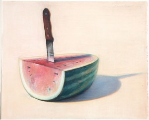
Watermelon with Knife
My wife and I meet our son and daughter in Palm Springs for vacation every year in August, when it’s super-cheap and affordable, and, well, broiling hot. Don’t challenge me on this. We love it. It’s a dry heat, as Bill Paxton said in Aliens. We were there again last week—golf, golf, golf, cicadas, scurrying quail, hummingbirds sometimes thick as insects on the front nine, doves, mockingbirds, roadrunners, moonlit mountains, Corona in bottles, gin and tonic, swimming, running in 95 degree heat, cards, epic dinner conversations, and drives to the Palm Desert Apple Store for a new trackpad. On top of all that, I finally visited the Palm Springs Art Museum. I went to see what I thought was a late Manet in their permanent collection, since I’d seen it in a promotion on our visit a year earlier, and it was there, all right—a gem, larger than I thought, all vigorous brushwork, the fearless shorthand execution of a master who knew he would soon die. I discovered, though, that it was part of an anonymous private collection on loan every summer, when the owner flew to cooler climes. Nice trade of services: you guard my paintings from thieves, heat and humidity, and I’ll let you show them to the public, but only if you don’t let anyone take pictures. Doh! It was a dazzling assembly of work, and I tried like hell to pilfer a few images with my iPhone, but the guards were sharp and vigilant. (My son-in-law, John, actually acted as my wingman and wandered off to see if the guard wouldn’t follow him, giving me the privacy to steal a few shots, but no dice. Though I was disappointed that he kept an eye on me, the guard was obliging enough to tell me the paintings in this exhibition were all owned by one local collector, who wanted anonymity, no doubt to protect his paintings.) In total, the room reminded me of a much smaller version of the Duncan Phillips Collection in Washington. It was a selection that showed the collector’s unerring ability to spot tremendous Modernist work: Van Gogh, an early Matisse, a whole series of Picasso drawings, three Joan Mitchells, a Rothko, a little Renoir portrait sketch more intriguing than most of the standard Renoir  fare I’ve seen over the years, a tremendous, placid non-figurative De Kooning, the Manet, and what turned out to be a small revelation for me: a set of a half-dozen Thiebauds. They were all a lesson in how to paint irresistible images, yet one of them was astonishing.
It occurs to me that I’ve been giving Thiebaud a lot of big ups, almost despite myself, because as much as I admire him, and love the late-career landscapes, there isn’t any single image of his that has knocked me out me the way this painting did. It’s an oil on panel of a wedge of watermelon impaled by a large cutting knife. I found another version of the subject online—not the same painting—and it’s not nearly as good. The photograph doesn’t even come close to conveying the saturation of his color in the Palm Springs painting, the depth of thickly applied oil that seemed to soak up the light and give you a rich tone from under the pa int’s surface, somehow. The knife had the shine of reflected light, and yet, at the same time, also had the flat abstract quality of Thiebaud’s typical work. The wooden handle was a marvel, and overall, the knife itself had an almost Arthurian sword-in-the-stone aura. The watermelon’s red fruit seemed polished and honed at the edge, with a neat semi-circle of seeds sown regularly just inside the rind, a couple strays having fallen to the surface below. And the shadow’s deep blue depths seemed to pull against the electric green of the fruit’s surface. The image he created resonated with all the pleasure of the man’s good cheer—as a viewer, you taste his subjects more than you simply see them—yet there’s an uncharacteristic implication of violence and even sex in this one. The color, the shine of the knife blade, the imagery of stabbing, the physical heaviness of what he shows you—the blade looks anchored firmly enough to quiver if you plucked it—it commands your attention with unusual authority, and yet all of these implications are bathed in his brilliant light and deeply saturated color, so that the effervescent quality of Thiebaud’s vision only seemed intensified by this mortal-seeming wound, inflicted for the sake of a summer dessert. Enjoy the sugar of those thirst-quenching bites, he seemed to be saying, and enjoy them all the more because that ominous knife casts a little strip of purple shadow down the center of the fruit. This unusual touch of duende, ultimately, seemed an almost ironic, serene reflection on a fate Thiebaud seems to have deferred indefinitely, now that he’s in his 90s.
August 26th, 2011 by dave dorsey

Two Trucks, with Tools
Anyone who doubts that painting is mostly a physical engagement with the world should have followed me around the past three days. I drove to Chelsea, to help another painter, Rush Witacre, build a set of storage shelves at Viridian Artists on 28th St. As a member there, I donate 40 hours of labor every year—doing whatever needs doing when I can get into the city for it. When I joined Viridian, our director, Vernita N’Cognita, asked me, “Are you handy?” I should have known better than to be honest about it. Three days ago, just before I left, I stood in our kitchen and took that photograph (up above) of my cargo for the visit to Manhattan. A power drill, extra batteries, a stud finder, a level, tape measure and—oh yes—a painting for “Moved,” the show opening next month to celebrate our new space, a few blocks north of where the gallery had been located for a decade. It was a move I’d helped the gallery make in July by loading heavy objects into Rush’s four-door pickup truck and then lugging them up to the new space, in a building wedged between a Porsche/Bentley/Rolls Royce dealership on one side and, on the other, Scores, the strip club Howard Stern helped put on the map. Directly next door to our building was what appeared to be an apartment complex called Art +, with a motto painted onto the street-level window: “Chelsea, the birthplace of creative modern art and the home of bad behavior.” I’ve been a member-level supporter of both of those causes, at one time or another, so I feel at home when I’m here.
It takes about five hours to drive to Manhattan from our Rochester suburb, which almost seems like a commute to me now, I’ve done it so many times. Yet our first afternoon of work was a lesson in the relative meaning of mileage. More
