Archive for the 'Uncategorized' Category
November 27th, 2011 by dave dorsey

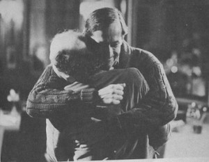
Andre Gregory surprising Wallace Shawn with a hug
I saw a baby blue jay land on our birdbath last summer. A jay tends to militantly scan its world to see what nuisance it might need to shoo off, while the average bird is constantly rubber-necking to stay alive. I suspect there’s too much pain involved in the kill for a cat to mess with a blue jay. And red-tails don’t circle over our house often enough to inspire fear—if they are a threat to jays. (We get no leopards here in Pittsford—I mean, this is upstate New York, not Ohio!) So I was certain this baby bird was looking around because he was fascinated by what he saw. He sat there intending to drink the water, but he never dipped his beak: he was too amazed by everything around him. That’s how it looked, anyway. He hopped from birdbath to privet to cherry tree, just looking around, checking it all out. He looked amazed. He sat there staring for so long at one particular thing after another, I’m sure he forgot himself in the process—completely unaware of how exposed he was, there on the birdbath.
I noted all this down in my journal because that blue jay seemed to represent a kind of lost ideal of the artist for me. Granted, I’m anthropomorphizing this little bird, but still. Aldous Huxley talked about this state of mind, a deep hunger to simply look, to see, in The Doors of Perception. He celebrated the way the world appears if you actually see it, without any intentions or concepts to warp the act of looking. Andre Gregory, in My Dinner with Andre, talks about the same state of mind he enjoyed briefly earlier in his life: “But I really felt as if I were floating above the ground, not walking. And you know, I could do things like go out to the highway and watch the lights go from red to green and think, How wonderful. It was a feeling of recognizing everything, of being able to be aware of the reality and specialness of even the most ordinary things. And that feeling lasted for quite a while, and then gradually it faded.” I love this passage, though you could easily dismiss it as the sort of thing you hear from stoners. It certainly does sound like an outdated refrain from the Sixties. And, yes, Huxley required mescaline to get back to this purity of perception, where it’s as if you’re seeing everything for the first time. But that sort of perception doesn’t require drugs. A great painting will do the job.
Those last four words—and then it faded—are among the saddest in the language. An awareness of the gap between that state of heightened perception—the sense of being in love, not with a person, but with everything—and the way it wanes as you age, formed a big part of the program of the Romantic movement in Europe and became a central thread of Modernism, at least in its early phases. Part of that tradition wanted to reclaim the purity and emotion of raw, childhood perceptions or at least an untainted, uncivilized equivalent of them. Rimbaud looms big on this score. Klee. Burchfield. Chagall. The surge of interesting in tilt-shift photography, the way in which it can make an ordinary scene appear to be a child’s glimpse into a diorama filled with toys, owes something to this same instinct, the desire to get back to the appetite for the intense perceptions of early life. Tilt-shift makes you feel as if you float over a world that might otherwise seem overwhelming. The recent music of Tune Yards has some of this same aura: the surprise of fresh, original and spontaneous perception. Even though the lyrics to the songs have darker implications. Likewise, Basquiat’s work, which looks as if a child has been set loose with crayons and watercolor, plays the same game: the noble savage, the “radiant child”, working on impulse and emotion without second-guessing, though his paintings are clearly meant to bear more social and political weight than a child would invest in them. Warhol cut the same figure: the balloon room at the Warhol Museum in Pittsburg is pure playfulness, just an electric fan stirring the air with a swarm of shiny helium balloons floating around at random. It isn’t just a room; it’s a state of mind. Yet Warhol undercut this aura by making it sound as if he believed art was just a branch of business. Keith Haring, same story: childlike, fun, and cheerful. I think those who love these artists are drawn to the unpretentious simplicity, the simulation of uninhibited joy and playfulness, inherent in the work. Though the work is quickly invested, either by the artist or the critics, in “meanings” other than this fresh state of perception. Sadly, these artists don’t convey much to me, yet I think many people have responded to them because, at first look, they appear to be making work that doesn’t require a priesthood of experts to deconstruct: it’s appears to be simple and primal.
For me, though, all great painting seems to cleanse the doors of perception. It doesn’t need to seem childlike; it just needs to be good. When I saw Fragonard’s Progress of Love at The Frick—a luxurious and cool commentary on a woman’s power to orchestrate a romance—the genius of his talent, his incredible skill, made it feel as if the top of my head had been lifted off, a feeling Emily Dickenson required of poetry. I don’t especially like Fragonard, but his brilliance is unmistakable, and he does what I want great art to do. The way his handling of paint created a continuum between earth and sky, so that the trees appeared to be green cloud formations and the sky merely a rarified extension of the trees . . . it offered the sense of walking into a world in which everything is slightly different, and deeply fascinating. I felt the way I like to imagine that baby blue jay felt, looking around at his new world.
November 27th, 2011 by dave dorsey

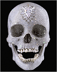
Damien Hirst, For the Love of God
Lauren Purje sent me a link to a blog post in the Guardian by Anthony Gormley calling for the return of melancholia in art. In his post, he says art over the past few decades has become a fashionable and fun way for one-percenters to park their wealth, as a diversion from the uncertainties of Wall Street or, say, Greek bonds—no argument there. He said, as a result, art has turned itself into an amusement, so that the least substantial work fetches the highest price. He would like to see a return to “serious” work, work that emphasizes mortality in a way that doesn’t amuse—just the skull, please, hold the diamonds. Who wouldn’t argue with the value of the late Goya, Brueghel, Guernica . . . add your favorite “dark” artist here. But somehow something has gone missing in this perfectly respectable harrumph about money. Gormley’s point would make Van Gogh’s potato eaters the pinnacle of his achievement. What happens to the joy of all the later, fully realized work, which helped make Modernism possible? Lauren writes:
“I don’t know if I’m part of the solution or part of the problem according to this guy—haha. Or if I agree or disagree. I definitely don’t like gold bricks.”
I want to get down, for the record, that I love gold bricks—I extend an open invitation to all gold bricks who wish to enter my life—as long as they’re in a vault, not on exhibit in a gallery. Gold bricks, though, they never hear my call. Just ask the fellow who does my taxes and calls me with that funereal tone every year, which says, is this all you made? My response to Lauren:
“He’s like Tom Wolfe in the way he overstates everything. I think he’d like your work, actually–you certainly focus on Continental philosophy’s “problem of existence.” My painting wouldn’t be depressing enough. I guess he’d toss out Matisse who wanted art to feel like an easy chair you fall into at the end of the day. Hm, where is the dark night of the soul in Matisse, and he was, let me get this right now, the greatest painter of the 20th century. It’s a toss up between him and Picasso, for Schjehldahl. Have to pay a visit to Picasso for the horrors, though. In my last post, on my friend Harrington, I talked about Hickey’s view that art needs to find it’s buyers and that the effort to connect in ways that make people want to own something because they love it, not because they’ve been told it’s good for them. His view is that this was slowly lost since the Baroque era. Typical Hickey: let’s go back a few centuries to the root of the problem. I agree with his view and yet I’m constantly thinking, “but this would make Koons and Hirst his heroes.” I’m sure Hickey would disagree. The more you ponder these things, the more you see the holes in any particular “stance” about what’s bad in art. You make the art you make and then let others confuse the issue by talking about it. As a rule, maybe I should talk less and paint more.”
If art is great, it can show you nothing more than the beauty of a summer day, or a woman’s face. It can take the slightest thing and turn it into a revelation. There doesn’t need to be a trace amount of the tomb in it. If it’s meretricious BS, it can do exactly the same thing, show you a lovely afternoon or a beautiful face in a way calculated to earn an inflated price. The role of a critic is to separate the genuine joy from what’s merely an extremely expensive pleasure. Gormley seems to simplify everything down to the dictum that art has to be depressing to be good. Should I list the hundreds of great artists he would need to banish from his roster? I think the bulk of Vermeer would have to go, for starters.
November 26th, 2011 by dave dorsey

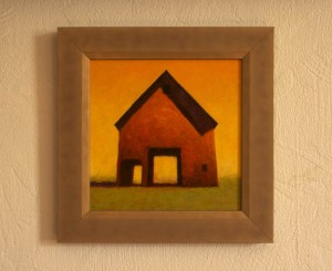
Small work by Harrington
Rick Harrington has been working on twenty-five small paintings simultaneously, all variations on his barn motif. Has the barn graduated to the level of an archetype yet? It has for him, anyway. As the foundation of a method, it’s an endless source of ways to study light and color. Like Monet’s haystacks and cathedrals, or Rothko’s horizon lines. I love what he does with it, working in thin coats, letting a complementary undercoat vibrate against the value of the paint closest to the surface. (Matt Klos, a Baltimore area artist who’s represented by Oxford, here in Rochester, often relies on this technique as well—in an intentionally visible way, as Rick does.) And he really knows how to balance the crisp, angular, geometric shadows of a roof against the soft, hazier treatment of the barn’s terrain. Harrington’s project has yielded a number of benefits. He appears to be working quickly by learning things with one image that he can then immediately apply to the others, on the fly. He’s focusing on method, so that he doesn’t make a fetish of the individual work, a standard tough to maintain. It’s hard not to play favorites, in terms of technique, with particular paintings. I suspect he’s also better able to see all of the key personal choices that serve as the foundation of his style, and, therefore, his visual world. How to handle the paint; what colors to choose; how many different hues can one image bear without collapsing; how to make both the values and the hues work together; and how far can he take the image into abstraction without losing the sense of his light source, the time of day, the season. Amazingly, his best images convey all those realities, while still maintaining the simplicity of abstraction. It’s all a lesson in how little it can require—how little in terms of “information” imparted by an image—to convey the sense of the actual, as well as the more elusive sense of a particular artist’s stylistic world.
The other side of what he’s doing—the pricing, the marketing, the appeal to buyers—is actually part of what makes his work strong. Dave Hickey maintains that a work of art has to find a home in the market—a central tenet of his thinking about what makes it vital. One need only say “Van Gogh” as a counter-argument. Yet, there’s a lot of truth in his perspective. Hickey’s beef is that art should first of all bring someone enough pleasure that he or she will want to take it home. He loves to celebrate art that seduces and charms, first and foremost, before it ever gives you anything to think about, which it doesn’t actually need to do. It does need to bring at least a reminder of joy, if not the genuine article. Without this, it’s a matter of asking a viewer to just shut up, take those vitamins and skip the meal. The question, as always, is how far you can focus on what people will pay to see without losing what gives the work its heart. Rick’s work never seems falsified for a sale, though: he finds a way to paint that brings him the deepest satisfaction and, therefore, has a chance of offering someone else the same sense of fulfillment while looking at it. If the amount of time invested in the painting can be reflected in a price that a potential buyer can afford, that’s the sweet spot, I think, Hickey was advocating. Rick’s getting pretty close to that in this small works project—in all of his painting, for that matter.
November 22nd, 2011 by dave dorsey

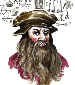
Leonardo, multi-tasker
Do not attempt any of these at home. Thanks to NPR, a quick list of tasks Leonardo Da Vinci jotted in one of his notebooks. Herewith, some samples. Dude really liked to measure things, and I think he was trying to track down some ice skates:
- Draw Milan
- Measure Milan and its suburbs.
- Measure the Duke’s Palace.
- Measure the courtyard of the Duke’s Palace.
- Ask Benedetto Portinari by what means they go on ice in Flanders.
- Find a master of hydraulics and get him to tell you how to repair a lock, canal and mill . . .
- Ask Maestro Giovanni Francese about the measurement of the sun.
When did he find time for the Mona Lisa? It’s hard enough to paint when there’s email in the world. I’m glad I don’t feel compelled to draw upstate New York, and I don’t see any curiosity about canal repair in my future. And I thought I had A.D.D.
November 21st, 2011 by dave dorsey

Lauren
This is an email I got this morning from Lauren Purje, my friend in Brooklyn. I wrote about her a few posts back. She works at Viridian Artists and will be showing her work there in the future, and she also has a solo show in Buffalo coming up soon. We’ve been talking about collaborating on something which intrigues me because we’re making art from completely different directions: I want my painting to get as far from words and concepts as possible, and her work is steeped in both, rooted in a quizzical stance that’s essentially philosophical. She’s always thinking in the most circumspect way about how to be an artist. From this email for example: “The meaning of art changes based on the venue you market it in and the value somebody puts on it.” That’s a pretty big caveat. Matt Klos pointed out to me a while ago that Stanley Lewis stuck with his artist-owned gallery even after his work started to sell for decent money. I would guess his thinking was the same as Lauren’s. Keep it real and address those who are looking at the work itself, not what it’s going to be worth in two or three or ten years. Her path in Brooklyn and Manhattan fascinates me, and I want to keep in touch with what she’s doing, how she passes hurdles or shies away from them, always thinking less about a “career” than what she wants her art to mean. I think she hits on quite a few essential things in this email, so she said I could pass it along:
Bob Cenedella, (professor at the Art Students’ League and my original connection to NY, I consider him a mentor) likes showing in bars and restaurants more than galleries, now that he’s done it all. He’s coming from a long career where he’s dealt with the art world and many times has been censored by it. His attraction to the bar scenes I think boils down to having his work seen by everyone–art in normal situations. His work is often political, or just plain satire. He hit it big back in the day when he had shows alongside Andy Warhol, but he was selling Brillo boxes for 15 cents, 5 cents if you assemble it yourself, haha— just to say it was bullshit.
It’s sometimes confusing. I don’t want to be bitter, but I know that the gallery system is pretty fucked up. I guess I’m just looking at it in terms of, who’s really looking at your work when you’re in Chelsea compared to maybe a bar on 2nd ave. There’s a lot of grey area, between Richard Serra and any Viridian artist–there’s not one ART WORLD, but lots of little ones. The one everyone thinks of is Jenny Holzer’s and Matthew Barney’s . . . Ford snuck in there. But exhibiting in places where people eat and drink is a way of reaching more people.
More
November 17th, 2011 by dave dorsey

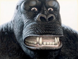
Walton Ford's King Kong
I can’t wait to get back to Manhattan in December to visit King Kong. The one that Walton Ford has painted, that is. A very disturbed Mr. Kong makes a series of faces in Ford’s enormous paintings of him that seem like perfect icons of the flight-or-flight impulse that has kept things breathing on this planet for so many eons. At the Paul Kasmin Gallery, until Dec. 22, the massive ape will be hanging out with some of his fellow mammals from the imaginary menagerie Ford has conjured at his studio in the Berkshires. A couple of years ago, in a lecture I gave at the Memorial Art Gallery, I veered off topic to show some slides of Ford’s paintings and rave about them while chiding the artist for a remark he made in his New Yorker profile about how he was a little disappointed in himself for not advancing the course of art. Yes, I think we’re all probably a little melancholy about failing to do that, Walton—at least since I last checked—though some of us get over it by reminding ourselves what year it is. My point was that it’s silly to feel that way because, as Arthur Danto has pointed out, it became clear half a century ago that anything can be a work of art, so the notion that we’re advancing anywhere in the realm of visual art has outlived its use-by date. Anything qualifies now, so the notion of progress has done its job quite well and now we need to find a new and more personal, if not mysterious, imperative for making art. I think what Ford has done points the way as well as anyone else’s work these days. The challenge now is to create a visually coherent world other people will be eager to enter and explore—place they want to keep returning to see. More than almost any other artist working now, Ford has created a seductive world all his own that looks and feels enough like the world outside my door to seem initially recognizable—hey, I can watch hummingbirds get into violent turf wars without leaving my house and that scene would be perfectly recognizable as one of Ford’s. Yet his world is a bit more exotic than the average suburban back yard (though maybe not for those living in Ohio after that fellow released his private zoo to creep around in the night). The ways in which his visions differ from my own daily world are what make them an inexhaustible delight. I want to look, and look, and look.
Ostensibly, his images always stand for something. They’re always a metaphor, an allegory. He has said so. But they’re allegory as it functions in a Hawthorne story, made terribly specific and yet fundamentally ambiguous, impossible to dismiss with any explication as the sense of meaning spills out beyond whatever seems to be happening in the scene. They arrest the mind and evoke an oneiric response—they may be bloody, violent and full of animal passion, but it’s all subsumed in a daydream’s ontological stillness. You can’t pin his images to one particular significance, as much as he often seems to want you to, and actually, you don’t need to reduce them to anything other than what you see, they’re so luxuriant and rich. Stare at them as long as you like, they’ll keep revealing things. His sybaritic, besotted monkey or his cyclone of birds serve as magnets for a multiplicity of interpretations, until the mind gives up and is just drawn into the restful magic of an alternate universe built of watercolor. His work reminds me of the fantastic and minutely detailed renderings of Brueghel and Bosch as much as Audubon, and somehow Chris Van Allsburg’s illustrations also come to mind, their precision and handling of light and their timeless dreaminess. Maybe that’s because in Ford’s rarefied savagery, there’s always a feel of primal regression to the terrors and delights of childhood. The wild things have taken over in ways I find thrilling and beautiful. His scenes are often brilliantly illuminated, usually with intense color condensed into tiny areas the way a cherry tree delivers its sugar. He concentrates a rainbow into the face and gullet of an exotic bird, or a mango, or a pink talon. Every time you look at one of his paintings, you feel as if you’re just waking up, looking at the world with raw, new eyes, and you think, oh, wow! So this is where the real dreaming begins.
November 15th, 2011 by dave dorsey

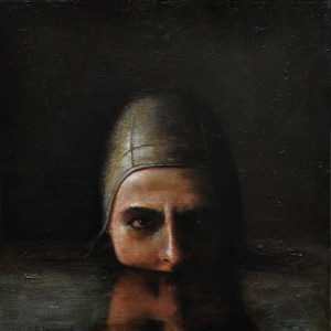
Thomas Insalaco, Swimmer
Paying Homage, a large solo exhibition of Thomas Insalaco’s oils at the Oxford Gallery here in Rochester is well worth checking out either in person or at least online. I wish James Hall had posted more of the work on the gallery’s website, because it’s all absorbing, and it consistently reflects a mind and heart obsessed with fundamental mysteries. Insalaco is an example of an artist who doesn’t seem to have ever consciously sought commercial success, obsessively exploring imagery and techniques that point toward a sense of what I would call spiritual unknowing—one canvas seems to show you an image of the artist himself as a wanderer with a backpack, lost in an unfamiliar world. Others evoke an aura of darkness dispelled or relieved by moments of grace, images that shine with a grave sense of beauty. Caravaggio’s presence can be felt throughout Insalaco’s work, and yet some paintings glow with a very un-Baroque light of day, or, in one case, probably my favorite image in the show, the electronic light of what’s likely an iPhone held by a young girl whose profile is lit by the touch screen you can’t quite see in her hands. The image has the casual feel of an everyday domestic moment caught with delicacy and love, and even though electronic media seems a menace to the average human attention span, there’s something hopeful in that young face connecting with other people, other worlds, through a tiny illuminated window. You see her gazing into that glow and think, things are going to be all right, after all. His female nudes, though, might be the most impressive work here: classic, sober views of the actual human body in all its awkward and imperfect beauty, and these images, which have a poignant gravity that seems ubiquitous in his paintings, make you feel the humble vulnerability of what it means to stand naked, alone and on view. Yet, above that psychological dimension, these nudes do what figurative painting ought to do: make you see what a marvel the human anatomy is, more marvelous than any representation of a particular body will ever quite capture.
November 15th, 2011 by dave dorsey

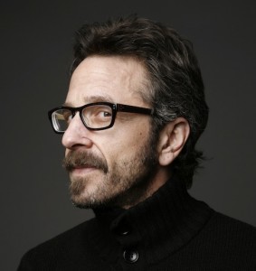
Marc Maron, compensatory narcissist
As I was painting this morning, listening to my usual rotation of podcasts, Marc Maron provided a funny portrait of himself drawn from a clinical description of a particular psychological disorder called Compensatory Narcissistic Personality. The character traits that define this comedian’s condition also struck me as markers for a certain artistic type:
- Seeks to build an image of high self-worth. (Fair enough.)
- Has trouble with empathy. (Maron: “I’m not going to check that one. I drove someone else’s cat to the hospital.” Agree. It depends on the artist.)
- Strives for recognition. (Well, if a tree falls in a forest and no one hears . . .)
- The achievements of others are degraded. (Everyone’s a critic . . .)
- Has desire for glory. (I would settle for positive cash flow.)
- Listens for critical judgment. Feels slighted by disapproval. (If you prick us, do we not bleed?)
- Feels vulnerable to the judgment of others. (Do you have to be so picky?)
- Covers up insecurities with feelings of pseudo-grandiosity. (Maron: “I think my arrogance is genuine.”)
- Has alternate periods of deadness and excitement. (Maron: “Oh that’s me.”)
- Has history of searching for an idealized partner. (Maron: “Oh boy.”)
- Frequently entertains exaggerated concept of himself which he can’t measure up to. (Maron: “Uh oh.”)
- Is touchy, quick to take offense and reacts with fantasies of revenge when frustrated in the hunger for constant admiration. (Maron: “Oh god.”)
- Dependent on others for approval. (Maron: “Bing, bing, bing. This all sounds like a description for my show.”)
I guess I wouldn’t check every single one of these, by any means, and there are plenty of positive characteristics in the personality of the average painter, but some of these traits do cut a bit close. I see this as a list to revisit on a regular basis, (maybe every couple of hours, nothing obsessive or anything), as a way of checking oneself before wrecking oneself. I agree with Maron, if I have delusions of grandiosity, it’s genuine grandeur I’m dreaming about, not the fake kind. I’m not sure grandeur is a word I’d apply to the work I do, though. And not that there’s anything wrong with a few delusions, at least between 11 a.m. and 3 p.m., when you need them the most. Something has to keep you going after the morning coffee has worn off.
November 10th, 2011 by dave dorsey

A Warhol will not cure a cold
I’ve been brooding for a long time about something I keep running up against: how highly intelligent people I know, highly educated people, who enjoy both art and photography and have sophisticated taste, cannot see anything to like in much of what’s been considered great in art over the past century. What many of us consider virtually classic, if classic can include both Picasso and Vermeer, leaves these people shaking their heads with puzzlement. They shrug when they see almost any kind of abstraction. Tom Wolfe took this same stance when he wrote The Painted Word, in which he suggested that abstract expressionism was little more than an illustration for Clement Greenberg’s theories. It was, in his terms, a way of putting Greenberg’s words into paint. The AbEx painters were simply showing, in visual terms, what he’d already said in his criticism. Wolfe celebrated photo realism as a return to sanity, and as much as I enjoy photo realism, it seems a little anti-climactic as a victory of sanity over madness, coming at the end of Wolfe’s typically over-the-top screed. Yet I find myself sympathizing with these reactionaries, who serve as a warning about what just doesn’t feel right in so much work that passes for great. The quote from Peter Schjeldahl I posted a while back echoes this unease about what’s happened to art, at least since the 60s: “The sixties had begun in a spirit of clarity, with youthful embraces of democratic taste and pragmatic joy. Then the shock of so much change, so fast, set in. As the art world expanded, it also fragmented, and artists retreated into subcultural parishes. Today, it seems plausible to look back on the past three decades in art as one long case of post-traumatic stress.” What’s interesting is that someone who may be our greatest living art critic finds himself as dubious as the next guy about what has been happening to art–along with great critics like Roberta Smith and Donald Kuspit–and the only point of difference is in how to assign the date when things started to go awry.
The puzzlement of some intelligent art lovers when they look at a Rothko makes me wonder if I’ve simply had a bit too much of the Kool Aid over the years. I refuse to believe it. I see the beauty and simplicity of his images, and the gravity of his devotion to art, and with a little study, I think maybe these dubious friends (including family members) would see it too. But I find myself reacting, involuntarily, the way they do, to a lot of work that has been celebrated as “important.” To wit, my reaction to Ed Ruscha’s word images, even though his enormous still lifes of trash strike me as powerful and elegant. Lisa Yuskavage’s coy duplicity about her subject matter puts me off, even though I love her handling of paint, and what I think is an honest and skillful passion for color. It isn’t simply that I’m annoyed by the knowing smirk I detect behind work like this, it’s that this professional smirk brings such high prices and seems to enable the art world to operate like one of those exclusive trading floors a little further south of Chelsea. Some level of cynical irony seems to be a cornerstone of how the art business churns the revenue of its one-percenters. (Here is where one usually points out that it was no accident that Jeff Koons was a stock broker before he became an artist. So there you go. Cheap shot, but he’s too rich to care about what anybody says.) I kept brooding about this all morning until I realized the way to describe my reaction to “great” contemporary art that leaves me cold is that I don’t trust it. Yes, I know, art is fundamentally untrustworthy. I think Dave Hickey has written at some length about how fungible the notion of authenticity is when it comes to visual art, and this is partly what enables it to survive and keep offering new meaning to succeeding generations. It’s meant to seduce you, not be true to you: that’s pretty much the foundation of his critical stance and you have to celebrate anybody who wants art to bring pleasure and then explain to you how this pleasure can be an ark for meaning. But Chardin seduces me and earns my trust at the same time. That cluster of grapes is exactly what he’s showing me. William Blake I trust because he was so honest he couldn’t say a thing without making enemies: The nakedness of woman is the glory of God. You said it, Bill, and you painted plenty of naked bodies to prove it. But what would you have thought of John Currin? And why does Currin’s work feel like a con to me? I can’t explain it myself, but I don’t trust it.
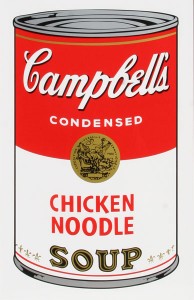
The artists I love don’t hold out a teapot to me and then, when I take hold of it, say, “Punked! It’s full of hazardous waste, you fool!” So much of what has passed for art, starting with Duchamp, seems to work this way. Either it’s supposed to look like junk, but really be a thing of beauty, or vice versa. Either way, somebody is putting you on, widening the gap between appearance and reality. That’s pretty much the definition of a lie. Art is trickery, from the start. Always has been. Always will be. It’s only paint, and it makes you see things that aren’t there. True that. Yet I will testify that Campbell’s chicken soup has curative powers. It’s one of the great comforts of life. It isn’t as good for me as the soup we make in a stock pot here at Casa Dorsey, but it gets rid of a cold much faster. Perservatives? No doubt. Too much salt? No doubt. But I swear by it. Maybe that does make me a fool who doesn’t care about what’s really in that red and white can. Yet Warhol’s flattened image of a Campbell’s soup can makes me wonder if he’s showing me a simple, small comfort that has helped me get through some of my worst days, or if he’s mocking middle class American consumer culture, as if to say, Here you go, fool. Eat this. I don’t trust him.
Thiebaud I trust. Dine I trust. Maybe that really does make me a fool, since it’s all a trick anyway, right? Technically maybe so, but what gets conveyed doesn’t have to be tricky. The only thing that distinguishes me from the people who don’t love Rothko is that I see, and feel, how much genuine passion he put into his images–and I don’t know why I see that and others don’t. Clement Greenberg couldn’t have justified Rothko’s work that way—hey, check it, look how much he loves his color!—but it goes a long way toward explaining why someone could love Rothko and be left cold by Duchamp and all his heirs. The problem continues to be, how do you get someone to see the love Rothko put into his paint? And am I just being blind to what’s inherent in the work of big names that leave me cold? It’s the question that still hangs over the past hundred years, a question that nobody can answer in a convincing way, and it makes me wonder how much I’ve been talking myself into liking things that aren’t going to last. But then I suppose “liking things that don’t last” is pretty much what so much of life is about, as you watch each year pass a little faster than the one before it.
November 10th, 2011 by dave dorsey

Long long . . . in a land before Google
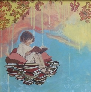
Lauren Purje, who shows at Viridian Artists and is just starting out—she shares a tiny Brooklyn apartment, sans kitchen, with two other artists, one of whom I wrote about not too long ago—has a show in December at Buffalo State University. Like the art festival in London I visited earlier this year, organized by two struggling young curators, this Buffalo show is brief. It goes up, runs a few days, then bam, it’ll be gone. It’s like that: before you know it you’re thinking, Did you guys have to leave so soon? But that’s the perfect mood for viewing Lauren’s work, which often features friendly cartoon dinosaurs, among many other haunting little line-drawn figures who cluster together for warmth or company or just the illusion of safety in a world that seems to have been evacuated overnight. (My take on Lauren is that if she could suddenly text a brontosaurus, her first words would probably be: Did you guys have to leave so soon?) Often, her scenes surround a little figure, with dots for eyes, whose no-nonsense outlines seem at odds with her romantically painted world. She’s dubious about what’s out there—and by out there, I mean in the neighborhood of Venus and Mars, not just Brooklyn. Her scenes glow with a harmless look of menace. Bad weather bleeds down from the sky in beautiful colors. A bit of quick thinking cures a bad case of the 24-hour Cartesian doubt. The silence of bush babies hanging around with their enormous eyes make it hard to sleep. That T. Rex throwing a fit just needs somebody to hold one of its tiny hands. And nobody up in here can say whether or not true love is just a binge of chemicals in the blood. Even so, little Victorian-looking children hang around, and one of them floats on a cloud of books, as far from Google as you can get. You go to Lauren’s website and her home page shows a wall with pictures of friends and words scrawled above the light switch: You are free. Be good. Be good. If I could afford a pair of wings, I’d fly off to Lauren’s world for a few days every January. A drive to Buffalo for a couple hours will have to do.
November 9th, 2011 by dave dorsey

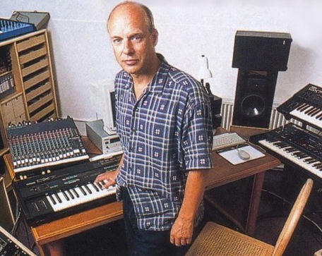
Brian Eno
“We all need to start using a different word than music for what we’re doing because it’s so different from what people were doing up until the 20th Century. With the birth of multitrack recording (music) became something much closer to painting . . . in the sense that people were saying a piece of music doesn’t have to exist before we start making it in the studio, and it doesn’t have to be done on one day. Well as soon as you have multitrack recording you can say let’s do those drums today and then put on a guitar next week and let them go back to the drums again and change the sound of it . . . so it’s much much closer to painting than to traditional music . . .
“It’s interesting to note that music students had very little impact on this . . .they were anchored to performance. But we art students thought this is like painting. Now we’re in a slightly different situation where we don’t have to do this in great big soundproof rooms with complicated microphones. We can do it in our bathrooms. The digitization of sounds allows us access to sound in really strange new ways. As soon as you transform sound into numbers, which is what you do when you digitize it, you allow it to be subject to all sorts of mathematical operations which sometimes have nothing to do with our prior experience of sound. We’ve now gone to a new level of abstraction in music. Music has always been a rather abstract form. It was a great breakthrough in painting when suddenly the subject matter could disappear. Kandinsky walked into his studio one night and saw one of his own paintings turned on its side and thought wow, what is that? He suddenly realized a picture that didn’t have a subject could still be a painting. Music has always been like that. But I think now with digitization it’s a new level of abstraction and we’re only just starting to discover what it is and what it does for us.”
Brian Eno, interviewed by Sound Opinions, 11.6.11
November 8th, 2011 by dave dorsey

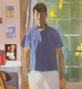
Fairfield Porter
It’s been a while since I last reread Keats. Yet I’ve always thought of his odes as the best example of the routinely remarkable synchronicity at the basis of traditional, rhyming poems. I like his famous odes as an example of this, because his two most familiar ones, on the Grecian urn and the nightingale are—at least for me—both wonderfully crafted orchestrations of sound and yet also perfectly, uniquely clear in what they mean. The beauty of their perceptions and ideas and imagery are expressed in words that also just happen to sound beautiful. What mystifies me is how the unique meaning captured by those particular words happens to rhyme in all the right places—it’s part of the wonder of poetry, how sound and meaning work together, though they would appear to be entirely unrelated. A Keats poem would sound enchanting, if spoken aloud, even to someone who doesn’t understand the language, and yet the music of those sounds has no rational connection to what the poem is saying. You couldn’t change a word without diminishing the ode; these are the only words in the only order Keats could have chosen to express what his poem means. So how is it that these words happen to rhyme in all the right places? At one level, the marvel of what these poems do is primarily sensory—it offers the purely physical pleasure of its sounds, the way they hit the eardrum, the way you imagine them humming in your own chest cavity as you read and silently recite the poem to yourself. It’s, at some level, a chant, which is far more about sound than meaning.
Something similar happens in the work of painters I love. I guess this is a long way to go to say that I favor Fairfield Porter probably more than any other American painter—and it’s largely because his work so perfectly illustrates this same duality. It’s both a way of creating a musical improvisation—the painter arranging color the way a poet composes pure sounds—and yet the orchestrated colors also happen to fall together in such a way that they show you an overlooked moment from daily life. On the one hand, the music, and on the other, the subject or “content” of the work. (I don’t think it’s an accident that many of Porter’s close friends were fairly well known poets in their day. He painted their portraits and tried his hand at poetry himself.) His work offers, for me, one of the finest examples of this duality you get in poetry, though in visual terms. Modernism made this possible, or at least it gave artists the motivation to create images that have this double life. It’s a long roll call of artists who were especially good at creating paintings that operated on both of these levels, as color became, for many of them, the actual point of the painting—Monet, Van Gogh, Gauguin, Matisse, Porter, Welliver, Thiebaud, Mattiasdottir, Fish, and countless lesser known artists over the past century and a half. In his best paintings, Vermeer anticipated all of this, setting up a scene and painting it in ways that focus on what color alone can express, while he’s also rendering a particular scene in a particular light. Rothko fits in here as well, since his subtle color consistently evokes the horizon line of landscape painting. Look at a Chuck Close from about a foot away and you’ll see nothing but a field of brilliantly colored oil paint, in grids, thickly applied, and then step back and the individual colors recede as the face comes into view, as if by accident. The work is pulling at you in two different ways, as a gorgeous physical object and also as a window through which to see what the artist saw. The “meaning” of these paintings resides in the vitality created by the tension between what you see and what you’re really getting: the physical, sensory pleasure of all that painted color and the marvel of how it all comes together in an imaginary image you recognize, both because of the color and sometimes in spite of it.
November 3rd, 2011 by dave dorsey

Chagall's chicken, Cincinatti Museum of Art
I want to be a farmer, but my wife is not on board with this. When I tell her I would be quite happy to start farming in a modest way—let’s say by growing a crop in our back yard and by purchasing two chickens to eat all of our table scraps and produce free eggs, as well as provide us with all the fertilizer we would need for our tomatoes and lettuce—Nancy does something with her face which I believe they call the evil eye in Italy, where her grandmother was born. I’ve been reading a wonderful book, Folks, This Ain’t Normal, by Joel Salatin, a man who farms in the Shenandoah Valley, and who has appeared as a colorful spokesman for genuine organic farming (not the Whole Foods kind of organic, but real organic, he likes to point out), in documentaries such as Food Inc. He wishes everyone would buy a couple chickens. Live chickens.
In a speech a few years ago, Michael Pollan, author of The Omnivore’s Dilemma, praised Salatin by calling him what Salatin calls himself: a grass farmer. Pollan offered his audience a great summary of what Salatin has built at Polyface Farms, which is essentially a natural topsoil factory. Salatin’s self-contained ecosystem produces beef, pork, poultry, rabbits and—his most valuable product—topsoil. He does nothing to create topsoil other than feed his animals. He fences off a paddock of grass, lets his cows graze on it until it’s been mown down, then, a couple days later—long enough for maggots to form in the manure but before they hatch into flies—he sets his chickens loose in the same paddock, and they eat all the maggots. In the process they add their own fertilizer to the soil as well as breaking up the manure into bits that will dissolve and feed the grass. Because the grass has been eaten down, it sheds roots, to equalize the ratio of “root to shoot,” and the dead roots are then broken down into compost by worms, insects, bacteria, viruses, fungus, all the varied life forms in the ground itself. As a result, the soil becomes richer and richer, with each passing season. The grass is his topsoil factory, fed by nothing but the waste from the cows and chickens.
All of this reminds me of painting.
Salatin always looks for ways to get two or three results from one action. It’s something that operates in a great painting: each element works in various ways as part of a whole image. Any particular line, or form, or color, has its own interest and quality, its own sense of unity, but it’s also integrated into a larger system, a bigger picture. Either as a color element in relation to other colors or in the shape it offers on the surface, or in the way lines both define a given form, in and of itself, and yet seem to complete or extend other lines related to other forms. When Salatin takes his Eggmobile (which Pollan describes as a kind of prairie schooner full of chickens) out into a paddock where the cows have grazed, they aren’t just being fed, they’re also:
1) controlling the fly population by consuming the maggots.
2) fertilizing the soil with their own waste.
3) surviving without anyone needing to provide anything but what’s already there.
Salatin does only one thing: move the animals from one place to another. He tows them or herds them into the paddock and sets them loose. Then he moves them back into their pens. That’s the extent of his intervention. In the end: grass. Big grass. A crop that would tower over your head if he let it grow, grass you could get lost in, grass that is steadily rebuilding the depleted topsoil in his valley.
I’ve been a gardener for many years, and all this time, I’ve been reminded of painting as I plant and cut and prune and feed. It’s a constant process all through the warmer months of looking and modifying what’s there, making little adjustments, starting something completely new, tossing out what isn’t working. To grow plants you need to keep adjusting and improving what’s already been done as you watch something come into view, exactly the way the image in a painting emerges. Painting or planting, you’re growing something. You’re making little adjustments that slowly enable an image to emerge, the way it happens in the garden, except that it takes less effort to grow lettuce: it emerges on its own, with very little effort, compared to what it takes to create an image of it. Either way, though, it feels as if you’re tending something with a life of its own. And, when it’s going really well, a painting seems to happen effortlessly–the way a plant produces fruit or a flower–in ways you don’t entirely expect. You’re always a little surprised by how things turn out.
October 26th, 2011 by dave dorsey

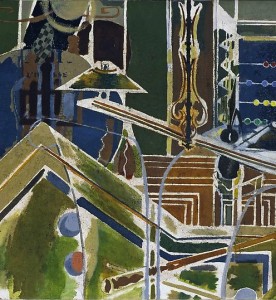
Braque's Billiard Table
I spent years looking at reproductions of Bonnard’s paintings and shrugging. I couldn’t understand what made them work. All the praise was lost on me. Then, only a few years ago, I finally stopped in front of one at MoMA, startled by the immense complexity of its color. Now I get it. Part of what woke me up was the depth of the paint: the intensity of his effort to apply color after color until he achieved something that just wouldn’t sit still as you watched it—and no reproduction even hinted at this shimmering complexity. A couple of days ago, I had an email debate with my cousin about how looking at a painting can be a tactile experience—even if all you’re doing is imagining how it would feel to touch it. Not only is that sense of a painting’s surface an integral part of what it delivers to the viewer, it makes looking at the actual work imperative, because no affordable reproduction can convey surface texture and what it does to color. Photography doesn’t even pretend to offer this sense of physical presence. Films and video are ghostly, a flickering sequence of disembodied shadows at the back of Plato’s cave. Paintings are objects in the world, something that has a physical relationship to your body. He scoffed at all of this, implying that texture and dimension have no significance in a visual medium and that current technology can produce life-sized reproductions that would convey a sense of the painting’s surface—or at least deliver everything that “mattered.” I shot back that maybe he should get out of his house and visit a museum or two, and he sent a long list of major museums around the world he had frequented in his younger days. I gave up. As long as I’ve known him, he’s never been wrong about anything. Like my wife.
Anyone who agrees with this kind of certainty about how painting works should check out the show of Braque canvases at Acquavella. It’s a fairly significant assembly of this master’s work, and it has a number of works from the middle of Braque’s career, when his genius reached its peak. If nothing else it will prove that standing a foot away from an actual Braque is a revelatory experience—he created objects, not just images, and they impart a sense of ancient provenance, with stratas of color like layers of sediment in rock. This is partly the result of the way Braque liked to mix sand into his paint, as if he were doing masonry. Like Burchfield, in America, Braque attempted to take painting into a region beyond the scope of painting, a territory populated, so far, by only one settler—both artists pushed the art form toward something beyond depiction, submerging themselves in their work to the point where their paintings seem to be offspring of the natural world rather than symbols of it. Braque’s genius was to make his images seem perfectly executed, down to the shape of every line, every color, every texture, when there’s no rational explanation for this sense of perfection. The complexity of his images shouldn’t work: they should seem ridiculously busy and cluttered, and yet they have a sense of invulnerable unity and repose. His work doesn’t mimic the world, but extracts shapes and forms from it to create something that seems both incorporeal and musical and yet as invulnerable and fixed and heavy as the striations in sandstone or granite. Picasso wouldn’t have had a clue how to reach the depths Braque excavated even on one of his off days. There’s no way to recognize this dimension of Braque’s work without seeing the paintings themselves.
October 25th, 2011 by dave dorsey

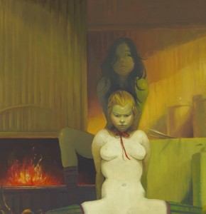
Detail from Fireplace by Lisa Yuskavage
A recent notice in The New Yorker with a title that made me laugh—Dangerous Beauty—compares a new painting by Lisa Yuskavage, Fireplace, on view now at David Swirner, to a couple paintings by Manet. It’s clearly a pastiche drawing from Olympia, and it shows what appears to be a seated sex worker naked except for her ribbon choker, backed by an attendant, or partner, with a fireplace behind her roaring with warmth. The tableau is a comfy little domesticated demimonde—exactly what Manet presented, with a smirk, in Olympia and Dejeuner sur l’herbe, a professional sort of nudity displaced into the bourgeois parlor and picnic. What was an outrage, at the time, now looks like wicked wit. In Fireplace, with the professional sangfroid of her spread legs, this temptress is more realistic than Yuskavage’s typical virtuoso performance, yet her pout is about as menacing as the work gets. Most of her paintings strike me as an adolescent fantasy which Alberto Vargas might have taught a Japanese anime artist to do on deadline for Playboy, with Russ Meyer attached for quality control. It’s caricature to mock the antiquated tropes of softcore pin-ups as a springboard to give herself license to achieve the innocently cheerful effects of light and color that actually interest her. The irony is that she needs to pretend that she’s offending you with her content in order to do, with color, something that actually just cheers you up, in a way that really does move beyond the settled boundaries of taste. The way she throws inhibition to the wind here is in her handling of color, not in the choice of subject, which is pretty tame. The danger is all in the palette. If you want something genuinely nasty, turn off SafeSearch and let Google take you by the hand and show you the way.
Critical comparisons to Vermeer are just jaw-droppingly knuckleheaded, but she isn’t too far from Fragonard’s coy eroticism. They both evoke sexual readiness as a career move, without investing much genuine emotion into anything but the execution of the work, which is impressive in her case (and was astonishing in Fragonard’s). But she seems to be satirizing—or should it be satyrizing—a harmless target. Her work feels like an amiable send-up of that old bugbear, the offending “male gaze”—but it’s the fevered stare of a 16-year-old boy circa 1967, a pimply kid who really buys into the perceptual distortions of chronic high school horniness. Everything seems unreal and weightless in Yuskavage’s world. Her girly-girls are over-ripe, vacuous fantasies. Yet they’re done in sickly-sweet colors that actually win you over, the more you see them—partly because Yuskavage has so completely surrendered to the excesses of her tongue-in-cheek kitsch. Her light and color, not her subject, have the feel of genuinely guilty pleasures. You sense that she’s giving in to the ease of her painting skills like a girl on a diet, with her bedroom door open–just try to stop me!–spooning her way through a gallon of French vanilla in a single sitting. Talk about transgressive. It’s an offense to the sophistication of coolness. The way she handles color and light is assured and energizing, and yet the outcome invariably looks more animated than alive, like the fantasies she depicts. Is this anything for her to bother herself with? I think not. The market niche she’s cornered probably overlaps a bit with John Currin’s sales region and customer base, and it’s a lucrative one. Her paintings bring six and seven figures now. The only downside to all this is that a masterfully rendered cartoon is still just a cartoon. Not that there’s anything wrong with that. But it doesn’t seem entirely out of line to wish for work where Yuskavage is as secretly invested in the subject as she is in the way she paints it.
October 21st, 2011 by dave dorsey

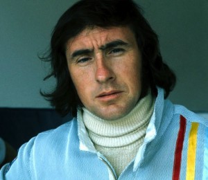
Jackie Stewart
Once again, a non-painter has expressed perfectly, for me, why painting matters. This time it’s the famous Formula 1 driver, Jackie Stewart. I finished watching Martin Scorsese’s excellent documentary, George Harrison: Living in the Material World yesterday. Late in the film, he brings in Stewart because Harrison became close friends with the driver—open-wheel racing was one of Harrison’s diverse passions, and in the movie, Stewart speculates on why this was the case. Harrison had other passions as well, none of which seem to have much relationship to the world of racing: God, cocaine, Pattie Boyd, landscape design, and Monty Python. Yet the ex-Beatle’s obsession with racing seems the one interest most closely related to Harrison’s brilliance as a musician. In the film, Stewart puts it this way:
You’re going very fast. You’re going at the absolute limit of the car’s tires, suspension, and you yourself are right there on the very edge of your own limits, taking it to the finest point. When that happens, your senses are so strong. In my case, I relate it to a real experience where I came to a corner and before I got to the corner I smelled grass. My senses were so sharp, so exaggerated, that a car had gone off the road in front of me, out of my sight. My senses told me there was something wrong. That was grass. The cars should be on the tar macadam road. So I backed off. The millisecond you’re talking about is so small. That’s what, I think, George saw (in me). That is this heightening of the senses, your feeling, your touch, your feel, your gas pedal, your brake pedal, the sensitivity to the function of those. When I talked about that, George loved that. A guitarist, how he can make that guitar talk, that is another heightening of senses beyond the ken, beyond knowledge . . .
The hint of mysticism in Stewart’s description of driving at the limit of one’s ability will ring true of anyone who has gone deeply into any physical activity to the point where the conscious mind steps aside and something else takes over, a larger and more intense state of awareness. Shooting a three pointer. Hitting a perfect chip shot. That heightened state of awareness is what, fundamentally, painting is about. It’s often a function of the amount of time required—hours, days, weeks, even months—the time devoted to just looking at something in order to capture the way light falls on it. Until you can convey what you see, without thinking. Someone looking at a painting can feel the time invested in it. You can almost see time itself, when you look at a Vermeer. What you’re really seeing is a form of meditation, a rich kind of disciplined mindfulness. And that’s primarily what’s conveyed to someone looking at a painting executed in that state of awareness. This same heightened awareness can be conveyed just as effectively in an ink-brush sketch that takes no more than an hour to do, if it’s done with that kind of total mindfulness—after years of learning how to do something with that intuitive and instinctive touch. Iris Murdoch sees this mindefulness as the basis of ethics and moral choice—as well as the foundation of great art. Aldous Huxley simply talks about heightened awareness as an end in itself. Waking up to the isness of things, the nature of what’s real, seemed to be, for him, the whole point of being alive.
October 20th, 2011 by dave dorsey

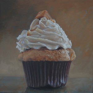
Caramel Cupcake
I’m taking a break from painting a cupcake this morning, partly because I keep second-guessing what I’m doing. I ought to be completely engrossed in the task at hand, because, I have to be honest, I find a cupcake visually intriguing. It offers nice contrasts—light and dark, straight and curved, soft and hard—a perfect subject for the study of all the basics of representational painting. Light, color, value, form, line. It’s a strange fusion of different kinds of texture and pattern, the prickly and rigid cup, a soft spongy pedestal of cake straining to hold up the coiled icing. It’s all decadent and excessive and tempting, crowned with its little sugary redunancy of candy or cookie. The whole thing is just plain bad for you. It has no redeeming value. It’s a little example of superfluous luxury—like art itself, in that respect. In fact, as you paint an image of one, you feel as if you’re looking at a tiny sculpture, with all those voluptuous curves. You fight the urge to quit painting and just stuff it into your mouth. (Occasionally, the relationship between artist and sitter can get complicated.)
So, in a way, it’s a perfect test of what I believe about painting—that the subject, the content, should have little or no metaphoric significance. You communicate in the way you paint more than through the subject you pick. The more an artist intentionally invests “meaning” into what he’s doing, the more skeptical I am about the final result. Painting, for me, is primarily about light and color and paint—which are the properties that convey an awareness, a feeling, in silence. When Ed Ruscha paints a shred of rubber tire alongside other trash he’s found on a highway, and doesn’t superimpose any words on top of it, I perk up: I’m drawn to the way he presents it, without needing to even know what he’s depicting. But then he titles his work Psycho Spaghetti Western, and I think, oh here we go again. It seems the title is meant to surround the image with dark, sophisticated hints about the decline of the West, the disintegration of our culture, the economic calamity we’re just barely holding off. Why can’t it just be a picture of trash, which is accurately rendered and yet looks gorgeous in a way you feel you’ve never seen before? Why isn’t that enough? The fact that he can create a simple, powerful and elegant image out of such meaningless material: now that’s painting. All of which is to say a cupcake should be the perfect test: you can’t get pretentious about something that has virtually no nutritional value, can you? Well, on second thought, you can get pretentious about anything, if you try. About five cupcakes into this series, as I was painting, I had what I thought was a little epiphany: what if I were to put together a solo exhibit of nothing but cupcakes (I suppose I could throw in a few other sweets) and call it Let Them Eat Cupcakes. This struck me, at the time, as a clever way to intellectually justify the act of painting a cupcake—which, let’s be honest, could be the perfect symbol for so much of what’s wrong with our world right now. (After I finished a large painting of a peanut butter cupcake last year, I wrote to a friend and said something to the effect that it reminded me of a delicacy that might have been served to guests at Versailles a couple centuries ago. Say, oh, around 1780. Something Marie Antoinette might have ordered up by the dozen. The parallels between that decade in France and the one we’ve living through right now can’t be lost on anyone. Did you know there’s a reality show on cable called Cupcake Wars? Meanwhile check the current state of unemployment.)
Well, if I ever do put together a show of cupcakes, I’m more likely to call it La Dolce Vita, but maybe you could take that in a sardonic way as well. I still believe a great painting should follow the same rule that used to apply to kids at the dinner table: it should be seen, not heard.
October 19th, 2011 by dave dorsey

Magic from T.E.D.
A little three-card monte from Marco Tempest at T.E.D.:
“Debussy said art is the greatest deception of all. Art is deception that creates real emotion. Art creates a lie that creates the truth. When you give yourself over to that deception it becomes magic.”
October 17th, 2011 by dave dorsey

Matisse cutout wounded in cover shooting
You never know where Matisse is going to turn up, this time with a gunshot through the heart. Why oh why couldn’t something by Jeff Koons have been wandering around that part of Philly? The new Roots album apparently drops on Dec. 6, according to an email alert from Okayplayer. The link took me to an image of what looks like an album cover but maybe it’s only there to promote the leaked single, Make My. I expect my favorites will probably remain Illadelph Halflife and Things Fall Apart. I just sighed, thinking about how long it’s been since I discovered those albums. I’m going to have to ask time’s winged chariot to go ahead and stop accelerating now. Meanwhile, I’ll just listen to the new Wilco again, which is at least one reason to cheer about the fact that it’s 2011 already.
October 16th, 2011 by dave dorsey

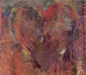
Blue Clamp Jim Dine
In the most recent Art in America, the editors called out a quote from Ed Ruscha about painting which has been nagging at me: “I’m still puzzled about my own work when it comes to painting—whether it’s really that necessary to believe in this great ideal of the painter’s painter and the idea of spreading paint on a canvas. I question all of that.” Ruscha’s work as a pure painter can be tremendously impressive, the simplicity and scale of his imagery, so stripped of emotion and seemingly devoid of context—his imagery is monumental, impersonal, and mysterious in a cerebral but fascinating way. One might almost say Cartesian in the way each painting seems absolutely sure of one thing: its own existence. When he superimposes text—his little Zen koans that aren’t meant to enlighten—the mysteries thin out toward a supercool ambiguity, like lines out of John Ashbery, so resonant when you read them until they self-destruct when you try to investigate a little further. Nothing wrong with that, but puzzlement gets old when awe doesn’t make you forget about trying to understand what you’re seeing. And Ruscha’s word paintings are too intentionally sardonic to evoke awe. They have Pop’s detached, self-cancelling reserve, suggesting a skeptical perspective on popular culture without ever letting you in on the joke. Ruscha’s precision, the way he makes you forget you’re looking at paint is part of what gives his huge paintings, the wordless ones, so much power, so it’s understandable he might decide to dispense with paint altogether.
The fascination of painting, first and foremost, is the sheer physicality of paint. Many of the greatest paintings revel in their ability to rub your nose in the nature of the medium on a given surface, the way it slides, clumps, and flows, thick as icing on a cake or thin as wax on a car—all of this while the paint makes you imagine something else, even if it’s as indistinct as a Rothko horizon line. This double-vision—the way a painting can make you see paint qua paint, while, at the same time, evoking an illusion of something that isn’t really there—that’s the magic. When Ruscha makes the paint irrelevant, when he makes you see only what he means for you to see and forget what you’re actually looking at, then he might as well dispense with paint. And that’s a perfectly acceptable choice. Spreading paint is simply a choice, but a choice that points toward a sort of surrender you don’t find in Ruscha’s work—a surrender to the medium where it’s allowed to contribute in ways that can’t be entirely controlled or anticipated. De Kooning made this surrender the central impetus of his work, yet go back centuries and you’ll see this duplicity, this fascination with the luxuriance of paint itself, as well as for the way it can let you see beyond it. It’s there, again and again, at the center of an artist’s mission, this duplicity. Bacon says somewhere, to comment on his indebtedness to Velasquez, that the texture of paint on a canvas—simply the way it’s handled—can have a direct, subconscious effect on the nervous system of someone who looks at the painting. That comment was his way of saluting the glories of brushwork in a typical Velasquez, and you can see how Bacon’s own handling of paint derives from it. Think of the artists whose discipline was to “push paint around” in his or her own unique way—a phrase Peter Schjeldahl used to describe Soutine’s technique. Braque, Van Gogh, Bacon, Freud, Sargent, Manet, Hals, Chardin, Vermeer, Matisse, Porter, Bonnard, de Kooning, Thiebaud, Sickert, Dine, El Greco, Saville, Kiefer, Innes—I’ll stop, but the list keeps going. Select a painting from each of those artists and turn it upside down—to nullify the image you’re meant to see through the paint—and just observe the surface, and it’s obvious how each artist imparted a unique feel for anyone viewing the canvas, simply in the way each applied paint to the surface. The texture produces a certain kind of purely physical experience. They all learned how to get paint to do things on its own and to make the almost tactile sensation of looking at paint a part of the mission. The list of artists who don’t do this—those whose genius emerged primarily in watercolor like Blake and Klee and Burchfield—might be just as long. But I think, to say the least, we’ve moved beyond the point where we think rendering an image in paint is the ultimate ideal for art, since we just emerged from a long dark period where painting was left for dead. Even so, it’s nice to hear somebody still talk about “the ideal of the painter’s painter.” If you want to be in total control of the process, of the final image, by all means, toss out the acrylic, the enamel, the oil, the brushes and knives and the rags. Yet the act of painting is as much about the body as it is about the mind. If you want a medium that has a life of its own, conveying the purely physical qualities of the object and the unexpected quirks imparted by the movements of fingers, hands, arms—and maybe even the legs, in the case of Pollock—then you can’t do any better than work in oil.
