Archive Page 36
December 17th, 2013 by dave dorsey
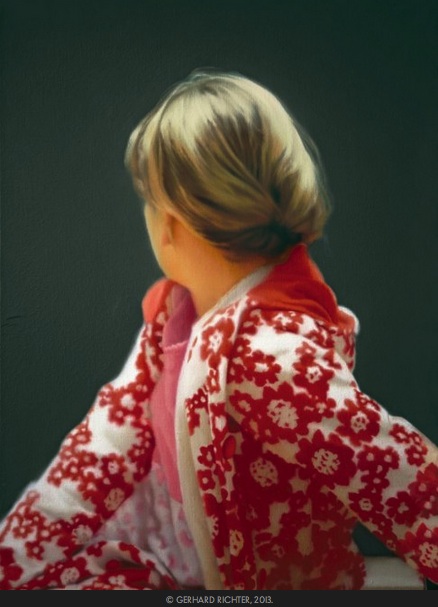
Betty, Gerhard Richter, 1988, oil on canvas
A poll among artists to identify who are the greatest living artists. Some, of course, voted for themselves. Vanity Fair suggests the artists hardest to pin down stylistically may be the most suited to the moment:
No doubt many respected artists who received few or no votes would have done better if the voters had been asked to name 10 rather than 6 artists. But establishing a cutoff was the point: it forced voters to define this moment’s priorities. The rather weak showing of artists who can be easily defined—as a “painter,” for example, or a “photographer”—is a defining part of the portrait. (Those artists would have done better in a larger sampling.) What, after all, would you call Nauman,Sherman, or Hammons? What is Weiwei? Or Kentridge? Are Baldessari and Ruscha only painters? Conceptual art doesn’t cover it. The phrase is a meaningless catchall. The preference for artists who are not tied to one genre or another, or who move among genres, reflects an impatience with customary boundaries and scales, perhaps because staying within the lines seems an insufficient response to today’s world. Floaters—and Richter and Johns, despite being painters, have a lot of “float” in their sensibilities—can more easily piece together a postmodern “I” that seems to fit the moment.
December 15th, 2013 by dave dorsey
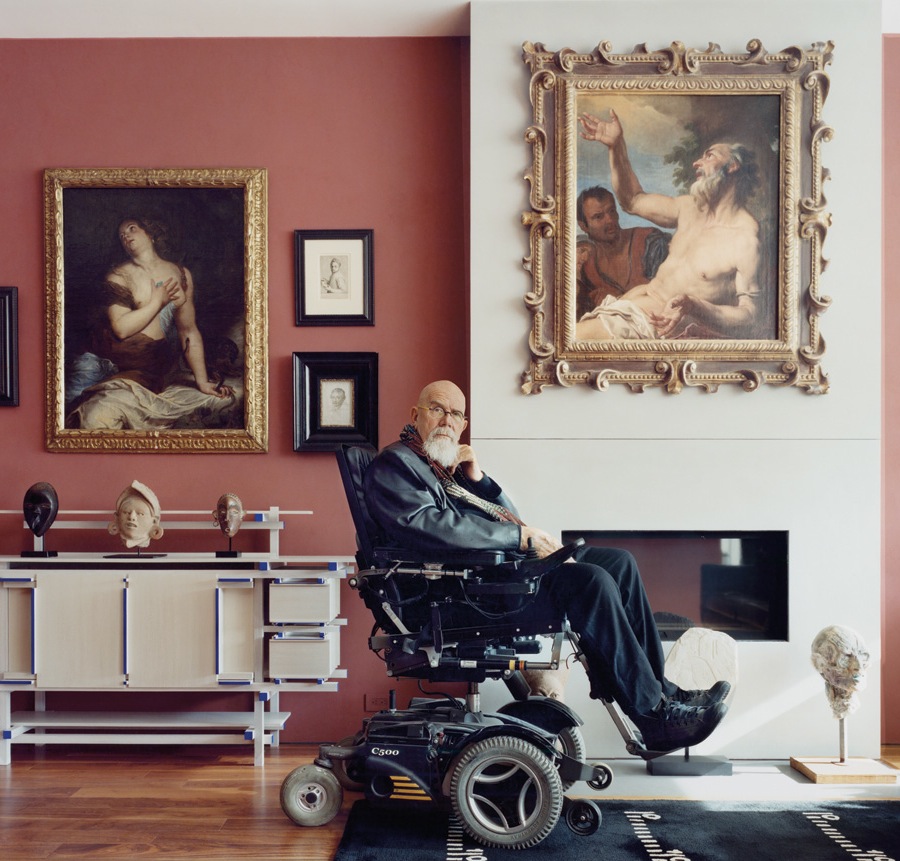
Chuck Close with his collection
From a NYTimes article about what famous artists collect. I want to ask Koons, if art is just about sex, what’s up with the word “transcendence”?
Jeff Koons
When Jeff Koons speaks about the “biological” subtext of his art, he’s alluding to the sexual references embedded within. (Think of the hoses and tanks of his vacuum cleaners, the crevices and shanks of his stainless steel balloon figures.) When Koons looks at the art he collects — old and modern masters including Picasso, Dalí and Courbet — he sees much the same thing.
The composition of a William-Adolphe Bouguereau nude that welcomes visitors to the Upper East Side townhouse he shares with his wife, Justine, and their six children is “vaginal,” he says, while a Manet painting of a boat displays “aspects of boat gender.” (To Koons, ships are metaphors for sexuality.) The Picasso portrait in his living room combines the faces of two women. “The whole thing is phallic.” In his bedroom, where nearly every painting — by Poussin, Magritte, Fragonard and more — is a celebration of desire, another Picasso depicting the artist making love is “about conquest, both artistic and sexual.”
If it seems as if he has a one-track mind, let it be said that the art in his possession affects his whole being. “I think art is about transcendence and consciousness, making connections to things in the world.”
Chuck Close
The living room of (Chuck Close’s) NoHo apartment doubles as a gallery for Dutch, Flemish and Italian old masters like van Dyck, Rembrandt, Titian and Tintoretto, as well as for African art.
A white marble bust of Hadrian, carved from life in the second century A.D., sits near a window, while a gilded Italian altarpiece, dated 1310, hangs over a Gerrit Rietveld cabinet. “When I studied Greek and Roman art,” Close says, “I didn’t know or care who the subjects were. Now I’m thinking, Hey, who’s Hadrian? Turns out he was a gay emperor. And a pacifist.”
Close, who is 73, . . . says, “I’m not acquisitive.” Yet on either side of an interior hallway are dozens of portraits, small drawings, photographs and paintings, many by artists Close has painted. They include Willem de Kooning, Eric Fischl, Cindy Sherman, Irving Penn and Alex Katz, as well as Jacob Lawrence, Diane Arbus and Man Ray. Most were trades, though a cut-paper collage by Ray Johnson was a purchase. One section of the work is blank, removed by the artist after Close requested a 20 percent discount. “Contemporary art is the most overpriced, overvalued stuff — thank God,” he says. “But old masters are the most powerful.”
December 11th, 2013 by dave dorsey
Martin Mull
AVC: By the way, did you really coin the expression “writing about music is like dancing about architecture,” as has been suggested on occasion?
Martin Mull: You know, I believe I had heard that as an apocryphal story, that “talking about art is like dancing about architecture.” Apparently, it had happened at a lecture at Pratt Institute, in New York.
–A.V. Club
Herewith, another little dance about architecture. In a previous post, I quoted a passage about the British philosopher Iris Murdoch from a book by another author, Matthew Crawford:
Iris Murdoch writes that to respond to the world justly, you first have to perceive it clearly, and this requires a kind of “unselfing.” “Anything which alters consciousness in the direction of unselfishness, objectivity and realism is to be connected with virtue.” “Virtue is the attempt to pierce the veil of selfish consciousness and join the world as it really is.” This attempt is never fully successful, because we are preoccupied with our own concerns. But getting outside her own head is the task the artist sets herself . . .
I’ve been thinking about it again, while writing recently about the way I paint and how diligently Tim Jenison worked to create a painting equal to Vermeer’s work. These lines of thought came together in the notion that for a representational artist, art is largely a matter of copying: mimesis. To make a charcoal line on paper come alive as a tiger or a gun or a flower is to submit to the ordeal of copying what’s already the case in the world. My post on Vermeer addressed how Vermeer copied what he saw as effectively as any painter who ever lived, but he also did more than copy, by ordering what he saw and undoubtedly altering it, in paint, to unify his vision. But copying was, by and large, the mission. To labor for long periods of time at the job of copying is the drudgery but also the joy of being a painter.
All of these thoughts returned, again, while I listened to MORE
December 11th, 2013 by dave dorsey
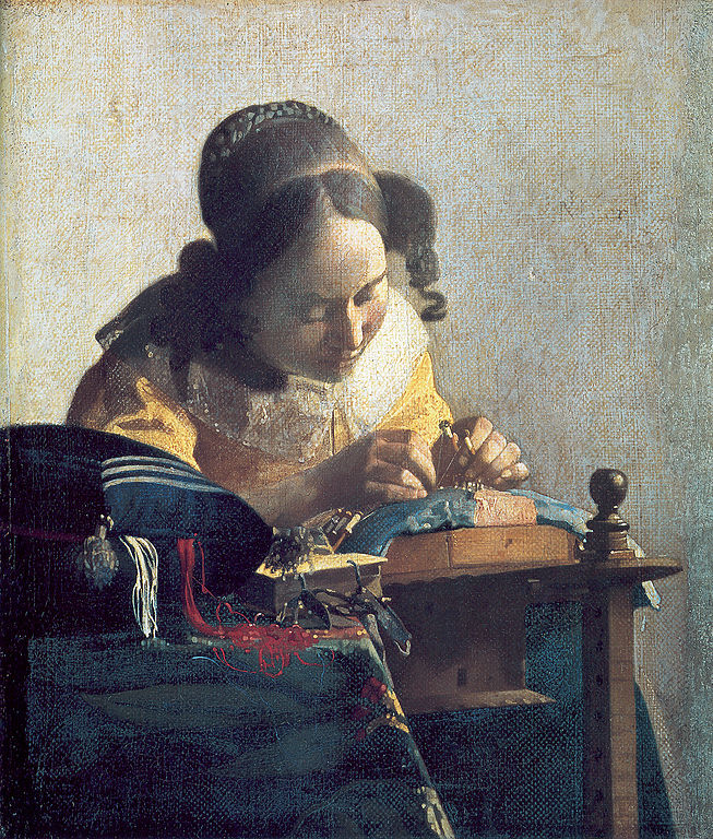
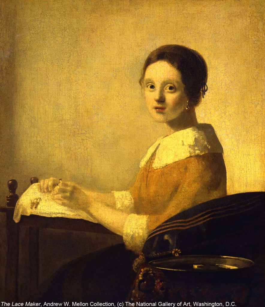
THE LACEMAKER
9 5/8 x 8 1/4 in.
This is astute: the reference to Aldous Huxley and the recognition that Vermeer was, like an abstractionist, obsessed with the quality of the paint on the surface, entirely apart form what it was meant to represent. This is the crux: “It was because for Vermeer his later pictures all have a second kind of subject matter: that is, the effects of light, shadow, colour and tone. All realist painters seek to capture these luminous attributes of appearances, of course; but for Vermeer they become subjects in themselves, as much as they are means to the representation of human faces or satin jackets or carpet-covered tables.” His slavish, devoted use of a camera obscura to copy what he saw enabled him to change the way he saw as he conveyed it with paint. As Steadman suggests: he separated seeing from recognizing. Therefore, everything looks new in his best paintings.
Herewith, from The Essential Vermeer, in relation to the documentary Tim’s Vermeer:
Philip Steadman’s meticulous investigation and lucid argumentation regarding Vermeer’s use of the camera obscura eventually brought almost all art historians onboard his not-easy to-digest hypothesis (i.e. Vermeer used the camera and traced with it too), no easy trick for an art history outsider.
Do you feel that Vermeer’s use of the camera obscura as described in your book necessitates a revision of the artist’s expressive intentions or of his place within Dutch seventeenth-century philosophic, scientific or cultural context?
Steadman: This is at once the most interesting of your questions, and the most difficult to answer. The changes to widely accepted views of Vermeer, necessitated by a recognition of his extensive use of the camera, are confined I believe just to certain aspects of his work, while others remain quite unaffected. The ostensible subject matter of Vermeer’s pictures from 1657 onwards does not depart very greatly from the 17th century Dutch genre tradition in which he worked. We read the pictures as variants of standard themes – scholars in their studies, the artist in his studio, women reading love letters, ‘merry companies’ – although with Vermeer there is often a tranquillity and melancholy, where say in Jan Steen there would be rumbustiousness and chaos. Vermeer is never obvious, and it can be difficult to gauge the exact psychological relationships between his sitters, as in pictures like ‘The Music Lesson’ or ‘The Concert’. His arrangements of figures, and the activities in which they engage, are nevertheless not so different from equivalent works by his contemporaries. So far as allegory and symbolism go, Vermeer again conforms to accepted meanings, albeit with a large element on occasion of ambiguity and elusiveness. The 2001 New York/ London exhibition ‘Vermeer and the Delft School’ sought to situate Vermeer within his local artistic milieu in exactly these kinds of terms.
For many visitors to that exhibition however, the curators’ central premise was undermined by the fact that, set alongside Pieter de Hooch, the Delft architectural painters, even Fabritius, Vermeer did not seem to be a member of any ‘school’. On the contrary, his pictures stood out by their strangeness and their radically different visual ‘feel’. This was not just because of Vermeer’s superior powers as a painter, I would suggest. It was because for Vermeer his later pictures all have a second kind of subject matter: that is, the effects of light, shadow, colour and tone. All realist painters seek to capture these luminous attributes of appearances, of course; but for Vermeer they become subjects in themselves, as much as they are means to the representation of human faces or satin jackets or carpet-covered tables. It is in the response to these optical phenomena that the wider scientific and cultural significance of Vermeer’s camera technique lies.
In my book I quoted Lawrence Gowing who says that “Vermeer is alone in putting [the camera obscura] to the service of style rather than the accumulation of facts.” For Vermeer, that is to say, the camera was not merely a tool for achieving correct perspective or for refining composition. It was both these things, certainly; but much more important, it was the key to a whole new way of seeing. The camera was, for Vermeer, an instrument through which to gain a new vision of the world at the scale of the everyday, just as the telescope and the microscope were instruments for gaining new views of the worlds of the very large and the very small.
Vermeer was a supremely intelligent painter, perhaps one should say an intellectual painter; but at the same time he had I believe an extraordinary capacity for switching between this intellectualised, rational eye, and what one might call a perfectly ‘idiotic’ eye, with which he was able to see luminous patches of hue and tone, quite independent of the real-world objects from which they emanated. As Gowing puts it, in this mode of seeing, “Vermeer seems almost not to care, or not even to know, what it is that he is painting. What do men call this wedge of light? A nose? A finger? What do we know of its shape? To Vermeer none of this matters, the conceptual world of names and knowledge is forgotten, nothing concerns him but what is visible, the tone, the wedge of light.” Aldous Huxley in his book The Doors of Perception describes the world seen under the influence of mescalin as being like a painting by Vermeer: “Things without pretensions, satisfied to be merely themselves, sufficient in their suchness, not acting a part, not trying, insanely, to go it alone…” The drug, as one might say, switches off the higher-level powers of conceptualisation, leaving the eye to see just light and colour – as the painter was able to do without the benefit of artificial stimulants.
I was recently much struck by a passage from the 18th century Scottish philosopher Thomas Reid, who speaks of the general habit of the human mind to move extremely rapidly, from the reception of stimuli in the eye, to mental interpretations of those stimuli in terms of known objects in the world. “The mind has acquired a confirmed and inveterate habit of inattention to [the luminous stimuli]; for they no sooner appear than quick as lightning the thing signified succeeds, and engrosses all our regard…” The only profession in life in which it is necessary, by training the eye and mind, to break this process apart – to separate seeing from recognising – Reid says, is painting. “The painter hath occasion for an abstraction, with regard to visible objects… and this is indeed the most difficult part of his art. For it is evident, that if he could fix in his imagination the visible appearance of objects, without confounding it with the things signified by that appearance, it would be as easy for him to paint from the life, and to give every figure its proper shading and relief, and its perspective proportions, as it is to paint from a copy.”
December 9th, 2013 by dave dorsey
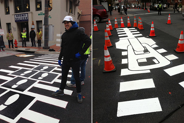
Walk this way
Artists design Baltimore’s crosswalks. Like it.
December 7th, 2013 by dave dorsey
Tim Jenison’s marvelous attempt at Vermeer
Reader advisory: I’ve been slacking on this blog, because I haven’t had time to write. So I’m going to make up for it here and go on and on at lengths nobody but me will want to finish reading. If I actually finish, uh, writing it. So, herewith, another post on Vermeer. Ironically, seeing Girl with a Pearl Earring at the Frick, along with three other works from the greatest Dutch master, isn’t what made me want to write about Vermeer again. Nor did I get the urge to write about probably the greatest Western painter in history (who was ignored for a couple centuries) after hearing, by contrast, how so much lesser art is selling like gourmet hotcakes in Miami right now. The itch to write this actually began while I was finishing up a month of work on a recent painting for my solo show next May at Viridian Artists.
Two things occurred to me as I kept returning to the canvas every morning: I spend much of my time thinking my purpose is to match my paint to what I see on a computer screen off to the side of my canvas. I copy as dutifully as a monk with a quill and some parchment and a tome on comedy from Aristotle. Usually, a digital photograph I’ve taken serves as the guide. I look at the photograph. Then I look at the canvas. I try to make them match. Repeat, repeat, repeat. I do this for days, weeks, or months. With this last painting, I realized, as I always do when I pay attention, how much more I’m doing than simply copying what I see. I’m continuously altering all sorts of things: the exact hue of an object or area, the level of detail, and even the shape of certain patches of color or value. Occasionally I improve elements that aren’t there in the photograph, and, more often, remove things that are there. Often I make significant changes to color: intensifying a yellow or orange, compared to what’s in the photograph, MORE
December 5th, 2013 by dave dorsey
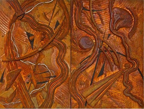
Ebb and Flow, Arthur Dworin
Arthur Dworin’s current constructions on view at Viridian are an exploration, in three dimensions, of forms that have occupied him for many years in his paintings. The organic and geometric shapes that populate his colorful work in the recent past are raised off the surface now and coated with an iron-rich medium that he then rusts to produce a more uniform brown that ranges from sienna to orange. Like Kandinsky, Dworin’s improvisations with form and shape are meant to resonate with his own spiritual explorations, in his case yoga. As he puts it, he hopes that, “The spirit in these works will act as a key to awaken what is already deep within the observer and anew with each viewing, bring a greater awareness of our inner and outer universe.” One of his collectors, Peter Selz, former curator of painting and sculpture for MoMA, has said of his paintings, “Abstract as they are, they bring a new sense of visual order to organic forms of nature.”
After the Viridian board meeting a week ago, I had a chance to ask Dworin a few questions about his work.
How do you build up the surface exactly?
There’s something called Magic Sculpt which is a safe, two-part putty and it hardens like a rock . You can carve it.
What do you use for a support?
Masonite, with one-by-two poplar. The surface is gesso-ed and then there are areas taped off before I put in the texture with Golden molding paste and Golden matte gel. The blocks are pumice and then there are areas where I put the paint on and shred urethane foam into it to get the texture. Finally, I spread on a high-iron content coating.
Which rusts.
Yes, I call these Swords to Ploughshares because it looks like MORE
December 3rd, 2013 by dave dorsey
Art is what happens when you’re making other plans for money.
“This talk of “a subject they love” brings us to the real crisis, which is both economic and cultural (or even moral). The point of work should not be just to provide the material goods we need to survive. Since work typically takes the largest part of our time, it should also be an important part of what gives our life meaning. Our economic system works well for those who find meaning in economic competition and the material rewards it brings. To a lesser but still significant extent, our system provides meaningful work in service professions (like health and social work) for those fulfilled by helping people in great need. But for those with humanistic and artistic life interests, our economic system has almost nothing to offer.
Or rather, it has a great deal to offer but only for a privileged elite (the cultural parallel to our economic upper class) who have had the ability and luck to reach the highest levels of humanistic achievement. If you have (in Pierre Bourdieu’s useful term) the “cultural capital” to gain a tenured professorship at a university, play regularly in a major symphony orchestra or write mega best sellers, you can earn an excellent living doing what you love. Short of that, you must pursue your passion on the side.”
—Gary Gutting, NYTimes
November 30th, 2013 by dave dorsey

Intrepid art lovers properly attired outside the Frick, in 20 degree chill with 40 mph gusts of wind. Some waited an hour.
More than ten percent of all 34 (maybe 35) Vermeers in existence are on view right now at The Frick. It’s a little show, a tour of 15 paintings from the Dutch Golden Age, on loan from The Hague, yet it’s a powerful and enlightening one. I’ve seen about half of all Vermeers in the world. The Metropolitan offered 15 of them in 2001 and then The Milkmaid, all by her ownself, in 2009. So, yeah, maybe I could have skipped this one. I hear that. But this show taught me a thing or two, or three, about Hals and Rembrandt, and introduced me to Jan Steen, whose work felt the most contemporary, out of everything in the show. Plus the goldfinch Donna Tartt is making famous at the moment. Most of all, though, when you surround this show with The Frick’s permanent collection, it’s a rare chance to see four Vermeers at once, and it’s a truth universally acknowledged that one can never get too much of Vermeer. The Girl with a Pearl Earring has a room all to herself, as The Milkmaid did. In the room adjacent are the three from the permanent collection. I hope to write at more length about what I saw here when the necessity of word smithing for my supper lightens up, if ever.
I stood in line for 40 minutes with at least 60 other shivering and likemindedly unhinged art lovers last week, with temperatures around 20 in New York City, and 40 mph gusts driving wind chills down to around zero. With my typical worldly foresight, I wore a wool sweater covered with a fleece, clothing options that should have sentenced me to the fate of this frog. But to my credit I thought to climb into some thermal underwear at the last minute before my friends and I headed into the city from New Jersey. ( I’d brought the underwear in case I decided on an outdoor run in the morning.) It felt as if those skivvies saved my ass, as well as a few other more expendable parts. Bottom line: the show was worth the painful wait. What did we learn this week? Most of that, that even old, old art, if it’s great, still draws crowds that require scheduled admission into a museum. Give the human race a chance, and it will always make you believe that what once mattered still matters. Makes me want to paint, right?
November 26th, 2013 by dave dorsey
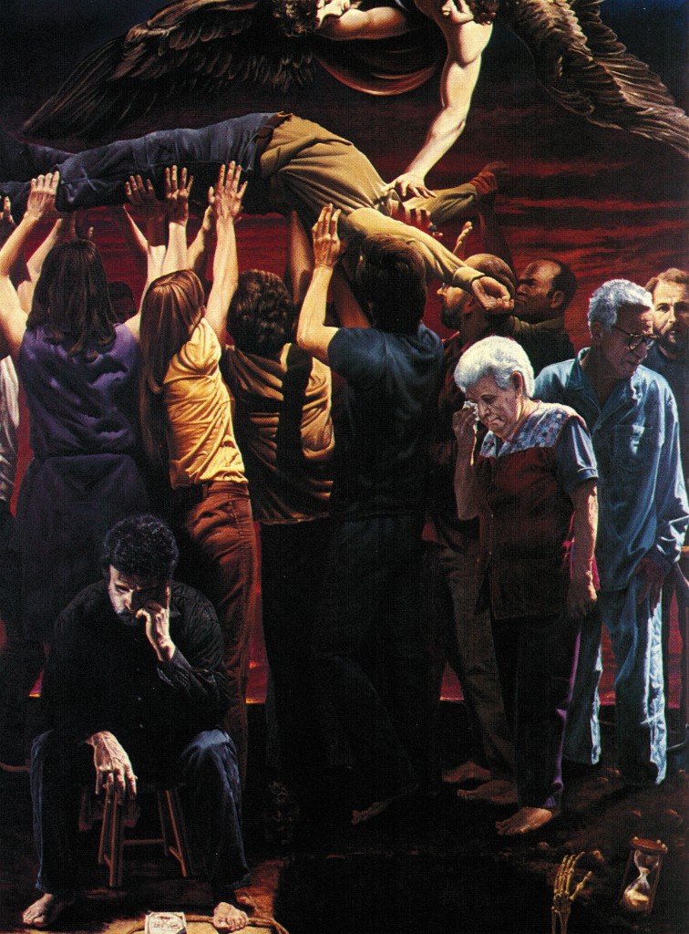
Dedication No. 3, Tom Insalaco, oil in canvas, 104″ x 79″
Hoping to get a look at the actual painting soon at Tom’s studio in Canandaigua. It’s one of three monumental oils he did a couple decades ago, while he was still wrestling with the absurd murder of his brother, Robert, a deputy sheriff who was serving a warrant in 1987. Tom’s brother died instantly when the naked suspect opened the door and shot him in the head. This painting’s full title: Dedication No. 3, Man’s final resting place is in the hearts and minds of other men.
November 24th, 2013 by dave dorsey

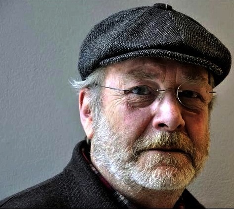
Grant Holcomb, director, Memorial Art Gallery
I learned yesterday that Grant Holcomb is retiring from his position as director of the Memorial Art Gallery here in Rochester, after nearly thirty years of service to the museum. He’s been ambivalent about concluding his tenure at MAG for many years, but now that he’s pulled the trigger he sounds happy to embark on his next chapter. And he isn’t completely disappearing from the organization. He’s going to stay in Rochester, continue to participate with MAG and, well, write a few books. Speaking of next chapters. (By the way, thanks for making me feel like a slacker, Grant.) What surprised me is that only one of his books will be about art: a catalog exploring the 2009 MAG exhibition “Lincoln in Rochester.” That’s definitely up his alley. He’s been a Lincoln geek, in the best sense of that word, for most of his life, and he can summon up almost anything about America’s greatest president at will. One of the other books he’s planning will be about Ed Crone, a Rochester man who was a prisoner of war with Kurt Vonnegut in Germany and became the inspiration for Billy Pilgrim in Slaughterhouse Five. Finally, he wants to write a book about the Los Angeles of Raymond Chandler’s Marlowe detective novels. In other words, his plate will be as full as it has been at MAG all these years.
A couple days ago, he sent me his prepared remarks when he announced his departure (as of next July) to his board and staff. It made me laugh out loud a couple times, yet the humble, appreciative quality of his words are emblematic of his personality and beloved leadership. In their own way his words reflect, in places, why most painters get up every day, or nearly every day, and try to make art. Part of why he’s going to be deeply missed at MAG is easily discerned in what he says here:
If I refer to my notes and keep drinking from a bottle of water, forgive me and remember that even Brett Favre choked up when he retired, as did Peyton Manning when he was traded. In fact, knowing this would be a difficult message for me to convey, I googled “How to Announce Your Retirement with Dignity” and what popped up was “Three Early Signs of Dementia.” I feel a bit like Lincoln when he faced an emotional trial . . . he said, “I feel like the young boy who stubbed his toe and said, ‘It hurts too much to laugh, and I’m too big to cry.’”
I was recently told that, today, the average tenture of an art museum director is four years—to extend that tenure by a factor of seven is due to the quality of the people I have worked with for now close to three decades. Early one morning this summer, I walked the Centennial Sculpture Park with a cup of coffee in hand. Starting at the western end, I approached the lyrical sculpture of George Rickey, swept by the “Unicorns” of Wendell Castle and looked beyond to the open grounds and the elegance of Jackie Ferrara’s sidewalks and the playful delight of the Otterness Plaza. Walking east, I turned the corner and looked north to see what I consider to be one of the best works by Albert Paley.
I knew right then that together we had created a magical, poetic, in fact, award-winning Sculpture Park. Together we have left a lasting legacy for both the Gallery and this community. I knew the timing was right (for retirement) when Dana Gioia spoke at the Gallery ten days ago. This was not only our last major Centennial event, it was an event that wrapped up everything we have worked for, cared about, and treasured together—the importance of the arts to our lives as individuals, as members of the community. Gioia spoke of Shakespeare’s “sweet . . . lessons of adversity” and he intoned Dosoevsky’s belief that “beauty will save the world.” The Centennial Year of the Memorial Art Gallery ended on not only a high note but the perfect note. This staff and board have enriched my life. You have enriched the lives of my children. And you have even enriched the lives of two of my ex-wives! I owe you so very much.
Beauty may help save us, but only if people like Grant are returning the favor, now and then.
November 22nd, 2013 by dave dorsey

The Way You Hear It Is The Way You Sing It, Jan Steen
On Sunday, on another visit to New York City, I’m heading to the Frick with a couple friends from New Jersey to see the Vermeers and this painting in particular, on tour from the Royal Picture Gallery Mauritshuis in The Hague. At first glance I thought it was a remarkably precise Hals, for a number of reasons, but then discovered otherwise. It’s more or less an illustration of a Dutch proverb about parental responsibility, which more than one painter interpreted in similar scenes of domestic partying. The title comes from a Dutch proverb: ‘as the old sing, so pipe the young’ (soo voer gesongen, soo na gepepen). (What you do in front of the kids.) The motivation behind this sort of painting is almost the antithesis of what drives me to paint: it’s symbolic, narrative, moralistic, and essentially conceptual. Yet the way it’s executed, the color, and especially the light, is remarkable, at least in this photograph. I’m hoping they’re even more impressive when I’m standing in front of it.
November 20th, 2013 by dave dorsey
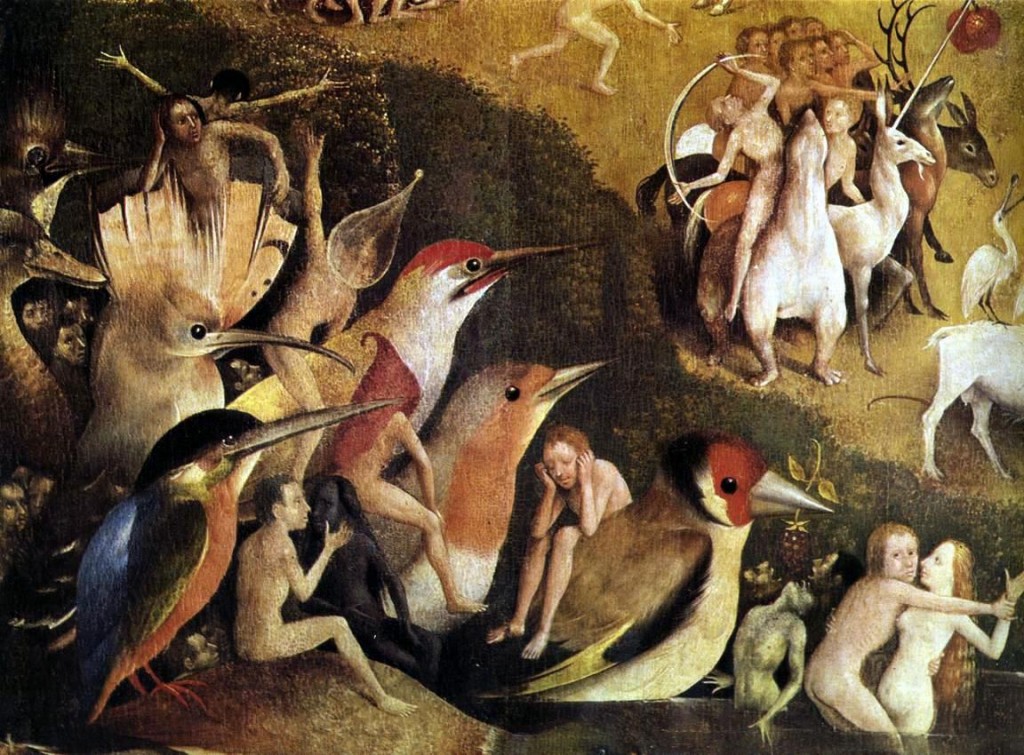
The Garden of Earthly Delights, detail, Hieronymous Bosch
“. . .just because you have looked at [a painting] does not mean that you have seen it. Just because something is available instantly to vision does not mean that it is available instantly to consciousness. Or, in slightly more general terms: access is not synonymous with learning. What turns access into learning is time and strategic patience.” –Jessica Lahey, The Atlantic
November 18th, 2013 by dave dorsey
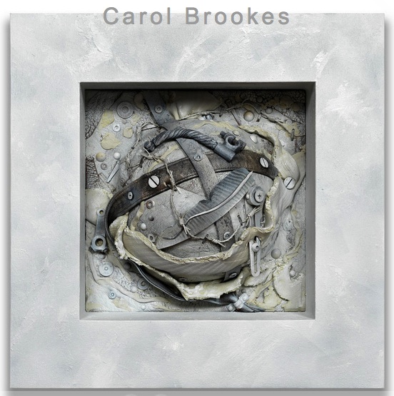
The amazingly prolific Carol Brookes, a fellow Viridian artist, has an opening Dec. 7 at Troy Fine Arts Services, in Southport, Connecticut.
November 15th, 2013 by dave dorsey

Nice of Jeep to make us aware of Mr. Dylan’s early adoption of Blind Willie Johnson. Dylan uses Johnson. Jeep uses Dylan. Something gets obscured the second time around, but not much, if you just quit looking at the flat screen. Does it make sense to watch a Cherokee moving around while Dylan sings about how God doesn’t treat him as well as a mother would? Not much. But I wouldn’t have heard the song without the commercial. I can’t afford a new Jeep, but I like the soundtrack to the invitation. Whenever I hear this recording from now on, I guarantee I will never think of a Jeep. Just as I never think of Volkswagen–though I do think of fireflies–when I hear “Pink Moon.”
November 13th, 2013 by dave dorsey
Vermeer forgery
This is quite nice, from Schjeldahl:
What do we see when we look at a painting? Decisions. Stroke by stroke, the painter did something rather than something else, a sequence of choices that add up to a general effect. If you’re like me—and, yes, I count myself a middling connoisseur—you register the effect and then investigate how it was achieved; walking the cat back, as they say in espionage. As a trick, ask yourself, of details in a painting, something like, “Why would I have done that in that way?” The aim is to enter into the mind, and the heart, of the creator. Attaining it entails trust, like that of a child attending a fairy tale.
Looking with this kind of absorption won’t immunize you to falling for a fake, but you are apt to be confused by false notes if the supposed artist’s style is familiar to you. The game then deepens. The forger hopes that, because you’re credulous, you will revise your estimation of the artist to accommodate the surprises. Or consider a reverse case: you’re told that an authentic work is a forgery. Paranoically, you view everything in it as sham. Again you’re bewildered, this time thrown into doubt about your powers of perception. You conclude that you’re a hopeless sucker.
To judge a work of art involves self-surrender.
You are something other than your own person when in art’s spell. If you dread being made a fool of, you will steer clear of art altogether. But risking foolishness, and succumbing to it occasionally, builds up antibodies of wisdom.
November 13th, 2013 by dave dorsey
 A list of artistic powerlessness du jour from Hyperallergic: brick and mortar galleries, anything that isn’t reheated modernism, photojournalists, negative critics, (wait, all critics), self-portraits (Instagram has it covered, thank you very much), and non-celebrity artists. (In other words, almost everything and all of us.)
In other emerging news, cats maintain their effortless tyranny over the popular imagination.
Life’s unfair. Therefore, one paints. Work’s what’s kept us happy.
November 9th, 2013 by dave dorsey

David Salle
“One should not be selling something, but rather finding something. Just because something is a hit doesn’t make it interesting. The noble failure is often more enlightening than the thing with immediate appeal.” As told to Spencer Bailey —New York Times, print edition
November 7th, 2013 by dave dorsey

Pomplamoose 4, Ben Folds
Ben Folds is also a photographer, and the fact that it isn’t his main profession enables him to be refreshingly humble, simple and honest when he talks about how he doesn’t intend his work to mean anything. It’s always nice to hear someone say this. Painting has, for me, no intellectual component whatsoever. I paint what I want to look at repeatedly, without pinning down why. If the image causes me to become aware of more than the literal object or scene, all the better, but this isn’t something I can consciously make happen. The process is subconscious. The “meaning” of the picture, if it has such a thing, as well as the title, come later, when I extract or attach them in a parasitical way. James Hall, my dealer here in Rochester, always mocks my simple, literal titles. Two Pears. Candy Jar #10. It amuses him, but I never think to suggest that he ought to check the titles of thousands of paintings down through history. They add no more than mine to the visual power of the work. Mona Lisa. Starry Night. Sunflowers. Nothing that wouldn’t have been available from a glance at the painting itself. The Tempest, Bathsheba, Lunch on the Grass. . . Not detecting much in those titles that wasn’t there at a purely perceptual level, except maybe the Biblical reference.
(There are some profound exceptions of course. Guernica comes to mind, a painting with a clear purpose and meaning, which, like the significance of Kafka’s novels, expanded to include many horrors of the 20th century: death from the sky in the form of nuclear war. And now drones. Mostly conceptual art puts the cart before the horse, though in this case this process gets incredibly effective results. Guernica also happens to be one of the most perfectly titled paintings in history, the actual name of the town which was bombed, a place name that happens to include within it the word for the larger metaphorical subject of the painting itself: war.)
But to bring things back from this exception, Ben Folds talks about his photography:
I’ve been making photographs for most of my life and printing in the dark room, and it’s been an obsession. It’s the second showing I’ve had but also the first in a way because I printed them this time. I stood next to them (at the exhibition) and told people what I was thinking when I shot them. I don’t think about that. When I write a song I can already hear the questions about it and I don’t like that I think that way. I just feel where it’s going. I enjoy trying to remember why I shot something. Sometimes it was just because it was . . . purty. (With that word Folds mimicked the voice of the backwoods assailant who says, purty lips in Deliverance.) When the kids were born I did the typical thing of taking ten thousand shots with a digital camera, and I thought nobody wants to see this shit. So I started taking printing seriously. I shot on tour and I just mailed off to a storage space and we ended up with four or five big stacks of negatives and contact sheets and I thought I really must be crazy. It’s a lot of work. It’s kept me sane. I would spend from five in the morning to one in the afternoon in the dark room and from then on to midnight in the studio. My mother’s a good artist, a painter. My parents didn’t play music. So music was less likely than photography was. I shoot what feels right. “The light is kinda cool. This will look good on film.” The meaning is just an add-on, side-effect, that I don’t even realize. I’m not aware of it. It’s just for the gallery. That’s all it is. It’s for the show when you’re standing there with the wine. When you’re creating something you really don’t know why you have to do it. You’re not making a Hallmark card. Which is a great thing too. I don’t write songs that way. I don’t write topically. But people ask me questions (about a song) and I’ve explained it, so Im fucked. With photography I’m still innocent.
I especially like: “I must be crazy. It’s kept me sane.” An artist!
November 5th, 2013 by dave dorsey

The Scream, as a t shirt
Greg Proops on Kevin Pollak’s Chat Show:
“This year I did Oslo, Amsterdam, Paris . . . I try to take it all around. There’s always an English-speaking crowd. We did a show in Oslo. We went to the Munch Museum. He painting The Scream, the most abject depiction of terror and despair in the face of modern alienation. Of course they sell Scream erasers, Scream bicycle reflectors, Scream everything, pencils, hilarious. Of all the things you want to see all around you all the time is the I-can’t-handle the-world anymore moment. They have Munch for children on the weekends.”

