Archive Page 11
June 21st, 2019 by dave dorsey
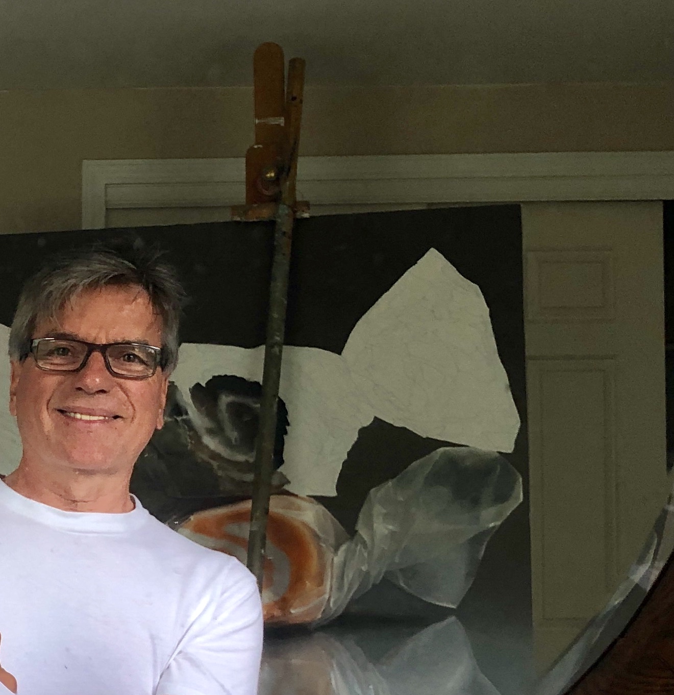
Here I am with a taffy painting I started in February, but have been deterred from finishing because of multiple family obligations. Nevertheless, slow but steady.
I embarked on a series of enlarged images of salt-water taffy last year, unable to reach cruising speed for the work because of a slow flood of continuous family obligations. Over the past year, I’ve had to keep halting my painting (and writing) every two or three weeks for multiple reasons, including several trips to Florida to prepare my parents’ condo for rental or sale, since they’re no longer able to get down there—as well as flights to L.A. to spend a welcome week with my kids and grandkids, after long absences. Having just gotten back from one of those weeks in L.A., my mother fell and broke her hip and then amazed the Highland Hospital staff with her rapid ability to get moving again after a partial hip replacement at the age of 94. So, with my time devoted to helping both parents adapt to all of this at home, my work has been on hold for yet another week as of today.
Caring for aged parents has provided an energizing counterpoint to work at the easel, especially because I’ve been focused on such what seems at first such a trivial subject, dollops of salt-water taffy veiled behind twists of waxed paper, in contrast to the somber, chastening experience of advanced age. Lauren Purje, after she saw my paintings of candy jars seven or eight years ago, remarked, “There’s sadness in them.” It was undoubtedly what charmed her about the paintings, though at the time I was nonplussed by the comment, unconscious of everything about those paintings other than my formal intentions. Sad candy seemed like an oxymoron. They offered me a way to bring more color to a still life—giving me a softened geometric image, a grid, and the format let me choose the colors I could put down. It also offered a balance between flatness and representational depth. The emotional pull of the image wasn’t even on my radar—I was too aware of my formal goals to be alert to what the act of painting had smuggled into the image on its own, while my attention was diverted to the paint itself. In other words, the candy jars were a reminder of how I think art actually operates, embodying a world of feeling and imagination despite an artist’s conscious intentions, conveying more than the artist is, or can ever be, aware of. Continue reading ‘The sorrows and joys of taffy’
June 18th, 2019 by dave dorsey
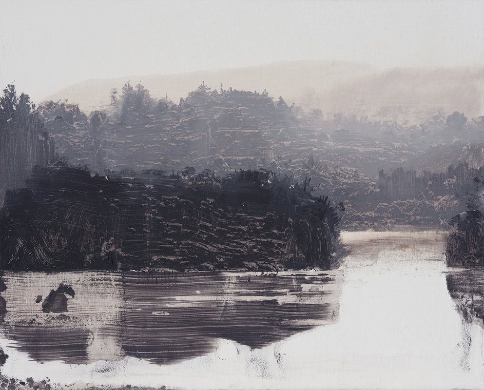
Lakeside-sunglare, oil on birch ply, 8×10 inches, 2019
I recently received my copies of INPA 8, from Manifest Creative Research Gallery, and I’ve been finding much to admire in its pages. I’m going to post some of the work over the next few weeks. It was especially pleasant to see David Smith represented yet again. He’s pitching almost a perfect game since Manifest started publishing INPA: getting his work into, I believe, all but one of the annual compilations of great contemporary painting. He used to have his studio in Hong Kong, which was appropriate, since in most of his work there’s a very Asian sense of unoccupied space, a philosophical void. As in the work of Clifford Still and Sam Francis, that sense of vacancy has as much to do with the effect of his images as whatever emerges from the emptiness. It links his work as well with sumiye painting and Chinese scrolls. It’s a Taoist esthetic that he doesn’t address candidly in his own statements about his work, though what he does say about his process echoes the principles of gutai, which finds new forms of creative expression by exploring the effects and properties of physical materials, again an Asian tradition, but out of Japan, rather than China.
From his website:
These paintings depict natural forms and spaces on solid, wood panels. They use the chemical qualities of oil washes to disrupt, dissolve or decay the image surface. Light, space, time and environmental decay play against natural elements. The images exist in a state of flux; location and time are not always apparent. The light, space and forms are shifting, living and dying, displaying a fragile and temporary nature. Influenced by ink painting, abstraction and photography, they aim for a sense of the mysterious and the elemental.
I recall the earliest work of his I saw in some of the initial INPA publications, work from nine or ten years ago. It showed a helicopter or jet suspended in fog, giving me the sense of being an entomologist discovering an unclassified caddis fly, with human technology seemingly as evanescent as a newly hatched insect. Having moved back to Ireland, he has evolved a process that, more than ever, prompts me to ask a question I emailed to Jason Franz years ago, knowing there would be no answer on the other end: “How in the world does he do that?”
I suspect there may be some originating step using the transfer of a photographic image onto his support, which is then worked by hand, the way R.H. Quaytman begins by silkscreening a Polaroid image onto a surface and then improvising on it with other materials. It’s possible, but the evidence of his brush is often so distinct that he doesn’t seem to be working from a transferred photographic template. Whatever he’s doing, I’ll bet he doesn’t want to talk about it in detail. I wouldn’t. He should consider his techniques proprietary. Like Quaytman, Smith reduces his image to the simplest possible interlocking layers of differing values—usually eliminating almost all color other than dark-to-light grays. The effect is wondrous: it’s as if he creates an astonishingly convincing landscape that recedes into a more and more atomized haze, each tier of earth or trees or water inhabiting its own particular distance from the eye. In some of the most recent work this year, he shows land masses rising from a remote lake, and these forms could be rock or trees or both, it’s hard to tell, and yet without being able to actually identify what you are seeing, the image looks perfectly real, even with the long parallel lines clawed into the paint, as if with a comb, on the shining surface of the lake. The effect is to make you feel a sense of convincing verisimilitude, true to dawn landscapes you’ve seen in the past, while at the same time introducing you to an entirely imaginary world, an almost abstract collage of shapes, where the scraped and squeegeed-looking ridges of paint somehow magically are both an inert substance disrupting a flat surface and yet exactly what the eye needs in order to seize on a perfectly-rendered, natural vista.
June 15th, 2019 by dave dorsey
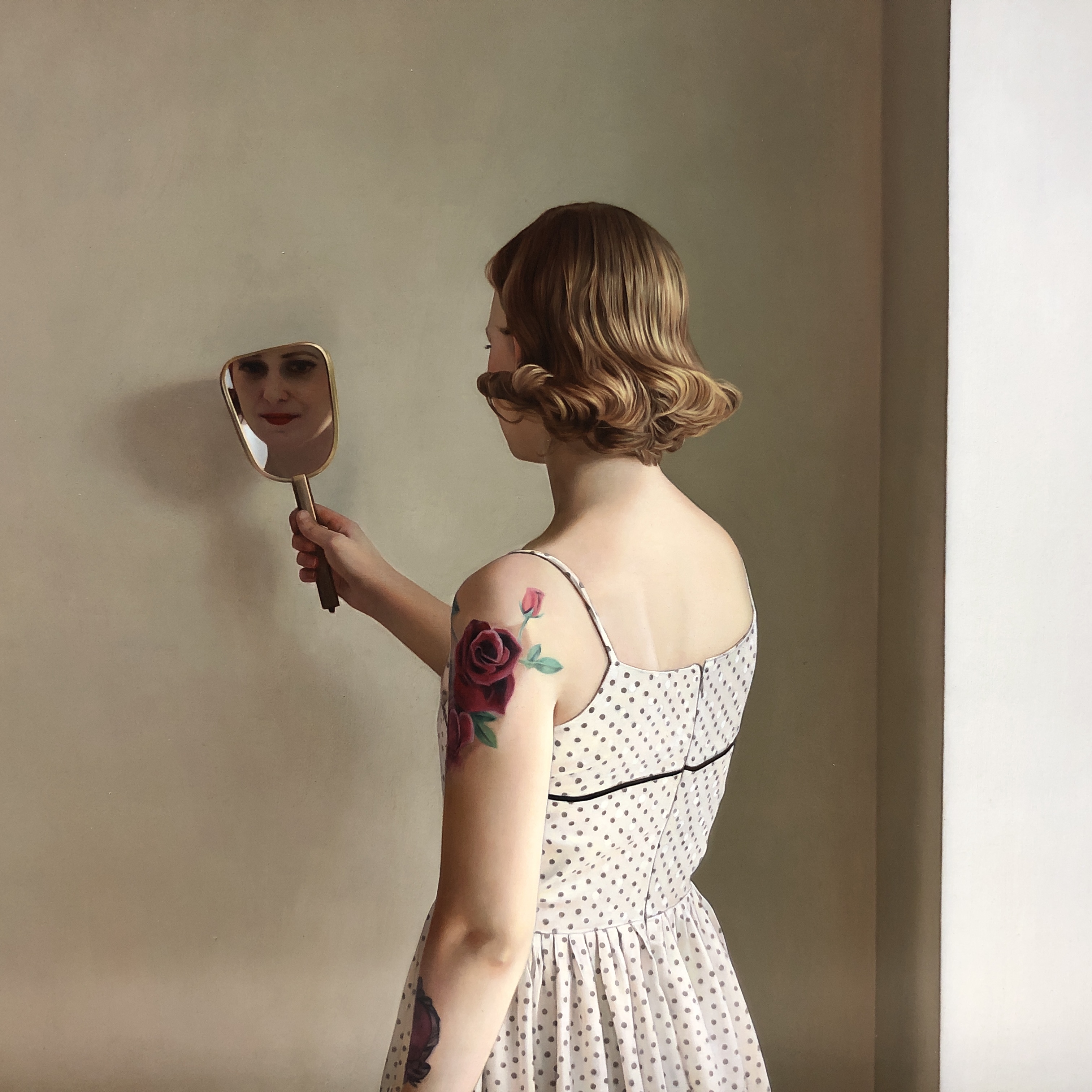
In Her Mirror II, detail, Shawn Downey, oil on panel, 2018
I visited Arcadia, in Pasadena, after Shawn Downey’s solo show closed nearly half a year ago now, yet some of his work was still hanging in the rear gallery and I was able to get a close look at half a dozen paintings, which was a great treat—including this one hanging above its shipping crate, ready for its trip home to Canada. Downey’s minimalist interiors, with a single contemplative woman, with the occasional tattoo, in stripped-down, geometric spaces, were a marvel. It felt like a contemporary fusion of Vermeer’s light and Hopper’s sympathetic eavesdropping on urban solitude, but with a brighter, more serene glow. I wish I’d been there to see all of the work.
June 12th, 2019 by dave dorsey
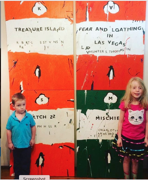
Ben Tankard’s kids posing with some of his book cover paintings.
It always cheers me when Ben Tankard posts something new on Instagram. The Australian painter works in several modes, one being his surreal landscapes where ordinary people confront things they can’t quite comprehend—if we’re honest with ourselves, we are those people, all the time, aren’t we?—and in another series he does Monopoly board images that have been slightly modified, as well as classic Penguin paperback covers. It’s all done with an ebullient wit. My favorites are his simple, uniformly produced fractures of Penguin covers, where everything has been slightly scrambled, as if the books are slowly becoming illegible as a result of macular degeneration. For me, the fragmentation of vision is cultural and his Pop version of those paperbacks speaks to our fragmented literacy in an age of inane social media telegraphy and knee-jerk rants. It’s refreshing to see a painter posing his two youngsters in front of images he’s completed of Robert Louis Stevenson’s and Hunter S. Thompson’s work. Just putting those books side by side feels tolerant, appreciative, and encouraging. Just painting the covers of great books, period, is a nice, humble way to class up the joint.
June 9th, 2019 by dave dorsey
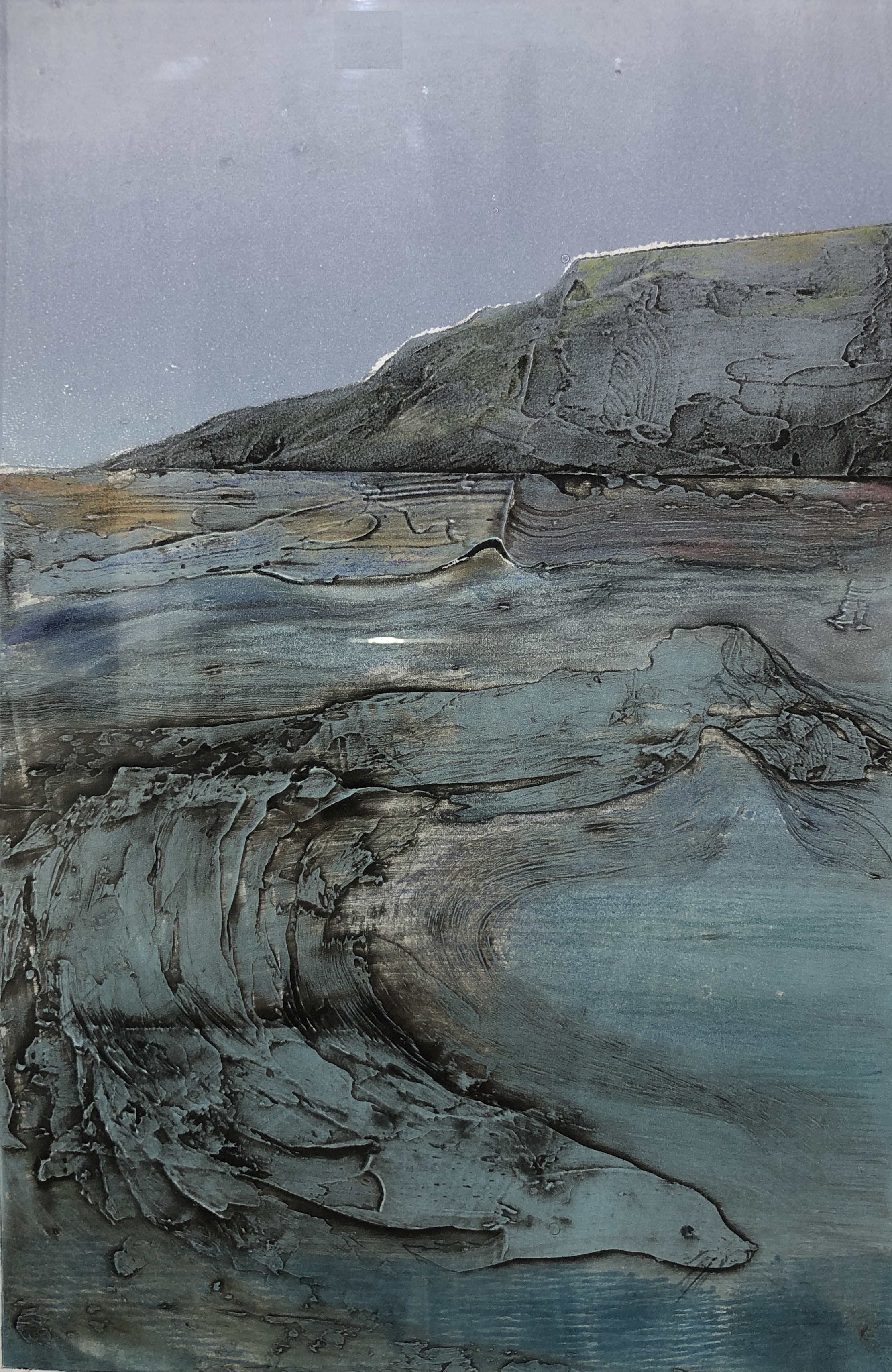
Selkie, collograph monoprint, Elizabeth King Durant
The current group show at Oxford Gallery, “Metamorphosis,” is one of the strongest James Hall has put together. Maybe because the theme signifies the essence of art itself. Art is alchemy, taking common human experience and transforming it into the idiosyncratic terms of an individual artist’s ornery insistence on his or her skewed way of seeing things. It’s a transformation of what could easily be a generic glimpse of something familiar into the odd, particular demands of one person’s heart. The greatest art goes a step further and somehow magically uses the unique weirdness of human individuality to open a window on the universal. A fleeting depiction of something partial and provisional offers a glimpse into what’s essential and enduring. Metaphor is metamorphosis. Yet, as Stephen Wright joked, “You can’t have everything. Where would you put it?” You can’t squeeze the whole world into a frame. But you can offer a door into it. In art, the part becomes the whole.
The best work in this show opens that door into the world as a whole. The pieces I keep going back to are the work from Debra Stewart, Elizabeth King Durant, Amy Mclaren, Barbara Fox, Phyllis Bryce Ely, Alexandra Latypova and, yes, even a few male artists, like Tom Insalaco and Daniel Mosner. (Has anyone else observed that the art women make right now often seems more vital and interesting than the work of their male cohort?)
Of all the work in Metamorphosis, my favorite has to be Durant’s Selkie, a perfectly executed and easily overlooked collograph monoprint visualizing the Celtic myth. Think Splash in more ancient terms, the shape-shifting of seal into woman and back again. There’s a perfect marriage of technique and subject in the print, with bravura, gestural lines seeming to articulate the shapes of seal and human in a sort of Taoist swirl of opposites. Her lines appear to be the edges of a three-dimensional surface, as if she had pulled the print from dried spackle applied with a knife—the wave that gives birth to both woman and seal also has the quality of a rock face, water transforming into stone. And yet another gentle polarity obtains in the tension between earth and heaven suggested in the extremely subtle shift between the emptiness of the grayish ultramarine sky above the slightly greener but almost metallic aqua of the sea under a mountain shoreline that quarantines those two regions. Her technique is spare and restrained and simple, yet the image looks timeless and primordial, an entire myth worthy of Joseph Campbell in a glance.
In a felicity that may be entirely unintentional, Alexandra Latypova’s misty landscape looks almost apocalyptic in the way she has suppressed the color of anything touched by the fog creeping toward the viewer from the horizon. The golden tones of what appears to be a foreground vineyard recede to a line where, at the edge of the fog and deeper into the haze, everything is sapped of hue. In Fog from The Bay, the ominous shapes of trees and shrubbery are faded to browns and grays, and somehow they seem to be in motion, becoming the fog that envelopes them, both collapsing and billowing up from the ground. The image reminds me of the live television feed from 911, the fall of the World Trade Center, where structures looming on the Manhattan skyline disappeared into dust. What may have started as a placid, idyllic morning on a lake’s shoreline has turned in a disquieting but eerily lovely reminder of the world’s end.
Amy Mclaren’s offering for this Oxford show, Retired, acrylic on canvas, upstages nearly all of her previous work in the gallery’s shows. Here she reminds me, surprisingly, of Norman Rockwell, his ease at suggesting deep emotional warmth through the depiction of facial expression and body language—in this case the stance and look in the eyes of an old dog. A 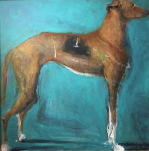 single greyhound, a retired racer, waits patiently at attention, wearing his worn racing color—it’s more of a visualized memory than an actual uniform here, dissolving into his flank. He poses against a nearly monotone but luminous blue background. The image has an iconic Pop simplicity, and the brushwork, as well as the way in which Mclaren positions the dog, boxing it in with the edges of the picture, flattening out the form, echoes Jim Dine’s robes. The very loosely applied globs of white to designate the greyhound’s paws are wonderfully accurate even though they almost look splattered onto the surface from the end of a brush fat with paint. The tension in the legs, the heartbreaking eagerness of the posture—please someone anyone give me another spin around the track—and the magnificently human look in that visible eye, the way it sadly studies whatever is happening in our faces as we loiter around this ex-champion indifferently, makes this image a wonderful, beautiful salute to all forms of guileless excellence and passion, especially when they have fewer and fewer chances to make their mark in the world. They also serve who only stand and wait . . . Continue reading ‘Windows onto the world’
April 21st, 2019 by dave dorsey
 I was pleased and surprised when I got the notice that the Butler Institute of American Art wanted my painting of taffy for its Midyear exhibition, since other work had been rejected this year by our local museum and another regional gallery. After a decade of selling my work and showing it in juried exhibitions, it was still a game of percentages, entering these events. This year it might be only the two small museums that showed my work—Arnot and Butler—mostly because I haven’t had the time to finish enough work to enter other shows. Last year, I’d vowed not to enter anything larger than 24” in at least one dimension, and if possible enter nothing larger than that in any dimension. The difference in cost, and the amount of hassle that goes into the whole physical process of getting a painting to and from a show, is dramatic, when you exceed a certain size. But I had nothing else to enter, having submitted smaller paintings to other shows. So in the week I was home in Pittsford, I had to build a new crate, the largest yet, and figure out how to get it to Youngstown, Ohio and back.
The only reliable way to do this was either to drive it there myself—about ten hours of a round trip on the road to deliver it and another ten to pick it up after the show, which I had done for the last show I was in at Butler—or ship it through the UPS Store. I had tried both Fed Ex and UPS before, signing up for accounts, but in every case I got lost in the obstacle course of being transferred to other people, or put on hold, or told to do things that weren’t available to me in the online forms. This time was no exception. The shipping companies aren’t terribly interested in a non-commercial shipper who wants to do things—like print out a return label—that only retail companies usually need to do. Getting that return label pre-paid and printed and inserted into the crate was the stumbling block. I called and the UPS help desk and they told me I had to actually create a permanent account with them, and so I did. They supplied me with my own account number, but it changed nothing in the form. Still no option to print a return label. Which is when they put me on hold for a transfer—and no one picked up. So I surrendered to defeat again and decided I would have to lug the four-feet by four-feet crate to the UPS Store, all sixty pounds of it, rather than have them pick it up.
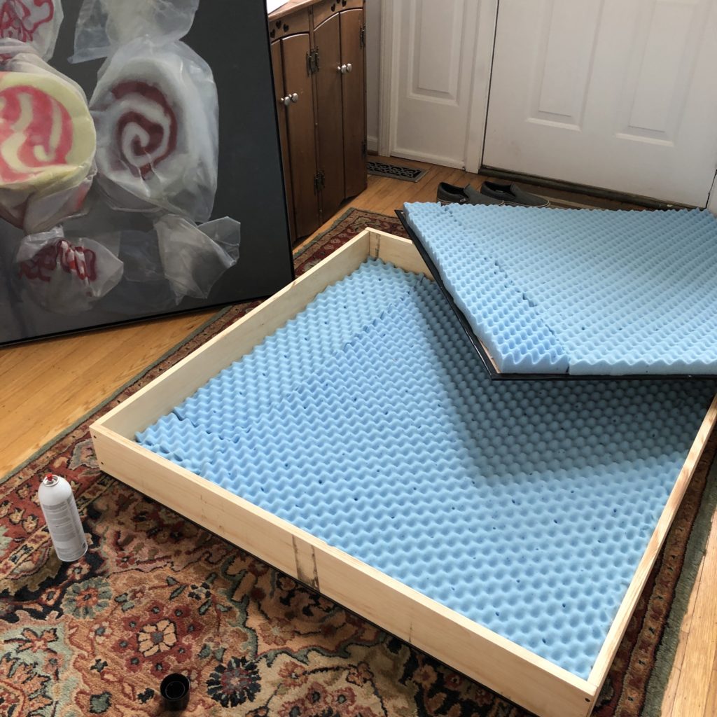
Before 8 a.m. I drove to Home Depot and got a 4′ x 8′ sheet of quarter-inch plywood sheathing— thin and flexible and lightweight. It’s more delicate than typical plywood and pretty easily punctured if you were to drop the crate onto something like a giant paper spike, which UPS once apparently tried to do with a previous shipment, luckily without damaging the painting inside. I had a friendly, helpful worker cut this sheathing into two identical squares and then slice the six-inch boards I would use for the sides of the crate into a pair of four-feet long planks and another pair of slightly shorter ones. I’d create the box out of them and then screw the sheathing to each side, using drywall screws. I’d done this many times, so I was finished by noon. Inside the crate, I attached a convoluted foam mattress top to the sheaths as cushion for the painting, and constructed an inner “lid” out of foam core to slip over the front of the canvas, so the lining wouldn’t press against the canvas inside the crate. Continue reading ‘A long goodbye’
April 18th, 2019 by dave dorsey
When I was a boy, I used to take a toy, whether or not it was meant to represent something aeronautically sound, and I would hold it out in front of me and “fly” it above the sofa mountains of our living room or, outside, over the terrain in our East St. Louis yard: a stone wall, peonies and day lilies, an actual manual pump (like the ones in Westerns) drawing air from an unproductive well, apple trees and woods. The scale of everything would be altered by whatever I was holding in my hand, an airplane, a Superman, or a scuba diver. I wanted to be a scuba diver more than anything in grade school. (Or a sardonic gambler with a six-shooter on my hip in a frontier Nebraska saloon.) A little molded plastic figure of a diver, lime green or blue, would swim over vast underwater canyons carpeted with bluegrass. I was the invisible giant holding him up: a giant or a god. The world was my diorama. Everything became more interesting.
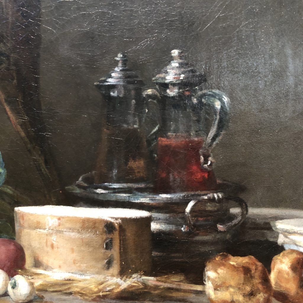
 I get the same feeling looking at a close-up detail I shot a few months ago at The Getty of a masterful Chardin still life I’d never seen before. Up close, the objects on Chardin’s mantle look massive, like magical alien minarets and a flat-topped stadium, a terrain out of Gulliver’s Travels. It’s a strange city built with things from his kitchen. Bachelard would have been nudged by this scene into a reverie, another unique poetic measure of space, if he imagined everything in the picture a thousand times larger than its actual size. (I suppose you have to leave out the fish.) It becomes like one of those clockwork models of cities rising up out of the earth during the title sequence of Game of Thrones. This effect is partly what draws me to enlarged images of ordinary objects—making them massively larger on canvas than they are in my daily, disenchanted world—to bring out their formal resonance with so many other things with similar shapes and tones. In a way, I think this is related to what Braque meant in his notebooks about the centrality of transformation in painting, the alchemy that takes an ordinary interior space, full of utterly familiar things, and turns it into a painting’s dream. His transformations were more radical, obviously, but Chardin is just as concerned with the feel of the paint itself and the tactile quality of what’s seen–making you aware of the medium that invites you into its world, the same as yours, but cooler, fresher, more alive.
I was familiar with many of the objects in this picture from his other paintings, because he kept returning to these old inanimate friends again and again, as still life painters like to do: shallots, garlic, a couple gougeres (they look like cream puffs), several ceramic bowls with covers secured by lengths of twine, and a silver dish designed to hold two glass-and-silver cruets for oil and vinegar. Freshly-caught mackerel in the background are the wild card. Chardin did this at least a couple times—showing you fish and game ready for cooking. But he indicates the shining white underside of the fish with impasto streaks of paint uncharacteristic of his usually subtle handling. In a photograph, it looks right. In front of the actual painting, it distracted me and felt like the part of an overexposed photograph where highlights wash out into too much white. In the end, though, the problematic fish and the way he painted them make the painting even more interesting.
Continue reading ‘Chardin’s dreaming’
April 8th, 2019 by dave dorsey
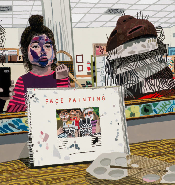
Face Painting, Jonas Wood (2014). Courtesy of the artist and David Kordansky Gallery, Los Angeles. Photo: Brian Forrest.
Bill Santelli sent me this interview, which is a good read. Jonas Wood makes Hockney-esque paintings that look like graphic art, colorful in unpredictable and interesting ways, and dense with detail. They feel immediate and carefully observed but executed with almost childlike simplicity. I love the embrace of flatness because it forces him to put so much of his feeling into the color and his color can be extremely good (but sometimes not all that interesting.) What you see is what you get and that has to be part of his appeal, the ordinary quality of the experience he conveys. It’s funny to hear Wood talking about his staff and his office. Who does he think is going to hire a staff after reading this? The only staff I could imagine wanting or needing is Gmail with a good spam filter and auto-reply as my receptionist. Which he would applaud, if it worked to manage the tsunami of demand I anticipate any day now. It’s sort of his point: detach yourself from all pressures other than the work and get it done, but that’s easier to say when you are selling work for $2 million in an auction. There’s a no-nonsense fearless voice here, but it’s speaking back towards us in a foreign tongue he picked up in this other dimension of big art world success where nothing is commensurate with the way all but one percent of one percent of artists live. All of this reminds me of France before the storming of the Bastille. Where did Fragonard go after the revolution? I think he just dematerialized. Or maybe he finally hired a staff. But it doesn’t seem we are at that point, income inequality notwithstanding. We’re facing something different. Economically, Wood is among the elite of the elite. This world the rest of us live in, the world nearly everyone else lives in, can’t imagine hiring a staff. But who doesn’t envy Wood’s ability to just do what he loves doing and, voila, the money and attention flows? Reading his comments feels like watching the Kardashians have breakfast while they talk about how you need to become an Instagram star as practice for your reality TV show. Working hard isn’t what gets these results. Most of the factors that make Wood’s work so lucrative are beyond anyone’s control–and if art schools teach anything about the market it should be that you aren’t going to face his choices. It happens to an infinitesimally small number of people who get beamed up to this rarified world, and then have to find a way to shelter in place from the abundance of their new planet, the way Wood does, in order to keep working. Hard work is a given, but it isn’t enough. Van Gogh ramped up to a painting a day, more or less, near the end. Nobody has ever worked harder. It got him something far preferable to sales.
Some good advice here, with the intro from art.net:
Jonas Wood is not shy. He won’t hold back, takes aim when he fires, and doesn’t seem concerned about ruffling anyone’s feathers. He’s also busy—very, very busy—and seems to have a lot on his mind.
When artnet News spoke with the artist earlier this month, he was preparing for the first institutional survey of his work at the Dallas Museum of Art, which opened last week. The show is a real boon; although Wood has earned a solid reputation for his lush interiors, tender portraits, and vibrant still lifes, which he has shown in dozens of commercial gallery exhibitions, museum support has largely eluded him until now. Not that he has much time to bask in his success. In April, Gagosian will present new works by the artist in New York, which means he has to quickly shift gears and look ahead.
From Wood’s answers to artnet’s questions:
I think it happens to be that I have a broad audience right now. Maybe that’s not always the case, but the reason I paint is not for those people. I think it’s for my own mental health and for my own sort of goals as a painter, but I’m aware of the viewer.
I worked with Laura Owens. And I got this really good advice—and from other people too—which was just, if you want to separate yourself from the noise, you’ve got to create some distance. Another thing was just saving my own work and not being so greedy, and being aware that, okay, $5,000 now is $5,000 now. If I sell three more paintings, yes, I’ll get a little bit more money, but it’s not like life-changing money. Maybe I should start holding onto things for myself and not selling everything. I mean, the dealers are going to hate hearing this, but maybe they won’t. Maybe it’s good because they want an empowered artist. But they would offer to give me money to buy stretchers and buy stuff for my studio, and I didn’t really want them to buy stuff for me because I didn’t want them to know how many paintings I was making.
I was painting for me, and I knew that I didn’t want to paint for the collector audience. I wanted to paint for me.
So establishing that was really important for me because I was able to keep my practice open. I didn’t want to be pigeonholed right away. I showed a lot of different kinds of work, and I didn’t really cut myself off and be like, “He’s the tennis court painter.” Or, “He’s the sports portrait painter,” or, “He’s the guy who makes the still life.” I guess I’m kind of all of those things, which is better than just being one of those things.
Well, when I was at school in 2002 at the University of Washington, my goal was to teach at a liberal arts school, have a studio on campus, have the summers off. That was probably my ideal.
Man, it’s fucking tough because people say crazy shit about your work. You have to be super thick-skinned, and it’s hard. That’s a big part of it. I would say that you just have to take all that energy back to your studio and try to be critical in your own way and just take that criticism. Just say, “Okay, yeah, I’m going to keep looking because maybe these people have a point.”
But that type of shit is tough. Dealers saying crazy shit, your friends saying crazy shit, collectors saying crazy shit, having a show where you don’t sell a bunch of stuff. That shit is tough.
April 5th, 2019 by dave dorsey
Iris Murdoch
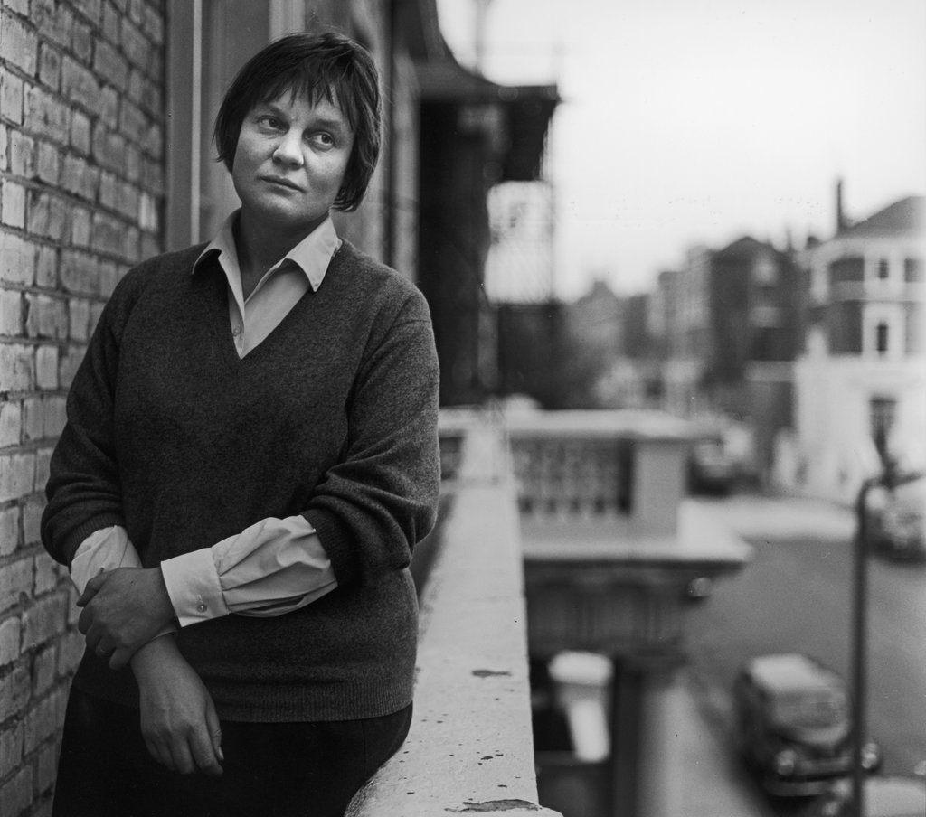
I’ve just reread Iris Murdoch’s The Sovereignty of the Good, in reaction to my rereading of Dave Hickey’s The Invisible Dragon, in an effort to see the contrast between their ideas about beauty. Hickey speaks about beauty and desire. Murdoch about beauty and love. One might think they are speaking the same language, Hickey at a very high rate of speed, full of rebellious spunk, and Murdoch deliberately, cautiously and in the dry language of a professional philosopher. They were both pushing back against a tide of thinking and theorizing, in their time, about what it means to be a responsible social human being. There is some commonality. It would seem Hickey would have been very uncomfortable with Murdoch’s wisdom. They arrive at what sound like very different conclusions, yet I’m wondering if Hickey might have appreciated Murdoch’s embrace of Greek philosophy a little more than he lets on in his own book. On the evidence, his view of beauty seems entirely utilitarian compared to hers, but his assertion that artists need to do beautiful work in familiarity with a tradition of past beauty that has some kinship with Murdoch’s concept of attention.
She starts off in the weeds of shop talk, fending off one academic philosopher after another, trying to somehow save the idea of individual subjective consciousness against all the 20th century efforts to render human beings merely an agglomeration of genetic/cellular activity–or an isolated will, an abstract freedom of choice, completely detached from any governing reality external to the individual will. (The latter, existentialist view, has certainly receded since she wrote her book.) In rereading the book, at first, I was annoyed and puzzled by how dense her thinking gets, right out of the gate, as she fends off the other thinkers–analytic and existentialist both–who want to dismiss the idea of what used to be called the human soul, a consciousness that isn’t simply the epiphenomenon of bodily activity. She tentatively asserts subjective consciousness as the only way to describe the actual experience of being alive and human–an inner life apart from actual behavior that proves to others it exists–in order to build her philosophy of Goodness. Everything good in human behavior for her depends on a lone individual’s effortful attention to other people and things external to the self and she needs that inner life, that inner struggle of attention, which goes on invisibly from moment to moment (essentially a sort of continuous, daily discipline of contemplation) for her view of moral goodness to make sense. (Though she probably would have been disheartened by the current ubiquity of mindfulness meditation, complete with helpful apps on your phone, her thinking isn’t all that far from the moral dimension of mindfulness.)
For now, here’s a long series of excerpts from throughout her book. Any painter, including abstract painters, will recognize how much this describes the act of painting, how little depends on personal choice and how much relies on obedience to the requirements of a given picture, even though her focus is on moral behavior. She sees very little space between moral attention and creative attention:
But if we consider what the work of attention is like, how continuously it goes on, and how imperceptibly it builds up structures of value around about us, we shall not be surprised that at crucial moments of choice most of the business of choosing is already over. This does not imply that we are not free, certainly not. But it implies that the exercise of our freedom is a small piecemeal business which goes on all the time and not a grandiose leaping about unimpeded at important moments. The moral life, on this view, is something that goes on continually, not something that is switched off in between the occurrence of explicit moral choices. What happens in between such choices is indeed what is crucial.
If I attend properly I will have no choices, and this is the ultimate condition to be aimed at. The ideal situation . . . is . . . to be represented as a kind of ‘necessity’. This is something of which saints speak and which any artist will readily understand. The idea of a patient, loving regard, directed upon a person, a thing, a situation, presents the will not as unimpeded movement but as something much more like ‘obedience.’
This is what Simone Weil means when she said ‘will is obedience not resolution.’ As moral agents we have to try to see justly, to overcome prejudice, to avoid temptation, to control and curb imagination, to direct reflection.
One of the great merits of moral psychology which I am proposing is that it does not contrast art and morals, but shows them to be two aspects of a single struggle.
In one of those important movements of return from philosophical theory to simple things we know about great art and about the moral insight which it contains and the moral achievement which it represents. Goodness and beauty are not to be contrasted, but are largely a part of the same structure. Plato, who tells us that beauty is the only spiritual thing which we love immediately by nature, treats the beautiful as an introductory section of the good. So that aesthetic situations are not so much analogies of morals as cases of morals. Virtue is au fond the same in the artist as in the good man in that it is a selfless attention to nature: something which is easy to name but very hard to achieve. Artists who have reflected have frequently given expression to this idea. (For instance Rilke praising Cezanne speaks of a ‘consuming love in anonymous work.’) Continue reading ‘Magnetic and inexhaustible reality’
April 2nd, 2019 by dave dorsey
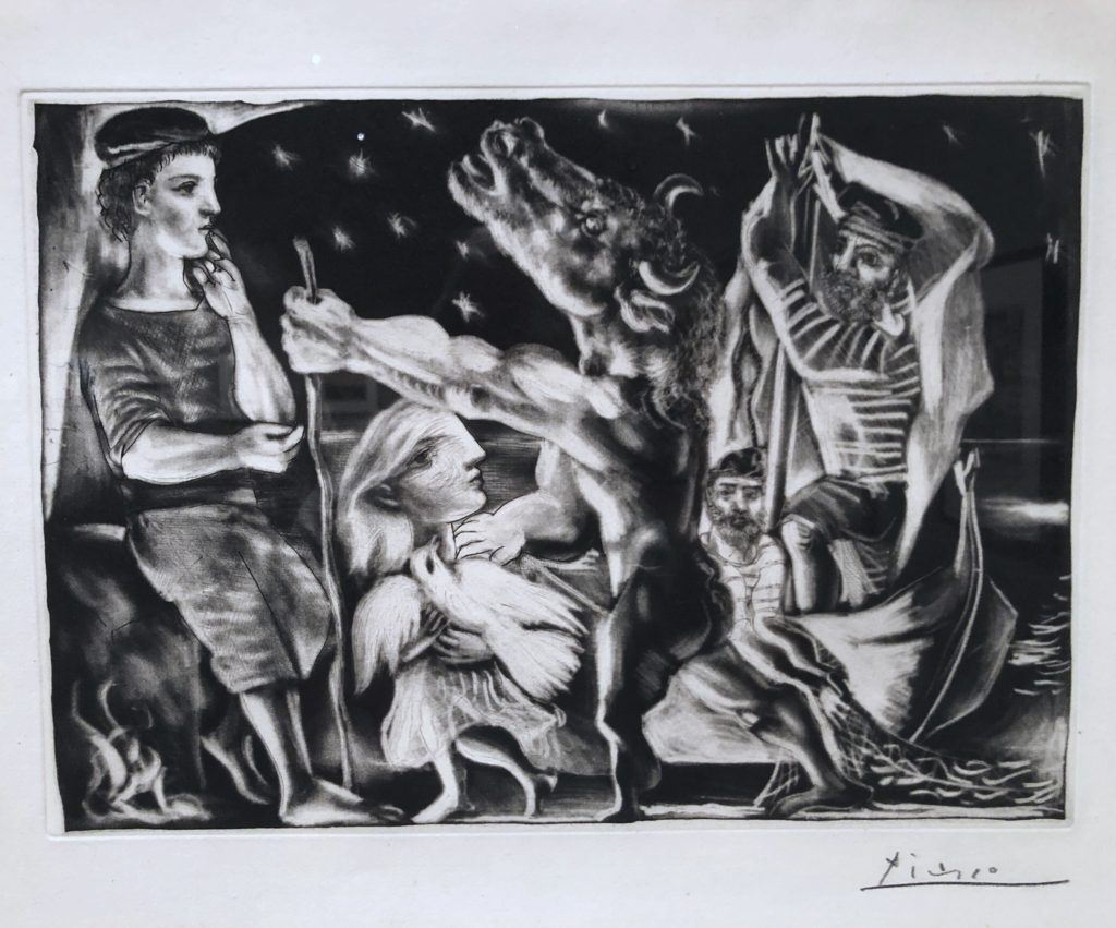
Pablo Picasso, Blind Minotaur Guided by a Girl at Night, burnished aquatint
I’ve been surprised that the exhibit that has occupied my attention the most since my last visit to LACMA was Fantasies and Fairy Tales. It was a small, quirky collection of prints from around the year 1900. The aim of the exhibit was to show how, within this tight, curatorial window of qualifications (prints mostly within a narrow, fin-de-siecle range of dates), a selection of work could suggest  incorporeal states of mind or spirit, as well as hint at transcendence. The show was beautiful and eerie, dreamlike and occasionally chilling. There was a slightly morbid strain in the imagery on view, but it was tempered with stylistic wit in the work itself and the playfulness of the curation. Charles Addams might have brought an Edwardian folding chair to this one, the better to take it all in. David Hockney etched a simple rear view of the prince nudging his horse up to Rapunzel’s dangling locks. In Death the Strangler, Alfred Rethel engraved an image of a skeleton in a hooded monk’s habit pretending to play a fiddle with a pair of leg bones as people cowered around him. Max Klinger’s aquatint, Pursued Centaur, depicted three seemingly naked hunters chasing a centaur through long grass—right after the centaur has loosed an arrow backward into the leading horse’s neck. It shows you the moment when the hunters became the hunted. It’s all slightly magical, in an altered states sort of way.
But the revelation for me was a print from Picasso, the one of the blind Minotaur commonly considered the final image from The Vollard Suite—if you discount the concluding three portraits of Vollard required by the art dealer in his commission. I’d seen many prints from that suite before, but seeing it in person, for some reason, stopped me in my tracks. It was an entrancing exhibit, and this one print sent me briefly down a rabbit hole of study off and on during the past two months since my visit in January. Eventually, I’m going to post a long essay on The Vollard Suite—if I can sit still long enough to write it—because it has changed the way I think of Picasso and his career. I’m finding it hard to see anything else he did as equal to this suite of prints, especially if you consider Guernica the offspring of his years laboring on them.
The Vollard Suite is giving me a deeper respect for the sort of art—the kind of art that critics love because it can generate so much discussion—that doesn’t fit into my essentially modernist advocacy for visual art’s fundamental kinship with music, in the way it acts directly on the pysche, in contrast to language and narrative. Visual art and music are equipped to do something different from the meaning-making role of language, opening up an immediate sense of the world, but in a direct way that bypasses the intellect, and I consider this their most valuable role among all the arts. When this work gets tied to the notion of “meaning,” then visual art heads in a direction that usually seems less compelling to me. Yet the Vollard Suite is making me see the other side of this argument. It’s catnip for the thinking mind, but in such a way that it leads you toward the impenetrable paradox of Picasso’s own personal daemon. The Vollard Suite is a maze of implied, mysterious narrative, but it becomes, as Picasso is drawn toward greater and greater honestly about himself and his art, a work of tormented self-questioning and self-criticism. I’m not sure there’s anything else like it in his work, or in anyone else’s. It’s art that calls art itself into question. Out of this self-defeating struggle, one of the most worldly and pagan of 20th century artists created, in this image of the blind minotaur, a dead-end reverie of blind enchantment. It’s a depiction of himself as both baffled and instinctively creative with no way to see where he was going, yet obedient to the beauty that offered to lead him through his darkness. In a way, it’s an image of soon-to-be rejected grace. I think Picasso understood his own spiritual blindness. It’s his brief discovery of enchantment, as a consequence of his being honest about his inability to comprehend himself or his life, that takes him and the viewer by surprise. He had his secular equivalent to Beatrice in his teenage lover, Marie-Therese Walter, yet he parted ways with her. Yet while he created this print and its companions, she offered to light a path for him that he ultimately abandoned.
March 30th, 2019 by dave dorsey
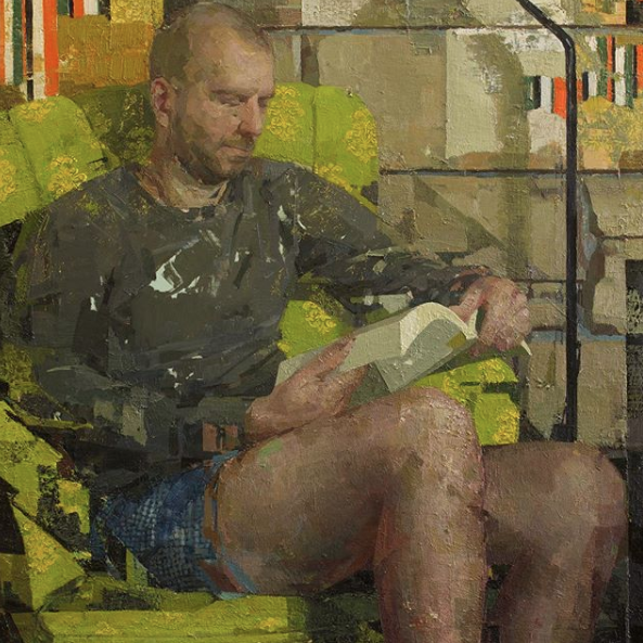
Peter Reading, oil on panel, 36″ x 36″
Zoey Frank has a show at Gallery Mokum in Amsterdam opening on March 16. She has to be the perceptual painter who has risen to prominence more rapidly than anyone else in that club. I’ve been following her with bemused fascination since she was the star of Manifest’s INPA not long ago. She’s everywhere, it seems. When I checked out Arcadia’s booth at the L.A. Art Show two years ago, I noticed they had one of her paintings on view. She’s included in a group show now at Danese Corey, with plenty of work to spare for a solo show in Europe. For someone with her prolific confidence, the challenge has to be picking what not to paint.
The polarities in her work are what keep me trying to reverse engineer what she’s doing, but it’s as hopeless as twisting a Rubik’s Cube back to perfect alignment. At her best, the surface works on its own semi-abstract terms. Conversely, the image works just as well, as a representation, despite all the flat decorative patterns she so often seems to improvise behind and almost in front of her subject, if you can actually pin down a single subject in some of them. Note the checkered pattern of the boxer shorts, the irregular cinder-block lines in the wall, the random-looking orange stripes at the top, as if someone has ripped a pasted advertisement away. Hers are “all over” paintings that resolve themselves, at least partly into the old familiar genres of interior, figure and still life. When this polarity between surface and image is strongest, but without marks that don’t seem unified into a recognizable image, her paintings are the most satisfying. (It looks as if lately she’s moving more toward heavy impasto, in the vein of Stanley Lewis, and the image flattens into two-dimensional patterns completely, losing some of her charm in the process.) Her work is about the texture of the paint and yet they often look as accurate in the way they convey light as a photograph. (It’s hard to imagine she doesn’t refer to photographs at all in some paintings.) As with most of the perceptual painters, she’s willing to paint anything she sees, seemingly just as she finds it, so that anything for her is a fitting subject. Each individual painting looks more like an inconclusive portion of a long scroll of work that never ends–just an arbitrary clip from a continuous experimental translation of seeing into paint, never quite arriving at completion, which adds to the transitory quality of her images. They feel more dreamed than seen.
In her most interesting work, she’s constantly juxtaposing scumbled or scraped spots of paint against crisply defined edges–the way Eve Mansdorf once talked about the importance of edges as a counterpoint for her more improvisational areas of paint. The governing greenish light here–is it a yellow incandescence or a muted natural glow on her friend’s nose from a leafy summer scene outside? She conceals a line that looks as if she’s trying to slice her friend’s anatomy off at the knees, angling up from the lower right, the way a Cubist would, arbitrarily (hints of Braque often are absorbed into her compositions and texture) and yet that little edge seems to work as an accidental but accurate alignment of shadow. In most of her work, she uses these structural straight lines, as if she’s clicking everything into a purely imaginary grid that keeps surfacing in the shapes she puts down. She breaks up this particular image with little shards, wedges and shims of color, without detracting from the depth of her forms and the realistic light, so that a lot of these details don’t coalesce the way you would expect them to, yet don’t keep you from seeing the scene. In this case, it’s almost the way a digital photograph looks when it’s pulled off a slightly damaged SATA hard drive, fractured with visual noise, but still recognizable.
March 27th, 2019 by dave dorsey
From “Art is Dead; Long Live Aesthetic Management:”
“The work of art,” Alfred North Whitehead writes, “is a message from the Unseen,” or as I would say, the unconscious. “It unlooses the depths of feeling from behind a frontier where the precision of consciousness fails.” This, I think, is the credo and intention of all true artistic creativity–to reach into the unseen depths of the psyche and bring back the pearl of original feeling from them. T.W. Adorno says something similar. “Works of art,” he writes, “do not, in the psychological sense, repress contents of consciousness. Rather, through expression they help raise into consciousness diffuse and forgotten experiences without ‘rationalizing’ them.”
Artistic expression thus undermines the pseudo-self and restores the original self. It uses unconscious feeling to undermine conscious reason. Diffuse feeling arises spontaneously, as though experienced for the first time or suddenly remembered, and so all the more meaningful. It is an unexpected message from the unknown depths, a surprise that cannot readily be explained, which makes it all the more resonant and urgent and profound–and makes the art that mediates it convincing.
–Donald Kuspit, Redeeming Art: Critical Reveries
March 24th, 2019 by dave dorsey
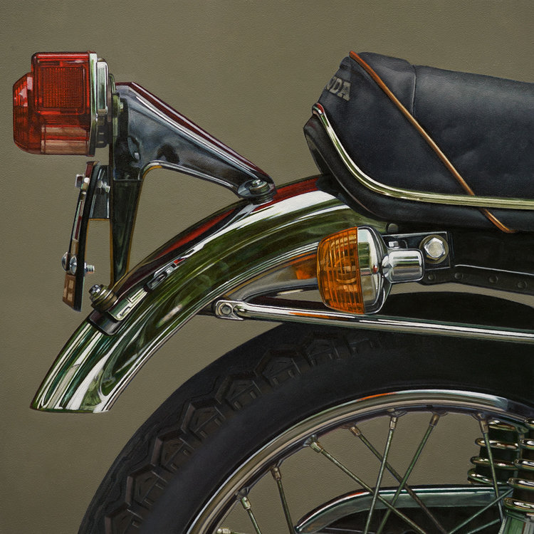
Honda: Aft, James Neil Hollingsworth, oil on panel, 12″ x 12″
To the prejudiced, everything that belongs to a certain category tends to look alike. Likewise, to its detractors, I suspect photorealism all looks the same. In their view, it smothers individuality. It’s impersonal and slick. It’s meretriciously seductive in its surface pleasures. And what makes it so galling: it’s popular. Although I use photorealist methods, I have been known to respond this way to some of the hyperrealism I see—opulently lavish with color and light and detail and yet seemingly devoid of subtle emotional tones. It’s so extreme in its technical skill that mostly it gives you an envious thrill similar to what you might experience while gazing at a Lamborghini on a showroom floor. I’d love to know how that car and those paintings are made, but I wouldn’t feel right bringing either of them home. I think that’s how many fellow painters react to this genre as a whole. It’s cool perfection seems as off-putting as a luxury item.
On the other hand, I could rattle off a list of photorealists whose work I love, as well as work that has the same deadpan, literal accuracy but relies to a lesser degree on photographic technology. (The Dresden painters, the French classicists, for example.) With his lenses and maybe mirrors, Vermeer would be the most beloved practitioner, of course, but many different contemporary painters working in this mode evoke far more than just a lust for looking. Their paintings find ways to convey almost exactly how things look, without any creative meddling, and yet also manage to be individually expressive by employing subtle, personal stylistic jigs—the self-limiting guides of an individual painter’s personal conventions and preferences. Some of these painters evoke a world of memory and stillness and poetry: the sense of order that saturates a certain kind of autumn afternoon, the smell and sound of a golf course, a childhood home in the dusk, or the look of a certain season in the way its light falls on things arrayed under a window. Behind all of that, throughout almost all examples of the genre itself, there’s an affirmation of the Apollonian order embedded in science and technology–its almost ontological presence in modern experience so omnipresent it becomes invisible, though it is what makes possible suburban homes and golf courses and lunches at a favorite diner and lavishly abundant supermarkets and quiet October afternoons scented with burning leaves when you can sit and do nothing in your backyard but listen to a remote motorcycle start up again at a green light. By and large, photorealism shows you how contemporary happiness looks and feels–you look at one of these paintings and realize how happy you actually are. Which is, by and large, what Vermeer wanted to depict as well.
I’m finding myself this year, in my own painting, concentrating on one sort of photorealist work that ought to have its own name: photorealist abstraction or abstract representation would describe it pretty well, though it Continue reading ‘Happiness, courtesy James Neil Hollingsworth’
March 21st, 2019 by dave dorsey

Again while running, two songs came up in my playlist rotation, and the lyrics struck me as a good description of two sorts of people, with two different visions of the world. But maybe not. It seems I fit into both of these groups. Why do both of these songs feel true at the same time . . .
Time Hard, The Pioneers:
Everyday things are getting worse
Everyday things are getting worse
Everyday things are getting worse . . .
I took him down to the market place
And them laugh at my dog
You never see smoke without fire
I said
Oh,
You gotta hold your head up high
Everyday things are getting worse
Everyday things are getting worse
Time so hard, why oh why oh lord
Getting Better, The Beatles
I’ve got to admit it’s getting better (Better)
A little better all the time (It can’t get no worse)
I have to admit it’s getting better (Better)
It’s getting better
Since you’ve been mine
Getting so much better all the time!
It’s getting better all the time
Better, better, better
It’s getting better all the time
Better, better, better
March 18th, 2019 by dave dorsey
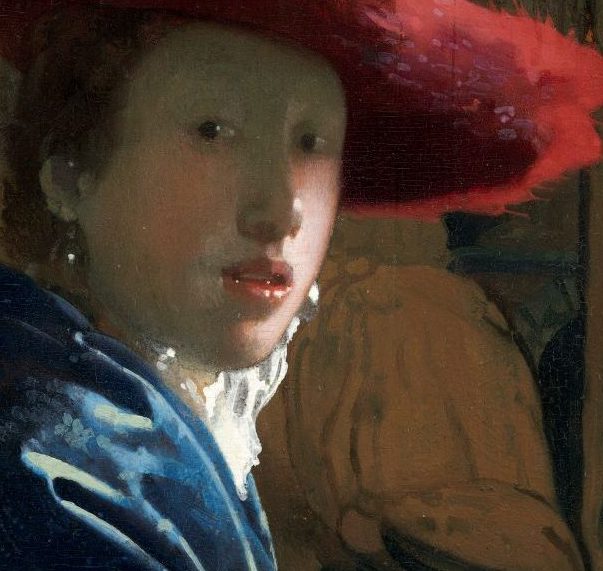
Girl with the Red Hat, detail, Vermeer, National Gallery of Art
While I was running today, it occurred to me there ought to be a contrarian challenge directed at idealistic and/or gullible art students before they get launched into the world. Someone should dare them to leave behind, at their death, fewer paintings—or works of any sort—than Vermeer or Piero did. Of course this isn’t difficult. Anyone could leave behind three dozen paintings. Three dozen supremely painted ones, though, is still a challenge. Vermeer’s A-game isn’t in evidence in every one of his 36 extant works. There are around twice that number from Piero della Francesca. The seed to be planted here is that you would spend so much time on each of them that you have a far better chance of achieving something near that rarefied level of quality, without going full-throttle OCD. Finish fewer than most, not more, but make each one count in a way few artists can. It would run counter to most of what the commercial art world herds people toward: don’t get on a track where you’re working for another solo show every three years, don’t try to come out of art school and sell through a metropolitan gallery for significant sums, quit worrying about building a CV with awards and honors, and so on. The whole point would be to ignore the entire system that turns an artist into a one-person factory and simply focus on producing a small number of supremely realized works of art, on your own terms. This is all slightly self-justifying though I have no intention of reducing my slow output even more. Yet I’m thinking about this because my own production has slowed down in the interest of getting things right and focusing on a single series of larger paintings. But the Vermeer Way would be more extreme. For someone thinking on those terms, it would require a day job, or some other humbler and/or more nefarious way to make enough money to get by, short of becoming a professional gambler or day trader—and it would probably mean not having children, though a marriage or other domestic partnership could certainly help, on the economic end. It pays to be gay in the art world, in many ways, but the greater chance it gives you of being childless is a major logistical advantage. Mostly though it would be a way of focusing, while in the studio, on nothing but the quality of the work itself, leaving aside all motivations related to quantity. Imagine posting one image every three or four years on Instagram. You would have six followers, but it would be an event. At the very least, you and a few others would know what you’d done, though you might feel like Crash Davis breaking his minor-league baseball record in Bull Durham with only Susan Sarandon paying enough attention to realize he was a record breaker. Worse fates could be imagined.
March 15th, 2019 by dave dorsey
 A couple weeks ago, I was pleased to deliver two still lifes to the Arnot Art Museum for the 76th Regional Exhibition. The show will run from March 16 through June 14. My two contributions are Breakfast with Golden Raspberries and Begonias and Dahlias.
March 12th, 2019 by dave dorsey
He was experiencing one of man’s keenest but least understood drives–information compulsion. –Tom Wolfe, Bonfire of the Vanities
I devote myself to painting, and then writing about painting, and I deposit any checks that come my way when someone buys one of my paintings, but I’ve never strategized any of it as a career. I do have a career, but it isn’t the point, that’s all. It seems like a way of warping the whole activity into something it isn’t. A CV resembles a parasitical, invasive life form, imported from the world of business, the way sparrows were brought to North America from Europe. I’m a professional artist, but that term seems almost an oxymoron, and I don’t really think of myself as professional (except for my diligence at the easel) any more than Socrates would have thought of himself as a professional philosopher or Jeremiah Johnson a professional badass. I always think of Van Gogh when I imagine the system in which artists now vie to get onto a career track–prestigious MFA, straight to prominent gallery, applications for grants and residencies, keeping a running tally of awards, all of it as dutiful as the path of a white collar organization man in the Fifties. I keep my CV fresh, I list my awards and summarize my shows and sales. Yet it feels as if I’m applying for a job as a comptroller whenever I submit my CV upon request. Where would Vermeer have found himself in this system? Imagine his exhibition history. After a lifetime of work he’d have had enough for one big solo show at Zwirner, with maybe some other artist to fill out the adjacent space.
My work always takes more time than I would like, but at that constraining pace I know I’m doing good work. The more I become committed to my best possible work, the less new work I have to show, though I’m starting to find ways to shave a little time from the process and actually do more during a day of painting, which is nearly every day of the week.
This puts me into a bind as far as hewing to the ostensible necessity of building a social media following. (In book publishing, this has become brutal. Publishers more and more have no interest in authors who don’t have a following.) As much as I like it—Instagram is the only social media I really use with any regularity, other than this blog which is social only in its availability to anyone. I recognize social media as yet another “professional” taskmaster even though it’s promoted as a service. If you are already known and have a serious following, it can be extremely useful, as is Twitter, which I don’t use at all. If I were far more famous, I would enjoy posting almost anything that seemed worth photographing on Instagram just as a way of being open about who I am. But I’m not, and Instagram isn’t going to get me there. The companies that own these platforms want you to think they will get you there. It’s a lie to make social media feel compulsory, in both senses of the word. They want people to feel irresistibly drawn to them but they also want the stream of content to begin to feel like a duty, an obligation, a necessity. Social media uses FOMO, the fear of missing out, to drive most users (sounds like “drug user” doesn’t it?) to work harder and harder to build a following and get likes, but all of social media has an inherent Catch-22. You need to have a following already by other means to even get noticed, which means there’s no way to gain followers unless you already have them. There are always rare exceptions as in the case of emergent YouTube stars, but any kind of time devoted to Instagram is better spent in front of an easel. Continue reading ‘Better belated than too soon’
March 9th, 2019 by dave dorsey
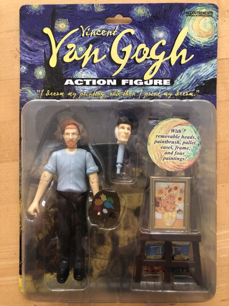 One would think only action painters would be honored as action figures. When you fail to get that Guggenheim Fellowship, and the Genius Award recedes beyond the horizon and MoMA looks less and less likely to put you into its permanent collection, take heart, as always, from Van Gogh’s non-existent career. Even if all else fails, a century from now they might make an action figure of you, only by then it will be fully animatronic and equipped with AI to keep painting in your style, perhaps even better than you do now. At last, action figures will live up to their toy category.
From the back of the package. Wait for it:
Full Name: Vincent Willem van Gogh
Occupation: Painter
Weapon of Choice: Straight Razor
I like how he comes with two heads, the one before and the one after he used that razor to turn his ear into a Valentine.
March 6th, 2019 by dave dorsey
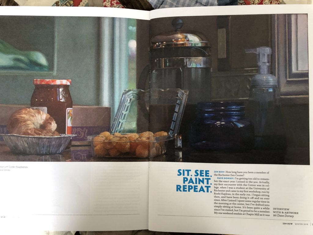 I had a recent email conversation with Chris Pulleyn, an old friend, a former employer, and a central figure at the Rochester Zen Center, where I’ve been a member mostly in absentia for a couple decades. She asked me a few questions about the relationship between my still nascent meditation practice and my painting–so that she could publish some of my work and our conversation in the Center’s publication, Zen Bow. It was a wonderful gesture on the part of the people at the Center, and much appreciated. One thing that was fun about the conversation was that she had a hard time seeing common ground between the few paintings of skulls I’ve done—which struck her as very Buddhist, being emblems of mortality and impermanence—alongside my candy jars. It forced me to think about how much meditation has governed not only the energy I bring to painting, but also influenced my understanding about how painting works. What follows is a condensation of the Q/A in Zen Bow.
 My first encounter with Zen was in college, when I was a student at the University of Rochester. With a friend from my dorm, I attended my first workshop, run by Philip Kapleau, the center’s founder, in the early 70s. I began sitting then, and have been doing it off and on ever since—constantly trying to establish a daily habit. After I joined as an actual member in the 90s, I spent some regular time in the morning at the center but I’ve drifted into simply sitting at home. It was more than taking up something like yoga. It was, for lack of a better word, a philosophical pursuit.
I came out of high school with a kind of corrosive sense of doubt: a tenacious questioning about the possibility of meaning that seemed urgent but unanswerable. The nature of this doubt is hard to describe without muddling it up, but it was difficult and life-changing and psychologically “totalizing,” to use a word I hear in other contexts now. After contending with this state of unrest for a couple years, as a freshman at UR, I finally got around to reading J.D. Salinger’s Glass family stories, which introduced me to a variety of spiritual traditions: Vedanta, Zen, Russian Orthodox Christianity. His fiction offered me an intersection of references to a variety of spiritual paths. I was so impressed by Salinger, in addition to my curriculum in English lit, I made out a reading list of Salinger’s favorite authors and read them, one after another, as if he had introduced me personally to each of the writers themselves and said, “you two should get to know each other.” Tolstoy, Dostoevsky, Proust, Henry James, Keats, Coleridge, and so on, (some of whom I’ve been going back to reread now after all this time.) As a result, I spent the summer after my freshman year at UR reading all of Proust and most of Kierkegaard. Kierkegaard was crucial—my parents were Presbyterian for a while in my teens, and I still consider myself a Christian who uses Tolstoy and Kierkegaard both as an excuse not to go to join a church, but a few of Kierkegaard insights were very close to the paradoxes one faces in Zen practice when trying to break through how the mind entraps itself without realizing it. (I think the conscious, egocentric mind is itself often a sort of self-sustaining trap.) In addition, I made a list of references to spiritual disciplines and other writers mentioned in Franny and Zooey: Ramakrishnma, Mei MORE
March 2nd, 2019 by dave dorsey
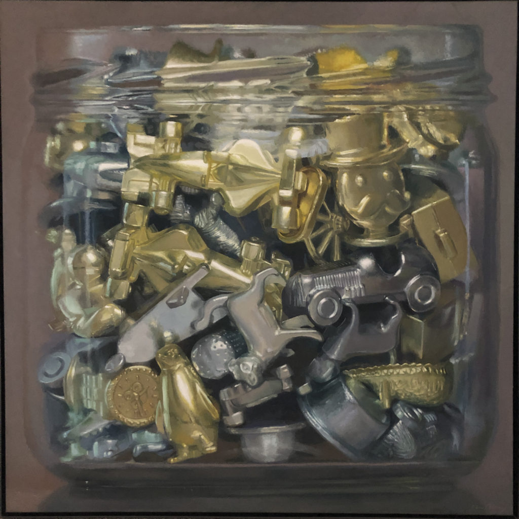
Monopoly Board Tokens, oil on linen, 40′ x 40″
I was pleased to learn recently that Monopoly Board Tokens was selected for inclusion in Manifest Gallery’s 9th International Painting Annual. They received 1313 entries from 399 artists and picked 122 works by 73 artists from nearly half a dozen different countries. I was included in the INPA 8 as well, which is available, and will be shipped soon for anyone who ordered it. Thanks, Manifest. Note: this is one of three paintings in a triptych: as part of the triptych it’s entitled Renunciation: Monopoly Board Tokens.