Archive Page 9
May 9th, 2020 by dave dorsey
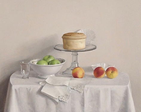
The Pain Surprise, Raymond Han, oil on canvas, 32″ x 36″
Decades ago, my wife and I (with our infant daughter) moved from my first job in Great Falls, Montana to Utica, New York. Within a year or two of that move, I attended two seminal exhibitions at the Munson-Williams-Proctor Institute, where I was enrolled in art instruction for a time. I had consciously refused to attend art school, even though I’d started painting seriously in my mid-teens, and made up for it by working with artists at places like MWP and later at Memorial Art Gallery. I’m going to write elsewhere about the article in Art News that turned me against the world of art in my teens–it’s intellectual pretensions, the post-modern obscurantism of art criticism, the way in which so much art during and after the Sixties arose out of a kind of snotty disdain for the ordinary life of common people. It was all repellent to me, and the artists I loved like brothers at the time–Blake, Van Gogh, Gauguin, Matisse, Braque, Rouault, Klee–struck me as obsolete, historically relevant but offering nothing for a contemporary artist to assimilate. I was too put off by the comparative austerity of Diebenkorn’s abstractions to see how they sprang almost directly from Matisse. But even aside from the way in which the art world seemed like an exclusive club devoted to making itself inaccessible to most people, I believed that I was a late-comer who had no place in the world of contemporary art. I looked at the increasingly sterile ways in which The Next Big Thing in art simply confirmed how all the revolutions were over and there was nowhere new for painting to go, if you understood progress as increasing levels of freedom for visual artists. I didn’t see what was actually going on, the way Arthur Danto did–how Pop Art made anything possible and therefore anything was now acceptable and contemporary. Anything could be art, including the sort of work done in the past. So I continued to paint, out of my own sense of inner necessity—but feeling as if my work had no place in the larger scheme of things, rather than paint and teach, I became a reporter and a writer.
Yet when I found myself walking into “An Appreciation of Realism” at Munson-Williams-Proctor in the 80s, I realized what was still possible, and how I’d missed the way art had become, in a sense, ahistorical. It was an exhibition devoted to representational painting and the roster of artists represented was incredible: Bailey, Estes, Pearlstein, Beal, Kahn, Lennart Anderson, Freilicher, Soyer, Leslie, Resika, Jerome Witkins, Katz, Welliver, Guston, Goings, Cottingham, Close, Bechtle, Fish, Beckman, Paul Georges, Leland Bell, Rackstraw Downes, and Fairfield Porter, along with more than a dozen others. It was an amazingly comprehensive curation of contemporary representational painting by all the names that I continued to study for years after I saw that show. It opened my mind to the possibility that I might actually be able to paint in ways that would belong to what was happening in art around me. It showed me, essentially, that it was possible to be any sort of painter I wanted to be–and all that remained was to spend years figuring out exactly what that was, which I did, slowly and patiently.
What’s interesting to me now is that photo-realism was well-represented but didn’t move me, and that I don’t even recall the work by Fairfield Porter, someone whose paintings I love as much as anyone who has ever picked up a brush. In short order, the arts institute organized a second show which had an even more profound effect on me: a large solo exhibition of Raymond Han’s still lifes. He was born in Hawaii in 1931 and died three years ago in upstate New York. He never got an art degree, but learned from other painters—as I did—and attended the Art Students League. His large still life work in the early 80s was astonishingly masterful: large tables covered in white tablecloths, where he had carefully arranged china, glass, silverware, all of it in tones of white, gray and brown, with small areas of intense color provided by a bit of fruit or flowers. His tables were set back against an off-white wall, his objects casting faint shadows against the wall, all of it like a little domestic city spread out on the fabric, a planned community where each object had been placed with infinite care. He had no desire to paint what he saw in his environment, just as he found it, but created the painting by placing everything where it needed to be to yield a certain kind of balance and serenity—in the way William Bailey does, but with an entirely different feel for his earth tones and matte surfaces from a level, frontal perspective. Han allowed you to look slightly down from in front and above the tabletop. The effect was to give you a glimpse of a snowy landscape, mostly variations of white, with objects and spots of beautiful color all the more powerful for being so rare. Continue reading ‘Han’s solo’
April 12th, 2020 by dave dorsey
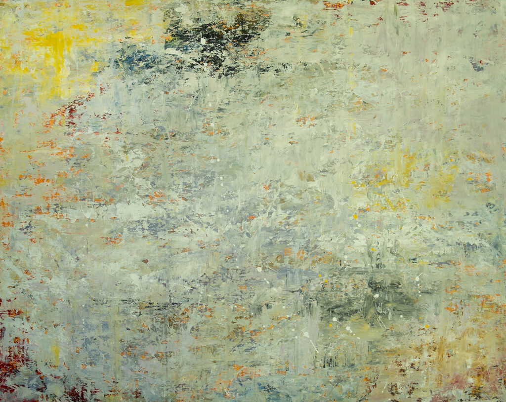
Winter, Richard Harrington, acrylic on panel, 48: x 60″
I stumbled across this abstract from my Oregon friend, Rick Harrington, a couple weeks ago, because I was intrigued by something he’d posted on Facebook and wanted to see what he was up to lately. He wrote that he’d completed it a couple years ago, as part of a triptych: all three paintings are posted at his site. He’s been painting what I would call color field barns and color field animals for years. This is presumably a snowstorm, which is already a fairly uniform field of white, but what he’s done here with that foreground white-out is wonderful: the way the intense under-layers of color suggest both natural and internal phenomena, late autumn reds, the yellow glare of the sun in the upper left, and memories of greenery, as if he just went all out with saturated tones in his first strike on the canvas and then started concealing everything he’d done so that you get just little glimpses, hints, of what’s there underneath, which makes the image as much a representation of human psychology as it is a Turner-esque vision of a storm. He paints his barns mostly with rags, and could easily have dispensed with brushes for this one, but I didn’t ask. I was too busy praising him.
April 9th, 2020 by dave dorsey
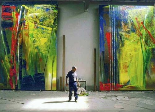
Gerhard Richter with his work
The shot of these two huge abstracts, with Gerhard Richter dwarfed by his work while posing in the shaft of light, appeared on Instagram at abstrac.ted. I can’t find anything quite like them in the compendium of Richter’s work over the decades at Gerhard Richter. I’m wondering if this means he has recently completed these, and if so, it’s an interesting shift in his work. With the exception of a series he did in 2005, all entitled Forest, these two paintings distinguish themselves from almost all of his earlier, extremely flat
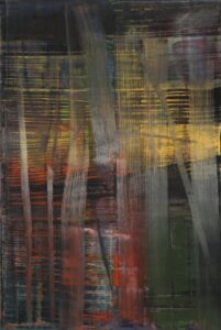
Forest
abstracts, obedient to Clement Greenberg’s advocacy of flatness as painting’s most essential, defining characteristic–what, in retrospect, seems like either the silliest or the most obvious proposition about art ever to be embraced in such a hugely influential way. In the bulk of his abstract paintings, Richter experiments with the effects he can get by using large amounts of multiple colors, smearing, masking, scraping, scumbling (on a large scale) one color into another in various ways. In the earlier work, he achieves suggestive effects of luminosity and hints of depth—so that some areas of paint seem to recede to an area just behind the surface. In the Forest series, this is more pronounced: you can discern what might be tree trunks in a foreground, or an underwater scene with tiers of aquatic plant life, against an indeterminate soup behind them, in a way that feels slightly Klee-like. Landscapes blur into twilight. But in this pair of huge canvases, the sense of space is vast, giving a sense of receding vistas. Light seems to shoot down through layers of foliage or enormous skylights, and the vertical shafts to the left in each canvas suggest buildings, or maybe the geometric angles of Richter’s studio itself. In the painting on the left, down in the lower right corner, the rectangular area of softened light seems like a window that offers a glow reaching the viewer from miles away. More than most of his abstraction in the past, this work from Richter, if it’s recent, gives reason to hope he’s trying to find a closer, expressionist truce between abstraction and his celebrated genius as a realist.
April 6th, 2020 by dave dorsey
My new favorite medium.
I’ve been joking with a number of people that having complied with the social isolation required around the world to fight COVID-19, I can’t tell the difference between this and my ordinary life. Such is painting. I still make furtive trips to the supermarket and Home Depot. I paid cash for one small purchase recently and my fingertips did an absurd dance with the clerk’s in our attempt not to touch each other. Meanwhile, running along the Erie Canal’s towpath yesterday, I felt as if dozens of erstwhile isolationists had fled to that nearly empty channel of water, far more people than I would normally see at this time of the year. Walkers, runners, cyclists and in-line skaters were easily able to keep their distance and most were friendlier than they are in the aisles of stores. Maybe I’m just noticing for the first time how eye contact at Wegmans is as rare as on the streets of Manhattan, where people walk under an unspoken edict never to smile at anyone or acknowledge individual faces in the packed flow of pedestrians moving along Fifth Avenue. (Fifth Avenue is as dry, figuratively speaking, as the Los Angeles River these days.)
All of these sequestered hours provide ample time to paint, though I’ve noticed in myself and a number of others—Christopher Burke’s latest post on Instagram talked about his creative rut—that this weird, nearly universal state of suspended animation in society casts a pall on individual effort, for some reason. I’m still painting every day, often for six hours, and making steady progress, but always with an irksome sense that I work more slowly than I would like—yet that doesn’t inspire me to put in longer hours.
So I’m busy enough to be posting new work every few weeks, but I’ve withdrawn to a great degree from Instagram, and have been lax in my posts here, partly because of this languishing sense that everything has come to a halt, but mostly because I’m working on a long series of salt water taffy paintings. I don’t want to post them piecemeal, but rather to wait until the series is nearly done—which will take more than a year. I want to excavate all the possibilities from this radical narrowing of my work. I spoke recently with Rick Harrington about this, telling him that I’m rankling a bit from the constraints of doing what feels in some ways like the same thing over and over again—which is entirely the point of the series, to see how a simple subject accurately rendered can end up working the way an abstract works—and he said, from his long experience with his abstracted barns, that you can learn much by sticking with a particular subject for years and years. After years of struggling to emerge from a fog that resulted from the aftereffects of anesthesia during surgery on his throat, he is back in fourth or fifth gear, reaching a new plateau in his efforts—though the sudden stasis in the economy seemed to threaten his momentum in his galleries. (It hasn’t just yet.) Of this, I’m certain: boxing myself into this narrow line of work will provide ample reward and allow me to learn a lot, and could open some doors. But that doesn’t make it feel any less confining, and doesn’t make it any more pleasant to become a reluctant Punxsutawney Phil and renounce a regular dose of likes on Instagram. It all comes down to hours at the easel; like everything else in life, it’s mostly a matter of showing up and letting the work happen. And maybe pushing for another couple hours beyond the point where you want to get outside and forget the canvas until tomorrow.
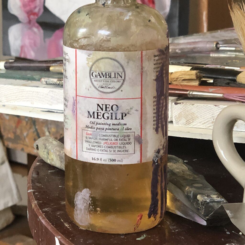
One thing I happen to have learned already, in my pursuit of a certain flow of paint in this series, is that from now on, I’m a lifelong convert to Gamblin’s Neo Megilp medium. It is a gel, rather than a fluid, a safer version of Maroger’s, a medium its inventor claimed was the medium of the Old Masters. It’s lead-based, while Neo Megilp uses no lead. Fairfield Porter mixed his own Maroger’s and you can see it in the quality of his marks. I don’t know why I haven’t tried it before now, but it’s marvelous—it gives a consistency to the paint that allows a fluent application, without dripping or visible thinning of the pigment, and stays ductile for a long time, allowing wet-on-wet technique, which is my goal. And a little goes a long way, so that the bottle I’m currently depleting will last for many paintings, even large ones. It’s a joy.
April 3rd, 2020 by dave dorsey
Skye, Chris Baker, gouache, detail.
About 200 hundred pages into the Kilmartin translation of Swann’s Way—I came back to this passage after finding a similar observation in the second book—Proust talks about how his fiction is non-intellectual, and that his lack of ideas originally persuaded him that he couldn’t be a writer. A La Recherche du Temps Perdu shows how his pursuit of love and friendship and social status kept him from discovering his vocation, though ironically the story of his immersion in the illusions of society becomes the actual content of the novel he was unable to write because he was living the events of the book. He had to get lost to find himself.
Here is the passage that says so much, for me, about visual art and the lack of intellectual content or meaning in the paintings I love most (it’s appropriate that visual art was one of the primary inspirations for Proust’s novel and for his style of writing):
Then, quite independently of these literary preoccupations and in no way connected with them, suddenly a roof, a gleam of sunlight on a stone, the smell of a path would make me stop still, to enjoy the pleasure that each of them gave me, and also because they appeared to be concealing, beyond what my eyes could see, something which they invited me to come and take but which despite all my efforts I never managed to discover. Since I felt that this something was to be found in them, I would stand there motionless, looking, breathing, endeavoring to penetrate with my mind beyond the thing seen or smelt . . . It was certainly not impressions of this kind that could restore the hope I had lost of succeeding one day in becoming an author and poet, for each of them was associated with some material object devoid of intellectual value and suggested no abstract truth.
He ignores these intimations for years because they offer him no ideas. He spends years believing he had no talent, no creative virtues, as a result of this lack of intellectual originality. By the end of the novel, the elimination of ideas in favor of the raw phenomena of life, the matrix of felt experience, becomes his sextant, enabling him to bring to life a complex and beautifully superficial world, saturated with a reality to which its inhabitants remain deaf and blind, except in brief, revelatory moments—and those simple moments are what his art is dedicated to triggering, the opening up of a world, intensely familiar but also fresh, surprising, and new. In other words, alive. And through all of it runs the Platonic suggestion that these glimpses are also glimpses of something incorruptible and timeless, hints that the material world is merely the tip of an iceberg invisible to conscious thought.
March 15th, 2020 by dave dorsey
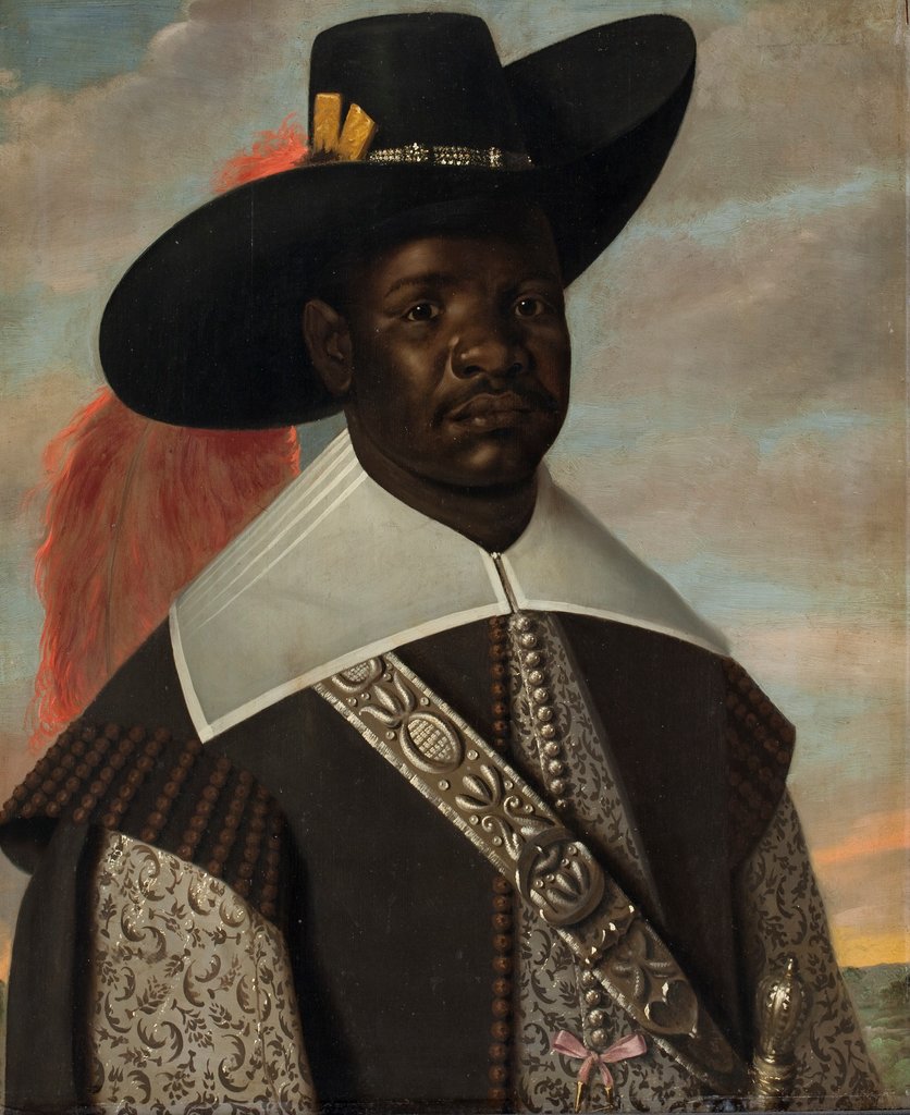
Jasper Beckx’s portrait of Don Miguel de Castro, a Congolese ambassador to the Netherlands, from 1643.Credit…Statens Museum for Kunst
From Black in Rembrandt’s Time, at the Rembrandt Museum in Amsterdam (closed at the moment in the European shutdown.) From the museum’s website: “For years I’ve been looking for portraits of black people like me. Surely there had to be more than the stereotypical images of servants, enslaved people or caricatures? I found the alternative in Rembrandt’s time: a gallery of portraits of black people who are depicted with respect and dignity.” – Stephanie Archangel, Guest Curator
March 13th, 2020 by dave dorsey
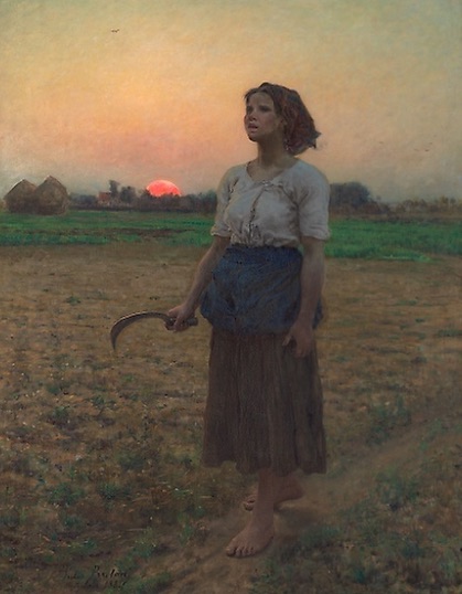
The Song of the Lark, Jules Adolphe Breton, Art Institute of Chicago
Bill Murray tells the story of how he stumbled onto this painting and how it saved his life, more or less, at an especially discouraging moment in his early career. Or at least it showed him how he had nothing to be discouraged about. I love how Breton manages to illuminate the figure with the cool, blue light of the dawn in the west rather than the direct and warm light of the sunrise in the east. It somehow conveys the clemency of the young woman’s experience hearing the bird to inaugurate a day of work. And, who knows, maybe we need to say a few words of gratitude to this painting for Ghostbusters, Lost in Translation, and Rushmore, not to mention a couple of the best moments in Tootsie.
March 10th, 2020 by dave dorsey
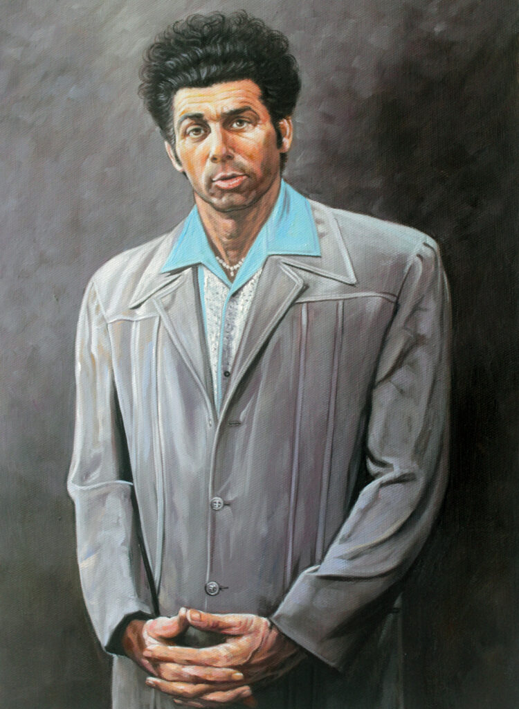
JERRY: I have to go meet Nina. Want to come up to her loft, check out her paintings?
GEORGE: I don’t get art.
JERRY: There’s nothing to get.
GEORGE: Well, it always has to be explained to me, and then I have to have
someone explain the explanation.
JERRY: She does a lot of abstract stuff. In fact she’s painting Kramer right now.
GEORGE: What for?
JERRY: She sees something in him.
GEORGE: So do I, but I wouldn’t hang it on a wall.
In
“The Letter,” the 37th episode of Seinfield, Jerry’s girlfriend, played by Catherine Keener, is painting a portrait of
Kramer, which inspires this conversation. Did anyone have to explain visual art before 1850 or so? Did explanations become more important than the creative work itself at some point mid-20th century? Jerry is right: there’s plenty happening in a great painting, but there’s nothing to get in the greatest of them, at least in the sense of an explanation.
March 7th, 2020 by dave dorsey
“I write only when inspiration strikes. Fortunately it strikes every day at 9 a.m. sharp.”
That quote has been attributed mostly to Faulkner but also to a number of other writers. It summarizes pretty much what it requires to be professional at anything: habitual hard work. I like the quote because that’s exactly the time I usually sit down at the easel, and it’s when I have the most energy and am also the most critical of what I’ve already done, partly because the sun rises and shines through a window behind me, often striking the canvas directly. There’s no escape from that intensity of sunlight: God’s flashlight, as Larry Miller put it in a slightly different context, though the feeling is the same. Despair and shame at everything so manifestly wrong that felt so right at the time. So 9:05 is when inspiration really strikes. It’s when you ignore everything going on inside you–the sudden urge to remodel the basement, the desire to shovel snow, the ease with which you can now contemplate the emotional safety of bank robbery compared with the struggle of painting–and you pick up the brush. Or the old shirt you use to wipe away a few square inches of still-tacky paint that represent five hours of sub-par effort–and you make merely acceptable whatever looked perfect yesterday and then, around 11 a.m, you actually start spreading paint on canvas in places you haven’t yet defiled. Around 3 p.m. you think, “Damn, I’m good.” Until inspiration strikes again at 9 a.m.
February 11th, 2020 by dave dorsey
Sans bananafish, J.D. Salinger with his sister, Doris
Some flava in ya ear (if you read this aloud.) I mean, seriously, a lot of flava. J.D. Salinger’s recipe for popcorn (I hope the measure for the popcorn itself represents the amount of unpopped kernels). This was a small contribution to the exhibit of personal items from his archives at the New York Public Library. The salutary effect of the exhibit was to bring into relief how happy, if not blissful, Salinger’s life was in Cornish. He liked him some Hitchcock. He loved spending time with his grandkids. He read books about spies and kept the Associated Press Stylebook on a shelf in his bedroom. He could write letters like nobody’s business. And, OK, he was a little weird, but the weirdness was at the heart of how great he was, and, besides, aren’t we all, a little? It was cool to learn that had a Chevy Blazer, from way back close to when GM started to market them, to haul the firewood he cut.
For 1/2 cup of popcorn:
6 tsps sea salt
2 tsps paprika
1 tsp. dry mustard
1/2 tsp garlic powder
1/2 tsp celery powder
1/2 tsp thyme
1/2 tsp marjoram
1/2 tsp curry
1/2 tsp dill powder
February 8th, 2020 by dave dorsey
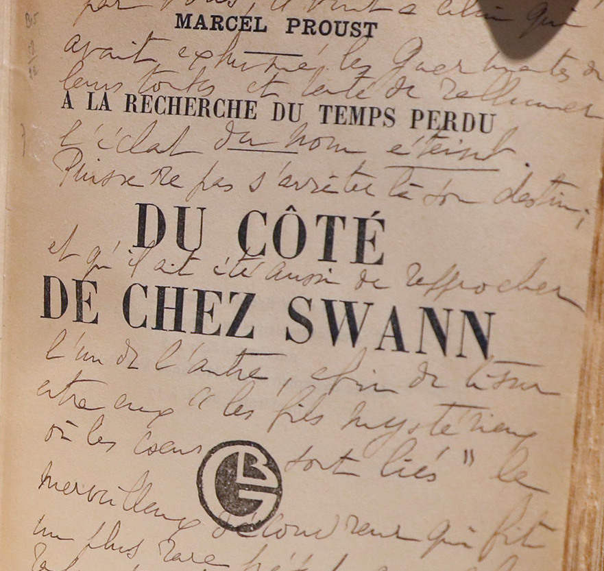
An orginal edition of Swann’s Way from Proust archives. Photo by Getty
Why art runs in parallel to science as a way of discovering what science can’t plumb, sort of the corrolary of chemical elements in the structure of human subjectivity, the human heart, from Swann’s Way:
When, after that first evening at the Verdurins’, he had had the little phrase played over to him again, and had sought to disentangle from his confused impressions how it was that, like a perfume or a caress, it swept over and enveloped him, he had observed that it was to the closeness of the intervals between the five notes which composed it and to the constant repetition of two of them that was due that impression of a frigid, a contracted sweetness; but in reality he knew that he was basing this conclusion not upon the phrase itself, but merely upon certain equivalents, substituted (for his mind’s convenience) for the mysterious entity of which he had become aware, before ever he knew the Verdurins, at that earlier party, when for the first time he had heard the sonata played. He knew that his memory of the piano falsified still further the perspective in which he saw the music, that the field open to the musician is not a miserable stave of seven notes, but an immeasurable keyboard (still, almost all of it, unknown), on which, here and there only, separated by the gross darkness of its unexplored tracts, some few among the millions of keys, keys of tenderness, of passion, of courage, of serenity, which compose it, each one differing from all the rest as one universe differs from another, have been discovered by certain great artists who do us the service, when they awaken in us the emotion corresponding to the theme which they have found, of shewing us what richness, what variety lies hidden, unknown to us, in that great black impenetrable night, discouraging exploration, of our soul, which we have been content to regard as valueless and waste and void. Vinteuil had been one of those musicians. In his little phrase, albeit it presented to the mind’s eye a clouded surface, there was contained, one felt, a matter so consistent, so explicit, to which the phrase gave so new, so original a force, that those who had once heard it preserved the memory of it in the treasure-chamber of their minds. Swann would repair to it as to a conception of love and happiness, of which at once he knew as well in what respects it was peculiar as he would know of the Princesse de Clèves, or of René, should either of those titles occur to him. Even when he was not thinking of the little phrase, it existed, latent, in his mind, in the same way as certain other conceptions without material equivalent, such as our notions of light, of sound, of perspective, of bodily desire, the rich possessions wherewith our inner temple is diversified and adorned. Perhaps we shall lose them, perhaps they will be obliterated, if we return to nothing in the dust. But so long as we are alive, we can no more bring ourselves to a state in which we shall not have known them than we can with regard to any material object, than we can, for example, doubt the luminosity of a lamp that has just been lighted, in view of the changed aspect of everything in the room, from which has vanished even the memory of the darkness. In that way Vinteuil’s phrase, like some theme, say, in Tristan, which represents to us also a certain accretion of sentiment, has espoused our mortal state, had endued a vesture of humanity that was affecting enough. Its destiny was linked, for the future, with that of the human soul, of which it was one of the special, the most distinctive ornaments. Perhaps it is not-being that is the true state, and all our dream of life is without existence; but, if so, we feel that it must be that these phrases of music, these conceptions which exist in relation to our dream, are nothing either. We shall perish, but we have for our hostages these divine captives who shall follow and share our fate. And death in their company is something less bitter, less inglorious, perhaps even less certain.
February 5th, 2020 by dave dorsey
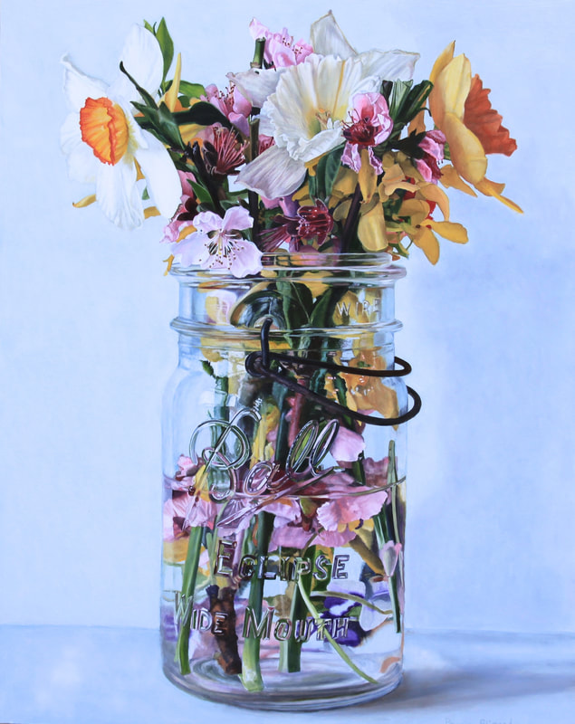
Peggie Blizard. Pink Flowers in Water, Oil on Panel, 30 x 24
I’m partial to jars. I love the way a Ball jar’s particular utility lends character to its shape and surface, and how everything flows from its usefulness, its handle, the gemlike refractions of the embossed logo, and especially the glass threads for the lid around the lip. Along with its generally humble demeanor. When I walked into the little room where Peggie Blizard’s solo show was on view at George Billis (yet another discovery for me there), my immediate reaction was that I wished I had done the paintings myself. (It’s the way I usually react to work I love.) Her translucently blue and colorless, transparent Ball jars have a squat, almost muscular repose that give weight to the dense delicacy of her seemingly random bouquets, loading the center of the canvas with a gorgeous and rigorously rendered entanglement of color and line. Each painting is an improvisation within the same format: the rampant complexity of flowers thrust into the smooth and simple and uniform tones of the glass, echoed by the slight variations in sunlight on the uniform wall behind the jar, which serve to unify the multiplicity of shapes and tones, centering them, concentrating them into a static explosion. With ingenuity, she has stuffed blossoms down into the jar, mingling with the stems, to extend and push her cluster of lustrous color down to the bottom of the panel. The tones are conveyed with passionate accuracy, and the light brings to mind Janet Fish’s sunny still lifes at their brightest. Her show ends in a few days.
February 2nd, 2020 by dave dorsey
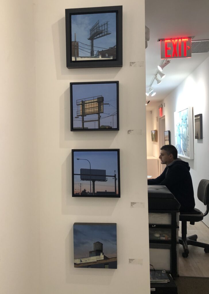
Christopher Burke’s work hanging in back at George Billis in Chelsea. Billis is at work on the computer, at the right.
Though three other artists at George Billis Gallery in Chelsea were having solo shows in the temporary space Billis had arranged to use next door to permanent location (undergoing renovation), he still managed to have maybe eight or nine paintings by Christopher Burke hanging in the office hallway. It was the first time I’ve been able to see the actual paintings, having followed him on Instagram with great interest. There’s a subset of artists I follow on Instagram who, like Burke, are working to find ways to make images representationally persuasive but also effectively abstract in one way or another, none of them much like any of the others: Burke, Joshua Huyser, Jessica Brilli, Harriett Porter, Mark Tennant, James Neil Hollinsworth, Harry Stooshinoff, Mitchell Johnson and many others. Each of them is representational and abstract in different ways.
Burke’s work holds up no matter how close you get to it. This is not something I can say about a number of otherwise amazing painters. (Walton Ford’s paintings are breathtaking , but up close, when you get near the actual work, the marks seem expedient and for some reason, disappointing, though it’s hard to say in what way. In a discussion with my friend Rick Harrington, now living and painting in Oregon, I learned that he’d had the same reaction. The images are stunning; the paint itself not so much, though neither of us could say why it mattered in terms of the quality of what he does. And Ford would hardly care about our disappointments.) All of which is an awkward, roundabout way to say Christopher Burke’s paint holds up from any distance, something I wanted to confirm by paying a visit to Billis on my short trip to Manhattan–having been unable to get to Burke’s show here late last year. His choice of subject is crucial to what he’s doing. The images, both his carefully composed portions of roof and sky as well as his drone-like perspectives of flood plains, offer him that perfect balance between abstraction and precise realism. What’s marvelous is how much feeling Burke can invest in images so minimal and geometric. Visually, Sheeler was up to something similar in Conversation–Sky and Earth, but Burke’s images are beautiful in a more vulnerable way, partly because of their almost Japanese aura of loneliness and emptiness. These humble corners of the sky keep company with an empty, silent billboard jutting up into view, an abandoned water tower gathering shadow, the dusk soon to make everything in these paintings invisible. No one’s around. The power lines sag. Birds congregate somewhere else. Everything is rendered with absolute care and rigor and even tenderness; everything is just as it needs to be. There’s nothing lacking in the painting nor in the world Burke just barely reveals to you.
January 30th, 2020 by dave dorsey
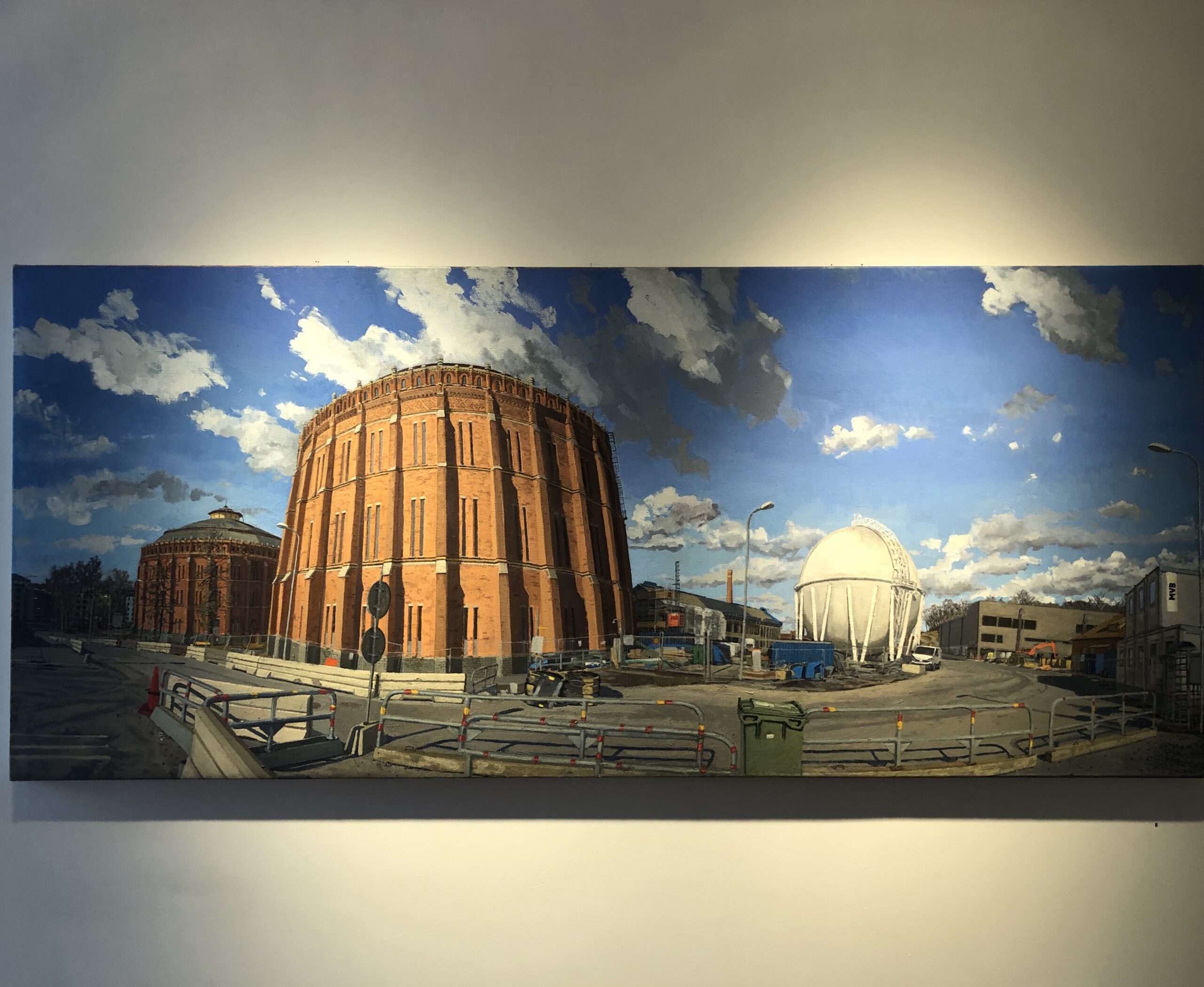
View of Norra Djurgardsstaden reurbanization project around Gasklockan 1 and 2, oil on linen, 33″ x 77″
On my brief visit to New York City, to spend a few hours at the New York Public Library’s J.D. Salinger exhibit a few days before its final weekend, I caught the new installation of work from three artists at George Billis Gallery. It was the only exhibit of new painting I was able to see, because I timed my visit on the worst possible day—between exhibitions at almost all the galleries in Chelsea. Billis had a leg up on all the others and was already prepared for the following night’s opening.
I was the only visitor at the time, with Billis himself clicking away on the computer in back, and Todd Gordon—the painter whose work had been hung in the main gallery space—standing at the window on a call with his wife who was arriving at the airport, having flown in from Sweden with the kids. I didn’t realize he was the exhibiting artist until I’d toured the entire gallery and wandered back to ask him, in my own charming way, where to find a rest room. I’m relieved to report that I never got to my question, because he introduced himself, and we launched into a discussion of the state of the art world at the moment—a delightful series of agreements about almost everything. He was intense, making his points without belaboring them, as I was more likely to do, but amiable and generous in his eagerness to endorse some other contemporary painters whose work would be on view at galleries he directed me to visit.
He’s tall, fit, with the bearing and aura of a guitarist who would prefer to be considered alternative, a good sense of humor, quick to pick up on the slightest irony and add his terse two cents. He had the quality of attention, the alert bearing, of someone who is out in the field, engaged in the hunt, a fellow soldier, not just someone making observations about the battle from a safe distance. I had the sense that, he was doing what we’re all doing: trying to puzzle out, not just from year to year, but from minute to minute, whether or not genuine art can rise up and float over the slippery, unreliable ocean of wealth that grants painters an income and makes a few rich, for better or worse. It’s an experiment with as many possible outcomes—and few, if any, are repeatable—as there are painters.
His painterly landscapes and cityscapes, many similar to urban scenes that he has been doing for quite a while, were compellingly intricate and fresh. In addition, he’d included some more traditionally rustic wooded settings, all of them just as unsentimental and exacting as the city scenes. He works from direct observation, and though he describes himself as a Brooklyn artist on his website, he resides in Sweden and paints both there and in Italy. Aside from his considerable skills at capturing tone and value and conveying the volume of what he’s depicting, what I liked most was the panoramic aspect ratio, as it were, of the work—extremely wide and shallow, like a sideways scroll. It gave me the sense of the proliferation of the world, the seemingly superfluous expanse of natural life and fabricated objects. It’s a meditation on the plenitude of every big and little thing out there—mundane, wonderfully ordinary, and suited to whatever it happens to be doing, or not doing, wherever it stands in the scene.
“This is great work,” I said.
“I’ve got more. I’ve got enough to fill the other two rooms,” he said, smiling ruefully, motioning toward the other smaller solo shows with a slight air of frustration.
It was a nice space, on an upper floor with plenty of natural light, and though I liked the way Billis was able to organize three solo shows simultaneously, I could sympathize with Gordon’s eagerness to get as much exposure as possible, if he had so much other new work not on view. We were actually occupying temporary quarters, next door to George Billis’s permanent gallery, which was undergoing a reconstruction. This space was on loan to him for the current shows.
I asked Gordon what it was like to live in Sweden.
MORE
January 27th, 2020 by dave dorsey
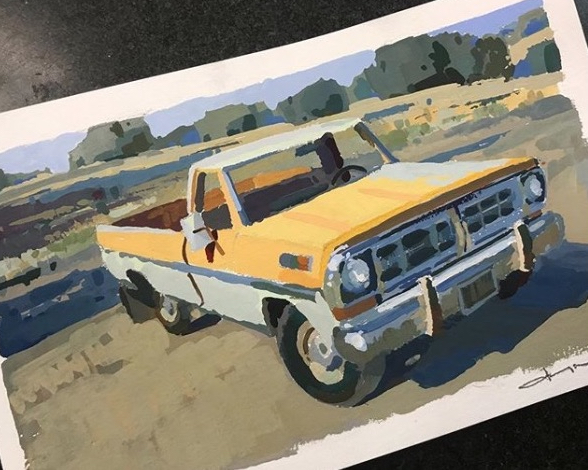
Jeremy Duncan, Ford Pickup, gouache on paper. Instagram
January 24th, 2020 by dave dorsey

Marie Therese Walter and Maya
The desires of the heart are as crooked as corkscrews.
—-W.H. Auden
1
When I was visiting the L.A. County Museum of Art a year ago, I came across the final print from Picasso’s Vollard Suite in Fantasies and Fairy Tales, a small, beautifully curated selection of graphic work by various artists from around the early 20th century. It immediately changed my emotional response to Picasso as a visual artist. It struck me as fine in a way so much of his work isn’t—there was a subservient care for the image itself that seems largely absent from so much of Picasso’s work. Usually, he forces his images to work, creating an image that feels kinetic and improvisational, without many pains taken for any other quality. I’d seen reproductions of the print, but never before actually noticed the self-effacing craftsmanship that went into the dreamy light that illuminates his figures in the Vollard print. By establishing that diffuse stage lighting, from below the players, with the light source hidden off to the left at ground level, he bathes the 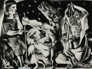 last moments before the Minotaur’s violent death with an inviting, tranquil peace (if you interpret the print as his version of the myth of Theseus). I wasn’t familiar with this narrative at the time, but simply responded to how brilliantly Picasso achieved something here that seemed visually distinct from his most familiar and famous work. The scene was intimate, intensely personal, full of emotion and tenderness, conveyed with masterful, loving craftsmanship. These formal qualities of the image and the print, a combination of aquatint, drypoint and engraving, left me wanting to know more. That one glimpse of the Minotaur prompted me, once I got back home, to order Picasso Prints: The Vollard Suite, and to keep returning to it through the rest of 2019, off and on studying what Picasso had done in it, leading me to conclude that these prints may have been his most original and personal (those two adjectives are mutually dependent) contribution to Western art. Much of the suite may not rank as his finest work on technical grounds, nor his most beautiful, nor his best on many different levels, but they are what I would save of everything he did, if I had to pick one achievement of his to take to a desert isle. I suspect no one else in the history of art has done what Picasso did here: it’s almost as if he is undercutting and cancelling everything he’s accomplishing as he achieves it, fusing the act of creation and destruction and creating images of great beauty in the process. All of this was in the service of the brief stirrings of a moral self-doubt he managed to suppress in himself once he’d painted Guernica, which served as a sort of footnote to this series of prints.
2
The Vollard Suite isn’t what I like most from Picasso, which have to be his portraits of various lovers, wives and children, and the often beautifully lit paintings of massive, neoclassical women. Some of his abstracted figures are powerful, but most of his work as he was inventing Cubism with Braque seems monotonous in retrospect. What makes the Vollard Suite unique is also what makes it ahistorical, though the series is clearly of its time: modern in the sense of being thoroughly anchored in surrealism, with a glance or two back toward Cubism. It’s also postmodern in its many self-referential subversions of its own beauty. Yet it’s mostly neoclassical in spirit, tone and ambition—to an almost reactionary degree—though his masterful lines morph into something rich and strange before he’s finished. These prints hint at a yearning for innocence through the intensity of their plea for lucidity, for an impossible way out of the blind passions that invest them with life. They yearn for goodness and wisdom, and even offer the glimpse of an ambiguous spiritual harbor, which remains just out of reach. MORE
January 19th, 2020 by dave dorsey
A sample of Leo Ragno’s portraiture, from Instagram
January 16th, 2020 by dave dorsey
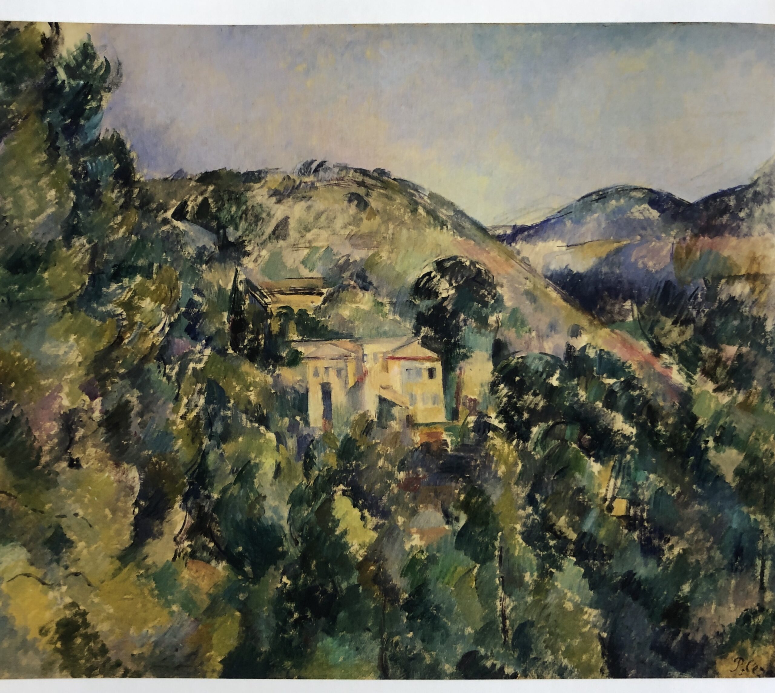
View of the Domaine Saint-Joseph, Metropolitan Museum of Art
I saw this painting almost exactly ten years ago at Cezanne and American Modernism at the Montclair Art Museum. After all these intervening years, I finally bought the catalog for the show. It’s a hardbound book once in the collection of the Art Institute of Pittsburgh Library, with the little envelope for the library loan card still glued just inside the cover. Purchased through a third party on Amazon, the book was finally a bargain. I bought it because seeing this show revealed so much about Cezanne’s influence on American painters and because this particular painting had such an impact on me when I was at the museum. I wanted to see the work in the show again after all this time.
The almost iridescent quality of the variations in color from the hillsides down into the forest, the way in which each mark hummed vibrantly in harmony with every other mark in that field of paint, left me more in awe of Cezanne’s color than ever before. I’m struck more and more by how Cezanne’s greatness has, for me, so little to do with his enormous historical influence. It’s ironic to react that way to a show designed to confirm his enormous affect on later American painters. But it seems that his influence had less do with with his theories–in other words his position in history–and seems so much more a result of the unique, lyrical feeling his paint inspires. His color, his handling of oil is almost always understated, and he seems to always find combinations of tone that make time itself visible–as Vermeer does in a different way. It derives from the intensity of his subdued passion for what he sees as he translates it into paint, which is hard to square, so to speak, with his famous dictum about interpreting nature geometrically, the advice that gave birth to Cubism. I wonder if his stress on seeing nature as sphere, cone and cylinder was merely an arbitrary way of imposing self-restraint to temper his passion for the colors of oil paint. He forced himself to think about form and volume rather than color and as a result his color became more subtle and unique. His actual achievement could have been almost as an incidental byproduct of the geometrical guidelines uppermost in his mind–even though color was what drove him to paint. Somehow, in the lower left hand corner, I see Gorky, of all people and I don’t mean the early paintings Gorky did which are hugely talented imitations of Cezanne. I mean his later paintings and his self portrait with his mother–the line and shapes and even a bit of the color. Cezanne is a marvel–and one can see why he could be classified as both an Impressionist and Post-Impressionist, though he was unlike everyone else in any category. He was perfectly himself.
January 13th, 2020 by dave dorsey
Les Indes Galantes, Johannes Muller Franken, at Louis K. Meisel Gallery
I saw this painting some years ago at an invitational group show at OK Harris, not long before the gallery closed, seemingly another little heartbreak in the cancer of real estate inflation in Manhattan driving out all sorts of businesses that operate on a human scale and replacing them with gentrified real estate and Google office space. I wonder how a simple corner bodega survives this slow, torturous cleansing by the tsunami of finance driving our metropolitan economies. That isn’t really why the gallery closed, but I’ve been wanting to rant about out-of-control inflation in big American cities. Many galleries have closed–or moved away like Arcadia, happily thriving in Pasadena now–because they can’t afford to stay open. In reality, its founder, Ivan Karp left instructions for how to wind down the operation when he died in 2012, and the managers of the gallery were simply following his dictates. He picked the name OK Harris because it sounded tough and American, like a riverboat gambler. Visiting on a whim five years ago, I saw one painting after another that startled me with its excellence, and this one left me gobsmacked at the raindrop-by-raindrop realism in mellow counterpoint with the scene’s romance and Maxfield Parrish color. Apparently, it’s still available at Meisel. How is that possible?
January 10th, 2020 by dave dorsey
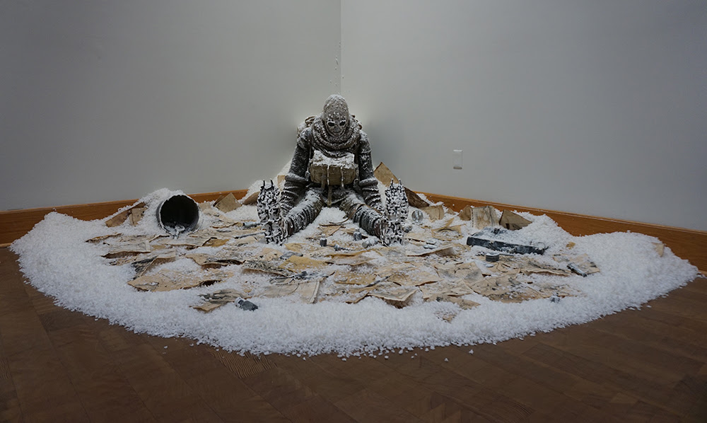
The Cartographer, mixed media, 39” x 132′ x 104″, 2019
I loved the artist statement (I can’t remember if I have ever those words in the past) for this installation that won Manifest’s coveted $5,000 Manifest One award and single-work exhibition. Here is the email announcement with Indiana artist Damon Mohl’s statement below. I like the sense of exhaustion and lostness in his vision, which seems appropriate as a viewpoint on Western culture. But I loved , his statement about the genesis of his creative work–which apply to the most compelling creative work in general.
Manifest’s projects are carefully crafted exhibitions of engaging works from around the world, judged and chosen by a dynamic jury of working artists, creative professionals, scholars, and educators. Once each year, we honor an exemplary artwork and test the extremes of our selection process in ONE: The Manifest Prize.
The nonprofit Manifest Creative Research Gallery is proud to be celebrating a decade offering this momentous award supporting artists making exceptional art. Now in its 10th year, one artwork has been chosen from a pool of nearly 900 works by 192 artists from 41 states and 12 countries to stand out as the best in one of the largest artist responses this project has ever received. Seventeen jurors from across the U.S. participated in this multi-stage selection process.
It should be noted that the winner and finalists*, 11 works, represent the top scoring 1% of the jury pool. The winner represents the top one-tenth of 1% of the jury pool.
We are proud to award this year’s $5000 Manifest Prize and corresponding ONE exhibit to Damon Mohl for his work, “The Cartographer” which will continue on view in Manifest’s Central Gallery through January 10th.
Of his work the artist states:
“In 2018 I spent a month traveling the north and south islands of New Zealand. Leading up to the trip, I had completed numerous sketches for an experimental film. In truth, the many fragmented images never connected, and when I arrived I started filming without a clear sense of the project. Traveling in a camper van, I gradually woke up earlier each day and heard a cacophony of birds singing before dawn. One song, in particular, stood out because of its melodic, contemplative nature and haunting strangeness. I learned this was the song of the Bellbird, and for the rest of the trip, I set my alarm so I could make audio recordings of the Bellbird’s morning song. These recordings led me to a new idea, and I ended up creating an entirely different film.
I find it compelling the way an image or sound can lodge itself in the subconscious and open up an expansive idea. Creatively speaking, ideas that originate from a presumed understanding or with a specific goal are often prodded and forced into existence. Outcomes are narrow and predictable, even before they are developed. Everything is over before it even begins. The most exciting ideas arrive as mysteries. They create enigmas to be explored but never fully understood. Art is the language that embodies and evokes that which cannot be rationalized or explained with words and it is this revelatory journey that keeps me fascinated and dedicated to the process of creating. My work is firmly rooted in metaphorical narrative, but at the project’s origin, I relinquish as much control as possible. I often reach a place on sustained projects where I can no longer remember what propelled me forward in the first place. If the origin remains intact, it was strong enough to stand the test of time. If it fades, what came after was much more interesting to me.
The Cartographer was recently created for an exhibition of costumes, objects, and set pieces utilized in five different film projects over the past four years. Thematically, the film connected to this piece tells the story of a man whose mind is locked in an endless cycle, in which he repeatedly imagines himself on doomed 19th century expeditions. The voice-over narration provided on the nearby wall is also from the film.“
Artist Biography:
Damon Mohl (b.1974) is a filmmaker and interdisciplinary artist. His work bridges drawing, painting, collage, and sculpture with digital technology to create experimental as well as narrative-based films and works of art. He received his BFA in drawing and painting from the Pennsylvania Academy of the Fine Arts in Philadelphia and his MFA from the University of Colorado, Boulder. With a focus on filmmaking, his graduate thesis film was nominated for a Student Academy Award in the experimental category. He exhibits his work nationally, and internationally his films have screened in over thirty countries. He is currently serving as an assistant professor of art at Wabash College in Indiana.