Archive Page 19
December 18th, 2016 by dave dorsey

SPACE
Art About the Between
Clay is molded to make a vessel, but the utility of the vessel lies in the space where there is nothing. Thus, taking advantage of what is, we recognize the utility of what is not. – Laozi
This is not a call for works about outer space. Rather it is a call for works which explore the subtler concept of the distances or spaces between things, or spaces which things occupy. Examples include, but are by no means limited to NEGATIVE SPACE, EMPTY SPACE, DISTANCE, POSITIVE SPACE, DEPTH, PERSONAL SPACE, and so on.
People often take space for granted, neglecting to respect its importance in defining our world and understanding of reality. Our interest in how this theme is addressed by visual art is broad, and artists may interpret it widely when selecting works to submit. This call is an open question seeking an answer about how artists address space as a subject, or key aspect in the design and creation of their work.
This theme is very open to interpretation and to any and all visual arts media.
Submission deadline: January 4, 2017
http://www.manifestgallery.org/space
PLACE
Art About Location
Designed to complement its sister exhibition, SPACE, this exhibit seeks works MORE
December 15th, 2016 by dave dorsey
Jim Mott at work
Some worthy notions from the mailbag, this time from Jim Mott, moderately incensed by a work of art he saw on a visit to the Memorial Art Gallery here in Rochester:
1
These thoughts were prompted by the MAG’s recent acquisition, a red sign that says “Knowledge is Power”. It has been mounted on the exterior of the museum, at the entrance. It is a jarring presence, an eyesore in what was one of the museum’s best parts. And the slogan itself is just very irritating in that context – a piece of empty visual noise, and the sad fulfillment of Tom Wolfe’s prediction for contemporary art in The Painted Word (1975): He noted that contemporary art had become so reliant on verbal theory that eventually words alone would be the visual art…
After a few days of extreme, maybe unreasonable, irritation, I did some research and found out the slogan was taken from a protest sign at Ferguson. <Jim went to Ferguson to paint for a bit on one of his itinerant tours. –dd> So it’s politically “relevant”…. But I think it’s idiotic for the acquisitions people not to see how the meaning has been lost – or worse – in the process of appropriation and decontextualization. It’s so opposite of what’s needed for art and for people viewing art. (I think I might not object much at all if the sign were inside, thoughtfully situated, with some contextualization. Maybe.)
2
Every artist – maybe every person – must feel, in childhood and youth, early stirrings of inspiration, intimations of power, glimpses of access to some great mystery that’s behind everything but usually hidden. The first question is, do you take it seriously, this elusive thing that no one else seems to notice or talk about? A sense of beauty and wonder and maybe later terror and uncertainty, all deep within, and deep without, maybe glimpsed in a dandelion, a speck of dust, a beam of light, frost crystals, the flight of a bird, the tone of someone’s voice… a significance barely there yet suddenly looming to a cosmic scale?
Do you serve the source or try to make it serve you? Is there a right answer? One, the other, neither, both?
I’m reminded of a conversation recounted by Dietrich Bonhoeffer in Letters and Papers From Prison. I read it in college. He said, when he was young, he had a friend in the church who wanted to become a saint. Bonhoeffer decided his ambition was to have faith. When I first read that I did not understand the significance of the choice. They were both abstractions and somehow did not feel relevant to me. So much was based on intuition back then; I did not have definitions for things.
Now I see how it might apply to anyone, of course, but particularly artists. It is about external status, worldly accomplishment versus relationship. Do you want to be a saint or have faith? Do you want to be famous, recognized, celebrated… or find ways to relate as transparently as you can to the source of your inspiration and to other people. Do you want your work to be bought by a museum or to move someone – not through sensation but through the realization of something deep or subtle shared.
The two are not of course mutually exclusive, even though I tend to think you must choose to give priority to one or the other. Sharing or relating – truly reaching people with your art can be enhanced by success, being collected, being deemed important. And in some cases art that effectively shares truth, beauty, inspiration, depth, wonder is taken seriously, does well in the marketplace. Sometimes there’s a hunger for it even there, if its packaged right. Although beware the hunger of the marketplace, that chews up and spits out and serves a power very different from the one that incites us to reverie and wonder.
Faith or honor, relationship or status. The people or the market. An artist should not have to dwell too much on such considerations, but a little bit, yes.
I think what bothered Jim most was the word “power” in the piece at MAG. My reaction would have been to be more skeptical about “knowledge.” The idea that visual art conveys “knowledge” puts it into a very Western, post-Enlightenment box, and constrains the way someone looks at the work, prompting them to ask of it certain things it may not have been meant to deliver–because it was busy conveying something more vital. Visual art is uniquely able to convey something far more encompassing than conscious knowledge strictly through perception, before thought can get to it.
December 12th, 2016 by dave dorsey
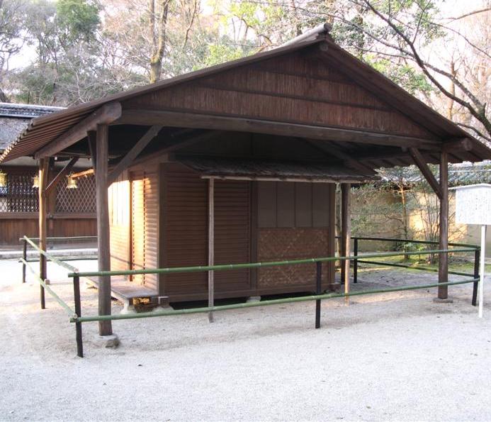 Consider the lives of birds and fish. Fish never weary of the water; but you do not know the true mind of a fish, for you are not a fish. Birds never tire of the woods; but you do not know their real spirit, for you are not a bird. It is just the same with the religious, the poetical life: if you do not live it, you now nothing about it.
–Kamo no Chomei, Hojoki (Ten Foot Square Hut)
The word painting could be substituted for “poetical” and Chomei’s thought would still apply.
November 25th, 2016 by dave dorsey
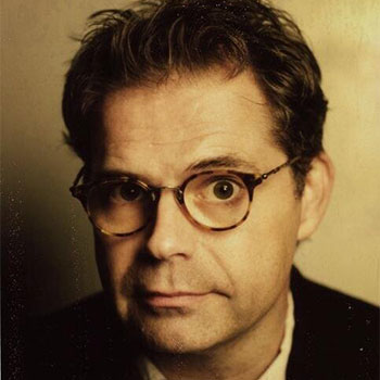
Dana Gould
Dana Gould served as a guest host on Kevin Pollak’s podcast recently, and he had this exchange with his guest. I love the term “jam econo,” which isn’t just about money.
Jonah Ray: A lot of people want fame and money and if they have a knack for comedy they use that to get fame and money . . . lot of people go too big (in) how they go about things. Mike Watt, of the Minutemen, has this saying, “We jam econo.” Stay within your means. Do what you can within your own self. Don’t get further in your life or career on credit. Do it within your realm of possibilities.
Dana Gould: That was an understanding I came to about my stand-up career, and I think this applies to all people who consider themselves craftsmen or artists. It took me decades to come to this conclusion. So much of your career is, “if I get this, then I’ll get this.” Your career is now. You’re here. This is it. It’s great. If you are actively building your career, you’ve made it. If you are working at Barnes & Noble trying to gin up the balls to do an open mike, you haven’t made it. If you do an open mike, you’ve made it. The rest is just a level of degree.
November 24th, 2016 by dave dorsey
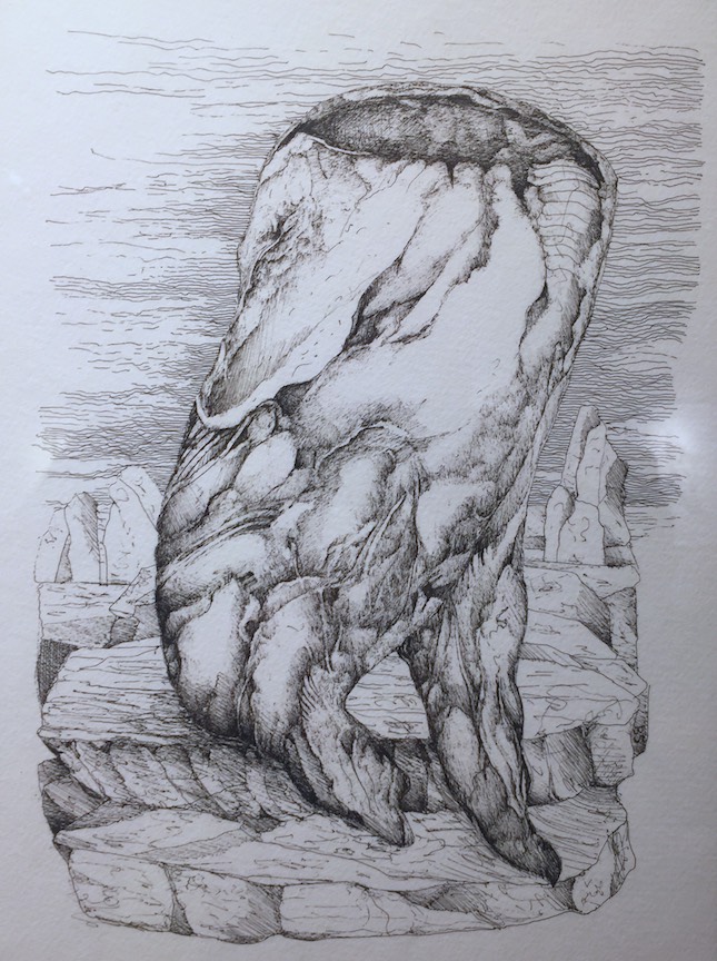
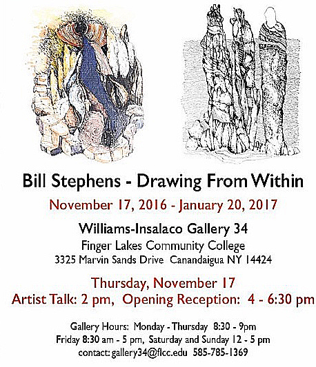
Drawing from Within, a solo show of drawings by Bill Stephens, is on view in the Wayne Williams and Tom Insalaco Gallery at Finger Lakes Community College. It isn’t a large space, but Bill’s drawings fit perfectly into it, and the show makes a striking impression when you walk in. Everything is framed and matted in such a way that his line drawings look, at a glance, as intricate as old engravings. He uses pens with an extremely fine point, creating form with cross-hatchings, Durer-like, never using solid blacks or grays. I’ve seen previews of this work at our get-togethers for coffee, and I’ve always been impressed, but the work makes a much deeper impression when you see it gathered together this way–the cumulative effect demonstrates how consistently his vision has emerged in this new direction for his work. His world holds together, stylistically, from each drawing to the next. They offer glimpses, from slightly different angles, into his unique and integrated inner world. Some of his images look almost like illustrations from Dante: clusters of souls migrating toward something beyond themselves.
What’s most interesting to me about Bill’s work is that the drawings are the outcome of a process rather than an attempt to render something already visible. His puts down lines and follows where they lead him, a journey to discover the forms that emerge as he improvises his way to an image that often fuses landscapes with botanical, animal, and human shapes. Everything seems an extension of everything else. The end result is surrealistic, and his process echoes surrealism’s “automatic writing,” letting the subconscious guide the hand. Yet as much as I was surprised to be reminded of Dali in many of these drawings, the feelings they evoke are far from the cool theatricality of Dali’s eerie, melting shapes. He’s enthralled by nature, and his enthusiasm infuses everything with a warm energy. He isn’t wedded to any particular sort of landscape–you can find echoes of his wooded Western New York backyard as well as the mesas of the Southwest. Mostly these are dreamscapes where vaguely recognizable forms emerge from the least expected sources–much of what he depicts seems to want to grow a pair of legs, even rock formations.
Bill’s talk about how and why he draws was completely extemporaneous and casual, yet it was often eloquent, and consistently illuminating. He says that each time he sits down in the morning in his studio, he brings a beginner’s mind to what he’s about to draw. For reference, he often refers to the notebooks he fills with quick, adept sketches when he travels, many times jotting quick, haiku-like impressions in the margins. He passed around these notebooks during his talk. The words hover around the edges, subordinate to the drawings. He and his wife, Jean, also an accomplished artist, are both enthralled by nature, and in their work they invest a spiritual depth into the simplest, most common and familiar aspects of the natural world, animal, plant and mineral.
In the days since Bill’s talk, having seen how intensely he’s venturing into this new series without knowing where it will lead, I’ve begun to realize that his process is, for me, a microcosm of how an artist’s career ought to evolve. The best work emerges from an effort to do something more and more consonant with the inarticulate feel of applying a medium in a certain way to a support–without knowing exactly where the effort will take you.The more you let other considerations come into play, the more they drain the life from the final image. Bill Santelli rode down to the show with me and on the way back we talked about how hard it is to stay focused on this factor of feeling one’s way forward in a particular painting, and, in a larger sense, in one’s career. The only reliable guide is to simply keep attempting to paint, or draw, what you most want to see. And you can work for years, or decades, without quite knowing what that is–or be constantly struggling to stay focused on it. Paint only what you want to look at: it sounds like the easiest thing in the world, but everything conspires to make you ignore that desire for any number of reasons: because what you might do won’t sell, or get shown, or be critically recognized, or because you want to belong to a particular “school” of work that has other requirements for admission. In these drawings, Stephens is answering only to what he wants to see emerge, line by line, and drawing by drawing, without any other consideration in play. And yet, groping forward in this way, sticking to process, he gets results that have an unexpected imaginative resonance.
In The Duino Elegies, Rilke spoke about how nature wants to “become invisible” through a certain kind of human reverence for it:
Earth, is it not this that you want: to rise
invisibly in us? – Is that not your dream,
to be invisible, one day? – Earth! Invisible!
What is your urgent command if not transformation?
I suspect in Rilke’s own life, this meant translating the tangible world into poetry. With Stephens, it’s just the reverse. His line, as he puts it down, creates its own necessity, so that while he draws he isn’t copying what he sees, but rather hopes his experience of nature will be translated, subconsciously, into tangible images that convey what might otherwise remain invisible, even to himself.
November 18th, 2016 by dave dorsey

Candy Jar #9, oil on canvas, 52″ x 52″
Candy Jar #9 will be awarded Best in Show tonight at The Red Biennial, presented by The Cambridge Art Association, on view at the Kathryn Schultz Gallery in Cambridge, Massachusetts. The exhibition was jurored by Joseph D. Ketner II, the Henry and Lois Foster Chair in Contemporary Art Theory and Practice at Emerson College, Boston. He also holds the position of distinguished Curator-in-Residence. His professional expertise is as a curator and art historian specializing in European and American Modern and Contemporary Art, and nineteenth-century African-American art.
November 14th, 2016 by dave dorsey
Agnes Martin, Cuba, New Mexico, 1970s
“You have to have a mind of winter to see nothing that is not there, and the nothing that is.” — Wallace Stevens
1
Agnes Martin painted like a thief. She seemed to be attempting to leave behind as little evidence of herself–or anything else–whenever she touched a canvas. It’s a self-effacing posture consistent with her immersion in Taoist spiritual traditions, and it’s part of what gives the rigorous austerity of her work its humble charm in the current Guggenheim retrospective. Yet as impersonal as the work appears, it’s often as beguiling as a simple, four- or five-note melody from nursery school. You climb the whorl of the Guggenheim’s spiral gallery, craving more than what’s there for much of the way. It makes you hungry for color, expecting to get it once you reach that museum’s higher elevations. Yet when it arrives, it leaves you wanting even more. Her tones are as faint and subtle as the pinks and blues in a Turner dawn. Meanwhile, there’s almost nothing to see in one pencilled spreadsheet grid after another, rows and columns of rectangles stacked on rectangles, each one as empty as the next. Then you’ll suddenly come upon a large, thin veil of paint that looks as soft and sensuous as felt or velour. The paint has a surface Thiebaud would have appreciated, though its almost the opposite of his impasto, more like a faint layer of powdered sugar on a cushion of icing, and, as if to heighten the effect through contrast, she scores that paint with a net of lines drawn into the still-soft medium. Again and again you feel a serene tension between the extreme simplicity of her means — the near-absence of all form — and the often sensuous, tactile surface, where the weave of the fabric, the absorbent gesso and finally the thin washes of paint all fuse to become a physical object that looks as if it were made to be stroked with your fingertips. (Which is an interesting urge considering the fact that she maintained she was trying to visualize an immaterial, spiritual state.) While the painting does seem to convey a state of mind, it also seduces you with its physicality. You note these polarities only if you stand and look with persistence, surrender to the static hum of her color or lack of it. Her art requires you to slow down and gives you almost nothing to think about. Judging from the evidence in this retrospective, it’s probably safe to assume she was constantly wondering how one might translate into paint the “no-mind” of Ch’an Buddhism’s Sixth Patriarch: awaken the mind without attaching it to anything.
2
I had never heard of Agnes Martin until four or five years ago, when for the first time I came upon one of her paintings, Untitled #6, at the MORE
November 9th, 2016 by dave dorsey
I’ll be there for the talk, and for a tour of the show. I’ve been watching Bill work on this series for a while, and own one of the best ones he’s done. It’s fascinating work, and I have a sense that Bill is always balancing between conscious technique and subconscious impulse, tending the process without quite controlling where it leads or knowing where the drawing is going to end up. It unveils itself to him, as much as it does for the viewer. The one in my collection feels like an illustration for Dante’s Inferno, but a lot of the work seems biomorphic, the forms growing as naturally as seeds and branches.
November 7th, 2016 by dave dorsey
October 29th, 2016 by dave dorsey
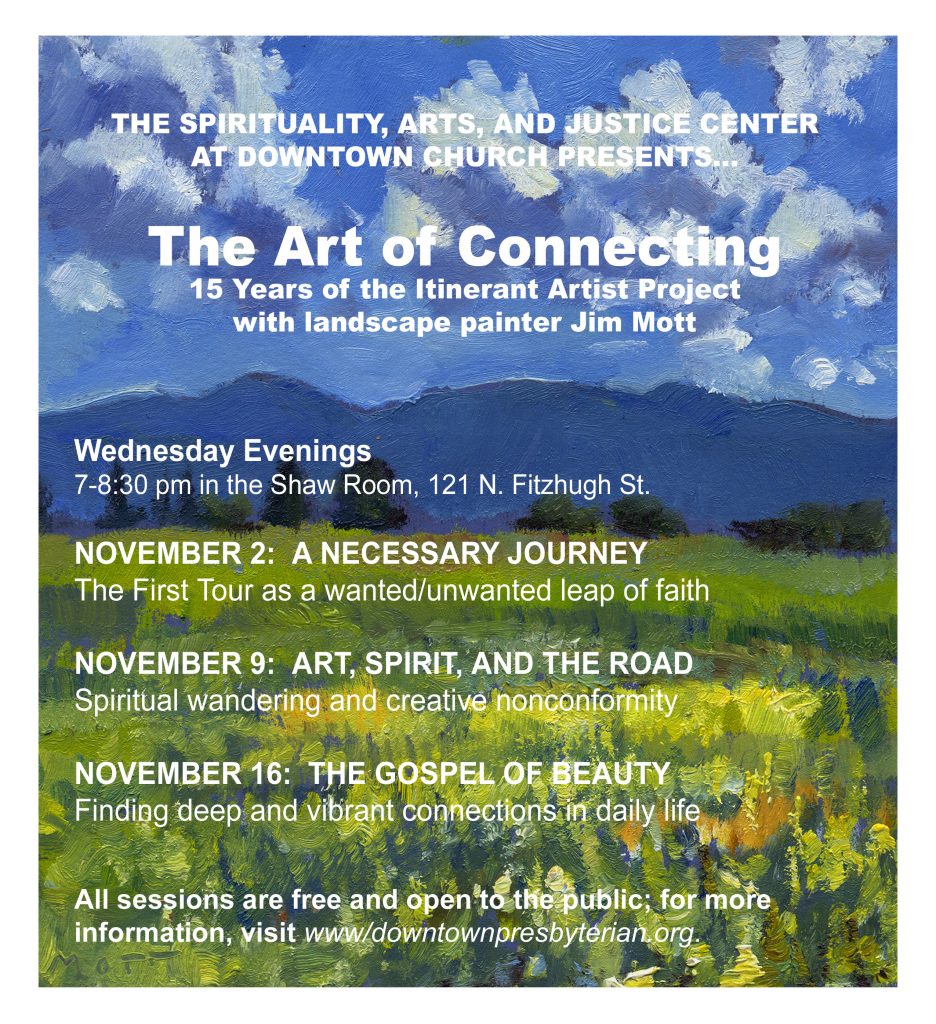
Jim Mott’s lecture series
When: November 2nd, 9th, 16th at 7:00 p.m.
Location: Center for Creativity, Spirituality and Justice, Downtown United Presbyterian Church, Shaw Room (2nd floor), 121 N. Fitzhugh St.
NOV. 2: A NECESSARY JOURNEY
The First Tour: cross-country creative odyssey.
NOV. 9: ART, SPIRIT, AND THE ROAD
Spiritual wandering and creative nonconformity.
NOV. 16: THE GOSPEL OF BEAUTY
Finding deep connections in everyday life.
October 28th, 2016 by dave dorsey
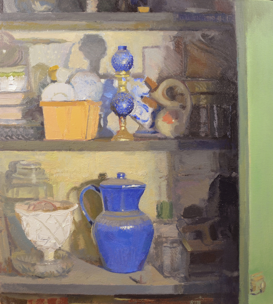
Sediment, Blue Pitcher, Matt Klos
I got a notice from Matt Klos, a fellow Oxford Gallery artist, that his work will appear in three fine exhibitions this fall. I wish I could see another two-artist or solo show of his work here again at Oxford. Kudos to Klos:
Carspecken Scott Gallery
French & Italian Landscapes by Matt Klos
& Italian Drawings by Cleveland Morris
Please join me for an exhibition of paintings I created on Mount Acuto while staying at the Barnes Artist Residency (2014) and while an artist in residence at the Alfred & Trafford Klots International Program for Artists (2010). The ever talented Cleveland Morris will be showing new Italian Drawings as well.
Opening Reception: Thursday, October 27, 2016
Carspecken Scott Gallery
1707 North Lincoln Street
Wilmington, Delaware 19806
___________________
Annapolis City Hall
Hypnagogia
Klos continues to work with interior themes and in a new series, Hypnagogia, he brings the outside in. His 2013 series of 35 plein air paintings portraying the houses of Fort Howard appear in the new interior works. The “house portraits” now fragment and color the underworld interior of a basement studio. The new paintings hover between the realms of abstraction/representation, real/imagined, and direct/indirect modes of painting; they are betwixt and between, capturing the transitional state of moving into a new state of consciousness.
November 1-28th
Reception, November 14th
Annapolis City Hall
160 Duke of Gloucester St
Annapolis, Maryland 21401
___________________
Delaware College of Art and Design
Toni & Stuart B. Young Gallery
The Un-Still Life
Can a still life be a face or even a body? Can a basket of fruit suggest a hillside? Does a single stick of chalk constitute a still life? And does a still life always have to be set upon a table? “The Unstilllife” celebrates the eccentric possibilities of still life and is a collection of works by Zeuxis, an association of still life painters that has presented group shows in New York City and around the United States since 1995. Painter Trevor Winkfield, who shows at Tibor de Nagy Gallery in New York and whose highly regarded work as an art writer includes co-founding the journal The Sienese Shredder, is collaborating with Zeuxis to organize the exhibition.
November 4 – January 14th
Opening: Friday November 4th
Delaware College of Art and Design
Toni & Stuart B. Young Gallery
600 North Market Street
Wilmington, DE 19801
_____________________
Matt Klos is an Associate Professor of Visual Arts at Anne Arundel Community College, a three time winner of the Maryland State Arts Council Individual Artist Award (2016, 2012, 2008), a winner of the Bethesda Painting Awards (2007), and received an Elizabeth Greenshields Foundation Grant in 2001.
October 26th, 2016 by dave dorsey
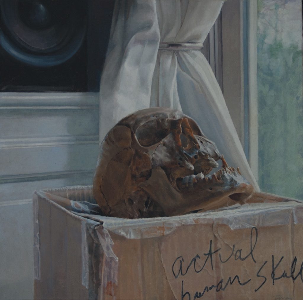
Human Skull, Unearthed circa 1930
Human Skull, Unearthed circa 1930 will be on view in “Concerning the Spiritual,” along with work from around the U.S. as well as Egypt, at the Foundry Art Centre, Satin Charles, Missouri, from Nov. 18 through Jan. 6. This painting has logged more mileage, literally, than almost anything else I’ve done. Its exhibition history is more extensive than most of my paintings, having been included in shows at Manifest, Florida State University Museum of Fine Art, Memorial Art Gallery, and Viridian Artists.
October 24th, 2016 by dave dorsey
Breakfast with Golden Raspberries, detail, oil on linen, 46″ x 26″
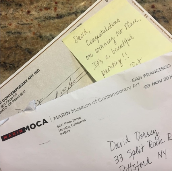
Breakfast with Golden Raspberries will be on view at the Marin Museum of Contemporary Art, Novato, California, from Oct. 29 through Dec. 4. The exhibition was curated by Susan Snyder, co-founder of the Caldwell Snyder Gallery in San Francisco. I completed this painting over the summer, after working much longer on it than I had anticipated–but this one required all the 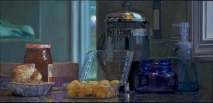 stamina and grit I applied to its execution, lingering for quite a while on the clear poly carton for the berries and the coffee maker behind it. I managed to catch some subtle effects of multiple light sources in a way that I haven’t attempted in any other painting. In reality, there were actually ten different sources of light present in this little domestic tableau: three windows and seven artificial lights situated in different places throughout the kitchen. You can see the ceiling lights reflected as little orbs in the stainless steel bands and lid of the French press. And yet with all that light, coming from nearly every direction, some areas of color nearly melt into others because they are tucked away and shielded from most of the direct light.
October 22nd, 2016 by dave dorsey
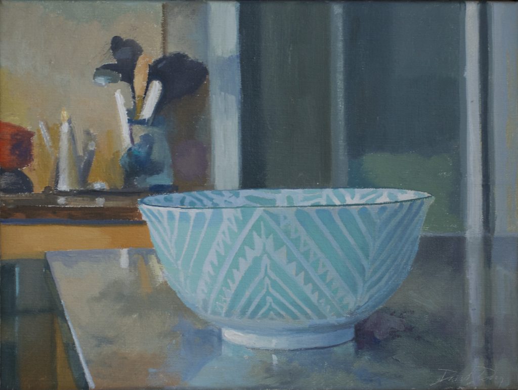
Chevron Bowl, oil on linen, 12″ x 16″
Chevron Bowl will be on view at the 2016 International Juried Exhibition at the Center for Contemporary Arts, in Bedminster, New Jersey, from Nov. 10 through Dec. 23. The exhibition was curated by Jonathan Goodman, an art writer and poet based in New York. He teaches at Pratt Institute in Brooklyn. This is one among a series of paintings of patterned bowls I’ve been working on this year with Fairfield Porter in mind. In this series, I’ve been trying to focus less on rendering the image with photographic precision, concentrating more on conveying light and color and pattern with an emphasis on more visible mark-making. I was gratified that this one made it into the show, because I was happier with the results in this painting than in nearly any other painting in the series. I’m going to keep working in this vein, following where it leads, while I also continue to do the sort of images I usually do. The line between this approach and the other is porous and a little unstable–I can start a painting thinking I’m going to be in one mode and find myself migrating into the other–but it’s a distinction that matters to me. What’s been surprising is that things I learn in one approach sometimes open up new modifications in technique in the other approach. Personal cross-pollination.
October 21st, 2016 by dave dorsey
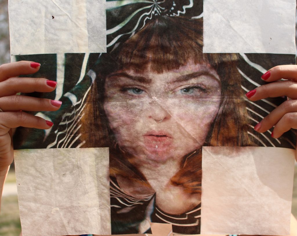
Kayleigh Harris, “Selfie”, detail. Archival pigment print within pressed wax paper.
Portraiture has become something like a new common language. With photography now a nearly daily practice for the average smartphone user, visual imagery is the favored way many people communicate who they are, what they are doing, and where they’re going. In Instagram and Snapchat’s ascendancy over Facebook, younger generations are making what they say subordinate to what they can show. The selfie has become the way people exhibit their place and role in the day-to-day world. FaceTime and Skype have turned telephone calls into face-to-face encounters: a sort of living portraiture. Even when you tap into Uber, up pops the face of the driver who is already on the way.
This is a radical shift in the role of the portrait–a shift that began with popular photography itself, history’s big Kodak moment, when George Eastman put photography within reach of the middle class. Now nearly anyone with a modest income considers it a requirement to have a phone that also doubles as a camera. As a result, many people post a continuous stream of self-portraits on the Internet. What was once a privilege for only the rich and powerful is seen now as almost a mundane obligation of contemporary life. A portrait was once something rare, costly, elegant, and almost magical. Now, MORE
October 20th, 2016 by dave dorsey
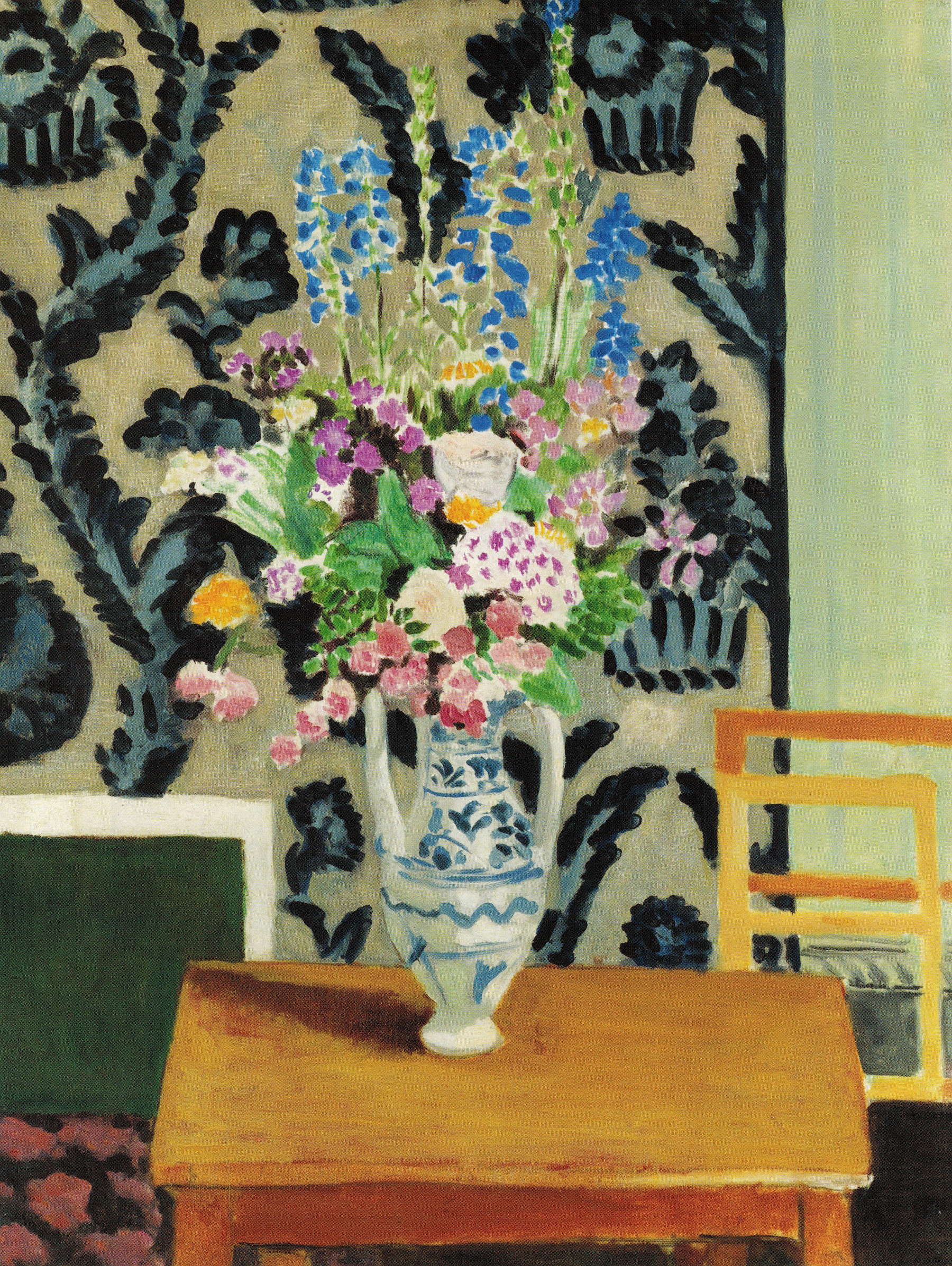
Matisse, Bouquet de fleurs pour le Quatorze Juillet, 1919
I’ve been having a conversation with Jennifer Wenker, the director of the Herndon Gallery at Antioch College, in which we have been touching on the role of art in human life. She has a show up now, Image: The Public Face, that relates to her deep interest in how art can promote social justice. It’s part of the FotoFocus Biennial in Cincinnati, an area-wide exploration with dozens of institutional participants that examines how photography does and doesn’t document reality and truth, and it has a postmodern twist of calling into question even the basic notions of reality and truth themselves. A central theme of the show is how photography has given power and a voice to people who otherwise wouldn’t have much of either–flattening the hierarchy that once put the painter in control of another person’s self-image and gave the privilege of a portrait to only the rich, powerful, and privileged. The spread of photography first through the invention of the Kodak camera and now through the popularity of the smart phone has thus become a force for social justice.
I’ve known and respected Jennifer for many years now. I participated in one of her art projects by tossing seeds into the wind down in the Finger Lakes, a memorable moment for me. (I like describing it that way because it sounds like a randomly MORE
October 18th, 2016 by dave dorsey
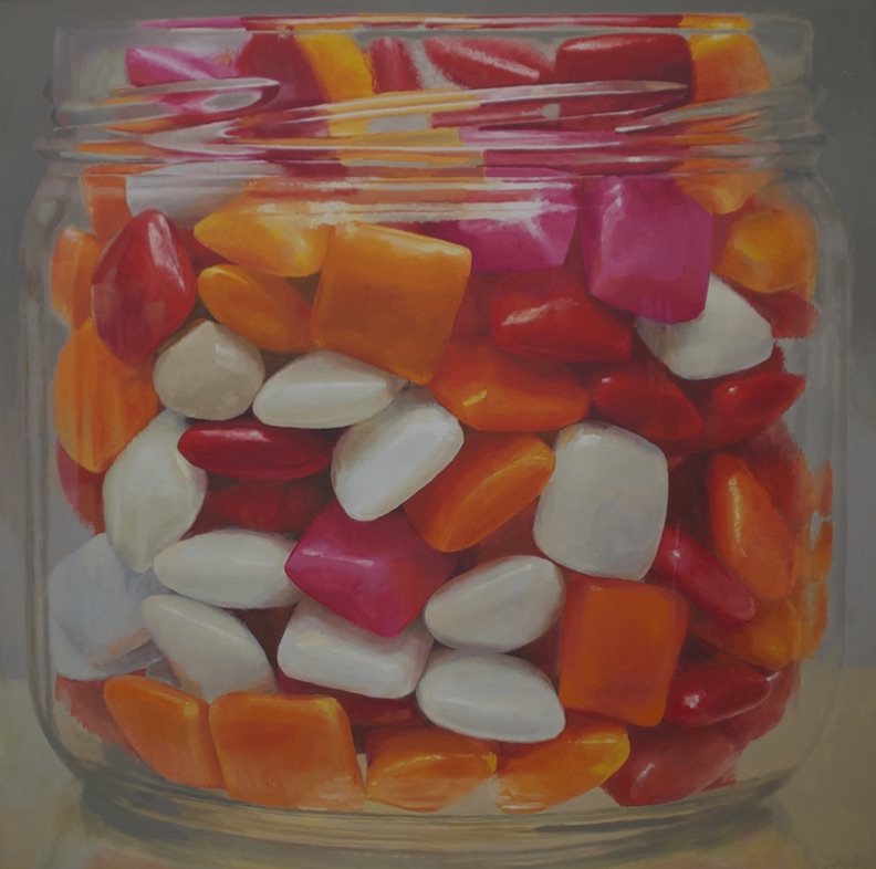
Candy Jar #9, oil on canvas, 52″ x 52″
Candy Jar #9 will be on view at The Red Biennial, from Nov. 8 through Dec. 21, in Cambridge, Massachusetts, at the Kathryn Schultz Gallery, 25 Lowell St. The exhibition was curated by Joseph D. Ketner II is the Henry and Lois Foster Chair in Contemporary Art Theory and Practice at Emerson College, Boston. This is one of the series of jars I’ve done and may return to, in a slightly smaller format, next year.
September 21st, 2016 by dave dorsey
If art works to change the world in any way, it does so subliminally, uncontrollably, and by means that usually aren’t summarized in an artist’s purposes when making a poem, or song, or painting. In other words, art is life, as much as it’s a reflection of it, and only diminishes itself by becoming some instrument used to achieve a particular end in the world. I didn’t realize Stanley Fish had quit writing his columns for The New York Times until several months had gone by, and I suddenly identified the feeling of something lacking from my visits to the Times online. I realized it was his voice. So I ordered a compilation of his columns: “Think Again: Contrarian Reflections on Life, Culture, Politics, Religion, Law, and Education.” It’s such a relief to hear him say things like this again:
These columns are written under the shadow of the (perennial) “crisis of the humanities,”a crisis to which humanists have responded by mounting ever more elaborate (and unconvincing) justifications of the humanities as a practice that will save democracy, if not the world. These justifications, wittingly or unwittingly, have the effect of implying that the humanities have nothing to say for themselves, that any defense of them can only be instrumental. An instrumental defense of the humanities is a defense that rests everything on the humanities’ usefulness to some other project—a robust economy, the realization of democratic principles, a peaceful world. The question posed to the humanities is “What are you good for?,”and the answer is assumed to issue from a measure of “good”that the humanities do not contain. The answer given in the columns reprinted here is that the humanities are good for nothing, for that is the only answer that preserves the humanities’ distinctiveness. If humanistic work is valued because of what it does politically or economically or therapeutically, it becomes an appendage to these other projects, and in a pinch it will always be marginalized and perhaps discarded when its instrumental payoff fails to arrive, as it always will. The paradox is that the stronger the case made for the utility of the humanities, the weaker the case for their support. In order to be truly healthy, at least in an internal way, the humanities must be entirely disassociated from the larger world of political/ social/ economic consequences, must, that is, be appreciated for their own sake and for no other reason.
September 16th, 2016 by dave dorsey
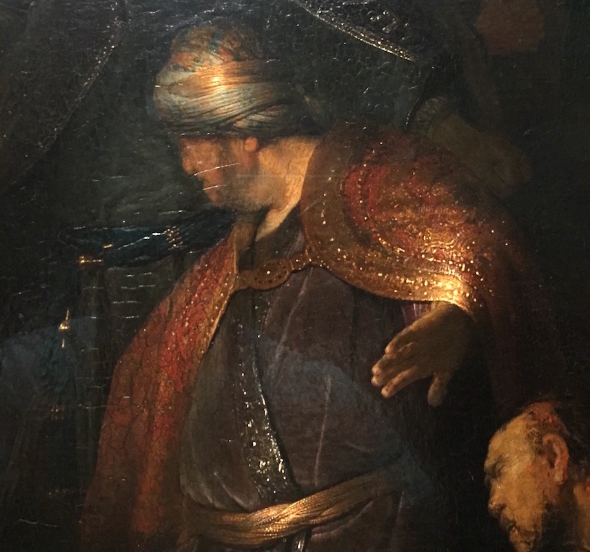
Judas Returning the Thirty Pieces of Silver, Rembrandt, oil on panel, detail
I rarely go out of my way to see a Rembrandt. He’s one of those painters you assume you know inside and out. What more is there to know? Yet, every time I spend time with one of his paintings, I walk away almost in disbelief at his genius and his flawless skill. Nothing about Rembrandt’s approach to painting appeals to me, personally: the staging and use of darkness to create cinematic effects, the way in which his chiaroscuro banishes most color from his palette, except in subtle concentrations, and even then it’s usually a world of brown and gray. I don’t live in a world that looks this way unless I’m glancing around a room lit only by the glow of a flat-screen TV. Yet when you stand before one of his great paintings, it’s jaw-dropping and almost dumbfounding. I felt that way in 2014 at The Frick, when I saw Simeon’s Song of Praise, a small canvas depicting a scene that feels enormous, and I had an even more intense reaction last week to Judas Returning the Thirty Pieces of Silver, on view until Sunday at The Morgan Library. The two paintings were completed two years apart, the latter when Rembrandt was only 23. How does a kid paint something this masterful, not only in technical skill but in its depth of understanding and empathy? When I saw this painting, it finally struck me that Rembrandt belongs in that cohort of rare, black swans who achieved effortless perfection at the earliest ages: Mozart, Rimbaud, Hendrix, Keats. In the case of both paintings I was astonished, the way I was six years ago when I saw how El Greco rendered the faces in The Coronation of the Virgin in a show at Onassis Cultural Center–overwhelming emotion and thought conveyed in faces that required, at best, a couple square inches of painted surface.
This show is built around only one painting, as the Frick show was primarily a way to offer the public a view of Vermeer’s Girl with a Pearl Earring, and the Metropolitan Museum of Art’s show in 2009 offered access to his Milkmaid. In all three instances, the exhibitions were devoted to work on loan from European collections, and they all gave a single painting its own stage supplemented by collateral work that helped put it into historical perspective. Of the three, the Morgan’s is the most effectively curated. More than two dozen drawings MORE
September 4th, 2016 by dave dorsey
Child at Sunset, Henry Coupe, oil on linen, 10″ x 10″
I’m driving into the city on Thursday to attend the opening of Henry Coupe’s posthumous solo exhibition at Viridian Artists. His wife, Ann, will be there in his stead, since Coupe died in December at a Utica nursing home. I visited with Ann in 2014 at their home and was able to see all or most of the work in this show. She was a gracious host, talking about her husband and his work with great affection and respect. She had arranged all his paintings on the floor of their living room, standing them upright in their floater frames, as if they were our audience rather than the other way around. I sat cross-legged and spent time studying them as she sat on the couch, talking about her life with Henry.
I was a member at Viridian when, shortly after Couple joined the gallery, I first spotted The Letter, one of his small paintings on the shelf behind the greeter’s desk. I immediately asked who’d painted it and learned what little was available about him: that he had studied at the Munson Williams Proctor Institute under Oscar Weissbuch, a student of Hans Hoffman, at the end of WWII, and he had gone on to exhibit his work in New York City during the 60s, while teaching in Utica. He retired from teaching in that city’s public school system in 1976 and continued to paint until he was no longer able to do it.
Viridian offers a lovely description of his work on its website:
Henry Coupe spent his life creating small paintings, most under 24”, executed in strong, simple strokes, of people in landscapes. His people are shown both alone and in small groups. Tiny in scale, his delicate oils are filled with feeling and speak of love, MORE