Archive Page 38
October 15th, 2013 by dave dorsey
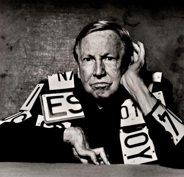
I ordered Supper of the Lamb last week, and Amazon told me it wasn’t supposed to get here until November, but it arrived today. I had no idea that he’d died, until I went searching for his photograph in order to post this:
The man who said “beauty is in the eye of the beholder” was on the right track, even if he seemed a bit weak on the objectivity of beauty. He may well have been a solipsist who doubted the reality of everything outside himself, or one of those skeptics who thinks that no valid judgments are possible, that no knife can in reality be pronounced sharp, or any custard done to perfection. It doesn’t matter. Like Caiaphas, he spoke better than he knew. The real world which he doubts is indeed the mother of loveliness, the womb and matrix in which it is conceived and nurtured; but the loving eye which he celebrates is the father of it. The graces of the world are the looks of a woman in love; without the woman they could not be there at all; but without her lover, they would not quicken into loveliness.
There, then, is the role of the amateur: to look the world back to grace. There, too, is the necessity of his work: his tribe must be in short supply; his job has gone begging. The world looks as if it has been left in the custody of a pack of trolls. Indeed, the whole distinction between art and trash, between food and garbage, depends on the presence or absence of the loving eye. Turn a statue over to a boor, and his boredom will break it to bits–witness the ruined monuments of antiquity. On the other hand, turn a shack over to a lover; for all its poverty, its lights and shadows warm a little, and its numbed surfaces prickle with feeling.
Or, conclusively, peel an orange. Do it lovingly–in perfect quarters like little boats, or in staggered exfoliations like a flat map of a round world, or in one long spiral, as my grandfather used to do. Nothing is more likely to become garbage than orange rind; but for as long as anyone looks at it in delight, it stands a million triumphant miles from the trash heap.
–Robert Farrar Capon, 1968, The Supper of the Lamb, a cookbook, among other things
October 15th, 2013 by dave dorsey
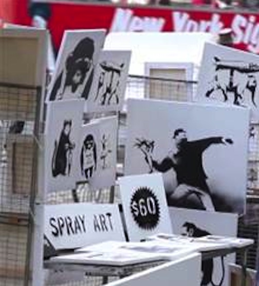
Banksy does a little playful subversion of art pricing. He can certainly afford it, as long as it’s a prank confined to Central Park.
October 14th, 2013 by dave dorsey
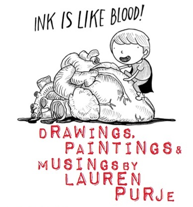
I got to know Lauren Purje when I served as her pack mule, along with Rush Whitacre when we helped move Viridian Artists from its old space on West 25th St. to its current digs on 28th. Well, a lot of good that did. This wily one is heading back for a solo pop-up at EMOA Space, now presiding in our old suite at 25th,. Doh. It’s a week-long exhibit, and she told me she thought about doing an installation for it, yet it’s likely to be primarily a way to see what she’s up to with her new paintings. My two cents was: do an installation and show the paintings. We’ll see. In her paintings, she melds her own contemporary preoccupations into Romantic landscapes—she swoons for Turner—with an occasional skull seemingly manufactured offshore by Durer and then imported into Brooklyn via time machine from Renaissance Germany. In her unstable, ambiguous world, the comic Purje persona appears as a diminutive focal point, interrogating or just suffering her natural surroundings, which might contain a few badass stowaways on the time machine, such as a stray T Rex. Her humans enjoy about the same allowance of space, and influence, vis-a-vis the rest of the world, as they would in a Chinese scroll painting. She has somehow stirred a little Charles Schultz into a full shaker of Samuel Beckett for a cocktail to ease enchanted and amused brooding about subjects otherwise off-limits. Her heart sides with Schultz, not Beckett, as much as she would like you to believe otherwise.
I was disappointed when she told me she doesn’t plan to exhibit any of her original drawings for the weekly comic she does at Hyperallergic. I tried to tempt her by saying I’d have shelled out some cash for the drawing she did where her persona was sleeping on the floor in a fleeting ray of sunshine through the window. No dice. That drawing had a cutline more or less as follows: “I don’t own a cat, but we have certain interests in common.” (She owns two cats now, hence a collectible!) It’s my favorite Purje, now lost forever she claims. (Bet not.) Her drawings are a subtle form of self-exposure, a la Jeffrey Brown—who once sent her a hand-written note which, when she found it in her clutch of U.S. Postal Service junk mail that day, caused her to bounce around her apartment as if it were a mosh pit. Her comics convey a refreshingly self-deprecating skepticism about her own inclinations while gently skewering the art world in general. In other words, she may be hard to pin down on the actual facts of her life if you ask her a direct question, but she’s unwaveringly honest and candid when she starts drawing her alter ego’s little bubble head. She’s a walking example of Fitzgerald’s maxim: “The test of a first-rate intelligence is the ability to hold two opposing ideas in mind at the same time and still retain the ability to function.” She’s constantly falling in love with her own life as the artist, and yet, at the same time, recognizing how much of the art world, like every other part of the world, is built on all kinds of unsavory fashions and elitisms. So she casts a cool eye on herself as she makes all the right moves for getting deeper and deeper into the New York scene. In her own life, I’ve watched her shrewdly connecting with influential art types, in remarkable ways, while simultaneously standing back and watching herself with the perspective of a pedestrian clocking a minor fender bender. She loves what she does. She hates what she does. Note the Transylvanian cape in the drawing above. Oh, Godot. It’s that “first-rate intelligence” that shapes her comics. She may be a moving target in actual life for anyone who tries to get a fix on her—but in her drawings she has an unerring bead on her own ink-pumping heart.
Opening reception: Saturday October 19th, 6-8pm., 530 W 25th St. #407
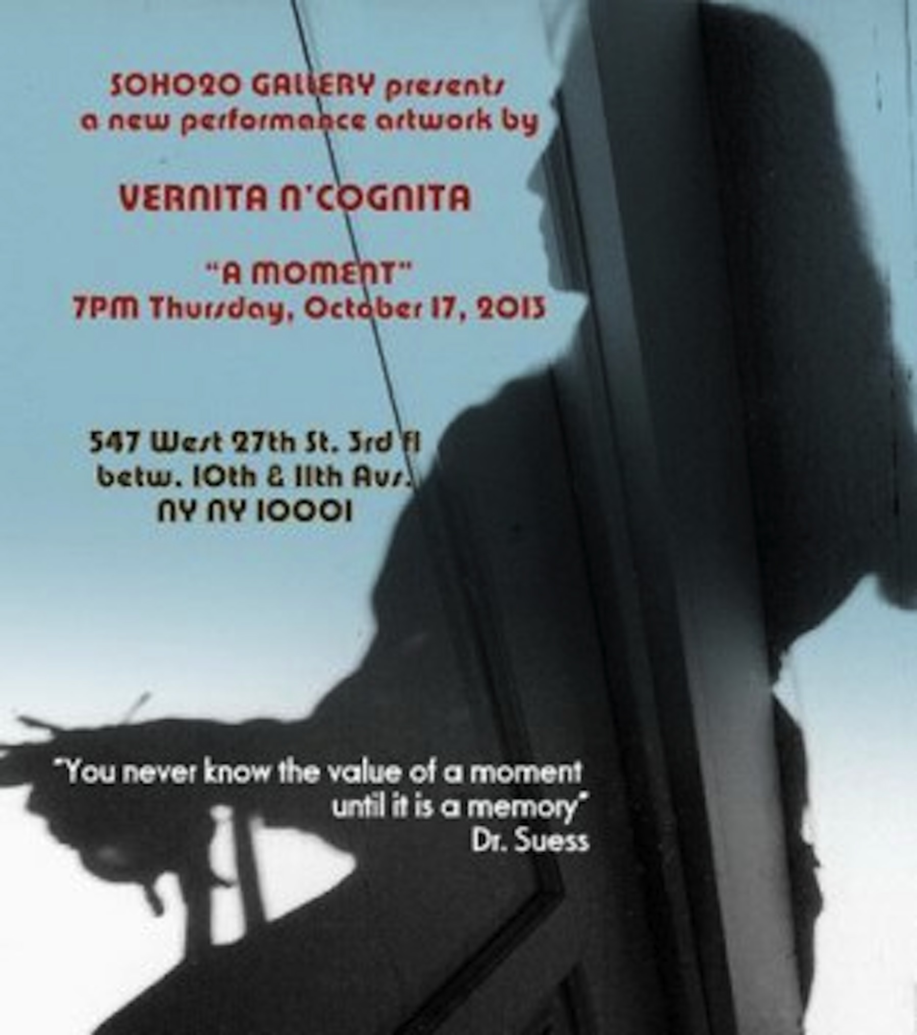
October 13th, 2013 by dave dorsey

A new performance from Vernita N’Cognita, from the email announcement I got from Franklin Furnace and the press release at Soho20:
“You never know the value of a moment until it is a memory”
Dr.Seuss “One doesn’t recognize the really important moments in one’s life until it’s too late.” Agatha Christie
Vernita N’Cognita presents “A Moment”
7PM Thursday October 17, 2013
“A MOMENT” is the newest performance work from N’Cognita. It attempts to project to the audience the deeper implications of our simplest actions and how they can alter the course of our lives. The slow-motion quality of Butoh movements allow the viewer to notice infinitesimal details and her smallest gestures. This will be the first public viewing of this work still in development. Its final form will be presented at Judson Church in January.
Vernita Nemec AKAN’Cognita began performing in conjunction with her visual practice in the late 70’s. One of her earliest performances, “Humorette”, occurred at Soho20 in 1978 in conjunction with her solo exhibit & installation there. She has studied Butoh and performance theory with many noted Japanese & American performers including Eiko of Eiko & Komo, at PICA in Portland OR with Deborah Hay & Akira Kasai, and most recently Body Resonance at Schloss Broellin in Germany with Yumiko Yoshioka. Butoh adapted forms an important aspect of her performance work.
Nemec, also known as N’Cognita to honor underknown artists, has presented more than 70 performance in the United States, Hungary, Japan, Ireland, Germany, Mexico and France, including guerrilla performances at the Pompidou Museum in Paris, Documenta 13 in Kassel, and more than 20 solo exhibitions of her mixed media collages & installations in the United States, Ireland and Hungary. Her visual art is in the collections of MOMA, the Savaria Museum in Hungary, Sylvia Sleigh Collection of Feminist Art, Rowan University, Asian American Art Center, Franklin Furnace, Groupa Junij, Belgrade and others.
Articles and reviews of her work have appeared in the New York Times, The Village Voice, High Performance, Nation Magazine & the New Yorker among other publications. Her performances can be seen on UTube and Vimeo. She is included in “The Power of Feminist Art”, 1994, Harry Abrams (Pub), edited by Norma Broude & Mary Garrard, “The Pink Glass Swan: Selected Feminist Essays on Art”, 1995, Lucy Lippard. and “Performance Artists of the 80’s” by Linda Montano. She currently lives and works in New York City.
www.ncognita.com ncognita@earthfire.org.
October 11th, 2013 by dave dorsey
Last Word, Darryl Moody
I had a fun conversation with Darryl Moody last week at Viridian Artists. The closing reception for his solo show on the 12th—tomorrow, as I’m posting this—and the show goes down the next day. He holds a BA in Graphic Arts from the University of Illinois in Chicago, where he studied design with Bauhaus artists who had fled Germany in WWII. He went on to get an MFA in sculpture from The School of the Art Institute in Chicago. He has written “Photography as a Psychological Narrative” while working at Indiana University.
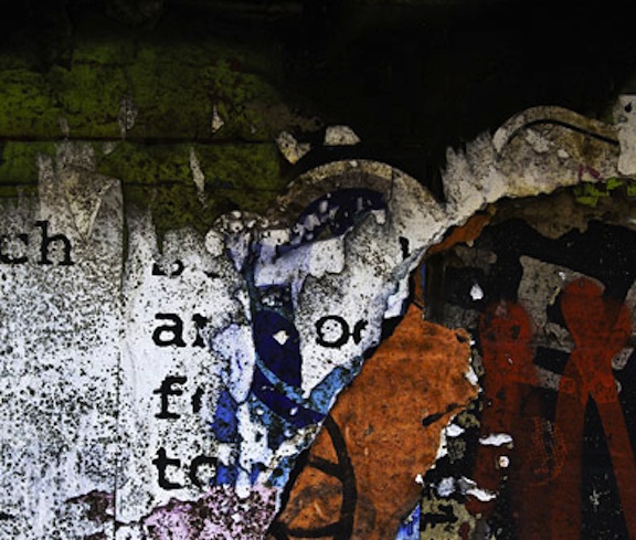
You take photographs in various cities of what people have posted and painted on public walls: street art that has been covered with other street art or printed matter. What’s interesting is how you capture the passage of time in the way these layers accumulate and then decay either because of the weather or as people successively alter what’s there. How did you get started doing this?
Ten years ago, in Baja, Mexico, a combination of things caught my interest. When I looked at street art there, I noticed how things that were posted usually deteriorated much more slowly than they would here. In New York, a lot of the imagery here disintegrates because it’s being attacked by people. The other thing that happens in Mexico, even with graffiti, they will use sharp objects, often on glass, and they’ll scrape on glass surfaces or hard surfaces in general, but they also scrape on metal. So a lot of things that were interesting initially weren’t just graffiti but the fact that they were on top of older imagery, even from the 40s. Occasionally when they would use a sharp object and write on metal, the oxidized metal would bleed through (and it would expose the older layers of material.) Also, there’s something about the light on the West Coast. When it’s a clear day, you get light that’s almost blinding. The intensity of the light made the experience much different.
You’ve been spending the three weeks of your show at Viridian wandering around taking a lot of photography in New York City. How did you get drawn to New York?
I got to New York in 2004, when I was doing a residency at Cooper Union. I was beginning to have questions about when and why does certain art become significant in art history. Where’s the edge of art criticism and how does it intersect with history?
In other words, how does art in a given period get legitimized and recognized as art?
Yes. How we arrive at determining what is art to begin with and what do we recognize as art over time? MORE
October 9th, 2013 by dave dorsey
Illusory Flowage, Neil Welliver, OIl on Canvas
When I have more time, I’ll write quite a bit more about the current dazzling show at the National Academy Museum, Say It Loud, Seven Post-War American Painters. I saw it Friday, and though I’m a guy who generally finds it impossible to stop talking (just click around on this blog if you doubt me), I was dumb-struck with awe and admiration. It features work by seven painters who aimed to reconcile representation and abstraction in a period when, as the catalog puts it, “American painters who came of age in the 1940s and 1950s were expected to choose allegiance to either abstraction or representation. As many saw it, no middle ground was possible.” These days, painter after painter–and artists working in other mediums–gravitate to that middle ground. By choosing to remain on the fringe, as it were, these painters stayed true to what is, for me, the central imperative of painting: make it simultaneously real and unreal, both a rendering of something actually seen and a physical field of paint assembled for its own sake. The show brings out how all seven painters recognized that the way forward was to make their medium and its support central to what the work is about: how painting is first and foremost about paint, even when it’s inevitably about something else. There’s so much to love in this show, and though I didn’t like all of it, it made me respect and admire even those among the seven whose work left me wanting. (We suspect the fault is in ourselves, not these stars.) More later. (I have to say that after a couple decades of admiring and envying Neil Welliver from reproductions of his work, I finally was able to see the how magnificent his paintings actually are.)
October 8th, 2013 by dave dorsey
 How many works of visual imagination have ever required fifty years of labor? That’s how long Jerry Gretzinger has been working on his ever-changing SimCity-like map. Hey, you have to get it right if you want the citizens of virtual Ukrania to find their way around. Google maps won’t help, yo.
October 7th, 2013 by dave dorsey
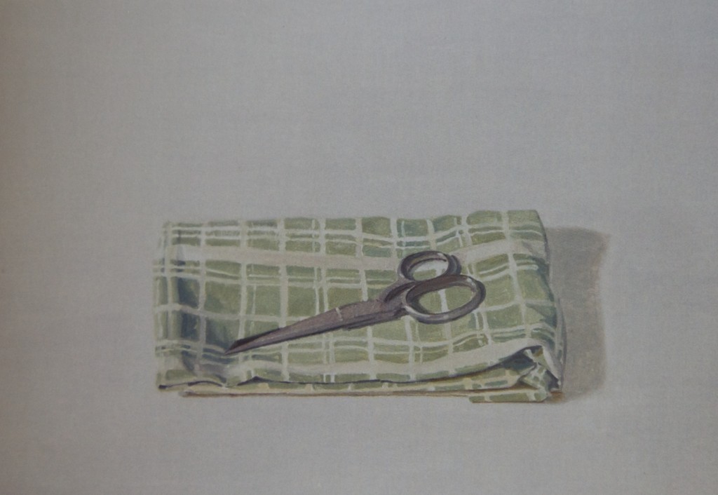
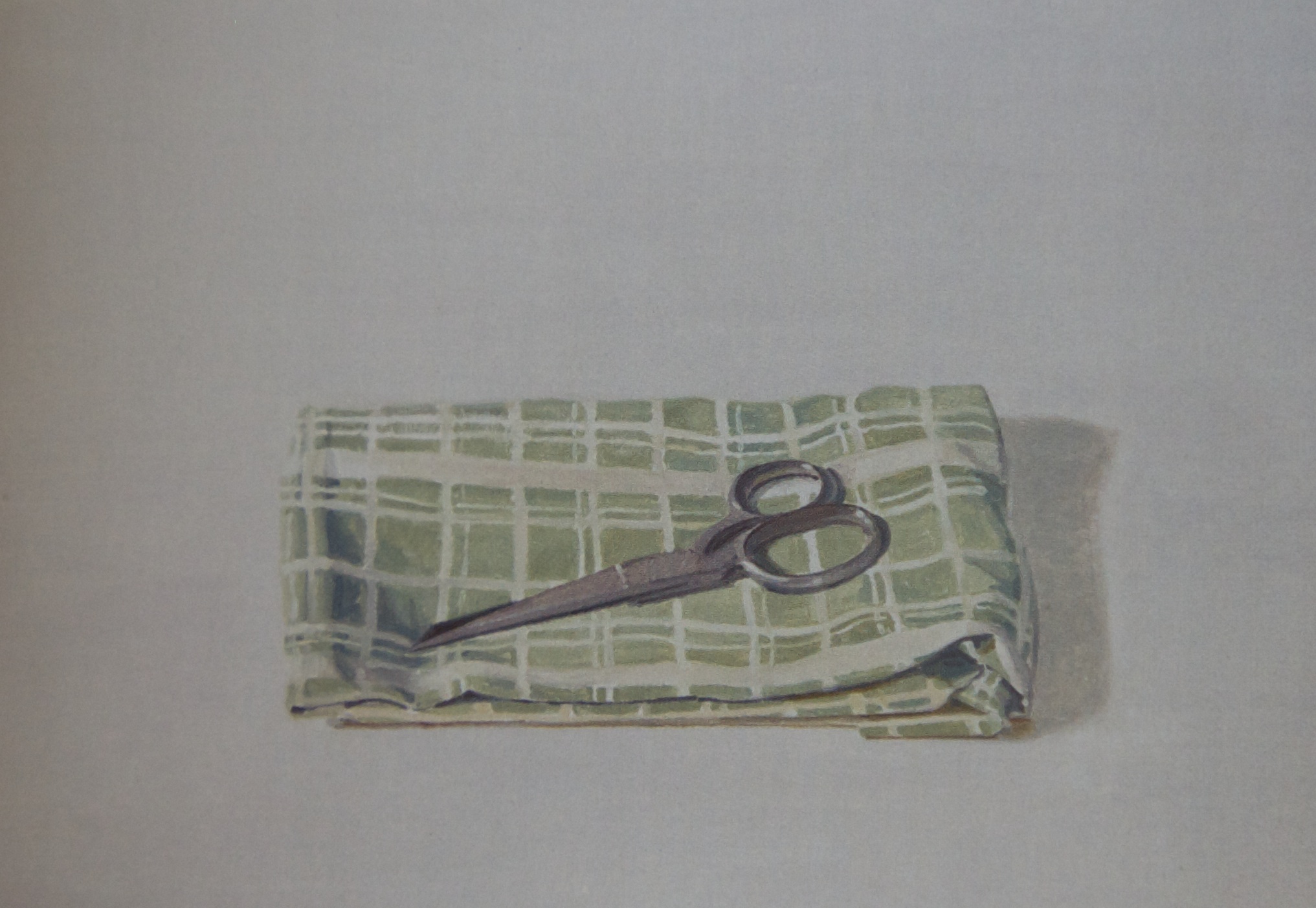
Scissors, Ron Milewicz, oil on linen
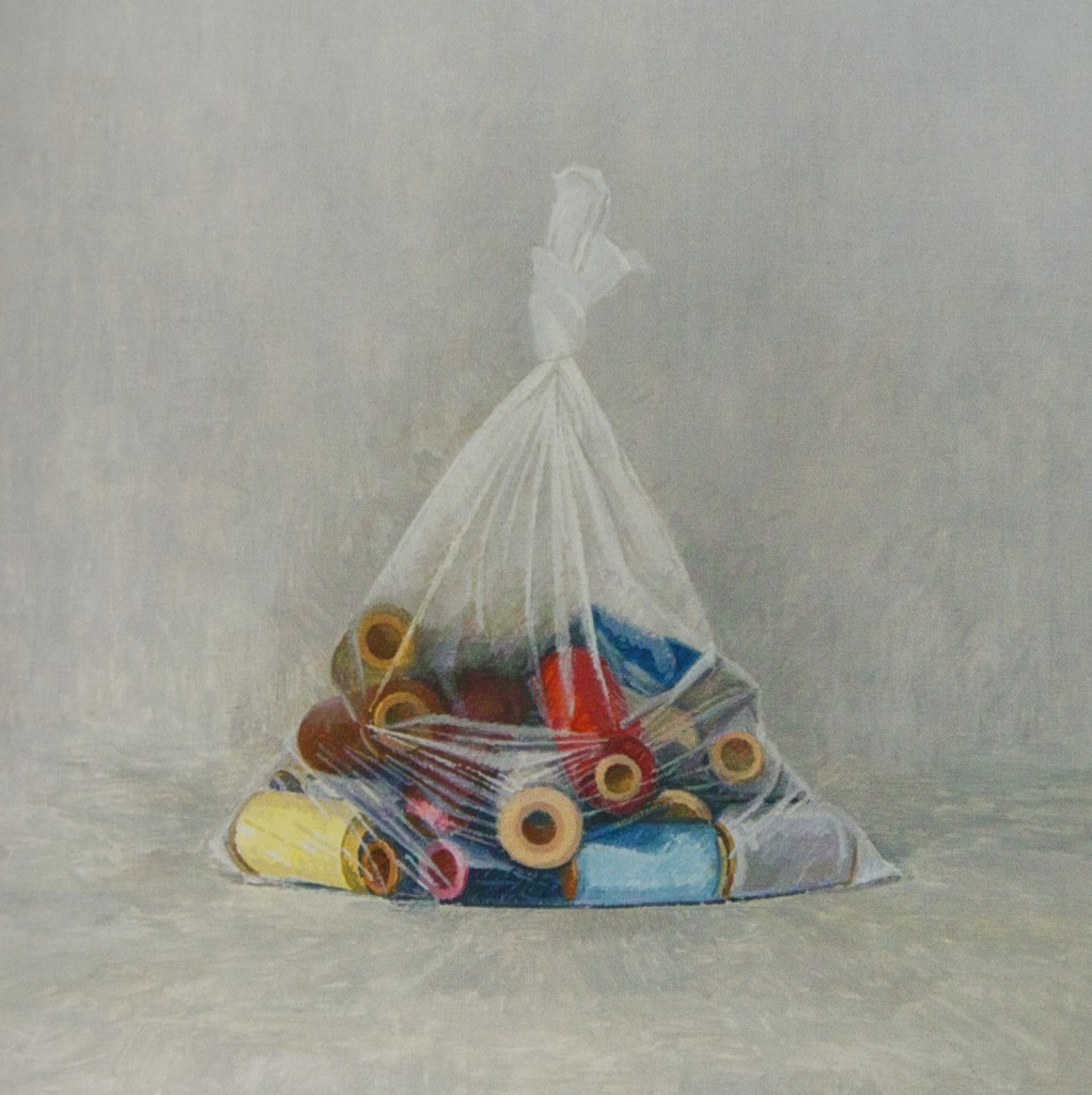
Spools, Ron Milewicz, oil on linen
I’ve never posted two paintings from a show I’ve written about, so that alone ought to indicate how much I liked this one. One of the deepest pleasures of my visit to Chelsea two weeks ago was seeing the quietly commanding still life paintings of Ron Milewicz at Elizabeth Harris. Having been given a free copy of the exhibition catalog, and reading the background on the show, entitled the soul exceeds its circumstances, I was conflicted, in a good way, about why the show worked so well. To say it “worked” is to diminish the subtle effect it has on you, at a purely instinctive and visual level. Even without knowing what inspired the show, you can feel these paintings are the outcome of restrained passion and love simply in the way he paints. You see image after image of modest household items, painted in an almost casual and un-assertive way, each object isolated in a field of white or Rembrandt-murk. The artist carefully depicts what he sees without fussing over hyper-realistic detail. These images immediately win you over with their humility, offered through an easy and relaxed execution. In painting after painting, you sense that Milewicz was working entirely within himself, as they say in sports, not striving to do anything more with the paint than he needed. Not trying to impress or dazzle with his skill; simply getting each object to the point where it’s all his own eye required to feel the life of the object. A brick, a shovel, a braid of challah bread, spools of thread, a hydrangea blossom, or a pair of scissors resting on a neatly folded cloth: they look as if they could smile back at you. Walking through the show, you feel as if you’re seeing tiny glimpses of the good life, in the highest sense, governed by an orderly middle-class serenity earned through hard work.
You might pause and wonder, as I did, why challah? Oh right, the artist is Jewish. Then, out of curiosity, you ask for a catalog and read the guest essay and the artist’s brief statement about his inspiration for the show. You realize this isn’t simply a refined way to make the simplest possible set of still lifes, but—looked at as a whole—this show is a fragmented narrative. These are glimpses of the happy life the artist’s grandfather led when he came to live in Brooklyn and work as a sample maker in Manhattan’s garment district. He and his wife apparently were gardeners as well. Yet you discover the deeper history behind each object when you read that Eli Milewicz weighed 60 pounds on the day Germany lost WWII and his “death march” to the Baltic Sea ended. His wife, Anna Kaplan, was also a survivor of the Nazi concentration camps. So you go back and look at each image and see the resonance of the horrific past in each painting: suddenly bricks mean a different sort of oven. A shovel is for digging both gardens and graves. Spools of thread struggle to breathe in their sealed plastic bags. And so on. If you are going to make a statement about anything, let alone something as evil as genocide, then it’s hard to imagine a more understated way to sum up an entire individual life in a set of images that have double, or triple, meanings. The show as a whole is a book of innocence and a book of experience, with both states of the soul fused together into half the images Blake required. And every one of these paintings is beautiful.
If art depends on commentary and knowledge extraneous to the image itself—and I generally hate it when that happens—then this is how it should be done. The paintings work well, entirely on their own, without background information, and yet they gain in gravity and, frankly, are even more interesting, when you hear why Milewicz was moved to paint such fraught images in such a sotto voce way. As Tom Sleigh puts it in the catalog essay: “The power of Milewicz’s images inheres in how he refuses to go in for the big teary-eyed gestures, and how ordinary objects like shovels, overcoats, and spools of thread are invested with deeper meanings. . . .but without insisting on them.” Those last five words are the key. The ‘deeper’ meaning is there if you wish to uncover it. Instruction isn’t included in the work itself, nor is it required. These are first and foremost paintings, not propositions. And very good ones at that.
October 6th, 2013 by dave dorsey
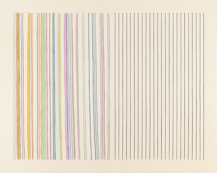
Mirror, Gene Davis, acrylic on canvas
After you’ve seen the more stident work of Ian Davenport at Kasmin–he drips orderly vertical stripes down aluminum and steel panels and then gets the paint to go all Dionysian on us near the bottom–walk a few blocks down to Ameringer McEnergy Yoho for something that looks at first quite similar but feels entirely different. Get up close to one of the Gene Davis canvases, and if you look intently enough you’ll see a perfectly straight pencil line just visible through some of the stripes. He used a straight-edge to establish where he wanted the stripes to go, but then painted them without any assistance other than his eye. The line was more of a suggestion than a rule, though most of the paintings don’t show how unsteadily his brush moved down the canvas until you really stand a few inches away. Math and human muscle are at odds in so many ways, but here it’s a good thing: minimalism seems friendly and humble and understated. I walked past these paintings on my way into the back room without paying much attention, but on the way out I stopped and tried to examine how he applied his paint, and it changed my attitude. A line of graphite, and then freehand. No masking tape for this guy. Suddenly, I started liking what I saw. It also helped, for some reason, to read this in the handout, though I really don’t quite understand it:
Look at a painting in terms of individual colors. In other words, instead of simply glancing at the work, select a specific color such as yellow or a lime green, and take the time to see how it operates across the painting. Approached this way, something happens, I can’t explain it. One must enter the painting through a single color.
–Gene Davis
October 5th, 2013 by dave dorsey
Allison Miller, “Wave” (2013), oil and acrylic/canvas, 36 x 36
I see a narrow depth of field, and therefore a background completely out of focus, glimpsed through rain, as my windshield wipers hit their apex, and I miss mine while steering through the turn. But I could be dreaming all that up. Definitely going to see this show when I’m back in the city this weekend.
From Hyperallergic:
The recent show further convinced me that Miller — who refuses to make work that is stylish, seductive, charming, nostalgic, retro, ironic or hip — is up to something. It is not that we wouldn’t recognize a Miller painting as such, it’s that she refuses to give her work a look. And in order to do this, and to keep everything in play while working on a painting, she seems to understand the necessity of exploring a territory that hasn’t been colonized by discourse, that hasn’t been snatched up and packaged by critics and theorists as the latest example of postmodern capital. I am further impressed by the fact that she refuses to affix a spiel to her work. I become distrustful when the artist resorts to a verbal component to deliver the enlightenment. –John Yau
So refreshing to read all of those sentences. I may post that somewhere as a manifesto, even though I fear I may give the appearance of violating much of it myself in the coming months. Doh. I actually have an idea for my solo show in May–until now I had hoped, as a painter, I possessed a mind so fine no idea could violate it. Apparently not. I pray I will recover from this after a spot of rest, once I’ve gotten it out of my system.
October 4th, 2013 by dave dorsey
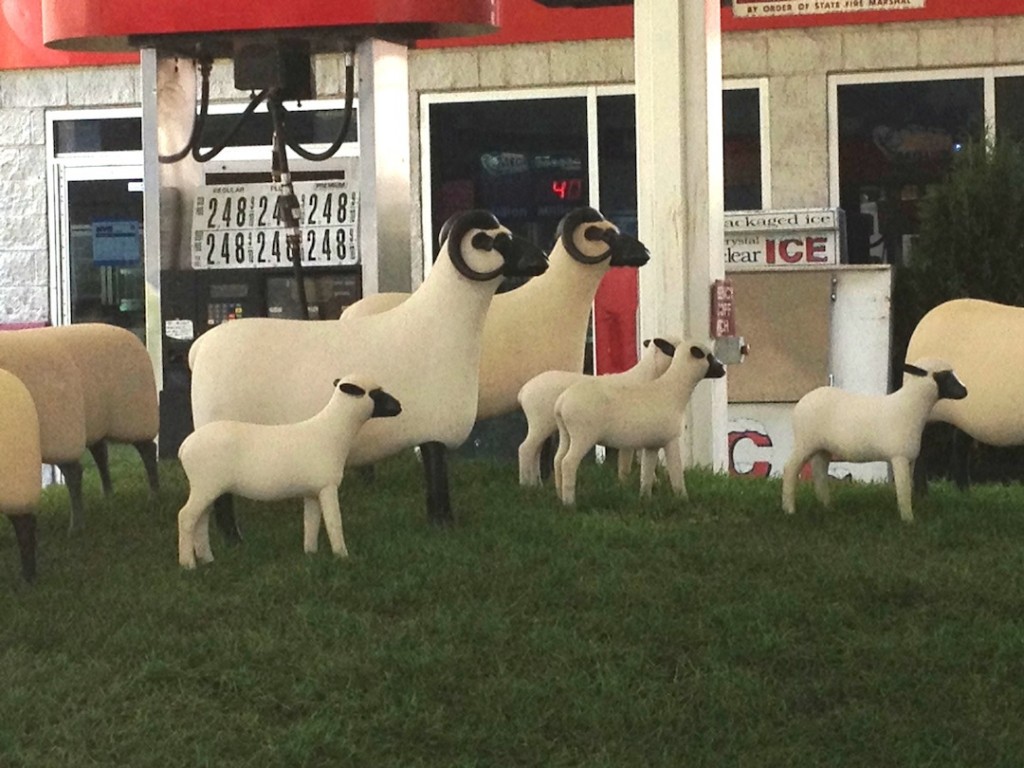
Tryin’ real hard to be the shepherd in Chelsea
As I headed down 10th Ave. a couple weeks ago, I saw, for the first time, the at-first-glance bucolic installation of sculptured sheep by Fancois-Xavier Lalanne, where once I would have seen lines of cabs stretched into the avenue, waiting for gas. Paul Kasmin and real estate developer Michael Shvo have turned what was a Lukoil gas station into Getty Station, an outdoor gallery, complete with white fence, fake rolling pasture, and a soothing herd of sheep. It isn’t the first time the station has been used to exhibit art, but in the past, the gas kept flowing. The name is a nice turn: suggesting both the petroleum and the art associated with the Getty brand. Also nice: gas prices on the vertical sign have been replaced with the show’s opening and closing dates. A dignified gallery minion guarded the art and handed out leaflets about the show. The gas station’s metamorphosis has gotten a lot of publicity—it’s friendly, funny, a natural target for cell phone photographers. It’s nicer to walk past this site now than it was a month ago when overheated cabs clogged the sidewalk and street. They exhaled a bomb of exhaust that cloaked the entire corner. But they were there because we needed them, and they needed that gas station. It was a handy stop for people in the neighborhood who wanted a lift and income-sustaining for the drivers. (Kasmin told the Wall Street Journal that many have asked him, “Where can I catch a cab now?” Gosh, I don’t know. By walking a couple blocks and looking for the glowing number on the roof, maybe . . . )
My reaction to the change was mixed. Two weeks ago, as I walked through once-familiar areas of West Chelsea, I saw one example after another of a real estate boom. Across from the building that houses Viridian Artists and many other galleries, and which serves as home base for me, a large complex of “affordable housing” has been going up for months. Now, on the corner of 10th and 28th, where we used to buy sandwiches, Diet Cokes and an occasional beer, our friendly bodega was gone, and the site was locked down with steel shutters. I was told residences are going to be built there as well, and developers have pushed the little shop a block north to 29th. All of this would be encouraging, if I hadn’t lived through 2008 and witnessed the fallout of the real estate debacle ever since. When I stood at the edge of the pretend picket fence at Getty Station, all I could think about was the Wal-Mart syndrome—big money coming into an area and snuffing little enterprises on Main Street. Only in this case it’s big art money shutting down what appeared to be a small, thriving franchise serving a vital need for cab drivers hustling to make a living. The sheep are pleasant, but no one needs them. That gas station was alive, and small businesses exhibiting that station’s healthy vital signs are all that will turn the current economy around. Walking through so many galleries in Chelsea, as I do whenever I come to town, it already feels like walking through a string of high-end car dealerships, where the price tags are so out of reach for nearly anyone but the ultra-rich, you feel as if you’re peering through someone’s window into a lavish dinner party. Every time I walked past the old gas station, it was nice to see a little hint of how most people scrape together enough to pay the bills and keep a car running. It was a quick little sniff of reality on my way between the clean, filtered air of one white cube and the next. Those industrious cab drivers getting their tanks filled at the old Lukoil station were the sort of mudders who keep the American horse race alive. This installation of artificial sheep was cute, family-friendly, amusing and cheerful, but it depressed the hell out of me. I looked at the gallery attendant and shook my head, with a half-smile, and said, “Chelsea.” He nodded and smiled right back in exactly the same way, and said “Yup”, and then handed someone else one of his leaflets. I could have just said, “America.”
October 3rd, 2013 by dave dorsey
Frederick Hammersley, Got Is Love, 17.5″ x 14.5″
Until a couple weeks ago, I’d never been in the back room at Ameringer McEnery and Yohe. For another week or so, that semi-hidden room in back is full of Frederick Hammersley. (I had no idea the gallery had this third exhibit space, more or less concealed behind the desk. Evidence of slippage in my powers of observation. Doh.) It’s another taste of perfection, two years after their last Hammersley show (was it that long ago? you see my point about slippage . . . ), and though it isn’t quite as dazzling as the previous selection, it’s a pleasure. All the qualities that won me over before are in evidence again: the color harmonies, the tension between the organic abstracts and the geometric ones, the playful puns in the title. Got Is Love, for example, above. As a noun, it’s German for God, but it’s a verb for something else entirely, serving as a nice little commentary on American consumerism and plain old avarice. You love what you own. Is that a sales pitch, disguised as a title? Artists have to eat, contrary to common lore. Hey, cigarettes and Pernod are expensive too, for that matter. So if he’s saying love me, buy me: maybe that title isn’t so acerbic, after all. As with Hodgkins, the frame is integral to the painting and gives it even more presence as a three-dimensional object you look at rather than see through. In these paintings, as well as the minimal stripes from Gene Davis that dominate the gallery as the main event, you see the evidence of the unreliable human hand everywhere, unable to hew perfectly to any line, curved or straight, if only you get close enough to see how things meander a bit. In both cases, the wavering edges open up a world of feeling where you might first just see a cool and calculated exercise. The edge always striving to get back to where it belongs, as we all do in life, for better or worse.
October 2nd, 2013 by dave dorsey
Skull installation in Singapore
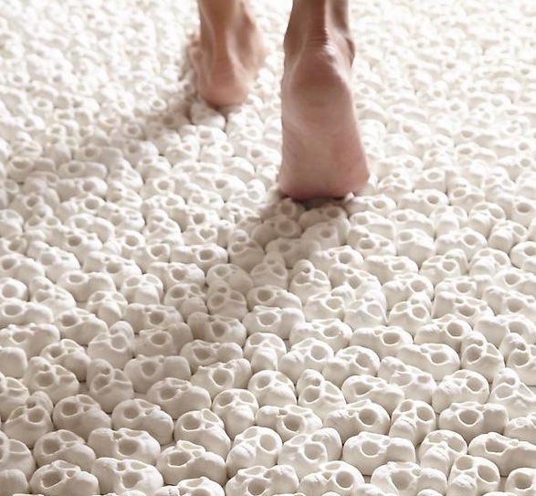
I was hiking a few days ago through Mendon Ponds Park with my brother, and the subject of my skull paintings came up. Like many people, I think he assumed I’d developed a slight, morbid side-interest in death. I tried to explain that skulls go back centuries as a primary subject in vanitas still lifes. A skull painting isn’t a nice Goth fashion statement, or declaration of allegiance to the occult, or a logo for an Ivy League secret society, or an initiation into the Sons of Anarchy Painting Guild. Skull paintings were, and are, a reminder of what matters most in life: you may die at any time, so live accordingly. Every moment counts. Awareness of life’s brevity helps reveal how meaningless most pleasures are. Of course, as time runs out, you might also go on one sort of binge or another, but that’s simply testimony to how a vanitas paintings test of the viewer’s character. What are you going to do with whatever time remains? Vanitas painters themselves don’t always pass the test. They like to sneak into their paintings delightful but suitably evanescent sources of “meaningless” pleasure, thus giving themselves and their patrons an excuse to revel in those pleasures while feeling righteous about how brief they are. Barkeep, I’ve just contemplated death for fifteen seconds, make it a double. I’ve earned it. The vanitas tradition is certainly alive in Singapore where Nino Sarabutra has covered a gallery’s floor with 10,000 tiny skulls. I’m not sure if visitors are required to go barefoot, as it would appear in the photograph, but they ought to be. On one wall hangs a painting with the words: What Will You Leave Behind? Nothing morbid about this at all: it’s a question at the heart of any serious philosophical or spiritual attitude toward life. Nota bene: skulls can actually be beautiful in their own way, like old bleached objects washed up on a beach, as complex and full of curving, pitted forms as difficult to paint as a fading white flower. Our bones are like driftwood.
Now that’s the spirit . . .
October 1st, 2013 by dave dorsey

There is no love of truth without an unconditional acceptance of death. Everything which is threatened by time secretes falsehood in order not to die–and in direct proportion to the danger of death.
—Gravity and Grace, Simone Weil
September 30th, 2013 by dave dorsey
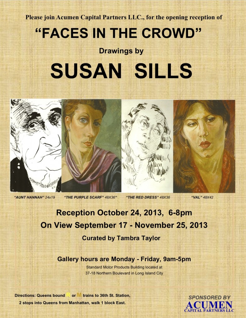
Faces in the Crowd, a show of drawings by my fellow Viridian artist, Susan Sills, opened recently in the lobby gallery at the Standard Motor Products Building in Long Island City. It’s a range of work she’s done over several decades, mostly ink drawings, but including one large painting as well. It’s a departure from the work she shows at Viridian, her three-dimensional wooden cut-out pastiches of works from art history. This is a show that reflects how she reacts to what she sees every day, and what she notices most are faces. In earlier years, while riding the subway, she would always have a small sketchbook and capture faces sitting across from her.
“A pen was a part of my hand back then,” she told me. “Today I just look.”
She prefers working from life, though she has included portraits of family members from the past hundred years, using scrapbook photos. “I do the eyes first. I know that isn’t the way you’re supposed to do a portrait, but I have to do it that way. When you start, your sitter is really looking at you intensely. Then they start to drift. You have to get the eyes when they’re paying attention.”
If forced to choose between painting and drawing, she would prefer to draw. In his campaign against photography-based painting, David Hockney said much the same thing: that painting should essentially be more like drawing, an immediate transfer of energy from the eye, through the heart, to the hand. At the time, he switched to watercolors, which are often considered drawings, rather than paintings. Hockney built his campaign, in part, on his celebration of a single brilliant drawing by Rembrandt, A Child Being Taught to Walk, where with only a few spontaneous and irrevocable strokes of a reed pen he evoked an entire family scene helping a toddler take her first steps. It’s closer to calligraphy or Japanese sumi e than most Western art. When I mentioned how drawing often feels more alive than painting, and mentioned how Van Gogh and Brueghel’s drawings seem to breathe more than their finished paintings, she immediately said, Rembrandt. “He was a genius as a painter, but his drawings are genius-plus.”
The show runs through Nov. 25.
September 29th, 2013 by dave dorsey
“While at bootcamp in Farragut, Idaho, Rauschenberg got hold of a set of oil paints and began a portrait of one of his fellow recruits. Working on the piece proved a bit of a challenge “…because the john was the only place with lights on after taps,” he says, “I sat in there to finish it. When I ran out of red, I pricked my finger and rubbed it into the skin tone.” After bootcamp, Rauschenberg was assigned to the hospital corps at Camp Pendleton, near San Diego. Before he reported for duty, he visited the Huntington Gardens, where three paintings changed his life: Pinkie by Thomas Lawrence, The Blue Boy by Gainsborough and Joshua Reynolds’sSarah Siddons as the Tragic Muse. Up until this point, Rauschenberg had never seen original oil paintings and had no idea there was such a thing as being an artist. What struck him, he told Time magazine’s Robert Hughes was “…behind each of them was a man whose profession it was to make them. That just never occurred to me before.”
“. . . Rauschenberg thought of (Albers) as his most important teacher. “He was a beautiful teacher and an impossible person,” he said in an interview, nearly 20 years after Black Mountain. “I’m still learning what he taught me. What he taught had to do with the whole visual world, and it applies to whatever you’re doing, gardening or painting or whatever.”
September 28th, 2013 by dave dorsey
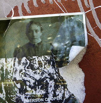
Red Rain, detail, Darryl Moody
The title of this show of objets trouvés could be the standard subtitle for any exhibit in a gallery setting, but it’s especially pertinent here, where the artist has captured photographic images from walls in cities around the world. Generally these walls are covered with an interesting and disintegrating surface of paper, paint, rust, dirt, and other layers of artificial skin, so to speak. While doing a critical assessment of work by artists in a residency at Cooper Union, Peter Schjeldahl once told Darryl Moody that his photographic prints reminded the critic of Aaron Siskin‘s work. This was after a long sequence of brutal dismissals aimed at other participating artists. Darryl asked The New Yorker critic if he could repeat that remark, and he got a nod. Few and far between are the artists who can carry around a blessing of any sort from Peter Schjeldahl. I had a brief chance to get a look at the photography on my hectic visit to the city on Thursday, and seeing it in person is the only way to absorb the subtle color of the prints. Not to dismiss the other strengths of his work, but his handling of color gives many of these images an especially poignant quality, a sense that weather and time are investing a rough beauty into something torn and punished that pushes back against what are otherwise lonely glimpses of loss and entropy. I’ve been looking at a smaller reproduction of the peeling image of Castro for the past two years at the gallery, but in the larger exhibited print, the steak of color he captured that runs through a rupture in Castro’s face is remarkably complex and almost melodic. Moody wanders around the world looking for images on walls to shoot, and half the success is simply finding a haunting image by spotting and cropping a particular area of what he sees. What you see is pretty much what he got when he clicked the shutter: I didn’t have the impression that there’s a lot of post-production going on as the image travels from camera to print, through a computer, but I may be wrong about that. There’s a reception tonight at the gallery: 458 W. 28th St. 6th floor. It’s Moody’s first solo with VA. Should be fun.
September 28th, 2013 by dave dorsey
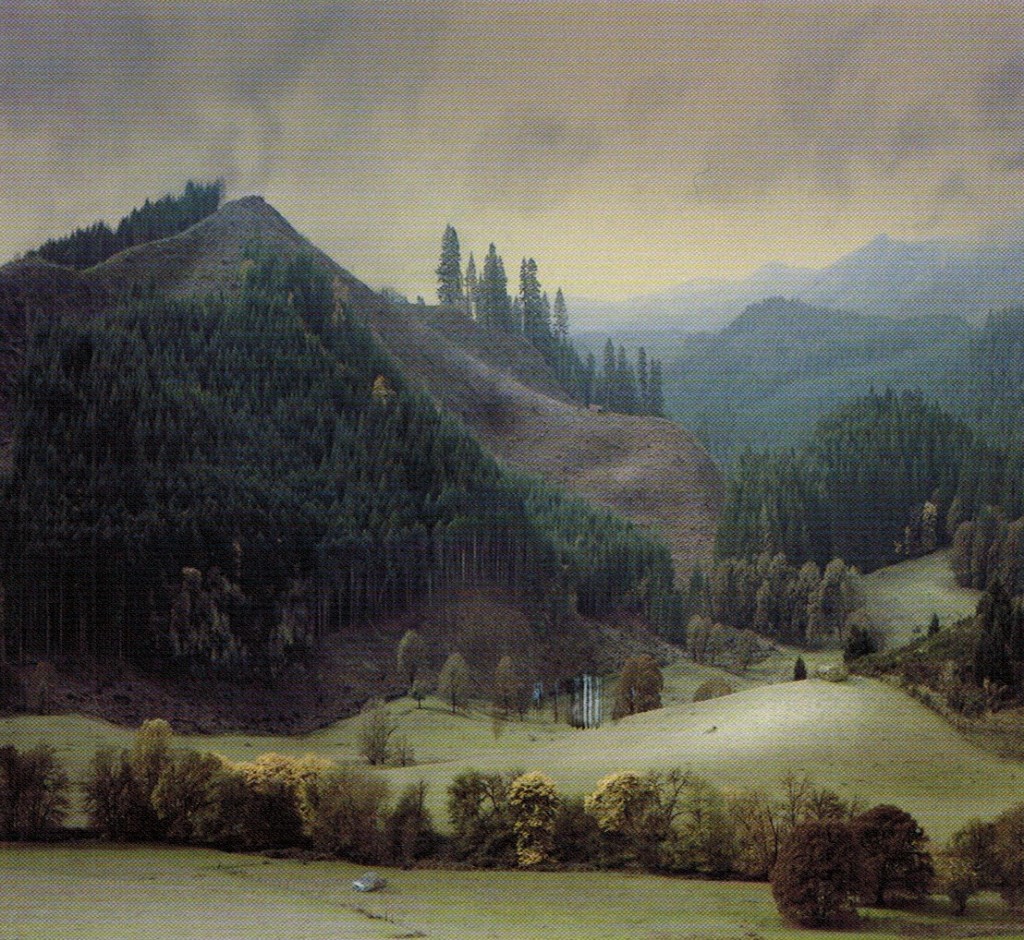
Untitled 2, Alexander Solomon
What looks like a tremendous show opened Friday at Manifest, including this great landscape from Alexander Solomon. I’m pretty sure we’re looking at a meticulously constructed diorama which the artist has then carefully lit and photographed. Hard to tell much more about it, and there’s very little information about the artist on the Web, but it looks superb on the invitational postcard I got from Manifest. Dioramas have become a fascinating branch of art, especially from people like James Casebere, Matthew Albanese, Amy Bennett and now, apparently, Alexander Solomon. (We had a photograph by Claudia Fainguersch, similar to some of Solomon’s, in a juried show at Viridian Artists not long ago.)
I must have done something wrong in a previous life, which brings with it a recurrent payback in this one every time I want to be in Cincinnati. It’s a city just barely too far away for me to get there more than once a year, if that. For me, it’s essentially as inaccessible as L.A., given the hours/cost required either on the road or in the air. Otherwise, I’d show up for every opening at Manifest, a little oasis of sanity and quality for artists around the world. Fallback position: I’m going to do some browser hunting of the artists in this landscape show to get a better look at their contributions to Vista.
On Mr. Solomon I could find only terse and/or cryptic comments he’s made about his own work. He appears to be a recent art school grad. What little I did find was interesting, especially his second observation below:
For any landscape, my goal is to make something sublime and unsentimental. To my mind, that combination tends to consist of pairing opposites.
I’m curious why I feel a compunction to coldly approach this kind of work and the fear of sentimentality that I’ve experienced throughout the contemporary art world.
For the viewer, I hope my work is like the cave in The Empire Strikes Back, “What’s in there?” “Only what you take with you.”
May the force be with you Alexander. Keep making scenes like Untitled 2.
There are impressive shots here, if you want a detail of this work (the scene is so amazingly rendered that I keep questioning whether or not I’m looking at something he constructed rather than an actual scene, but I’m sticking to my story. The silvery car helps.) Plus another similar scene, just as impressive, of a hill shorn of trees but ready for more depradation.
September 27th, 2013 by dave dorsey
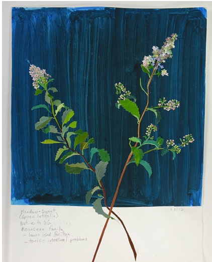
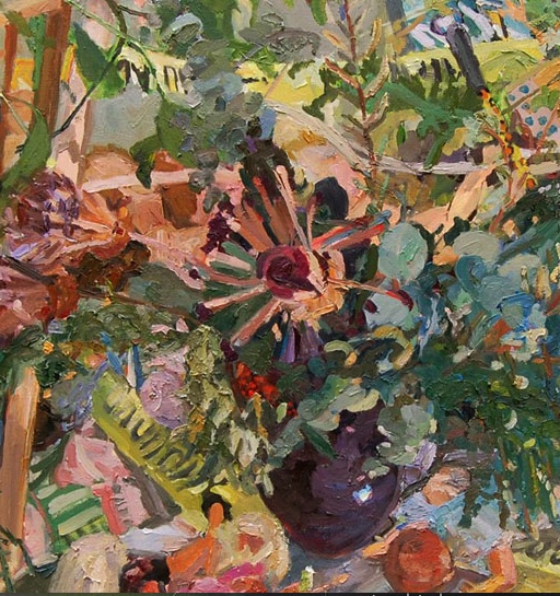
Meadow Sweet, Elizabeth Bisbing, gouache, paper, graphite.
Any artist who learns to work in a garden quickly recognizes parallels in the way a plant and a painting grow. It takes time and repetition: fluids (oh, don’t I know), light, and an interaction with random elements all play a role in both forms of creation. As I work with plants I’m constantly reminded of how I work with images: I get something started, I add more of this or less of that, and I prune away at whatever isn’t helping. And what I’m working on tends to grow more slowly than I’d like, requiring a lot of waiting otherwise known as patience. What you’re really doing is guiding, not creating. Looking at a nasturtium bloom or a ripe tomato, after sometimes months of husbanding the plant, can feel exactly as if I’m standing back and gazing happily at a completed painting. (I start dahlia tubers in January, inside the house, and step-by-step transfer them to potting soil and then sometimes larger pots before putting them outside in May or early June. Some even start blooming in the house in May. There are really only a few months I’m not tending dahlias one way or another–from October through January I keep them dormant in the garage.) So, more and more, painting an image of a head of lettuce or a dahlia strikes me as almost the final step in gardening itself. I’m actually just looking, studying, consuming with my eyes, the outcome of continuous labor and care over the course of more than half a year, in the case of the dahlias. And the act of painting one of these plants recapitulates the process of growing it. What I see is beauty, but it’s more than that. There’s always a hint of strangeness in natural forms, which is part of the fascination. Often I see something like what Michelangelo conveyed in his unfinished Captives, a wrestling with the constraints and obstacles of physical life–every flower and vegetable is, in some respect, at act of overcoming. The flowers that emerge twisted and deformed–qualities echoed in the complex form of a healthy dahlia, which has as many curving planes as a skull–can become just as fascinating as what seems initially more symmetrical and “perfect” in the healthiest flower. What comes through, in nature, again and again, is unity within complexity, how something with so many diverse parts can look utterly simple and coherent. It’s amazing to me that a dahlia can emerge from a shrunken tuber locked into the ground, as even enormous plants emerge from the tiniest seeds. I look past the beauty of a flower, amazed at how something like this, something this infinitely detailed, can emerge from the skin of that little brown lump underground, swell itself into fat stalks that sometimes rise seven feet into the air, get as large as a cluster of corn stalks, produce dozens of ten-inch flowers and then turn black in the frost and disappear. Paintings are like that flower at the peak of its cycle. You stand there, looking at it, thinking where did that come from? Seriously? How did that get made?
Many of these reflections and experiences influenced the way I appreciated Elizabeth Bisbing‘s exhibition of flower mosaics at Soho 20, late in the show’s run last week. (It closes in a day or two–I was late to a number of shows on this MORE
September 26th, 2013 by dave dorsey
The Secret Messages, detail. Gulgun Aliriza, oil on board
At Blue Mountain, Gulgun Alizira, a young painter from Turkey, has her first show with a delightful range of work, from quite large to extremely small. As in 4″ x 4″. Clusters of these tiny oils greet you as you walk into the gallery, and they held my attention the longest. At first they look like details from or studies for larger paintings, but they push Aliriza’s all-over technique into full abstract expressionism. In the larger paintings, there’s a tug-of-war between representation and paint itself, which reminds me most of Cecily Brown‘s more recent, less porn-y images where it’s even more of a “Where’s Waldo” hunt for the nude figure in the nest of brushstrokes. Here, the thicket of paint gets just as dense. In a studio scene, stretchers and props mix it up with furniture, and the room looks like what’s left after a tropical storm has blown out all the windows. It’s an interesting creative mess, both as a place to work and as an image of actual space. It’s all about making the paint a little more important than the rendering of a scene, and this comes through most dramatically in the tiny squares that seem to abandon representation altogether and where her areas of color become more coherent and powerful. I liked all of it, but the smallest work had the most charm. The paint gets really thick too in these tiny ones: folds and ripples of it rise up like peanut butter on a cracker. I told the sitter at the desk, “I’d love to see her duplicate one of those tiny ones, but on the same scale as her big paintings.”