Carol Brookes
November 18th, 2013 by dave dorsey
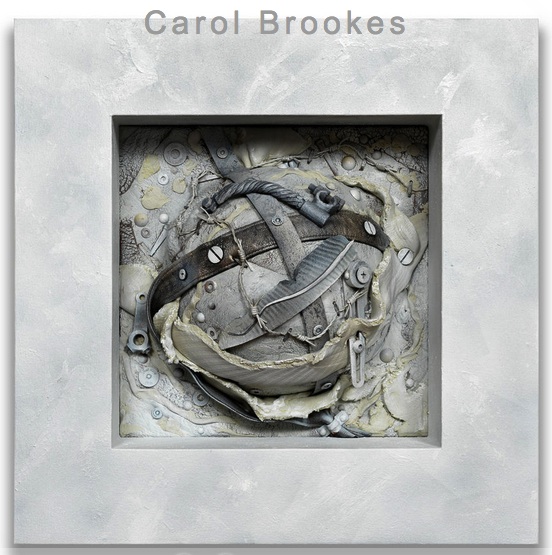
The amazingly prolific Carol Brookes, a fellow Viridian artist, has an opening Dec. 7 at Troy Fine Arts Services, in Southport, Connecticut.
the painting life
The amazingly prolific Carol Brookes, a fellow Viridian artist, has an opening Dec. 7 at Troy Fine Arts Services, in Southport, Connecticut.

Nice of Jeep to make us aware of Mr. Dylan’s early adoption of Blind Willie Johnson. Dylan uses Johnson. Jeep uses Dylan. Something gets obscured the second time around, but not much, if you just quit looking at the flat screen. Does it make sense to watch a Cherokee moving around while Dylan sings about how God doesn’t treat him as well as a mother would? Not much. But I wouldn’t have heard the song without the commercial. I can’t afford a new Jeep, but I like the soundtrack to the invitation. Whenever I hear this recording from now on, I guarantee I will never think of a Jeep. Just as I never think of Volkswagen–though I do think of fireflies–when I hear “Pink Moon.”
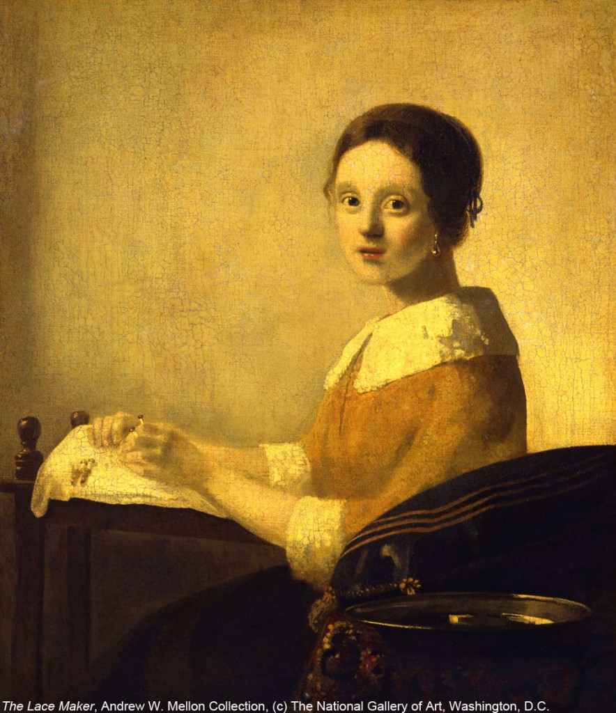
Vermeer forgery
This is quite nice, from Schjeldahl:
What do we see when we look at a painting? Decisions. Stroke by stroke, the painter did something rather than something else, a sequence of choices that add up to a general effect. If you’re like me—and, yes, I count myself a middling connoisseur—you register the effect and then investigate how it was achieved; walking the cat back, as they say in espionage. As a trick, ask yourself, of details in a painting, something like, “Why would I have done that in that way?” The aim is to enter into the mind, and the heart, of the creator. Attaining it entails trust, like that of a child attending a fairy tale.
Looking with this kind of absorption won’t immunize you to falling for a fake, but you are apt to be confused by false notes if the supposed artist’s style is familiar to you. The game then deepens. The forger hopes that, because you’re credulous, you will revise your estimation of the artist to accommodate the surprises. Or consider a reverse case: you’re told that an authentic work is a forgery. Paranoically, you view everything in it as sham. Again you’re bewildered, this time thrown into doubt about your powers of perception. You conclude that you’re a hopeless sucker.
To judge a work of art involves self-surrender.
You are something other than your own person when in art’s spell. If you dread being made a fool of, you will steer clear of art altogether. But risking foolishness, and succumbing to it occasionally, builds up antibodies of wisdom.
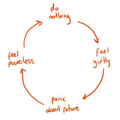 A list of artistic powerlessness du jour from Hyperallergic: brick and mortar galleries, anything that isn’t reheated modernism, photojournalists, negative critics, (wait, all critics), self-portraits (Instagram has it covered, thank you very much), and non-celebrity artists. (In other words, almost everything and all of us.)
In other emerging news, cats maintain their effortless tyranny over the popular imagination.
Life’s unfair. Therefore, one paints. Work’s what’s kept us happy.

David Salle
“One should not be selling something, but rather finding something. Just because something is a hit doesn’t make it interesting. The noble failure is often more enlightening than the thing with immediate appeal.” As told to Spencer Bailey —New York Times, print edition

Pomplamoose 4, Ben Folds
Ben Folds is also a photographer, and the fact that it isn’t his main profession enables him to be refreshingly humble, simple and honest when he talks about how he doesn’t intend his work to mean anything. It’s always nice to hear someone say this. Painting has, for me, no intellectual component whatsoever. I paint what I want to look at repeatedly, without pinning down why. If the image causes me to become aware of more than the literal object or scene, all the better, but this isn’t something I can consciously make happen. The process is subconscious. The “meaning” of the picture, if it has such a thing, as well as the title, come later, when I extract or attach them in a parasitical way. James Hall, my dealer here in Rochester, always mocks my simple, literal titles. Two Pears. Candy Jar #10. It amuses him, but I never think to suggest that he ought to check the titles of thousands of paintings down through history. They add no more than mine to the visual power of the work. Mona Lisa. Starry Night. Sunflowers. Nothing that wouldn’t have been available from a glance at the painting itself. The Tempest, Bathsheba, Lunch on the Grass. . . Not detecting much in those titles that wasn’t there at a purely perceptual level, except maybe the Biblical reference.
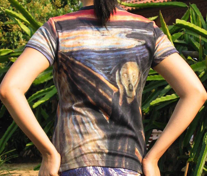
The Scream, as a t shirt
Greg Proops on Kevin Pollak’s Chat Show:
“This year I did Oslo, Amsterdam, Paris . . . I try to take it all around. There’s always an English-speaking crowd. We did a show in Oslo. We went to the Munch Museum. He painting The Scream, the most abject depiction of terror and despair in the face of modern alienation. Of course they sell Scream erasers, Scream bicycle reflectors, Scream everything, pencils, hilarious. Of all the things you want to see all around you all the time is the I-can’t-handle the-world anymore moment. They have Munch for children on the weekends.”
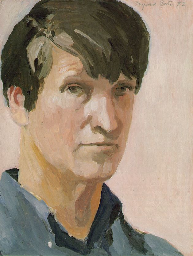
Fairfield Porter, Self-Portrait
“What we’re worried about forgetting … tends to be quite particular. It isn’t just anything about a person or scene that’s at stake; we want to remember what really matters, and the people we call good artists are, in part, the ones who appear to have made the right choices about what to communicate and what to leave out. … We might say that good artwork pins down the core of significance, while its bad counterpart, although undeniably reminding us of something, lets an essence slip away. It is an empty souvenir.”
“Art holds out the promise of inner wholeness.”
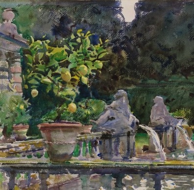
John Singer Sargent, Villa di Marlia, Lucca: A Fountain
I’ve always thought the watercolors Sargent began showing in his 50s are his greatest work, when he finally began to grapple with color. What looks like a tremendous show at the Museum of Fine Arts in Boston offers a chance to look at 90 examples:
From The New Yorker:
The way in which he could just summarize optical effects is what boggles the mind,” Carbone said. With the eraser end of a pencil, she pointed to the back of one of the statues. Its shadowed curve is the color of dark wood in water, while behind it a sunlit plant is an explosion of yellow-green, the color of a light-skinned lime. “This kind of thing,” she said, “it’s crazy!”
Sargent’s watercolors, Carbone explained, were painted in a “spectacular shorthand”: “He was a master of corrective technique—he could make alterations where an amateur couldn’t.” We stopped in front of “A Tramp,” which Sargent made sometime around 1906. A bearded man, his skin tan and weathered, seems to emerge from a forested background. His face, and especially his eyes, are clearly defined, but below his elbows the painting becomes vague and abstract, as if in a fog. Carbone pointed to the lower-left corner, a blur of green and gray. “This area was a puddled area of wash that he just wiped off,” she said. “You can even see the stroke marks.” The blurred area seemed a little punk-rock. In a sense, Sargent had defaced his own art, but the hint of casualness only makes the painting seem more accomplished.
In 1907, at the age of fifty-one, Sargent announced his retirement from the kind of society portraiture that, with the help of some judicious investments, had made him so prosperous. By then, he had already begun painting watercolors outside of the studio, en plein air. At first, Carbone explained, he painted the watercolors for himself. “In his studio, apparently, he had stacks and stacks of them, just in piles. People describe parts of his house with stairways lined with framed watercolors. He would give them as presents—there’s this joke that people would get engaged just so they could get a Sargent watercolor.” (“These sketches keep up my morale,” he told a friend, “and I never sell them.”) Eventually, though, he grew serious about exhibiting and selling them, and came to see the watercolors as a body of work in their own right.
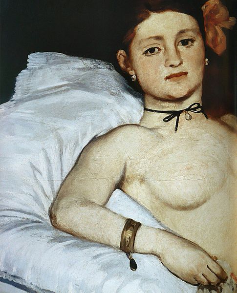
Olympia, detail.
From David and Goliath, Malcolm Gladwell’s new book, published earlier this month:
There are in Paris scarcely fifteen art-lovers capable of liking a painting without Salon approval,” Renoir once said. “There are 80,000 who won’t buy so much as a nose from a painter who is not hung at the Salon.”
When the artist Jules Holtzapffel didn’t make it into the Salon of 1866, he shot himself in the head. “The members of the jury have rejected me. Therefore I have no talent,” read his suicide note. “I must die.”
in 1865, the Salon, surprisingly, accepted a painting by Manet of a prostitute, called Olympia, and the painting sent all of Paris into an uproar. Guards had to be placed around the painting to keep the crowds of spectators at bay.
in 1968, Renoir, Bazille, and Monet managed to get paintings accepted by the Salon. But halfway through the Salon’s six-week run, their works were removed from the main exhibition space and exiled to the depotoir–the rubbish dump–a small, dark room in the back of the building, where paintings considered to be failures were relocated. It was almost as bad as not being accepted at all.
Did they want to be a Little Fish in a Big Pond of the Salon or a Big Fish in a Little Pond of their own choosing? In the end, the Impressionists made the right choice.
The Impressionist’s exhibition opened on April 15, 1874, and lasted one month. “We are beginning to make ourselves a niche,” a hopeful Pissarro wrote to a friend. “We have succeeded as intruders in setting up our little banner in the midst of the crowd.” Their challenge was “to advance without worrying about opinion.”

Top to bottom. How Welliver painted, from Realists at Work.
As promised, here are interesting comments from Neil Welliver, this time from an interview in The Art of the Real, edited by the poet Mark Strand. As with the previous Q/A, some of what he says I listen to a little more skeptically than when I first read these books. He criticizes 19th century art on terms that seem to partly apply to his own painting, it seems, which strikes me as “systematic and structured”—isn’t almost all painting structured?—but in a good way. I understand what he’s saying: the painters he dislikes respond less to individual and particular qualities of a scene and do whatever they’ve learned to do in a uniform way. They become tree-painting factories, and don’t need to observe actual trees in order to do it. He says he responds to the particularity of a given place so that “generalities are wiped out of your life” but his method, reducing his technique to such a limited selection of colors, tends to create a “feel” when you look at one of his pictures, common to all of them. So his style generalizes areas of an image because of the way it simplifies what he sees: generalizing within a discreet area of color is what he does. (That isn’t what he means of course but I can here ironies in what he says now.) The particular variations between one Welliver and another seem slighter than what all his paintings have in common, which is what he learned from Abstract Expressionism. Even so, reading these interviews is a great way to understand a little better what you’re seeing with the Wellivers on display right now at the National Academy Museum:
In Maine there is an extraordinary clarity. You can look for a mile but objects seem right before your face; you can identify them. I’m interested in the character of the light—that northern flat light—where the sun doesn’t get very high. A lot of it is geologically young. The upheaval is still apparent, the gouging of all the glaciers, all of that. I paint what would, in terms of theater, be considered innocuous and banal—ordinary places. I could not paint where the landscape doesn’t interest me, where it’s not complicated enough, where it’s been too ordered by people.”
Hudson River pictures look to me procedural, systematic, structured, MORE
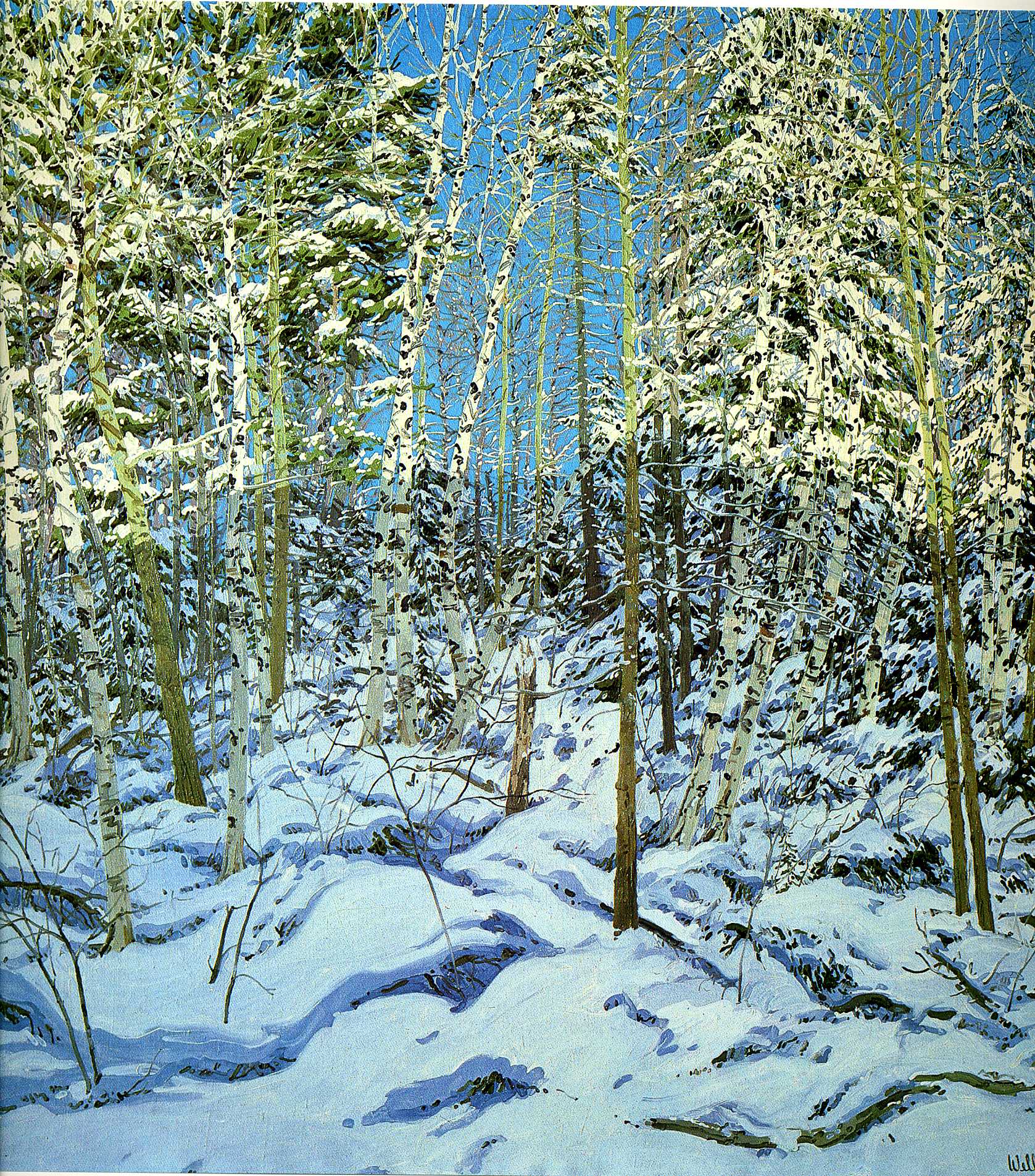
Shadow, Neil Welliver
I’m still meaning to write at more length about the current show at the National Academy Museum, and how it gave me a first glimpse, after all these years, of work by Neil Welliver, Stanley Lewis, and Albert Kresch, as well as Paul Resica, whose beautiful work I’d seen here in Rochester, and three other related post-war artists. But seeing Welliver’s huge landscapes for the first time reminded me of two fairly extensive interviews he did in the 80s, much of which I’m going to reproduce here, in a couple posts, which is probably in violation of fair use. The books appear to be out of print, and often priced more expensively than most people would be willing to pay, so if there are any copyright issues, they won’t have much of an economic impact. (Represent ain’t Napster.) I haven’t made a penny off this blog for the two years I’ve been writing it, so I think I could be forgiven for passing along Welliver’s thoughts to the few people paying any attention. Plus, these coffee table books are valuable primarily for the great color reproductions of paintings as well as photographs of artists at work in their studios—and you’ll have to resort to Amazon for that. The books Art of the Real, edited by Mark Strand, and Realists at Work, by John Arthur, were both published in 1983, and I bought them a few years later. If you’re a representational painter, they’re indispensable books. I’ve returned to them repeatedly over the years for inspiration and to reread the interviews with Neil Welliver which had as strong an impact on me as his paintings did when I discovered these books. In these pages, for the first time, I set eyes on work by William Bailey, Janet Fish, Louisa Mattiasdottir, Lennart Anderson, Ralph Goings and William Beckman: a world of possibilities and a treasure of information and insight back when I was just settling down and trying to get my bearings as a painter after many years of doing whatever I felt like doing at the time, a tendency I haven’t completely lost. (I’m a slow learner.)
This past week, I returned to the interviews with Welliver in both books MORE

Vivian Maier, Self Portrait
From a story in Sunday’s New York Times about the universality of self-portraiture thanks to “selfies.” This androgynous self-portrait by Vivian Maier, one of over 100,000 pictures she took, makes her seem even more interesting. I’ve adjusted it to match the way it was printed in the paper edition (with higher contrast and darker exposure). Maybe I’m superimposing El Greco onto those eyes. One of my many regrets: not being able to spend five hours in a coffee shop, listening to Vivian Maier talk about her photography.
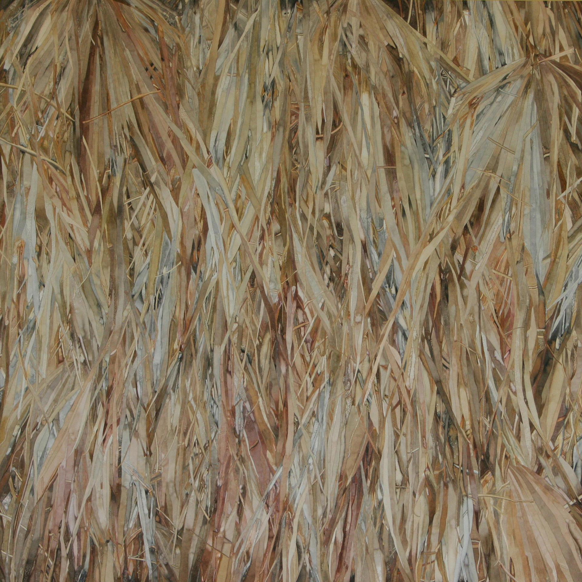
Tangled Palms, Bonnie Wolsky
“I treat each shape as a painting in itself.” –Bonnie Wolsky
The current show at Oxford Gallery, Frame of Reference, submits for your consideration the work of eleven artists as evidence for James Hall’s curatorial thesis that all abstract art is, at some level, representational. The eye instinctively struggles to recognize a figure in the carpet, as it were, and this reflexive impulse gives the best abstract work a vital tension as the mind tries to reconcile the abstract patterns with what the mind imagines it sees, based on them. The work is all excellent, yet, as if to confirm what Hall says about abstraction in the fine catalog he produced for the show, the paintings that most captivated me were also the most literally representational. Bonnie Wolsky’s all-over watercolor images of tangled palm fronds work as finely rendered realistic images as well as purely abstract patterns of line, value, and the extremely restrained hues of precious metal. She works from photographs as a source, but improvises and alters what she sees as she goes. Her fronds cascade down the paper in spidery streaks and they often shimmer and gleam like hair in a shampoo ad. It’s quietly seductive, so quiet that you can walk through the gallery and glance at them without staying long until you come back and suddenly pause long enough to see what’s there. Each strap-like frond is rendered with all the care of a distinct, separate object in a still life: she draws flawless long outlines and then works within them, improvising with color, sometimes (I’m told) dropping grains of salt into the drying paint to create little crystalline patterns, like frost on a window. What’s so immensely persuasive about the work is how it’s simultaneously so flat and yet so deep: the eye and mind are constantly flipping back and forth between a recognition of the abstract pattern and the sense of three-dimensionality created by the areas of dark background, peeking through the fingers of palm, or shining off little foreshortened areas where the fronds swerve away from the viewer into the depths behind what seems to be hanging on the actual surface of the paper. The effect is meditative and spiritual, as light shines up from within a thicket of dried vegetation, transforming the dead material into lustrous hues of platinum and gold. In short, it’s alchemy. Go to see all the work in this show, but pause long enough at Wolsky’s work to really notice what’s there.

Marina Abramovic
Contemporary art so often makes me pleased that the greatest existential questions I face as an artist often come down to: “Do I dare to paint a peach?” This is a nicely balanced story about a performance artist who is something like a less-ironic Warhol for our time, and it appeared on the front page of the Sunday New York Times waiting for me this morning in my driveway. Simply reading a story about any visual artist, let alone a performance artist, on the front page of the Times is like sighting a rare bird, so it’s quite an achievement in celebrity, but it’s hard to read the story without laughing both appreciatively and, more often, whilst shaking one’s head. It’s occasioned by Abramovic’s intent to build an institute for mind-and-body-cleansing in Hudson (where David Byrne said he might move to join the “expat hipsters” fleeing New York City). Here are some choice moments in the story:
Mistrustful and possibly envious, some performance artists and critics are accusing Ms. Abramovic of cultivating something suspiciously like a cult of personality. She seems so enamored of the spotlight, they say — so caught up in dancing with Jay-Z, doing mind-cleansing exercises with Lady Gaga and hanging out with James Franco — that she is in danger of disappearing down the rabbit hole of her own mythology, betraying not only her own roots but also, perhaps, the true nature of performance art itself.
“I respect Marina a lot in the overall sense, but I think the art world has lost its mind,” said Amelia Jones, a professor of art history at McGill University. “I keep wondering what’s next — is she going to set up her own small country somewhere?”
Marina: “Now I understand that my work is not my work anymore. It’s about culture in general, about changing the consciousness of human beings on this planet.”
In conversation, she leans in close and speaks with an intimate urgency, her voice a low, soft, Slavic-accented purr that brings to mind both Christiane Amanpour and Natasha the Eastern Bloc cartoon spy.
“One idea is to take 250 drops of blood of the most important human beings on this planet who contribute to humanity — in science, technology, writers, filmmakers, whatever,” she said. Once a year, “the most important shaman of that century,” she explained, would energize the blood drops, using the “life force” that connects body to blood.
As she says, the possibilities are endless.
Endless possibilities. Yes. It’s been a great opportunity and a great curse of art for more than half a century, hasn’t it?
Neko Case
When it came out, like a lot of people, I fell in love with Fox Confessor Brings the Flood. It has that feel of originality that albums back in the late 60s and early 70s had: when it seemed to be easier to record things that sounded utterly unique and new. Plus she has that voice like the wind in the Rockies, as Garth Hudson put it. She can write and sing like few other women, and, as it turns out, she can talk, too. She’s friendly and funny, in the conversation she had with The Nerdist about a month ago. Not just witty, but quick and completely, unguardedly open about how she responds to people and things. She’ll say absolutely anything that crosses her mind. Yet she can also pull back and offer small, unexpected and seemingly innocuous observations that would hardly register with most people. At the end, the conversation goes this way about when she was a little girl and visited Disneyland:
You know what the most amazing thing about Disneyland is? (This influences the rest of my life. I still think about it.) Waiting in the line for Pirates of the Caribbean there are these cat tails in between you and the restaurant. And they had these fake fireflies that would light up. I don’t know if they’re still there. And I just remember being, like, that’s the coolest thing I’ve ever seen. If I could explain to anyone my entire artistic aesthetic, that’s it right there. You made me fireflies, Walt Disney, so that when I was waiting to eat that disgusting burger in there I would have these fireflies.
Now, this is not the persona she projects in most of her music, but it’s the person who’s actually there in those songs. Add Christmas tree lights to the fireflies and that pretty much sums it up for me, as a painter. I think of my parents the way Neko Case thought of Walt Disney: they gave me fireflies and Christmas tree lights in East St. Louis so I had something to look at while I was waiting for the rest of our lives to happen. Fireflies in a jar . . .
Favorite song on her new album: “Calling Cards.” (She also talks about touring with nice-guy and funny man Nick Cave, and speculates about lathes in a way that would cause Ron Swanson’s brain to seize up on a number of levels.)
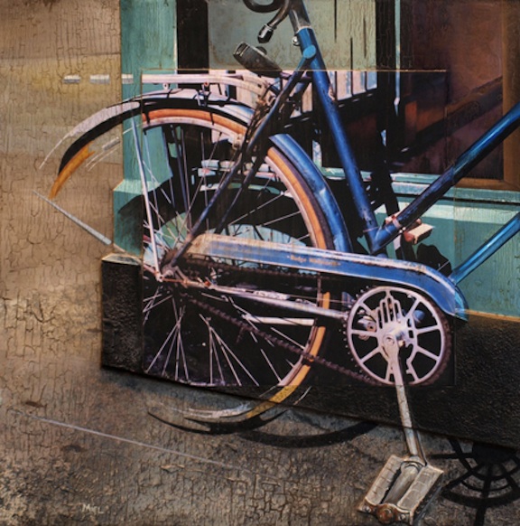
Rudge Whitworth, Robert Mielenhausen
Robert Mielenhausen’s solo show is up at Viridian Artists with an opening this weekend, and I’ve been looking forward to it ever since it was delayed after Hurricane Sandy did a number to his house and studio last year. He’s back on track now, and has been doing additional work that looks even more interesting than what he had planned to show a year ago. Jerry Saltz actually stopped in to see Mielenhausen’s previous show at Viridian a couple years ago—the indefatigable Lauren Purje, who was overseeing the opening reception, recognized him on the elevator in the building, and, having friended Saltz on Facebook, invited him to take a look. Saltz liked some of what he saw, but not enough to write it up. He should check out the new stuff. Mielenhausen has found channels to reach some collectors in NYC who’ve bought his work recently, and he deserves to be better known.
Mielenhausen focuses on merging photography and painting in a way that allows him to experiment with materials—emphasizing the texture of the surface. He paints on hollow lauan doors, the kind you can get at Home Depot, sealing them and then aging and weathering them with compounds that he spreads over the surface and lets dry in different ways. That surface is one part of a tension between opposing qualities that he sets up, at various levels in each piece: photography vs. painting, abstract surface vs. representational illusion, and universal vs. particular. The show is a series of images of bicycles he has come across and photographed in New York City, and the images capture not only the human quality of the bikes—most have been heavily used and have the character of an old pair of jeans molded to the wearer’s body—but also a sense of time of day and season. His use of color is especially subtle and evocative, beautiful but in a reserved way that seems to bring out the feeling of the place and the time of the photograph. Though the work is formally experimental, it feels natural, a glimpse of a recognizable moment in ordinary daily life: a visual haiku.
I talked with him briefly this past week about the show.
You developed a lot of your techniques as teaching experiments, right?
Working with students I began to develop this technique and began to pursue it myself and pushed it further with found objects and by making partial MORE

David Byrne
“Many of the wealthy don’t even live here. In the neighborhood where I live (near the art galleries in Chelsea), I can see three large condos from my window that are pretty much empty all the time. What the fuck!? Apparently, rich folks buy the apartments, but might only stay in them a few weeks out of a year. So why should they have an incentive to maintain or improve the general health of the city? They’re never here.
This real estate situation – a topic New Yorkers love to complain about over dinner – doesn’t help the future health of the city. If young, emerging talent of all types can’t find a foothold in this city, then it will be a city closer to Hong Kong or Abu Dhabi than to the rich fertile place it has historically been. Those places might have museums, but they don’t have culture. Ugh. If New York goes there – more than it already has – I’m leaving.
But where will I go? Join the expat hipsters upstate in Hudson?”
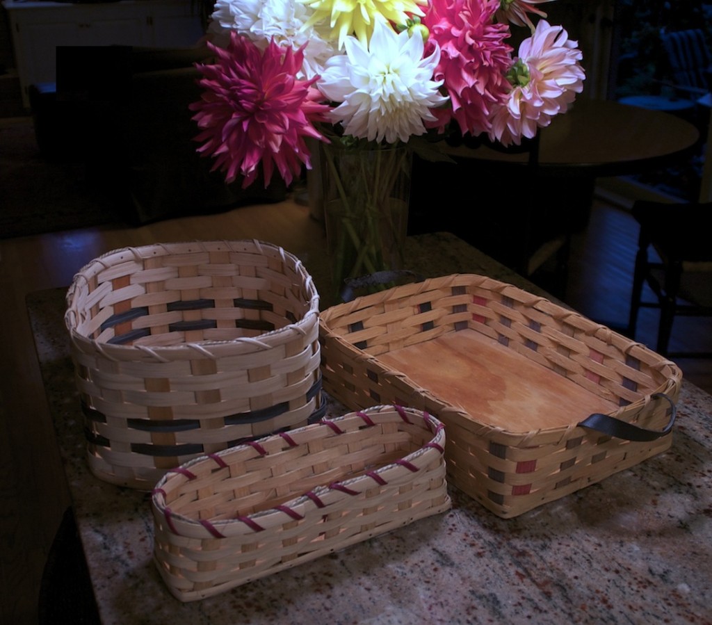
Amish baskets
I’ve been doing still life paintings since the 80s, and I’ve tended to rely on fairly common household objects: jars, pitchers, napkins, flowers, fruit, all standard fare. OK, now and then, a skull, but skulls are as traditional as you can get in Western art. Like Chardin, I return again and again to a limited set of objects. We owned a couple baskets years ago—one of them survives in my wife’s classroom at School #43 in the city of Rochester, but we lost the other one in our last move. I’m reminded of that lost basket every time I visit my parents at their place in Florida, where a painting of it hangs in their dining room. Thinking about a show I’m preparing for next year, I wondered if I could find something like that lost basket on the Web, and I began a search using various words until for some reason I remembered that the style of that basket was Amish.
I found www.amishbasketweaver.com and picked out three baskets that were as close as I could get to the one I’d painted before. The site sells crafts from an Amish community in Tennessee. (Two of the baskets are in the photo above, on the left; the larger one on the right I found on eBay.) So I ordered the baskets and forgot about them for a few weeks. When I realized the baskets hadn’t arrived, I wrote a friendly note asking if things were still on track. Lydia, who wrote back, hinted that a particular person was still weaving them for me: Mary Mast. I said there was no rush. A week or two later, the baskets arrived in an old, spavined box, nestled in egg cartons, in perfect condition.
I wrote back to Lydia: “The baskets arrived today. Beautiful work. Thanks very much.”
She replied: “I’m happy you are pleased with Mary’s workmanship.”
“Definitely,” I said. “My compliments to Mary.”
I think those few additional words for some reason triggered what came next, which completely changed the way I look at those baskets now, sitting on our kitchen counter.
“Thank you so much for your compliments—I will be sure to tell Mary when next I see her. She is a widow with nine children; Alvin died a year ago this past July—her only income is making baskets and selling her baked goods. Mary is a very inspirational human being—Alvin was permanently disabled in a farming accident 13 years ago, and Mary was the devoted wife, taking care of him, the farm and the children. She never complained about her lot in life, but is so incredibly loving and tender-hearted. She epitomizes ‘selflessness’. While Alvin was still alive, she would take care of him on Saturday mornings, load up her buggy before daybreak with all her baked and canned goods, and her baskets and make the six mile trip to the Amish Auction barn. Once there, she had to set up her tables and load these with her goods to sell to the tourists. She did this every Saturday regardless of weather, because their farm is so far off the beaten path, the tourists never find them. We set up the amishbasketweaver.com website to help her sell some of her baskets after Alvin’s accident—it is something of a nuisance trying to find boxes for shipping, but if it helps this struggling family, it is worth the work—it certainly doesn’t come close to comparing to the load Mary must carry.” MORE