Jessica Brilli
February 27th, 2019 by dave dorsey
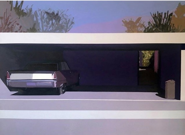
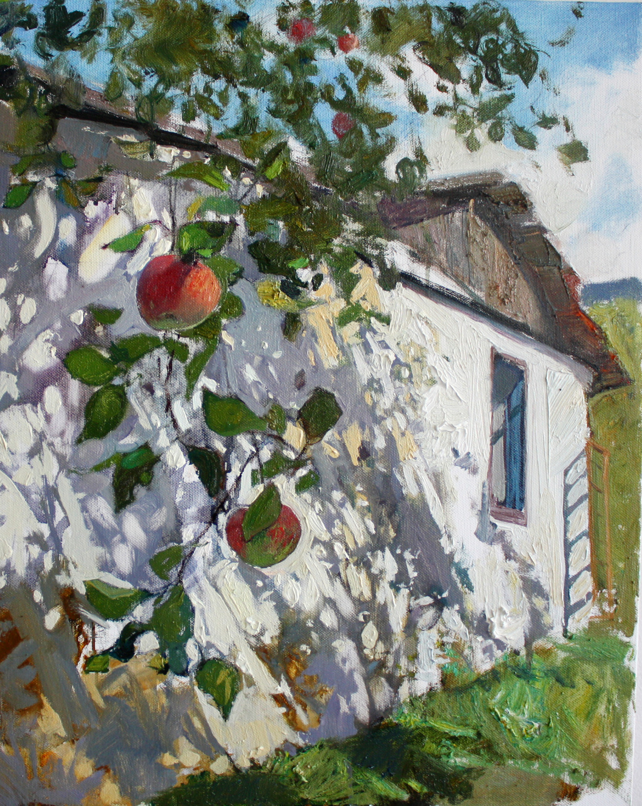
Jessica Brilli, Caddy in Carport, 2019, Oil on Canvas, 36×48
A preview of Jessica Brilli’s work, which keeps getting better and better, on view at Kobalt Gallery in August.
the painting life
Jessica Brilli, Caddy in Carport, 2019, Oil on Canvas, 36×48
A preview of Jessica Brilli’s work, which keeps getting better and better, on view at Kobalt Gallery in August.
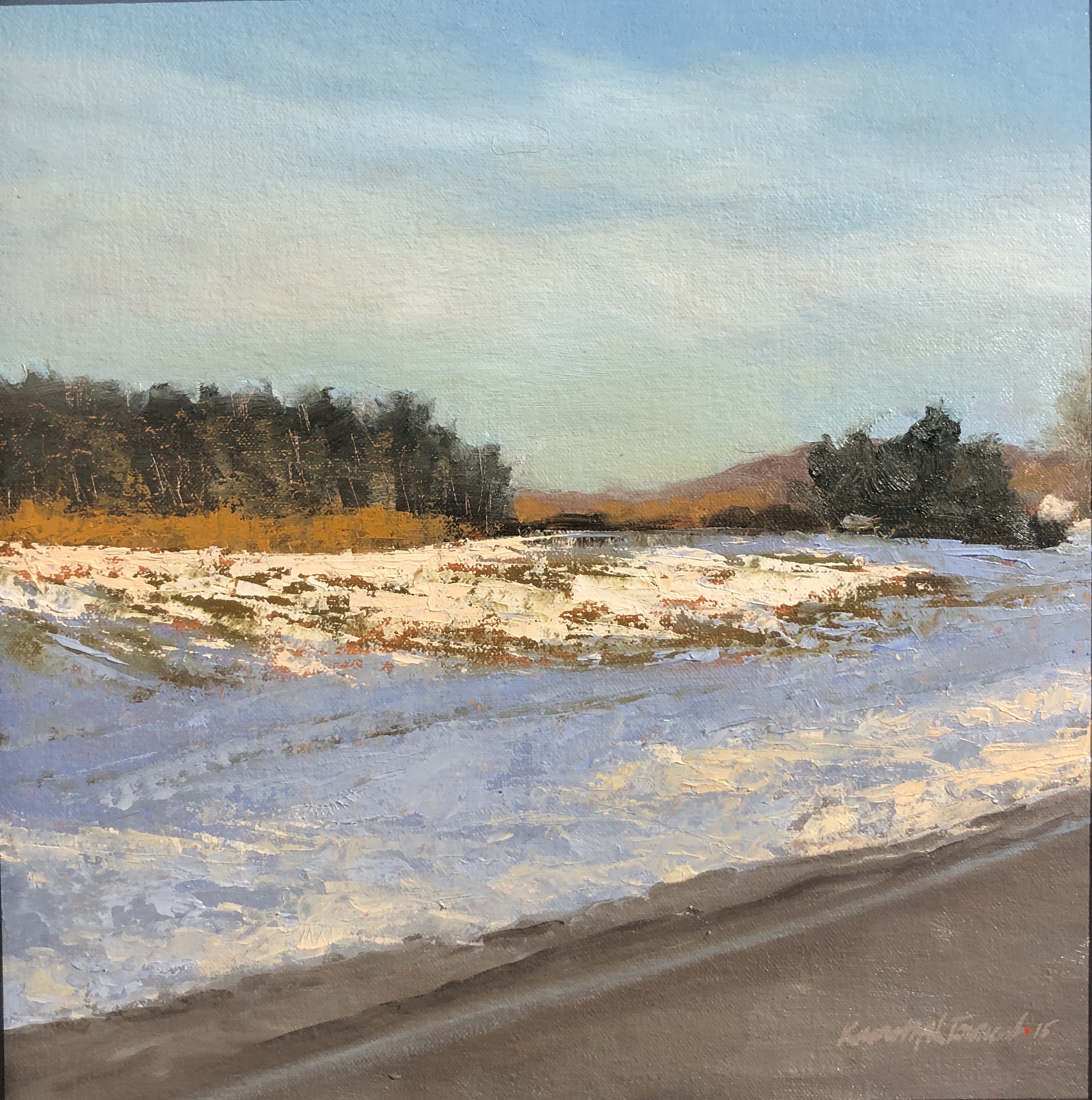
Roadside I, Ken Townsend, oil on panel
There’s a little more than a week left to see Among Untrodden Ways at Oxford Gallery, and it’s well worth the time to get there before it closes. Sean Witucki, Charles Houseman, and Ken Townsend are all working in the same stylistic neighborhood, but each of them has a distinctly individual vision.
Of all the work from Witucki in the show, the standout is a small oil, only a foot in height, Wolf Creek After the Rain. The way he renders the water of the creek purling over the shallow ledge of laminated shale so common in Western New York is remarkable. Anyone who has hiked the Finger Lakes will recognize that hardened prehistoric mudstone, once the bottom of a sea, under such a thin layer of fresh water. The color of the water, from ochre to olive and then to a gray/greenish blue where it recedes to the far rocky bank, is amazing. The little fringe of foam, harmless whitewater to a wader, beckons to the viewer, but it’s what’s below that remains enticingly visible, an inviting but risky submerged surface, seen through ripples and reflections of the sky. He manages to capture that sense of being able to look into the water down to the slippery face of the creek bed—there’s more trouble here than the shallow depth would suggest. One wrong step and you’re on your back. The woods beyond are done with Corot-like flicks of the brush on soft masses of color. The image conveys a rapt, luxuriant pleasure in the paradoxical stillness, the restfulness, of water that never stops changing but always seems the same.
Charles Houseman has contributed more than a dozen of his newest paintings to the show, and I reacted most strongly to the most elemental, his vision of the Maine Coast, Great Head at Low Tide, where rock, sky, trees and tidal pool compose a scene that—like Townsend’s shale—could have remained largely the same for a hundred thousand years. It perfectly captures the way the Maine coast seems assembled—or rather dropped into place by a receding glacier—to repel anyone who isn’t standing on dry land, while still inviting you through a jagged gauntlet of stone with its hazy beauty. One of his smaller paintings, Newton Farm, was a minimalist composition with a small strip of land beneath a blue void, an apophatic affirmation of energy through the absence of everything inessential, both pictorially and for anyone actually standing out in that open field, taking it all in.
The revelation for me in this show is Ken Townsend’s assured versatility, where nearly every painting looks utterly natural while being carefully, masterfully designed. It’s his first appearance at Oxford and an auspicious one. Most of his paintings can be broken down into four areas of comparatively uniform value that lock together like a simple puzzle, with all the detail rendered as variations within that particular value—darkest, second darkest, second lightest and lightest. The way he gives each of these areas a clearly defined contour, compositionally, makes the paintings so visually powerful. It also enables him to emphasize and augment the color in each of these areas almost as an abstractionist would. He could push this even more than he does, but when he allows himself some rich hues, the colors are  beautifully chosen, deeply felt. This is readily apparent in work like Gardner’s Road and Mendon Ponds, an overhead glimpse of water lilies, with one small white blossom serving as the tiny, lightest section. Yet a second painting of probably those same water lilies, Dar Reflected, is a perfect example of how Townsend is able to lay down areas of vibrant color by emphasizing and unifying those four areas of value and working within them as a structure for the image. All the viewer sees is a flat stretch of violet water, reflecting the sky, throughout most of the lower half of the painting, broken up by a cluster of lilies with one blossom, and then in the upper half of the canvas, the reflection of the dark woods and at the top, what appears to be the rippled reflection of a two-toned kayak with a slash of pink for the paddler. Keeping out of view what would have been the subject of the whole painting for most painters (Eakins, for example) is what enlivens the entire scene. The brilliant blue and green of that reflection draw your eye and then leave it wanting, hinting at what’s almost visible, so that what you actually see feels more like a memory or a dream of something even more alive than what’s available to the eye.
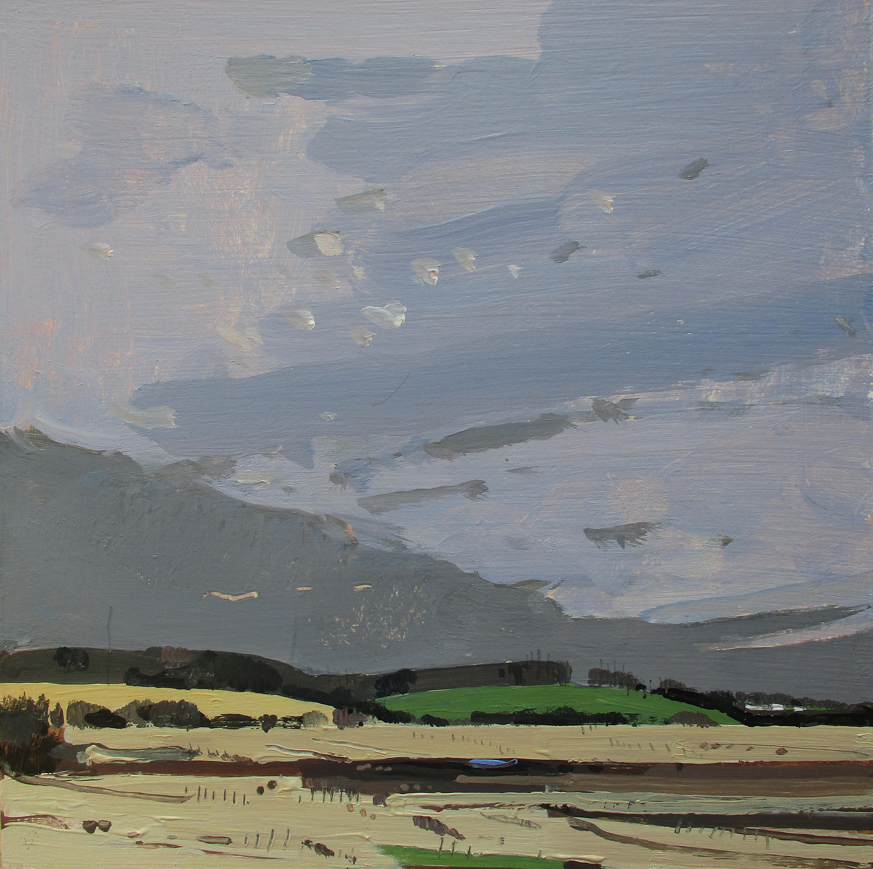
The Townsend painting that knocked me out, though, was a very small square one, Roadside I, executed with palette knife. The technique, though rougher and more approximate than any of the paintings done with brushes, creates a snowy embankment almost more visually convincing than anything else in the show—with a tremendous sense of clarity. Again, he’s broken down what he sees into continuous areas of value, the darkest, a line of trees on the horizon, then the brightest strip, in the patchy snow just beneath it and then, above and blow these two tiers of color, the cerulean sky and a violet reflection of the sky in the snowbank, sharing almost the same value, with a triangle of road at the bottom, the second-darkest region of the image. He captures everything perfectly, the low sunlight scudding almost horizontally across the embankment, the becalmed sky, and the purple shadows that look scraped into the soil and driven over by a plow or a truck, yet without any indication of exact detail in the thickly scumbled paint from under his knife. The eye sees what it expects to see though it isn’t really there. He works into the image not just the purple of the snow and the classic blue of the sky but a little strip of orangish growth along the tree line, a color also breaking through the snow in the foreground, that makes the other colors sing a little more distinctly. It’s a perfect painting, hopefully hinting of more to come.
(Note: for fun, see if you can find the one Witucki painting in the show that bears the same title as an old Pearl Jam song.)
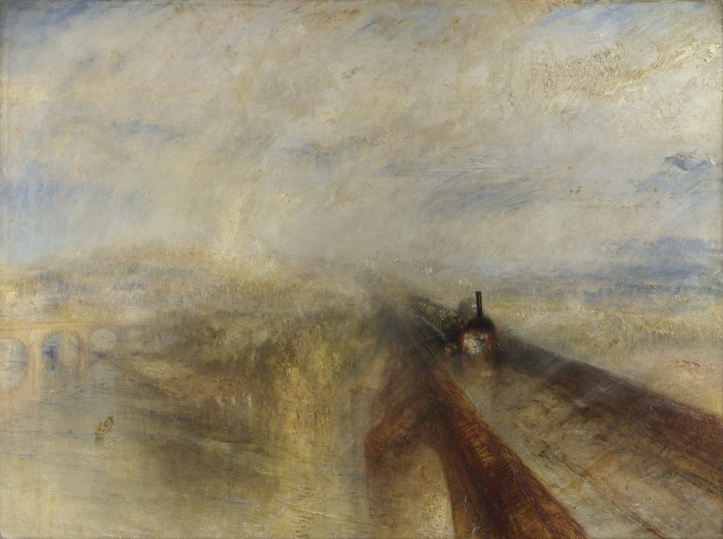
From My Struggle, Karl Ove Knausgaard’s phenomenological angle on Turner’s painting:
. . . the eye that puts aside all it knows, that puts aside all preexisting insight, is the eye that can see the world anew, as if it were emerging before it for the very first time. Turner was interested in the relationship between the inconstant and the immutable, the solid and the fluid, and in that way the train becomes an expression not of anything else, one of the many categories into which it might be placed to do with modernity, industrialism, civilization, and the man-made, but only of what it is in itself, in pure physical terms, an enormous iron object proceeding along an iron track, almost obliterated by the snow, which would obliterate almost any other object in the same way: a sailing ship, a horse-drawn carriage, a funeral procession, a bear.
—Karl Ove Knausgaard, My Struggle, Volume 6
The painting shows how dwarfed this massive iron horse appears in the context of a nature overpowering and sublime. Our view of nature now is both the same and the opposite: in the “anthropocene,” we constantly tell ourselves that we are changing everything around us, spoiling it and twisting it into a state of imbalance and disorder, and we makers of engines are going to incite nature to violent storms and deadly droughts and massive, hostile phenomena akin to what Turner was depicting. The difference is that now we think our little engines, our technological and chemical footprints, cause the storm that envelopes them and threatens their and our disappearance. Now the engine in the painting, as it were, creates what dwarfs and erases it from view–we are the storm. As usual with human beings, it’s all about us.
Knausgaard glosses over Turner’s awe and passion for nature’s beauty and power, no matter how hostile it becomes to human life, his Romantic devotion to nature as a new sort of God, a source of mystery, if not meaning. He’s right that Turner wasn’t trying to illustrate an idea, but convey through perception and intuition the relationship between human life and a larger, implacable world–the way Chinese scroll paintings juxtaposed tiny human figures against beautiful, craggy mountains, putting us into proper perspective within the whole. (It’s nice that the Sung Dynasty had no locomotives to include.) Man isn’t the measure of all things, in those paintings, except as a unit for judging the scale of a world infinitely more extensive than the human body and human concerns.
Andrea Durfee at ROCO
When I was growing up, in both East St. Louis and then in Idaho, my family lived at the edge of undeveloped land. These havens for my imagination weren’t protected, just overlooked or privately owned—undisturbed stretches of wildlife and undergrowth, a mix of grassy slopes, streams, and wooded paths. In a suburb at the edge of East St. Louis, it was a small copse at the base of the hill behind our little Cape Cod, and in Idaho, from our home sitting at the rim of the bench—just above the Boise Valley—I could walk to the edge of our back yard and look down at a fenced pasture with horses and, alongside it, the only human development within a convenient walking distance from the base of the slope, a sawmill. (We had some dangerous forbidden fun bounding across those floating logs.) My friends and my brother and I would spend hours in those spaces, only dimly aware of the smells, the soft feel of the earth, the birds and insects—yet all of it was imprinting itself on my mind whole, planting in me the desire to grow things as an adult and to get outside whenever possible. In those little overlooked tracts of wildness, I felt in touch with myself and the world in a way that I couldn’t in school or inside our home, in front of a television, the only screen that existed back then.
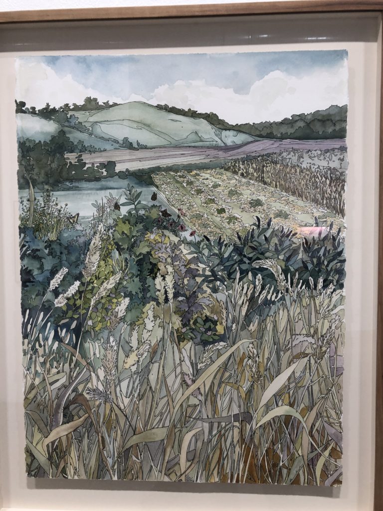
There’s a surplus of artwork on view in Rochester right now devoted, more or less, to the symmetry between human nature and the natural world. (Thou art that, the ancient Hindu philosophers would say.) In a fortunate coincidence, while Oxford Gallery is showing the work of three masterful landscape painters, Rochester Contemporary Art Center has assembled a themed show, Landscapes and the Unbuilt, that celebrates the slightly paradoxical effort that we human beings are making to keep from spoiling places like the ones that helped shape me as a kid. We’re intervening to prevent ourselves from, well, intervening. For the RoCo show, a group of artists took as their subject a particular parcel of land under the protection of the Genesee Land Trust, and they created one or more works to capture the spirit of the place. The work is all marvelous, especially grouped together in a way that amplifies each individual effort—and some of it represents the best work I’ve yet seen from these particular artists. The terms of the show may have brought out new dimensions in their work by forcing some of them to pay attention to the particulars of a specific place.
I responded most intensely to what I saw just inside the entrance to the East Avenue membership gallery. There’s an intricacy and density in Andrea Durfee’s paintings and Bill Stephens’s drawings that makes it hard to get any deeper into the exhibition, there’s so much to see in just one or two of these pieces up front. In the work of both, the task of having to convey an actual, particular place—to sift through myriad impressions of a specific location and nurture a companionship with that landscape—produced excellent results. I’ve always liked Durfee’s work, but the clarity and particularity of her vision is amazing in her three largest paintings of Full Lotus Farm in Arcadia, NY. It feels like a new benchmark for her. She uses flat areas of color outlined with spiderweb-thin lines, vaguely reminiscent of stained glass. Her technique echoes the outlines of cloisonnism and some of the Nabis, yet her paintings have a different effect on the viewer—they draw you deep into the scene she depicts, forgetful of the painted surface, though they aren’t conventionally realistic. In each one, she conceals a nude female figure—her avatar, maybe—merged with the landscape yet emerging like bedrock pushed up from beneath permafrost. Continue reading ‘Visions of the unbuilt’
Jim: Max Picard has a book called Hitler in Us. Picard was anti-radio.
Look at what technology is doing to the culture now. Sam Harris was saying that it’s like road rage. It’s anonymous. You get into your car and you become this crazy person. People have an anonymous handle on social media, same thing.
Jim: I think art is a place where you can get people to step out of that. Richter, have you watched that new movie? I’ll bet it’s pretty good. A director has done a controversial movie about how art can redeem suffering—something like that—and he thought Richter would make a good source, since some think he’s the greatest living painter. This director wanted to interview him and worked all this information out of him and then did a fictional account that Richter has disowned. Richter’s gallery director says it is half fact and half fabrication and viewers don’t know which is which, but some of it is true. He thinks Richter has been hiding these truths in his paintings and has wanted someone to ferret them out. All of these horrible things about his family and the Nazis and then having to flee. An innocuous looking photograph of three people on the beach is supposedly his father and a Nazi.
That’s interesting that you’re intrigued by this examination of the artist’s life in relation to his work. When I was at LACMA, I saw a Picasso print, from the Vollard Suite, that sent me on a couple weeks of investigation into those prints that his dealer commissioned him to do. The minotaur material came together in that effort and when I saw the final image in that suite, after having just seen a lot of the late portraits that he did, which leave me so indifferent and then seeing this aquatint and how amazingly crafted it is, and dreamlike, and beautiful. Even Guernica looks fast, though it had to have taken a long time to paint. This suite was his way of ramping up to Guernica, working up images he used in that painting. The suite is a sustained dream about love, sex and creativity, and was his apologetics for moving from one woman to another in his life. It’s an interesting example of self-awareness and doubt and a sense of shame over what he’s doing as he’s doing it, without intending to ever stop. From his wife, to this 17-year-old girl, and then Dora Maar and on to others who followed. This horrible sequence of what could be construed as exploitation, but it’s so complicated and you look at the influences that went into it you can see the implication that the women have nearly as much power as he did—except Marie Therese. But in the work, she is the guide, the inspiration, the light that tames him. His Beatrice. Everything about it is so interesting and so totally the opposite of the way I think about art, because it’s about something in an intellectual way. It could be the greatest thing he ever did and yet it’s basically just drawings, no color. For me everything in painting comes back to color as the motivation and color has no place in the suite.
Jim: You take line for granted.
Maybe. His biography is what’s paramount and what drives this whole thing is his own personal story, though it works without knowing his story. The meanings aren’t transparent.
Jim: Something intense drives an artist to make form.
That’s the core of art. It becomes something that works for formal reasons, without necessarily knowing why you did it or what it means.
Jim: Even if you’re just seeing the struggle with the impulse and its resolution, it’s uplifting.
The impact is the same for the viewer and the artist.
Jim: I know how people can think up stuff, and it’s fun to see it happen, though.
This is visceral. The resolution he comes to is visceral, and you can tell in what you’re seeing. Regardless of whether or not you understand what was being resolved. So how’d your show go?
 <Jim’s recent show at ROCO offered a look at the results of his landscape lottery project, with Rochester itself providing the landscape. Rolls of the dice determine the location of the pinpoints on a map where he goes to set up and draw what he sees, completely at random, as a way of showing that all places have an equal worthiness to be painted and also a way to get him out of his comfortable neighborhood into areas in the city he would otherwise have no impulse to visit. He showed me images of paintings from the ROCO show. One of them, a suburban street with a white mailbox, stood out from the rest and we spoke about it.>
Jim: I told you about that guy I met when I was doing that painting. He lived there at that house and he came out when I was sketching the mailbox. The short story is that he sketches a lot but wouldn’t let me look at his sketches. I got him talking enough to say he’d done a painting in high school he liked and that he’d gone back to find it ten years later and had to go back to New York City but then he said they liked it so much they put it up on the wall near the entrance until last year when some donors from an art museum who gave money to the school saw the painting and bought it.
You’re kidding.
Jim: He’s a night nurse.
But he has sales.
Jim: In the collection at MOMA or something. Who knows?
That’s hilarious. What a comic scene in a movie. Your whole mission in life is to make these paintings and a nurse comes out to tell you he sold a painting to a museum.
<He points to his painting of a couple on the stoop of a house in the city.>
Jim: This woman told me about her gnomes and how she had to bring them inside because people were stealing them. I painted a lot of people for once.
They’re good. The figures are very good. These are Porter-quality.
Jim: The birds is the most popular one.
The chain-link is great, the way you just scratched it into the paint. It’s almost looks like the diagram of a molecule.
Jim: I want to ask your advice. I’m applying for a residency at the University of Michigan. I’m an alum.
Go Blue.
Jim: I looked at past winners. A lot of contemporary stuff. I don’t have much of a chance. The thing that gave me encouragement was, I’ve been doing the landscape lottery. The idea is that everything is sort of equal, and you can find a subject anywhere.
And yet the work is tied to specific locations. Knausgaard talks about that: how the local is getting lost.
Jim: The landscape lottery is the kind of project I want to take to other cities, so that’s the idea: bring it to Ann Arbor.
That’s original. They won’t have seen a proposal like that before. Definitely. That works.
Jim: Part of the residency is that you spend two days a week in a glass studio in the art museum.
In a glass studio.
Jim: People can interact directly. They could roll the dice.
So you’re in a cage. Like Hannibal Lecter.
Jim: But they want me to interact with students and people in the community. My two questions are if I just do a straight lottery . . . do you know Ann Arbor at all? It’s a very small city that’s half students and faculty, more or less. Imagine a very small city and not a whole lot of inner city which is the beauty of Rochester that half the time I went to places white suburbanites wouldn’t go. So my question is, should I propose Detroit which is nearby? Or is it better to keep it in the community? The other question, when I was doing this, Sonya and I were . . . I was thinking of going to find people and letting them commission what they want. She said, oh that’s great. She said, no one would have made me think my life growing up was worthy of art. If you let someone tell you what they want to see, let someone like this be a patron. But it takes it away from seeing the random little thing that’s there. It’s more about people. The reason I was thinking about this was that there’s a philosopher there, who was in The New Yorker recently, and she is sort of a radical egalitarian. She’s revolutionizing philosophy by being a pragmatist and kind of liberal and kind of not. She doesn’t want to impose a welfare state from above: she wants everyone to respect everyone, which goes along with this. How do you actually respect everyone: get to know them and do a painting for them?
You could have a dialog with her while you’re there.
Jim: So I don’t know whether to propose the lottery or do this other thing. The question is, how to find people randomly.
Well, find people through the lottery. You ended up here, you ended up at the mailbox. Just do the lottery to find whoever it is and say here’s my project. By commission you mean you do the painting and give it to them. Say you tell me where you want me to go and what do you want the picture to be of, your house, the inside of your house . . Have them commission it but find them with the lottery. Isn’t this what you’ve been doing with the itinerant project?
Jim: Usually they say they don’t want to tell me what to paint.
Who’s not going to want to do it? Who would say no? This is so close to what your philosopher is talking about. It’s an enactment of what she’s talking about. I can’t believe they wouldn’t want you to do this. If you incorporate her philosophy into it. It’s clever. It would be different from anything they would ever come across.
Jim: I had the show at ROCO and went to there to drop some stuff off on the way to a talk somewhere else. A guy with a beard, his work was a video of him in his underwear trying to do pushups while video games were playing in the background, and he was trying to explain it as a protest and was laughing a lot . . What is that all about? I still feel as if I’m missing something. Why is the director of an art gallery collecting videos like that . . . But most museums are doing it.
That’s sort of true, there’s always art that feels empty, but the impression I had in L.A. was different. I went through the Getty and Norton Simon and LACMA, and I didn’t have that impression from much of what I saw. I saw a lot of excellent judgement in the work on view. Of course most of the collection goes back, it isn’t all contemporary, but there was a retrospective of Sally Mann’s photography, and it was just phenomenally beautiful work. It just looked like such a sane exhibit and such great work, and it was encouraging because I didn’t see intentionally off-putting stuff.
Jim: Maybe places with low budgets, they buy into narrative.
Things they can talk about. That’s what Jim Hall says, people want art they can talk about. What can you say about Richter’s painting of a candle flame?
Jim: I still want art to be a retreat where you get a different perspective.
Art should be a way of seeing something for the first time. You just want to look. Everything else is secondary.
This is spot on. From an interview with Robert Ryman:
RYMAN: I came from music. And I think that the type of music I was involved with—jazz, bebop—had an influence on my approach to painting. We played tunes. No one uses the term anymore. It’s all songs now, telling stories—very similar to representational painting, where you tell a story with paint and symbols. But bebop is swing, a more advanced development of swing. It’s like Bach. You have a chord structure, and you can develop that in many ways. You can play written compositions and improvise off of those. So, you learn your instrument, and then you play within a structure. It seemed logical to begin painting that way. I wasn’t interested in painting a narrative or telling a story with a painting. Right from the beginning, I felt that I could do that if I wanted to, but that it wouldn’t be of much interest to me. Music is an abstract medium, and I thought painting should also just be what it’s about and not about other things—not about stories or symbolism.
ART21: You don’t think of meaning?
RYMAN: There is a lot of meaning, but not what we usually think of as meaning. It’s similar to the meaning of listening to a symphony. You don’t know the meaning, and you can’t explain it to anyone else who didn’t hear it. The painting has to be seen. But there is no meaning outside of what it is.
ART21: So, meaning is closer to an emotional reaction?
RYMAN: I think that’s the real purpose of painting: to give pleasure. I mean, that’s really the main thing that it’s about. There can be the story; there can be a lot of history behind it. But you don’t have to know all of those things to receive pleasure from a painting. It’s like listening to music; you don’t have to know the score of a symphony in order to appreciate the symphony. You can just listen to the sounds.
ART21: How does your work fit into the contemporary art world?
RYMAN: I don’t think of myself as being part of anything. I don’t get involved with art. I mean, I’m involved with painting, but I just look at it as solving problems and working on the visual experience. I’m not involved with any kind of art movement, and I’m not a scholar. I’m not a historian, and I don’t want to get into that kind of thing because it would interfere with my approach. So, it’s better that I not think of that. (LAUGHS)
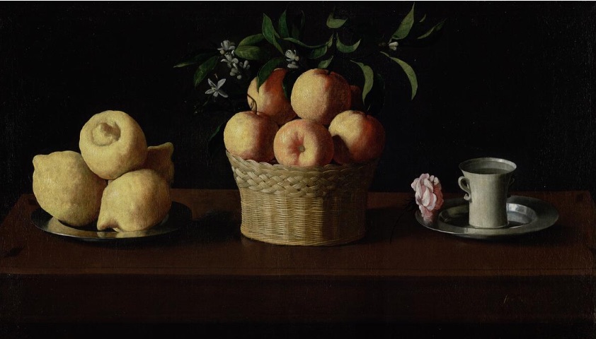
Zurburan’s fascinating, austere Still Life with Citrons, Oranges and a Rose hangs directly opposite the entrance of its period room so that it commands your attention as soon as it comes into view at the Norton Simon Museum. When I saw it a few weeks ago during our visit to the museum in Pasadena, I immediately recognized the work from its visit to The Frick a decade ago. What I actually remembered was Peter Schjeldahl’s review of the show and his justly ecstatic paean to this particular painting—similar to his raptures over Morandi in another essay. It’s simple, spare, and as perfectly balanced and restful as a Matisse, but also full of mysterious grandeur, in an almost ironic way, since it’s a depiction of the most commonplace things. It’s a surprisingly large painting by traditional still life standards, close to four feet wide, so that the depicted objects are larger than their actual size. The layers of Catholic symbolism—the objects standing both for the Holy Trinity and the Virgin Mary—has little resonance now and yet the painting’s power and subdued beauty hasn’t diminished. Its simplicity feels as integral as ever, as if it embodies some kind of alternate mathematical axiom—five + seven + three = one. Stripped of its religious symbolism, it continues to shine with its intended spirit, as if Zurburan’s religion was merely a way of climbing a ladder, as an artist, to quotidian serenity not limited to its theological expression.
The ideas have fallen away leaving the perceptual power of the image to keep working on the viewer and marvelously urging the same orientation toward the world as the ecclesiastical one. The lesson has faded, but its wisdom remains: humility, self-abnegation, attention to the abundance of ordinary experience, and gratitude for any glimpse of ordinary goodness and truth and beauty. Both artist and viewer marvel at the generous luxury of the earth’s simple gifts, its fruit and flowers. These subjects still look like offerings on an altar but at the same time seem to be just the opposite: not sacrifices, but gifts going in reverse, from a greater to a lesser power—from one who can make a lemon to one who can make a picture of one—offered to whomever stands before them as sustenance for either body or spirit.
In other words, even without all the intellectual trappings that gave Zuburan a pretext for making this painting, they pass along the same monk-like devotional intensity—in the assiduously achieved formal qualities of the painting, the long hours of solitude in the studio—without consideration of his religious justification for painting them. They stand as an example of how the greatest art embodies a life that spills up over the lip of every meaning and purpose meant to contain it—and meant for it to contain—conveying a quality of attention that operates as a moral and spiritual corrective in and of itself. A great still life conveys psychological qualities that have moral consequences—silence and calm. The painting stands as one of the supreme justifications for the still life genre—not nearly as congenial and charming as Chardin, but just as magical as the French master’s best. The humblest and most commonplace objects, simply by reflecting light a certain way, seating themselves naturally in their space, bearing the pull of gravity in their own particular ways, can convey the quiddity of life itself, long before the mind has time to go to work breaking down what it sees into what it ostensibly means and, in the process, gets further and further from the actual work—and life—itself.
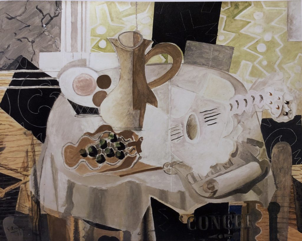
On my visit to LACMA last month, I was delighted most by the work in two particular areas of the museum: Fantasies and Fairy Tales, a themed exhibition of arresting prints and the small wing devoted to the Janice and Henry Lazarof Collection. The latter had the feel of those private collections converted into museums–the Frick, the Phillips–where the taste of the collectors is tantamount to a class on how art should be made. Nearly everything in the Lazarof Collection begged to be photographed, but when I tried to take a shot of the Braque above, the guard hurried over and chastised me, which was a surprise, because the wing appeared to be a permanent installation of work–a way of sharing the vision of two insightful collectors with the public–not a temporary exhibition, which seems to be the only shows that prohibit photography now in an effort to increase catalog sales. I asked, therefore, if there was a book available, and he directed me to the shop where it was on sale and for a discount. It was a fortuitous purchase because it includes a long essay on Picasso, so prominently featured in this collection, that turned out to be an indispensable aid to the thinking I’ve been doing, since my visit to Los Angeles, about one particular Picasso print I saw elsewhere at LACMA–it changed my understanding about that painter whose fame and position in the history of 20th century painting has always, for me, eclipsed the aspects of his work that have turned out to be most powerful and intriguing.
So I purchased a book simply to bring home an image of this particular still life by Braque, which was done toward the end of his most fertile period, from his move toward synthetic Cubism through the more and more idiosyncratic interpretations of pedestal tables, the “gueridons,” his most personal motif, especially with a guitar on board. It preoccupied him for at least twenty years; the most representative and familiar example of this series is The Gueridon at the Phillips. What’s astonishing about this work, for me, is that everything in the paintings from this period–with a few exceptions–seems to have been invented perfectly, naturally, as if Braque were proceeding like a scrupulous realist, where you know the work is great because the proper marks are the ones that most faithfully reproduce exactly what’s seen. The rules are obvious and simple. Here, none of that is the case, there is no common sense guideline for what makes a Braque so manifestly perfect–everything he sees or imagines is flattened into an essentially arbitrary pattern, and yet though every shape and line and color seems the outcome of improvisation, the final result looks inevitable, almost immutable and right, but also deeply felt in a way that seems in a class of its own next to all the other work that sprang from the Cubist movement. How a painter achieves this is the great mystery–on a par with the question of how Vermeer enabled a fleeting moment in an average day to look eternal. Braque’s own enigmatic journals only deepen the mystery and suggest that his path, once he broke with Picasso, took him more and more deeply into the region he entered via synthetic Cubism–a long, meditative and assiduous creative exploration during which Braque rightly felt infallible without ever letting his ego know what he was up to. He’d reached the artistic equivalent of a state of grace:
On this painting, from Envisioning Modernism, p. 62:
The viewer is thus forced to focus on the tenuous relationship between the still life and its environs, demonstrating what Braque called his “great discovery”: “Objects don’t exist for me except in so far as a rapport exists between them or between them and myself. When one attains this harmony one reaches a sort of intellectual nonexistence–what I can only describe as a state of peace–which makes everything possible and right. Life then becomes a perpetual revelation. That is true poetry.”
I’ve been reading, with greater and lesser pleasure, Karl Ove Knausgaard’s My Struggle, which–throughout the series of fictionalized memoirs–has repeated references to Romanticism, especially in painting. In the narrative, he’s regularly moved by images that convey the implacability of nature–and these moments, not of epiphany, but of emotional release, baffle him because the author has no way of making sense of his deep response to nature through these paintings, in contrast to his almost Beckett-like exhaustion with the daily life he so tediously represents in thousands of pages of prose. My response to the series of books is similar to my reaction when I look at artwork created in devotion to an invariable idea–in other words, a fair amount of work done over the past 150 years–once you grasp the idea, if it’s merely the illustration of an idea, why keep reading or looking? What’s fascinated me about Knausgaard is his deep ambivalence about modernism and the way it has set ordinary human emotions aside in favor of general artistic principles (though his own artistic principles seem, in the course of the work, to be destroying his own family so that maybe has more in common than he thinks with the modernism he distrusts). Hence, his retreat, emotionally, to Romanticism. Yet, in the final volume he seems to see his florid outpouring of feeling in reaction to certain poetry and painting as delusional, or at least negligible–leaving the reader with a vision of his creative work as a pointless exercise in obsessive attention to his own life, out of a conviction that life is essentially meaningless. Not exactly where I had though he might be going.
Three artists on view now at Oxford Gallery are equally drawn to the beauty and grandeur of nature–Ken Townsend, Charles Houseman, and Sean Wituck–and don’t quite distrust their passion the way Knausgaard does. And there’s an appreciative realism involved here, a friendly humility in the face of nature, that seems more contemporary than the era evoked by the quote from Wordsworth Jim Hall has used for the show’s title. Their work hints back to the Romantic love for nature, but not in a way that evokes the Hudson River School, nor the sublime of Edwin Burke or Kant, where nature is great beyond comprehension. Turner’s storms are nowhere to be found here. Nature is beautiful in their paintings, and in some cases, as indifferent to human comfort and scale as it is in the Romantics, but it’s also still, inviting, and serene–a setting for human purposes, on its own terms. The painting that most interests me is what appears to be a diptych depicting a spot on the coast of Maine, at Acadia National Park by Houseman–enormous rocks, typical of Maine’s fractal coast line of glacial rock. The massive boulders at the center are surrounded by tidal pools covered with a thin layer of autumn leaves–the leaves are what make it inviting. It’s a glimpse of an outcropping that could serve as a seat for a hiker’s quick lunch in October, or could just as easily be what was visible twenty thousand years ago, when cave paintings were the only contemporary art. I suppose that’s a roundabout way to say the current show at Oxford offers a glimpse of what’s timeless everywhere around us, with a hint that our time is brief, compared to the tenure of sky, earth, ocean and trees. Maybe that’s a Romantic insight after all.
Manifest Gallery has a new show, Similitude, through Feb. 22, devoted to contemporary portraiture. I wish I could get to Cincinnati to see it and another show revolving around the subject of sinks and chair. Sinks are a fascination for me, though I’ve only painted one from different angles and in different lights. Here is the overview of the show from the folks at the gallery:
SIMILITUDE
The Contemporary Portrait
As we stated four years ago when we last approached the theme of portraiture, technology exacerbates people’s retreat into the upper limb of their body, encouraging portraiture on a mass scale in the form of social networks such as Facebook and Instagram with their flood of ‘selfies’. Facial recognition tools which help sort photos of friends and family based on images of their face, and ‘facetime’ calling also put the focus on the front of the human head, and puts a premium on visual identity. The center of our humanity has coalesced into the mind, behind the face. When we think of each other, we (usually) start with the face.
Recognition matters. Throughout art history the ability of the artist to not only capture a likeness but also the character and spirit, if you will, of the subject has defined whole careers.
From Matt Klos, of Exeter Gallery, in Baltimore, on the gallery’s current show:
Accidents of TimeMagnolia Laurie & Gillian Pederson-Krag
January 11th – February 28th
Magnolia Laurie’s paintings and Gillian Pederson-Krag’s prints present landscapes that feel immutable. The landscapes are poetic and, at times disquieting. Often monochromatic, and grand even at a small scale, each work possesses a profound stillness. Magnolia presents paintings on panel excepting two large oils on canvas. Each panel features subtle washes which form reticulated edges where the puddles of pigment end. The fine networks at these perimeters form distant blurred treetop canopies or the appearance of pulled cotton where clouds give way to sky. Her paintings feature volcanic mountains, scorched earth, and in “To Weight it Down” a forested space with what could be police tape cordoning off a crime scene. This is what remains after the cataclysmic event. Nature remembers the action lest we forget. Gillian makes meticulously crafted etchings. These dense and expertly arranged tangles of linework describe landscapes of bare tree branches, rivers, and ruins. Thin filaments run behind thicker ones creating a deep quiet space. In an amber toned etching a statue of Persephone sits with one leg crossed over the other holding a fruit amongst an overgrown thicket. She presents bounty from nature as nature itself threatens to overtake her. Many of these landscapes bear the mark of humankind. Human elements create the formal structure which carries one’s eye throughout the scene.
In Laurie’s works towers and fences serve as this device while in Pederson-Krag’s ruins and weathered statues are featured. Our affect on nature is front and center in current scientific and political conversations. If a monomyth is present here perhaps it reveals that our striving, our monuments, our self-importance, and our collective self, will eventually pass away. The landscape of tomorrow will contain our ashes and dust. “The happy ending of the fairy tale, the myth, and the divine comedy of the soul, is to be read, not as contradiction, but as a transcendence of the universal tragedy of man. The objective world remains what it was, but, because of a shift of emphasis within the subject, is beheld as though transformed. Where formerly life and death contended, now enduring being is made manifest – as indifferent to the accidents of time as water boiling in a pot is to the destiny of the bubble, or as the cosmos to the appearance and disappearance of a galaxy of stars.” – Joseph Campbell, The Hero with a Thousand Faces, pg. 28
Pirjo Berg’s oils on paper, reminiscent of Gerhard Richter’s dense and multi-colored abstractions executed with squeegees and deep layers of paint, were nearly colorless, by comparison with the German master, but they effectively suggest both motion and electronic media—the blur of a culture moving so quickly forward that everything melts into a virtual blizzard of horizontal lines. Elizabeth Courtney’s This Green Place II uses heavily and loosely worked impasto, a bit like Stanley Lewis, but more faithful to the actual look of the wooded, remote glimpse of summer pond she depicts with great skill. The sky is slathered on with a knife and yet it has exactly the energized, gorgeous brilliance of summer, the sort of light Van Gogh wanted to convey in his glimpses of southern France—the sort of light that is such a distant memory now, close to the darkest day of the year.
Alex Gruttadero, himself a local curator, has finally done what I’ve been thinking for quite a while that someone needs to do: portraits of Lego people. There are so many interesting ways to make it work and he’s found the most straightforward: a loose, assured depiction of one with a sweep of forelock and handlebar mustache, complete with cupholder-shaped hands. It lives in that zone where some of my own work lives: a subject suitable for Pop Art but done in a painterly way, lit with feeling, as if he’s just caught the little fellow on his way to another eight-hour grind at his plastic office.
Of Chad Cleveland ’s three offerings, two seem inspired by the spirit of Edgar Allen Poe—a crow (rather than a raven) and a skull—but both are executed with such painterly energy they felt like Jungian celebrations of psychological complexity and depth. I kept returning to the one that merged a human face with the silhouette of a crow, the two sharing the same eye, that divulged its roughly rendered intricacies only to sustained, patient observation. And several of Connie Ehindero’s encaustics are probably the best argument for getting in your car and showing up in person for the exhibit: there’s no way to convey in a photograph the sort of uniquely beautiful color only encaustic can achieve—more than any other medium, it’s thick translucence gives it the quality of flesh or murky stained glass, with light reflecting back from multiple layers. It’s the best argument against Walter Benjamin’s thesis—and Warhol’s for that matter—that the manufacture and mechanization of art so often means the singularity of an original object itself no longer matters. The only way to actually see what Ehindero does with her medium is to get as close as you can to the actual work.
Eventually, as usual, I wandered upstairs and happened on a couple paintings that could easily have been a centerpiece of the show—but weren’t actually part of it. They were virtually hidden in one of the side rooms, an afterthought that will serve as a sort of rare Easter egg for anyone curious enough to seek them out. They were a pair of small oils by Bradley Butler, director of the gallery, and thus wouldn’t have been eligible for the exhibit, but could easily have won the top prize.
Most powerful is an acrylic on panel entitled, amusingly, “Life is (And Isn’t) Meaningful.” It’s nearly as crepuscular as the prize-winning self-portrait downstairs, but more colorful and with more dramatic effects of light. One of my companions at the show read my mind: “It looks very Asian.” Yes, if you were to take a Chinese scroll painting, turn it sideways, and let Turner whip up a version of the landscape at midnight. It’s entirely done in black and a sort of phosphorescent blue, with a massive Gibraltar-like promontory in the misty distance rendered in purple. It immediately looks like a stormy, Romantic shoreline—opening for Poldark in storyboard—but with small touches of white and a scumbled plume of it in the center of the painting suggesting foamy, breaking wave crests and moonlight just starting to peer over that massive mound shaped like one of those Chinese karsts featured in Sung dynasty landscapes.
The effect the painting achieves is remarkable. All the detail is entirely imaginary, in the mind of the viewer, because the surface itself is little more than boldly applied, directional brushstrokes, or smudges of twisted paint layered on top of a previous quick coat. I couldn’t help thinking of the twisted, tiered branches of West Coast cypress, though there’s nothing to indicate any of that in the black sections over at the right. The painting is all about the flowing brush, loaded with paint, but the result is haunting and evocative and mysteriously specific. Just beyond the horizontal, rocky spit in the foreground, where I imagine gnarled roots being pummeled by water, rises that looming, glowing mount that conceals the moon and seems itself to evaporate into the sky. It’s like a glimpse of next year: I’m certain something interesting awaits me there, but I can’t quite know what it is.
The artist is the opposite of the politically minded individual, the opposite of the reformer, the opposite of the idealist. The artist does not tinker with the universe, he recreates it out of his own experience and understanding of life. —Henry Miller
Fairfield Porter
This work by Fairfield Porter is startling in its bold freedom, the almost arbitrary way he represented the flowers, the saturated tones, the almost splattered looking petals in contrast to that marvel of a jar used as a vase. I’ve never seen this painting through any channel other than this page eight years ago from Art News. I recently found a stack of magazines and tore out half a dozen pages from this 2010 spring issue. I will post iPhone shots of them now and then in the future. Just thumbing through the ads in Art News was best way to explore unfamiliar work and learn a few things, while diligently ignoring the text. Sort of the way most of us boys engaged with Playboy back in the day.
Mark Tennant’s recent work
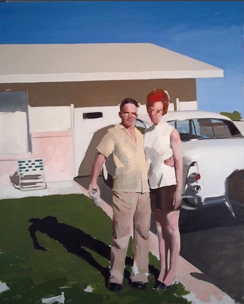
Mark Tennant posted this painting on Instagram a little while back, and I’ve since gone back to it many times with pleasure. At first, it suggests an almost clinical distance from his subject, a hauteur about a fragment of past American culture, which he’s isolated for observation. In this case, he seems to be looking back at a middle-class couple, standing proudly in front of their tract home and new car, circa 1960—he with beer in hand, she in pumps that aren’t even indicated except by the tiptoe slope of her feet. It’s all imbued with a cool, dubious squint of someone who doesn’t share the enthusiasms he depicts, a clinical detachment present in some of Tennant’s more erotically suggestive work, much of which has a muted, colorless sheen reminiscent of Gerard Richter’s early portraits based on media photographs of Baader-Meinhof terrorists. In this clinical mode, Tennant picks subjects that seem selected to provoke a raised eyebrow or a half-smile of condescension—as if he’s looking down, rather than head-on, at whatever he’s showing. It reminds me of what Martin Mull has been doing in his work—purchasing collections of family photographs from garage sales and flea markets to use as source material for his own surreal, emotionally detached and dreamlike visions occasionally on view at Hirschl & Adler.
Still, though I doubt this is the response Tennant wants, I react to this painting with nostalgia for those brief post-war decades when America was genuinely thriving, leading the world in building a middle class that was actually earning more than what it needed to get by. What drove productive lives wasn’t false hope back then. This proud couple could easily have been living on one salary at Eastman Kodak here in my hometown, with its generous wages and annual bonuses for workers, when a household could thrive on a single income, earning enough to get a mortgage on a new house and even buy a new car every few years. Over the past few decades, that level of material comfort could be sustained only on higher and higher lines of credit and more than one wage. The middle class has waned though it remains to be seen if it’s down for the count. Simple bourgeois comforts, along with an occasional luxury, are certainly as illusory as anything else on this spinning planet—so Tennant is perfectly justified in suggestions of sic transit gloria mundi, especially when the glories are so humble. He casts a cold eye on this moment of celebratory happiness yet it feels like something most people wouldn’t mind working toward now as much as they did in the 60s, and rightly so. It’s precisely what people who flee into our country are hoping to find. But what’s going on in this image has gotten harder and harder to make happen.
That said, this painting is different from what I consider Tennant’s usual mode and that keeps me coming back for another look. It’s far more colorful than most of what he posts. His technical MORE
September Apples, Igor Shipilin
Another find from Lilacs and Wild Geese.
 I can’t find a name for this painting anywhere, even with a Google image search. It’s Robert Henri, from the cover of a book he wrote.
Green Hill, Harry Stooshinoff. 8″ x 8″, acrylic on board
Harry Stooshinoff is a Canadian painter who has conquered the way of a picture-per-day. I hate looking at his Instagram feed because it makes me feel like a total slug, the guy is so incredibly prolific and fast, but also, worst of all, masterful. One glimpse of Harry S. and I just want to give up. Fast is the hardest thing to be as a painter, but he’s flawlessly so. He’s the ultimate premier coup painter, everything done in one sitting. His work looks like en plein air but I think he simply does studies and sketches on site and then improvises from his notes in the studio. You can read a great explanation of the thinking that goes into his process in a well-written little statement here. He posts and sells quite a bit of work online, I gather, for prices that are feudally cheap, but he lives by an economics I find admirable—he can apparently afford to aim high in his work and sell low on the market, which both moves the work and makes it almost universally ownable. It’s a generous strategy that reminds me of Jim Mott’s gift economy. I suspect a lot of teaching in the past is what enables him to do all this now. He can’t be living that far north of Rochester, so I ought to track him down and shake his hand at some point but knowing me, I probably won’t. His methods look utterly transparent, the way Fairfield Porter’s seem to in his best work—no cards pulled out of sleeves, no mystery about how or why that slash of paint happens to be there or do what it does—but try to paint something in such a self-evident way and you will see how Stooshinoff is nearly without equal. Welliver had that quality: you can see what he’s doing all along and would love to do it yourself—“no going back over”—but try it and see what a mess you make.
Belfast Bay, Matt Klos, oil on canvas. Absent inches, let’s just say very very small.
This may be, so far, my all-time favorite painting by Matt Klos, which I’ve seen once in a show he had at Oxford Gallery early in this decade, a tiny work, probably done on the spot when he was overseas, I’m not sure. The way he scumbled the paint to allow the canvas to peek through the porous medium gave a perfect shimmer to sea and sky, but it’s the way he used color that really knocked me out. I took a shot of it at the show and have kept it filed away ever since.
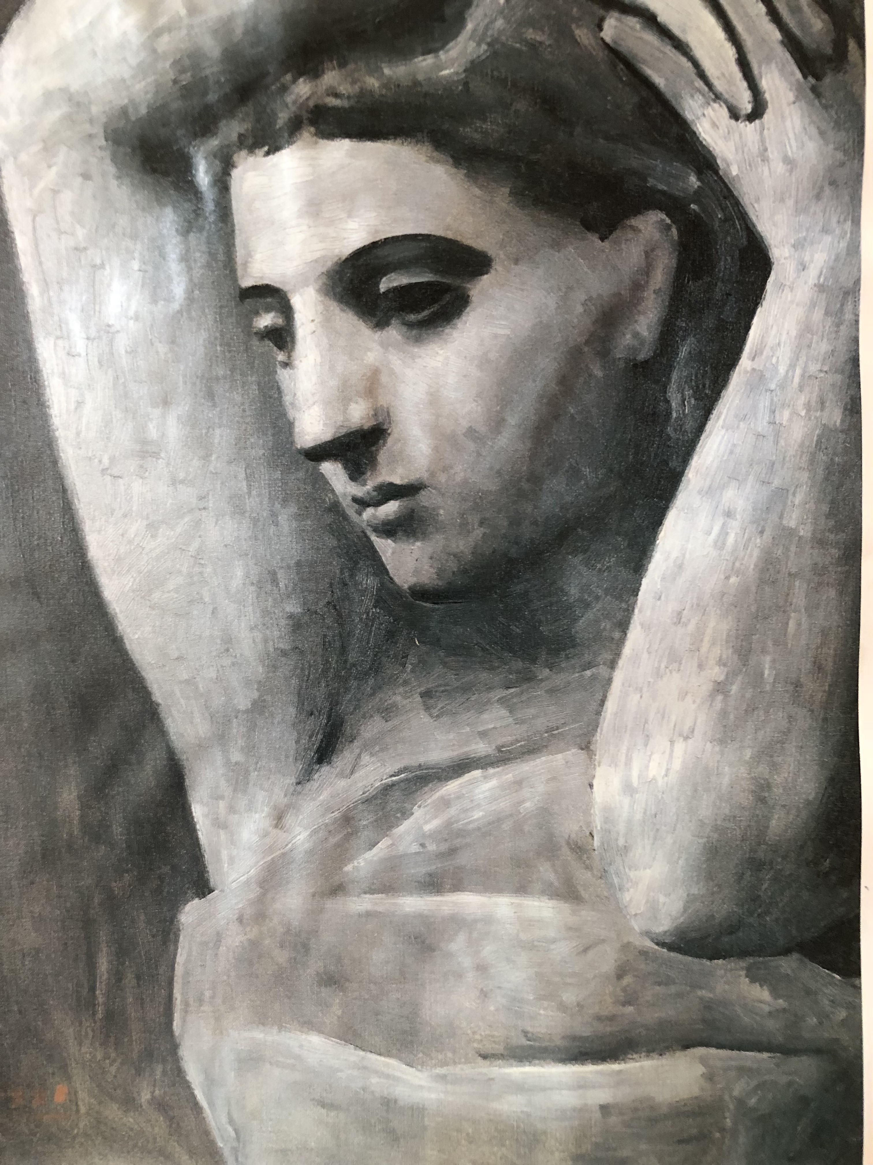
Another page torn from that 2010 issue of Art News. Every time I think Picasso was the most over-rated painter in the history of Western art, I come across something that makes me think again. This is almost a riposte to Braque’s Canephorae. It was from the Guggenheim’s Chaos and Classicism exhibition. I have to say I prefer this to Braque’s figures–someone once pointed out that Braque invested all of his sensuality in his still lifes, not his nudes–though in almost every other respect, I expect Braque will outlast his rival. But something far more lasting that eroticism shines in this one from Picasso, even though it often seems nearly everything he did had some tangential link to sex.