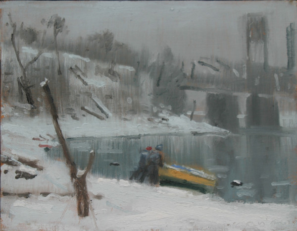
Fransioli
November 26th, 2015 by dave dorsey
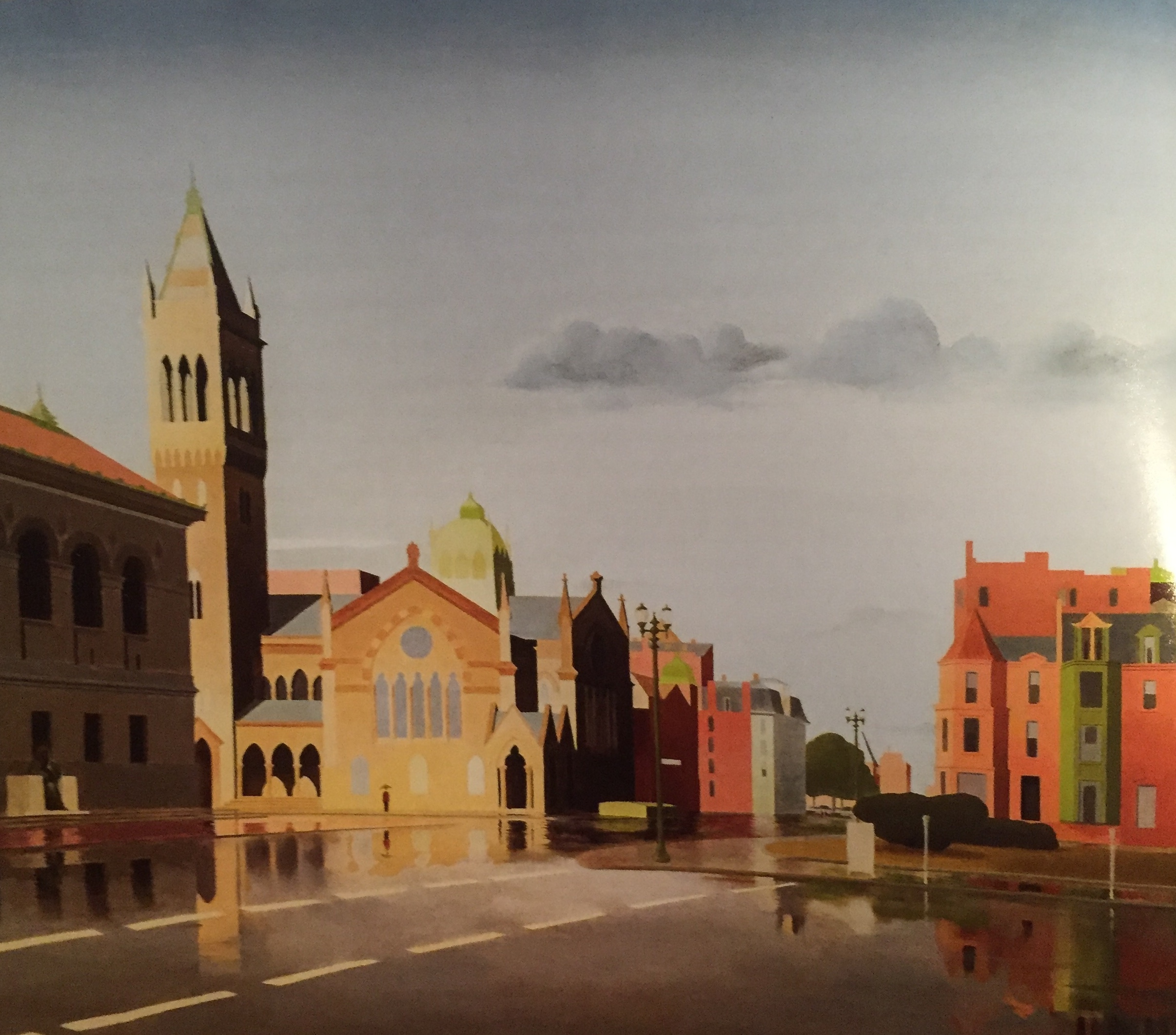
Currently on view at Hirschl & Adler:
Thomas Fransioli (1906-1997)
Copley Square, Boston, 1959-61
Oil on canvas, 24 x 30 in.
the painting life
Currently on view at Hirschl & Adler:
Thomas Fransioli (1906-1997)
Copley Square, Boston, 1959-61
Oil on canvas, 24 x 30 in.
A couple examples of Tom’s warm-up work
During the recent afternoon I spent with Tom Insalaco at his home studio, I saw some of the amazing work he’s done over the past several decades. It’s a measure of his humility and generosity that he spent less time showing me his own work than he invested in introducing me to—or reminding me of—great work from other contemporary realists.
When he could have been pulling big paintings out of storage for me to photograph, instead he handed me a catalog of work by Richard Maury, a slim set of wonderfully printed plates from a show more than a decade ago at Forum. He pulled it out the the midst of hundreds of books Tom keeps on his shelves, including the entire catalog raissone of John Singer Sargent. Tom has spent a lot of time in Italy and ran into Maury there once:
Still Life While Listening to Brahms, Richard Maury
“He’s wonderful. In one of his paintings, you can sense the terra cotta under the glaze on a little ceramic jar. You can sense the depth of the glaze. We found his house in Florence and who comes walking out the door but his wife. I was in Florence and was walking to a church to look at Masaccio, and we stopped a guy with red hair, and he said something and I said something . . . and it was Richard Maury. I didn’t realize it at the time. He was speaking in Italian, but he knew the ins and outs of English. He really had bright red hair back then.”
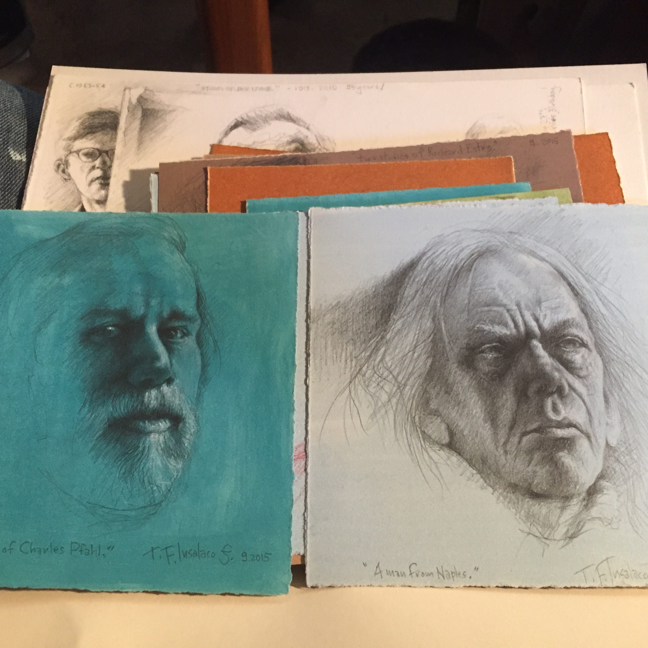
We talked for several hours, and Tom showed me dozens of drawings from a collection of the ones he has done every morning, without fail, on sheets of rag paper he has prepared by tinting them with oil—“It has to be rag paper.” Working from the overall middle tone he lays down, he creates portraits of people from photographs in the Renaissance manner, adding darker tones the usual way and then highlighting with white. (I recently skimmed through a catalog from the fantastic Durer show of drawings and prints at the National Gallery of Art in 2013 and was surprised by how intensely white Durer’s work was in those highlighted areas.) What was impressive was the size of that sheaf of sketches—Tom draws every morning, first thing, before doing anything else. Up, out of bed, he begins drawing immediately. When he’s done, he gets a little breakfast and then it’s on to his easel at the front of the house.
I’m guessing that Tom is in his mid-70s now, but hasn’t slowed down at all. He has a better memory than I do, and recalls things I’ve told him in passing about my wife and brother and parents, and also comes up with names of specific paintings by artists who don’t even ring a bell with me. He has no patience with contemporary art, and his recent visit to the new Whitney nearly enraged him when he saw the floor of one gallery space covered with a foot of mud—a recent installation.
“I don’t know if you’ve been to the new Whitney. Last time I was in there I screamed. I said why don’t you have the art, instead of this? There was a room full of mud, twelve inches deep. They probably thought they needed to call the police. It was chicken shit. They have so many great paintings. Edward Hopper’s Sunday Morning. Jack Levine’s Feast of Pure Reason. Why don’t they hang that?”
I timidly suggested that the Stella retrospective there now might help ameliorate the effect of the mud, and he allowed that this might be the case, but still . . .
It’s refreshing to talk with someone so candid and unguarded about how he feels when confronted with much of what’s happened to visual art. What I don’t understand, I told him, is why a curator in Western New York isn’t putting together a retrospective of Tom’s work, which reached epic proportions in a trilogy of paintings he did to commemorate the death of his brother a couple decades ago—he was a Buffalo police officer and was murdered by a participant in a domestic fight. One moment his brother was walking up to the door of the house; a few seconds later, he was dead, shot by the man he had come to restrain. Those paintings are monumental; but Insalaco has been building on that work ever since, drawing mostly from Renaissance precursors for his methods, with a bit of Dali tossed in. He was told a year ago or so that he has been invited to exhibit more often in the Memorial Art Gallery’s Finger Lakes Exhibitions than any other artist in Western New York—it’s the most prestigious juried exhibition open to all artists this side of Albany. So why isn’t someone putting together a definitive survey of what Tom has done throughout his career? He wasn’t even included in the most recent Finger Lakes. It would be a wonderful exhibit.
From “Tiny Tokyo: The Big City Made Mini”, Ben Thomas
For a guy, c’est moi, who thinks street photography reigns supreme when it comes to cameras, this photography from Ben Thomas is hard not to love in a completely different way. Tilt-shift images are impossible to resist–you’re a child again, the world your playhouse–yet in his Chroma series, the way he transforms images into flat, hard-edged abstractions, with such a limited range of color, is just as satisfying, even if you want him to free it up a little. They’re like pages coloring books for photo-realists.
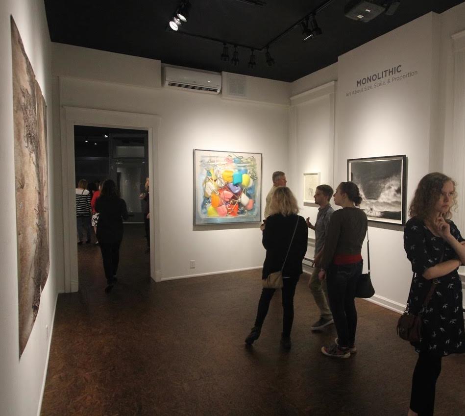

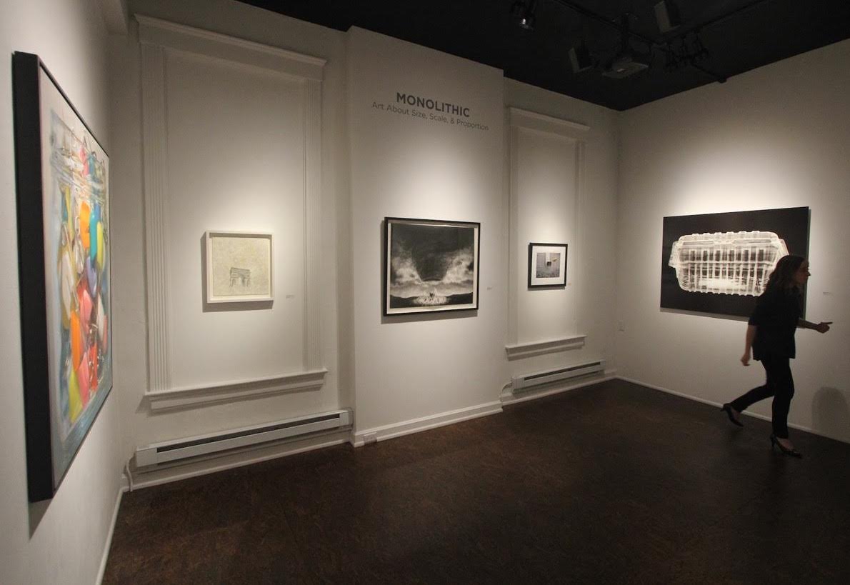
It’s more expensive, and it takes longer, to fly to Cincinnati than to L.A., and the drive requires an entire work day–just one way–so it’s almost more inaccessible than most cities in the country for someone who lives in Rochester. But at least Jason Franz sends shots of the shows to his participants–and in these you can see my jar full of safety pins among some elegant company at Monolithic, one of the exhibits at Manifest right now.
Shore Boat at the Cove, 2014, oil on panel, 10″ x 8″
From Gabriel Liston’s site with the comment: “People live in old boats anchored in the water here between the BNSF bridge and the St Johns.” The modulation of the tones to capture the light is fantastic–it’s the look of a typical winter day here in Rochester, though this one is from Oregon.
From Forty Years of Painting, the catalog for a great Gerhard Richter retrospective I saw in 2002 at the Museum of Modern Art, some thoughts on when he was an obscure and struggling artist. In the interview, he stresses how his aims, in representational work, are classical. It’s a tremendously honest discussion: “I wanted to be seen.” When a friend of mine saw his work recently he said, “I think he’s the greatest painter alive.” Mission accomplished, Gerhard. My interest in Richter is that his work found a place in art history mostly by simply being incredibly good, but also by finding his own way to paint, on his own, without concerning himself with the notion of “progress” or “movements” in art. His sense of alienation from the art of the 60s and 70s makes him a forerunner for everyone now who has to see art as a uniquely individual pursuit, redefining what’s “new” in a completely individual way. You can’t return to the past, but to employ techniques and methods from the past doesn’t require you to be ironic about them. I love the term “tin art” Richter uses. And yet apparently he was pals with Blinky Palermo and “Bob” Ryman, who would seem to be in the minimalist club, so his work is a natural affirmation of what he most values rather than a reaction against other work. He’s candid about his vulnerability in the 60s: “He was a real artist. Not like me.” The interviewer tries to pin down whether Richter is being ironic in his embrace of tradition, whether Richter is really just doing a postmodernist dance, undermining culture, and so on, but Richter answers like a politician about the “absence of the father.” Say what? It’s amusing; yes, the loss of authority, the loss of “the father,” I get it, but he’s still wriggling away from the question.The century as a whole was problematic for him, not to mention the current century, and it’s clear how his feelings are anchored, even though in his abstracts he certainly found a way to embrace modernism. The interviewer manages to fuse modernism and postmodernism into this one sentence as the 20th century club Richter didn’t want to join (his abstracts weren’t under discussion) and Richter agrees he didn’t want to be a part of it:
Your evocation of the classical was basically a response to the whole mood of the late 1960s, early 1970s, where the general rules were: Away with the old; Everything must be new; and Everything must be a cultural critique.
Yes. Exactly.
But that interpretation differs from what many people seem to think the work is about.
Oh really!
Some critics seem to regard the 48 Portraits as an empty, almost stamp-like array of cultural icons. Why do you think it has had strong response?
If it was only postage stamps it wouldn’t be as elaborate, and there wouldn’t be as much trouble. It is too big and there is too much presence and always people wonder what it is about. Women are angry because there are no women. It keeps upsetting people again and again. People are always upset when confronted with something traditional and conservative, and therefore they don’t want it. You’re not allowed to do that; it is not considered to be part of our time. It’s over, reactionary.
Some critics explain it to themselves–make it okay to like–by arguing that it’s an exercise in rhetoric, the rhetoric of a certain kind of representation of culture that questions or nullifies that culture’s authority.
And as I mentioned, you also have the psychological or subjective timeliness of the father problem. This affects all of society. I am not talking about myself because MORE
 I’m finally back on a regular painting schedule, and it’s surprising how it puts me in a better mood—helped along by a few other changes in my life. Maybe this makes it odd that I’m thinking hard about taking a year off from exhibiting (while continuing to contribute to local group shows at Oxford Gallery) in order to take all considerations out of the act of painting other than the quality of what I’m doing, based on my own response to it. It’s difficult to resist the sense that I need to refine what I do into something that will either be exhibited or will sell, or both, as a way of validating my work. It’s a little silly to be consciously trying to eliminate these considerations, at this point in my life, since I didn’t give them any thought at all for most the years I’ve been painting—when I did it as a solitary pursuit. In other words, it doesn’t take much effort to quit worrying about a “career” because that’s never been the motivation. Imagine Cezanne or Van Gogh scanning their CVs with a worried look. Being able to both eat and paint is the goal. Whatever creativity is, you’ll kill it by putting a harness around its neck. Once you start showing and selling, as I’ve been doing for seven or eight years now, those activities become a reflexive consideration—you ask, will this be anything someone will want to show or buy? In theory, I don’t think that’s wrong; in fact just the opposite. With Dave Hickey, I agree that making art people want to own ought to be a central consideration, not because it makes sense economically, but because it means an artist is trying to connect to others in a way they’ll welcome. When you speak, you hope someone is listening, otherwise, you’re . . . well . . . you’re a blogger, right? But I’m putting that aside for now. If I give myself a hiatus from questions of selling and showing, I might be able to feel free to fail in an attempt to get better results while painting in ways I ordinarily don’t give myself permission to do. (Do I contradict myself? Very well . . .)
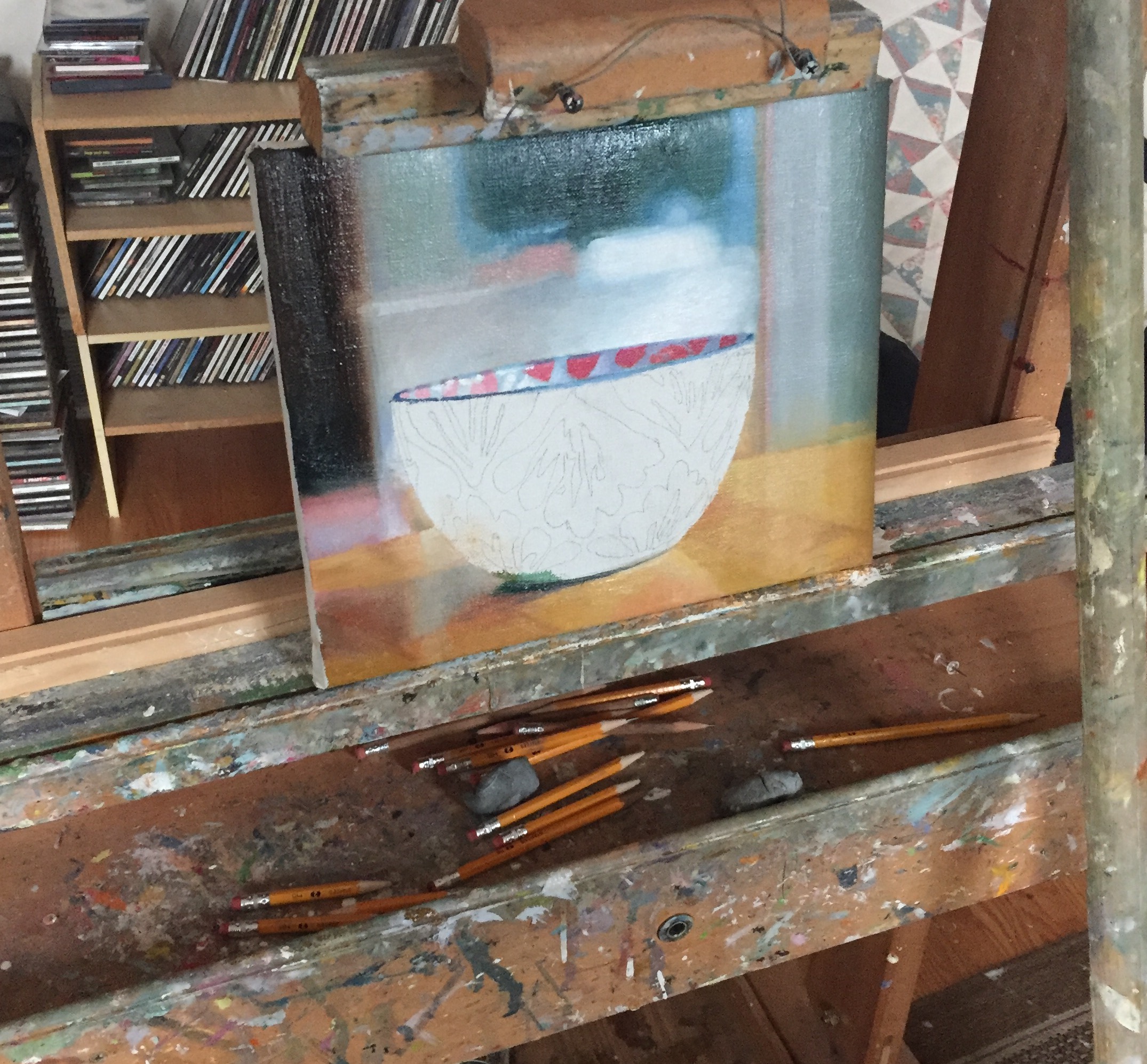
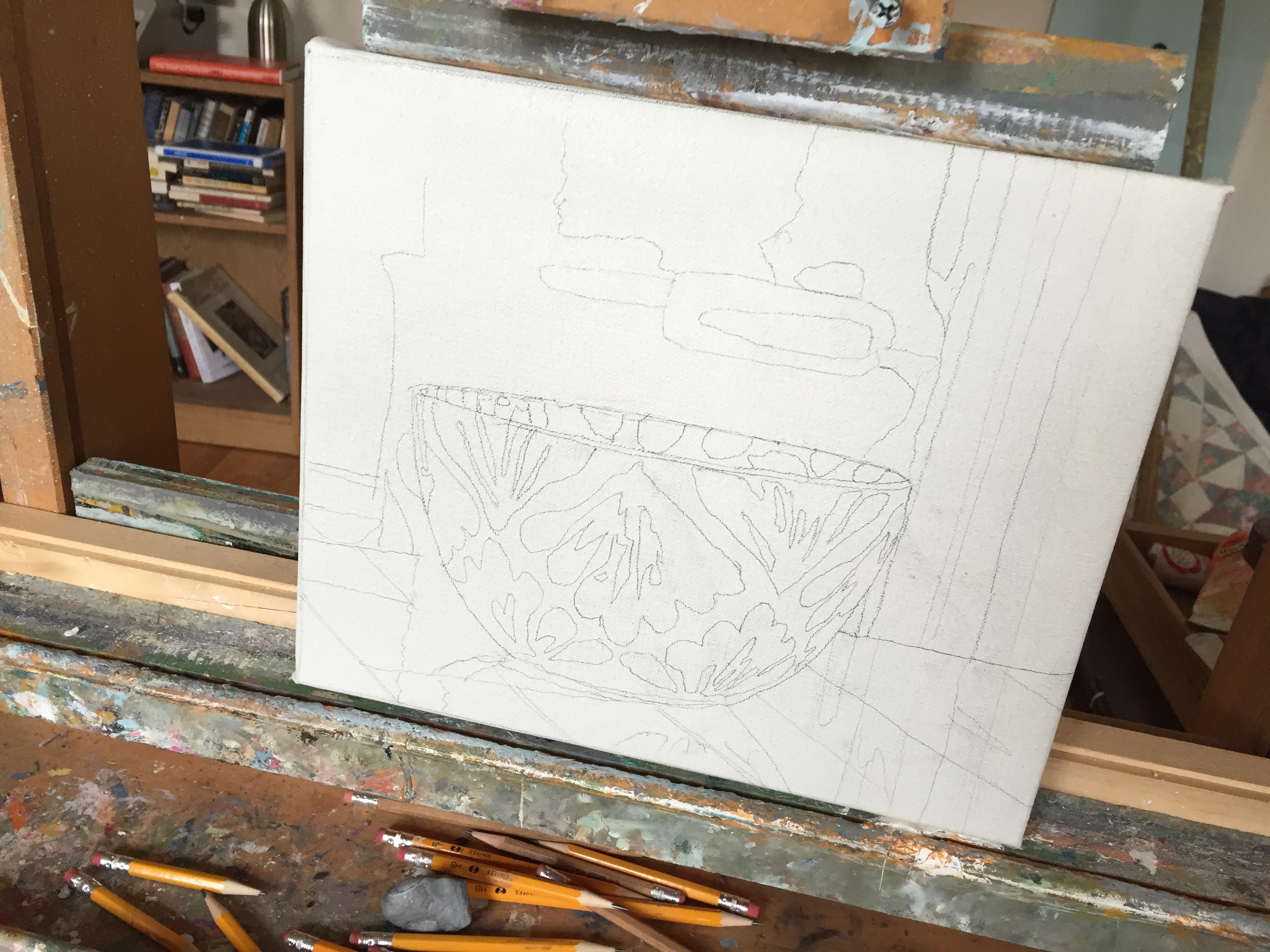
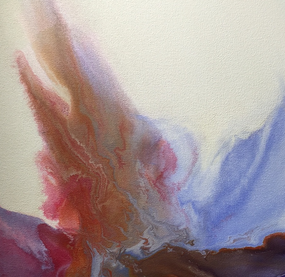
So, in this frame of mind, I’m finishing a small, modest still life of a bowl, using methods I’ve been trying for the past year. It’s the first of a series of small ornamented bowls I’m going to paint between now and the end of the year. In this one, as in the last few I’ve done, I’m being completely transparent about my use of photography. I depict one or two commonplace things as the focal point of the image and use a shallow depth-of-field to intentionally create blurred backgrounds. What I’m building is a series of still lifes that show objects in ordinary, everyday surroundings—not simply a wall or undifferentiated space—without rendering the background as precisely as the foreground. In other words, photo-realism, but not hyper-realism. The way I’m painting these backgrounds ranges from slightly blurred but recognizable to extremely out-of-focus scenes that dissolve into softly abstract geometry. It creates a sense of depth in a way some would consider too easy, probably, because it relies on how our eyes have been conditioned to recognize the way a lens alters the view, giving distant things a gauzy aura. I suspect what I’m doing would be dismissed these days by those attuned to what’s currently respected and what isn’t—photo-realism may be commercially viable, but I don’t have the sense that it’s in critical or academic favor right now. Will that last? Probably not. Do I care? No. Maybe a little (see above on Dave Hickey). But that’s precisely what I want to take out of the picture with my hiatus from thinking about sales and shows. With the way I’m working right now, I’m able to achieve pure areas of color that just wouldn’t have the same character if I were to render everything in the image with the same level of painstaking, realistic detail. So far, I like the results. I also like how this approach is encouraging me to find the most efficient way to apply color without losing a sense of clarity and immediacy in the image, despite the lack of detail in most areas. It’s a way of painting where I feel as if I’m using the simplest possible means to get the results I like, focusing on flat areas of color, putting one simple area of color next to another, as Hawthorne said, when he talked about “spots” of color.
None of this has anything to do with adhering to a theory, or some “better” way of painting, but is the result of paying attention to how the act of painting feels as I’m doing it, and whether or not I want to keep looking at the results when I’ve made a mark. It’s a way of savoring the tactile quality of the paint, so that I’m able to spread it in thicker layers and move it around in a way that actually, to me, feels like slicing into a cake—it’s full of that kind of anticipation. I’m sure it’s how Braque felt every time he touched his canvas with his brush. If you’re a painter, you’ll know what I’m talking about: the scale tips toward the paint and the pure color you put down, and the quality of both, while the illusion you create follows along behind, seeming to be summoned up almost as an afterthought of fitting all those shapes of color together in just the right way. I’m also finding myself achieving things with very small areas and gradations of color that undoubtedly nobody else will even notice. I do, though. Someone else, looking at one of these finished paintings might say, “I don’t get it. What’s so different about it?” And there you go: that’s exactly what I was talking about earlier, just painting with only my own eye and heart and hand as a guide, for better or worse, regardless of whether anyone notices what I’m achieving.
School Dance, David Stenulson, oil on paper 48 x 58
I’m happy to have a painting included in Monolithic, one of the current shows at Manifest in Cincinnati. It’s Cutting Loose, Breaking Free, a large oil of diaper pins clustered in my favorite jar, which I’ve used many times, for other paintings like it. Here’s the commentary on the show from the Manifest website:
Sometimes a particular work of art has a way of making us aware of our own physicality, helping us feel our bodies by giving us new perspective on our relationship to things around us. In MONOLITHIC, Manifest presents artworks from around the world that engage our sense of physical, intellectual, and emotional scale.
For this exhibit 82 artists from 26 states and 4 countries submitted 240 works for consideration. Fifteen works by the following 14 artists from 12 states and Canada were selected for presentation in the gallery and the Manifest Exhibition Annual publication.
In two sittings I finished Michel Houellebecq’s latest novel, Submission, a mordant vision of an Islamic future for Europe though the eyes of a man in a state of hedonistic despair. I couldn’t put it down. To call it dystopian is to misunderstand its paradoxes; it simply works out the logic of where things might lead given current events in the Middle East and Europe, speeding up the timeline for Western culture’s surrender to a new order, with a whimper rather than a bang (there’s plenty of the other sort of banging on both sides of the velvet revolution here). The book’s central paradox is that Islam wins, which is both the bad news and the good news, depending on what page you’re on, and how wedded you are to the Western notion of equality. For the author, it seems secular culture built around self-fulfillment has exhausted itself. Houellebecq has been vilified for calling Islam “the stupidest religion” and yet the picture of the society that would follow from this cultural revolution, via a vote runoff, is actually depicted as a supple and peaceful correction to Europe’s socio-economic woes. He doesn’t find it repellent at all. It’s clear that Islam has allure for his main character who seems like an avatar for the book’s author.
For someone who has claimed to be an agnostic, who has said science is the only arbiter of truth, he conveys impotent spiritual yearning in a convincing and sad way. (Recent interviews indicate his views on religion have shifted, or have simply become clear, depending on how you interpret his remarks.) It’s a brilliant book and it made me laugh out loud, and yet it isn’t a satire. Through the mouth of the man who heads the new Islamic Sorbonne in the novel, Houellebecq downshifts into beautiful prose, which comes out of nowhere (given the tone of the rest of the novel), when the subject comes to Muslim worship:
For Islam, though, the divine creation is perfect, it’s an absolute masterpiece. What is the Koran, really, but one long mystical poem of praise? Of praise for the Creator, and of submission to his laws. In general, I don’t think it’s a good idea to learn about Islam by reading the Koran, unless of course you take the trouble to learn Arabic and read the original text. What I tell people to do instead is listen to the suras and read aloud, and repeat them, so you can feel their breath and their force. In any case, Islam is the only religion where it’s forbidden to use any translations in the liturgy, because the Koran is made up entirely of rhythms, rhymes, refrains, assonance. It starts with the idea, the basic idea of all poetry, that sound and sense can be made one, and so can speak the world.
Though he puts those lines into the mouth of a recent convert, he is deeply drawn toward this vision of an Islamic future. (The author at first tried to build the book around a conversion to Catholicism, but wasn’t happy with the results.) To put it mildly, the world he depicts would be a sharp U-turn from the path we’ve been on since the Enlightenment. It’s impossible to imagine Western women peacefully retreating from the workforce as they do here–or putting up with polygamy. It’s also possible to imagine many who would welcome a permanent vacation from the workforce. Houellebecq seems secretly drawn to Islam and feels a nostalgia for the retrograde social order it might bring. You might say he writes about it the way Milton once wrote about Satan, knowing the ostensible enemy is the most interesting character on the page, and maybe the real hero. He’s drawn to what he understands would be a sharp abridgement of all the freedoms that have made his career possible. Islam may loom like a conquering power here, but it would hardly be a despotic rule if the Islamic moderates from this novel took over. Their power grab proceeds through attraction, not force. This isn’t ISIS. The book doesn’t mock anything but the decadence of its central character, as a stand-in for the West’s decline.
Here’s a blast from the past from The Paris Review:
INTERVIEWER
But what stops you from succumbing to what you have said is the greatest danger for you, which is sulking in a corner while repeating over and over that everything sucks?
HOUELLEBECQ
For the moment my desire to be loved is enough to spur me to action. I want to be loved despite my faults. It isn’t exactly true that I’m a provocateur. A real provocateur is someone who says things he doesn’t think, just to shock. I try to say what I think. And when I sense that what I think is going to cause displeasure, I rush to say it with real enthusiasm. And deep down, I want to be loved despite that.
. . .
It may surprise you, but I am convinced that I am part of the great family of the Romantics.
INTERVIEWER
You’re aware that may be surprising?
HOUELLEBECQ
Yes, but society has evolved, a Romantic is not the same thing that it used to be. Not long ago, I read de Tocqueville’s Democracy in America. I am certain that if you took, on the one hand, an old-order Romantic and, on the other hand, what de Tocqueville predicts will happen to literature with the development of democracy—taking the common man as its subject, having a strong interest in the future, using more realist vocabulary—you would get me.
INTERVIEWER
What is your definition of a Romantic?
HOUELLEBECQ
It’s someone who believes in unlimited happiness, which is eternal and possible right away. Belief in love. Also belief in the soul, which is strangely persistent in me, even though I never stop saying the opposite.
INTERVIEWER
You believe in unlimited, eternal happiness?
HOUELLEBECQ
Yes. And I’m not just saying that to be a provocateur.

Georgia’s Stuff, Tom Insalaco, oil on canvas
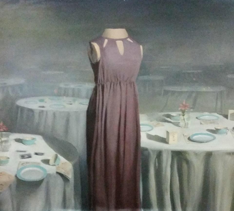
I spent the afternoon talking with Tom Insalaco on Monday, at his home/studio in Canandaigua. It’s a home built in 1882 and now packed with several decades of work. He paints in what would have been the living room and stores his materials and finished paintings elsewhere on the first floor, including the original kitchen, and he lives upstairs, where he built a room that triples as a fully functional kitchen, a library and a media center. I want to write up the conversation we had but until then, I’m offering the large painting from 1987 that hangs on the landing at the top of his stairs. It’s around five feet square, and is paired with another brightly lit outdoor scene, at least as large, of several tourists standing beside Niagara Falls in full sun. The two paintings are so different–in color and light–from much of what he’s done since then that, when I saw them, I wanted to pull up a chair and study the work for a lot longer than I had time to do. This one captures a moment on a day his then-girlfriend moved into his place as they unpacked her stuff, a frozen cascade of clothing on which floats the dust lid from an old turntable, with the leaves of a big philodendron jutting into the scene, and a little ripple of a woven reed rug in the lower left. You can’t see it well from the iPhone shot, but there’s a taupe pair of narrow-wale corduroys, which became popular in the 70s, folded and sitting in a prominent spot in front of the chair bearing the turntable lid. The way Tom rendered the velvety shine is amazing, each cord distinct and visible. Tom’s artistic idols are Caravaggio, Rembrandt and Sargent, but he loves the photo-realists, and it’s never been more apparent than in this and its companion painting on that second floor landing.
I’ve been reading above my pay grade, as it were, for the past couple weeks, delving once again into On Certainty, by Ludwig Wittgenstein. I minored in philosophy at the University of Rochester, and as a senior I took a graduate seminar mostly to study The Blue and Brown Books, and Philosophical Investigations. When I say “seminar”, I mean that I, and two grad students, met for several hours every week in the office of a tall Afro-American professor who packed tobacco into his pipe and inhaled the smoke (as he would have with a cigarette) for the duration of our conversation. He didn’t lecture us, but played Socrates, as Ludwig often did, too, as we thought our way forward. I was often baffled, if not completely lost, but not always. He was kind, and he never disparaged my beginner’s efforts.
I came out of it knowing what is commonly known about Wittgenstein: that he believed the cure for his philosophical obsessions was to see as clearly as possible how language was fooling him into asking questions, or coming up with theories, that were essentially pointless. Philosophy was a cure for philosophy. (Yet he kept doing it. Continuing to ask a question with no answers somehow matters.) This encouraged me because of my own history, at that point, of asking philosophical questions that had no answer, at least not the way ordinary questions have an answer, embedded in a sensible pattern of behavior, a “way of life.” My reading in that class supported something I’d come to see, through reading Kierkegaard MORE
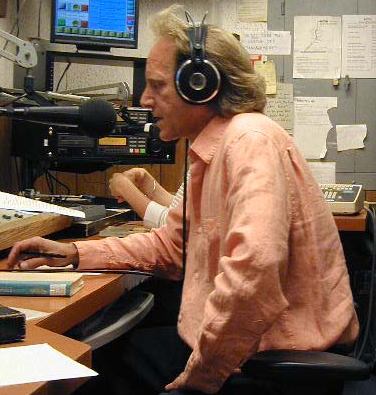
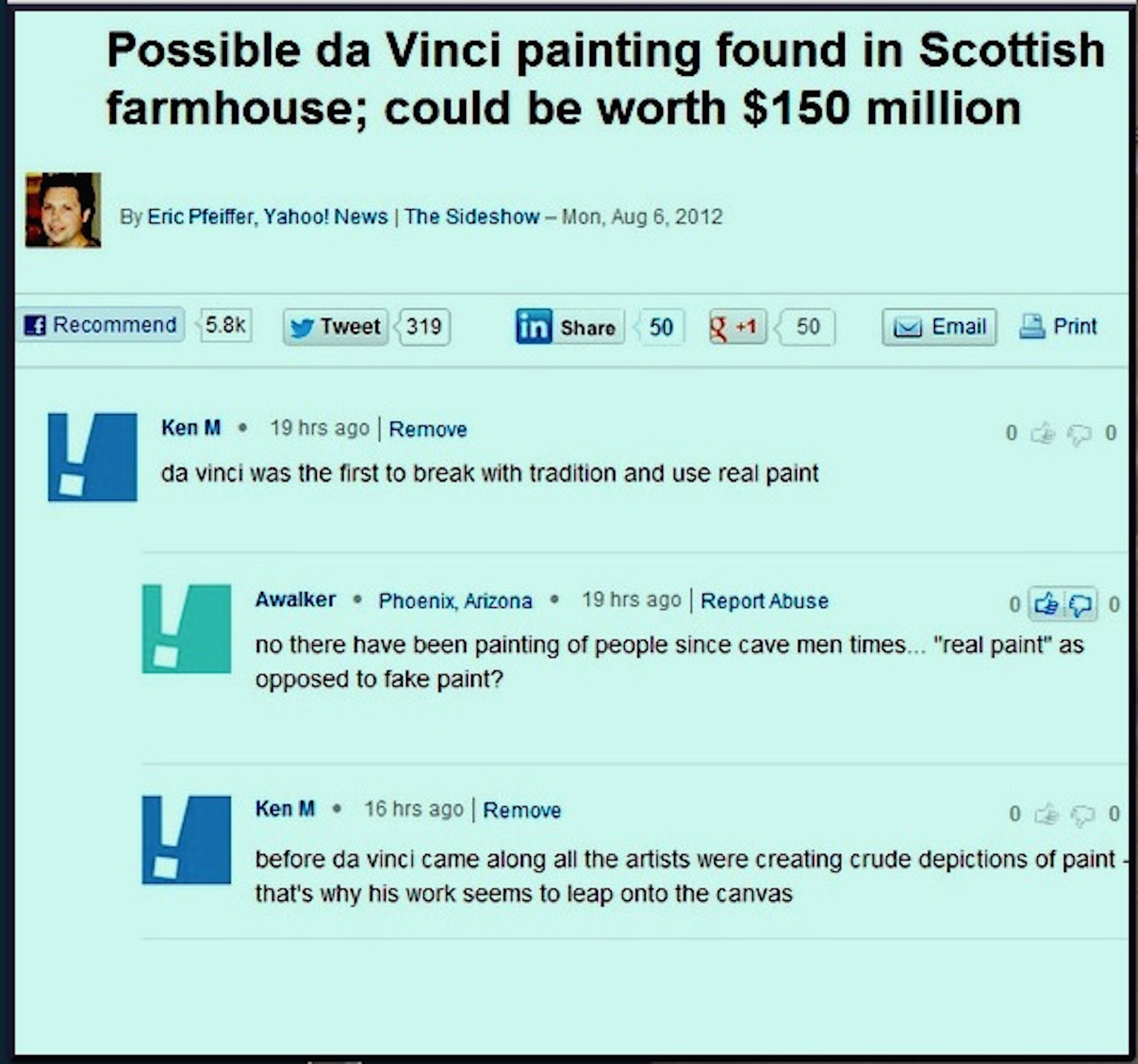 From Gizmodo, here’s a brief salute to Ken M, the world’s most famous and funniest troll, who shares a sample of his incisive views on the art of painting above:
Ken M has achieved what few trolls can dare to dream of. He has his own dedicated subreddit, with 58k subscribers, /r/KenM. The subreddit’s been around for years, just like Ken M, who has collected a following for his deft acts of trolling as the world’s least-informed commenter. His official Facebook page, which lists him as a “professional dirtpig,” has 20k Likes, and he is also onTwitter and Tumblr. His notoriety was such that College Humor paid him to run a column, The Troll, which made him, in truth, a professional dirtpig.
In comments, Ken M comes across as your ornery, befuddled grandfather–that’s what his social media avatars, which depict old men, suggest–but read on and you’ll find his tongue planted firmly in cheek. Ken M’s greatness derives from his subtle trolling method, which is never crude or combative. His apparent cluelessness infuriates others, who don’t seem to get that the joke is on them.
Through it all, Ken M remains blissfully confused. He never breaks form.
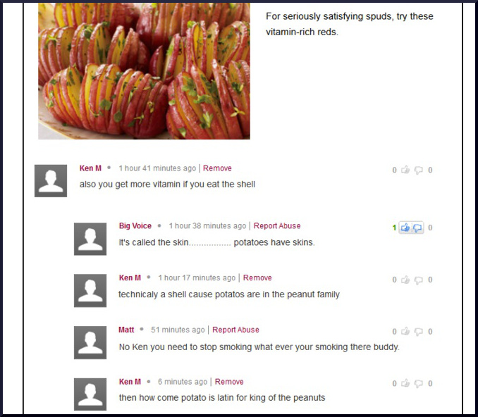
Here’s another:
 We’ve had a couple killing frosts already here, which is typical: snowfall by Halloween. And then it’s followed by a string of much warmer, Indian summer days, a temperate mix of sun and clouds, sometimes for weeks. One thing about Western New York, at least in my suburb, is that robins sing only into June, and then we hardly see them until the next spring. I have no idea where they go or why they don’t keep plucking worms from the grass all summer long. They retreat to more wooded areas or maybe properties where the birdbaths get cleaned more often than ours does. Or they just don’t like me. That’s probably it.
It makes me feel a little cheated. Every time I visit my cousin Brian in Laurel, Maryland, near Baltimore, I hear flocks of robins singing up and down his street, regardless of what month it is. I want to shout up into the branches, hey what gives? Yet, as the sun came out this morning, robins showed up again, way ahead of schedule, and started fighting for exclusive claim to the birdbath, and then half a dozen of them were hopping around in the front yard, tilting their heads to the side. Then, while I was sitting in my studio I heard one of them singing in a crabapple next door. This is something of an event around here for me—which may be sad commentary on my particular suburban life. A little more birdsong and, let’s be honest, three more blowout backyard parties per year—which would be three more than I usually have—and I’d be a pretty happy camper. Maybe the robin was announcing that winter isn’t coming after all, and we’ll finally get a local windfall from global warming. As I understand it, we’re one of two places on the globe where temperatures have been declining steadily as they rise everywhere else on the planet.
Whatever inspired him to sing, I’ve decided to take that little avian tune as a good omen for breaking old patterns. Recently, I resolved to shift my painting more resolutely toward a new method I’ve followed off and on for years, but without MORE
Yellow Labyrinth, Anthony Dungan, acrylic on canvas
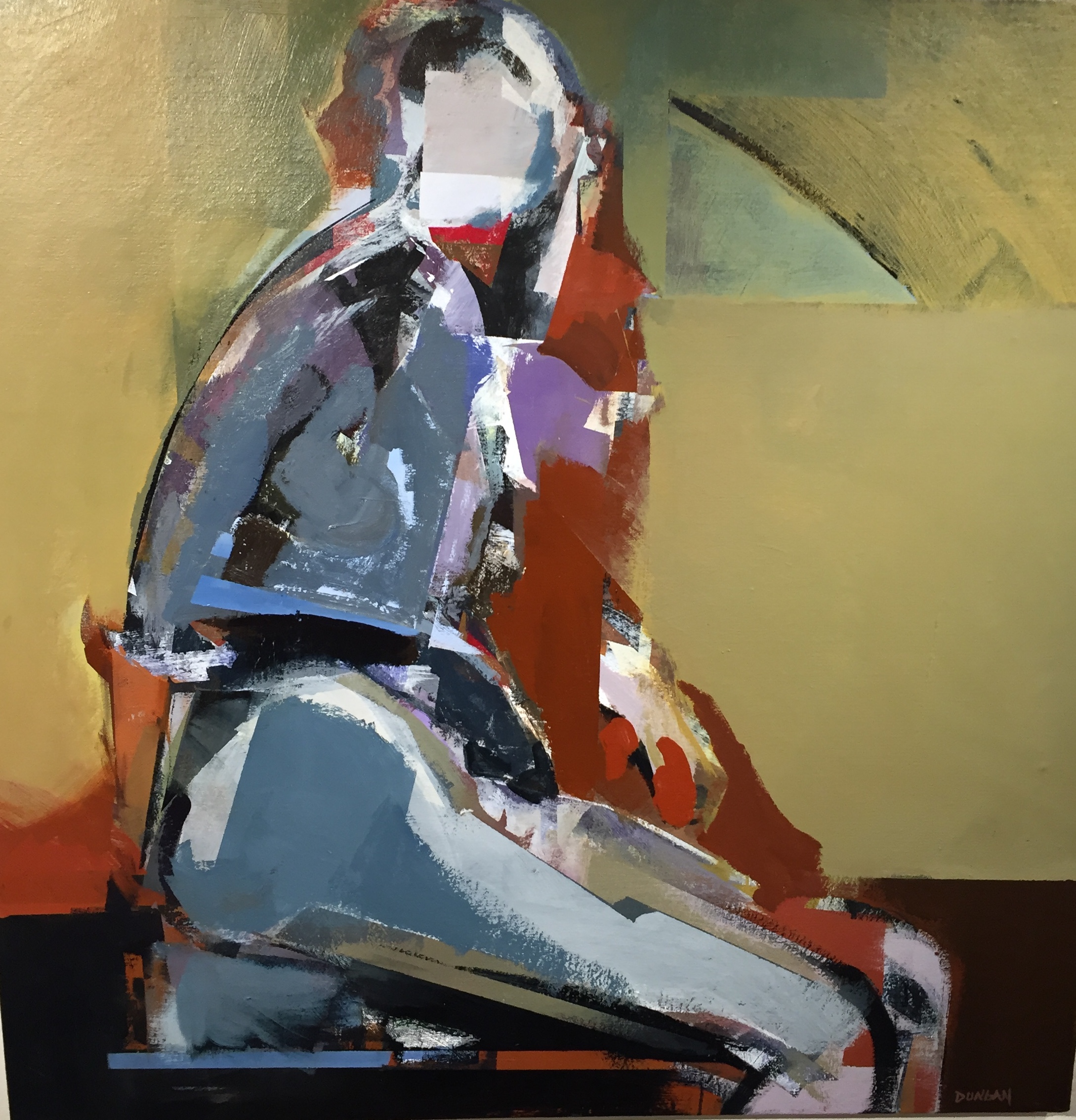
The new show, “The Elusive Image”, at Oxford makes an amazing impression when you walk into the gallery. As I wrote before, it’s one of the most unified exhibitions I’ve ever seen there, all abstract, or at least semi-abstract, modernist work. Part of what gives the show such immediate impact is the seriousness of the intent on the part of all three artists: Bill Santelli, Anthony Dungan, and Jan Hewitt Towsley. It’s all modernist in the sense that you’ll find no hints of postmodern irony about the nature of the work itself—or the suppositions behind it. It varies between quasi-representational and almost entirely abstract, with Dungan’s powerful new nudes as the most figurative.
Towsley’s constructions, work that is woven from filaments of metal, look perfect in the company of the paintings around it, but it gets a little overshadowed. It’s quiet, glowing, subtle and, at times, intricate without being overly complicated. My favorite is a rippling curtain of metal screen that flows in waves down toward the floor, like a Chinese scroll with figure-eight curves that seem permanently pressed into the fabric. Up close, a variety of colors emerge, and, as does all of her work, it reflects light differently from different angles (something it has in common with the gold leaf areas in some of Bill Santelli’s drawings). Jim Hall, in his write-up for this show, does the best possible job of describing the strength of Towsley’s work:
A weaver may appear an odd choice to exhibit with two painters, but the compositions of Jan Hewitt Towsley more closely approximate, at times, that of a painter or draughtsman than that of a traditional weaver. Although she does weave patterns in more conventional materials, such as cotton, silk, or linen, many of Hewitt Towsley’s compositions are woven of metallic ‘thread’. Such work would have to command our admiration if only for its sheer difficulty of execution. But we might say that this artist “draws” with her loom, creating still-life compositions, landscapes, and cityscapes. The images seem to exist in a space somewhere between two and three dimensions. They announce themselves with the play of light not only upon different metals, such as brass, copper, or steel, but upon weaves of different type and density. The images are chimerical, as they emerge, change, and disappear when we move around them.
I’ve already delved into Santelli’s work in an interview posted a few days ago. It breaks down into four categories, three of them familiar to me in addition to a small series of minimalist geometric abstracts based on the dimensions of a tennis court seen from above. I’ve admired his work over the years, but in the context of the show, it came alive in a new way for me, though I’m not sure why. This time, MORE
Hawaii Dream Flash 13 (detail), Bill Santelli, acrylic on canvas
The new show at Oxford Gallery, “The Elusive Image,” makes a powerful impression when you walk through the door. The gallery has integrated the work of all three artists–Bill Santelli, Tony Dungan, and Jan Hewitt Towsley–into a show where everything you see augments the work around it. The tension between angular, hard edges and organic curves ripples from one work to the next, leading your eye forward and back to reassess things you’ve already seen. It’s probably the most unified show I’ve seen at Oxford, and the work is all first rate. I’ll write more soon to share impressions about Dungan and Towsley, but for now I’ll pass along some of the conversation I had with Bill as he walked me through the show, commenting on the work.
Bill’s work falls into three buckets, more or less: large abstracts that set up a tension between geometric shapes and eddies of paint that form partly through chance; his PATH abstractions that call to mind tall grass in the wind; and his “silent dialogs.” He also added a small set of drawings, minimalist squares in the dimensions of tennis courts seen from directly above. We started with the little Open Court series and moved to The Path drawings and then the larger abstracts:
When I was working on (the Open Court series), I was thinking they’ve already been done as large paintings.
I really like them on this scale. The size adds to the sense of restraint and minimalism.
I think I’ll keep the series going for a little while to see how they turn out.
You can see your hand in them, despite how flat and spare they are. There’s real feeling in the tiny variations of color in each grid. They’re so close to watercolor.
It’s funny you say that because I was thinking of doing these in watercolor. Then at the last second—I was even thinking of thinning out acrylic—but with the work on The Path drawings and Zen Mind/Silent Dialogue stuff going in Prismacolor, I figured I’d do the first one in Prismacolor and I got hooked on it.
How does Prismacolor work? What’s different about it?
It has a fair amount of waxy content to it.
It’s in pencil form?
Yes, you can get them in stick too. But those are chalkier.
It sounds similar to pastel.
Yes. They aren’t forgiving in terms of erasability. I’ve tried scaping with a blade but you can’t get all of it.
Do you have something to guide your hand?
No, the series started with just making a mark spontaneously. What I really was doing in the beginning was just putting down the color without the black (outlines) and for whatever reason I kept looking at it and thinking this isn’t really popping the way I wanted it to. So I outlined one mark in black and really liked it and then just went ahead and did it all.
I don’t know how you get such a steady line.
They aren’t one continuous line. I go a ways and stop. Then again. Tom Insalaco gave me the hint to use a bridge. I started using a bridge above the paper. Sometimes I use tracing paper or plastic sheet so I can put my hand or arm on it while I’m putting down the mark. They are smaller strokes, but I try to get into the motion (of the whole line). You can see all the little strokes, if you catch the light just right. The inspiration for these was sea grass. My father in law had a house on the north fork of Long Island where we used to go in the summers. We could take a canoe out and just go out. There were always the grasses. The whole series, I started when I’d ordered some pre-stretched canvas and had nothing to do, so I had this paper lying around and going through file drawers looking for something I found this box of paper. I just got it out and made a slashing mark and liked it to much that I kept it going.
You did it spontaneously. A large quick gesture?
A swift mark like the beginning of one of these only bigger.
The first one could be fast, but after that . . .
Exactly.
There are so many parallel lines, perfectly aligned.
After the first one, I recognized something and was thinking about it, and my wife came in and said, that looks like the grasses. I started looking at them more and just kind of went from there.
When I first saw these I moved on, but the more I see them the more I like them. I see more and more in them. There’s a Taoist feel of the grass surrendering to the force that moves it. They are so simple, I thought, OK, I’ve figured that out, nothing much to see here, and I’ll move on. But there’s more and more there.
You can see there’s a lot of build up of layer. It isn’t that it’s applied thickly initially. It’s all these tedious strokes to get the color I want. These drawings take about three months on average.
That’s astounding to me. The other thing that fooled me at first, it looks like a print. I thought they were “just” lithographs. But these are one-off. To spend that amount of time on something that is, in the end, this simple . . .
I didn’t paint for almost a year. When I first put these out there, they were getting a fair amount of attention, so I went with it and kept it going. It took so long to do one of these, and I was working eight hours a day and had no energy left.
You have very clearly defined areas of flat color.
The black outlines really makes it work.
Frank Stella did white margins that worked the same way.
Yes. That’s it. They are a challenging. It gets to be like meditation.
(We move on to the large abstracts.)
How do you get the paint to behave this way, with these eddies and swirls? It has a life of its own that you seem to guide and nurture without too much forcing.
I did a lot of research on paint when I started working seriously and I was reading all the literature about Golden acrylics. I also studied Paul Jenkins and Frankenthaler and others and learned they were working in oil and Chrysochrome, (an enamel). Jenkins was the most scientific about it. I worked for Zora’s Art Supplies at the time and went to Zora to ask what Chrysachrome was – and she admonished me: “Look it up in the dictionary! Learn for yourself!” That was what started my studying and experimenting with mediums and different paints.
Swimming inside a David Hockney could be a bucket list item for the serious collector.
People paid him to paint their actual swimming pools. So I was asking what’s chrysachrome? With these it’s basically, first mixing the viscosity and getting it to the point where it isn’t too thick or too thin. I’ll lay it down, using hake brushes, so that it has texture but not brushstrokes. The first layer I’d take the hake brush and dip it into whatever medium I was using and put that down and then add color. With the hake brush you can manipulate it.
The shapes and patterns look natural, as if they form on their own.
The color in the rectangular shafts are things I remember from dreams. (Jim called these armatures and that’s a great description.) (In the organic areas of free-flowing paint) sometimes the paint has the consistency of milk and if it gets too thick it’s harder to control when you put down the second or third or fourth layer. The Renaissance painters used to work on copper and they wanted the light to come back from underneath. I want the light to work that way as well, so the layers have to be of a certain viscosity.
In this one you can see sky, and that’s what’s interesting, it’s like a view of interior states but you can see external worlds in these images too.

I’m passing along the latest email from aeqai, an online arts magazine in Cincinnati. I’m an occasional exhibitor in Ohio thanks to Manifest and the Butler Institute, so I’m also one of their readers. If you think the only way to see great art is to live on one of the coasts, just take a glance at what’s going on in Ohio (aeqai is reaching out to other places as well–thanks to its correspondents). It’s impressive:
The month of October always brings with it not only glorious weather, but some of the most fascinating art shows tend to appear during this month every year, and 2015 is no exception. Exhibition offerings are very strong, and the October issue of aeqai, now posted, is full of reviews, profiles, and manifests aeqai’s growth into new cities: we introduce Elisa Mader, who’ll be covering the visual arts in Seattle for us, this month, as well as Joelle Jamison, who will be covering Houston for us, regularly, joining Anise Stevens, our LA correspondent, and Cynthia Kukla, who has Chicago as her beat. And next month, we’ll be introducing area photographer Kent Krugh, who has become aeqai’s photography editor, and will be selecting photographers’ work from the region, nationally, and internationally and offering our readers photo essays of the work he selects for us.
Both the art museum and the Taft Museum have singular offerings : Keith Banner reviews the Jacob Lawrence painting show, recently opened at The Taft Museum in a strong and passionate review of Lawrence’s work from the thirties, while Jonathan Kamholtz analyzes the one Raphael painting that’s traveling the world right now (which we think’s a terrific idea). Two reviews of recent Contemporary Arts Shows/performances aren’t in yet at press time, but we will post them when they come.
Matthew Metzger returns this month as an aeqai critic, and he went to Antioch College to review a show about the rhyzome, a complex metaphysical idea that the Antioch Curator has adapted into an art show with the most splendid of results, with the assistance of a professor of sculpture there: this is a must see show, and it’s a great time of year to take this short drive to this lovely town so close to us, in Yellow Springs. Zack Hatfield offers a thoughtful anaylsis of photographer Elena Dorfman’s work at The Weston Gallery in The Aronoff Center; aeqai reviewed her work several years ago, and her career seems to be soaring. And Craig Ledoux, who started with aeqai last month, both reviews and offers an overview of the public art/mural scene in Covington, including an interview with both Jay and Cate Becker of the BLDG (building) , who’ve been so responsible for this burgeoning scene in Covington, which is celebrating its 200th anniversary this year (The Carnegie also offers several shows dealing with Covington’s birthday /anniversary, which is why we asked Ledoux to write this column now).
Hannah Leow reviews an oddly moving show of work by Jane Carver at The Art Academy of Cincinnati; our review of The Michael Lowe Collection of (conceptual) photography will appear next month rather than this month due to extenuating technical problems on the writer’s now old computer. Fran Watson, whose knowledge of prints and how they’re made always amazes us, reviews Frank Hermann’s new monoprints on offer at Clay Street Press, and new aeqai writer Dan Burr takes a look at a small group show at the Women’s Y downtown, called “Color” and featuring work by, amongst others, Paula Wiggins and Susan Mahan. Burr, whom we welcome to aeqai this month, will be reviewing for us regularly, too. And Marlene Steele reviews Cedric Michael Cox’s new work at The Clifton Cultural Arts Center: Cox’s work’s optimism is always refreshing to see in such a dystopian era. And Jennifer Perusek, aeqai’s fashion editor/correspondent, looks at the Alexander McQueen line of women’s clothes this month, after the truly tragic and untimely death of visionary McQueen himself.
Aeqai offers two profiles this month, both of area artists: Mike Rutledge’s profile of Brad Austin Smith, one of our region’s most creative and prolific photographers, who has a new photo in the upcoming Mapplethorpe After 25 Years show at The CAC, opening in November, and Laura Hobson offers a profile of regional draughtsman and painter Marlene Steele, who also writes for aeqai regularly. Marlene Steele also offers a fascinating review/essay on The Letterheads, a group which met here recently and deals with all kinds of aspects of signage, graphics and the like , as well as older design forms including calligraphy, at which Steele herself excels. We hope that you’ll read Steele’s piece as it’s truly fascinating, and most of us know little about these fields.
Aeqai has a slew of reviews from other cities. Our own Jane Durrell was visiting Atlanta, and found a museum at Emory Univeristy which is full of ethnic memorabilia and objects from cultures around the world, but reviews the temporary show there about Native American arts and culture; it’s a fascinating review and there’s much to learn from it. Our LA writer, Anise Stevens, offers two reviews, one of a show of work by African-American geometric abstractionist–all 46 of them–in a show that’s an eye opener. Her other review of new work by NY artist Randy Hage, shows us work in the realistic , almost photo-realistic vein, of storefronts, current and those long gone, in New York, and they’re miniaturist as well as dimensional, too: this show sold out at its opening in LA. The work is sensational, as is her review of it. Our Chicago correspondent, Cynthia Kukla, looks at Charles Ray’s sculptures of mainly male nudes at The Art Institute, and she doesn’t much like the macho bombast which she describes and anaylzes so admirably. Elisa Mader, of Seattle, reviews work by Lisaann Cohn, in a show that shows influences from Surrealism, Egon Schiele and others, that looks fresh and exciting and beautifully rendered. And Joelle Jamison looks at a design show at Houston’s version of our Contemporary Arts Center: Houston has a very active design scene in clothing, furniture, jewelery , and the like: much fascinating art’s coming out of Houston; next month she’ll write about the Houston photography scene.
Louis Z. Bickett of Lexington returns with another of his fascinating photo-essays, this one called “Sam with Broom: South”; these photos are part of a large, ongoing series of deadpan/conceptual photographs where a young man named Sam wanders the Lexington area and throughout the South with one broom. And I offer two book reviews this month, of phenomenal new short stories by Ann Beattie, a truly rare treat, and of a very disappointing new novel by very talented writer Lauren Groff.
We’re also posting with this eblast an invitation to the aeqai benefit party, to be held on Tuesday, November l0, at The Weston Gallery in the Aronoff: tickets are cheap at $40/head, and we’ll have a great art auction, thanks to the vast generosity of regional artists: we hope you’ll come; everything’s tax deductible as Aeqai is a 501c3 nonprofit. Nibbles and wine/beer’ll be on offer, and this event’s aeqai’s major fundraising event, and we hope you’ll come and support it, and if you can’t, please consider sending a tax deductible check anyway.
We’ll return in a month –November’s issue will include a lot of material on the FotoFocus sponsored symposium on Mapplethorpe/lessons learned , which’ll take place on the 23rd and 24th of October at The CAC (their show opens a couple of weeks later). New York FotoFocus Curator Kevin Moore has put together one of the most impressive groups of experts and specialists worldwide for this event, and we encourage you to attend various parts of the symposium as you can. It’s a major event in and for Cincinnati, and aeqai will review the symposium and the show next month.
Daniel Brown, Editor
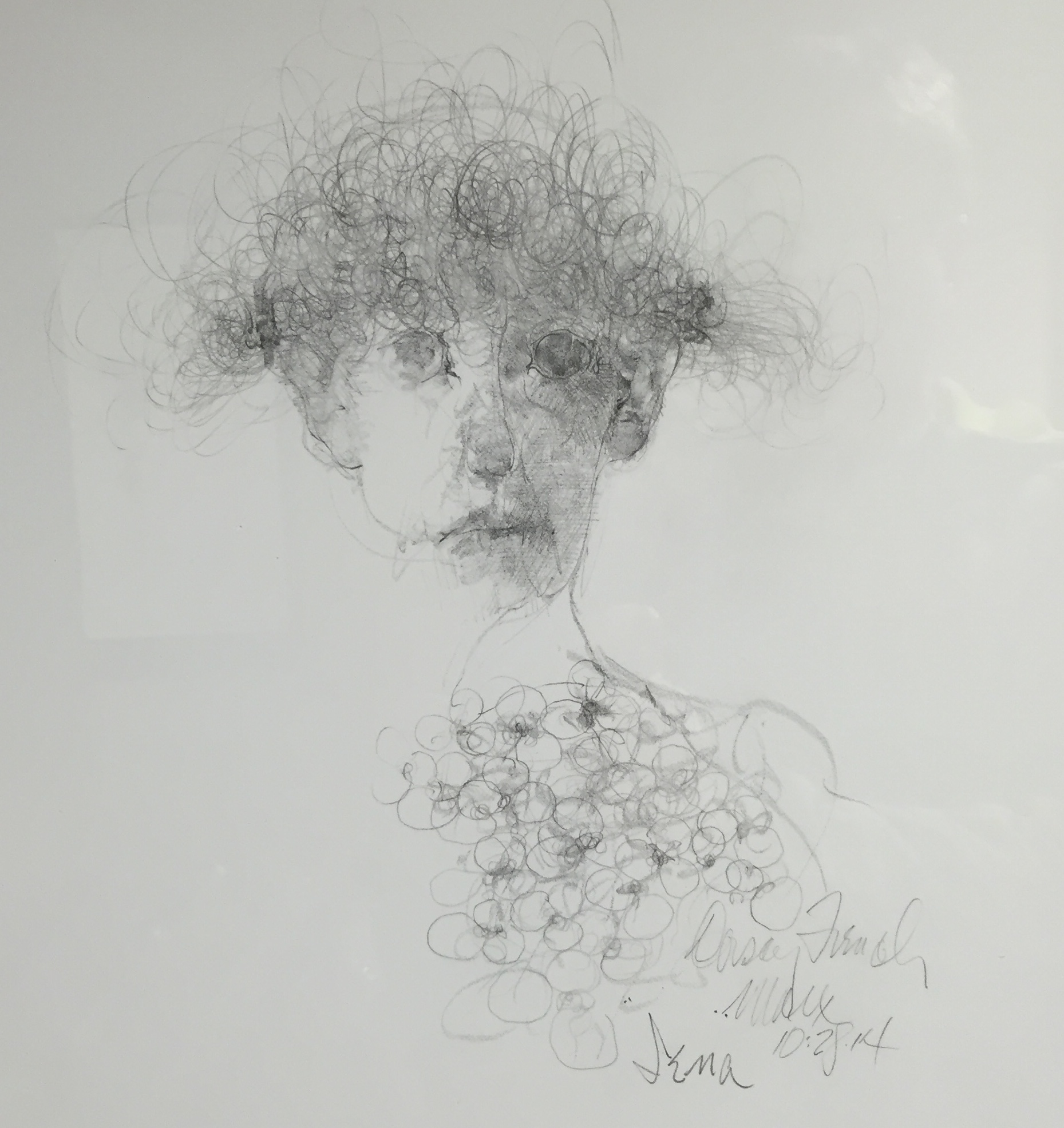
Iena, Robert Ernst Marx
I have to say Robert Ernst Marx, now 90, is still at the height of his powers, based on a recent visit to his current one-man show at Rochester Picture Framing. It sounded like an unlikely venue for such an esteemed local artist. Yet it’s a beautiful, perfectly-lit space, and Marx appeared to have sold around $20,000 worth of work already. So it appears to be a perfect fit. His vision is as it has always been: dark, full of spectral inquisitors and aristocratic succubi who seem half-Elizabethan, half-Gothic. His world reminds me of Goya’s black period when the Spaniard painted Saturn feasting on his son and Titans going after one another with cudgels in the dusk. Marx, too, paints the monsters generated by the sleep of reason–he’s as skeptical and unforgiving as a French philosophe. His figures emanate menace with nothing more than a steady gaze. In his minimalist portraits of spiritual deformity he invests all the complexity into the way he applies the paint while indicating as little as possible about his imaginary sitter. His color is surprisingly rich and subtle. In his drawings the line is masterful and utterly free and in the example above, occasionally lovely. That’s in his wheelhouse too.
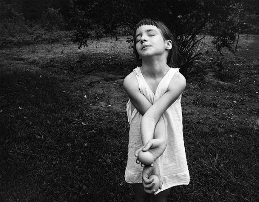
Nancy, Danville, Virginia, 1969
The day I graduated with my master’s degree in photography, my mother told me, we’re so happy you became a photographer. I looked at her, stunned, because I knew that her intention and my father’s had been for me to follow him [in the ministry]. I have exactly his name; I was to be the stereoscopic repetition of my father. So I stared at my mother, and finally she said, ‘Oh, we were so afraid you might become an artist!”–Emmet Gowin, from “Hidden Likeness”
1
When I came away from the Morgan Library’s recent retrospective of Emmet Gowin’s photography, I was stunned at how he was able to make his vision both personal and universal. In the last twenty years of his career, the personal element nearly disappears as he almost completely loses himself in loving attention to the world of insects. The smallest details in Gowin’s images often carry a lot of weight, and yet there’s very little detail in his work that anchors it to a particular era or even a particular place. His family photographs from half a century ago could have been shot decades earlier as a contrarian vision of idyllic bliss in Depression-era Appalachia—or in any number of other rural places. His aerial glimpses of catastrophes or environmental blight or nuclear testing sites remind me of shots relayed back from Pluto or Mars, or maybe fragments of inconclusive clues from one of Fox Mulder’s X-files. The truth is out there, but you won’t know what you’re looking for until you’ve shot it and brought it home. His wonderfully humble photographic catalogs of moths and butterflies in South America could be taxonomies from an entomology textbook, or a sequence of pictograms from a lost language. They are powerful in part because he is a lone explorer finding and honoring such tiny, obscure moments of nature’s inexhaustible beauty. The longer he has worked, the more universal his images look, and yet you can feel his idiosyncratic passion in every image.
It’s a wonder how much mystery and enigma he manages to convey, subliminally, MORE
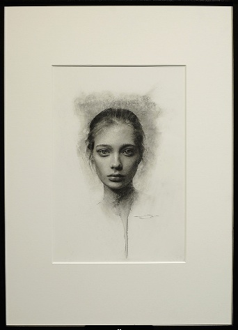 “Youth”, Casey Baugh, charcoal on paper, 16″ x 11″, Arcadia Gallery.
In the New York Times book review this Sunday, Jonathan Franzen used a term familiar to me only from Martin Heidegger’s writings on technology. As result I got curious to know how Thomas Sheehan’s recent book about the German thinker has been received. I didn’t come across any reviews with a Google search, but I did find a paper he’d written last year, “What, After All, Was Heidegger About?”, which serves almost as an overview of the new book, which I haven’t finished. The paper is far easier to understand than the book simply because it’s less laden with un-transliterated Greek words (there are still plenty) and the footnotes are easy to delete and ignore if you copy and paste the content into Word. How’s that for a workaround to avoid distractions? (My apologies to Sheehan’s assiduous attributions demonstrating the depth of his comprehensive scholarship on the German philosopher.)
I’ve read the paper a couple times and may post a reaction to it. I’m no authority on philosophy, but I still read it as part of an effort to cobble together, slowly and haltingly, a view of what painting has the potential to do, when it is at its best. Heidegger’s thinking represents a personal cornerstone in this effort, based on what little he wrote about visual art–though Sheehan’s essay doesn’t address the philosopher’s views in a way that helps me much with that right now. Still, it’s lucid and brief and apparently controversial among some core Heideggerians. But this is what I gather second-hand, because I don’t “follow” philosophy. I’m a layman dogged by philosophic questions, and I have only few un-entitled opinions to air about it.
Which brings me to the good news. Entitled Opinions, where I discovered Sheehan, is back! I’m only two podcasts behind in the new season. The Stanford University radio program had been gone for more than a year. I can’t wait to hear Robert Harrison’s new discussions as they become available. I can hear echoes, in the paper, of things said in conversation with Harrison, about how Heidegger did little to address the subject of ethics as a philosopher (and made some questionable ethical/political choices as an individual). But mostly the content of the paper is distinct from much of what Sheehan has said about Heidegger on this podcast. I hope he’s on deck, or at least somewhere in the season’s line-up, to talk at length about his new paradigm for understanding the philosopher.