Archive Page 10
January 7th, 2020 by dave dorsey
Peter Schjeldahl, courtesy The New Yorker
I was delighted when Jim Mott sent me some excerpts from Peter Schjeldahl’s sayonara at The New Yorker, inaugurating his retirement. I spend so little time reading magazines now; I missed it. May he move on to write a book, if he survives his battle with cancer long enough. The prospects don’t sound good. He’s always been my favorite art critic. I didn’t realize he had a faith, but it sounds as if it didn’t emerge until he quit drinking. Maybe I am reading too much into a couple sentences. In this cultural climate, it’s a brave move, albeit a bit quieter than Kanye’s, to offer a shout out to Christianity, which now seems to be equated unfairly with deplorable politics. It feels as if we are living in the cultural Dark Ages. (It helps if you quote Simone Weil; that “cherry on top” is a nice touch.) His judgments have almost always struck me as unimpeachable and delivered with wry self-awareness, meaning humility. The humility grows here to the proportions I consider de rigueur for an artist, and especially a critic. I agree with nearly any self-skepticism: I don’t know much, and maybe someday, if I’m good, I’ll know nothing, along with Socrates. Danto often has a similar tone of implied disclaimer: Well, this is how it looks to me, I could be wrong, but I don’t think so. But Schjeldahl’s doubt is less philosophical and more personal, hence more engaging and intimate. His first paragraph below says precisely what I recognized a few months ago after my father’s death, when I came across the Google street view photograph of the house my wife and I lived in during the first few years of our son and daughter’s childhood–the photograph did everything a work of art ought to do, and it was simply the tiny artifact of some camera mounted on top of a car moving past the house in the most impersonal way possible. It was essentially a surveillance shot. But it contained more than my world from those years; it gave me a window into the entire world, emotionally, imaginatively, and in some other way I don’t have language to pin down. I had been punished into receptivity at that point, granted, but there you go. That’s how it works. Danto would smile at the fact that the Google street view shot was art for me right then and there–though it would contradict his argument about the need for meaning–but it’s exactly what Schjeldahl is getting at.
From Schjeldahl’s farewell, courtesy Jim’s email:
To limber your sensibility, stalk the aesthetic everywhere: cracks in a sidewalk, people’s ways of walking. The aesthetic isn’t bounded by art, which merely concentrates it for efficient consumption. If you can’t put a mental frame around, and relish, the accidental aspect of a street or a person, or really of anything, you will respond to art only sluggishly.
I like to say that contemporary art consists of all art works, five thousand years or five minutes old, that physically exist in the present. We look at them with contemporary eyes, the only kinds of eyes that there ever are.
I retain, but suspend, my personal taste to deal with the panoply of the art I see. I have a trick for doing justice to an uncongenial work: “What would I like about this if I liked it?” I may come around; I may not. Failing that, I wonder, What must the people who like this be like? Anthropology.
Simone Weil said that the transcendent meaning of Christianity is complete with Jesus’ death, sans the cherry on top that is the Resurrection. I think so.
“I believe in God” is a false statement for me because it is voiced by my ego, which is compulsively skeptical. But the rest of me tends otherwise. Staying on an “as if” basis with “God,” for short, hugely improves my life. I regret my lack of the church and its gift of community. My ego is too fat to squeeze through the door.
Disbelieving is toilsome. It can be a pleasure for adolescent brains with energy to spare, but hanging on to it later saps and rigidifies. After a Lutheran upbringing, I became an atheist at the onset of puberty. That wore off gradually and then, with sobriety, speedily.
January 1st, 2020 by dave dorsey

Envy, from Giotto’s Arena Chapel frescoes
To paint pictures is to live in a state of paradox. What I intend usually just points me in the direction of what I achieve, and by not achieving quite what I want, I sometimes succeed in ways I wouldn’t have imagined and may not even realize. Occasionally I invest paint with something far better than what I could have intended or predicted. In every success, there’s a bit of surprise, if not discovery.
When you begin to realize how great paintings aren’t necessarily limited by whatever outcomes the painter desired, it dawns on you that this is how life itself works, almost invariably. All of your representations, all of your mental pictures of what matters in life fail to embody what it is you think those images represent. Try to picture anything—goodness for example—and whatever instance of goodness you imagine will fail to capture what it actually is. And, even if you lower your sights and accept the consolation prize of depicting what’s actually visible in life, even then, there’s shortfall. What you do picture to yourself as familiarly good will rarely resemble how living, new instances of goodness actually appear.
Early in Swann’s Way, Marcel Proust elaborates on a physical similarity between his cook’s pregnant kitchen-maid and one of Giotto’s figures of virtue and vice in his Paduan frescoes. It’s a little running joke between the novel’s protagonist and Swann, when he comes to visit and asks how things are going with Giotto’s Charity. As his focus shifts from the kitchen-maid to the painter, the way Proust elaborates on the Gothic painter, circling around his subject, reminds me of how Francis Bacon, in his essay on it, seems to turn the subject of Truth inside-out and then outside-in, until you are almost completely disoriented but left with a kind of Socratic doubt about your own callow assumption that you can actually know Truth. In the same way, you think you’ve understood Proust’s point and suddenly he seems to be saying just the opposite—this symbolizes X, but X is nowhere visible in the behavior depicted and yet the reality of X is embodied by it. Come again? It does make sense, but at first it feels like riding in circles on a Mobius strip. All the while he asks you to keep reconsidering what exactly is happening in Giotto’s paintings of virtue and vice—forcing you to go back and look at them. Which is both the first and last step in letting a painting do its work.
For years, I’ve considered Proust a purposely amoral novelist, someone so driven to see exactly what’s happening in human behavior and human consciousness, that he can’t stop to pass judgement on the behavior he depicts—not letting discriminations of good and evil constrain his phenomenology. Passing judgment on something gives you an excuse to ignore what you’re seeing. I’m beginning to think differently. In my third reading of this novel right now (first in college, second when the Kilmartin translation was published), I’ve delved only a hundred pages into the book, and it seems he was constantly thinking of goodness, interested in why his many of his characters found it so difficult to see and embody it. His ability to convey goodness was so fresh, so unsentimental, that it’s hard to realize what he’s doing as it happens on the page—in a way analogous to his consistent depiction of social and sexual relationships as detours that usually lead away from an authentic life. In a way similar to how I’m seeing this new dimension in Proust, this year I’ve become more and more interested in visual art that seems to be doing exactly the opposite of what I think painting and drawing should do when operating in its most innate way. Painting that has always struck me as the most fully realized has no meaning. Any effort to extract meaning from it is, in a way, to look away from what’s actually happening in the work, the awareness it can generate, and nullify it by translating it into thought. (In the same way, the best passages of Bergotte’s writing have an impact on Proust’s narrator unrelated to their significance. In one of his book’s quietly amusing moments, Bloch advises him to read only poetry that means nothing.) What’s most powerful in a work of visual art has nothing to do with meaning: deconstructing it will get you places, but it won’t replace the looking and often gets in the way. MORE
December 19th, 2019 by dave dorsey
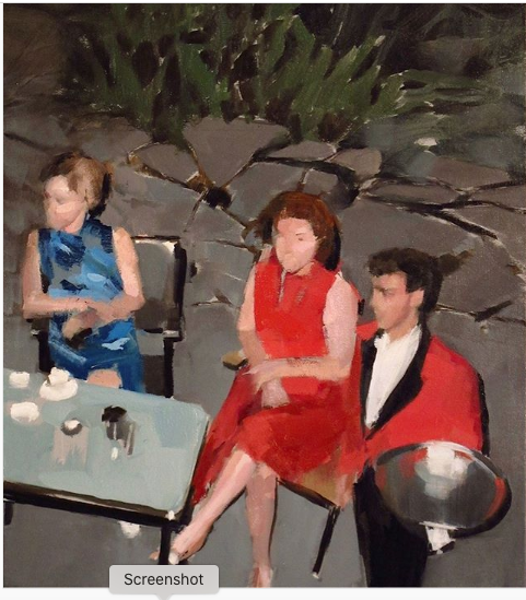
Mark Tennant, 20 x 16
Mark Tennant, 20 x 16. That’s all I know about this painting by an artist who has turned a bit of a corner in the past year or two–the simplicity of his execution has become extraordinary given how convincingly he puts one perfect tone alongside another. These chunks of color do exactly the job he asks them to do. In some cases he creates an almost expressionist surface that resolves, after a bit of viewing, into a bracingly convincing glimpse of women caught in a candid moment not intended for public consumption. No title, no medium nor indication of the support, though it’s almost certainly oil. He posts his work on Instagram and at his website, but it’s all untitled as far as I can tell. I did a post about an earlier painting of his not long ago, but couldn’t resist posting again, it’s so impressive. I found his scenes off-putting at first, murky and seemingly jaundiced visions of people lost in an eroticized world of youth and folly. Now I’m not bothered by lost-in-the-dark quality of his figures. The brushwork is so deft and accurate and minimal, as if he were the Fairfield Porter of cultural decline. At first, his work briefly brought to mind Eric Fischl and Richard Prince’s ironically prurient stuff, but this latest work feels more like early Richter. There’s a muted compassion in all of it, even though the scenes are illuminated unsparingly and the figures are mostly faceless. It all looks as if he has discovered troves of snapshots, Polaroids maybe and worked from them quickly–the way Martin Mull buys boxes of old, unwanted family shots at garage sales to use as sources. The bruised sexiness that runs throughout Tennant’s work is suppressed and seems almost accidental in many of the images–the young women are mostly unaware that there’s a guy with a camera eavesdropping on their misdemeanors, but in more than one of the paintings the women are hiding their faces. Many seem lit by flash photography, which adds to the tabloid feel that runs throughout, the awkwardness of bodies caught off balance or hunkered down in self-defense. He gets exactly how a single bright light source plays on objects in dim surroundings and his extremely abbreviated handling of paint captures the look and feel of an onlooker snapping a furtive high-contrast exposure of a compromised subject. The shot above could be from a cocktail party in the Hamptons or Connecticut, some partier with a Kodak Instamatic up on a balcony, gazing down at his bored fellow celebrants, the butler or caterer passing with his gleaming tray, with nothing to offer the idle women on the flagstone patio. The elegance and evening formality seem imported from America’s economic heyday, or else from last week in certain increasingly wealthy and isolated zip codes. Either way these privileged figures look as exposed and spiritually endangered as nearly everyone else Tennant captures unaware.
December 16th, 2019 by dave dorsey
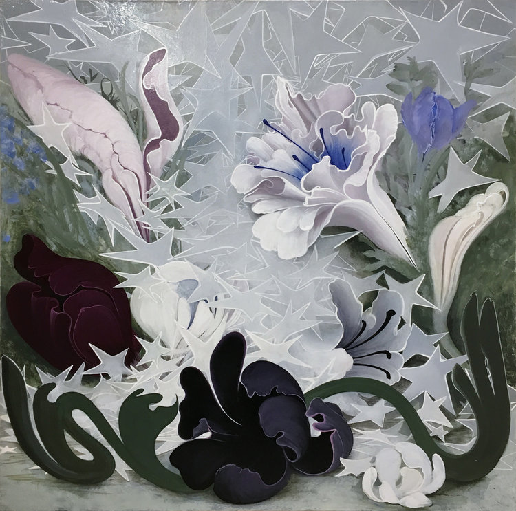
Flowers in Starlight, enamel on canvas, 24×24, 2018
The artist’s individual struggle, individuation as Jung would have put it, as it worked itself out in her own career:
I wanted to paint what today looked like or felt like. But as I just grew older it didn’t seem as important to make paintings that were necessarily as contemporary as possible. I wanted to make paintings that I wanted to make. You don’t have a choice. You can try to make the work you think everybody likes, but that isn’t going to work. If I had never changed then possibly I would just be that person who made paintings that looked as if they were done in the 90s.
–Inka Essenhigh
I didn’t want to be light and girly and trivial and I suddenly was and I loved it and it was all okay. And I had an immediate sense of relief. I could tell stories and I knew that I was on the right track for making something that was important to me. I could pursue what you might call “the inner world.” I could sit down and look for certain images I wanted to paint and they would look a certain way, they would feel a certain way. They could have that feeling of child-like wonder and I could bring it forward.
–Inka Essenhigh
December 7th, 2019 by dave dorsey
I’m beginning to realize it’s entirely fair to classify some of my work as Pop, and I’m comfortable with the idea. It doesn’t clarify anything—categorizations and schools and movements just obscure what’s actually going on in a painting—but I’ve begun to warm up to what Pop was doing, historically. It made me uncomfortable in the past, because I didn’t arrive at what I do as a way of emulating Pop Art at all. I’m sympathetic with the non-intellectual aims of that movement, the notion that visual art can be accessible and enjoyable to anyone with eyes and that visual art can, maybe should be, entirely a perceptual matter. I’m happy that Arthur Danto considers Andy Warhol’s Brillo boxes to have been a major philosophical meditation calling into question the nature of art and putting an end to the notion of progress in the history of painting—but I don’t think that sort of philosophical investigation was Warhol’s mission. Whether it was or wasn’t, Danto’s insight made me realize, in my thirties, that I could consider myself a contemporary visual artist, rather than just a latecomer. I don’t think Danto would agree with me that people now have permission to do exactly the sort of thing done in the past, without irony, and create work that is absolutely vital and compelling and fresh. But his insights make this conclusion inescapable.
I conclude from Danto’s thesis that for the past seventy years or so artists have been free to do anything at all, including exactly the sort of work that has been done in the past, and what they produce can be considered entirely relevant and contemporary. Everything is permissible because anything can be art. (This doesn’t mean anything is great or even good art: that’s as rare as it ever was.) Ending the tyranny of art history is the last, great liberation for individual painters—and it was Danto’s genius to recognize all of this. The challenge now is to become oneself, in whatever idiosyncratic way works, even if the outcome looks like a painting rooted in traditions from thousands of years ago. Picasso already understood this between the wars when he was borrowing stylistic inspiration from Ingres and the figures on attic vases for the Vollard Suite. Continue reading ‘Fine, Call Me Pop’
November 21st, 2019 by dave dorsey
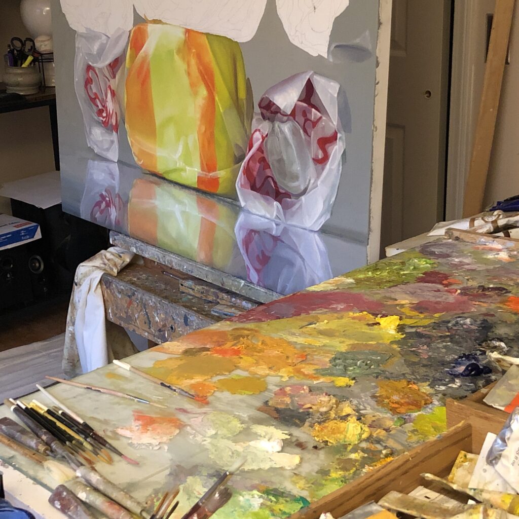
The Light in The Room, detail, oil on linen.
My most recently finished still life makes me uneasy. If I look at it in a dim light, before going to bed, I’m gratified that I did almost exactly what I set out to do—capture a glowingly illuminated kitchen in the middle of a bright, summer day. But during the daylight hours, if the surface of this painting is well-lit, I want to crawl into a corner and close my eyes.
I had this same feeling a year ago last month when I went to see my prominently displayed paintings—I could see them through the front windows of the museum while parking my car on the street—at the Wausau Museum of Contemporary Art exhibition in Wisconsin, jurored by Frank Bernarducci. Once I got up close, by virtue of the unsparing gallery lighting, the brushwork made my skin crawl. I felt exposed. The execution didn’t appear to have bothered anyone else, considering the placement of the two paintings. But ever since that opening, I’ve been concentrating on the thickness of the paint—endeavoring to get a Goldilocks feel, not too thick, not too thin—and the way I need to handle it, wet on wet. I’ve been conscious of the desire to user thicker paint for years, but this determination to paint wet into wet began when I returned from Wisconsin last year. (I make exceptions when this isn’t possible, when I see something in the already dried coat that makes my stomach tighten with disappointment, as it did yesterday with the taffy painting I’m doing now. But I make my amendments by putting down uniform areas of wet color and then going back to push detail into them immediately.)
I don’t want what I’m rendering to look hyper-realistic. The paint should look like paint, not the surface of a photograph. But it needs to flow gradually from one spot to the next. No rough edges where edges don’t form clear lines and borders in the source. So now, today, the formerly irksome part of the painting doesn’t make me want to hide when I look at it. It’s all about the nature of the brushwork, the energy and visibility of the mark (or just the way the paint flows from one tone into another) as catalyst for how the eye flows across the image and reads it. I don’t expect my brushwork to be what it is in Van Gogh, or Sargent, or Manet, or Hals, or Thiebaud, or Jenny Saville. But the brushwork now doesn’t get in the way of what pleasure I get from looking at what I’ve done. It isn’t at odds with the image. But when I see areas where the paint is applied skillfully in terms of value and hue, but it just looks awkwardly scumbled, dragged across already-dry paint, and the edges of each spot of color make it look scuffed and chaotic, then I want to slip the painting away into storage. I don’t, because it’s a decent enough painting. Yet his knowledge doesn’t help, which I take as a good thing. Excellence requires striving.
It’s all about whether or not the eye bumps into a spot of paint or glides over it, riding the energy of the paint itself, the life it imparts to the act of looking. I am probably right in reacting this way to the work I’ve done. But maybe not. When it comes to painting, it’s best not to be certain of anything except in those rare cases when I know the painting is really finished and as good as I can make it. (I’m certain about the prefection of most of Vermeer, and quite a bit of Piero, but that’s a pretty safe certainty and though I know I’m looking at a painting when they’re the ones making it, the marks they make aren’t all that visible.) The less refined execution might end up being what people value most in some of these paintings I want to avoid seeing—the way in which the surface is at odds with the image it induces you to see. In fact, I’m constantly trying to do smaller, more improvisational paintings that are all about the visibility of the paint and where the areas of paint look abstract and unrecognizable up close—in other words, simplified and much more painterly work. But this isn’t what I’m after in the sort of paintings I’ve been exhibiting over the past decade—with the exception of one small interior with figures, quickly executed with easy brushwork, I showed at a pop-up in London years ago.
The humorous element here is that with either kind of brushwork, my current painting looks roughly the same from a few feet away—and the magic of Chardin resides in how, up close, it is just a chaotic mess, while a little farther away, it’s amazing. But it’s a good chaotic mess up close. His paint was thicker, more sensuously applied, more like Thiebaud than Vermeer, so that the paint itself was a pleasure to see. As opposed to what I’m dealing with. But I’m working on it.
November 18th, 2019 by dave dorsey
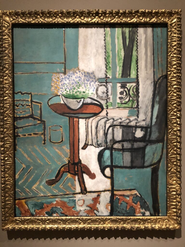
The Window, Matisse, oil on canvas, 57″ x 46″
One of the treasures from my visit to the Detroit Institute for Arts Museum, and displayed near two equally excellent paintings. Historically speaking, it’s only a short walk from this painting (hanging with two equally beautiful pieces by Matisse) to the work of Richard Diebenkorn. Yet this was painted half a century before Diebenkorn’s Ocean Park series. What’s baffling is how so much lyrical feeling can be invested in such a restrained and limited range of colors.
November 14th, 2019 by dave dorsey
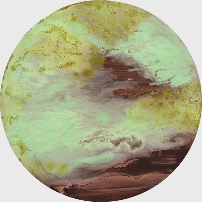
Moment #34, H.K. Freeman, oil on panel, 18″ diameter
I collect spoors, molds and fugus.
—Egon Spengler
In the fungus among us, H.K. Freeman sees a world suffused with seemingly chaotic but purposeful mystery. That alone marks her as someone worthy of attention. Fascination with things almost everyone else ignores or shuns, for me, is a springboard for originality in visual art. She is yet another interesting artist I discovered in Manifest’s recent Painted exhibit. Freeman’s current obsession reminds me of Emmett Gowin’s full immersion in the South American rain forest, devoting himself to capturing moths, not with a net but with his photographic lens. Yet moths are already beautiful. Anyone who has come across a cecropia moth, as I once did in our back yard many years ago when we lived in Utica, will not be able to look away, the wings are so Blakean in their eerie glamour. With fungus, not so much. Noting the mold on my basement cinder blocks after a rainy month, I reach for the bleach.
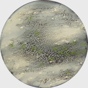 But Freeman is a spiritual cosmologist. She sees wonder and mystery in what others recognize only as decay. She marvels at a devouring life form that is neither animal nor vegetable, but something that eats the world’s leftovers as an after-after-party clean-up crew. In all fairness, anyone who has enjoyed a portobello or truffle knows that fungus can taste pretty good, as well. Freeman shows us something more rarefied in her sometimes tiny spherical paintings of fungus that look like miniature worlds viewed through a microscope, or the surface of planets light years away.
She’s at her best when she finds a symbiotic strength in her medium’s proclivities, offering a little guidance here and there—like a color field painter pouring and steering a flow of paint. It’s both a practical and a symbolic relationship with materials. Anyone who has worked in the natural world, say, growing a garden, recognizes the partnership. The garden does most of the work. Anyone who has tried to steer himself or herself through the world recognizes how free will represents a tiny marginal allowance you earn through prior discipline, simply for the chance to choose against the daily inertia of one’s character. You are there to nudge things—including yourself—this way and that, toward the desired end. When she finds the effects she wants by letting the paint do what it does on its own, but  intervening where needed, the work is enchanting.
What’s marvelous is that, in this fascination with one of the lowliest of life forms, she sees God. She doesn’t preach, just passes along her awe at how much order and beauty and shines forth from the world of decomposition. She’s working a field Richard Wilbur tilled in his great poem about the vulture, and how that carrion bird’s meals serve the same purpose as an ark, delivering life from death.
From Freeman’s website:
The intricate worlds of lichens, fungi, and mosses serve as a starting point for my paintings. These sublime organisms help ensure and maintain life on earth. I draw upon the history of landscape painting and abstraction, together with eco-theology, to communicate spiritual ideas in relation to creation. Using the finite to think about the infinite, the paintings evoke the mysterious, wondrous, interconnected process of existence.
I alternately manipulate the paint and playfully relinquish control to create these worlds. The imagery simultaneously fuses and dissolves, oscillating between certainty and uncertainty with the promise of resolving into something familiar. The luminosity of the colors and the use of abstraction convey the euphoric, transcendental sensation of my initial encounter with the subject matter. The abstraction and the colors stimulate not only the visual senses, but also act on the psyche to contemplate the painted microcosms. I hope the references to creation will invite viewers in, while the abstraction will challenge viewers to perceive in a way that goes beyond the surface of the painting, so they can explore their own thoughts and beliefs.
November 11th, 2019 by dave dorsey
Ed Clark, Maple Red, Oil and mixed media on canvas, 73″ x 76″
I discovered this magnificent painting at the Detroit Institute of Arts Museum on a visit late last month to Detroit. I recognized the artist when I saw it from a distance only because I’d recently discovered him after news of his death. I felt like Art Brut singing about their ignorance about The Replacements: “How have I only just found out about Ed Clark?”
October 30th, 2019 by dave dorsey
Untitled Study, 2014, oil on canvas, 42″ x 56″
I can say that my drive to make art is a desperate issue for me. If I was motivated narrowly by my desire to place myself in some kind of professional situation, where I was primarily concerned with the work’s status within a narrow set of theoretical discourses, then I am not sure that I could proceed with the faith and doubt necessary to the work. I want the work to make sense to people whether they are educated in art theory or not. Like good music I hope good art takes you in. It is hard work to make art and I want to think that it matters to people. That it enlarges our capacity for living.
—Dana Saulnier
In an interview a bit harder to penetrate than this lucid remark in the middle of it, Dana Saulnier offers a couple of tangentially related thoughts. I spotted his work in the recent exhibit at Manifest Gallery, so I delved deeper into the paintings already familiar to me from his show at First Street. In this brief observation, Saulnier resists the professionalization of art. It sounds as if he’s saying that he refuses to find his place in whatever happens to be going on theoretically or, as I would put it, conceptually, in the art world. He doesn’t need to belong. I like this, because he’s asserting his individuality, but also because theory comes second here. Starting from conceptual premises works against painting’s ability to convey an awareness more oceanic than conscious thought–so it’s ass backwards to make a painting to illustrate an idea or a theory of art. To look for significance in visual art can obscure what it’s actually doing. An industry of critical thought depends on the need to extract significance from creative work. As Tom Wolfe pointed out in The Painted Word, to make work that depends on criticism for elucidation or justification upends the relationship between creativity and critique: the critic rules the creator. Postmodernism depends on this. Painting begins to obey the need to be significant in such a way that it will attract critical approval. What gets put aside is attention to what a painting can do, in contrast to what, say, a novel does. Work that arises out of a theory of art, or any conscious purpose, reduces a painting to the role of “signifier” which has, at least, the virtue of keeping critics busy. It sounds as if maybe Saulnier wants to sidestep all of that and allow his work a more elusive impact—though his own critical thought about his work throughout the rest of the interview would seem to argue otherwise.
In this short reflective comment, though, he also says he wants his work to be available and effective, in some way, for people who know little or nothing about art in general—again suggesting that a painting’s work is unmediated, requiring neither commentary nor training. Looking is required; thinking optional and not advised. (Tolstoy’s theories of art toward the end of his life took a similar stance, repudiating much of the Western canon that most educated people would have considered sacrosanct—and quite a bit I would hate to lose, personally. But his intent was to remain true to the wisdom he earned after narrowly avoiding the impulse to kill himself over his inability to understand life intellectually, all of which he dramatized in Anna Karenina.) Granted, some of the most thrilling and powerful visual art has significance in the sense that it conveys much that can be clarified by criticism and commentary and training. It represents ideas, it has significance, the way language does. Yet, for me, the greatest painting has no significance whatsoever, but is instead a perceptual catalyst, a representation only in the sense that an aroma represents a meal. A scent doesn’t signify anything but its provenance—it’s an element of its life-sustaining origin and it brings you toward that origin in the way a painting by Braque could be said to embody the world it invites the viewer to inhabit. How it does this is utterly mysterious, and that isn’t a reality that offers much mileage to critical conversations about it.
October 18th, 2019 by dave dorsey
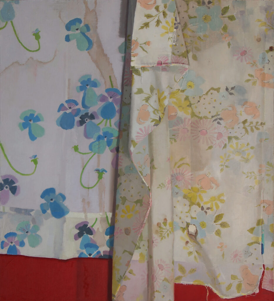
Laid Down, Erin Raedeke, oil on canvas
I first noticed Erin Raedeke’s paintings when she was a member at First Street Gallery in Chelsea some years ago and was immediately charmed by her handling of color. Her delicate, playful images of birthday party detritus, strewn across the field of view, gave her endless ways to improvise with tones that created deeply felt, personal color harmonies. The work was representational but also “all over,” without the negative space typical in a still life, the objects in the foreground against an empty background. The work was fine-tuned, with attention to unique details, but gracefully and effortlessly executed. If she worked from photographs, it didn’t show. My first thought was that Fairfield Porter would love the work. Nothing is overdone; the paintings appear to be first responses to whatever she sees without much going back over earlier marks. I saw her work again in 2015 at a group show curated by Matt Klos at Anne Arundel Community College. The painting in that show was simpler and harder to read, but still executed in the same steady, quiet and idiosyncratically personal insistence on representing humble objects in recognizable space in order to come up with results as close to abstraction as representation.
Her birthday party images give her an ample and varied palette of hues—almost any color can be made to fit into an image. Conical hats and flaccid balloons could be strewn across a surface to create patterns and shapes at will, though she was sedulous about keeping her subjects as random-looking, as “found” as possible. Departing from the party leftovers, she has used layered fabrics to create quasi-minimalist abstractions, some almost as radically simplified as Rothko or a Barnett Newman zip. The top layer of fabric would be torn or punched in places to reveal the color or pattern of what was underneath. Some of these paintings were as large as five feet tall, adding to their sense of kinship with abstracts from the mid-20th century. Yet even in this flat, minimal work, Raedeke has been just as diligent in capturing factual detail—the frayed tendrils of thread bristling from a torn edge running across a canvas as demarcation between large areas of nearly uniform color. She has an insistence on rendering lines as thin as spiderweb. Such minute detail in a sea of color seems like a pyrrhic effort to pull back from the larger strategy of enveloping the viewer—but it works. Oh, OK, we’re looking at cloth. There is something compulsive in this, in the way that much of what’s best in a particular artist’s style represents a surrender to inarticulate instincts about what needs to happen simply to make a picture come alive. Yet that adherence to minor detail makes even these larger, more amorphous paintings approachable, humble, amiable—when you recognize what’s been represented they snap back into insignificance, studies of what nearly anyone else wouldn’t even have bothered to notice. The fabric even looks a little stained.
Her recent work is included in Manifest’s Painted, and it seems like a culmination, in a way, of what she’s been doing over the past decade, from the versatile color of her birthday party messes to the almost ascetic renunciations of the fabric paintings where she seems to want to improvise as simply as possible with color and form and space and yet still show you something you might actually see on the surface of a bed or countertop. She’s sticking with fabric, but there’s more depth—and the patterns of this fabric give her room to vary color and line and shape It hangs like a curtain, and its decorative print gives the painter a way of bringing back the musical tones. In this case, it’s just a pair of muslin sheets, it seems, decorated with floral patterns, a scattering of blue pansies on the cool side of the painting. The fabric hangs in supple folds, against a deep red background that shows as a slash of color at the bottom, beneath the hems. It’s as humble and unspectacular as possible, but the patterns are rendered with care, almost gratitude for the opportunities they offer.
The particular integrity she brings to her work shines through in this insistence on painting nothing but what she sees—even if it’s merely the torn edge of monotone, porous cloth—in order to create a nearly flat field of color. If you allow for varying degrees of flatness, this is a pursuit common to countless painters, but she brings a lyrical, almost wistful quality to her images, as if she’s nostalgic for the moment, a few seconds ago, that she last glanced at her subject. And in the work I enjoy the most from her, the impression of flatness gives way to depth—albeit the shallow relief of curtains or layers of wrapping paper under a half-eaten hamburger. They’re fragments of a larger experience, not signifying anything but rather saturated with her sense of how life feels.
October 13th, 2019 by dave dorsey
Towards Dam, Michael McCaffrey, oil on panel, 8″ x 8″
This little work is lit with an intensity that Van Gogh went south hoping to find, painted with an economy of means Edwin Dickinson pulled off in his premier coup canvases. It’s tiny, eight inches square. At that size, Michael McCaffrey invests a humble power and life into his kinetic, tactile marks. It makes De Kooning’s slashes of paint seem hyperbolic and theatrical by comparison. McCaffrey’s targets are way harder to hit, being so finely calibrated, which concentrates the power of his marks, his accuracy of representation making the brute physicality of his brushwork so energizing. The stucco promontory in the front looks as dazzling as coral, and yet also gently evocative of early growth in the spring. It works observationally, gives a convincing glimpse of a grassy patch, yet that sandpapery swath of color easily could be a detail from Braque.
One of the many mysteries of painting is how such rough execution, such raggedy shreds of paint, applied as if the project were masonry rather than a picture, conveys the raw light and air, no less, the clean scent of that tumbling breeze, almost by accident–the way rhyme somehow coincides with the exact articulation of something new in a sonnet. The sky and clouds are a sort of hyper-blue that feels like one of those noons in March, warm with spring sun but still chilly with late-winter wind. The wiped-away blur of olive and ochre and murky blue-green across the middle works as a distant landscape with a tree for this miniature world to pivot around. It looks as if he’d painted with blunt, bristly instruments, and maybe a cotton rag, that little random scribble under the cloud carved into the wet paint with the dull point of a brush handle, like a jerky signature. Michael McCaffrey’s work can be seen in Painted at Manifest Gallery, and spotting his name in that show, I went hunting, and I found this wonder from the past along with a few equally impressive little landscapes, executed with the same kind of heedless joy.
October 9th, 2019 by dave dorsey
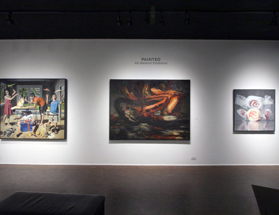
Taffy #2, on the right, next to work by Perin Mahler, far left, and Dana Saulnier
Taffy #2 will be in Cincinnati at Manifest Gallery until later this month, in Painted, the organization’s 4th biennial survey of contemporary painting. It was up against some stiff competition from the U.S. as well as from a number of foreign countries. As the indefatigable Manifest crew says on their site:
For this exhibit 167 artists from 35 states, Canada, Greece, Singapore, and Turkey submitted 682 works. Thirty-three works by the following 26 artists from 17 states were selected by a blind jury process for presentation in the gallery and the Manifest Exhibition Annual publication.
Jason Franz, the gallery’s director, sent participants an email with nearly exhaustive photography of the beautiful installation. The glimpse it offered of the other work inspired me to search out a better look at the paintings on view—from the artists’  websites. I’ll be posting some brief appreciations with images of paintings from the show over the next couple weeks. Some of the most arresting work was from: Kim Anderson, Hannah K. Freeman (can’t wait to see where this young artist goes with the devotion she brings to her work), Donald Keefe, Anne Lindberg, Martina Nehrling, Robert Samartino, Carol Stewart, Dganit Zauberman and two painters associated, in the past and now, with First Street Gallery in Chelsea: Dana Saulnier and Erin Raedeke, one of the most delicate and lyrical of contemporary perceptual painters, whose work I’ve written about before.
I’m hoping to get back to a regular schedule of posts, after four months of nearly total immersion in caring for my parents. It was a sea change of a summer for me, and I hope I can channel my response to that ordeal into a renewed dedication to daily painting. Even so, for several members of my family, a relocation to the Northwest where I grew up may be on the horizon over the next year. It will pull me away from the ability to work for another (much shorter) hiatus at some point. It’s a frustrating period for me, because I’ve reached a point where I know I can apply, in an organized and reliable way, what I’ve learned to do over a period of decades.
All in due time, you might say, but patience is easier to observe than to put into practice. It is the hardest virtue to learn in painting. But during these unjustly lazy-feeling periods of hiatus from the studio, I will feel like a sinner even if I develop all the patience in the world, because I always have Kafka’s aphorism in the back of my mind: “There are two main human sins, from which all the others derive: impatience and indolence.” No matter how hard I work at other crucially vital things, time not spent painting feels like time lost, though I know this feeling was my enemy and not my friend this past summer. I’m happy I didn’t heed it.
September 27th, 2019 by dave dorsey
E.M. Forster’s A Room With a View delivers its wisdom with affection. There are no villains in this novel, only people who, unintentionally, without malice, lead others astray. This is a universal human predicament for Forster, primarily because individuals can so easily lead themselves astray, and he finds it both amusing and problematic. People may be hopelessly lost most of the time, but he doesn’t dislike anyone for that. It is a very amusing novel, though it’s also one that can bring the occasional tear of humble gratitude to your eyes for the warmth Forster shows to all his characters. As with Jane Austen’s vision, his is the story of someone at risk of never recognizing that everything she wants is right in front of her. This isn’t just a familiar high concept for a romantic comedy, it’s also Forster’s general view, in the novel, of human awareness. It’s a book about the folly of conformity in the social world and, on an epistemological level, the ignorance embodied in knowingness. The challenge for his characters is how the mind becomes a prisoner of what it takes for granted. His story shows how one heart wins out against the long siege of the mind. In all of this is a hint at the role visual art can play in human life. In a world where a well-timed view can offer escape from the mind’s confinements, visual art is situated to open some doors.
In the foreground of the story are groups of people who are hyper-aware of one another, self-consciously doing what they are supposed to do, seeing what they are supposed to see, Baedeker in hand, a herd of travelers obedient to their own confirmation bias. They judge themselves and one another by conventions that channel their lives into safe, predictable paths. Abroad and at home, they are like bees gathering pollen without ever seeing the garden.
As a backdrop to this comedy, the novel offers glimpses of a categorically different, all-encompassing way to see the world. The sky, the sea, the hills, untouched by the seasons, preside like Greek gods–but ones who have ceased to meddle, for better or worse, in the plight of the book’s characters except to show them a radiance that hints at freedoms they seem to dread. Those elements serve as backdrop and origin of everything human, all of the events most threateningly vital and beautiful: a sea of violets, a face at a window, a kiss in an open field, a passionate murder in a piazza that erupts in front of Lucy Honeychurch and then fades like a thunderstorm until it almost seems to have never happened, at least to her. She shakes it off and shuts it out.
The book can be read as a comedy, but it’s a novel with sobering convictions about the estrangement of psyche from eros (in the largest sense of eros as an appetite for Life beyond the grasp of understanding). The struggle to harmonize mind and heart rises to the status of a spiritual ordeal: their estrangement is a sort of original sin in Forster’s world. George Emerson scrawls a question mark on a sheet of paper that he leaves behind in the room that Lucy and Charlotte eventually occupy after they arrive in Florence. He’s obsessed with what Heidegger would call “the question of being.” He can’t make sense of the universe. It’s an impenetrable puzzle to him, as his father suggests to Lucy in a quiet moment. He tells her that she could befriend him, free him from his question mark and help him say yes to life.
It doesn’t appear to be a tough assignment. A glimpse of her beauty is enough. As Lucy wanders off looking for the Rev. Beebe, she steps onto a natural terrace covered with violets that have spread out and down the hillside, overflowing and flooding the hill with color. Forster situates Lucy at the source of beauty itself: “This terrace was the well-head, the primal source whence beauty gushed out to water the earth.” Whether or not beauty will save the world, as Dostoevsky wrote, it’s all that’s needed to get George reoriented. Lucy realizes she has stumbled onto this disturbing, unconventional young man, raptly observing the view of the trees, hills, sky, and when he sees Lucy riding her sea of violets, like Botticelli’s Venus, he strides forward and silently kisses her. The death in the piazza she was able to shake off within minutes. The kiss, though, infects her with an anguish of divided emotions she wrestles with for the rest of the story. Unconsciously, she can tell where this all leads, and it terrifies her. She shuts the window on it, the way she did with the murder in the piazza, and acts as if nothing has changed in her–that a man has simply insulted her virtue. But the rest of her story shows her fleeing what she feels, hiding from the fact that she loves someone odd and unconventional and at times offensive to the people around her.
Lucy “was sure that she ought not to be with these men; but they had cast a spell over her. They were so serious and so strange that she could not remember how to behave.”
Finally, because of the elder Emerson’s insistent compassion for her and her son, she finally awakes from the self-deceit of her engagement to the most educated and knowledgable man in the book–the one least aware of the beauty in Lucy’s character.
There has always been much talk about the novels of ideas. Saul Bellow was once heralded as a thinker. Yet as brilliant as Humboldt’s Gift is, Bellow applies a welter of ideas to the story the way a gardener applies compost. (In the book, Humboldt calls himself a “shoveleer.”) Bellow’s musings, transferred into the mouths of his characters, help expand and grow them in the mind of the reader, because they indicate so much of Charlie Citrine’s and Humboldt’s inner lives, but the action of the book has little to do with the ideas his narrator wedges into the events. The story simply gives the author an opportunity to digress into the historical and philosophical and metaphysical speculations that preoccupy him. Forster’s characters, in their conversation and behavior, their emotions and thoughts, embody and enact Forster’s central insight about the limits of human self-awareness. They don’t tell you about it–they aren’t aware of it themselves–instead, they show you. At one point his narrator simply steps in and states directly what is obviously happening, simply to underscore the central idea of the book, that people have to struggle all their lives to take one honest step: to recognize who they are and what they should do.
The contest lay not between love and duty. Perhaps there never is such a contest. It lay between the real and the pretended, and Lucy’s first aim was to defeat herself. As her brain clouded over, as the memory of the views grew dim and the words of the book died away, she returned to her old shibboleth of nerves. She “conquered her breakdown.” Tampering with the truth, she forgot that the truth had ever been. Remembering that she was engaged to Cecil, she compelled herself to confused remembrances of George; he was nothing to her; he never had been anything; he had behaved abominably; she had never encouraged him. The armour of falsehood is subtly wrought out of darkness, and hides a man not only from others, but from his own soul. In a few moments Lucy was equipped for battle.
The battle is with herself. Lucy’s peril is everyone’s. She’s like Huck Finn feeling guilty for freeing a slave and yet ultimately unable to stop himself–precisely because he’s a good person, though he believes himself a criminal. Lucy’s “views grew dim” as she locks herself into the room of what she thinks she should do. George and his father are exceedingly odd ducks, awkward men she knows are unacceptable in her circle–they are embarrassing–and yet everything they say and do opens her soul to the beauty of her life.
Forster’s religion is individual, idiosyncratic, the religion closer to William Blake, the early Wordsworth, and the American Renaissance, one without an institution to contain or channel it. He keeps organized religion at arms length and gently mocks it in the figure of Rev. Eager who is giving a pedantic–but well-informed–tour of the Giotto paintings at Santa Croce early in the book. But one of the wisest and kindest people in the novel is Rev. Beebe, almost an avatar for the book’s narrative intelligence that nudges people in the proper direction, hoping for the best, expecting much less, while forgiving them for whatever ends up happening. What’s required in Forster’s world isn’t knowledge, but rather a new sort of self-knowledge that’s rooted in an expansive sense of the world’s beauty and joy and a conviction of human fallibility.
The book is essentially about the real meaning of the word “repentance” in the New Testament: the need for an upheaval and transformation and radical reorientation of human awareness through humility. The story embodies this transformation without ever talking about it: it’s the armature of the story. Metanoia, as the Greeks referred to it, means to do an about-face, to gain a completely different view of life–but when that upheaval comes for Lucy, sorrow is all she feels, until the joy of realization floods in. The transformation Foster is trying to dramatize is about awakening from the sleep of safety and predictable routine and propriety to a riskier engagement with what is unpredictable, what’s “indelicate but beautiful” as the book expresses it early on. It’s about doing the inappropriate but beautiful thing, again and again, as the only path to a true life. As the elder Mr. Emerson–the most compassionate and socially awkward soul in the book–says, urging Lucy to realize she loves his son: “Life is a public performance on the violin, in which you must learn the instrument as you go along.” This is Emerson’s greatest gift to Lucy, shocking her into a view of her own heart. His words devastate her, at first, but his tenacious compassion, the depth of how much he cares for her and his son, enables her to see herself for the first time.
Up from the labyrinth of common sense and conscious reasoning, somehow or other, she gets a glimpse, a view, of the whole of life–and this view, this life preserver, is a gift not an achievement. Lucy and Charlotte are given their view of Florence and the Arno at the start of the book–and Lucy keeps being given an enlarging view of the world throughout the story. They don’t earn it; mostly they don’t even want it. The book is all about the tension between the safe confines of the room of daily life–habit, convention, caution, and prudence–at odds with the rescue of a beckoning view. It’s all about the struggle to finally see the truth by letting go of what you think you know. The opposite of ignorance, for Foster, isn’t knowledge. Those who know the most are the least likely to see the view.
Modernism, in painting, began with a rejection of knowing in favor of seeing the world with fresh eyes–and nothing more. It was an attempt to replace ideas with life. Cezanne had highly influential ideas about how to paint, but not about what a painting was supposed to mean. Impressionism offered a way to see the world directly, without reference to myths, without trying to turn a painting into a metaphor. Modernism and post-modernism moved on from this radical, original shift that put seeing as the whole point of the enterprise. Since then, thinking has returned to painting with a vengeance. Yet modernism began as a way of putting into practice Blake’s assertion that you can escape mind-forged manacles through “an improvement of sensual enjoyment.” This sounds fraught with problems. But Blake was pushing back against the intellectualism and skepticism of the Enlightenment, its disembodied lucidity. Painting, for Blake himself, was one way to enact this insight–open your eyes in order to open your mind, which was a credo implicit in Impressionism.
Pure painting requires the painter and the viewer to simply pay attention; thinking about what’s been shown or seen is an option, not a necessity, and usually an impediment. It blocks the view. The particulars of what’s seen matter in a technical way, enabling the painting to work, but it’s the integral nature of the view that’s mysterious and inaccessible to intellect; this wholeness is the whole point, as it were, regardless of all the specifics of an individual work. In Forster’s novel, music serves this function. Lucy plays a bit of Beethoven on the piano, immerses herself in Beethoven’s world, and then ventures out into the world of Italy more open to its possibilities, receptive to what’s there. (In one of Forster’s other great novels, Howard’s End, the Schlegel sisters debate whether painting and music do essentially the same thing.)
In Rev. Eager’s little textbook commentary on the Giotto paintings at Santa Croce, Forster gives one of his most foolish characters a chance to express the book’s deepest wisdom about art and life. The paintings don’t shine because of technical qualities. They make visible something otherwise inexpressible: “Observe how Giotto in these frescoes—now, unhappily, ruined by restoration—is untroubled by the snares of anatomy and perspective. Could anything be more majestic, more pathetic, beautiful, true? How little, we feel, avails knowledge and technical cleverness against a man who truly feels!””
July 28th, 2019 by dave dorsey
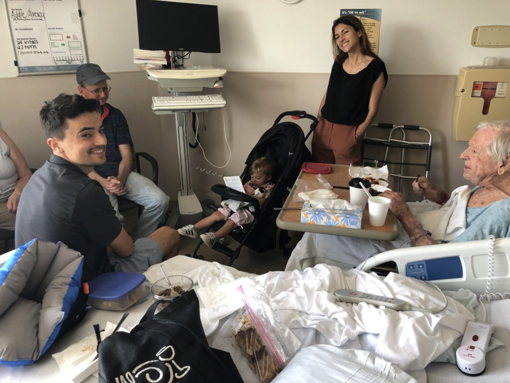
Part of the extended family in my father’s hospital room a week ago.
And therefore I looked down into the great pity of a person’s life on this earth. I don’t mean that we all end up dead, that’s not the great pity. I mean that he couldn’t tell me what he was dreaming, and I couldn’t tell him what was real.”
Denis Johnson
When I got to the hospital to tune my father’s institutional television into the last round of the British Open on NBC a week ago, we had an unusually lucid and direct conversation about whether he should just go home and let things run their course, rather than be transported to a nursing home tomorrow, potentially for weeks of rehabilitation and healing. It was both honest, but also hyperbolic—a way of simply telling me that he felt completely defeated and cared only about going home.
“So we’re going to rehab after this to keep me alive?” he asked.
“Yes, to get you better.”
“Then why can’t I just go home and die?”
“I understand the question, Dad.”
“I’ve had a good life.”
“We want you around. We want to get you healed up and back to the way you were before you got to the hospital,” I said. “Get better for us. Do it for us. We miss you.”
At that, he started to cry, and I went over and put my arm around his head, the only way I can give him a hug anymore, since he’s usually seated—this time he was still in the surgical bed adjusted into an armchair position. I told him no one can force him to go to the nursing home, and it’s entirely his choice to have us bring him home or go into rehab where he was accepted for it. He seemed to find this reassuring, but I’m not sure he believed that we would listen to him. He had the power to choose his future, but he was willing to choose rehab. (Which he did and where he is now getting better very slowly but with more emotional balance.) Emotionally, at 92, suffering from significant cognitive impairment, unable to walk as a result of stenosis and vulnerable to pressure sores, he has often felt left out, disregarded in conversations, hovering at the periphery of whatever is happening around him. This has been the case for the past couple years. It’s intensely frustrating, an invitation to despair, for a former CEO, a man who ran a total of four different newspapers at various points in his career, who was honored with an award from President Reagan in the Rose Garden for his work in the volunteer sector as head of the Gannett Foundation, when that organization was still operating as a force for change in the communities served by Gannett newspapers. He was a pen pal briefly with Barbara Bush, and was conversationally acquainted with three presidents in his various roles at Gannett, Independent Sector, and the American Council for the Arts: Reagan, Jimmy Carter and even Nixon, many years ago, after he joined Gannett. All of that feels like a dream now, the life of a different person. Now, like a little boy with mournful eyes, he waits patiently as two women he met only in the past week come into his hospital room to lift him up and change his clothes, get him into a reclining chair, adjusting his catheter, clean his wound with a bleach solution. The pressure sore after debriding was the size of a shallow cupholder, looking as if it had been created by pressing a round cookie cutter into his bottom. It will take months to close up and will require debriding by a specialist. He feels nearly helpless and totally at the mercy of everyone and everything, and this would be some fresh hell for anyone, let alone someone who controlled organizations for a living. Now his life is subject to the prerogative of diligent people he hardly knows. His decline began when he turned 80 and began to feel the first indications of stenosis—funny bone-like reverberations in his legs as a result of pressure on the sciatic nerves branching from his spine. For years, he slowly lost strength and sensation in his legs, with operations that arrested the progress of the neuropathy and opened up circulation to his feet in order to save them from amputation. It has been a war against the disintegration of his body and brain, and despite everything the father we know and love is still in there, dwelling behind his eyes, joking, flirting with our mother, when he is at his best and most rested. Without warning, his wit can reach out to use through those shining eyes with a few words.
As the young technician got him into the device that would transfer him to the reclining chair she said, “We just need to change you.” Meaning his clothing. He glanced at me and said, “Change me into what?”
Continue reading ‘Why I’m not painting’
July 7th, 2019 by dave dorsey
A Late Arrival, Aron Weisenfeld, oil on panel.
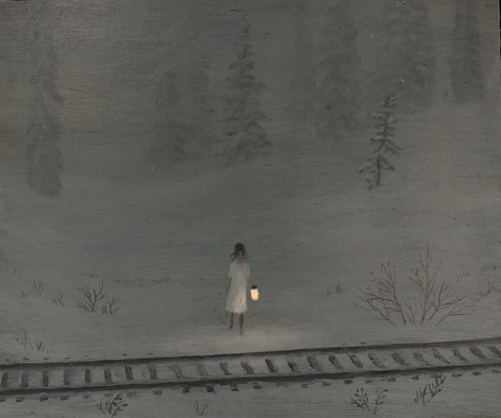
At the risk of coming across as a human billboard for Arcadia Gallery, I have to note with pleasure a show that has already come down—with the same inadvertently useless timing of my last post on the gallery. Maybe this helps offset the impression that I’m standing on the street directing passersby through the front door, not that I would be ashamed to do that. On my last trip to the West Coast I was in California too early to see Matthew Cornell’s tour de force of small works, Roadside Attractions—(Manifest Gallery could do a solo installation of this same show entitled Magnitude 7, except that Cornell usually sells out whatever he shows). I arrived in time, though, to marvel at Aron Wiesenfeld’s Natural Selection, a haunting series of images that have a patina of somber fantasy, but are surprisingly vivid depictions of gentle, and sometimes intensely beautiful, alienation. His paintings are mostly centered around a young waif whose occasionally elongated figure reminds me faintly of Giacometti’s gaunt sentinels. Wiesenfeld creates scenes of almost hermetic silence, inwardness and isolation—all surrounding what look to be adolescent figures. Yet these qualities aren’t nightmarish, but are closer to tranquil waking dreams set in natural surroundings or sparsely populated urban landscapes. Illuminated signs beckon from a rural highway across an empty field or the glow of an Apple display logo shines like a candle from the lap of a teen sitting under a stone archway. His young, reflective figures seem slightly lost or just willfully unmoored from any recognizable purpose other than to be aware of their own superfluous presence in a world too busy or remote to notice them. (A mood known to most people, at any age, no?) This comes across as a good thing for us, at least—these figures become conduits for the viewer to variously absorb the intense beauty of the world immersing these idle avatars.
What’s so gripping about the work is how these almost stylized images awaken powerful, haunted feelings of familiar moods inspired by subtle qualities of light and even temperature that echo back through a viewer’s experience of countless winters or autumns, along highways, in woods. It’s a twilight world, alternating between wide, almost desolate open spaces (fringed with signs of random commerce) or protective havens for Wiesenfeld’s subjects: a reflecting pool, a tunnel, a crawl space or crumbling wall, and a beckoning pit. The images are like moments from disenchanted fairy tales, yet they aren’t depressing. They convey the not entirely unpleasant sadness one courts by listening to certain music in mid-teens, or twenties (or thirties for that matter)—when the joy of heartache can be a way of feeling most alive. Three paintings in the show have an almost mythical simplicity and resonance. His largest canvas, The Bridge, shows his waif standing on an old, improvised footbridge gazing off to the horizon dotted with lights from scattered commerce and low-rent homes clustering along a state highway. (It’s the sort of development that zoning boards relegate to places where those on the board wouldn’t build their homes, but in these paintings, there’s poetry in the yawning distance between the ruminating figure in the foreground and the winking points of light that shine at the far edge of the field.) One of the marvels of the painting is how everything looks illuminated exactly as it would under a full moon. The mood is one of fragile, forlorn expectation. The Pit shows a white robed figure, ghostly beside the black open mouth of a large well, or maybe just a firepit, but it feels more like a wormhole to the Black Forest. And a third depicts a single young watcher, patiently holding a lantern beside a rail line in the middle of an obscuring snowfall. She could be waiting to say hello, or lingering after a goodbye, or just loving the silent fall of the snow, though the title, A Late Arrival, tells the story. That little lamp illuminates an entire world, like the imagination itself, and though almost nothing is clearly distinguishable, everything in the picture seems just as it should be. As in most of these paintings the lonely figure is enveloped and sustained by the world they seem to establish around themselves simply by being at the imaginative center of it.
July 3rd, 2019 by dave dorsey

Max Gottschlich
A few months ago, I came across what for most people other than professional philosophers would be an obscure, academic essay on Kant in the journal Metaphysics from 2015. I stumbled onto it after skimming through some art criticism online and finding a phrase about “Kant’s theories on the limitations of logic.” This intrigued me; anything about the limits of human reasoning draws my attention, but especially in relation to this foremost German critic of human reason, who also happened to be the fellow who established the philosophical framework for the reliability of the scientific method. So I Googled “Kant on the limits of logic” and this essay topped the list of hits. The title of the paper almost sounded like a Monty Python parody of Continental philosophy: “The Necessity and Limits of Kant’s Transcendental Logic, with Reference to Nietzsche and Hegel.” Yet the content of the paper has held my interest, off and on, for months.
I have reread Gottschlich many times, and though I’m still bemused by a few passages toward the end, the essay strikes me as both a useful explication of what Kant was doing in his philosophy and also a way of putting logical reasoning into proper perspective. All of which has a bearing on what visual art can do outside the scope of what Kant was exploring. The quietly radical implications of all this probably wouldn’t bother those who think science is the last word on truth—but it should. In other words, it’s an effort that seems at least partly consonant with Heidegger’s own critical views on the entirety of Western thought and the nihilism at the heart of it.
Max Gottschlich, the essay’s author, starts by pointing out that Kant sets aside metaphysics—all the theories of truth that have arisen in Western philosophy since the Greeks. Instead, he examines, in The Critique of Pure Reason, only the marriage between logic and the knowledge it offers. Instead of postulating an ontology—a theory of being—he shows how the system of logic gives form to the manifold world of sensory experience and thus give rise to our understanding of a world that operates by natural laws. All other forms of awareness are set aside in this process. What the world or anything in it actually is remains beside the point–and unknowable through logic. Logical understanding—transcendental logic as it is called in the essay—provides the superstructure within which all individual things become comprehensible within this ordered world of appearances.
Kant no longer undertakes the inquiry into being and its determinations, but more fundamentally asks about the conditions of the possibility of knowledge of objects in general.
It’s pertinent to note that logic isn’t only the ground for scientific investigation, but also provides the structure of computer software and artificial intelligence, as well as an individual’s common sense problem-solving in daily life. Logic itself is reshaping our entire world–it’s what rules the spirit of our age. Gottschlich wants to understand how this sort of knowledge functions as a whole. For him, Kant isn’t interested, per se, in particular operations of formal logic, as a computer engineer would be, but in the role that logical understanding and knowledge play in forming the boundaries of thought and human awareness. He aims to think about how logic structures knowledge, how it generates it, rather than about how the rules of formal logic lead to particular valid propositions that can be proven.
He points out that Western philosophy perennially begins with the identification of thinking and being: it is taken for granted that rational thought is how we come to unveil the being of things and the world. Thought corresponds with the world in reliable ways—and the goal of much philosophy has been to propose a theory, a metaphysics, to explain how and why this is so. Until Kant, the author says, philosophy assumed an equivalence between thinking and being. In this view, the actual being of an object in the world, what it is, reveals itself through its intelligibility—it becomes transparent to thought. If you think in a logical, non-contradictory way about the world, it has been assumed you will arrive at an understanding of the world’s inherent nature. To achieve this consistent, non-contradictory realm of thought—and being—much of Western philosophy has situated truth somehow apart from this changing, imperfect world: Plato’s realm of Forms or Ideas, for example. Continue reading ‘Max Gottschlich on the limits of knowledge’
June 30th, 2019 by dave dorsey
Audition #4, detail, Chris Hyndman, acrylic on canvas, 72″ x 48″
From INPA 8. I have to say, this doesn’t look humanly possible, if it is painted in the traditional way–you know, uh, with brushes. The regularity and exactitude of the lines in the fabric, draped across what looks like a sheet of old Ben Day dots, the way in which little specks and lines of white backing show through the surface of the curtain fabric–it all looks as if it would require months to complete. Hyndman’s intentions are highly conceptual and the feel of the work resists emotional engagement. He says on his website that he imagines them as backdrops–like ambient music, presumably–for people to pose or express themselves, such as a prop for a stand-up comic. I can’t help feel there’s more going on here, at the technical level, than “acrylic on canvas” is willing to divulge, but if not, then these paintings are an astonishing act of hyper-obsessive skill.
June 27th, 2019 by dave dorsey
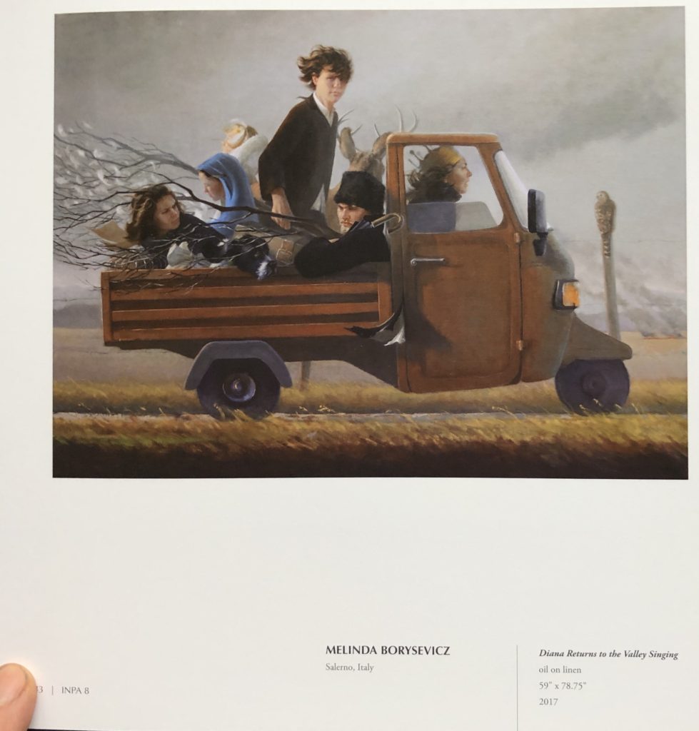
A page from INPA 8, work from Salerno, Italy. From Manifest Creative Research Gallery’s website:
For the INPA 8 Manifest received 1301 submissions from 389 artists in 42 states and 26 countries. Entries represented works made from 2014 through mid-2017. The publication will include101 works by 62 artists from 27 states and 6 countries including Canada, France, Italy, Ireland, Scotland, and the United States. A written work by Anne Keener (Columbus, Ohio) is also included.
Twelve professional and academic volunteer advisors qualified in the fields of art, design, criticism, and art history juried the eighth International Painting Annual. The process of selection was by anonymous blind jury, with each jury member assigning a quality rating for artistic merit to each work submitted. The entries receiving the highest average combined score are included in this publication.
June 24th, 2019 by dave dorsey
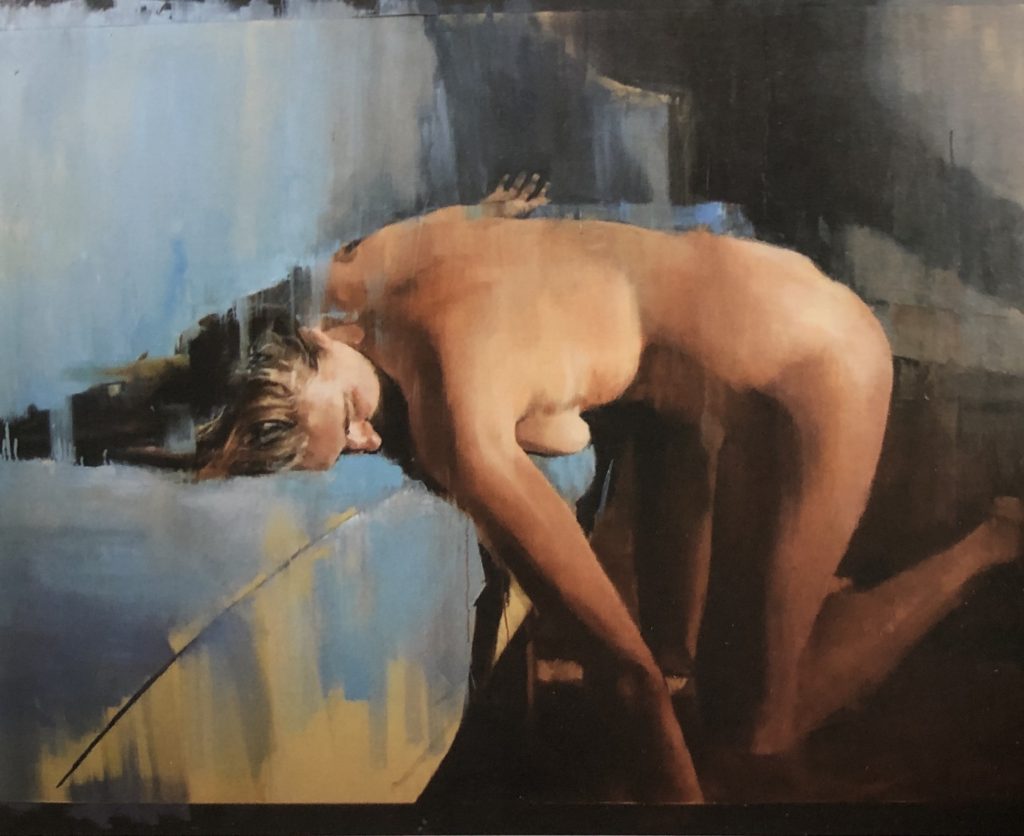
Hope, Yolanda Heijnen, oil on canvas, 48″ x 60″
This large oil on canvas is from the recently published INPA 8, from Manifest Creative Research in Cincinnati. (I’m going to post a series of paintings I love from the publication over the next couple weeks or more.) This is one of two offerings Manifest selected from Yolande Heijnen, of New York City. The remarkable handling of the paint gives the image the quality of something seen through a streaked, clouded window, yet it also flattens out what appears to be a couch or bed where the woman kneels in a surrendering pose. The way in which the artist abbreviates the blue sheen of the cloth in loose handling on a tan undercoat, with that one crisp line to designate a seam in upholstery or slipcover or bedspread, works beautifully to convey a tactile sense of the fabric without indicating any level of detail at all. The assertively, sensuously unfinished quality of the painting reminds me strongly of Diarmuid Kelley–and Mark Tennant to a lesser degree, though with Tennant there’s less love of the paint itself and an a more acerbic emotional distance from what’s depicted. This is an economical study in three or four colors, depending on how you parse it: dark gray, dull blue, yellow tan for the furniture and redder tan for the skin tones.