Archive Page 24
October 28th, 2015 by dave dorsey
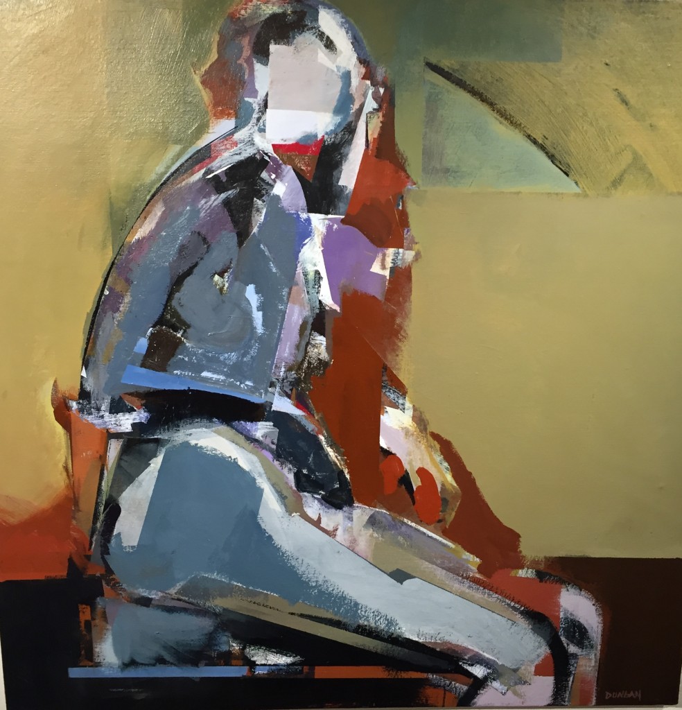
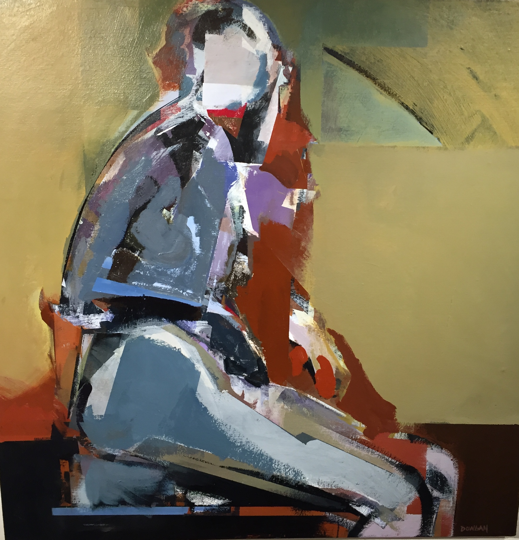
Yellow Labyrinth, Anthony Dungan, acrylic on canvas
The new show, “The Elusive Image”, at Oxford makes an amazing impression when you walk into the gallery. As I wrote before, it’s one of the most unified exhibitions I’ve ever seen there, all abstract, or at least semi-abstract, modernist work. Part of what gives the show such immediate impact is the seriousness of the intent on the part of all three artists: Bill Santelli, Anthony Dungan, and Jan Hewitt Towsley. It’s all modernist in the sense that you’ll find no hints of postmodern irony about the nature of the work itself—or the suppositions behind it. It varies between quasi-representational and almost entirely abstract, with Dungan’s powerful new nudes as the most figurative.
Towsley’s constructions, work that is woven from filaments of metal, look perfect in the company of the paintings around it, but it gets a little overshadowed. It’s quiet, glowing, subtle and, at times, intricate without being overly complicated. My favorite is a rippling curtain of metal screen that flows in waves down toward the floor, like a Chinese scroll with figure-eight curves that seem permanently pressed into the fabric. Up close, a variety of colors emerge, and, as does all of her work, it reflects light differently from different angles (something it has in common with the gold leaf areas in some of Bill Santelli’s drawings). Jim Hall, in his write-up for this show, does the best possible job of describing the strength of Towsley’s work:
A weaver may appear an odd choice to exhibit with two painters, but the compositions of Jan Hewitt Towsley more closely approximate, at times, that of a painter or draughtsman than that of a traditional weaver. Although she does weave patterns in more conventional materials, such as cotton, silk, or linen, many of Hewitt Towsley’s compositions are woven of metallic ‘thread’. Such work would have to command our admiration if only for its sheer difficulty of execution. But we might say that this artist “draws” with her loom, creating still-life compositions, landscapes, and cityscapes. The images seem to exist in a space somewhere between two and three dimensions. They announce themselves with the play of light not only upon different metals, such as brass, copper, or steel, but upon weaves of different type and density. The images are chimerical, as they emerge, change, and disappear when we move around them.
I’ve already delved into Santelli’s work in an interview posted a few days ago. It breaks down into four categories, three of them familiar to me in addition to a small series of minimalist geometric abstracts based on the dimensions of a tennis court seen from above. I’ve admired his work over the years, but in the context of the show, it came alive in a new way for me, though I’m not sure why. This time, MORE
October 25th, 2015 by dave dorsey
Hawaii Dream Flash 13 (detail), Bill Santelli, acrylic on canvas
The new show at Oxford Gallery, “The Elusive Image,” makes a powerful impression when you walk through the door. The gallery has integrated the work of all three artists–Bill Santelli, Tony Dungan, and Jan Hewitt Towsley–into a show where everything you see augments the work around it. The tension between angular, hard edges and organic curves ripples from one work to the next, leading your eye forward and back to reassess things you’ve already seen. It’s probably the most unified show I’ve seen at Oxford, and the work is all first rate. I’ll write more soon to share impressions about Dungan and Towsley, but for now I’ll pass along some of the conversation I had with Bill as he walked me through the show, commenting on the work.
Bill’s work falls into three buckets, more or less: large abstracts that set up a tension between geometric shapes and eddies of paint that form partly through chance; his PATH abstractions that call to mind tall grass in the wind; and his “silent dialogs.” He also added a small set of drawings, minimalist squares in the dimensions of tennis courts seen from directly above. We started with the little Open Court series and moved to The Path drawings and then the larger abstracts:
When I was working on (the Open Court series), I was thinking they’ve already been done as large paintings.
I really like them on this scale. The size adds to the sense of restraint and minimalism.
I think I’ll keep the series going for a little while to see how they turn out.
You can see your hand in them, despite how flat and spare they are. There’s real feeling in the tiny variations of color in each grid. They’re so close to watercolor.
It’s funny you say that because I was thinking of doing these in watercolor. Then at the last second—I was even thinking of thinning out acrylic—but with the work on The Path drawings and Zen Mind/Silent Dialogue stuff going in Prismacolor, I figured I’d do the first one in Prismacolor and I got hooked on it.
How does Prismacolor work? What’s different about it?
It has a fair amount of waxy content to it.
It’s in pencil form?
Yes, you can get them in stick too. But those are chalkier.
It sounds similar to pastel.
Yes. They aren’t forgiving in terms of erasability. I’ve tried scaping with a blade but you can’t get all of it.
Do you have something to guide your hand?
No, the series started with just making a mark spontaneously. What I really was doing in the beginning was just putting down the color without the black (outlines) and for whatever reason I kept looking at it and thinking this isn’t really popping the way I wanted it to. So I outlined one mark in black and really liked it and then just went ahead and did it all.
I don’t know how you get such a steady line.
They aren’t one continuous line. I go a ways and stop. Then again. Tom Insalaco gave me the hint to use a bridge. I started using a bridge above the paper. Sometimes I use tracing paper or plastic sheet so I can put my hand or arm on it while I’m putting down the mark. They are smaller strokes, but I try to get into the motion (of the whole line). You can see all the little strokes, if you catch the light just right. The inspiration for these was sea grass. My father in law had a house on the north fork of Long Island where we used to go in the summers. We could take a canoe out and just go out. There were always the grasses. The whole series, I started when I’d ordered some pre-stretched canvas and had nothing to do, so I had this paper lying around and going through file drawers looking for something I found this box of paper. I just got it out and made a slashing mark and liked it to much that I kept it going.
You did it spontaneously. A large quick gesture?
A swift mark like the beginning of one of these only bigger.
The first one could be fast, but after that . . .
Exactly.
There are so many parallel lines, perfectly aligned.
After the first one, I recognized something and was thinking about it, and my wife came in and said, that looks like the grasses. I started looking at them more and just kind of went from there.
When I first saw these I moved on, but the more I see them the more I like them. I see more and more in them. There’s a Taoist feel of the grass surrendering to the force that moves it. They are so simple, I thought, OK, I’ve figured that out, nothing much to see here, and I’ll move on. But there’s more and more there.
You can see there’s a lot of build up of layer. It isn’t that it’s applied thickly initially. It’s all these tedious strokes to get the color I want. These drawings take about three months on average.
That’s astounding to me. The other thing that fooled me at first, it looks like a print. I thought they were “just” lithographs. But these are one-off. To spend that amount of time on something that is, in the end, this simple . . .
I didn’t paint for almost a year. When I first put these out there, they were getting a fair amount of attention, so I went with it and kept it going. It took so long to do one of these, and I was working eight hours a day and had no energy left.
You have very clearly defined areas of flat color.
The black outlines really makes it work.
Frank Stella did white margins that worked the same way.
Yes. That’s it. They are a challenging. It gets to be like meditation.
(We move on to the large abstracts.)
How do you get the paint to behave this way, with these eddies and swirls? It has a life of its own that you seem to guide and nurture without too much forcing.
I did a lot of research on paint when I started working seriously and I was reading all the literature about Golden acrylics. I also studied Paul Jenkins and Frankenthaler and others and learned they were working in oil and Chrysochrome, (an enamel). Jenkins was the most scientific about it. I worked for Zora’s Art Supplies at the time and went to Zora to ask what Chrysachrome was – and she admonished me: “Look it up in the dictionary! Learn for yourself!” That was what started my studying and experimenting with mediums and different paints.
Swimming inside a David Hockney could be a bucket list item for the serious collector.
People paid him to paint their actual swimming pools. So I was asking what’s chrysachrome? With these it’s basically, first mixing the viscosity and getting it to the point where it isn’t too thick or too thin. I’ll lay it down, using hake brushes, so that it has texture but not brushstrokes. The first layer I’d take the hake brush and dip it into whatever medium I was using and put that down and then add color. With the hake brush you can manipulate it.
The shapes and patterns look natural, as if they form on their own.
The color in the rectangular shafts are things I remember from dreams. (Jim called these armatures and that’s a great description.) (In the organic areas of free-flowing paint) sometimes the paint has the consistency of milk and if it gets too thick it’s harder to control when you put down the second or third or fourth layer. The Renaissance painters used to work on copper and they wanted the light to come back from underneath. I want the light to work that way as well, so the layers have to be of a certain viscosity.
In this one you can see sky, and that’s what’s interesting, it’s like a view of interior states but you can see external worlds in these images too.
October 24th, 2015 by dave dorsey
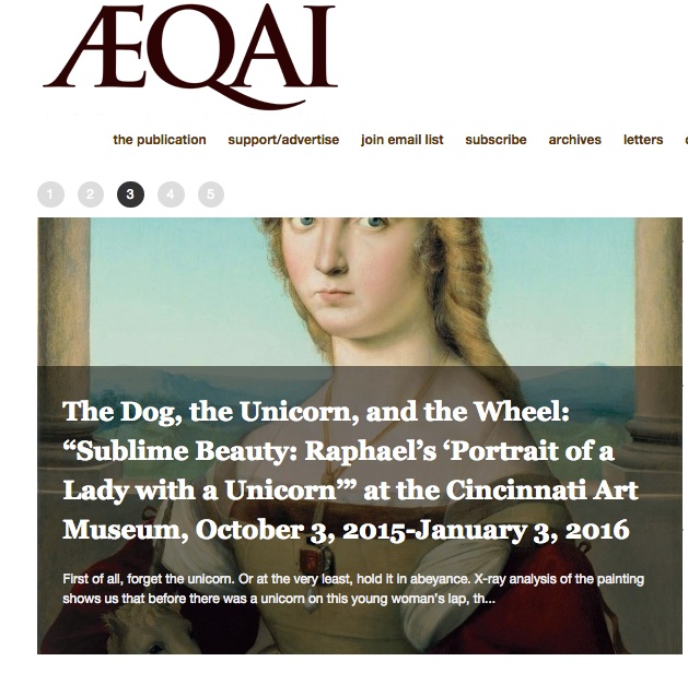
I’m passing along the latest email from aeqai, an online arts magazine in Cincinnati. I’m an occasional exhibitor in Ohio thanks to Manifest and the Butler Institute, so I’m also one of their readers. If you think the only way to see great art is to live on one of the coasts, just take a glance at what’s going on in Ohio (aeqai is reaching out to other places as well–thanks to its correspondents). It’s impressive:
The month of October always brings with it not only glorious weather, but some of the most fascinating art shows tend to appear during this month every year, and 2015 is no exception. Exhibition offerings are very strong, and the October issue of aeqai, now posted, is full of reviews, profiles, and manifests aeqai’s growth into new cities: we introduce Elisa Mader, who’ll be covering the visual arts in Seattle for us, this month, as well as Joelle Jamison, who will be covering Houston for us, regularly, joining Anise Stevens, our LA correspondent, and Cynthia Kukla, who has Chicago as her beat. And next month, we’ll be introducing area photographer Kent Krugh, who has become aeqai’s photography editor, and will be selecting photographers’ work from the region, nationally, and internationally and offering our readers photo essays of the work he selects for us.
Both the art museum and the Taft Museum have singular offerings : Keith Banner reviews the Jacob Lawrence painting show, recently opened at The Taft Museum in a strong and passionate review of Lawrence’s work from the thirties, while Jonathan Kamholtz analyzes the one Raphael painting that’s traveling the world right now (which we think’s a terrific idea). Two reviews of recent Contemporary Arts Shows/performances aren’t in yet at press time, but we will post them when they come.
Matthew Metzger returns this month as an aeqai critic, and he went to Antioch College to review a show about the rhyzome, a complex metaphysical idea that the Antioch Curator has adapted into an art show with the most splendid of results, with the assistance of a professor of sculpture there: this is a must see show, and it’s a great time of year to take this short drive to this lovely town so close to us, in Yellow Springs. Zack Hatfield offers a thoughtful anaylsis of photographer Elena Dorfman’s work at The Weston Gallery in The Aronoff Center; aeqai reviewed her work several years ago, and her career seems to be soaring. And Craig Ledoux, who started with aeqai last month, both reviews and offers an overview of the public art/mural scene in Covington, including an interview with both Jay and Cate Becker of the BLDG (building) , who’ve been so responsible for this burgeoning scene in Covington, which is celebrating its 200th anniversary this year (The Carnegie also offers several shows dealing with Covington’s birthday /anniversary, which is why we asked Ledoux to write this column now).
Hannah Leow reviews an oddly moving show of work by Jane Carver at The Art Academy of Cincinnati; our review of The Michael Lowe Collection of (conceptual) photography will appear next month rather than this month due to extenuating technical problems on the writer’s now old computer. Fran Watson, whose knowledge of prints and how they’re made always amazes us, reviews Frank Hermann’s new monoprints on offer at Clay Street Press, and new aeqai writer Dan Burr takes a look at a small group show at the Women’s Y downtown, called “Color” and featuring work by, amongst others, Paula Wiggins and Susan Mahan. Burr, whom we welcome to aeqai this month, will be reviewing for us regularly, too. And Marlene Steele reviews Cedric Michael Cox’s new work at The Clifton Cultural Arts Center: Cox’s work’s optimism is always refreshing to see in such a dystopian era. And Jennifer Perusek, aeqai’s fashion editor/correspondent, looks at the Alexander McQueen line of women’s clothes this month, after the truly tragic and untimely death of visionary McQueen himself.
Aeqai offers two profiles this month, both of area artists: Mike Rutledge’s profile of Brad Austin Smith, one of our region’s most creative and prolific photographers, who has a new photo in the upcoming Mapplethorpe After 25 Years show at The CAC, opening in November, and Laura Hobson offers a profile of regional draughtsman and painter Marlene Steele, who also writes for aeqai regularly. Marlene Steele also offers a fascinating review/essay on The Letterheads, a group which met here recently and deals with all kinds of aspects of signage, graphics and the like , as well as older design forms including calligraphy, at which Steele herself excels. We hope that you’ll read Steele’s piece as it’s truly fascinating, and most of us know little about these fields.
Aeqai has a slew of reviews from other cities. Our own Jane Durrell was visiting Atlanta, and found a museum at Emory Univeristy which is full of ethnic memorabilia and objects from cultures around the world, but reviews the temporary show there about Native American arts and culture; it’s a fascinating review and there’s much to learn from it. Our LA writer, Anise Stevens, offers two reviews, one of a show of work by African-American geometric abstractionist–all 46 of them–in a show that’s an eye opener. Her other review of new work by NY artist Randy Hage, shows us work in the realistic , almost photo-realistic vein, of storefronts, current and those long gone, in New York, and they’re miniaturist as well as dimensional, too: this show sold out at its opening in LA. The work is sensational, as is her review of it. Our Chicago correspondent, Cynthia Kukla, looks at Charles Ray’s sculptures of mainly male nudes at The Art Institute, and she doesn’t much like the macho bombast which she describes and anaylzes so admirably. Elisa Mader, of Seattle, reviews work by Lisaann Cohn, in a show that shows influences from Surrealism, Egon Schiele and others, that looks fresh and exciting and beautifully rendered. And Joelle Jamison looks at a design show at Houston’s version of our Contemporary Arts Center: Houston has a very active design scene in clothing, furniture, jewelery , and the like: much fascinating art’s coming out of Houston; next month she’ll write about the Houston photography scene.
Louis Z. Bickett of Lexington returns with another of his fascinating photo-essays, this one called “Sam with Broom: South”; these photos are part of a large, ongoing series of deadpan/conceptual photographs where a young man named Sam wanders the Lexington area and throughout the South with one broom. And I offer two book reviews this month, of phenomenal new short stories by Ann Beattie, a truly rare treat, and of a very disappointing new novel by very talented writer Lauren Groff.
We’re also posting with this eblast an invitation to the aeqai benefit party, to be held on Tuesday, November l0, at The Weston Gallery in the Aronoff: tickets are cheap at $40/head, and we’ll have a great art auction, thanks to the vast generosity of regional artists: we hope you’ll come; everything’s tax deductible as Aeqai is a 501c3 nonprofit. Nibbles and wine/beer’ll be on offer, and this event’s aeqai’s major fundraising event, and we hope you’ll come and support it, and if you can’t, please consider sending a tax deductible check anyway.
We’ll return in a month –November’s issue will include a lot of material on the FotoFocus sponsored symposium on Mapplethorpe/lessons learned , which’ll take place on the 23rd and 24th of October at The CAC (their show opens a couple of weeks later). New York FotoFocus Curator Kevin Moore has put together one of the most impressive groups of experts and specialists worldwide for this event, and we encourage you to attend various parts of the symposium as you can. It’s a major event in and for Cincinnati, and aeqai will review the symposium and the show next month.
Daniel Brown, Editor
October 22nd, 2015 by dave dorsey
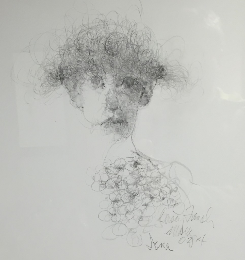
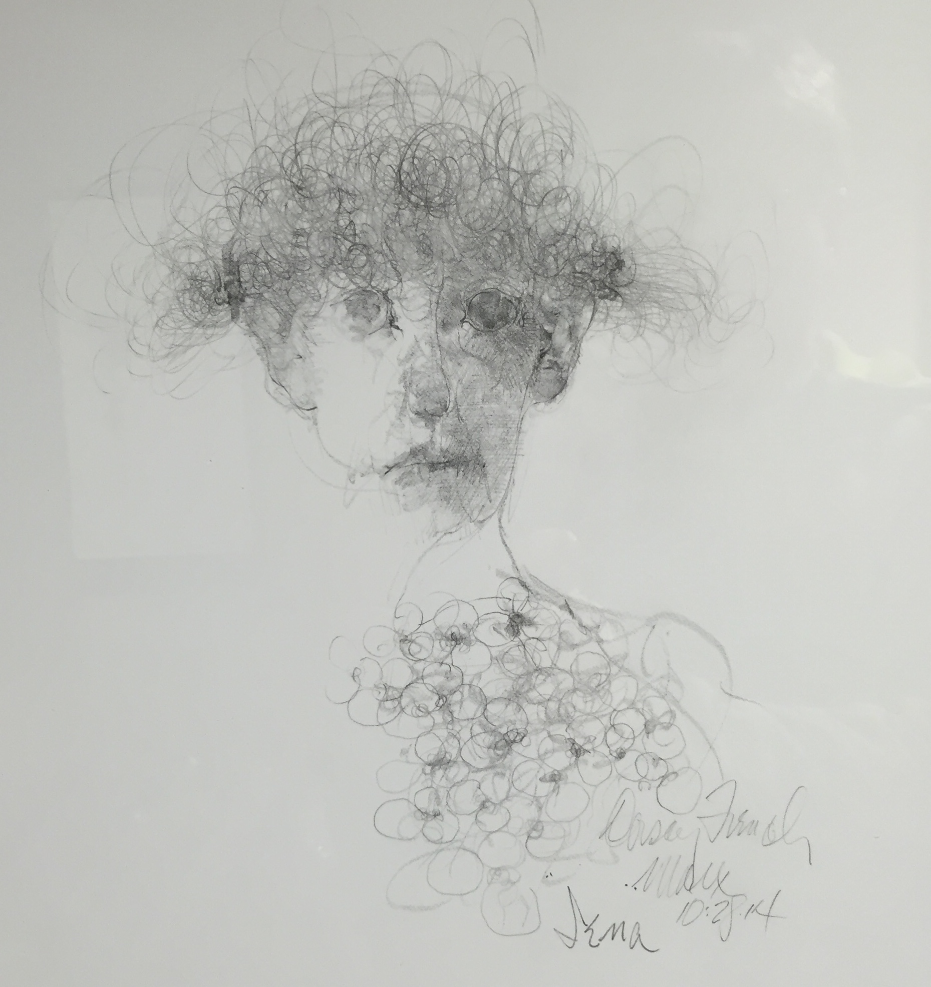
Iena, Robert Ernst Marx
I have to say Robert Ernst Marx, now 90, is still at the height of his powers, based on a recent visit to his current one-man show at Rochester Picture Framing. It sounded like an unlikely venue for such an esteemed local artist. Yet it’s a beautiful, perfectly-lit space, and Marx appeared to have sold around $20,000 worth of work already. So it appears to be a perfect fit. His vision is as it has always been: dark, full of spectral inquisitors and aristocratic succubi who seem half-Elizabethan, half-Gothic. His world reminds me of Goya’s black period when the Spaniard painted Saturn feasting on his son and Titans going after one another with cudgels in the dusk. Marx, too, paints the monsters generated by the sleep of reason–he’s as skeptical and unforgiving as a French philosophe. His figures emanate menace with nothing more than a steady gaze. In his minimalist portraits of spiritual deformity he invests all the complexity into the way he applies the paint while indicating as little as possible about his imaginary sitter. His color is surprisingly rich and subtle. In his drawings the line is masterful and utterly free and in the example above, occasionally lovely. That’s in his wheelhouse too.
October 19th, 2015 by dave dorsey
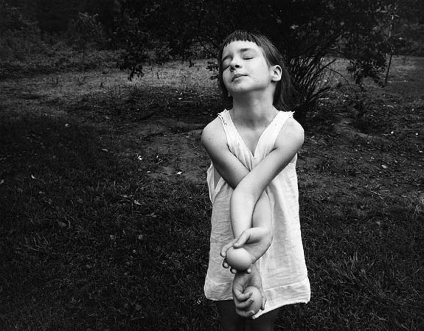
Nancy, Danville, Virginia, 1969
The day I graduated with my master’s degree in photography, my mother told me, we’re so happy you became a photographer. I looked at her, stunned, because I knew that her intention and my father’s had been for me to follow him [in the ministry]. I have exactly his name; I was to be the stereoscopic repetition of my father. So I stared at my mother, and finally she said, ‘Oh, we were so afraid you might become an artist!”–Emmet Gowin, from “Hidden Likeness”
1
When I came away from the Morgan Library’s recent retrospective of Emmet Gowin’s photography, I was stunned at how he was able to make his vision both personal and universal. In the last twenty years of his career, the personal element nearly disappears as he almost completely loses himself in loving attention to the world of insects. The smallest details in Gowin’s images often carry a lot of weight, and yet there’s very little detail in his work that anchors it to a particular era or even a particular place. His family photographs from half a century ago could have been shot decades earlier as a contrarian vision of idyllic bliss in Depression-era Appalachia—or in any number of other rural places. His aerial glimpses of catastrophes or environmental blight or nuclear testing sites remind me of shots relayed back from Pluto or Mars, or maybe fragments of inconclusive clues from one of Fox Mulder’s X-files. The truth is out there, but you won’t know what you’re looking for until you’ve shot it and brought it home. His wonderfully humble photographic catalogs of moths and butterflies in South America could be taxonomies from an entomology textbook, or a sequence of pictograms from a lost language. They are powerful in part because he is a lone explorer finding and honoring such tiny, obscure moments of nature’s inexhaustible beauty. The longer he has worked, the more universal his images look, and yet you can feel his idiosyncratic passion in every image.
It’s a wonder how much mystery and enigma he manages to convey, subliminally, MORE
October 14th, 2015 by dave dorsey
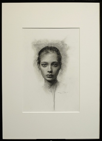 “Youth”, Casey Baugh, charcoal on paper, 16″ x 11″, Arcadia Gallery.
October 10th, 2015 by dave dorsey
In the New York Times book review this Sunday, Jonathan Franzen used a term familiar to me only from Martin Heidegger’s writings on technology. As result I got curious to know how Thomas Sheehan’s recent book about the German thinker has been received. I didn’t come across any reviews with a Google search, but I did find a paper he’d written last year, “What, After All, Was Heidegger About?”, which serves almost as an overview of the new book, which I haven’t finished. The paper is far easier to understand than the book simply because it’s less laden with un-transliterated Greek words (there are still plenty) and the footnotes are easy to delete and ignore if you copy and paste the content into Word. How’s that for a workaround to avoid distractions? (My apologies to Sheehan’s assiduous attributions demonstrating the depth of his comprehensive scholarship on the German philosopher.)
I’ve read the paper a couple times and may post a reaction to it. I’m no authority on philosophy, but I still read it as part of an effort to cobble together, slowly and haltingly, a view of what painting has the potential to do, when it is at its best. Heidegger’s thinking represents a personal cornerstone in this effort, based on what little he wrote about visual art–though Sheehan’s essay doesn’t address the philosopher’s views in a way that helps me much with that right now. Still, it’s lucid and brief and apparently controversial among some core Heideggerians. But this is what I gather second-hand, because I don’t “follow” philosophy. I’m a layman dogged by philosophic questions, and I have only few un-entitled opinions to air about it.
Which brings me to the good news. Entitled Opinions, where I discovered Sheehan, is back! I’m only two podcasts behind in the new season. The Stanford University radio program had been gone for more than a year. I can’t wait to hear Robert Harrison’s new discussions as they become available. I can hear echoes, in the paper, of things said in conversation with Harrison, about how Heidegger did little to address the subject of ethics as a philosopher (and made some questionable ethical/political choices as an individual). But mostly the content of the paper is distinct from much of what Sheehan has said about Heidegger on this podcast. I hope he’s on deck, or at least somewhere in the season’s line-up, to talk at length about his new paradigm for understanding the philosopher.
October 8th, 2015 by dave dorsey

This made me laugh, as was intended, maybe because Renoir is my least-favorite Impressionist. BBC coverage of an anti-Renoir demonstration:
The Boston Globe reported that they chanted: “Put some fingers on those hands! Give us work by Paul Gauguin!” and “Other art is worth your while! Renoir paints a steaming pile!”
October 1st, 2015 by dave dorsey
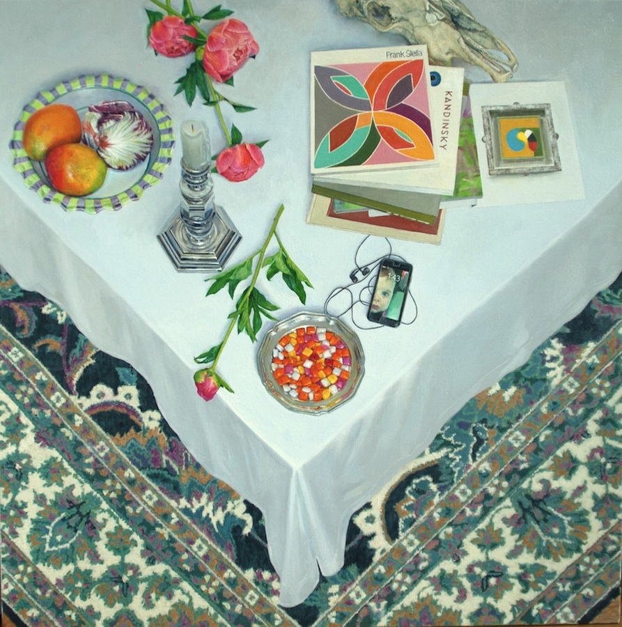
Gifts, oil on linen, 53 x 53
1
Starting this spring, and all through the summer, I’ve worked on only one painting. I’ve never invested this many calories into a single painting, this much obedience to the act of looking at a particular set of objects. I suppose this can’t be an entirely good thing for a person, but I’m pleased with the results. For me, painting is rhythmic, like factory work—you do a certain amount each day, on a regular basis, and at the end of X number of days you have a painting. This one has been different. Most days, since early May, I’ve put in several hours of writing every morning, first thing, usually from 6 a.m. to 9 a.m., which enables me to pay the bills, then another four to six hours of painting, seven days per week. I took much of July off, in the middle of all this, when I went sort of rogue, insofar as that’s possible at my age, and I rode 1,700 miles around New England and into Canada on my eleven-year-old BMW R11050R motorcycle, mostly staying with friends. Then I came home and got back to painting, wielding my brush with the wrist I’d made sore during a couple weeks of using it to twist a throttle. Around four each day I would settle into a chair for a while or go for a run. Writing this blog took a backseat, as did most other things. My absorption with this painting drew me away from a number of other activities, and last week I more or less finished it. I say that provisionally, since no painting is ever finished until you store it somewhere you won’t see it again, preferably in the home of a new owner–or send it off for exhibition. I’ve already entered in in a show at Manifest, so that means it’s done.
This newest painting is an overhead views of a tabletop’s corner, with wedges of Persian carpet beneath, and various household objects strewn at random over the white tablecloth, some like tropical birds perched on snow. I’ve been doing these tabletops for twenty years, probably finishing a dozen of them in all, and I think I secretly hope this one will be the last. I undertook it partly as an effort to complete a definitive version of this personal genre.
I started doing these tables in the 80s after a long obsession with Braque. MORE
September 30th, 2015 by dave dorsey
I’m emerging from a tunnel of work on a single painting I began in May and finished last week, so I’m only now catching up with what friends have been up to over the summer. Rick Harrington moved back to the Northwest, where he grew up, and is now living and working in Portland. I was sorry to hear he was going to be on the other side of the country, probably from now on, but I hope to keep in touch, and I also hope he keeps exhibiting at Oxford here.
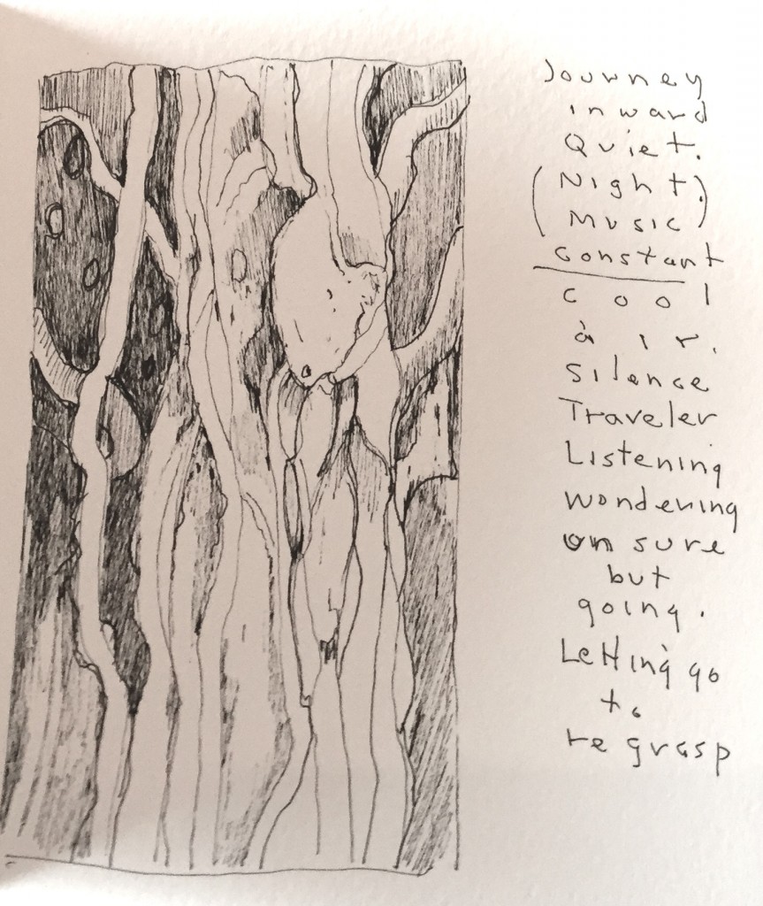
Bill Stephens has been on the road this summer, heading east to a retreat and then west to travel around the mountains and do sketches of what he was seeing. He’s creating notebooks that are a nice combination of text and image that he ought to try selling, a little touch of Basho on his journey. The line drawings in ink are assured and fresh and calming. With an economical use of line he puts me wherever he was from one day to the next. I’ve posted one of them above.
Bill Santelli is very busy, showing his work both here in the next Oxford Gallery show and right now at ArtPrize in Grand Rapids, Michigan. ArtPrize is an open international art competition decided by public vote and expert jury. It awards grants to 25 recipients, and has as well as offering a Fellowship for Emerging Curators program. The $500,000 competition runs from September 23–October 11.
My friend Rush Whitacre is teaching now at Washington State Community College, and he’s recruiting people for a fantastic tour of Italy next March: 10 days and six cities, Rome, Florence, Venice, Assissi, Sorento and Pompeii. You can learn more and sign up here. If I had the money to spare, I’d already be signed up.
Jim Mott is still on the road, as far as I can tell. He’s usually off the grid as he makes his way across the country and stays with his hosts on one of his itinerant painting trips. He ought to be somewhere in California by now. Send some images of what you’re doing, Jim, if you see this.
September 28th, 2015 by dave dorsey
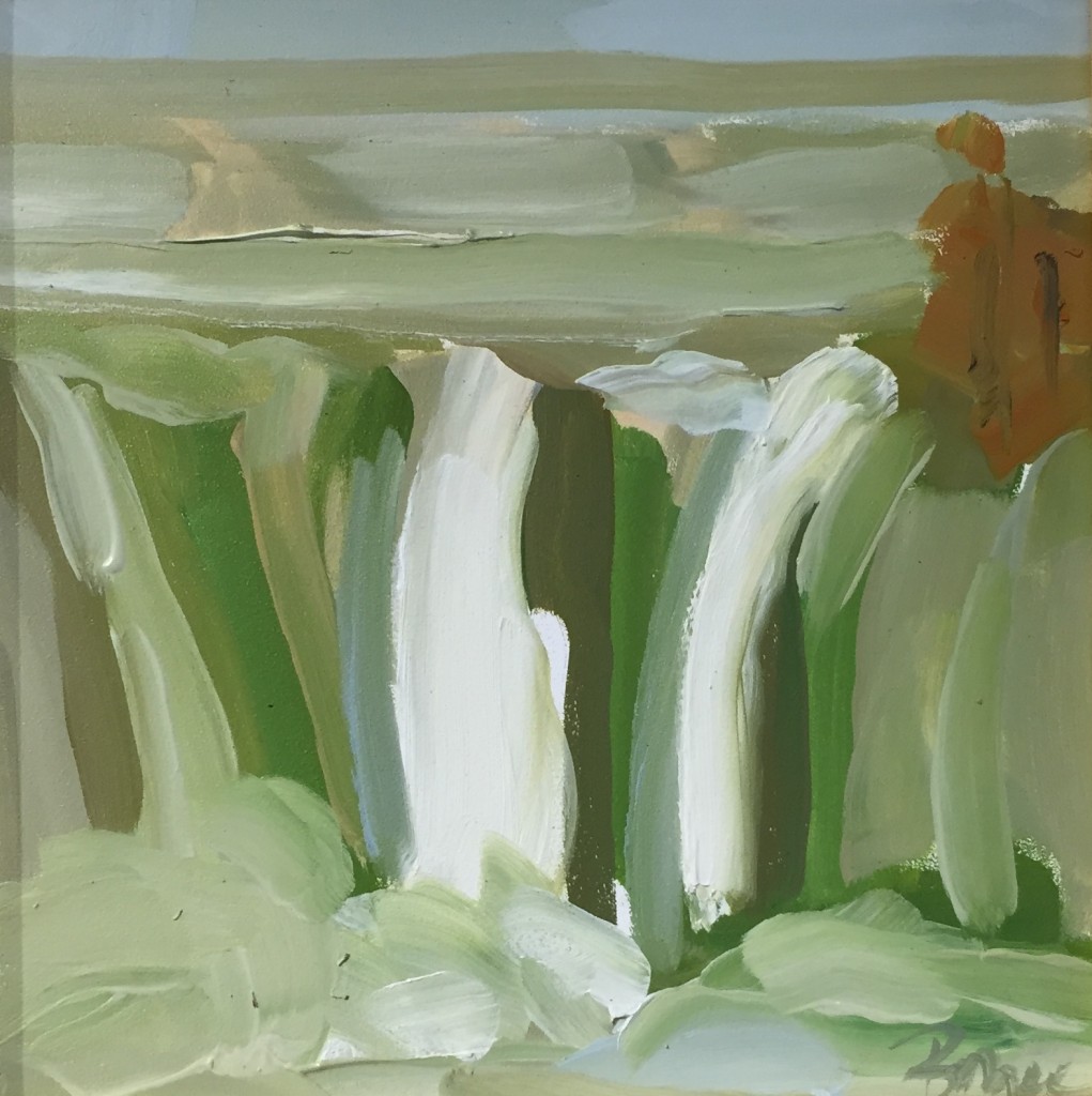
High Falls, Bryce Ely, oil on board
There’s a great show in its final days at Oxford Gallery, abstractions from two artists whose work took me by surprise. The invitation card didn’t convey how effective their best paintings are, and, as usual, the work was powerful insofar as I was mystified by what exactly enabled their imagery to succeed. I’d seen Phyllis Bryce Ely’s work before, when it won an award in the Memorial Art Gallery’s biennial Finger Lakes Exhibition in 2013. I admired her style without finding myself arrested by it as I walked around the exhibit back then. This time, I found myself coming back many times to particular paintings, seeing more as I stayed with it. Her work hovers right on the cusp between representation and abstraction. It’s always a distillation of a landscape, often involving swirling or falling water. This time, moving from one painting to another, I was reminded of both Charles Burchfield and Arthur Dove, yet her work departs from both influences. Where these two earlier artists were more concerned with careful depiction of a heightened vision of nature, Ely wants to create and convey a quiet energy by giving priority to the paint itself, making visible the way it flows from her brush, creating line and form with the edges of her strokes and slightly unpredictable modulations of tone that flow from the brush as it moves. (Many artists try to paint this loosely; it takes a gift to make it work as consistently as Ely does.) It gives her a special affinity with the subject of moving water–her paint seems a slow, loping doppleganger of the rushing flow it enables you to see. She’s very much in your face about how she pushes paint around. It’s the first thing that meets the eye, before your eye resolves the paint into a scene. Her most effective work looks as if, with Welliver, there’s not much “going back over” for her. So she’s also in a zone between what’s spontaneous and what’s calculated, and yet despite this irrevocable quality in how she applies the paint, the effects are often amazingly evocative–she’s still rendering a scene, with subtle effects of depth and distance, inspiring you to feel there’s more detail in the image than is actually there. With so much emphasis on the surface, and the quality of the paint, you still have a distinct and subtle assurance of a hazy, glowing light source. Or to put it in layman’s terms: you clearly see the, uh, sunlight. It’s remarkable. She makes you imagine more than she requires herself to show, which is the magic of painting at its best. Her technical mastery, from one painting to another, conveys a vision of nature in turbulent motion, but going nowhere in particular, an illuminated world giving a cold shoulder to the eye that eagerly takes it in.
 Todd Chalk, of Buffalo, has included some of her latest work–I counted three different personal modes. Some are more conventional abstracts. One especially powerful and effective small painting represents a glance upward through bare branches into an illuminated sky–it’s one of the best pieces in the whole show–and, finally, a series of square watercolors on yupo paper. I confess I’d never heard of that paper before, but it sounds like the perfect support for the green-minded crowd: synthetic, yet recyclable and “100% tree-free” as a promotional website puts it. I love it when artists explore unusual materials, and in this case, the qualities of what seems to be primarily an industrial paper made her intricate, small abstracts fresh, crisp and vibrantly colored. Watercolor on waterproof paper suggests an unconsummated tension as paint and paper fail to merge. She puts that romantic suspense to use: by keeping all the pigment right on the white surface it adds a special intensity to her beautiful explorations of color. Chalk has created a suite of improvisations with color and form, composing intricate Klee-like inner worlds as layered with overlapping tones as a looping song. For an artist thriving and innovating into her eighth decade–if her listed birthdate is true–these paintings offer hope for all of us embarking into the final third of our lives.
September 27th, 2015 by dave dorsey
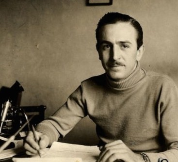
There was a fantastic two-part bio of Walt Disney on PBS recently. It’s worth the time if you have a chance to see it. Here is a near-quote from the broadcast about a time in his life I considered one of the most interesting moments in the story:
Underway was Cinderella. . . he seemed wary of fully investing himself in his film. Yet he left most of the hard work to his staff. Disney was . . . beginning to wear down and he kept a trained nurse in the studi0. Hazel George showed up every day to massage his back and his hips . . . she becomes one of those very few figures in his life . . . with whom he could talk. It wasn’t a sexual relationship but she was one of those figures with whom he could say anything and everything. It was difficult to say he had any close friends with whom he could share . . . he thought I’m never going to make anything as good as Snow White.
She suggested he attend a model train convention in his home state of Illinois . . . so he goes. The ride transforms him. When he arrives back home, Walt Disney was building these trains with his own hands. All in the zest for invention, for creating fantasies . . . Walt was happy to have the good reviews of Cinderella, but it was no Snow White as far as he was concerned. He builds a scale model of the old Marceline (his impoverished childhood home) barn for hours designing a (railroad) track and the engine. It was the toy he never had as a little kid, something that was pure fun and a pleasure to do. There was more in that train than just fun for Walt. When Salvadore Dali visited . . . Dali was taken aback. Such perfection did not belong to models. “It was comfort and salvation. I can’t control my workers. I can’t control the larger stage, I can’t control my company. . . but this is a world I can create down to the smallest details, down to the tunnels under my wife’s flower bed, that is mine and safe. I want you to work on Disneyland he told one slightly confused artist, and you are going to like it.”
September 25th, 2015 by dave dorsey
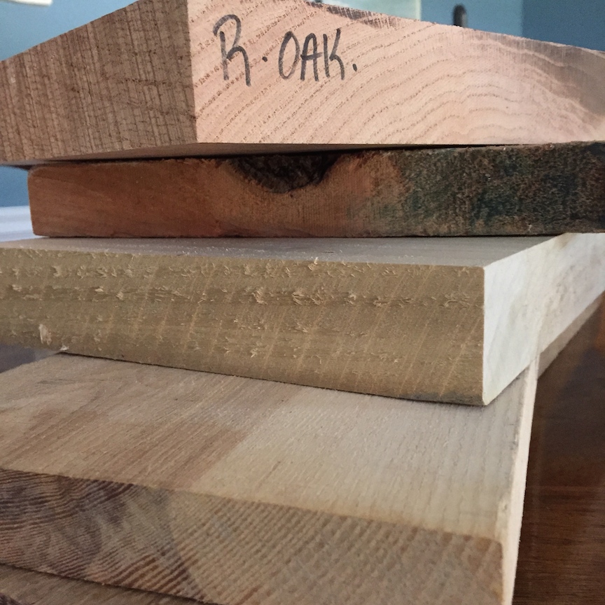
Two days ago, I hitched a ride south to Bristol to help my friend, Ed, buy some lumber for a pencil post bed he’s making. He bought more than $500 worth of wood simply to finish the frame for the bed—he’s already made the faceted posts. While he was selecting his long boards, I picked up about $25 worth of scraps, little flat blocks of ash and oak left over from the longer planks someone else had bought. (I’ll use them in small informal still lifes, with a couple objects resting on them, because I want to see what I can make of the raw wood’s texture and grain.) Ed needed a hand because he has a ruptured disk. Surgeons will fuse two of his vertebrae in October and, until then, he has to watch how much he lifts. We talked most of the way down to the little lumber place—it’s a specialty shop located in the Finger Lakes near the Bristol Mountain ski resort. I brought him up to date on the book I’m helping Peter Georgescu put together on income inequality and the need for the private sector to stimulate the economy by raising wages. Peter is a former CEO himself, not an academic. So far, it seems publishers feel more secure if an academic is solving economic issues, rather than someone who actually knew how to make a payroll once upon a time. So we’re involved in—how shall I put it—a gradual process of finding a home for his book.
“That’s what’s wrong with academics,” Ed said, though I hadn’t really offered any criticism of them, per se. I was intrigued by this logical leap, though. He brought it into focus as he talked: when it comes to actual market dynamics, how things get made and bought and sold, in his last job before retirement Ed watched an academic come in and mess with his company, a distributor of electronic components. “Before I retired, a guy took over the company who had never run anything, but he’d been a professor. I had a fantastic group of sales people. They started without much experience but were super smart and full of energy and ideas. This new guy decided that we should get rid of any client who was doing less than a certain level of sales with us. We had hundreds of clients. According to this new rule, we were to say goodbye to all of them but seven. I ended up having more sales people than we had customers. I had to let go of everybody. They were exceptional people. It was unbelievable. I became the only guy on the team because they didn’t need anyone else to handle the customers we had left. You couldn’t tell this CEO anything. He’d made the decision, and that was that. We lost hundreds of customers.”
“Organizational life is always a mess, but that sounds like a sure way to ruin a company,” I said, and then, MORE
September 18th, 2015 by dave dorsey
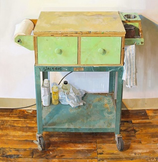
Paintiing Cart, detail, Brett Eberhardt, oil on panel, 69.5 x 41
September 14th, 2015 by dave dorsey
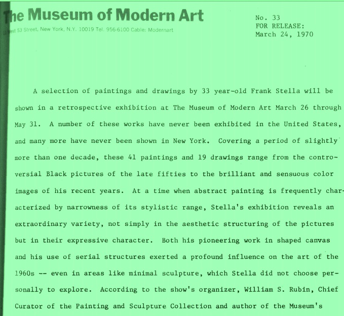
A week ago, as I was looking for a photograph of the Stella catalog I mentioned in the previous post, I came across this pdf of a typed press release from MoMA about a Stella retrospective in 1970. Everything about this bit of public relations made me intensely nostalgic for that period in American art and happy to have stumbled onto something so congenial to my sense of what a painter ought to be. The quotes from Stella at the end are what really made me smile, since there’s such humility and honesty in his words. I especially loved reading the phrase, “the Benjamin Moore” series, named after a brand of house paint. You won’t find a trace of the BS that infects so much talk about visual art in anything Stella says, plus he shares my admiration for Matisse, which makes me love Stella’s work even more:
In the past year, the interlaced, fan and rainbow patterned Protractor series have partly given way to paintings in which the protractor is used to create lyrical, almost floral patterns close in value and tender in their color — the most decorative stage of Stella’s painting. He sums up this recent development: “My main interest [in these pictures] has been to make what is popularly called decorative painting truly viable in unequivocal abstract terms. Decorative, that is, in a good sense, in the sense that it is applied to Matisse….Maybe this is beyond abstract painting. I don’t know, but that’s where I’d like my painting to go.”
September 13th, 2015 by dave dorsey
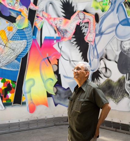
Frank Stella
There’s a great, lucid profile of the great Frank Stella in this morning’s New York Times: the photograph of him standing with his work in the background says it all. I’ve been working since May on a large still life, another in the series of tabletops, and it depicts, as an earlier one did, a Frank Stella catalog from MoMA, published for a retrospective many years ago. The cover of the book has been difficult to paint, especially the sans serif typeface of Stella’s name, which I’ve done over three times in an attempt to get it right. I may have to settle for “right enough”. We had a few friends here for dinner last night, from our previous neighborhood, and one of them was looking at the nearly-done painting and asked, “Who’s Frank Stella?” I sent him this profile from today’s Arts & Leisure section, about the upcoming Stella show at the Whitney. Without ever saying it in so many words, it conveys, at least for me, that most of Stella’s work has been, if not actually a visualization of joy, at least a reliable source of it. Some of my favorite passages from the piece:
Mr. Stella has done more than any other living artist to carry abstract art, the house style of modernism, into the postmodern era. Yet his passion for form, for contemplating weight and balance, has made him an outlier in an age of nutty auction prices and art that adopts the global economy as its very subject. By his own admission, Mr. Stella does not keep up with the current scene. “In all honesty,” he said, “I never got beyond Julian Schnabel and that generation. He was the ’80s, right?”
What does he think of Jeff Koons, whose shiny balloon dogs and other pop trophies made up the most recent retrospective at the Whitney? “You know what I always thought he was like? The Franklin Mint. He’s from Pennsylvania, and he outdid them. He outshone them! It’s for very wealthy people with no taste.”
Mr. Stella does confess to admiring at least one mid-career artist, Kara Walker, whose monumental sculpture of a sphinx-like deity was displayed to great acclaim in a former sugar factory in Brooklyn last year. “I saw it on YouTube,” he said. “I thought it was interesting.”
And, at the end:
Mr. Stella could have been talking about himself when he told me, “De Kooning was once asked how he felt about celestial space” — the heavens, the stars, and all that. “He said he was only interested in the space he could reach with his hands.”
September 6th, 2015 by dave dorsey
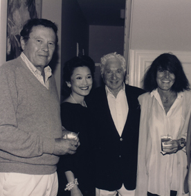
Joy Williams, right, with Bud Schulberg to her left, and Richard Wilbur, far left
Gratitude is the only mood for a painter who realizes the most significant word in this sentence, from an unpublished essay by Joy Williams is “undeserved”: Behold the mystery, the mysterious, undeserved beauty of the world. The second most important word is the one she underlined, of course: behold. Excellent profile of her in today’s New York Times Magazine. The other woman in the shot is Lynn Kaufelt, the author of an obscure book I actually bought long ago on one of our annual visits to Florida: Key West Writers and Their Houses.
September 3rd, 2015 by dave dorsey
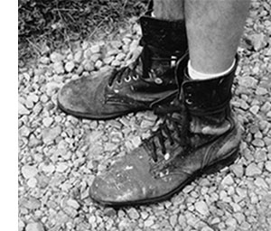
Jim’s boots
From Jim Mott:
There is gift-exchange in my life, to be sure, but even I have never had the nerve to try an experiment as full as the one you undertook. Bravo! – Lewis Hyde, author of The Gift, praising Jim Mott’s itinerant art project
Traveling Artist Seeking Hosts for Cross-Country Painting Project: Fall 2015 [2015 tour webpage]
Nationally-recognized landscape painter Jim Mott is celebrating the 15th year of his Itinerant Artist Project (IAP) with a coast-to-coast painting tour this fall, September -December 2015. Traveling New York to California, his route will be determined largely by where he finds volunteer hosts.
Each stop along the way is typically 2-4 days, during which Mott paints a set of small oil paintings in response to the surroundings. One of these paintings is given to the host.
The Itinerant Artist Project – “art for hospitality across America” – is about sharing non-virtual connections, a sense of place, and a sense of life’s journey through art.
You can share the adventure by being a host. Or by forwarding this message to friends and colleagues anywhere who might be interested in the project. This IAP announcement is not just about finding hosts but also about sharing the ideas behind the project. Spreading the word freely, without any need to feel responsible for specific outcomes, is best.
Links:
Email:
August 27th, 2015 by dave dorsey
A New York Times review of a book about butterflies and moths, unfinished and never published in its author’s life, sounds as if it’s worth a look. I see there will be illustrations of leaves in it. I’ve been laboring with the job of rendering peony leaves in oil paint over the past couple weeks–it might do my morale good to see how someone else succeeded or fell short in the effort. But I’m interested in this fellow’s project on its own merits. A few days after my wife and I moved into our little A-frame-like gingerbread house in Utica, New York, back in the 80s, we found a cecropia moth slowly fanning its wings on a rock in the little overgrown garden left behind by the previous owners. It seemed more animal than insect. With wings spread, it was as large as my hand. The symmetrical patterns in those scaled appendages, intricate and abstract, looked like eyes or planets. And this, in turn, reminds me that I have yet to write a full response to the fantastic retrospective of Emmet Gowin’s photographs at the Morgan–this book of lepidoptera coincidentally echoes Gowin’s humble, obsessive two-decade photographic pursuit of butterflies and moths in South America.
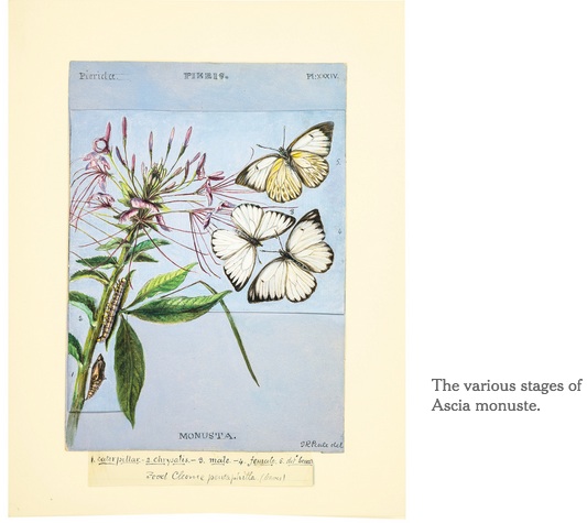
The book described below, The Butterflies of North America, includes the drawings by a fellow artist/observer, Titian Peale (who seemed to be named after two earlier artists.) Anyone who undertakes any artistic project that stretches over decades is automatically interesting, yet the names of his winged insects alone are a treat:
. . . you’ll discover the Mexican dartwhite and the Pacific orangetip, the yucca and the duskywing skipper, the coontie hairstreak and the sunset daggerwing, the stinky leafwing and the patch checkerspot — not to mention the Eastern comma and the mourning cloak. There are moths here, too: the yellow-necked prominent, the white-marked tussock, the satellite Sphinx and the snout.
The book, unfinished and unpublished when Peale died in 1885, represents more than 50 years of work. The manuscript ended up in the rare book collection of the American Museum of Natural History, where it somehow languished after it was donated by a family member in 1916. All of Peale’s artwork and some of his field notes from the manuscript are being published next week as “The Butterflies of North America: Titian Peale’s Lost Manuscript.”
Peale, who spent much of his life as an assistant examiner with the United States Patent Office, could never have lived up to the original title; there are, after all, several thousand species of Lepidoptera in North America. But what he did leave us is revelation enough.
“Butterflies” features more than 200 works of art — in gouache, watercolor, ink and pencil — that through Peale’s sharp but sensuous eye show the life cycle of moths and butterflies, from egg to caterpillar to pupa to winged adult. These striking illustrations are complemented by notes, studies and sketches in Peale’s hand from his field books.
Peale “considered scientific description and graphic representation entirely commensurate and complementary modes of attention to the natural world,” the art historian Kenneth Haltman writes in the book’s biographical essay.
Each caterpillar, often paired with its preferred food, is precisely drafted. Peale takes clear pleasure in depicting each foot, bristle and segment in tiny strokes. “Walking, bending, and inching up branches, Peale’s caterpillars are a tour de force of observational art,” Tom Baione, director of the museum’s research library, writes in the introduction to the section.
We may marvel at the sheer biological persistence of the 17-year locust, but consider: Titian Peale’s lost illustrations are finally seeing the light of day after a metamorphosis lasting nearly 200 years.
August 18th, 2015 by dave dorsey
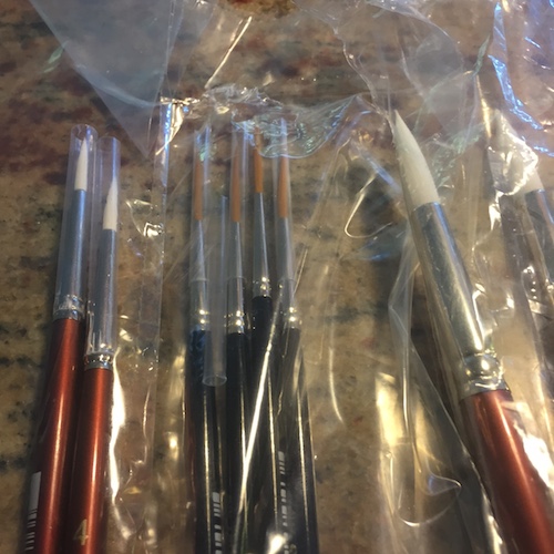
New brushes from Dick Blick
Hope and confidence both. Can’t buy me love. Can’t buy me faith. But I can buy a little accessory to hope. Is there anything more like a fresh start than a set of new brushes? For a painting I started in May, granted, but I’m getting that campfire in the gut while working on it.