Animals are people
July 25th, 2013 by dave dorsey
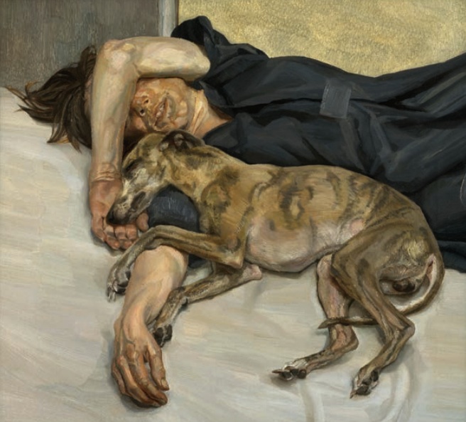
Double Portrait, Lucien Freud
In the current Harper’s, this could be my new favorite by Lucien Freud.
the painting life
Double Portrait, Lucien Freud
In the current Harper’s, this could be my new favorite by Lucien Freud.
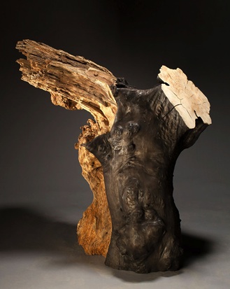
Samothracae, Jack Elliott
It’s impossible to do justice in a single blog post to a show as excellent as the 64th Rochester-Finger Lakes Exhibition at Memorial Art Gallery. Its effect is cumulative, as you wander past a hundred individual works. I learned recently that the heart rate of singers in a choir quickly synchronizes—so that every individual singer’s heart somehow times its pulse to the beat of every other heart in the choir. You get the sense of 81 unique hearts working in unison here as well, even though the artists live hundreds of miles apart, across the state of New York, pursuing a quiet, personal excellence. Each voice here is individual, operating in accord with its own unique set of stylistic principles, yet you feel the same passionate allegiance to private imperatives from one work to the next. You sense in this show a universal determination, across all the work, to focus on the slightest choices—how to render a line in a woodcut, how to stick to a certain kind of mark on canvas, how to check one’s ambitions into the confines of an unspectacular scale—as hard-won personal standards that result in mastery for that individual and no other in quite the same way. Jack Elliott’s Samothracea, the most powerful piece in the show, unapologetically reaches back many centuries for inspiration (it magically evokes its sculptural ancestor by pairing two enormous segments of willow trunks into a human torso that appears to be both in motion and standing still), while Donna Meadows Manier’s monoprint Luxury could be seen as sly up-to-the-minute commentary on our currently lopsided economy where a commodity can become an symbol of exclusive taste. In terms of diversity of style, purpose, and medium, you find yourself in a different world every time you take another step through the exhibition. But in each individual case, the craftsmanship is so uniformly subtle and understated, what’s happening in each work might slip right past you if you don’t dwell for a bit and give yourself time to see it. The spectacular nature of so much contemporary art has been shrugged off here in favor of values and dedication that don’t scream for attention but seductively invite it.
Since 1938, the Rochester-Finger Lakes Exhibition has served as a platform MORE
My work at the Memorial Art Gallery
I have to admit it’s cool to see my work hanging on a wall in our local museum only a few steps away from the spot where I stood when I was 18 and saw my first Rembrandt, Portrait of a Young Man. As part of the permanent collection, Rembrandt’s painting will be inhabiting the Memorial Art Gallery far longer than my work will. I’m on view for a couple months. (When you stand in a museum whose website tagline is “Fifty Centuries of World Art” you become hyper-aware of how little time you spend doing anything.) The 64th Rochester-Finger Lakes Exhibition, which accepted three of my paintings, will last until Sept. 9. Yet, as evanescent as my tenancy is there, my second participation in this exhibition (I sold my entry in the same exhibition four years ago) has given me a sense that the decades I’ve spent practicing, experimenting, learning, and building up one side of my back muscles from holding a brush aloft (I kid you not) have resulted in work that offers something of value to other people. I’ve had confirmation of this over the past five years, as I’ve begun to exhibit around the country and even in London, and I’ve sold a fair number of paintings, but this show always feels like the highest honor to me. Maybe because it happens here in what has become my home town, and maybe because the quality of the work, especially this year, and the quality of this museum, seems equal to anything I see anywhere I’ve looked at contemporary art. So the honor of being in this biennial show gives me a sense of achievement, but it also gives me a keen awareness of the humbling ironies implicit in being a visual artist now. Or almost any sort of dedicated, disciplined artist.
Artists in any field–poet, painter, musician, novelist, short story writer, actor, photographer, comic–do something that can represent a genuinely rare achievement (given the population of the world) and yet still be almost totally unknown and obscure (given the population of the world). Take it up to the highest notch, and this still holds true. You can even make a lot of money at what you do, be highly recognized in a given field, get profiles in glossy magazines and still labor in almost total obscurity when it comes to the human race as a whole. Part of the drive to be creative is to fashion something that could potentially have meaning or be a part of almost anyone’s life, in any time. Universal and timeless are a tired pair of adjectives that describe great art. Postmodernism aside, that’s the unspoken hope and dream of every artist: to make something that deserves those adjectives. And yet even the most celebrated and lucrative work, the art that reaches the most people and has the greatest chance of being seen years into the future, has little impact on most people. Jeff Koons is probably one of the most publicized and controversial artists now living and yet almost no one would recognize his face on the street. Nor would most people be familiar with his name or his work. I think those who devote their lives to art tend to forget how much it takes place in a comparatively tiny social bubble, at various levels–local, regional, national, even international. The global audience even for the MORE

A student at Protsohan in New Delhi
A great, through brief, story on how one woman, Sonal Kapoor, is teaching art, design and photography to help poor girls in New Delhi escape lives of despair. The program also has a Facebook page. I loved their mission statement there: “Encouraging Skills Development & Creative Education through DESIGN THINKING at the bottomest of pyramid.”
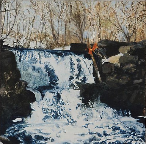
Ithan Creek, Peter Allen Hoffman
I found the current show at Freight + Volume both disappointing and encouraging, which, if you think about it, ought to be a hard thing to pull off. It was a bit of a letdown in a way that I’ve experienced several times over the past couple years. It goes like this. Paintings that intrigue me when I see them reproduced on a website look much less vibrant and resonant in person. They aren’t as alive as I expect them to be. A surface richness I think I see in reproductions isn’t there when you stand before the actual work. (I remember reading an account of this same experience from someone who had gone to a show of Natalie Frank’s paintings.) It happened, for me, at Walton Ford’s most recent show at Kasmin. I still admire his scenes as much as ever, for many reasons, but I’d expected to revel more in his paint handling. Standing a couple feet away from the images, I wasn’t as charmed by them. Do I quibble? Probably. Would it matter to anyone other than a painter? Probably not. Yet, in some way that’s hard to explain, I felt a little conned at the surface level of the work. His interest didn’t seem to be in the paint itself, but in simply creating the illusion he wanted, as expeditiously as possible. Those same words could be applied as high praise for the work of Sargent or Hals or Vermeer or Fragonard any number of other painters—mastery often means getting the most powerful results out of the least effort. But up close a Vermeer remains as much a marvel of execution as it is from five feet away. Not so much with Ford. His work left me feeling as if the act of painting was something he was impatient to get past. At the recent Durer exhibition in Washington, for example, I never felt that way: MORE
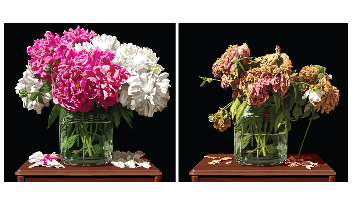
Peonies from Chris Lyons. Harrington wondered why not do it as an actual serigraph, in whatever way Warhol did it. I wondered why not do it as big as Warhol did a serigraph. The difference would be, no irony. In any case, we want more, Speedy. Only large. Big Warhol serigraph, only larger. Just thinking aloud. I liked the white background better in the email you sent.
Parquet Courts delivered. Sadly, the Post Office didn’t.
Represent is about the painting life. It says so up there on the banner. As of today, it’s also about shipping, which is a crucial part of the painting life (if you care to show your work to other people in a public way.) Mostly, over the past two years, I’ve been writing about the painting part, and not much about the life. So I’m going to correct that with a lesson on how not to attempt something absolutely essential to this pursuit: frugality. It’s always a good idea, in any field, to spend as little as possible, but especially as an artist. With that in mind, it would seem a no-brainer that I shouldn’t vacation in, say, Palm Springs. Or play golf. (Or visit New York City for that matter. You know how much parking costs in Manhattan? I don’t have the heart to tell you.) But if both your kids live and work in L.A., and you get to see them once a year when they come home for Christmas, going to L.A. for a week in the summer is the best option. This is because it’s exceedingly hot in the desert in July, when rounds of golf and rental homes are as inexpensive as they ever get there. During July, it would cost more to golf at many public courses here in Rochester.
So we save up my wife’s earnings from teaching second grade, and we spend a week with our kids in Palm Springs (much less expensive, actually, than staying virtually anywhere closer to L.A. itself), during one of the hottest weeks of the year. A round of 18 holes at Indian Canyons Golf, where my son Matthew and my son-in-law, John Bridge, and I will be playing every morning during our annual week in Palm Springs, costs $45 for eighteen holes, per player, unless you buy a summer discount card for a one-time fee of $65, which lowers the greens fees to $30 per person, every day, for the six days we play. A couple hundred dollars of savings! Beautiful. I’m a painter so, as you know, I can find the beauty in many things, including a vacation where the daily high will be 115.
Which brings me to the subject of the U.S. Postal Service. I know, that’s a pretty bumpy transition, but it will make sense if you stay with me. MORE
 In Pakistan they paint actual trucks and consider it art, as they should. They also paint billboards as an art form. Mahwish Chishty imagines, in her paintings, this tradition applied to drones. Mother Jones asked her:
MJ: So has the Department of Defense asked you to repaint any of their Predators yet?
MC: [Laughs.] No, but I was thinking that would be so cool. I probably should put in a proposal for that.

Night Sky in Nevada
If you’ve got six hours to spare, this is what it looks like to sit in rural Nevada and gaze at the stars. You can see them just starting to appear in the post-sunset sky here. Warhol wishes he’d done this. Full disclosure: I watched about 30 seconds. Click to YouTube to see any or all of it.
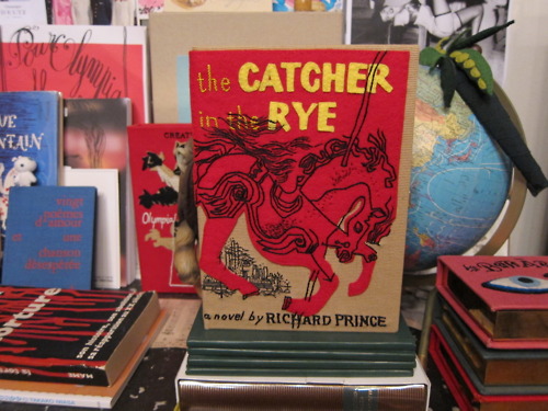
Catcher In The Rye, facsimile plagiarized first edition, Richard Prince, $62.
Warhol shrugs.
“Richard Prince has been in the news a lot lately for his courtroom battles against the laws of copyright as they apply in fine art. Some have even suggested that Prince’s courtroom behavior—ambivalent responses to simple questions about his work—is the latest stage of the artist’s protests against authorship and authority.” —Interview
The courage! Protesting the tyranny of authorship! Oh so postmodern. Isn’t the disappearance of the common reader and the death of the mid-list book enough? The Koran might look nice with Prince’s name on it, but he should check with Rushdie first. (Anyone else think the last Sonic Youth album was so more compelling than this interview?) Someone recently told me, “The internet is a beautiful and complicated web of glittery bullshit.” Sometimes it’s beautiful, sometimes not.
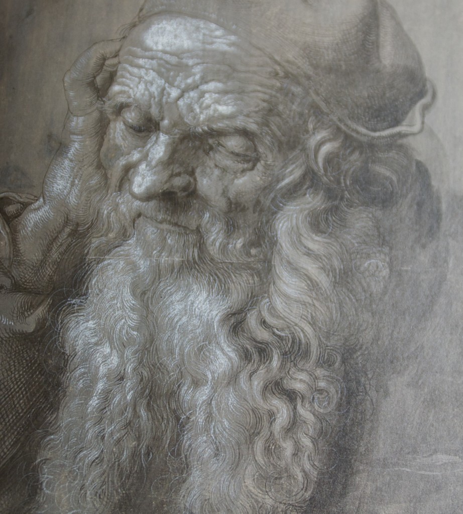
Detail, An Elderly Man of Ninety-Three Years, Durer
A week ago, I drove six hours, due south, from Rochester and arrived at the National Gallery during the final afternoon of the Durer exhibition in Washington, D.C. It would be a bit of an understatement to say a glimpse of some of the greatest art ever created was well worth the zigzag navigation of Pennsylvania’s state highways. Being able to stand a foot or two away from some of this work, from Vienna’s Albertina Museum, was a profound experience, and I walked away from this magnificent show with a much deeper awe over Durer’s genius. He may be the greatest draftsman who ever lived, not simply because of the accuracy and versatility of his representational skill—how true he could be to the way ordinary things actually look—but also, paradoxically, because of the idiosyncratic, obsessive extremity of his images, which always seem to convey something infinite and unknowable, even in the depiction of commonplace things. I’d be hard-pressed to think of any work of the Italian Renaissance that could compete with the intricate precision of Durer’s line.
It’s no accident that this exhibition focused on prints, drawings, and watercolor paintings—which, with Durer, are really drawings with color. His heart and soul, as well as his income, were in his drawings, not his oils. The show made clear he had a preternatural ability to reduce everything to line, especially when, standing close to one of his surfaces, you recognize that even when he was ostensibly “painting” on paper, he was often using parallel lines—as if he were doing an etching—to indicate shade. He established areas of mid-value simply by drawing straight or wavy lines, perfectly aligned and equally spaced, thick or thin, depending on the level of gray he wanted to evoke. Standing before some of this work, it’s hard to believe he could have done it without some kind of mechanical guide to steady his hand—the lines are so perfectly executed and uniform.
When Durer traveled to Italy, Giovanni Bellini refused to believe the artist could do what others said he could until he saw Durer demonstrate it. He asked Durer what tiny brushes he used, with multiple hairs that would produce the wavy parallel lines in his depiction of hair and fur and shaded areas. Durer showed him the ordinary, single-pointed brushes. “No, I don’t mean these but the ones with which you draw several hairs with one stroke; they must be rather spread out and more divided, otherwise in a long sweep such regularity of curvature and distance could not be preserved.” Nope, these are the ones, Durer said. Prove it, Bellini said. So he did. As Bellini later said, “Taking up one of the same brushes, he drew some very long wavy tresses such as women generally wear, in the most regular order and symmetry.” As a second observer recalled, “No human being could have convinced Bellini by report of the truth of that which he had seen with his own eyes.”The exhibition catalog expresses the same thing perfectly about MORE
William Eggleston
From patriksandberg.com:
Drew Barrymore: How do you feel about cropping?
William Eggleston: I don’t.
DB: Thank you! Cheers. God bless you. There’s a part of me that feels like it’s not fair.
WE: You’re right, it’s not. It’s messing with things. There’s something sinister about it. When it’s cropped that’s not you anymore. So that’s one reason I don’t do it. Another reason is just one of those personal disciplines. I might have picked it up originally from [Henri-]Cartier [Bresson], who was a fanatic of never cropping. You know, I had a meeting with him, one in particular, it was at this party in Lyon. Big event, you know. I was seated with him and a couple of women. You’ll never guess what he said to me.
DB: What?
WE: “William, color is bullshit.” End of conversation. Not another word. And I didn’t say anything back. What can one say? I mean, I felt like saying I’ve wasted a lot of time. As this happened, I’ll tell you, I noticed across the room this really beautiful young lady, who turned out to be crazy. So I just got up, left the table, introduced myself, and I spent the rest of the evening talking to her, and she never told me color was bullshit.
River Mosaic I, John Cullen, mixed media
There’s a fine show of John Cullen’s latest work at Viridian Artists. He paints modestly-scaled abstracts that begin with a kind of AbEx experimentation, where he allows thinned acrylic paint to drip down a sheet of paper. In other words, he lets water have its way, at the start, and then he begins to build on the trail it leaves behind with pencil and more acrylic. That may sound like a pretty dry way of describing an artistic practice, yet Cullen is all about the wet. His paintings evoke the flow of water in all its forms: streams, raindrops on glass, mist and clouds. While so much abstraction builds from geometric exploration, Cullen’s provenance is really physics: the irregular, organic waves evoked by light reflected on fluid. He ends up with mosaics that appear to have the intricate order of fractals. His colors glow and hint at different states of consciousness, not simply different angles on the outer world.
His current work builds from a wavy, warped grid, a skeleton, of vertical and horizontal axes, which provides an anchor for his improvisations with color. If you look long enough at some of them you realize he’s created an abstraction from an actual image of a scene reflected on rippled water. You see bits of blue become sky, and tiers of green resolve into trees that surround it. There’s a mosaic quality to his technique inspired by pointillism. Yet he found that Impressionism didn’t allow him to create the color harmonies he wanted MORE
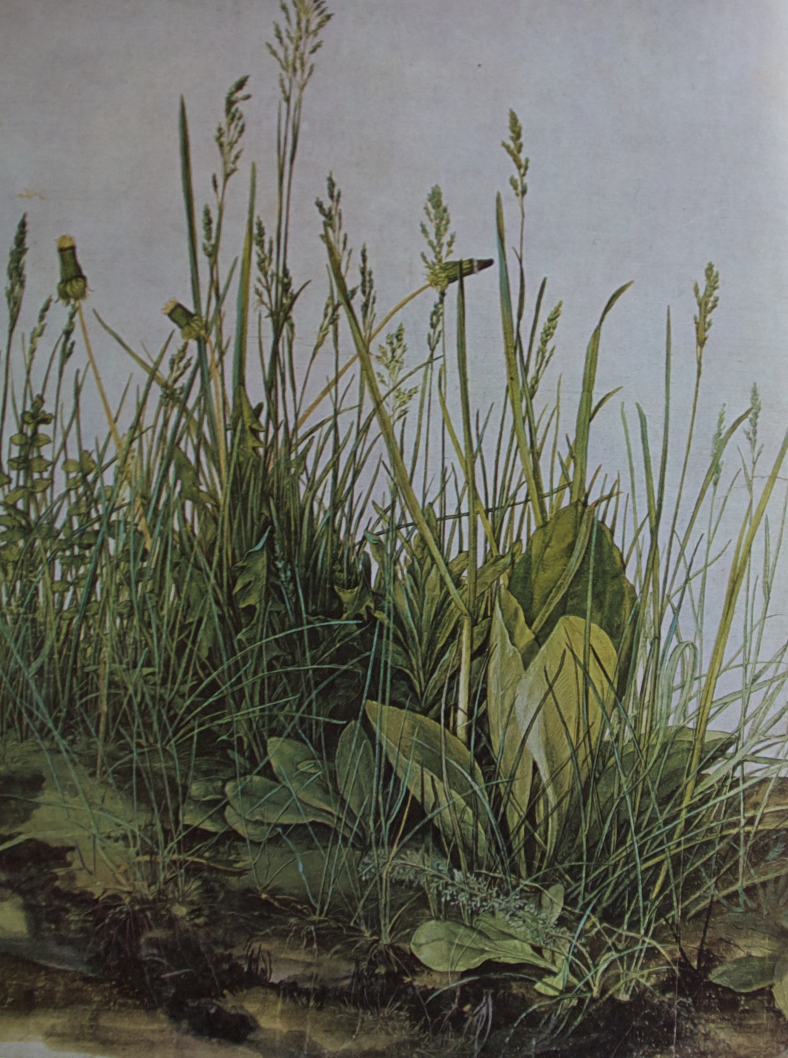
The Great Piece of Turf, Durer, 1503
“The piece of turf must have been dug not long after sunrise, for the florets of the dandelions are tightly closed, and the leaves below them are still moist with the morning coolness. Such a clump of plants and grasses might be found today along any country road, in Europe or America, where it dips down into the dampness of a hollow. Besides the dandelions there are the fleshy leaves of the great plantain, creeping Charlie, and a dwarfed feathery shoot of yarrow. As for the grasses, they are the most commonplace–meadow grass, cock’s foot, the thin spikes of heath rush. “In truth,” Durer wrote, “Art is implicit in nature, and whoever can extract it has it.” –Francis Russell
Wish I’d painted that.
Or written that.
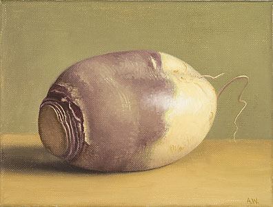
Rutabega, Amy Weiskopf, oil on linen, 2013
Size: 6 x 8 inches. Hirschl & Adler.
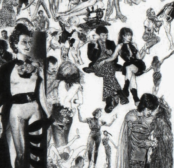
Detail from Libidinal Economics, Rafael Leonardo Black
“So the Dalai Lama says, there won’t be any money, but when you die on your deathbed, you will receive total consciousness. So I got that going for me. Which is nice.”
On the other hand, sometimes in the end there’s even a little money for all the effort: “Discovered at 64, a Brooklyn artist . . . “
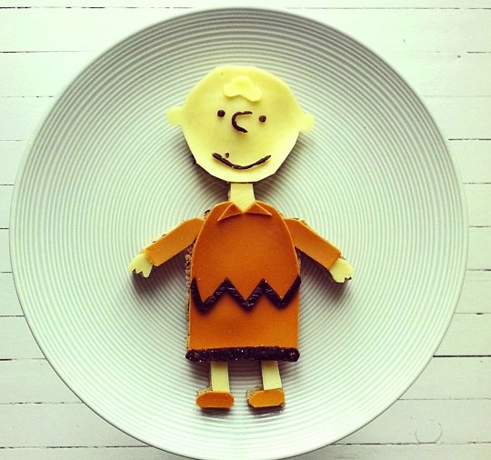
Oh, good grief
And then she Instagrams it. More here. (You have to check out The Scream. Just scroll down a bit for a munchable Munch.)

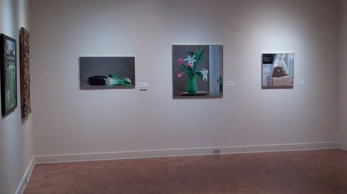
Eggplant and Bok Choy, oil on linen, 20″ x 36″ at Memorial Art Gallery this summer
In July and August this year, visitors to our local museum in Rochester, the Memorial Art Gallery, will have the chance to press a few keys on their cell phones and listen to me and quite a few other artists talk about our work. This morning I recorded sixty seconds of commentary on painting and why I do it. I was fortunate this year to have three pieces chosen for MAG’s 64th Rochester-Finger Lakes Exhibition. All exhibitors were requested to record a brief artist’s statement for viewers to hear as part of a recorded tour. So, not only will those in attendance have a chance to see my work, but they can listen to me talk about it as they do. Off-hand, this strikes me as a little too much of David Dorsey for most people’s taste, but maybe it will be sufferable since I kept my recording within the time limit.
Once again, this has been a chance to face the challenge of the dreaded artist’s statement. I’ve approached this from many angles over the past few years, and it’s difficult to condense into a few words something as elusive and complex as the act of painting as well as the totality of what drives a person to paint. It’s like asking someone to say, in half a minute, why life matters. Especially if you have an aversion for sounding grandiose and/or pretentious, and I do have that aversion, despite all evidence to the contraryon this blog. So here’s what I came up
It’s just air in there.
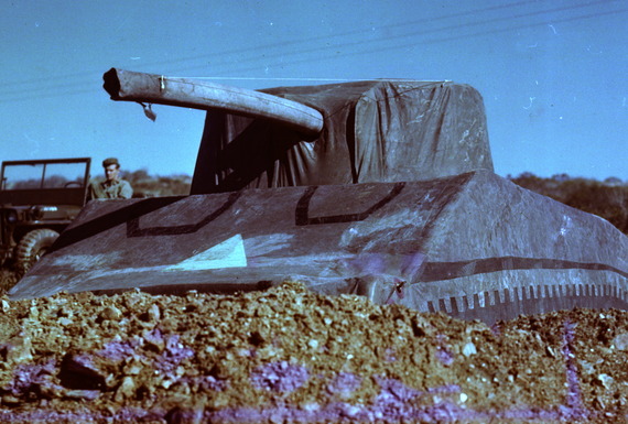
From The Atlantic, how performance art, essentially, helped save lives in World War II. Talk about art mattering.