Archive Page 2
March 31st, 2024 by dave dorsey
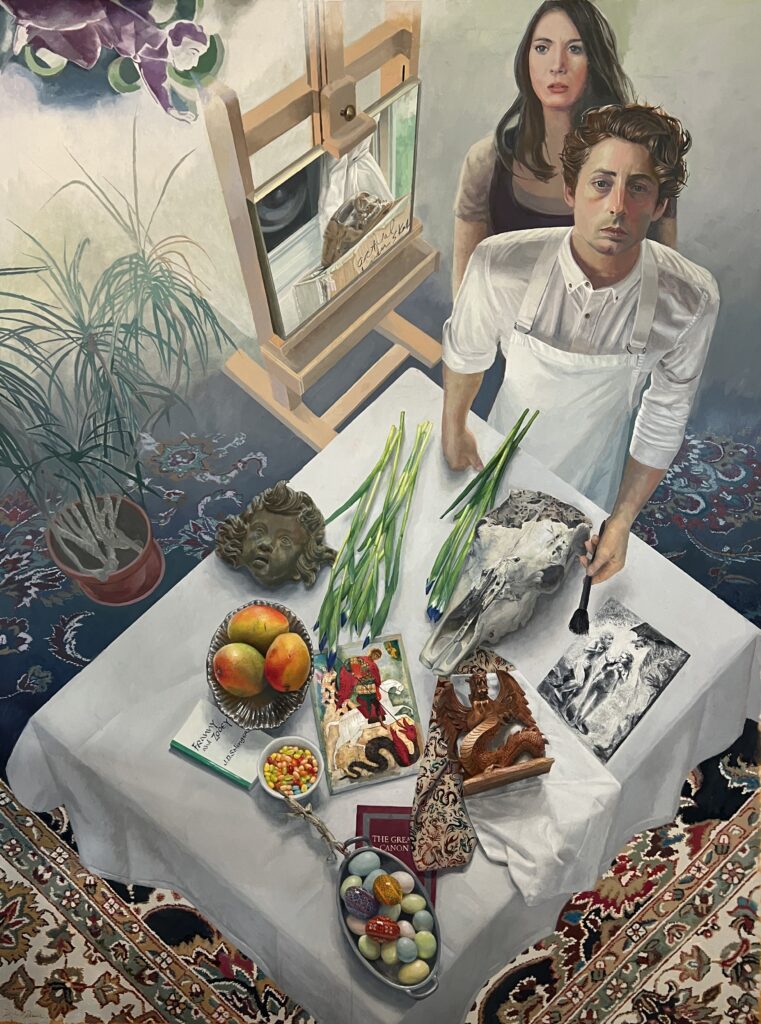
George’s Dream, oil on linen, 60″ x 80″, 2024
There are a few small things to do still, but this is essentially complete, for The Stuff of Dreams at Oxford Gallery, opening in about three weeks. I started George’s Dream in late November though I had been sketching and researching elements of it for more than a year. I was exploring the theme of St. George and the dragon from different angles, though I ended up creating the image of a dream that starts out near the bottom as one of the tabletops I’ve painted for many years and then dematerializes a bit into the dream as your eye moves to the top of the canvas. It was ironic to be working on this during my No Ideas But in Things solo show at SUNY-Finger Lakes Community College, which was a survey of work from the past fifteen years rooted in the idea that painting communicates and embodies an awareness that has little or nothing to do with the kind of thinking that recognizes narratives. This is certainly an image that suggests multiple interpretations, so it’s completely outside the scope of how I work as a painter: to try and bypass illustrated ideas. But having the occasion of the theme Jim Hall offered gave me a chance to work in this mode. I found it challenging and rewarding from start to this provisional finish, though there were two or three tedious periods along the way. It’s nearly seven feet high, so I had to buy a small scaffold at Home Depot in order to work on the upper third of the image. I found myself doing half a dozen unfamiliar things and discovering that I could, in fact, get satisfying results with some objects when I had serious doubts about my ability to depict them accurately. Many thanks to a painting by Chagall for that Cubist cherub in the upper left corner. It’s my favorite painting of his.
March 28th, 2024 by dave dorsey
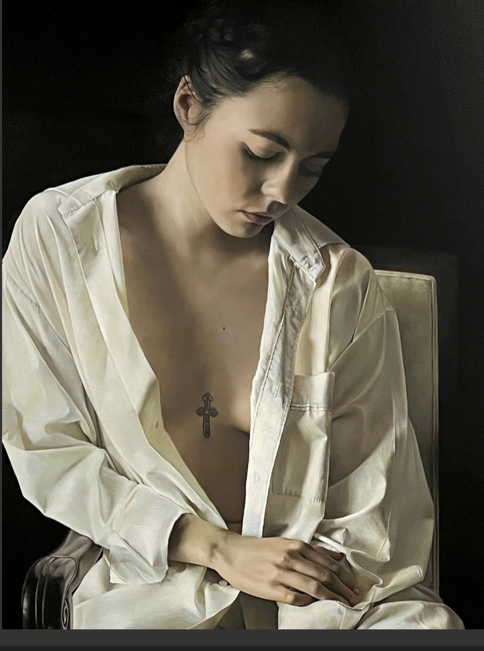
Le Chemise Blanche, oil on linen, 56″ x 45.”
March 8th, 2024 by dave dorsey
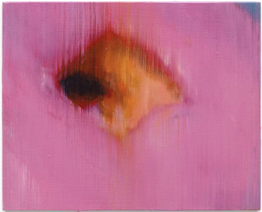
Purity, oil on panel, 5 1/4 x 6 5/8.
The Rococo era, with its beautiful, frilly tribute to eroticism and abundance, flourished for a few decades in the 18th century before the French Revolution brought it to a violent halt. The Jacobins used a guillotine on all the privileged fun one sees in paintings from the mid 18th century. Chardin, the greatest of the French painters in that century, belonged to this era, but mostly he lived in it while not really being of it. Watteau, Fragonard, Boucher, and Tiepolo embodied the effervescence of rococo painting while depicting what must look to most people in our era (so glumly serious about politics) like scenes of fatuous and frivolous pursuits. Tiepolo, though, had a conscience. A painting I saw for the second time late last year at the Norton Simon in Pasadena is the marvelously simplified Allegory of Virtue and Nobility: it’s about the conscious choice to be good. And rococo is far from irrelevant in any era: one thing is self-evident to anyone who has seen The Progress of Love at The Frick: Fragonard was a preternaturally talented painter who knew exactly how women win the hearts of men. The immense imbalances of wealth that led up to the revolution sustained his creativity and nourished the work of many others. Fragonard’s productive years ended with the Reign of Terror. Great wealth feeds great art. Until it doesn’t.
Actually, Chardin’s bubble-blower might fit nicely here as an emblem of a much larger bubble that burst when all of this disappeared into the chaos of the new France. It seems we’ve lived in the era of his bubble-blower for decades now: the dot.com bubble, the real estate bubble, smaller ones bursting within the overarching long-term bull market that has been fueled in many ways by dizzying levels of unsustainable debt. (We have been in the Lord Voldemort of bubbles for decades, the one whose name we don’t speak.) The wealthy are getting wealthier every year, in some cases faster than at any time in history out of financial maneuvers rather than creative contributions from genuine labor in and devoted to the actual world. It all feels a bit rickety.
So it’s little wonder that visual art in many ways now echoes the Rococo era: the decorative energy, its flamboyant excesses and its lush eroticism with a fervor that implies it can’t last. (Let’s get our kicks now while there’s time!) What this means for the future, who knows, but for now it can be a delight because in many cases its generating art that’s meant to be loved for the desire and pleasure it embodies. It isn’t ameliorative or scolding or therapeutic, as Dave Hickey might have put it. It’s art made with a life-affirming energy. The music of Phoenix, a band I never tire of listening to—French of course—should be the soundtrack for all this.
Lisa Yuskavage, Will St. John, even Kehinde Wiley and Zoey Frank with the decorative patterning that plays a key role in so much of Wiley’s and Frank’s work, are all indebted to different elements of rococo. Flora Yukhnovich reimagines rococo scenes as gestural, painterly impressions somewhat the way Elise Ansel does with other paintings from various eras. Daniel Bilodeau’s floral still lifes at Arcadia Contemporary and at the LA Art Show last month are another outstanding example. You can find elements of rococo now everywhere.
Emily Eveleth’s new show at Miles McEnery shows that she has enlisted her skills into this neighborhood of visual exuberance. She has stayed mostly true to the self-imposed limits of her chosen subject: glazed donuts, jelly donuts, sugared donuts. It’s the gamut of donuts, which isn’t much of a gamut unless, say, you enlist apple fritters or crullers or eclairs into the mix. I’m only half kidding. Where does one go? The new show demonstrates where it has led.
Her allegiance to donuts is a discipline. It’s like Rothko’s unwillingness to try anything outside that heaven-earth-horizon format that became his only way of expressing various human states of being. For years, I thought Eveleth had backed herself into a corner. The original glazed donuts, seen with the viewer’s eyes at the level of the surface (the way William Bailey always lined up his assiduously un-shiny antique pottery on a shelf or table) were wonderfully humble, but also baroque in their spotlit elegance. The light settled on the sugary glaze from above and seemed to caress the muted browns and golds in the front rim of the pastry, everything at rest—it felt like a cross between Rembrandt and a Chardin brioche, with a dignity that nothing other than the light and the dark backdrop provided, along with the restraint of her paint handling. She moved from those original, classic still lifes to jelly donuts slouched against a vertical surface and oozing their innards in a way that felt anatomical and seemed decadent and suggestive in comparison with the earlier images where all the expressive possibilities were restrained and channeled through the sensuous accuracy of her brush. That was when I wondered, how does she get out of this? What’s the next step? Accuracy restrained her color choices and compositional options. How would you move on except by doing a huge pivot into some other format, another kind of subject?
She stuck with donuts. It’s what anyone could learn from the fundamental abstractionists: Rothko, De Kooning, Stella (in the Sixties), Albers, Agnes Martin. Find a format and keep dancing with the one you brought. See if you could learn to move in new ways without changing partners. In the past decades, she has found greater freedom in the corner she constructed for herself to get started. Staying in place, she’s turned around and faced the other way. She has gotten even looser with her paint and more arbitrary with her color. Her earlier show in 2021 and this current exhibit demonstrate that she’s evolving more toward a focus on color and improvisation, and she’s moving closer to gestural abstraction. She hasn’t pulled up her anchor in the representational core of her image, but it’s dragging along the bottom a bit. The results are impressive, though a little mixed here and there.
Some of her tropes are fantastic: wallpaper patterns that look as if they were stenciled through thin, filigreed metal onto another sheet of metal. Flagrant juxtapositions of flat patterns juxtaposed against lush thick renderings of donuts like big velour bean bags. Her feeling for color harmonies can be wonderful. When she cuts loose, she’s earned the right to have her way with donuts and it’s fun to see what she can think up. The pink flamingos as wallpaper behind one figure seem a bit of a joke: see what I can get away with! Yet the work is always exhilarating because there’s not a snide or sorry note in anything she’s doing, and those oozing wounds in the jelly donuts are universal, aren’t they? Everything dissolves and comes apart eventually. In her most powerful paintings she stays true to the earlier spirit of closing most of her options, the restraint that Hemingway described as the iceberg. What’s underwater remains inherent in the work, withheld and pushing for expression but held back, giving power to what little is visible.
The Small Rooms of Paris: radiant golden jelly donuts sitting one on top of another, with their little sweet ports puckered and singing some silent praise for being in Paris, against a very subtle, complementary wallpaper of turquoise and Thalo blue. The Soft Machine: two pale donuts stacked so that the mouth of the top one shows just a little red, a small hot tone crowning an orange-pink cairn of flour and fat. The simplicity of the entire composition harks back to her earliest work and the seminal American abstractionists. Diary of a Thief owes plenty to Matisse with its decorative background and reflections in the surface under the donut, though that blatant, blood-red orifice brings the viewer up short in a way Matisse never did. A tiny miniature, Purity, is a marvel of simplicity and restraint. It’s a detail painting of a center hole in a glazed donut where the paint uniformly trails down from the upper edge as if scraped—Richter style—in a way that creates an abstract image that is still amazingly representational. She has used that technique for years, giving her paint those downward ridges, like uniform brush marks offering a febrile sense of potential motion as if the whole painting were paused digital image on a screen. The most interesting painting in the entire show, Flesh and Blood, owes a slight debt to the earliest Alyssa Monks paintings of women seen through wet glass. Eveleth has worked from a shot of a donut glimpsed through a glass fogged with mist like a bathroom mirror. She drew what appears to be a lion’s silhouette with her finger, wiping clarity into the frost on the glass as the excess water drips away at the bottom. You see a portion of the donut clearly through that shape with the rest dissolving into a haze of mist. What’s powerful is how much remains inaccessible and merely suggested here, everything you glimpse obscurely through the fog, with all the most intense color visible in a small area of the canvas, the tip of the iceberg.
March 7th, 2024 by dave dorsey
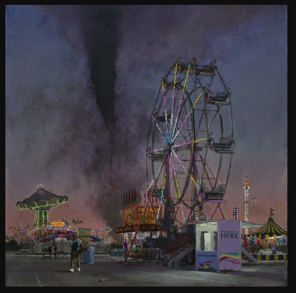
John Brosio, Tornado and Ferris Wheel, 2023
Imagine living your life under the continuous shadow of physical or spiritual annihilation. Imagine being able to go about your business fairly effectively and check off all the items on your To Do list as the day goes on despite the funnel cloud descending from the sky behind you. That’s more or less the feel of John Brosio’s world, which can be startlingly lovely in the foreground, partly because the darkness of that nightmarish backdrop sets off the carnival lights so beautifully. He paints nightmarish scenes that also depict tediously ordinary things happening before hell breaks loose. Those hellish possibilities often seem to loom behind the most ordinary tableaus, the sublime potential of catastrophe giving even a nondescript parking lot a marvelous aura of cozy familiarity by contrast–since it may soon be obliterated. Other times, he shows you just a huge Big Gulp sitting behind a check cashing service, tall as a water tower, inexplicably as large as King Kong. It’s a lot cooler to look at when it’s that tall.
John Brosio’s slightly skewed and darkly funny visions of everyday apocalypse will be on view at Arcadia Contemporary for a few more days. They can be both funny and chilling in the same way that it’s amusing to watch children devote hours to building worlds with toys only to destroy them in a few seconds, which makes the whole creation/destruction cycle seem amusing and contained and safely translated into entertainment, the way disasters can feel in a theater. It’s no surprise that J.J. Abrams is one of Brosio’s collectors. I love his tornado paintings the most, partly because of the structural simplicity of the black funnel descending from above, ready to vacuum everything in its path, but also because tornadoes once taught us there is no place like home. Brosio’s paintings all tend to remind me of that chant from the Wizard of Oz. I’m not sure Brosio believes in our ability to get back home, though.
March 3rd, 2024 by dave dorsey
 \
\
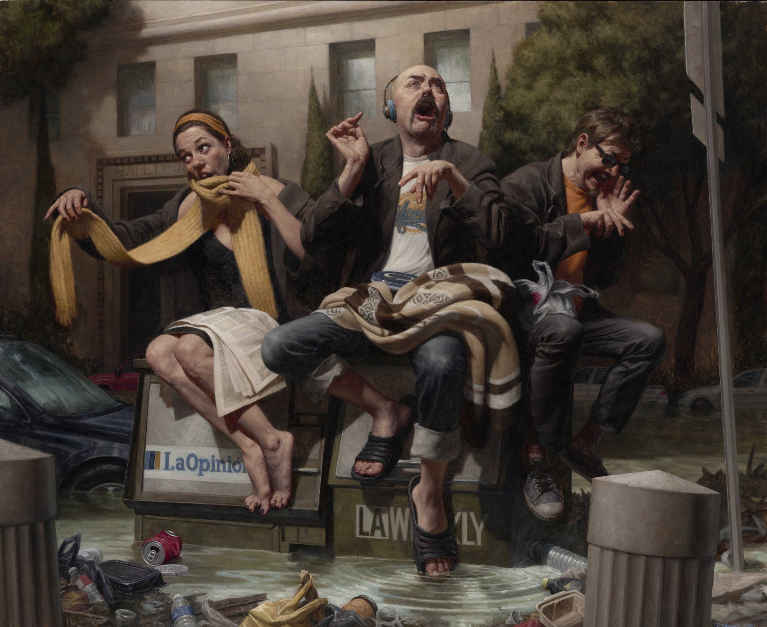
The media. Who gives them their platform. Or plinth in this case, I guess.
February 13th, 2024 by dave dorsey
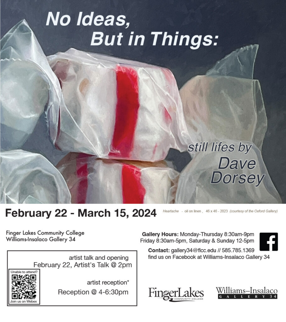
I’m going to deliver about eighteen paintings to the Williams-Insalaco Gallery today for a solo show opening next week: No Ideas But In Things. It’s the motto coined by William Carlos Williams for the Imagist poets a century ago. The exhibition is a survey of work I’ve done over the past decade. I’m giving a talk mostly for the art students at FLCC, describing my slow progress to where I am now as a painter. I’m going to open with my wisdom about being a painter, reduced down to five words: Don’t quit your day job. This was a crucial choice for me, to make money in other ways and make paintings in the time that remained. (I still have the vestige of a non-art day job, though I work full days as a painter.) This choice delayed my ability to become a professional artist, but also gave me the freedom to experiment and simply learn to absorb what I loved in the work of others and learn from it at my own pace. I think highly ambitious artists who are determined to go to Yale or Pratt and then start exhibiting in New York City and selling for high prices within a few years of having gotten an MFA are at risk of losing touch with what drives them to be an artist. Anyone who succeeds commercially in short order will, of necessity, be under pressure to adapt to the demands of collectors and critics. A painter can easily lose touch with what prompted him or her to make art in the first place.
I didn’t go to art school for a couple reasons. One, I didn’t feel at home with much of what was going on in the art world in the 1960s when I was in my teens and in love with the work of the early modernists: Van Gogh, Gauguin, Chagall, Braque, Klee, Matisse, Burchfield, and others. As art progressed into the mid-20th century it became less and less appealing to me. I felt like a late-comer. I thought that I had to somehow fit into my historical moment, so effectively this opportunity had come and gone before I was born. But I also began to wonder how the practice of painting could progress at all beyond the work of the abstract expressionists and color field painters. It seemed as if painting had run its course. A cluster of other, weirder ways of being an artist had sprung up in a desperate attempt to keep the idea of the avant garde alive. Performance art, happenings, minimalism, conceptual art, installations and so on. Everyone was struggling to do something new when the idea of newness had exhausted itself. It all seemed contrived and arbitrary. It seemed painting had nowhere else to go. This didn’t keep me from painting. But I assumed I would need to do it simply because I enjoyed it without any hope of finding a way of belonging to an art scene that had moved beyond me. So I kept painting without attempting to make a living from it. I avoided a degree in art, even though in my thirties I studied at the Munson-Williams-Proctor Institute and the Memorial Art Gallery.
I got a master’s degree in English, became a reporter, got jobs in newspapers and then with MORE
February 2nd, 2024 by dave dorsey
 My work will be shown by Arcadia Contemporary at the 29th edition of The West Coast’s largest, international art fair, The LA Art Show. I’ll be visiting on the 15th and looking forward to seeing all the work at the exhibition. The art fair is February 14 – 18 at The Los Angeles Convention Center West Hall, Booth #713/812
Here are the artists Arcadia will be representing: Timur Akhriev – Nick Alm – Michelle Amatrula – Mary Jane Ansell – Naima Aouni Daniel Bilmes – Laurie Lee Brom – John Brosio -Hogan Brown – Richie Carter Michael Chapman – Fernando Cidoncha – Matthew Cornell – Darya Dolgareva – David Dorsey – Shaun Downey – Adele Flamand-Browne- Alex Russell Flint – Stephen Fox – Ivan Franco Fraga – Sara Gallagher – Brian Haberlin – Takahiro Hara – Peter Harris – Ron Hicks – Anhelina Holembivska – Andreii Kateryniuk – Sung Eun Kim – Patrick Kramer – Brad Kunkle – William Lazos – Malcolm T. Liepke – Stephen Mackey – Darian Mederos – Renato Muccillo – Alberto Ortega – Carla Paine – Julio Reyes – Anne-Christine Roda – Denis Sarazhin – Jesse Stern – Kesja Tabaczuk – Hideo Tanaka – Kari Tirrell – Alex Venezia – Jose Lopez Vergara – Angel Reyes Vergara – Aaron Westerberg – Aron Wiesenfeld – Caren Wynne-Burke & Dana Zaltzman
January 31st, 2024 by dave dorsey
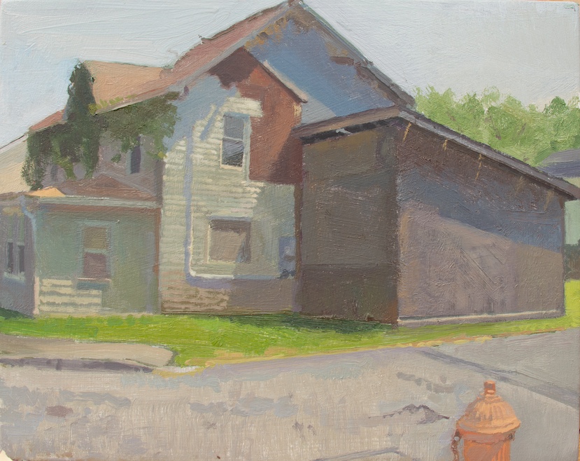
Matt Klos, Sycamore Avenue, oil on panel, 8″ x 10″, 2023
Matt Klos and Nora Sturges are showing new work at Anne Arundel Community College in the The Cade Center for Fine Arts Gallery. Matt is from my hometown, and he showed his work for a number of years here at Oxford Gallery and now teaches at Anne Arundel Community College in Arnold, Maryland. Years ago, he was also a student of my friend Bill Stephens. It’s always a great pleasure to see his new work. He’s constantly finding pictorial opportunities usually in overlooked places most people would rarely pause to admire. Yet his achievement isn’t simply to show you what’s physically visible, but to convey a time of day, a quality of light and a season. You see what he saw in the short period of time it took to paint these small pieces, but his images root themselves in a stillness that reaches out far beyond a particular moment. His statement, below, on the new work is eloquent. What follows is from his email invitation to the show.
Street View: Paintings by Matt Klos & Nora Sturges
EXHIBITION ON VIEW
The exhibit is open February 2 – March 1
RECEPTION: Feb. 8. 5-7pm
In “Street View,” painters Matt Klos and Nora Sturges investigate the visual contours and terrain of cityscapes both near and far from home. Klos’ series A Community Portrait investigates his historically working-class community of Sparrows Point by tracing the alleyways and painting on site. Generally, each painting spans a few hours of working time to capture a particular light, time of day, and season. In the series The View from the Road, Sturges paints from screenshots she takes in Google Street View following the route Charles Darwin took on his voyage with the Beagle (1832-36). These meticulously crafted paintings reveal idiosyncratic contemporary moments. Both artists value discovery by looking closely. Their ideas are couched in the time required to paint in an empirical and investigative manner.
MATT KLOS: “This project is a series of small format paintings of my community made during my sabbatical in spring 2023. Subjects include the outbuildings as seen from the back alleys near my home and front views of houses along a historically black and landlocked street in Sparrows Point, MD. Over the last twenty years I’ve spent time observing these often-overlooked areas, which I have seen on walks at various times of day. I’m often surprised by the endless variations and beauty found here. As we increasingly choreograph our identities via social media, slavishly attending to every detail of how we may be perceived, it’s refreshing to see a dimension of our public facing selves that is not as self-conscious and as premeditated. Our homes reveal volumes. I see each painting in this project as a type of portrait and, as such, communicates both specific and general truths about our communities and ourselves.”
NORA STURGES: “Since 2008, I have worked intermittently on a series of tiny paintings collectively called The View from the Road. My original inspiration was the early color photographs of Sergei Prokudin-Gorskii, who set out in 1905 to document the Russian empire, and my paintings offered me an opportunity to document the interesting things I saw on my own travels, out in the world near home and farther afield. During the pandemic, deprived of actual travel, I found myself devoting considerable time to exploring foreign places in Google Street View, and wanting to paint the wonderful things I was discovering. Instead of using chance or previous knowledge to choose places to explore, I decided to follow the route Charles Darwin took on his voyage with the Beagle (1832-36). Like Darwin, I am convinced of the value of observation, especially the intense observation painting entails, even when the subject is, on the surface, boring. Darwin’s observations led, years later, to the theories of natural selection and evolution he set forth in On the Origin of Species; already my voyage and observations are leading me to ideas about the human species.”
FOR MORE INFORMATION: Contact Chris Mona, Interim Director, Cade Art Gallery, at cpmona@aacc.edu
January 28th, 2024 by dave dorsey
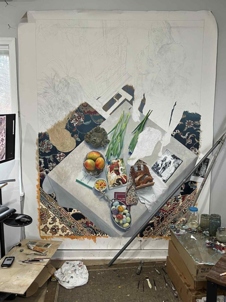
George’s Dream in progress
I realized today that I haven’t posted here for nearly a season. I’ve been absorbed by the largest painting I’ve ever undertaken, a departure from almost everything I’ve done so far. I’m moving off the edge of the map of what I know how to do, and it’s both unsettling and exhilarating. It’s a one-off effort is how I look at it; I’m not seeing a series of paintings like this in my future. Oxford Gallery has a group show on the theme of dreams in April, and I’m hoping to finish this in time to have it in the show. It’s not the smartest thing to be doing right now, given the fact that my taffy paintings have been selling, but the opportunity emerged to put myself on a deadline and get this thing finished after thinking about it for the past couple years. I’d be smarter to do half a dozen more taffy paintings on the chance that Arcadia Contemporary will sell most of the work it shows at the LA Art Show next month. But if that work sells, I should be able to begin producing more work for Arcadia in March.
All of this has been going through my head: can I finish this big canvas in time for Oxford and will I be able to return to some taffy paintings without missing more than a beat or two when this one is finished? I think so, but wasn’t feeling it until this week when the still life portion began to look closer to completion. I’ve been so focused on the considerable demands of this painting that I’ve neglected the blog and Instagram and opportunities to have more fun than I deserve. I also have a solo show, a review of work from the past ten years, at SUNY Finger Lakes Community College coming up in a month. (As Spoon sings, everything hits at once.) I have more than enough work to provide for the show, candy jars from a decade ago, a sampling of still lifes over the years since then, and several taffy paintings that aren’t on their way to Los Angeles. That said, most of my time every day has been devoted to inching my way up from the bottom of this canvas to the top.
This work is a departure for me in that it’s intentionally meant to evoke a narrative. I’ve done tabletop paintings, gazing down from overhead on a square table covered with a white cloth, objects arranged randomly with more consideration for shape and color than anything else. They have suggested narratives to some of my friends, but that was never the intention. Like Chardin I tend to reuse familiar and favorite things in my still life paintings simply for their formal qualities, shape and color and so on: a cream pitcher, jelly beans, flowers from my garden or the supermarket, art books, CDs or mobile devices, patterned napkins. In this one the objects are chosen to serve as props for a painting about good and evil. They are under consideration by the painter who hasn’t been painted yet: his outline with the drawing of a woman standing behind him, appears behind the table on the right. Beside and slightly behind them, in the right/center, stands an easel with a painting of a human skull on the drawer than supports it. In the upper right corner, there’s a sketch of an angel I’ve quoted from Chagall’s huge painting where he depicts himself grinning, perched on his wife’s shoulders holding a wine glass to the sky. George’s Dream is about the painter who has yet to appear except as a line drawing. It’s a visualization of this painter’s dream, his assembly of objects to represent a modernization of that St. George and the Dragon legend. It’s up to the viewer to speculate on how the objects on the table figure into this project. The etching just below the painter’s hand is by Rembrandt, Adam and Eve in the garden, with the exchange of an apple in the offing, and in the upper corner of that print, there’s a dragon attaching himself to the tree trunk, looking as if he’s ready to pounce, more like Hobbes in the cartoon series than a dinosaur with bat’s wings.
I look forward to making a little, incremental progress on this image every day. Even the finished looking objects would benefit from more work. The Salinger book isn’t white enough where the light hits it. The etching is too white overall. There’s a blank space for a cow skull on the table. I’ve been indicating areas of flat color and then working on individual areas and object until they are finished. The tablecloth is just two areas of flat color at this point.
I have a backlog of little posts I’ve wanted to do about various other artists whose work I’ve seen since last October, and I’m hoping to get some quick observations off for a while now. I’m still finishing my fourth reading of Proust and my thoughts on that book could fill a book, but he is one of the greatest novelists for a painter to read, since he was influenced by a number of painters in his writing and much of what he says uses paintings as reference points and metaphors. His work is inexhaustibly intelligent, insightful and ultimately unique: what he was doing was spiritually radical in a way no one has really fully explored except for how Samuel Beckett touches on it in his long essay. More to come.
October 31st, 2023 by dave dorsey
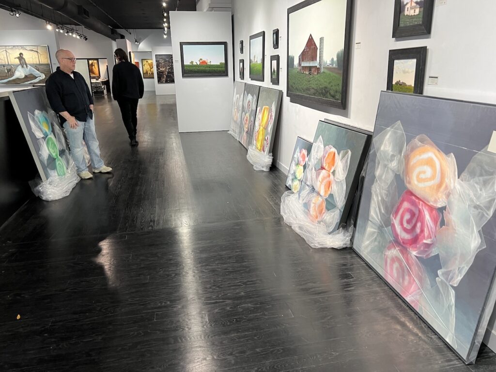
Steve Diamant, owner of Arcadia Contemporary, takes a look at the work I left with him.
On Tuesday, week before last, I turned a significant corner in my life as a painter.
Two days earlier, I’d filled a minivan with more than a dozen large paintings. I picked up my friend Tim Farrell and drove my work down to Manhattan to deliver them to Arcadia Contemporary. I was hoping Steve Diamant would keep a few of the taffy paintings to see if they would sell as readily as three smaller ones he sold at the Five and Under show in August. I also brought four of my older candy jar paintings.
This was something I’d decided to do only a couple days earlier. When I emailed Steve and said I was coming to town and would check in to see the new group show, he said “Bring those candy jar paintings we discussed.” This was a pleasant, but puzzling surprise. My plans had been to visit New York for two days of entertainment. Tim and I had tickets to a Rick Beato talk at Gramercy Theater, (Tim had played briefly in a band with Beato in high school) as well as tickets to the Rangers in their season opener at Madison Square Garden. During the day, I was going to get a look, as well, at the superb exhibition of paired work from Degas and Manet at the Metropolitan. This trip had originated as Tim’s first venture out since his wife passed away of ALS this year, one step toward getting back in stride, and he agreed to help with this additional venture.
My puzzlement at first was in determining which candy jar paintings we had MORE
September 19th, 2023 by dave dorsey
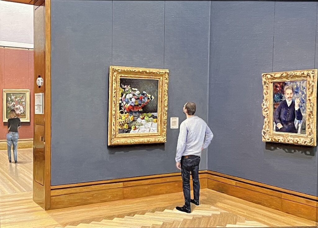 At Arcadia Contemporary through Sept. 20:
Russia, b. 1986, Impressionists, oil on aluminum, 9″ x 12″
September 17th, 2023 by dave dorsey
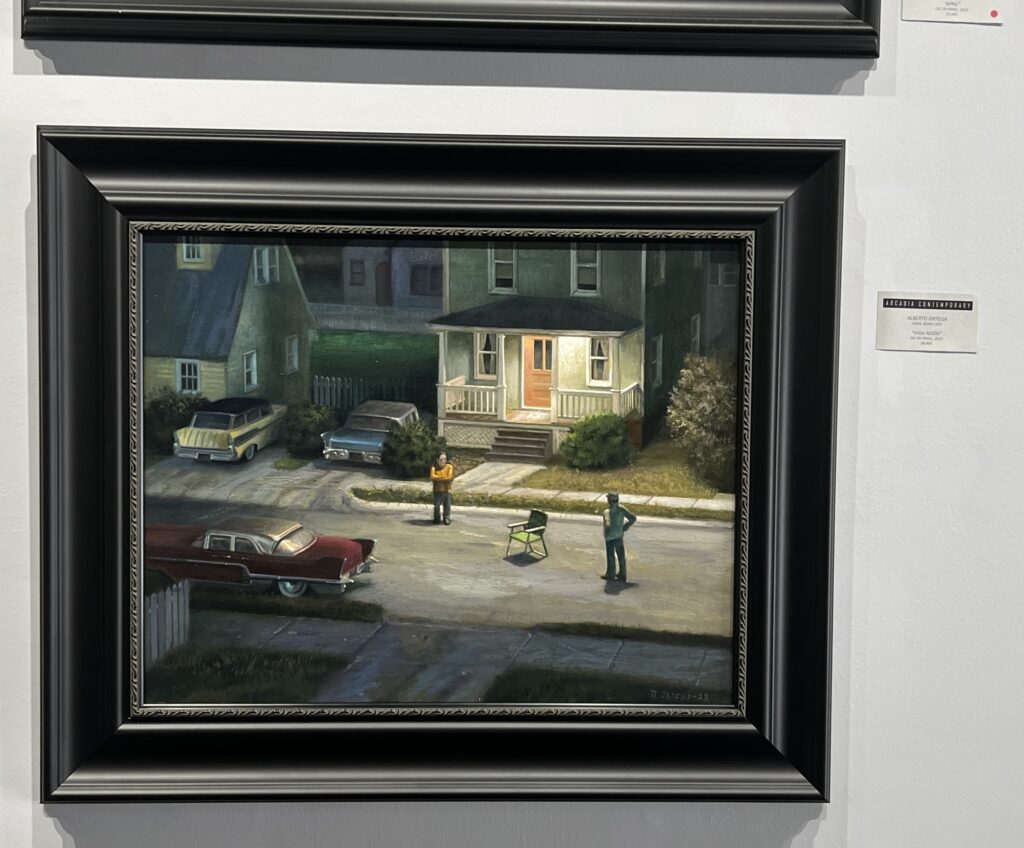 At Arcadia Contemporary through Sept. 20:
Spain, b. 1976, High Noon, oil on panel, 15″ x 20″
September 15th, 2023 by dave dorsey
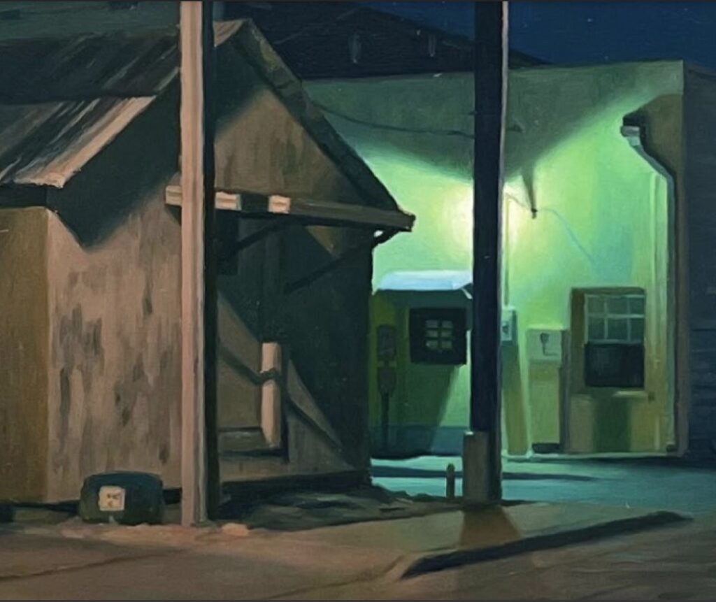 At Arcadia Contemporary through Sept. 20:
United States, b. 1964, “Grace”, oil on panel, 8″ x 8″
September 13th, 2023 by dave dorsey
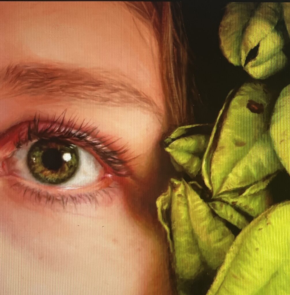 At Arcadia Contemporary through Sept. 20:
Australia, b. 1978, “At First Glance”, detail (4″ x 4″), oil on panel, full painting: 4″ x 16″
September 13th, 2023 by dave dorsey
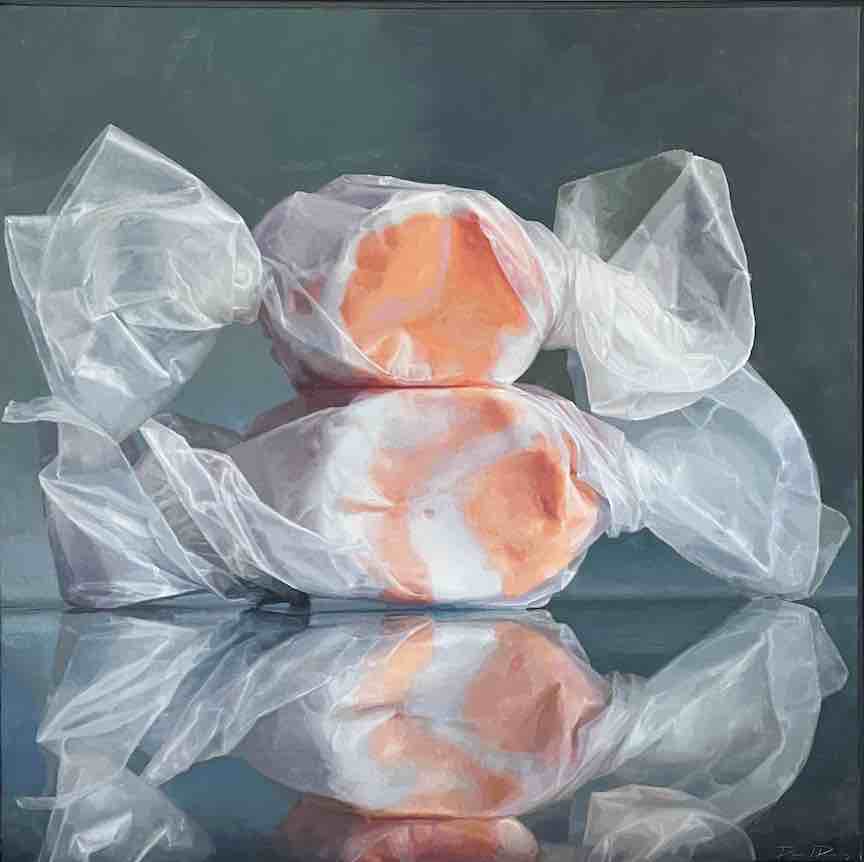
Summer Afternoon, oil on linen, 36″ x 36″
I’m sure when some people see my taffy paintings, including the most recent one above, they think of them as Pop and categorize any candy paintings with Jeff Koons or Thiebaud or one of the hyper-realists who do candy now. Yet Pop has really never been much of an interest for me except for some of Jim Dine’s work and Thiebaud’s landscapes. Anyone who sees the influence of Emily Eveleth’s donuts would be closest to the mark, since I’ve loved the simplicity and the lighting of her enlarged still lifes of pastry, her painterly approach to her medium and athe straight-forward depiction of what she sees without stylization, enlarged to the point where the subject assumes a new character. Many years ago, when I first saw one of her early glazed donuts in a New Yorker squib, I was moved by the way it was lit, set against a dark background out of the Dutch Golden Age. The fact that it was a loving, masterful painting of a donut amused me; but the irony of depicting such a humble guilty pleasure, with all the appreciative skill of Vermeer trying to capture light glancing from the curve of a milk pitcher, made her paintings seem not cynical but friendly, full of subtle feeling. She was adopting the repetitive simplicities of mid-20th century abstraction and applying similar strictures to representational painting. Who knew that if you lit a donut this way it would stir something in you other than than appetite? The donuts reminded me as well of Chardin’s use of humble, everyday objects from his own home in painting after painting–a painter whose rank among the masters decades ago inspired me to narrow most of my efforts to variations of still life painting. William Blake could see the infinite in a grain of sand. Still life painters see the world in a cup of coffee or a jelly bean.
The taffy paintings are still lifes restricted to the simplest possible terms. In the back of my mind I’ve always thought of minimalist color field painting as an inspiration for these variations in color, line, form, light and volume within an identical hashtag grid of nine vectors. Two pieces of salt water taffy sitting on the reflection of the lower piece arranges itself into nine segments, the three colored candies and the six ears of waxed paper on left and right, all of them rising in three ranks from the bottom edge. Within these limitations I experiment with unlimited shapes and colors, depending on the design of the taffy and the way the twists in the waxed paper create lines and forms that converge and run throughout the composition. Rothko was a remote inspiration with the way he reduced landscape painting to a kind of Taoist void: empty sky, horizon line, empty earth. Within this primordial view he experimented mostly with luminous color harmonies to evoke dramatically different responses with each painting. Over and over, he explored all the ways such a simple composition could express an endless range of feeling and perception, from joy to despair. The ways in which colors assume volume and shape in the taffy itself have always reminded me of Rothko, or Frederick Hammersley’s small abstracts with organic forms or Stella’s experiments with protractors or Barnett Newman’s zips. With the taffy I’ve found a way to pay subliminal homage to a lost age of painting, color field memories contained and congealed into these dollops of sugar wrapped in a haze of waxed paper.
When I arrange the taffy, usually on the granite countertop beside our kitchen sink, where the natural light is best for most of the ones I’ve done, I spend hours trying in some cases to rewrap them repeatedly until the bow-tie shape of the paper seems to unify into an actual shape rather than a veil of chaotic wrinkles. It’s like trying to build a tiny sculpture with nothing but your thumbs and forefingers. Then, once the lines and curves of the paper come together somehow, I balance one on top of the other and then photograph the candy at different angles to catch the light properly. Sometimes this can come together in ten minutes, other times it takes hours. But all I have in mind at this point is the formal unity of the image–to create something that looks as if it’s exactly as it should be as a result of the way form, light, line and color come together.
The taffy paintings hew closely to the way I think visual art most fundamentally works. The subject itself has no significance, narrative or otherwise, and the ways in which I get to the final image don’t arise from any desire to visualize a preconceived meaning or significance. Most of my work is meant to be a visual image devoid of consciously-invented signifiers. Yet through the purely formal struggle of arriving at the objects to paint and in the process of adopting colors and choosing paint in response to an image I’ve essentially built, I see resonances with times, places, feelings, certain experiences and even spiritual states. I don’t intentionally invest any of this into the work as I’m creating it. I want the painting to have no significance whatsoever, strictly speaking. It doesn’t stand for anything but itself, yet in looking at the finished work, I see through it, the way you see a world through a window, these periods in a person’s life: struggles, joys, states of mind, and so on. While my methods are as repetitive, dutiful, utterly subservient to the uniform process of making one painting after another, with little room for improvisation throughout the process, what’s happening behind all this essentially lowly labor is an act of discovery: how to get an object as meaningless as a chunk of taffy to become a window through which to see a world.
September 11th, 2023 by dave dorsey
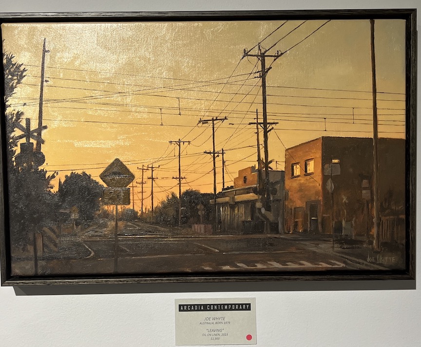 At Arcadia Contemporary through Sept. 20:
United States, b. 1987, Leaving, oil on linen, 10″ x 16″
September 9th, 2023 by dave dorsey
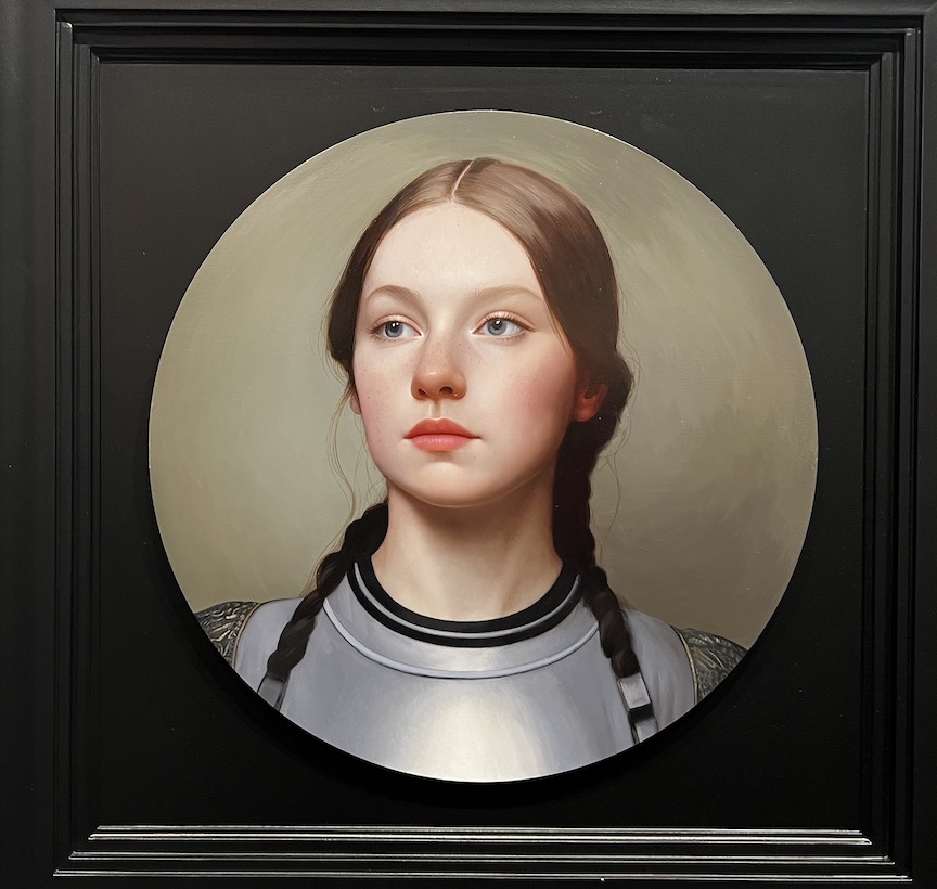 At Arcadia Contemporary through Sept. 20:
United Kingdom, b. 1983, “Cours Vaillants I”, Oil on aluminum, 12″ x 12″
September 7th, 2023 by dave dorsey
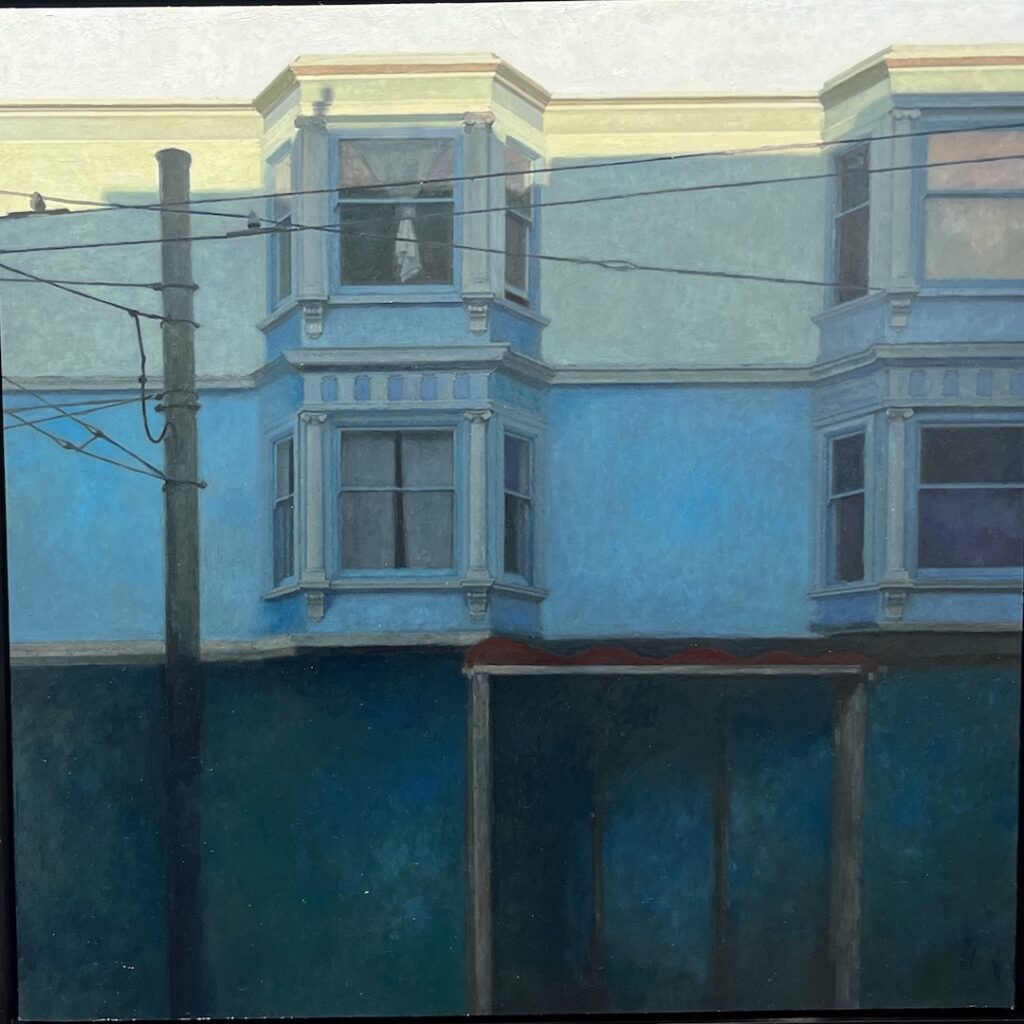 At Arcadia Contemporary through Sept. 20:
United States, b. 1968, Daybreak Fillmore, oil on panel 12″ x 12″.
September 5th, 2023 by dave dorsey
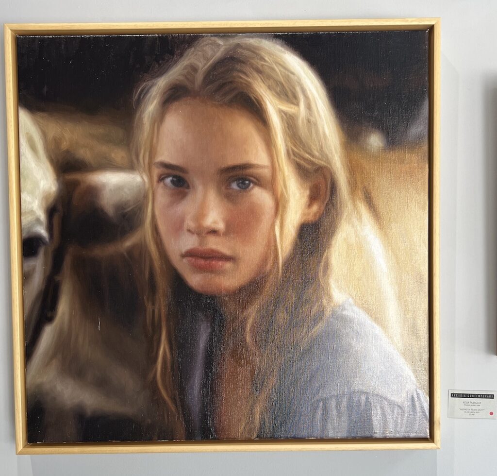 At Arcadia Contemporary through Sept. 20:
Poland, b. 1989, Hiding in Plain Sight, oil on linen, 28″ x 28″.
September 3rd, 2023 by dave dorsey

At Arcadia Contemporary through Sept. 20:
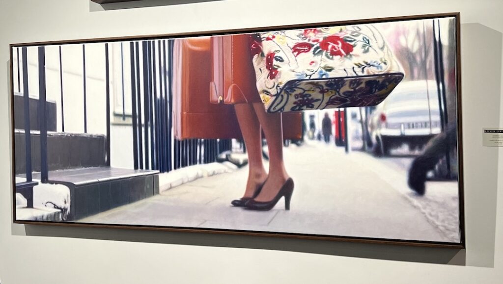
United States, b 1980, Traveler with a Coach Bag, Oil on Linen, 24″ x 58″.


 \
\
 My work will be shown by Arcadia Contemporary at the 29th edition of The West Coast’s largest, international art fair,


 At Arcadia Contemporary through Sept. 20:
 At Arcadia Contemporary through Sept. 20:
 At Arcadia Contemporary through Sept. 20:
 At Arcadia Contemporary through Sept. 20:
 At Arcadia Contemporary through Sept. 20:
 At Arcadia Contemporary through Sept. 20:
 At Arcadia Contemporary through Sept. 20:
 At Arcadia Contemporary through Sept. 20: